Toggle button group

v1.0.3

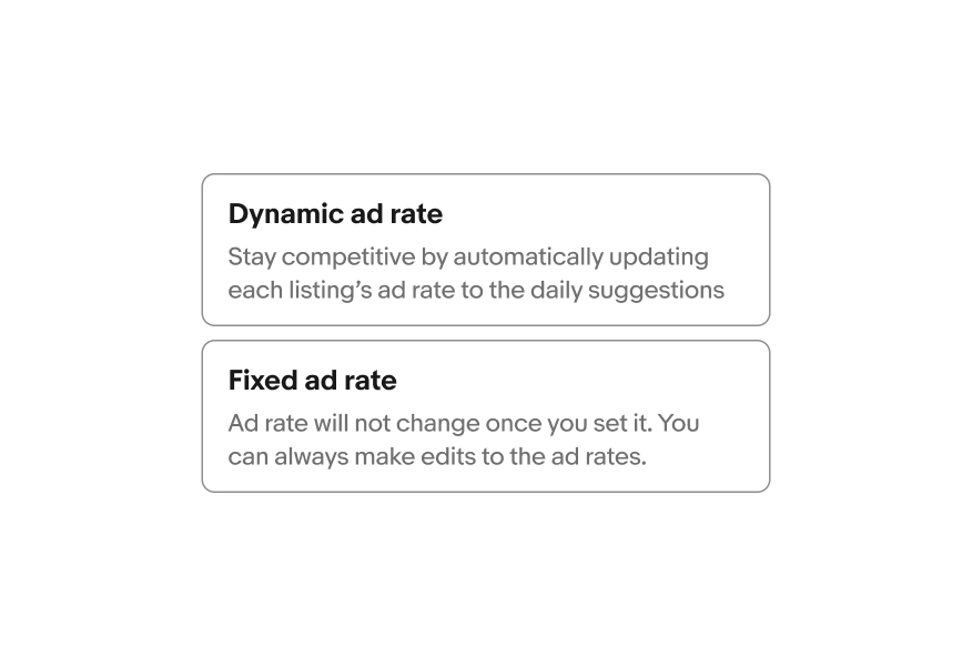
A toggle button group is a single and multi selection pattern that provides increased visual emphasis for the available choices.

  • Skin
  • CoreUI
  • React
Stylized artwork of a toggle button group.

Considerations

Friendly

Toggle button groups are interactive and provide subtle delight to the experience.

Quick

They should be lightweight and easily digestible for the action at hand.

Informative

They should help make decisions easier to scan in order to take action.

Anatomy

A toggle button diagram with 5 elements numbered: 1. Image, 2. Title, 3. Subtitle, 4. Border, 5. Container.
  1. Image
  2. Title
  3. Subtitle
  4. Border
  5. Container

Properties

Single select

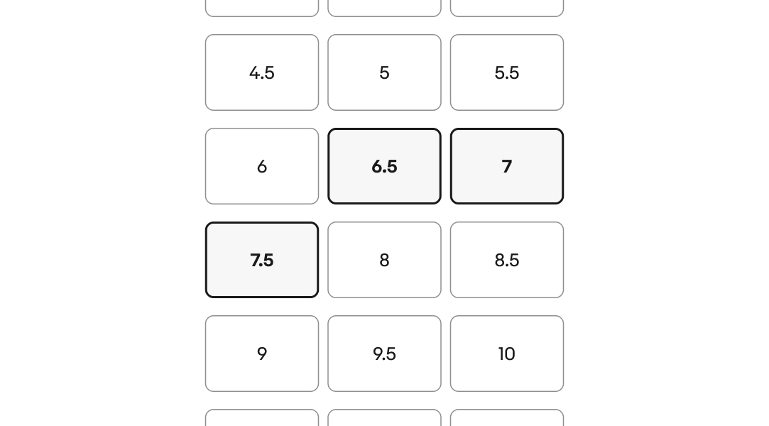
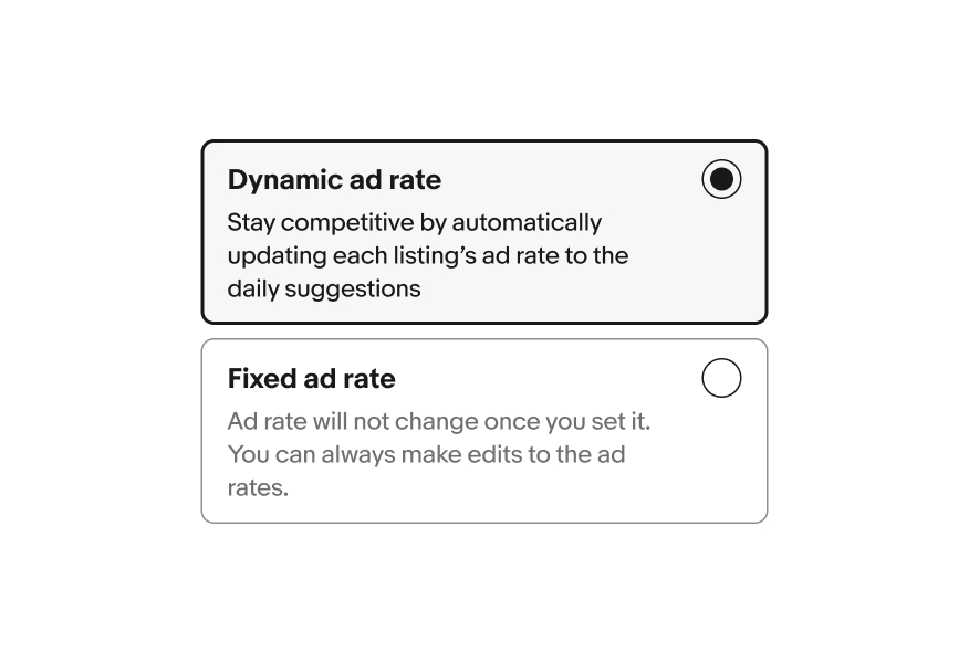
Single select allows the user to select one option from a set. Only one can be selected at a time.

Three single select toggle buttons are shown.

Multi-select

Multi-select allows the user to select multiple options from a list or a single yes/no option.

A group of toggle buttons are shown in a list, with three buttons selected.

Title

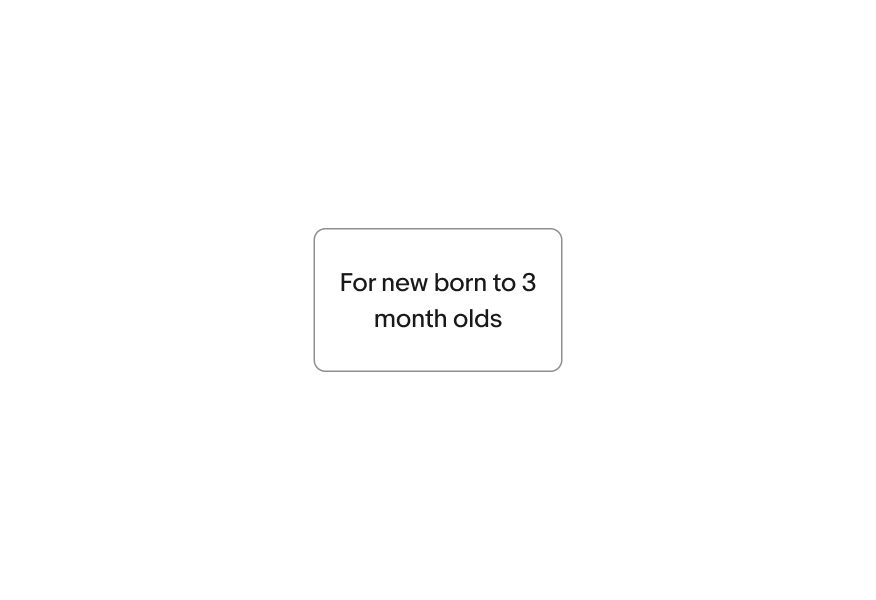
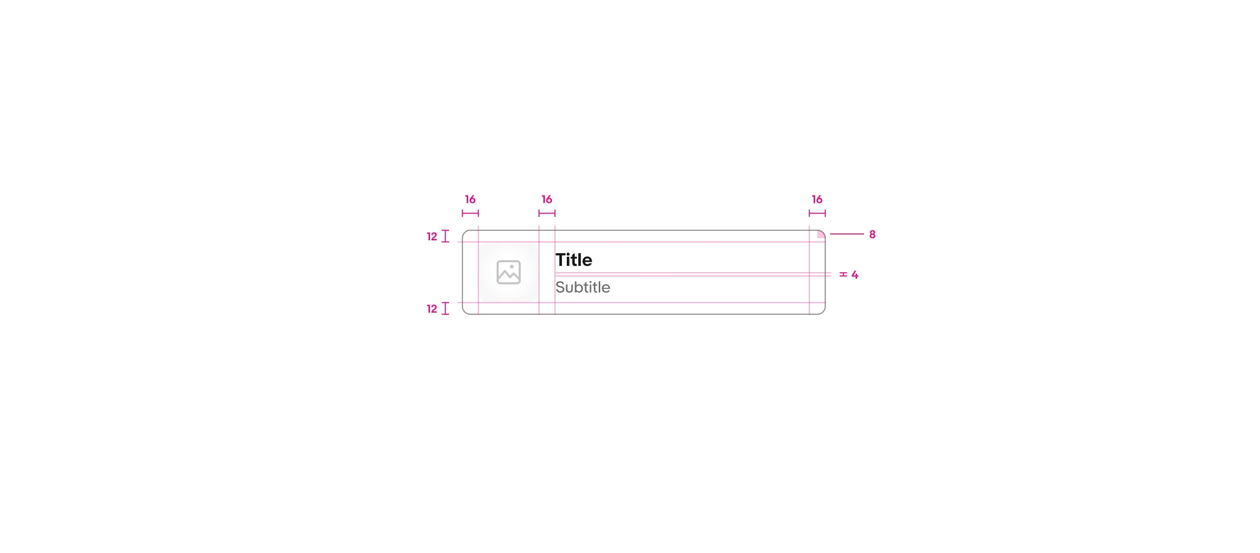
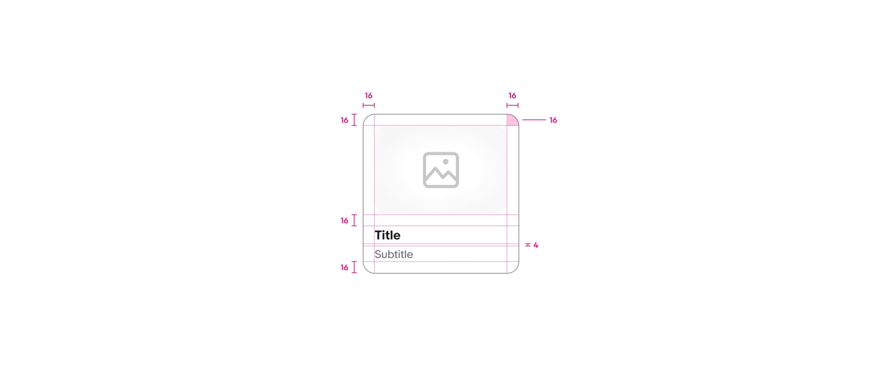
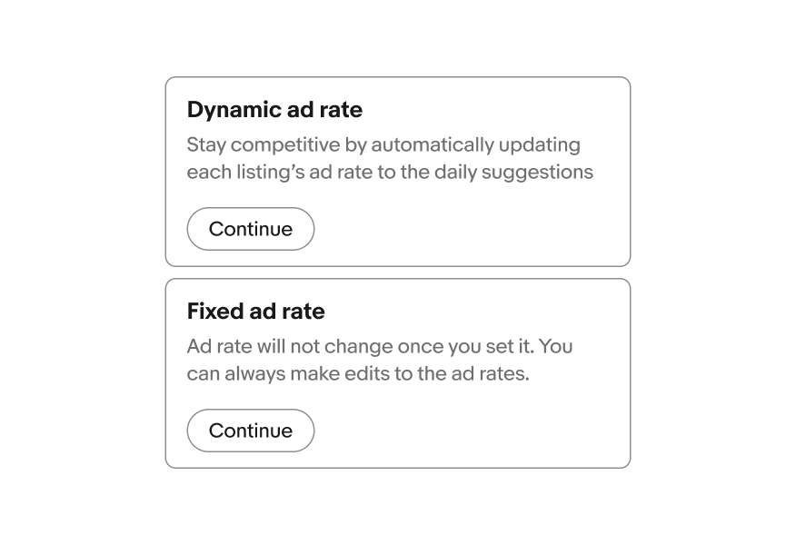
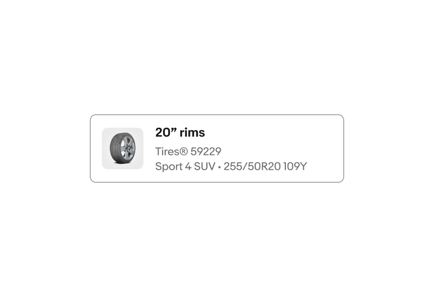
The title is required for every option. Keep titles short and concise.

A text toggle button, an icon toggle button, and an image toggle button are shown with titles.

Subtitle

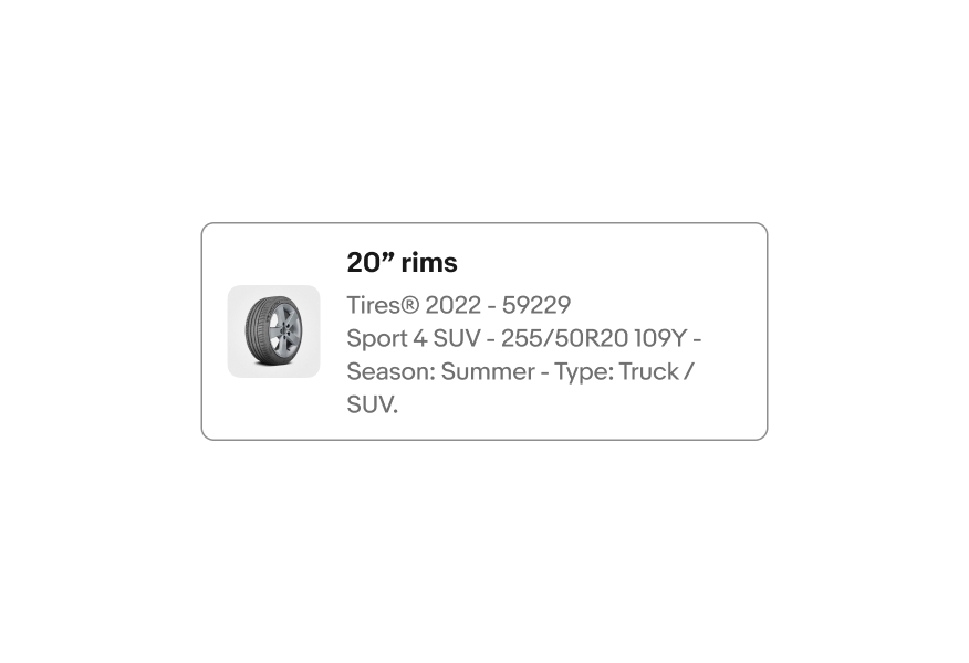
The subtitle is optional. Use a subtitle to provide more context or details. Aim for 1-2 lines.

An icon toggle button and an image toggle button are shown with subtitle text.

Lead element

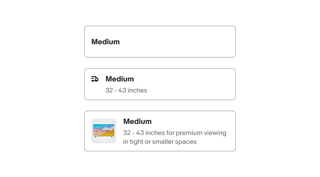
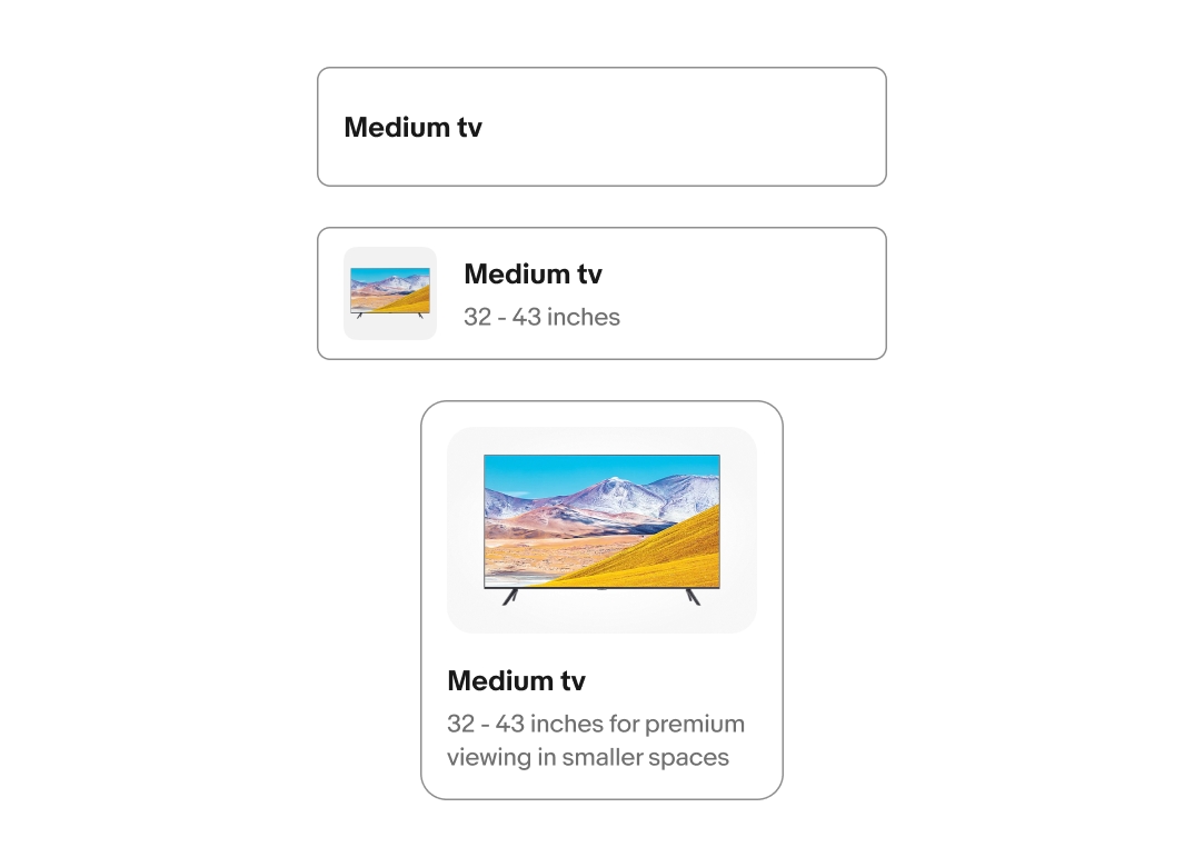
The lead element is optional. It provides visual support for the available options. There are 2 options for lead elements: Icon and Image.

An icon toggle button and an image toggle button are shown with supporting visuals.

Layout

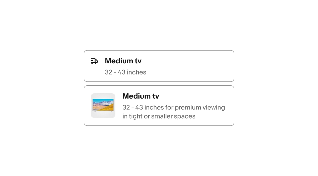
Toggle buttons can be presented in 3 variants: Minimal, List view, and Gallery view.

A minimal toggle button, a list view toggle button, and a gallery view toggle button group is shown.

Disabled

Toggle button groups can be disabled in unselected state.

A toggle button group in a list featuring a disabled button.

Behavior

Selection

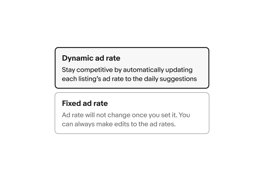
The selection state toggles on and off for both multi and single select option list styles.

On selection the border color changes to “border.strong” and the background color changes to “background.secondary”.

Learn more about Color tokens.

A toggle button group in a list featuring a selected button.

Size

It is important to ensure you follow the sizing guide for each toggle button variant. The various styles and layouts adhere to different minimum and maximum sizing rules.

Minimal

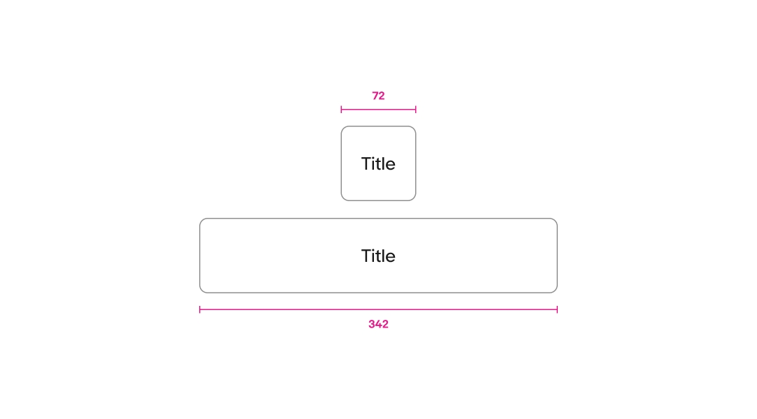
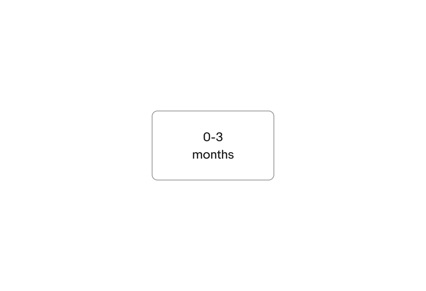
The minimal layout has a minimum width of 72px and a maximum width is 342px.

Two toggle buttons.  A toggle button with a width of 72px sits above a toggle button with a width of 342px.

List view

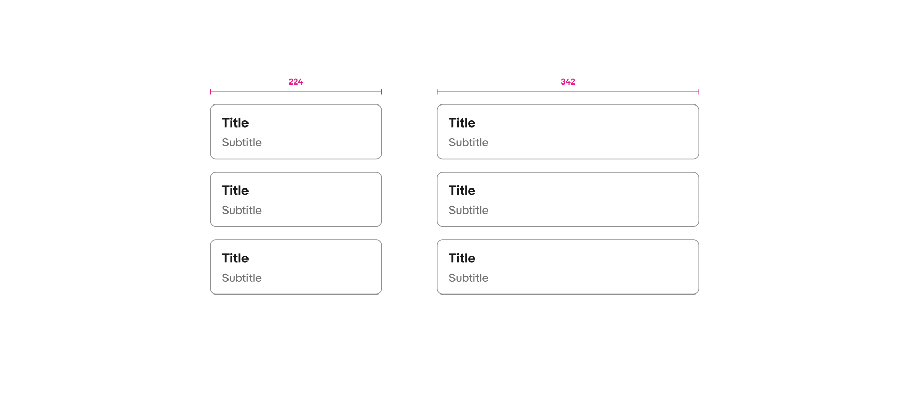
List view layouts have a minimum width of 224px and a maximum width of 342px.

Three toggle buttons with a width of 342px sit to the left of three toggle buttons with a width of 224px.

Gallery view

Gallery layouts have a a minimum width of 168px and maximum width of 342px.

Two gallery toggle buttons with icons have widths of 168px and 342px, and two gallery toggle buttons with images have widths of 168px and 342px.

Screen sizes

Small

A toggle button group in a list is displayed on a mobile screen.

Medium and large

A toggle button group in a gallery is displayed on a larger screen.

Best practices

CTA buttons

Do use the variant options provided within the component.

Two text toggle buttons sit on top of one another.

Don’t add CTAs or additional buttons to the option list.

Two text toggle buttons with CTAs sit on top of one another.

Additional controls

Keep content minimal and straight forward.

A text toggle button in a selected state sits above a text toggle button in an enabled state.

Don’t add additional controls or selection indicators, such as checkbox, radio button, or checkmark.

A text toggle button with a radio button in a selected state sits above a text toggle button with a radio button in an enabled state.

Content length

Keep titles to a single line of copy when possible. Subtitles can have more content but should not exceed 3 lines of content.

A toggle button with an image is shown with a title and two lines of subtitle text.

Avoid lengthy content. Keep your title and subtitle short and concise.

A toggle button with an image is shown with a title and four lines of subtitle text.

Overflow

The title can wrap to 2 lines for the title-only option. In general, keep your content brief and to the point.

A text only toggle button with the title ‘0-3
months’.

Don’t write overly detailed titles.

A text only toggle button with the title ‘For new born to 3 month olds’.

Specs

A toggle button list is shown with specs. The padding on the top and bottom of the toggle button is 12px, and the padding on the left and right of the toggle button is 16px. The padding between the image and text content is 16px, and the padding between the title and subtitle is 4px. The corner radius around the button is 8px.
A toggle button gallery is shown with specs. The padding on the top, bottom, left, and right of the toggle button is 16px. The padding between the image and text content is 16px, and the padding between the title and subtitle is 4px. The corner radius around the button is 16px.

Change log

VersionDateNotes
1.0.3
Oct, 2024
  • Updated to eBay Evo
1.0.3
May, 2023
  • Updated name to “Toggle button group”
  • Added more guidance for min. and max widths
1.0.2
Apr, 2023
  • Updated selected state stroke weight to 2px
1.0.1
Mar, 2023
  • Updated name to “selection group”
  • Updated default state stroke color
  • Added keyboard interaction
1.0.0
Jan, 2023
  • Added documentation and guidance