Chip
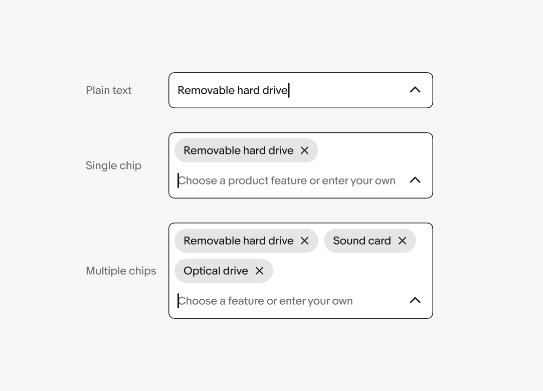
Chips represent discrete input values.
- Skin
- CoreUI
- React
Discrete
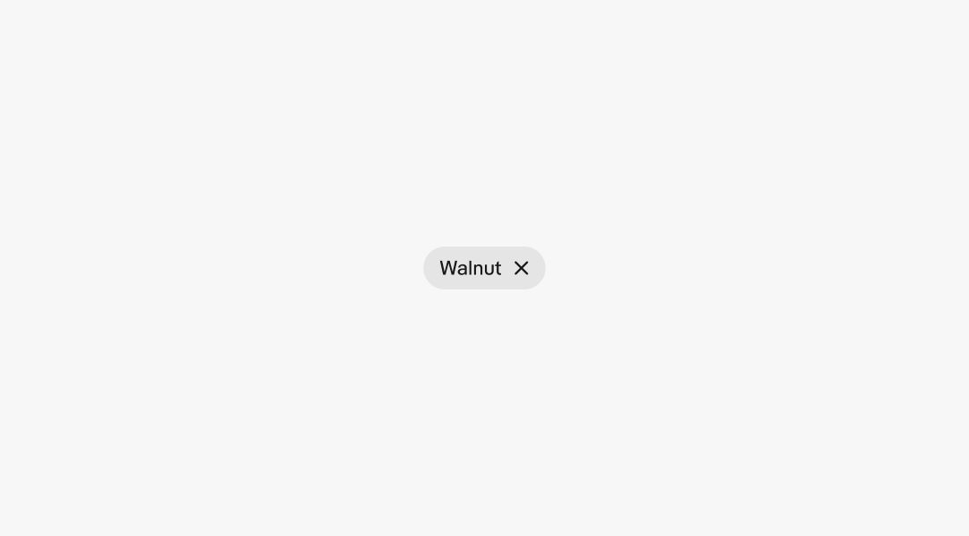
A chip represents a single value.
Contained
Chips provide a stronger visual distinction between values by containing them in their own shapes.
Verified
Chips indicate that the input is verified and submittable.
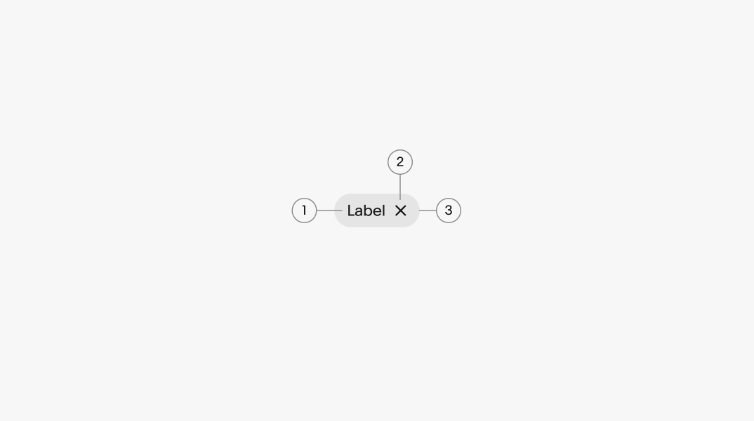
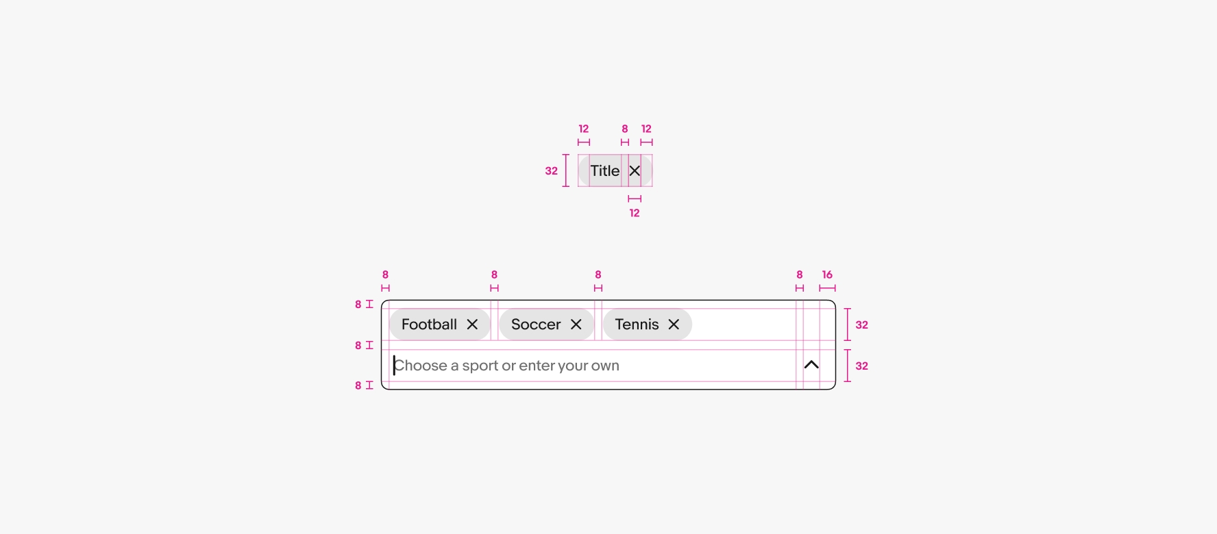
- Title
- Delete button
- Container
Title
All chips have a title to represent the value entered or selected.
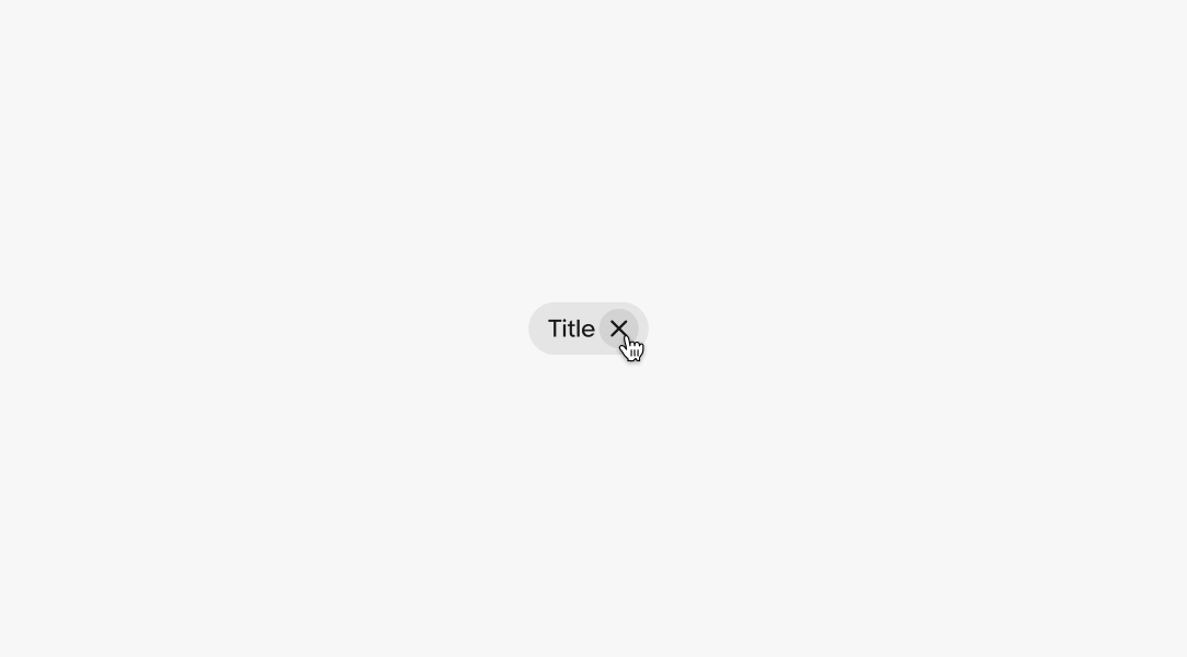
Hover
A hover state appears over the chip’s delete button.
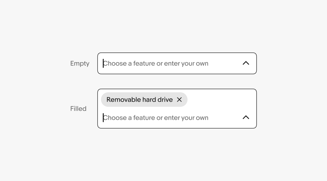
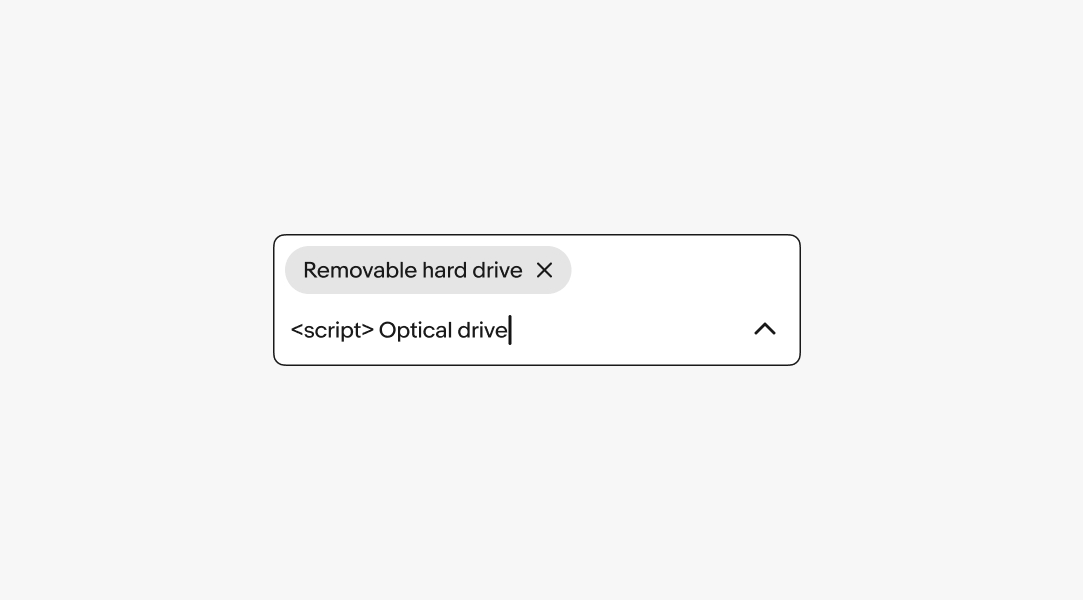
Plain text conversion
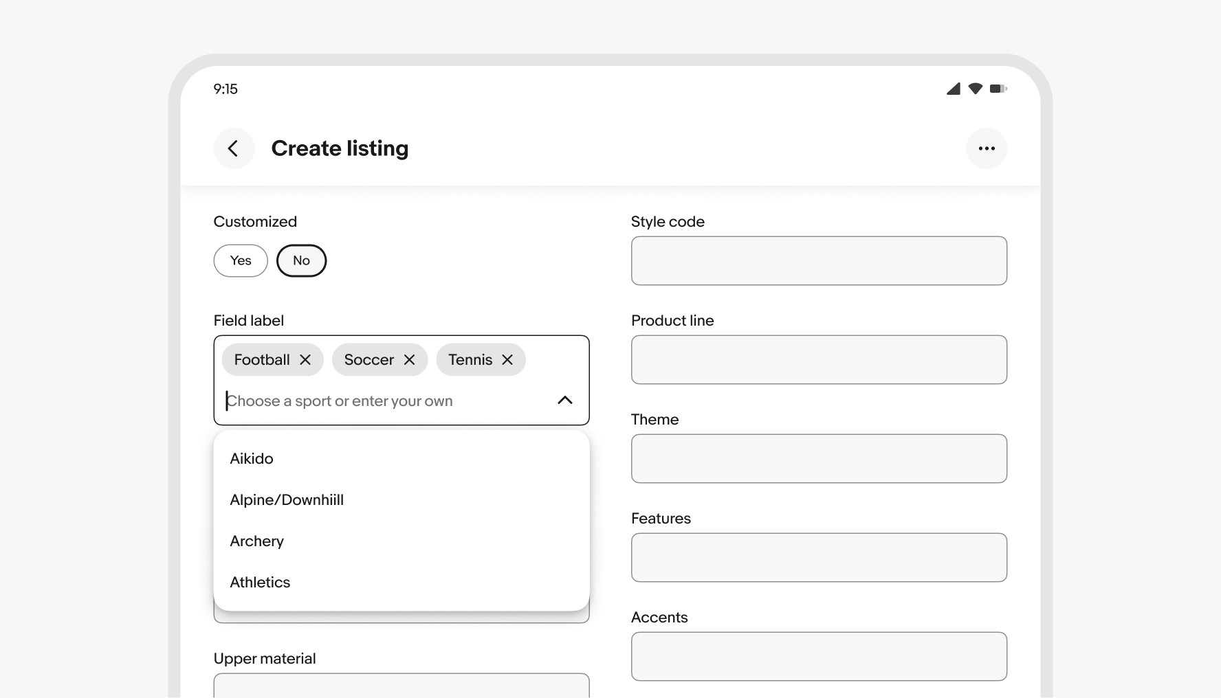
On native platforms, characters can be typed in plain text and converted to a chip by hitting the ENTER key or selecting a filtered value from a list.
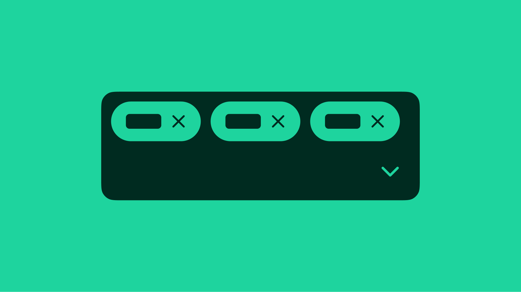
Overflow
Chips within a text field wrap to a new line when reaching the edge of the text box. The cursor wraps to a new line when the first chip is added.
Validation
Only valid entry values convert to chips. If a value fails validation, it should remain as plain text until corrected or deleted. Focusing away from an input field removes invalid values. Existing chips within the field remain.
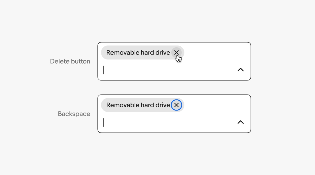
Removing chips
Chips are removed by pressing (or holding) the BACKSPACE key within an empty input field or activating the delete button.
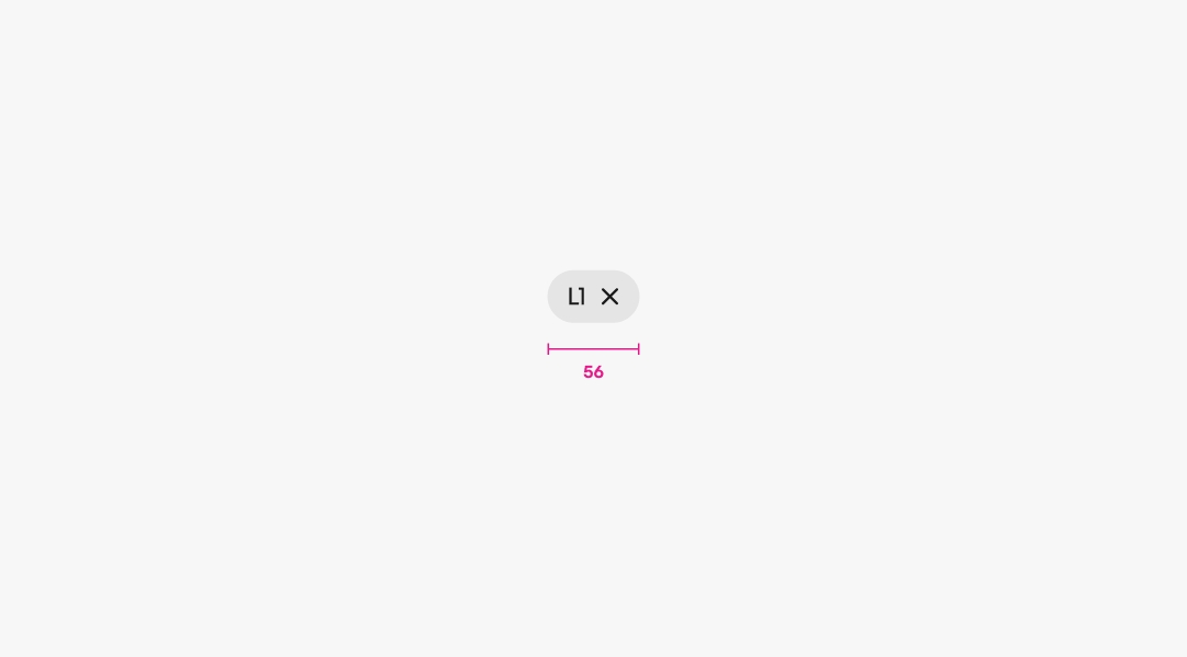
Min width
Chips have a minimum width of 56px.
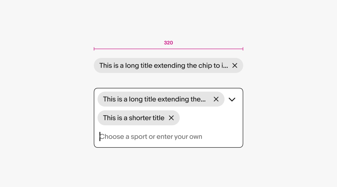
Max width
Chips have a max width of 320px before the title is truncated. If chips are nested within an input field that is narrower than 336px then they will extend the full width of the field minus padding.
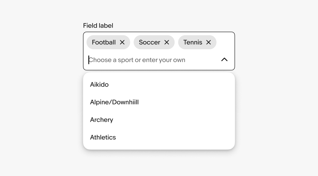
Popover options
Input fields with chips leverage the same behavior as comboboxes:
- The popover appears automatically when the user starts typing in the input field, or when they focus on the input field.
- The popover is filtered as the user types, so that only the options that match the user's input are displayed.
- If no option exists, and the field allows for custom values, then the value is created and added to the list.
- When an element is selected and added as a chip to the field, that item is removed from the list.
- Options within the popover can be grouped and organized as necessary.
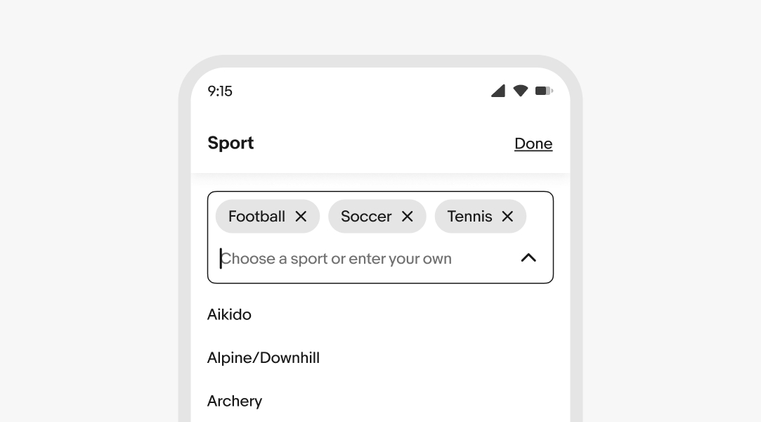
Small
Editing and selecting chips within a field on compact screens launches a fullscreen overlay.
Medium and large
Chip fields use popover menus to present values.