Expressive loader

v1.0.0

Leveraging a branded expression, the expressive loader provides reassurance, guidance and delight.

Expanded component guidance coming soon.

This page will be updated soon with expanded guidance and clarity from Design, Platform, and Accessibility teams.

Principles

Expressive

Users experience a delightful, branded moment with the expressive loader. It is meant to replace our traditional spinners to feel faster during periods of longer loading.

Reassuring

To provide reassurance, the expressive loader uses support text to indicate that actions taken by users are being processed.

Quick

To portray responsive and quicker loads, the expressive loader's design utilizes visual momentum to indicate progression across refreshing, page loading and user actions.

Anatomy

Our four core colors are prominently displayed in the expressive loader through colored bars and can include optional support text for all instances except pull to refresh.

Usage guidance

When to use

  • For branded moments of delight to enhance refreshing a page or during final purchase
  • When navigating to a page where the visual design is mostly unknown ahead of time and a skeleton loader can’t be leveraged
  • For periods of longer loading where the user needs reassurance
  • When a user action is being processed and it is expected to perform multiple calls to load

When to consider something else

  • If the visual layout/format of the content being loaded is mostly known, a skeleton loader would be the better option
  • If content can be pre-loaded or optimized in another way, don’t default to the expressive loader because it is easier to implement

Color

Expressive loaders work across both light and dark modes.

Max-width

Expressive loaders have a max color bar width of 343px across both native and web applications. This width does not account for the left and right padding.

Options

Pull to refresh

The pull to refresh variation is exclusively used on native devices as a branded moment of delight when refreshing content on a page.

Bars only

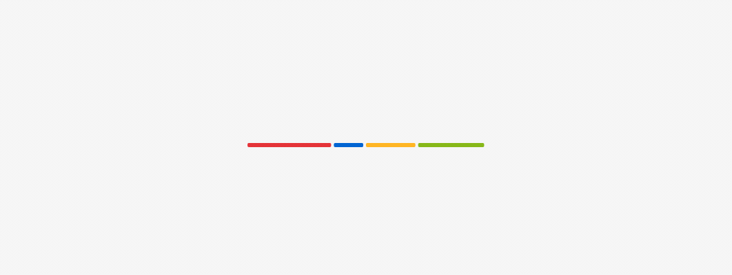
The default expressive loader is the bars only variation. It is primarily used as a replacement for the traditional spinner, in order to help conceal loading speeds and make the experience feel visually faster.

Bars with large text

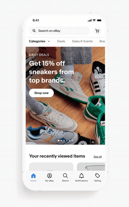
The bars with large text variation is utilized when support text is required to better inform users during longer loading periods. Common situations in which they are used include navigating to a page that is not fully known beforehand, loading a large set of data, or completing a purchase.

Bars with small text

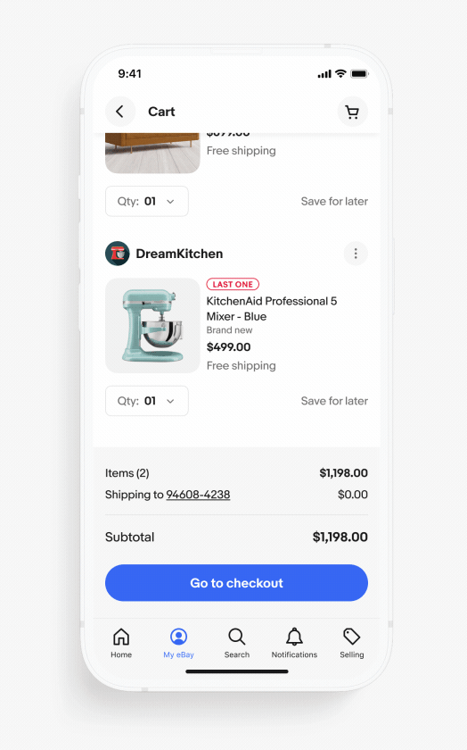
Common actions, such as adding items to the cart, may use the variation with small text within bottom sheets if additional load time is required. Due to its smaller visual footprint, this variation is only used in bottom sheets. Text should appear at the beginning of the animation since this loader is launched by a specific user action.

Text progression

When loading takes longer, support text helps inform users that their actions are being processed. There should be no more than 3 strings of support text in a sequence. Text should reflect progress on the page and should be vetted by the content team before implementing.

Motion

We use motion with the expressive loader to convey that a page is not stalled and that data is still being retrieved. This movement can help reduce user uncertainty.

Initial bar generation specs

  • All four colors should be present on initial generation of loader
  • Bars will be assigned a value between 10%–40% of screen width equalling 100% (accounting for padding)
  • The loader starts with a screen size of 375px
  • Then subtract all padding totaling 44px
  • Then generate the initial bars totaling 100% of the remaining screen size, 331px

Additional bar generation specs

  • Each additional bar generated is randomly assigned a value between 10%–40% of the screen width
  • Each new bar will continue the color pattern, red, blue, yellow, green
  • Each bar will scale from the leftmost edge of itself from 0%–x% over 700ms with a linear animation curve
  • When scaling each bar, it will push the bar in front of it forward
  • Another bar will spawn 100ms after the previous and repeat the pattern
  • Do not simply loop the animation, the idea is to have it constantly generating new bars

Mobile

Across native, pages may require additional requests that extend the duration of the page load or action. The expressive loader is used across the native experience to mask load times, reduce visual latency and provide reassurance to users. Please note, the following examples are for visual reference and may not actually require expressive loaders in product.

Pull to refresh

The expressive loader is used as a branded moment during the pull to refresh experience. The max-height of the pull portion of the loader is 96px. Once the bars snap back to the top, the animation begins.

Bars only

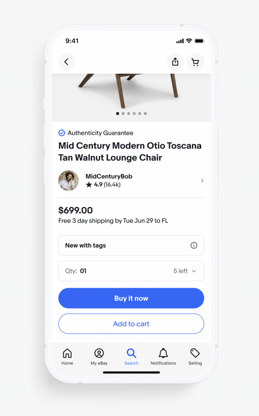
When navigating to a page where the design is unknown and may take additional time to load, a skeleton loader is not typically leveraged. The “bars only” variation of the expressive loader can be used in these cases as a replacement for a full page spinner.

Bars with large text

When loading a page or communicating an action is taking longer than expected, strings of support text appear to provide reassurance for the user. These text strings should communicate the progress of the screen. The bars with large text variation of the expressive loader is the default text option.

Bars with small text

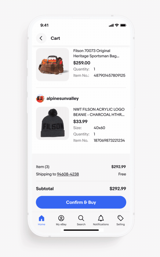
Similar to bars with large text, the bars with small text variation is used in the same way, but only within bottom sheets. The other difference is this version starts with a text string as soon as the expressive loader is visible because it is responding to a specific user action like adding an item to the cart. For the large text version, text does not appear until after 1500+ms.

Desktop

Pages that load quickly on larger screens may not require a loader, due to optimization on the web. Nevertheless, a loader can be helpful during unexpected delays in page loading.

To help users feel more at ease while waiting for a large amount of data to load, such as a table, an expressive loader can be deployed to provide visual cues and reassurance.

Accessibility

Alt text should be provided both at the time the loader appears and consecutively when support text appears. New text should read as the text string progresses.

Best practices

Support text

Do keep support text short and direct.

Don’t use text phrases that extend past the bars.

Do use support text when loading is taking longer.

Don’t use support text when loading is expected to be faster. The exception is when using the loader in the bottom sheet for actions like “add item to cart”.

Do use a single line of support text.

Don’t add additional lines of support text.

Styling

Do use the standard size of the expressive loader on desktop.

Don’t extend the loading bars to the width of the screen on desktop or increase the size of the loader or text.

Specs

Component versions

VersionDateNotes
1.0.0
Mar, 2023
  • Expressive loader documentation created