Do use a single bottom sheet per action.
Bottom sheets present supplemental content anchored to the bottom of the screen.

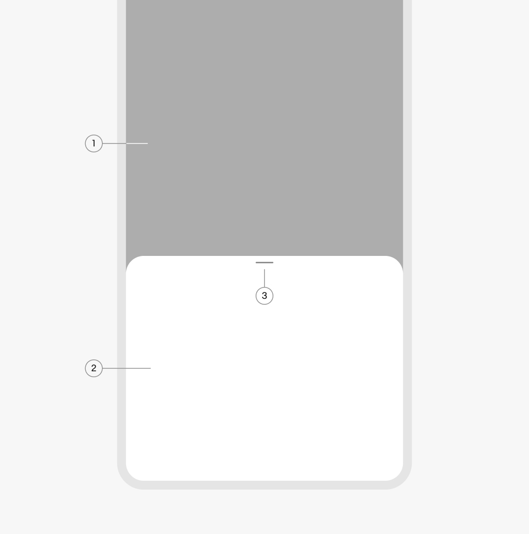
The container adjusts to fit their content up to an initial maximum height. They can be expanded by scrolling content within the sheet or pushing to a fullscreen sheet.
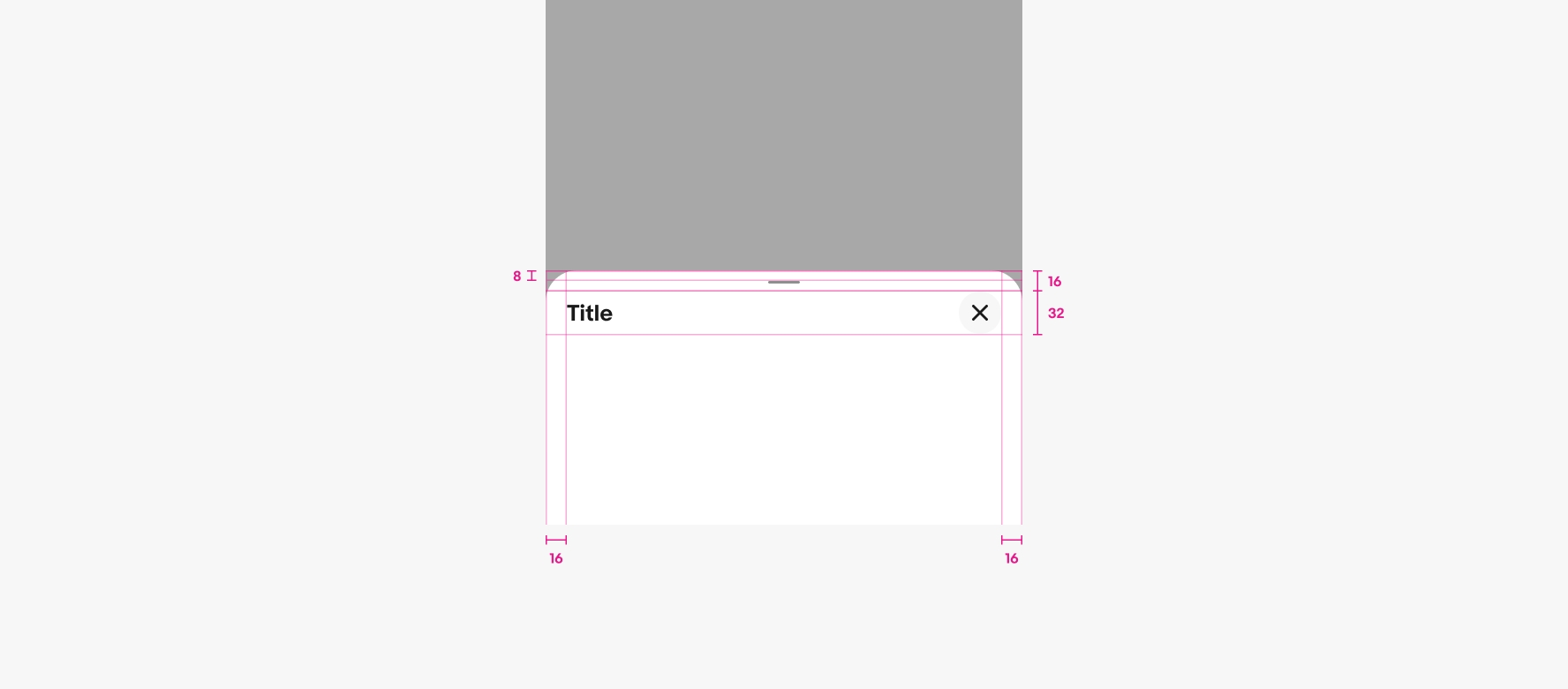
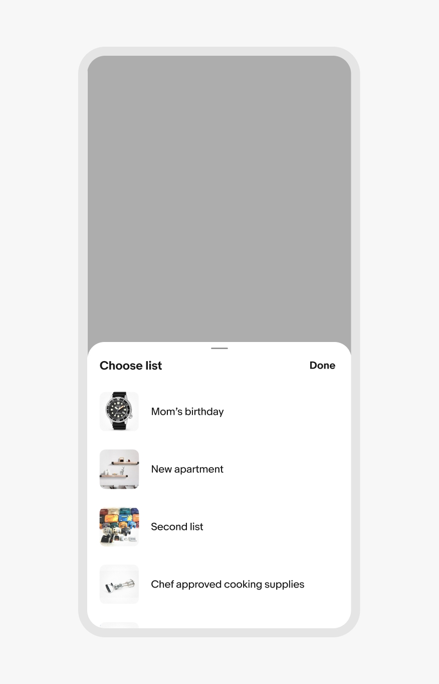
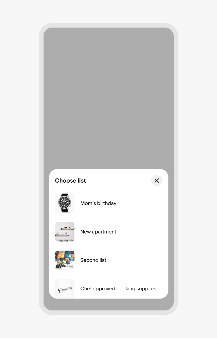
A title is required for bottom sheets. The title appears at the top and should summarize a decision or information within the sheet.
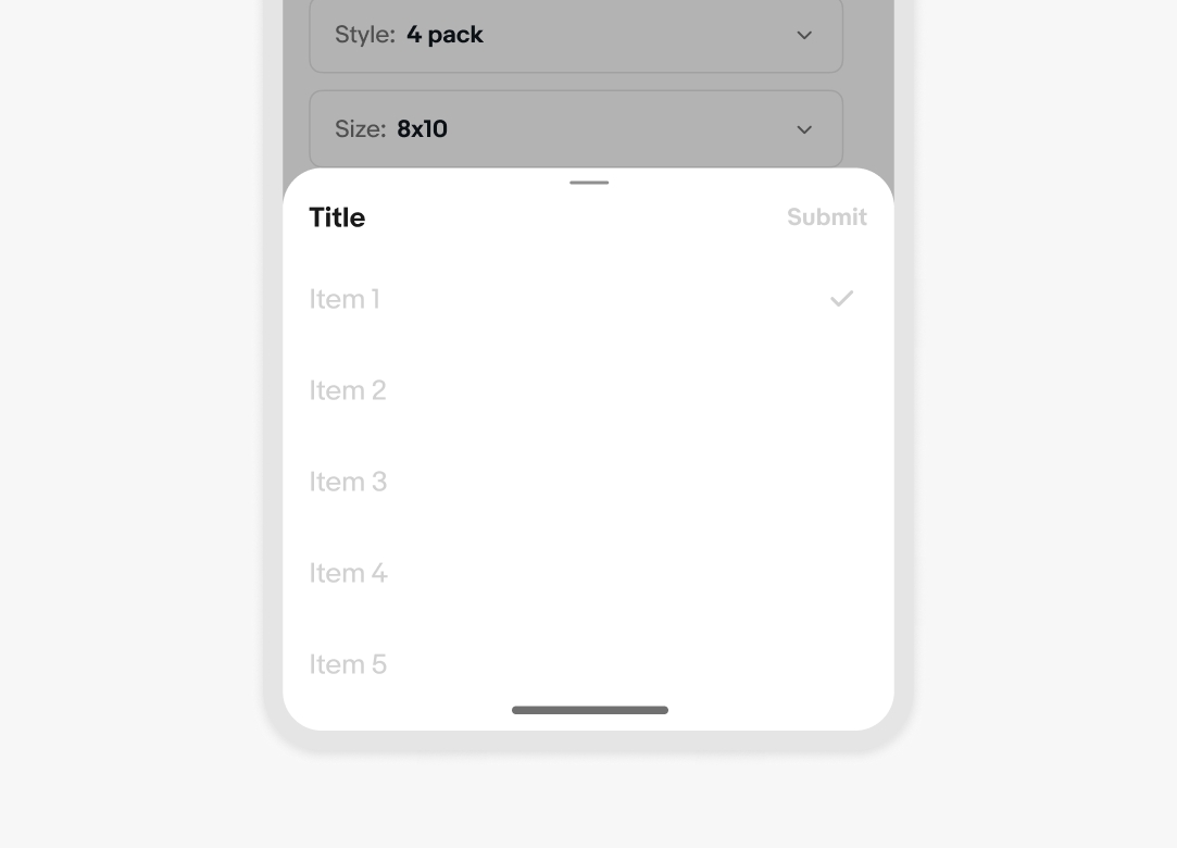
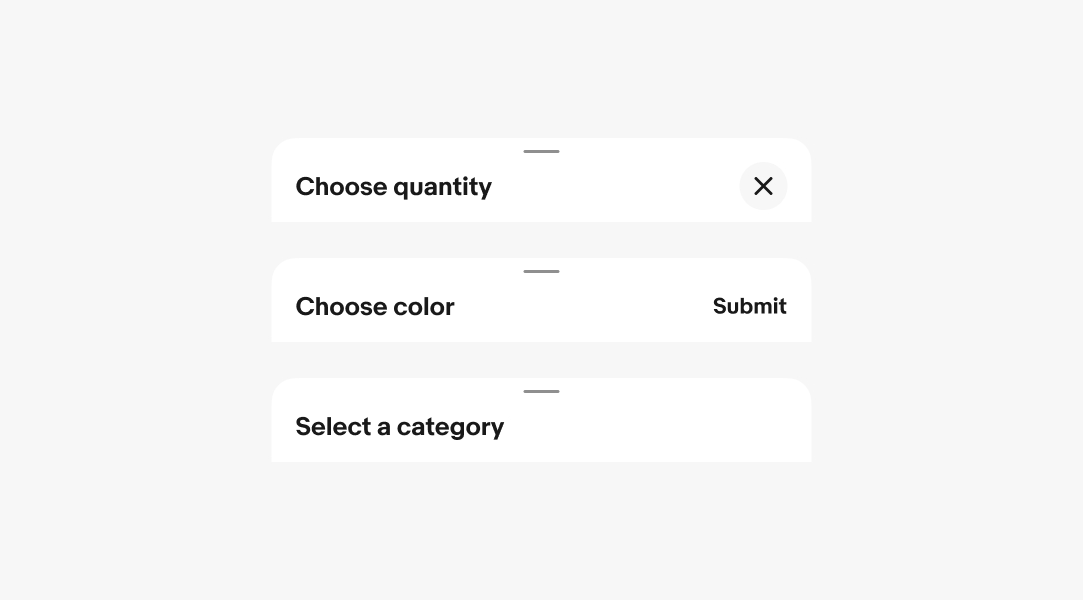
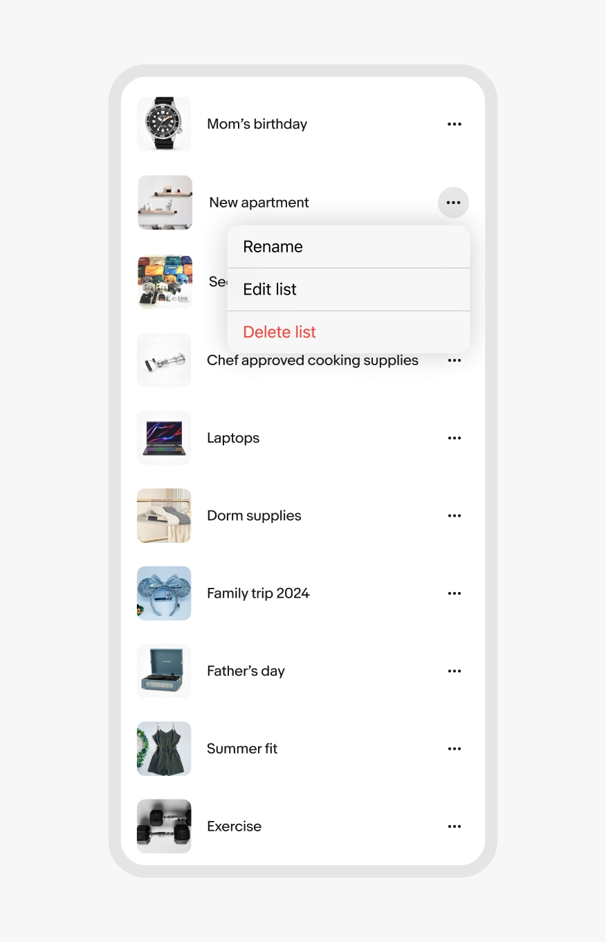
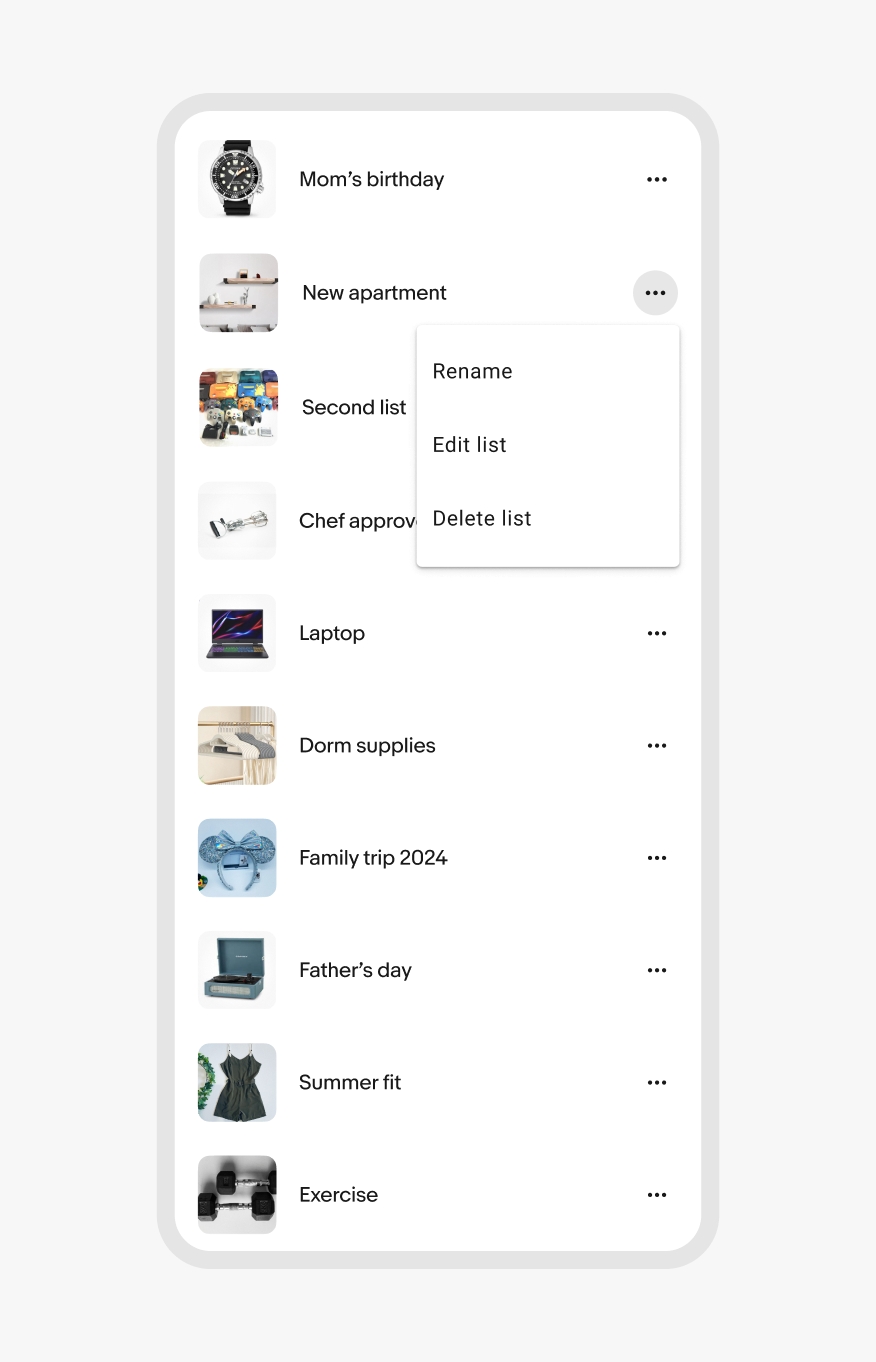
The header can have an optional action to the right of the title. The action can be an icon or text action, with a close icon being the default on web and no action on native iOS and Android. Text actions should follow a verb + noun structure and describe what will occur when pressed.
The close icon isn’t required on native, but a close icon will always be present if native accessibility options (like Android TalkBack) are enabled.
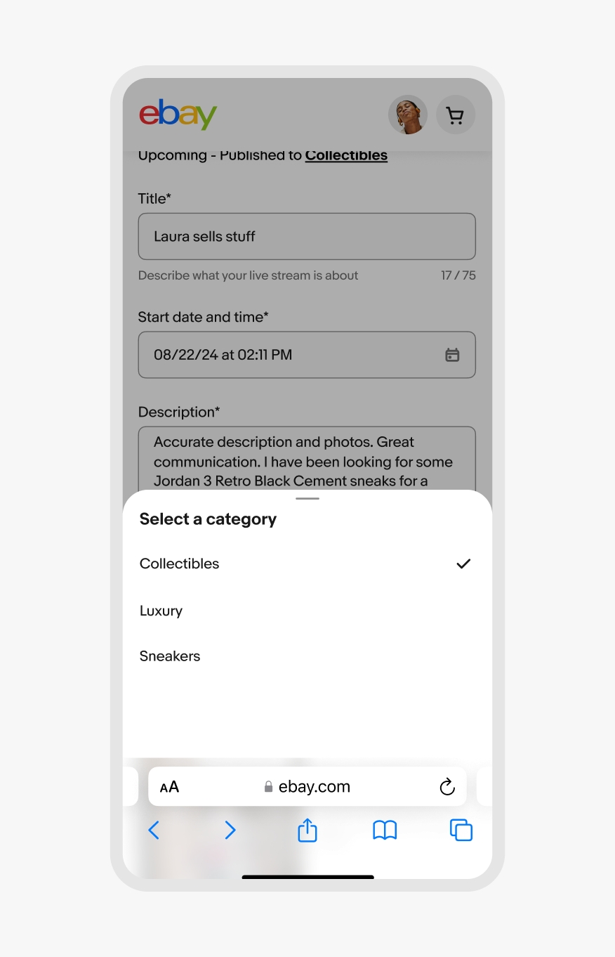
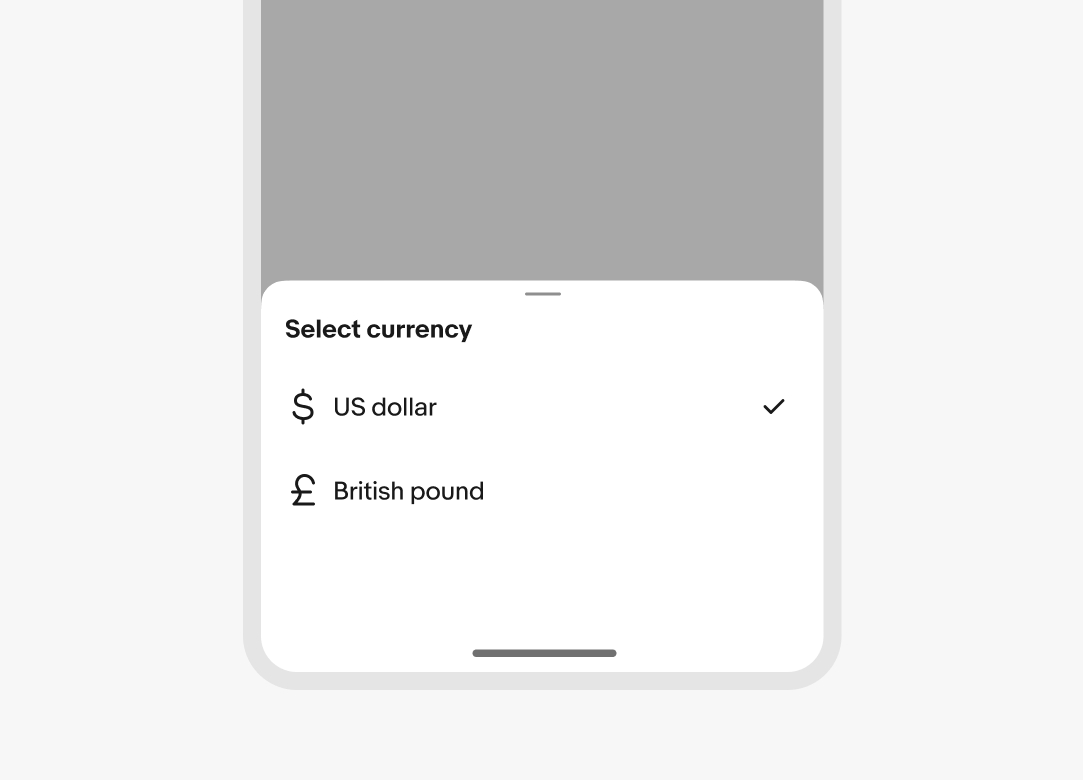
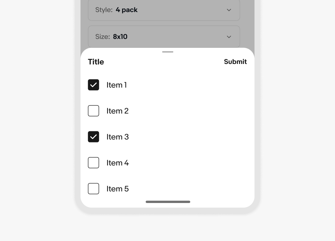
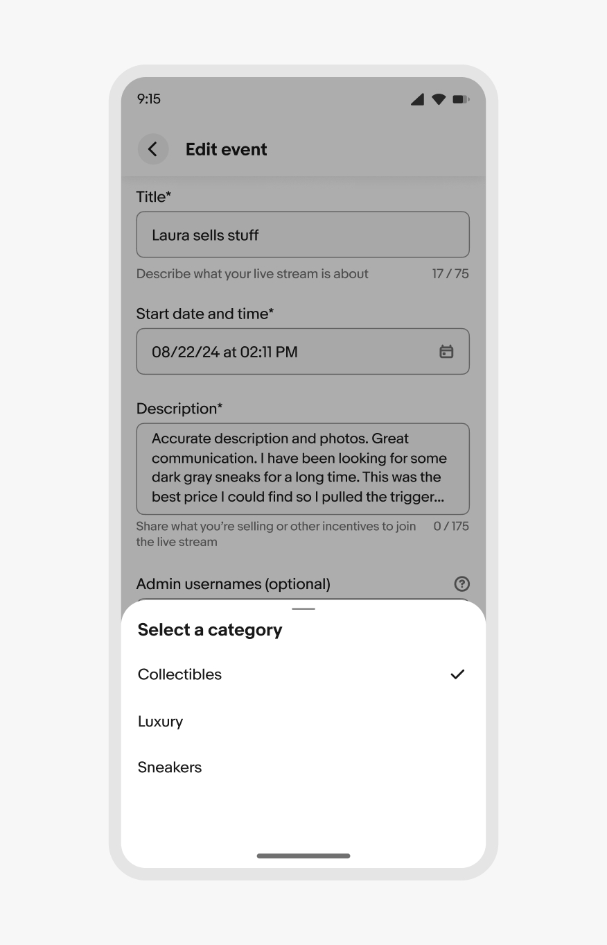
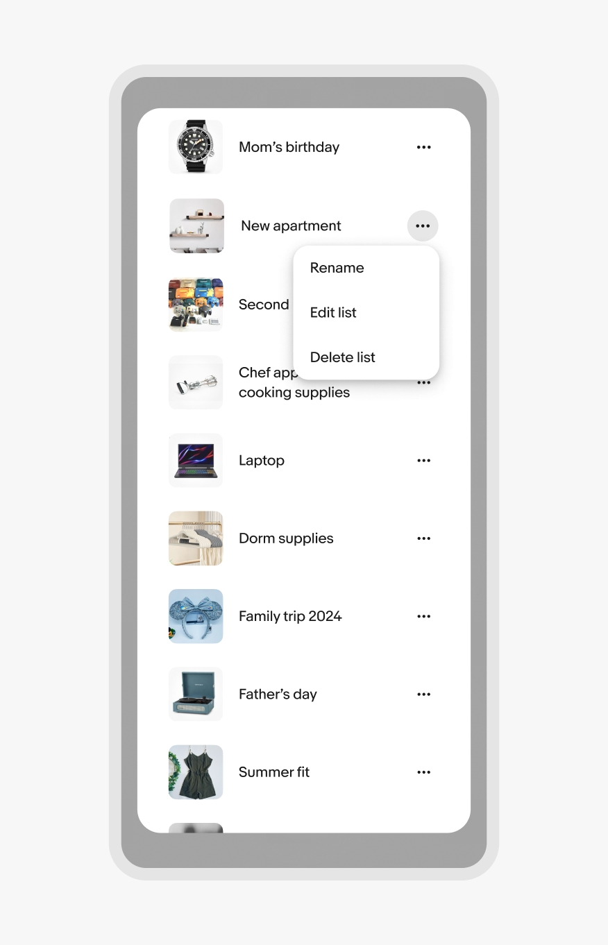
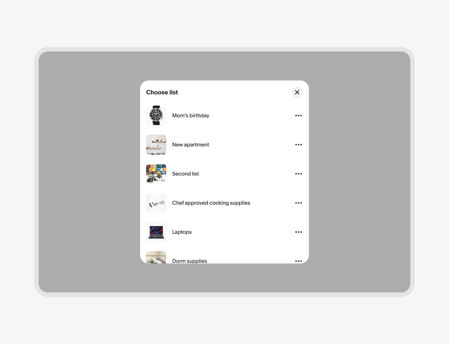
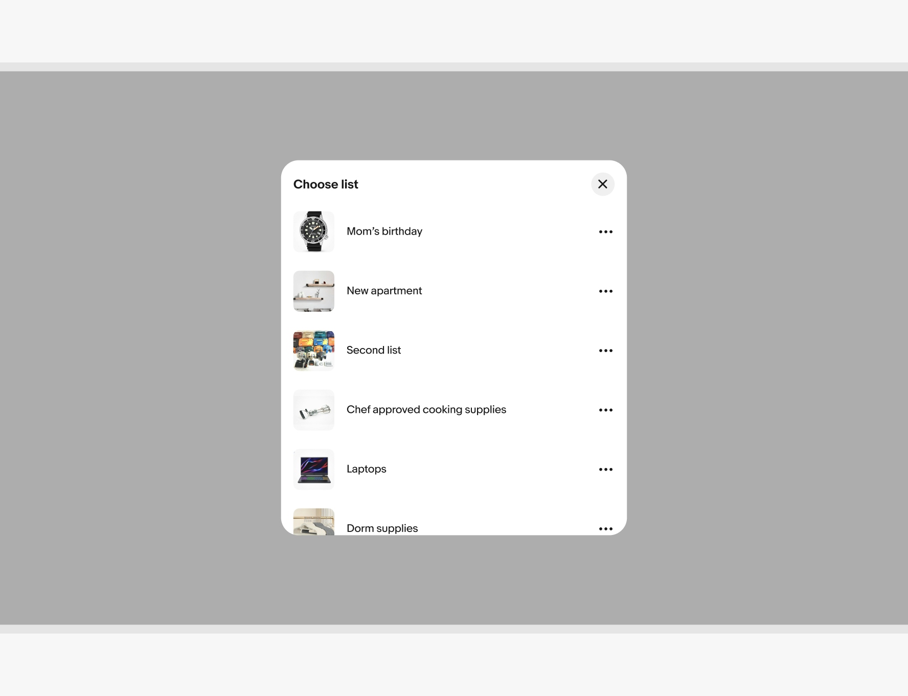
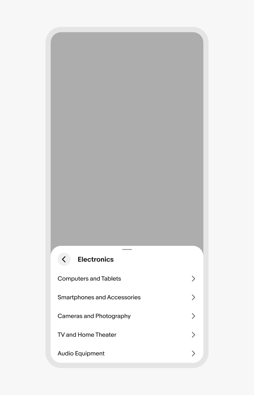
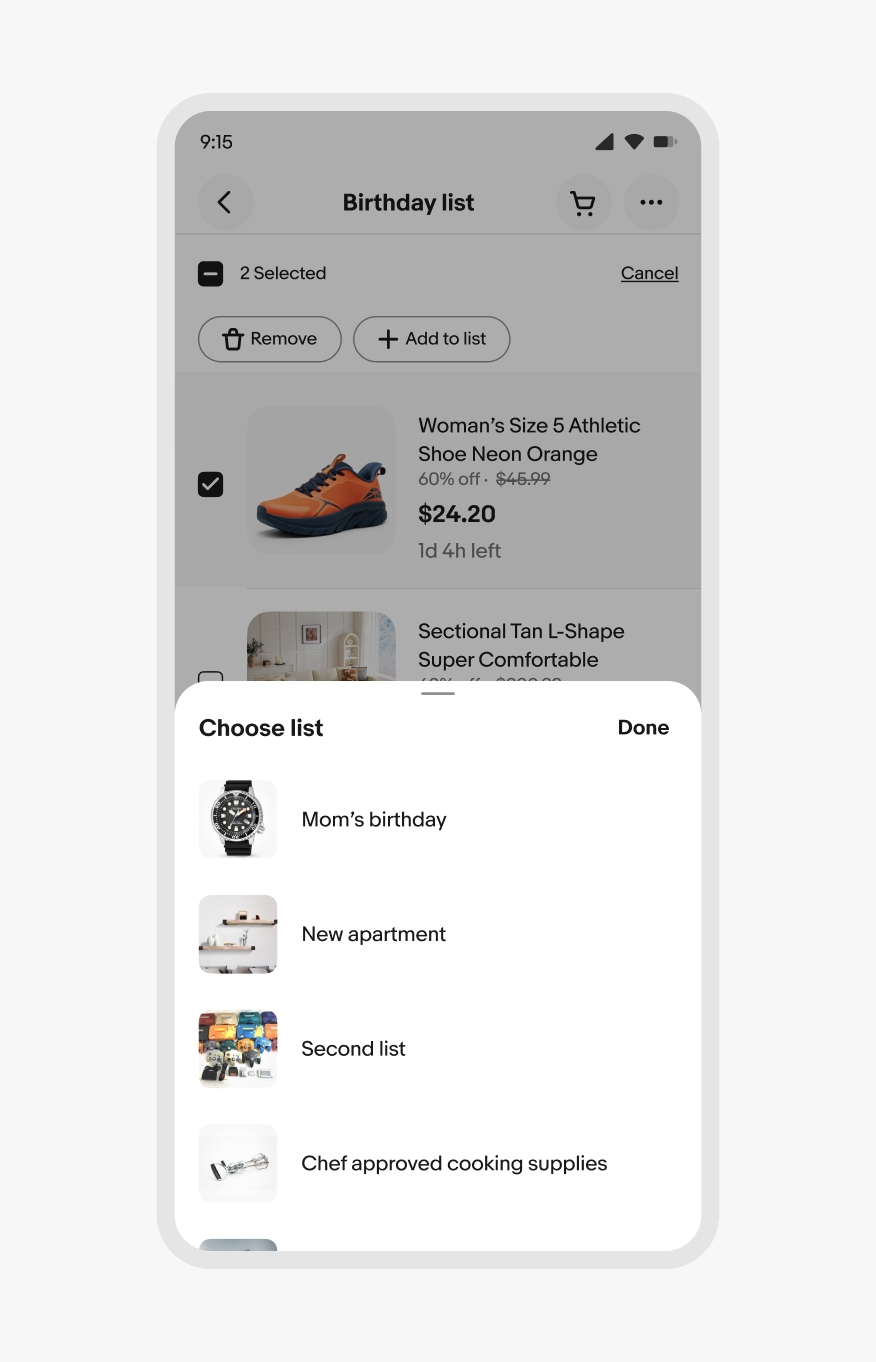
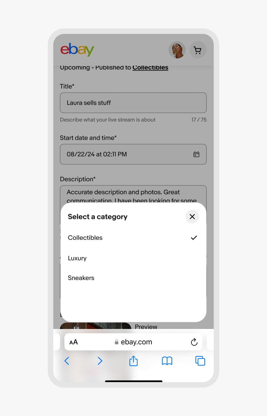
Input sheets are the most common and ask the user for input. These can be single-select or multi-select.
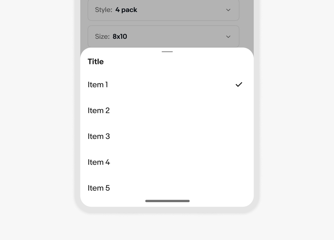
A trailing header action is unnecessary when only a single option can be selected. The container dismisses automatically once a selection is made.
When multiple selections can be made, the sheet remains open until the user confirms the selection or dismisses it.
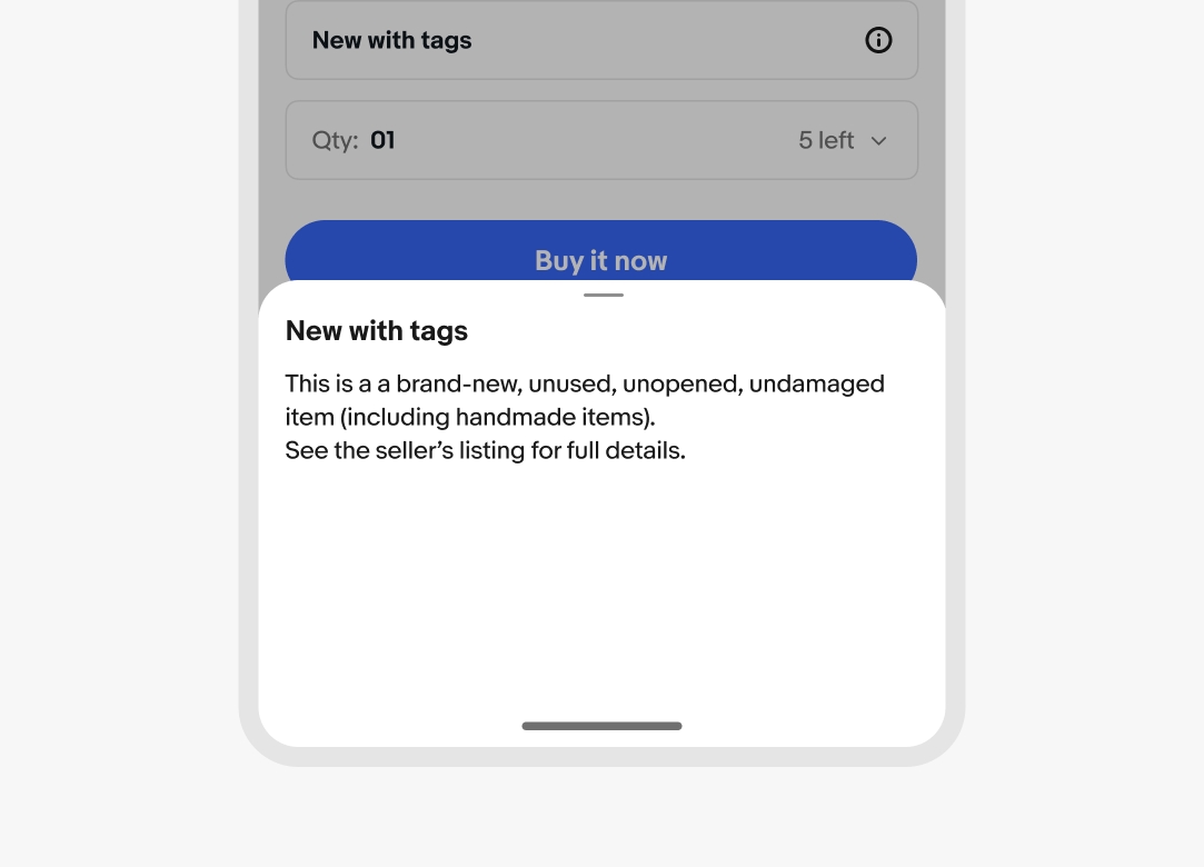
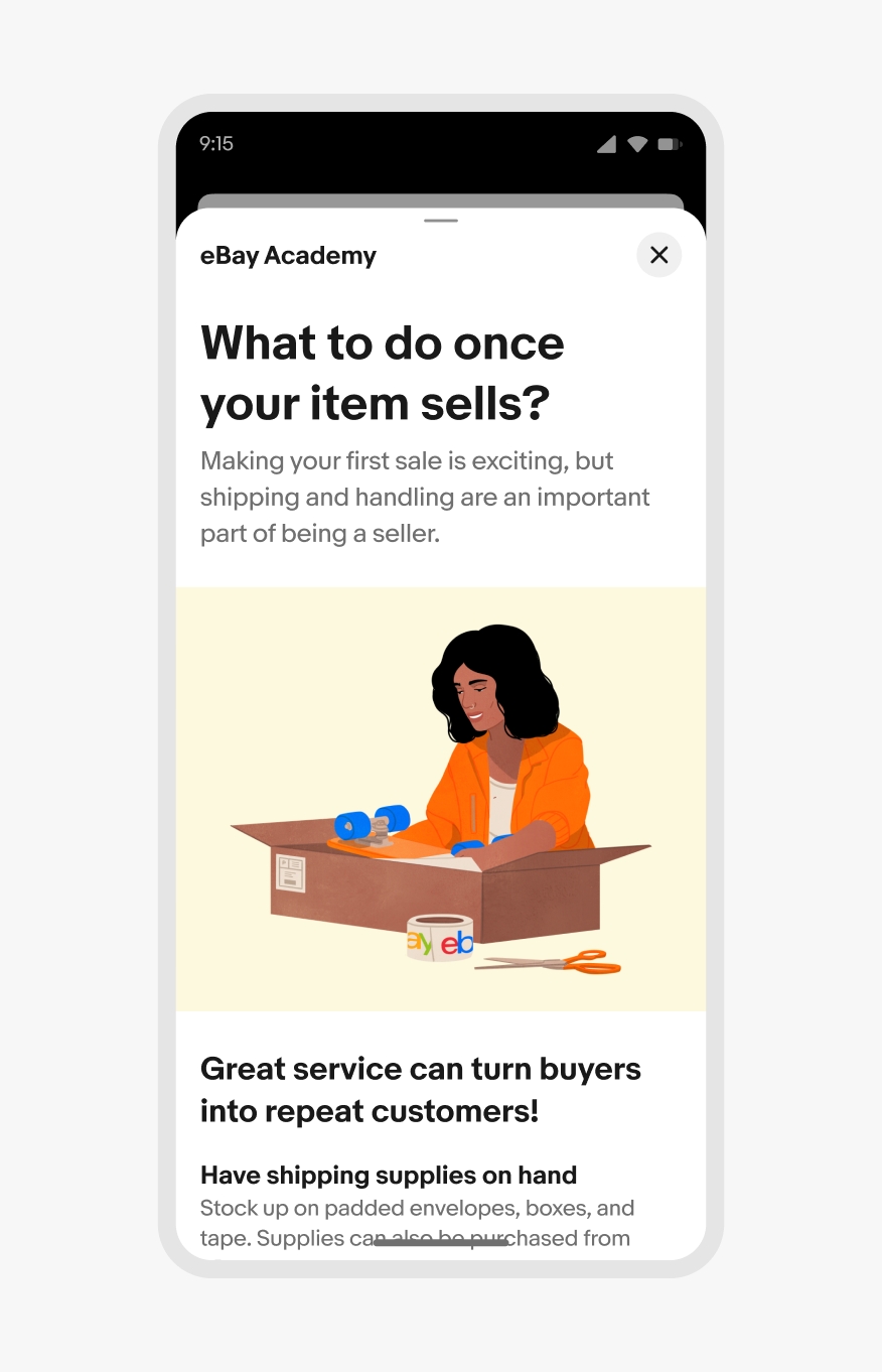
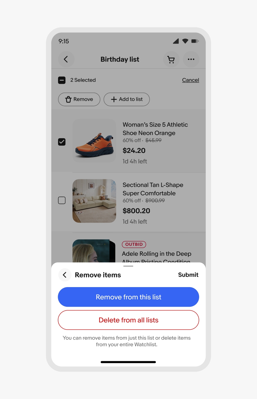
Info sheets provide supplemental information. They don’t require input from the user and they don’t submit data.
The scrim blocks interaction with the main page and is active by default. Use the scrim to focus on the task within the sheet.
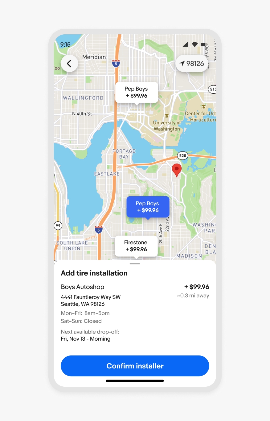
The scrim can be turned off when interaction with the main page is needed, like navigating a map where the sheet contains information about a selected location.
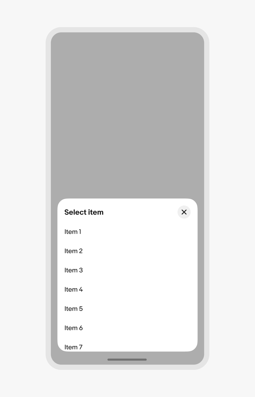
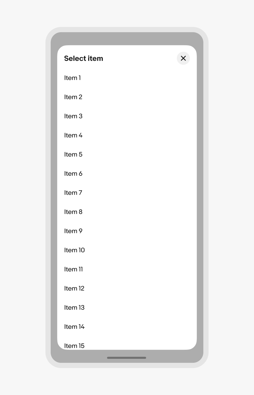
The vertical height of the sheet defaults up to 50% of the screen height to provide quick access to popular actions. When the content is scrolled, the sheet slides to full height and the content body scrolls when the height is reached.

Small native sheet
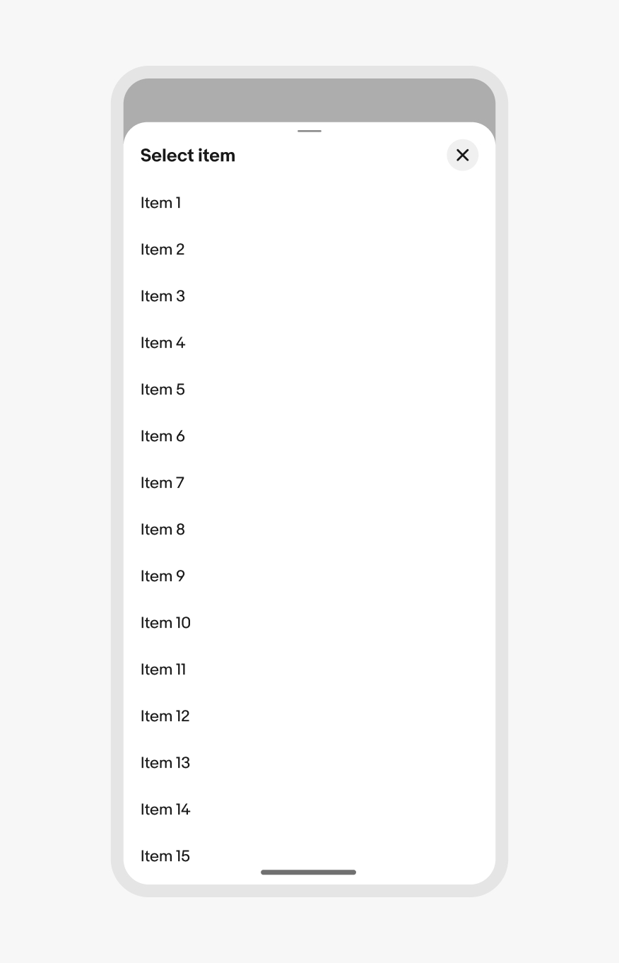
Large native sheet
Web sheets behave the same way as native, but are inset on all sides.
Small web sheet
Large web sheet
The height of the sheet can be smaller than 50% of the screen height if there are only a few options. The minimum height is 30% of the screen height. It’s acceptable to have white space below options if the minimum height has additional room below the sheet content.
Content should open directly to a full modal overlay for long-form content or a large selection group with no apparent hierarchy of importance.
30% minimum height
Full modal
If a sheet has input fields, the sheet expands upward with the native keyboard as the field gains focus. The sheet moves back down when the keyboard is collapsed.
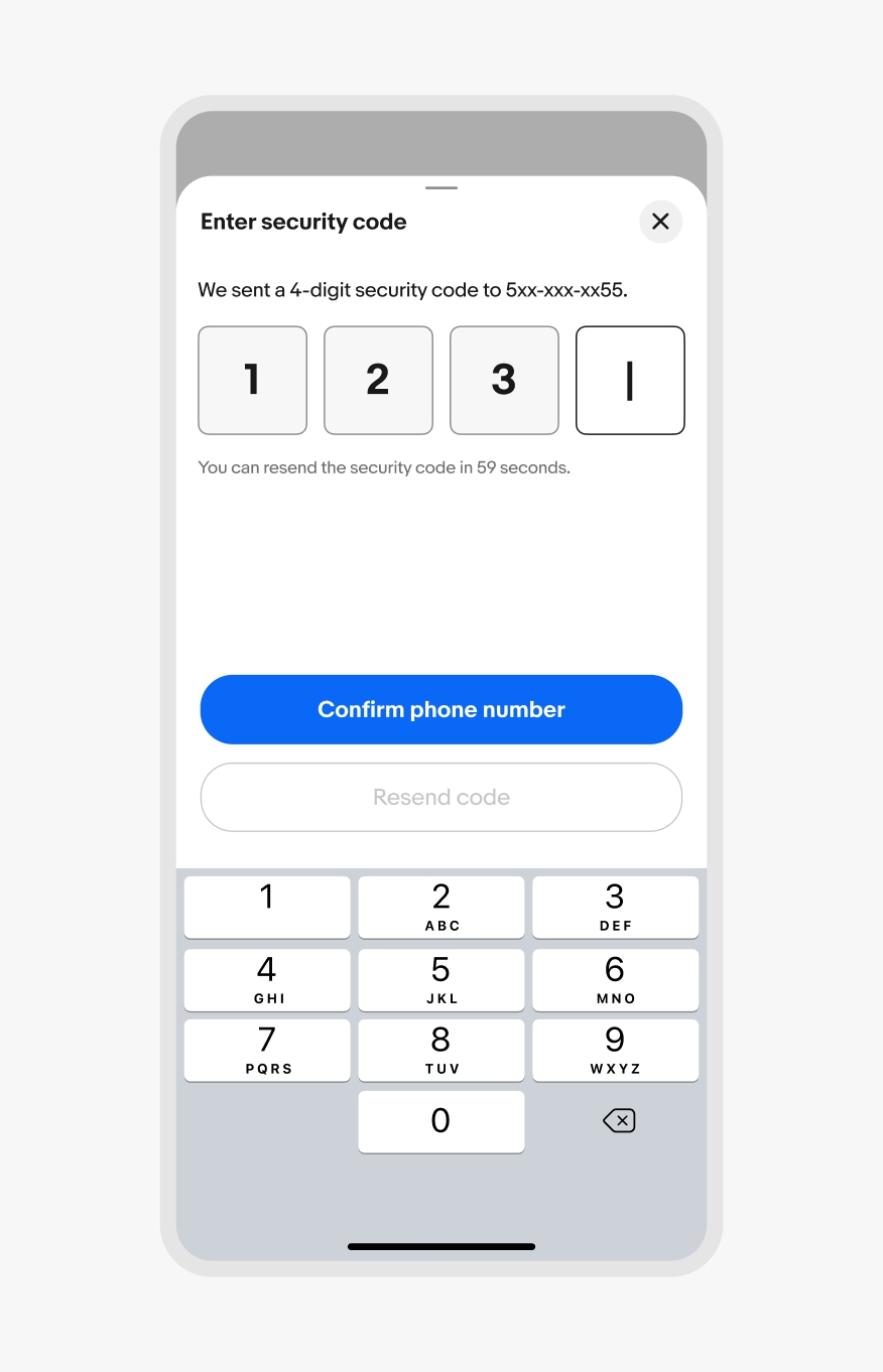
iOS keyboard
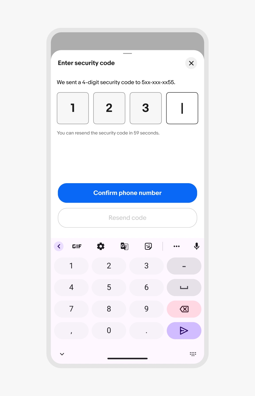
Android keyboard
Bottom sheets can be either modal or non-modal. The default is modal, so interactions with the main page are blocked by a scrim until the sheet is dismissed.
Non-modal sheets omit the scrim and allow for interactions with the main page and the sheet content. This is common for experiences like navigating a map. A non-modal sheet allows for freedom of movement of the content below while also providing quick access to supplemental information.

Modal bottom sheet
Non-modal bottom sheet
Bottom sheets can be dismissed by:
Asynchronous updates are preferred as users make selections within a sheet. Since the selections are already being made, dismissing the sheet doesn’t reset anything. If asynchronous updates are unavailable or disabled, dismissing a bottom sheet via the scrim, drag gesture, or a close button cancels the decision and returns to the state before the sheet was triggered.

Sheets on iOS extend the full width of the screen. They open up to 50% of the screen’s height by default with the option to expand upward when scrolled.
Use bottom sheets for long lists and richer content on iOS. For simple menus, use the native context menu instead.

50% of the height
100% of the height
Sheets on Android extend the full width of the screen. They open up to 50% of the screen’s height by default with the option to expand upward when scrolled. Simple menus can use the native menu instead of a sheet.
50% of the height
100% of the height
Web uses bottom-aligned dialogs and popover menus instead of bottom sheets.
50% of the height
100% of the height
Bottom sheets update to side or center sheets on medium native screens.
Bottom sheets update to side or center sheets on larger native screens.
Do use a single bottom sheet per action.
Don’t launch other modal elements, like other bottom sheets, from a bottom sheet. This quickly becomes inaccessible and disorienting. Use full screen modals instead.
Do keep decisions within bottom sheets simple and straightforward. If a push to a new view is needed, the sheet expands to a large sheet for the new view.

Don’t override sheet behavior to keep sheets small or dynamically adjust height between views.
Do use bottom sheets for low-to-medium-priority decisions and messages.
Don’t use bottom sheets for high-priority decisions or messages. Use an alert dialog instead.
Do use the appropriate sheet for the platform.
Don’t use native sheets on web.