Do use a select list when the list values are simple and short.
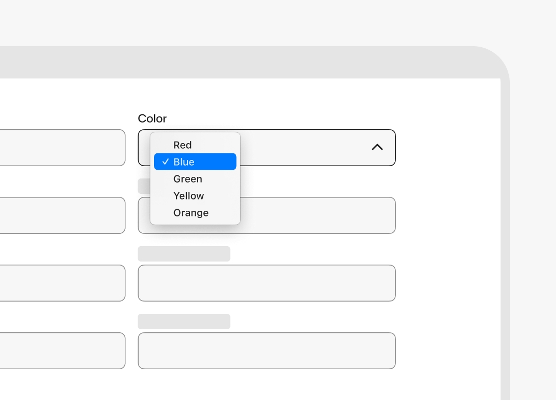
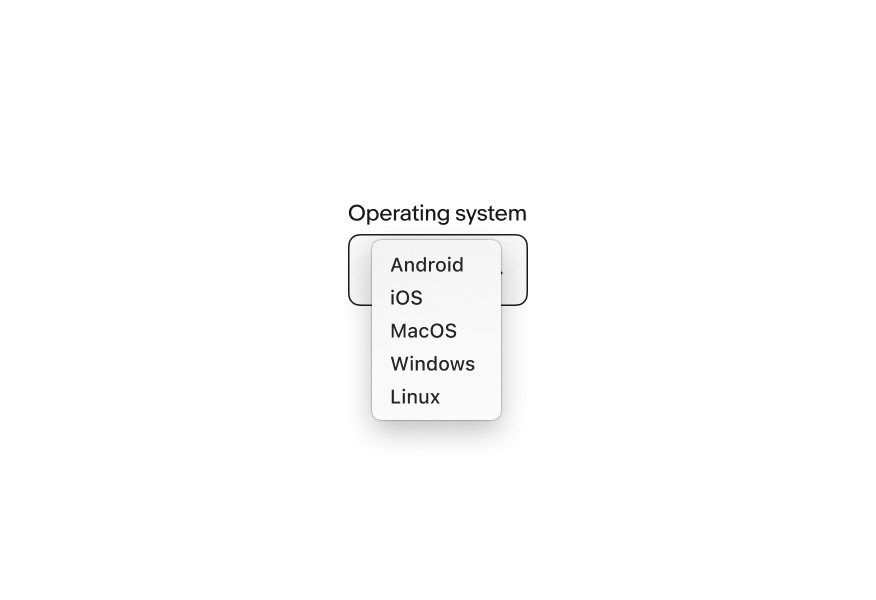
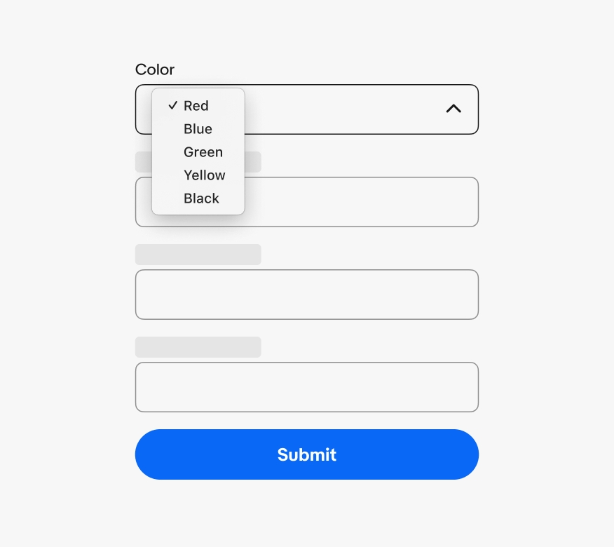
Select list is a web-only, form-based component that discloses a simple list of actions or options using the browser’s native <select> element.
The select list inherits functionality and accessibility features from the browser’s native <select> element. The list styling is determined by the browser and operating system.
A select list is only used within a form that submits a value and rarely on its own outside of a form. If the list includes actions or navigation, use a Dropdown.
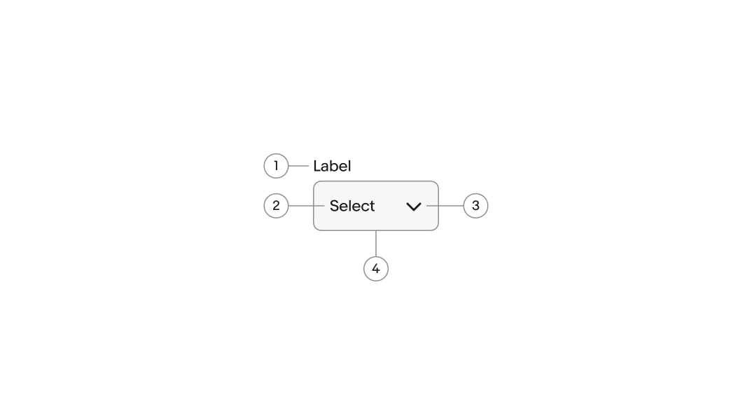
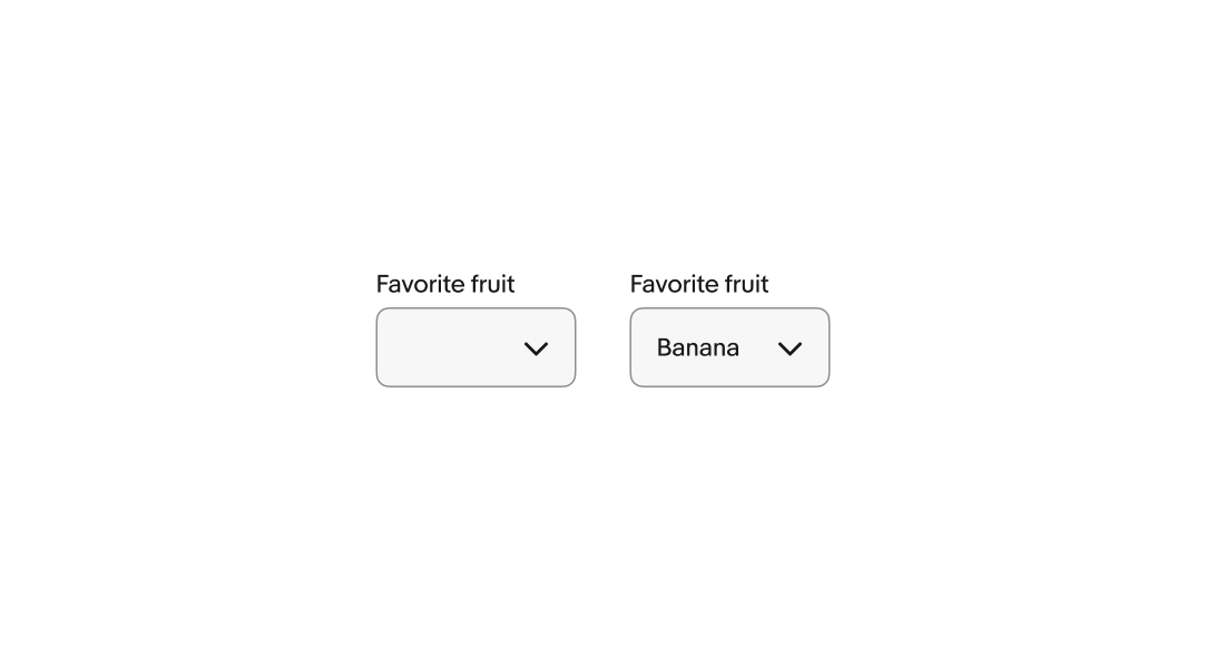
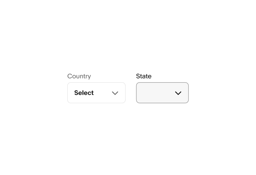
The label describes the field’s purpose and expected input value. They are short, usually 4 or fewer words.
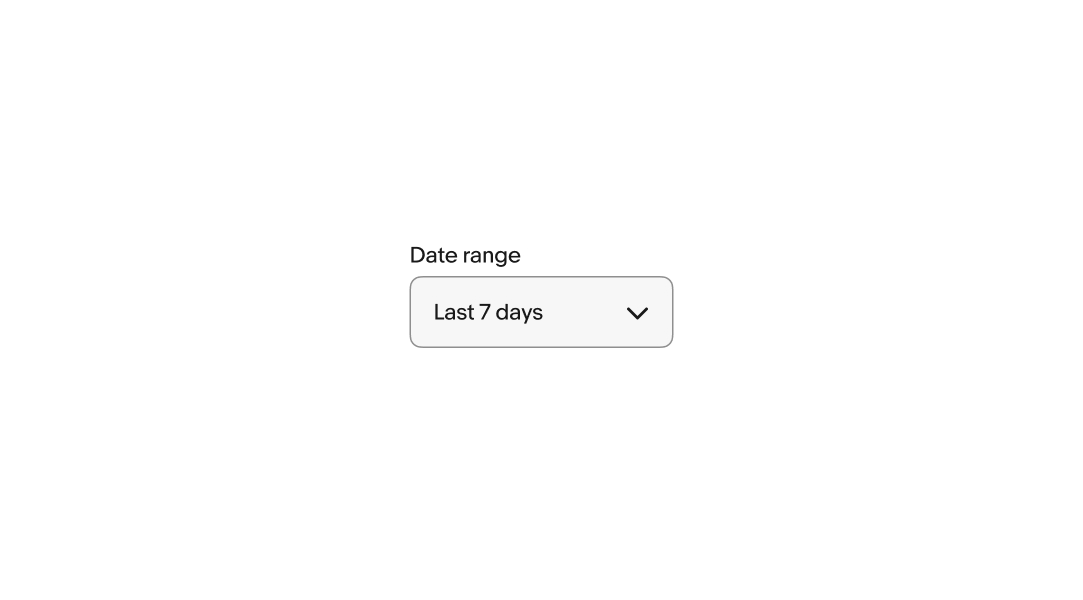
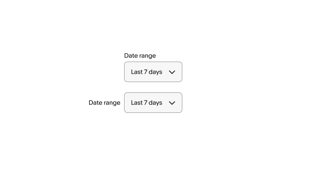
The label can be positioned above or beside the field.
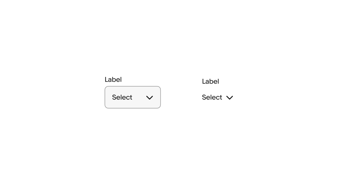
The label can be visible or hidden.
A visible label is strongly recommended to maintain accessibility and usability. However, if content elsewhere on the page is sufficiently acting as a label, like a section header or title element, the visual label can be hidden.
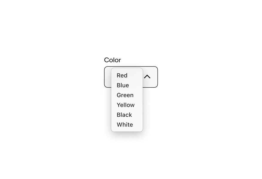
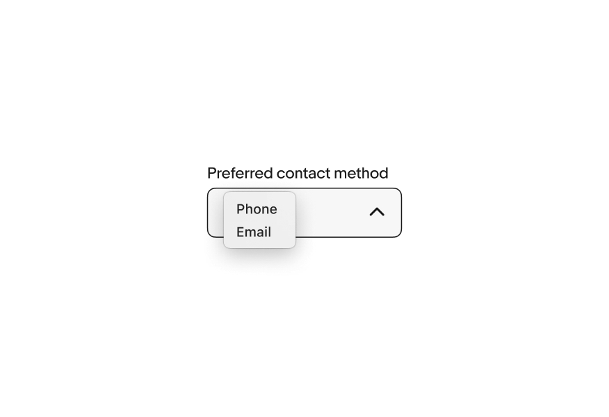
There are two styles available for select lists, bordered and Borderless.
Bordered: has a visible container with a stroke for increased prominence.
Borderless: has no visible container for lower prominence.
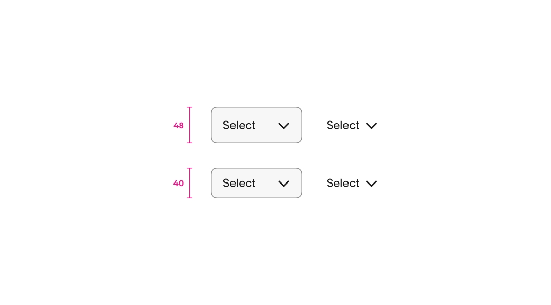
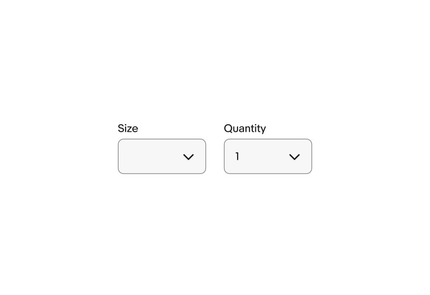
Select lists are available in a large and small size.
The default value can be an empty value or a value from the list. The choice depends on use case.
By default, select list uses an empty default value. The empty value will fail validation if the field is required, so it’s useful for forcing a selection.
Alternatively, the default value can be set to the first option in the list. This default value is submitted even if a user hasn’t interacted with it. Use a value from the list as a default when it’s likely used by the majority of users.
The list style is determined by the browser and platform.
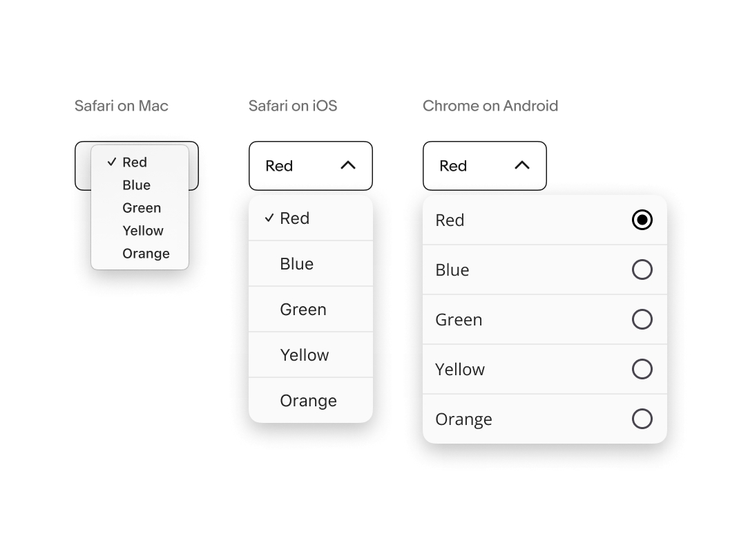
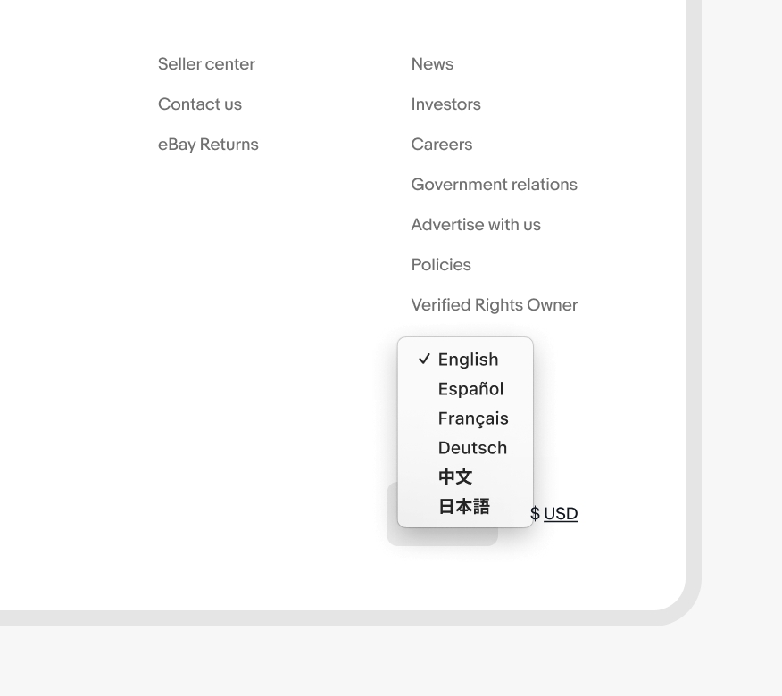
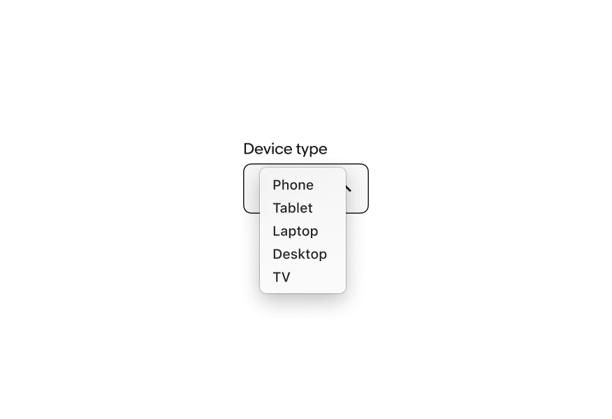
Select works the same across all screen sizes. The list menu style is determined by the device’s browser and operating system.
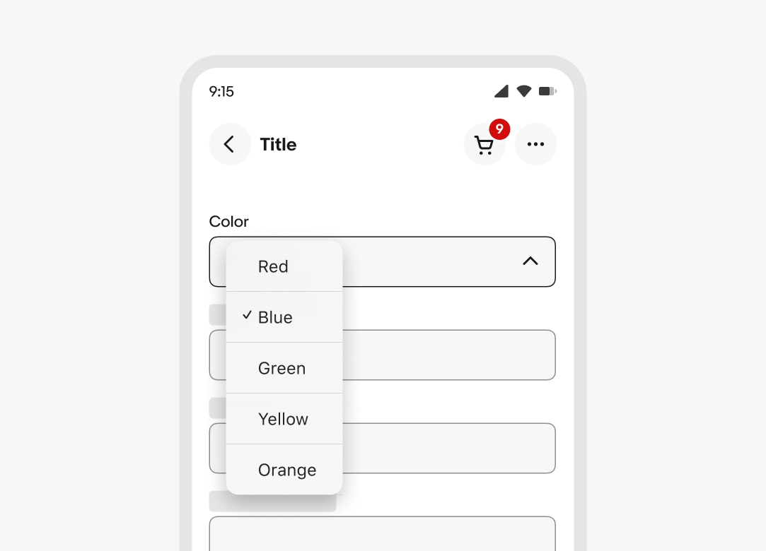
Select works the same across all screen sizes. The list menu style is determined by the device’s browser and operating system. Larger screens will try opening the list with the selected value aligned with the field’s value.
Do use a select list when the list values are simple and short.
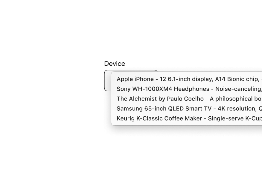
Don’t use a select list if the list values need to use subtext or grouping. Use a Dropdown instead.
Do use a select list when the list is small and simple.
Don’t use a select list for extra large lists that could benefit from filtering. Use a Combobox instead.
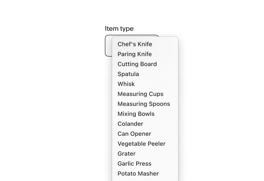
Do use a select list for lists larger than 3 items.
Don’t use a select list for 3 or fewer items. Use a Radio button group instead.
Do use the same selection style within groups. If some selections require the additional functionality of a Dropdown, use a Dropdown for all items in the group.
Don’t mix selection styles in the same group.
Do use select lists within forms.
Don’t use select lists outside of a form as it is a traditionally form-based element.