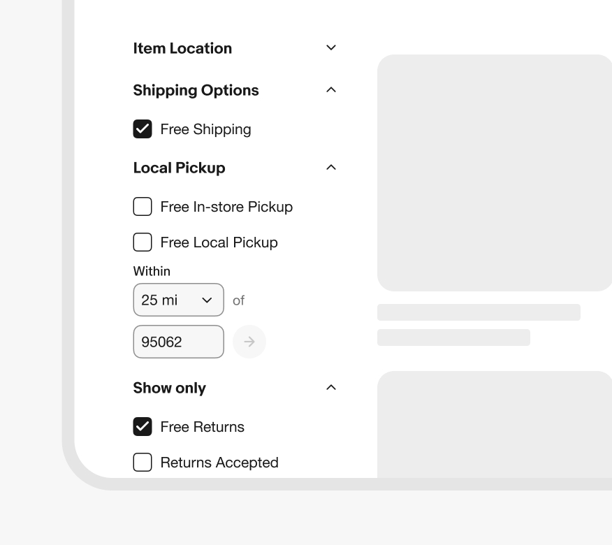
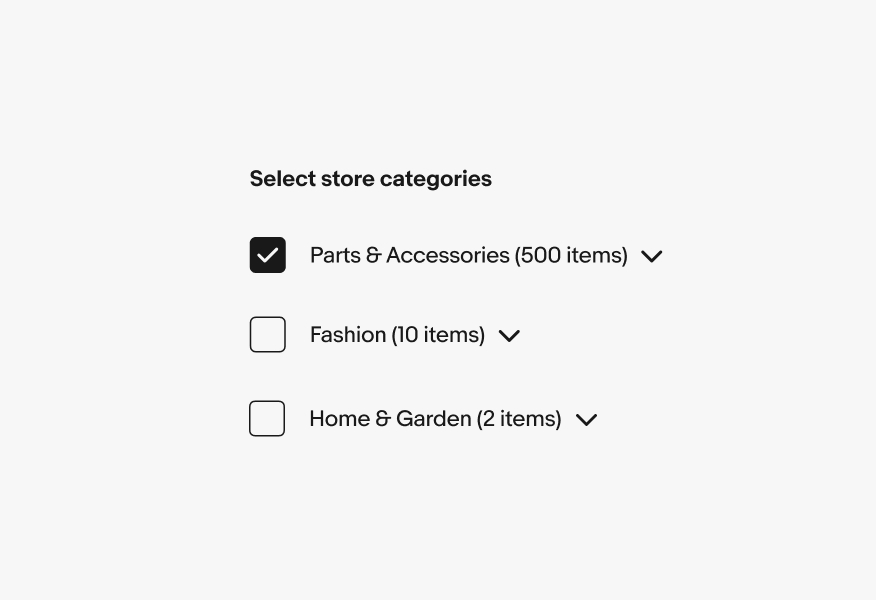
Do use checkboxes when multiple elements can be selected at once.
Checkboxes allow the user to select multiple options from a list or a single yes/no option.
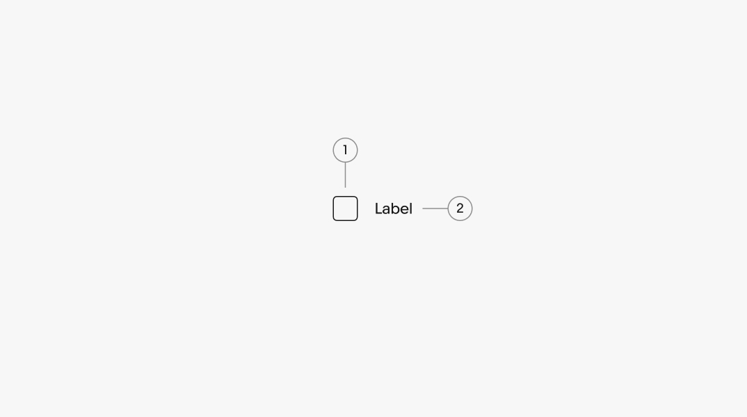
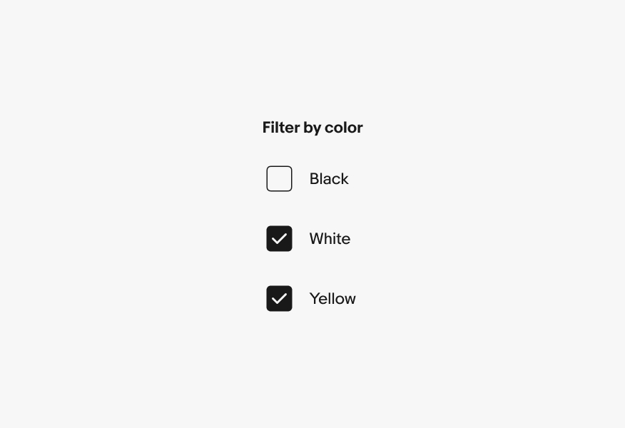
A label is required for all checkboxes. They should be short and represent a value or yes/no decision.
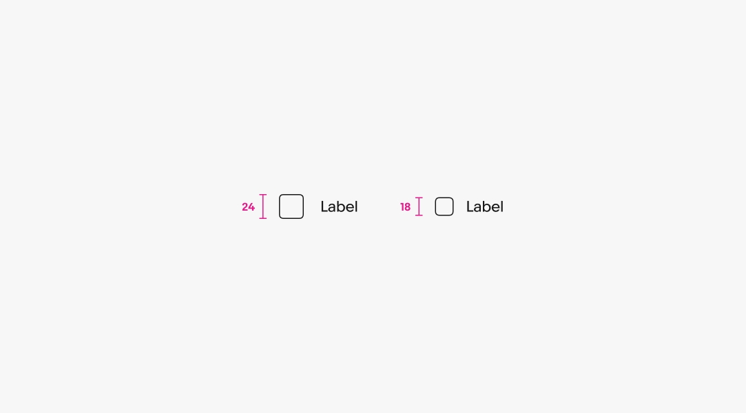
There are two sizes available. Large is the default and is preferred on smaller screens. The smaller checkbox can be used for dense layouts, but are less tap-friendly.
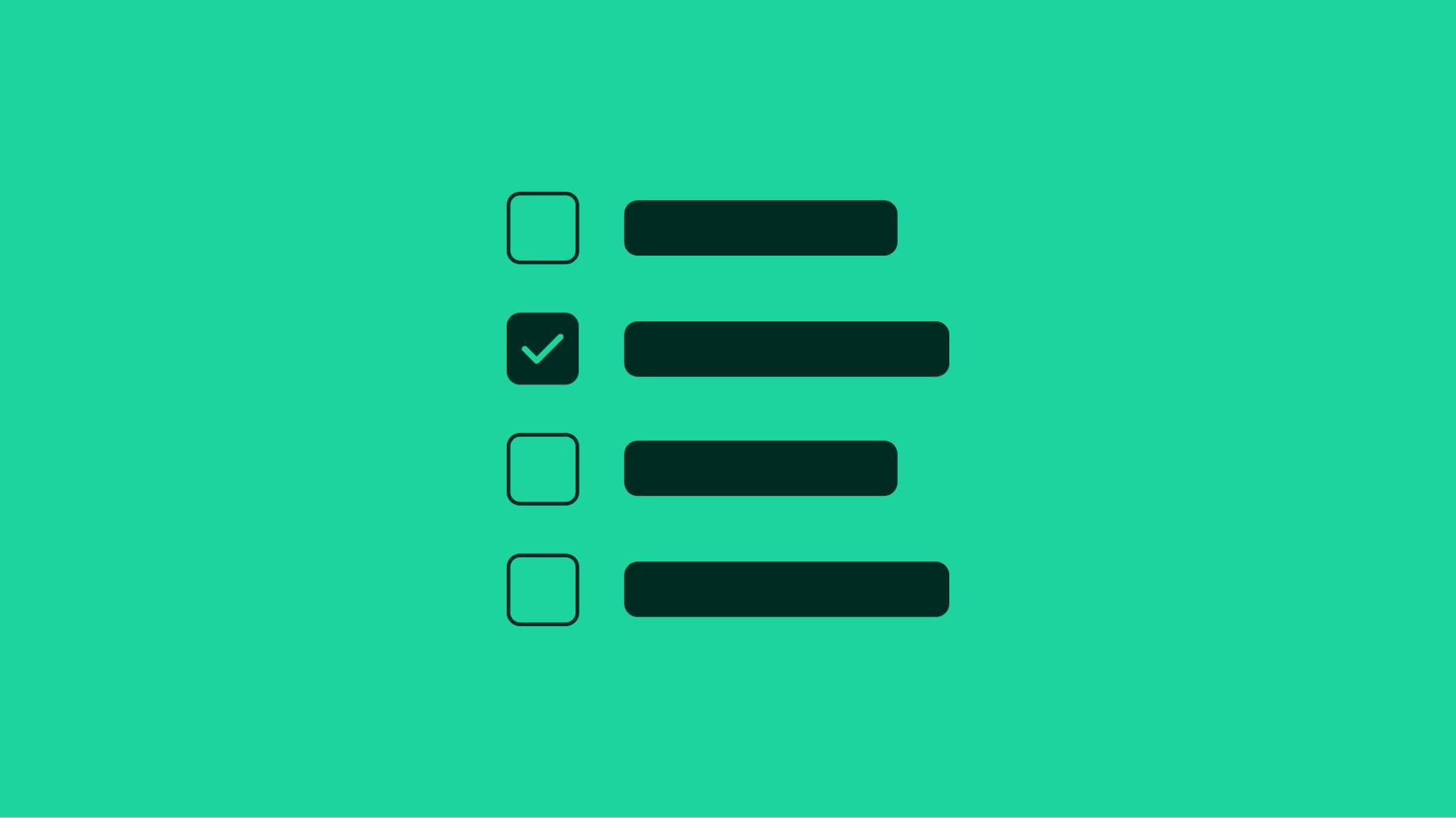
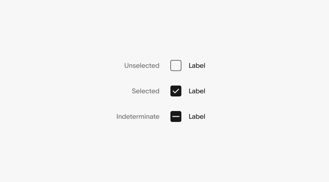
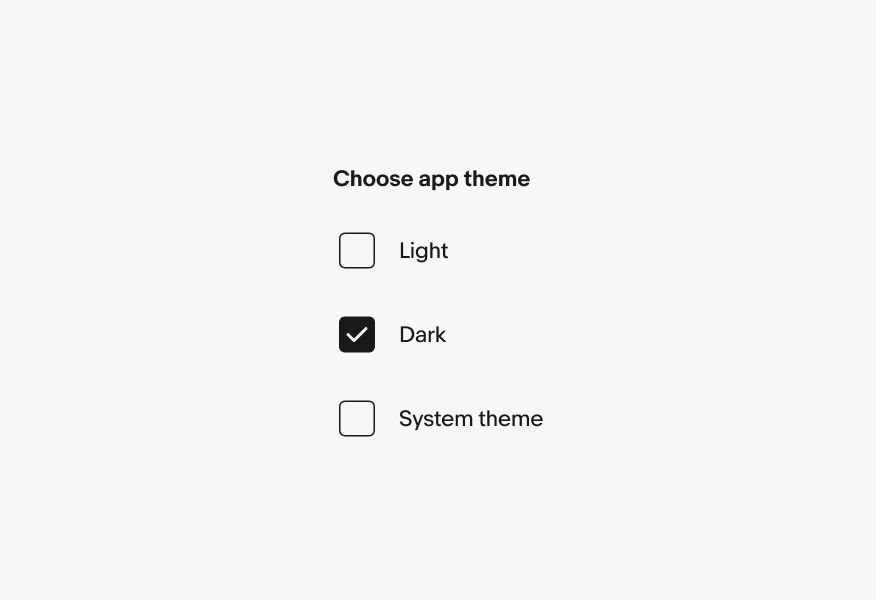
A checkbox can be unselected, selected, or indeterminate. A checkbox is indeterminate if it includes both selected and unselected options.
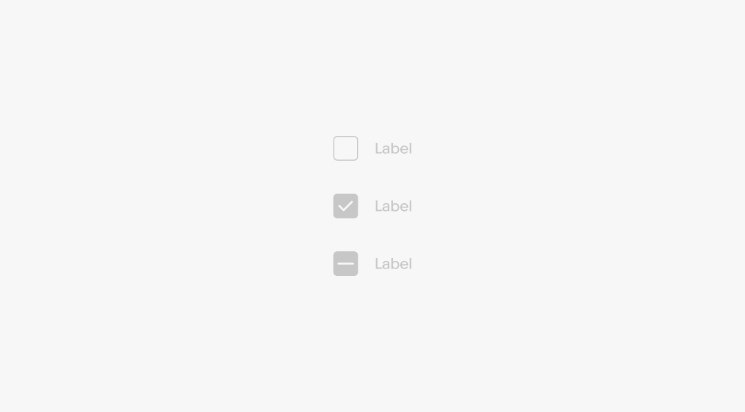
A checkbox can be disabled in any state if there is a prerequisite to activate.
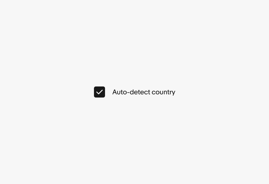
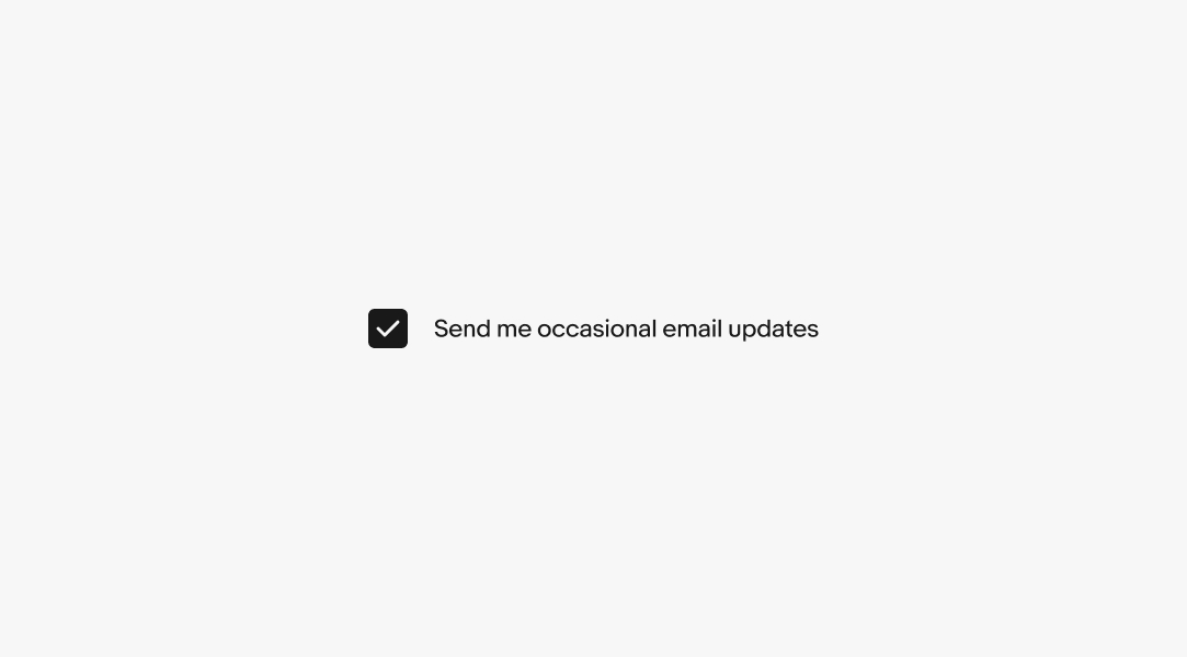
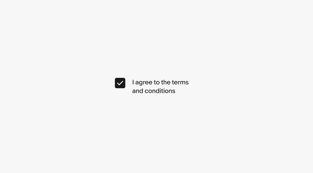
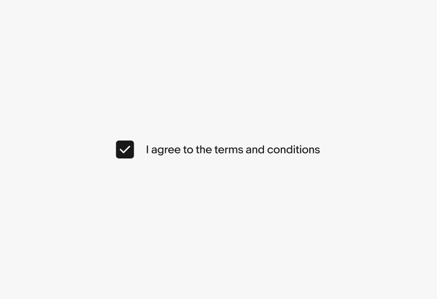
A single discrete checkbox can be used for yes/no decisions within a form.
Labels will wrap if they are wider than the parent container. The checkbox remains aligned to the top of the text box.
Android devices leverage the native Material checkbox component.

iOS devices leverage the native checkbox component.

Checkboxes are either form-based or menu-based. Form-based checkboxes are the traditional checkboxes used in HTML form elements. Menu-based checkboxes appear in dropdown menus and in panel dialogs.

Do use checkboxes when multiple elements can be selected at once.
Don’t use checkboxes when only one option can be chosen at a time.
Checking a box is a positive, enabling action or opt-in.
Don’t mix verbiage on the labels, a checkbox shouldn’t be utilized for opting out.

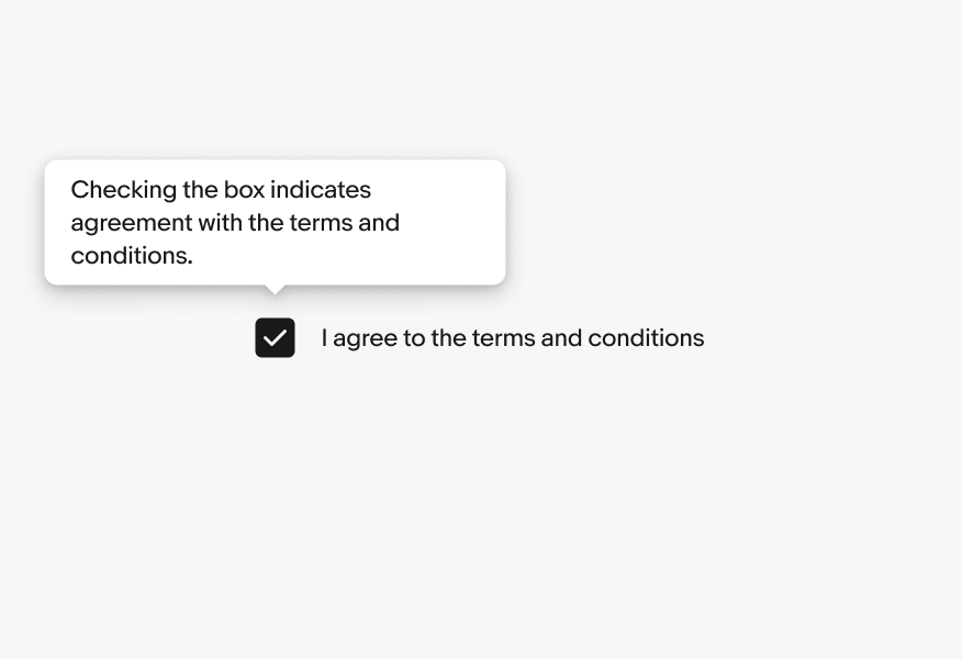
Labels have built-in interactivity. In web browsers, clicking the label toggles the checkbox value.

Do not add additional interactivity to the label, such as tooltips. This will conflict with the browser’s native behavior.
A checkbox should be used independently for multi-select elements without incorporating other behaviors or nested controls.

Don’t overload the checkbox with additional behaviors, such as expansions.
Do use a single checkbox for selections. They usually need to be submitted for a change to occur.
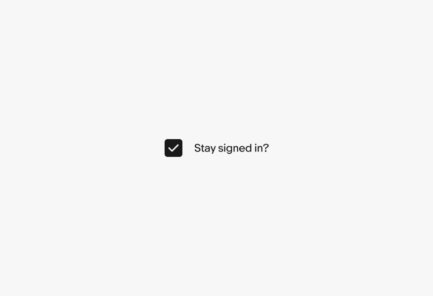
Don’t use a single checkbox for activation or immediate application. Use a switch instead.