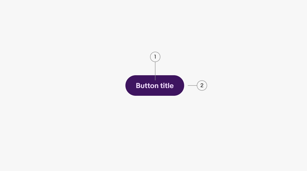
Use the proper pre-selected foreground, background, and button color for the selected theme.

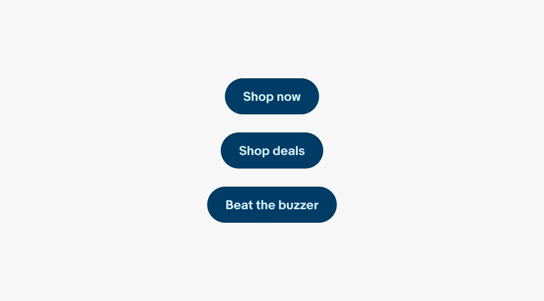
Branded buttons tie eBay’s CTA to our marketing palette.
Branded buttons provide an extended palette for greater expression, but overuse can affect their prominence over time. Use branded buttons sparingly.
Branded buttons help maintain a cohesive theme to marketing placements using the broader marketing color palette.
Branded buttons are always paired with a marketing statement within a banner or card. They don’t appear alone and are rarely used in button groups.
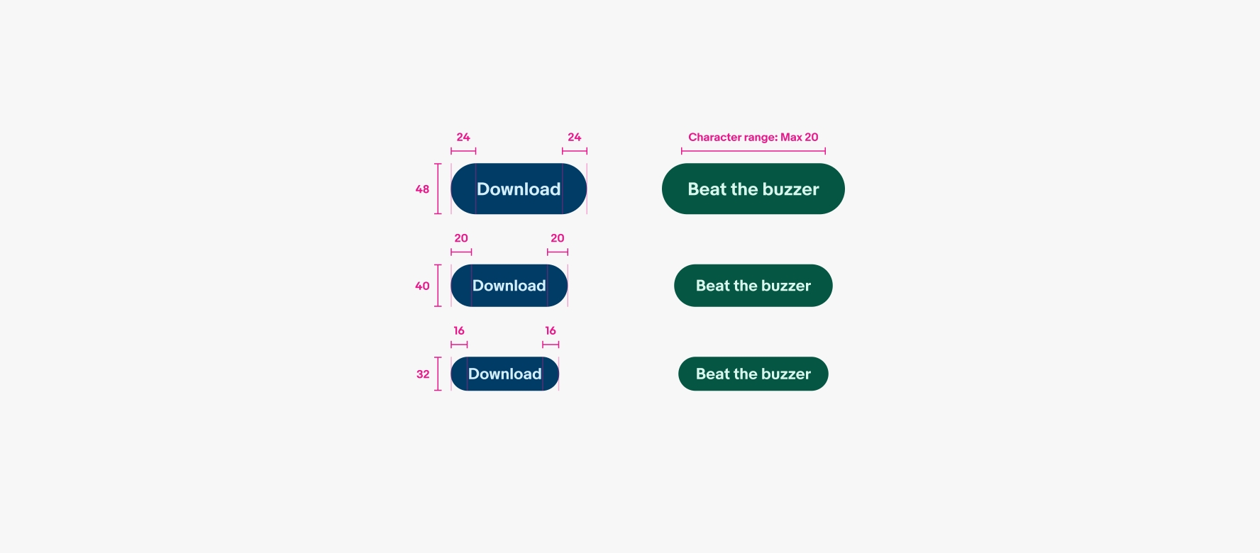
Titles are short and sweet with a max character count of 20. Keep the title related to what the action will do.
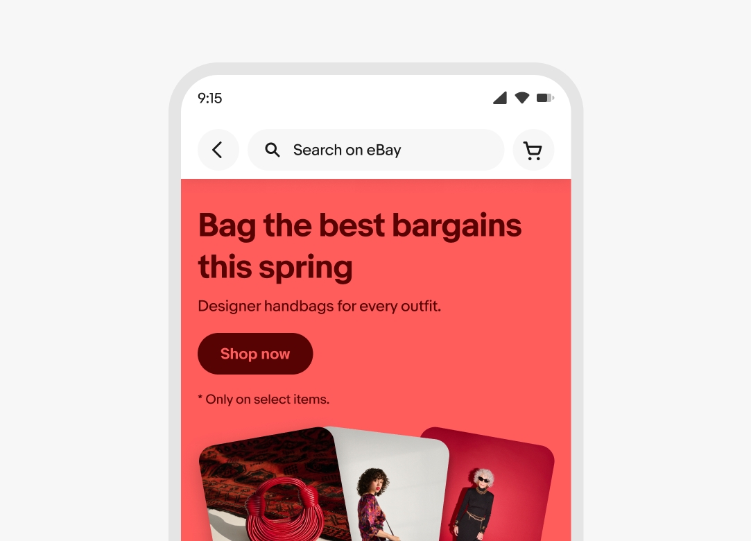
Branded buttons inherit the expressive theme of their parent container. Learn more about using color within banners on the Banner component page and in Using color in marketing.

In contrast to CTA buttons, branded buttons always hug their content. They don’t fill the width of their parent container.
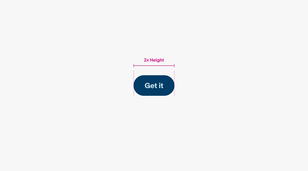
The minimum width for basic and destructive buttons is 2x the height of the button.
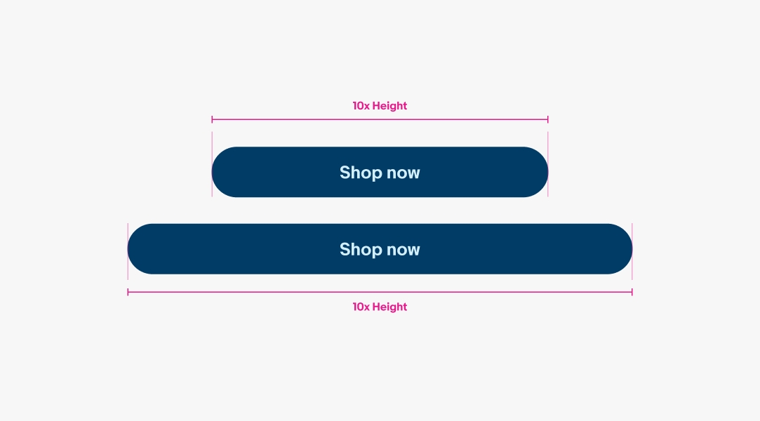
The maximum width for buttons is 10x the height of the button. While a wide button is possible, it is also rare. Expect to keep the button width to the size of it’s contents since there should be no more than 20 characters within.
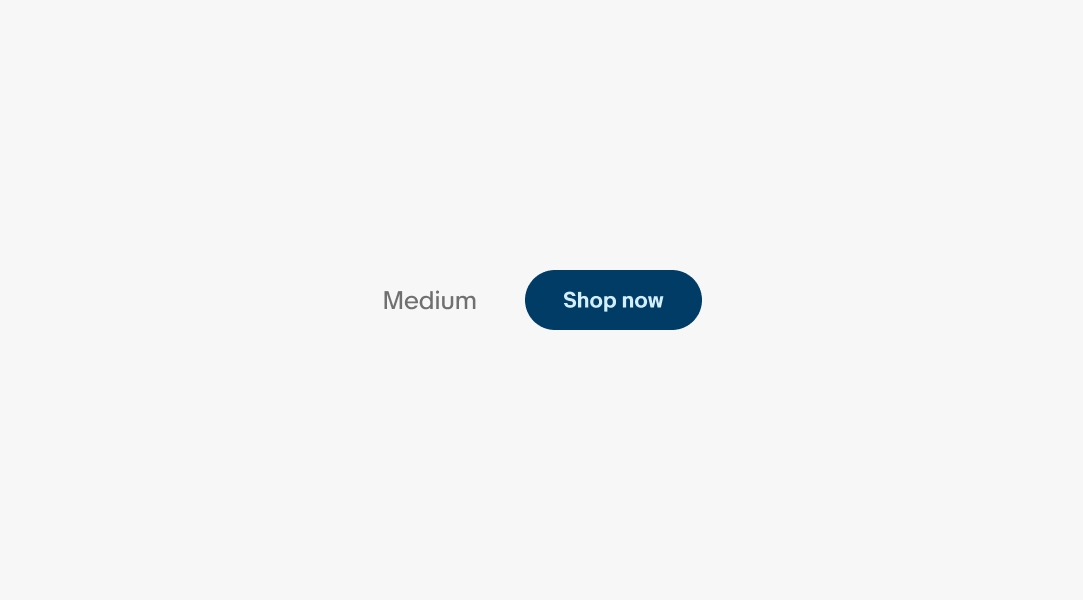
Branded buttons use the medium button size across branded contexts.
Titles that extend beyond the width of the button container will wrap to a new line to ensure the title remains visible for all languages.
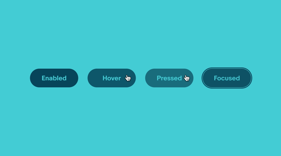
Buttons use state layers for states. The available states are enabled, hover, pressed, and focused. The focused state outline should match the button’s color theme. Learn more about the state layer color values in Color tokens.
Use the proper pre-selected foreground, background, and button color for the selected theme.
Don’t deviate from the pre-selected color palettes.

Branded buttons are meant to clearly tie into our marketing campaigns. Icons are not currently recommended.

Icons are not supported within branded buttons. Refrain from using icons to avoid assigning arbitrary meaning to our iconography sets.

Work closely with your content and marketing partners to deliver button titles that use an “Verb + noun” structure that is less than 20 characters.

Don’t use ambiguous titles that make understanding the action being taken difficult or misleading. Don’t use more than 20 characters.

Don’t mix colors from different themes.

Don’t create your own color combinations.