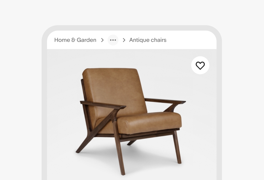
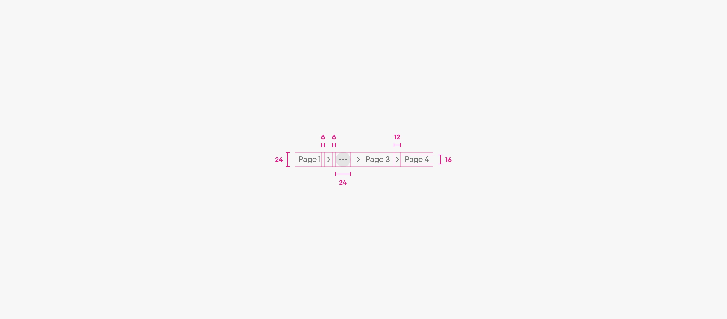
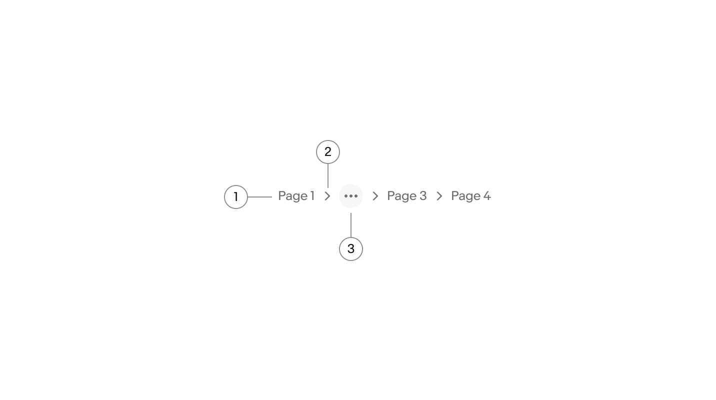
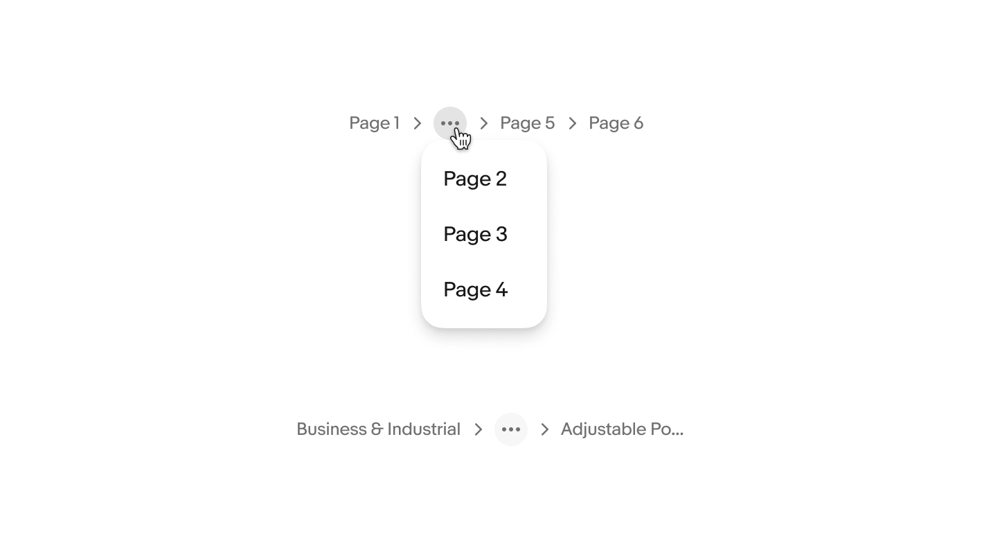
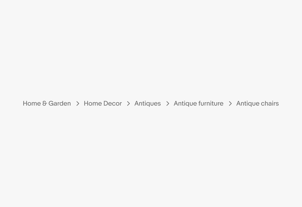
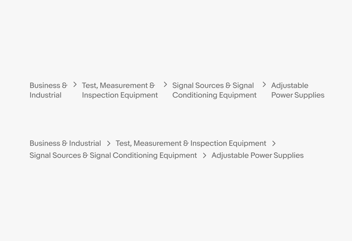
Do keep the number of items visible to no more than 4. Collapse pages into an overflow if there are more.
Breadcrumbs show the navigational hierarchy of a page.

Breadcrumbs help wayfinding no matter how many layers.
Breadcrumbs show a user's current location within the hierarchy of a site.
Breadcrumbs help users understand what screen they're on relative to the information architecture.
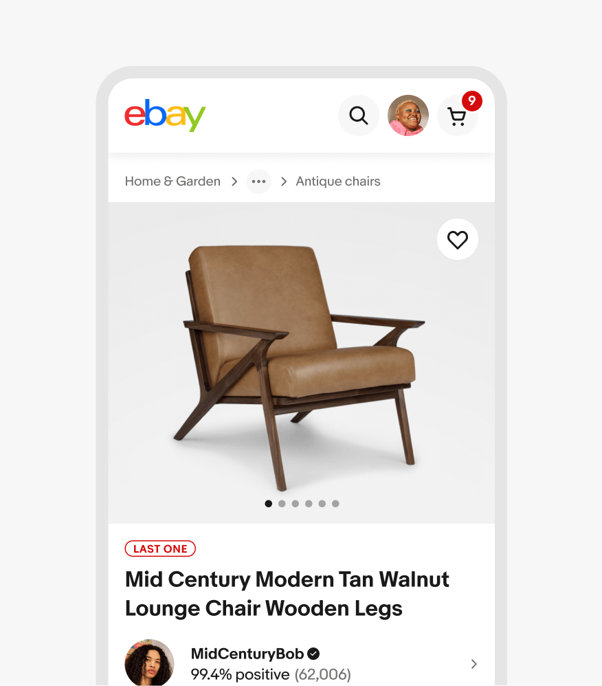
By default, the first item is the root category page and the last item is the most immediate parent page. Pages within the hierarchy are separated by a chevron to indicate the hierarchical relationship.

The last item in the hierarchy can be the current page title if it is valuable to include, and it should be static, not interactive.

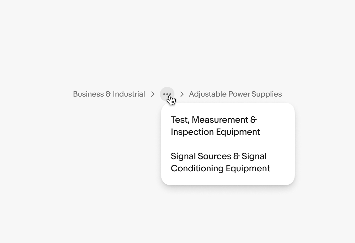
Use an overflow control to collapse pages when there are 4 or more labels visible to avoid extending elements offscreen.
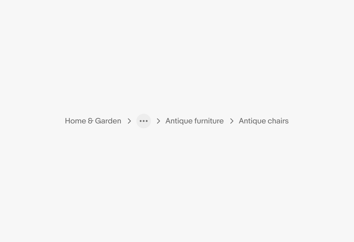
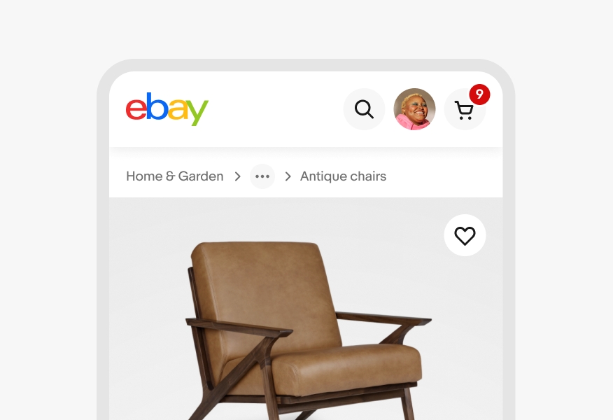
Overflow can also be used if multiple parent pages have truncated labels.
The width of the parent container informs how many items are collapsed into an overflow and whether or not the last page is truncated.
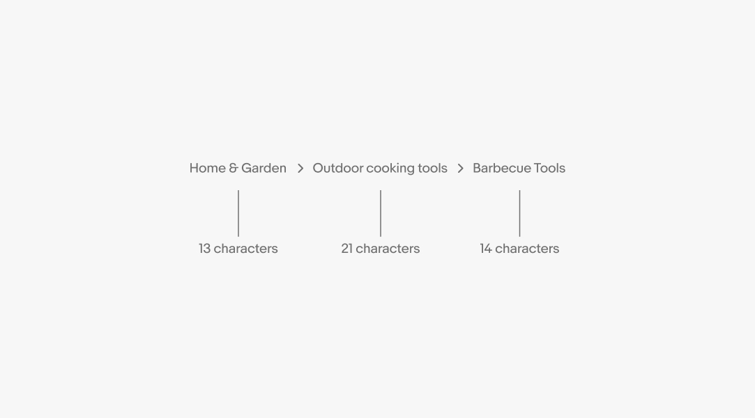
While titles can vary in size, the preferred character count for titles is 24 characters and under.
Only 1 label should be truncated within the hierarchy. If multiple labels are long, collapse all but the last page into the overflow menu.

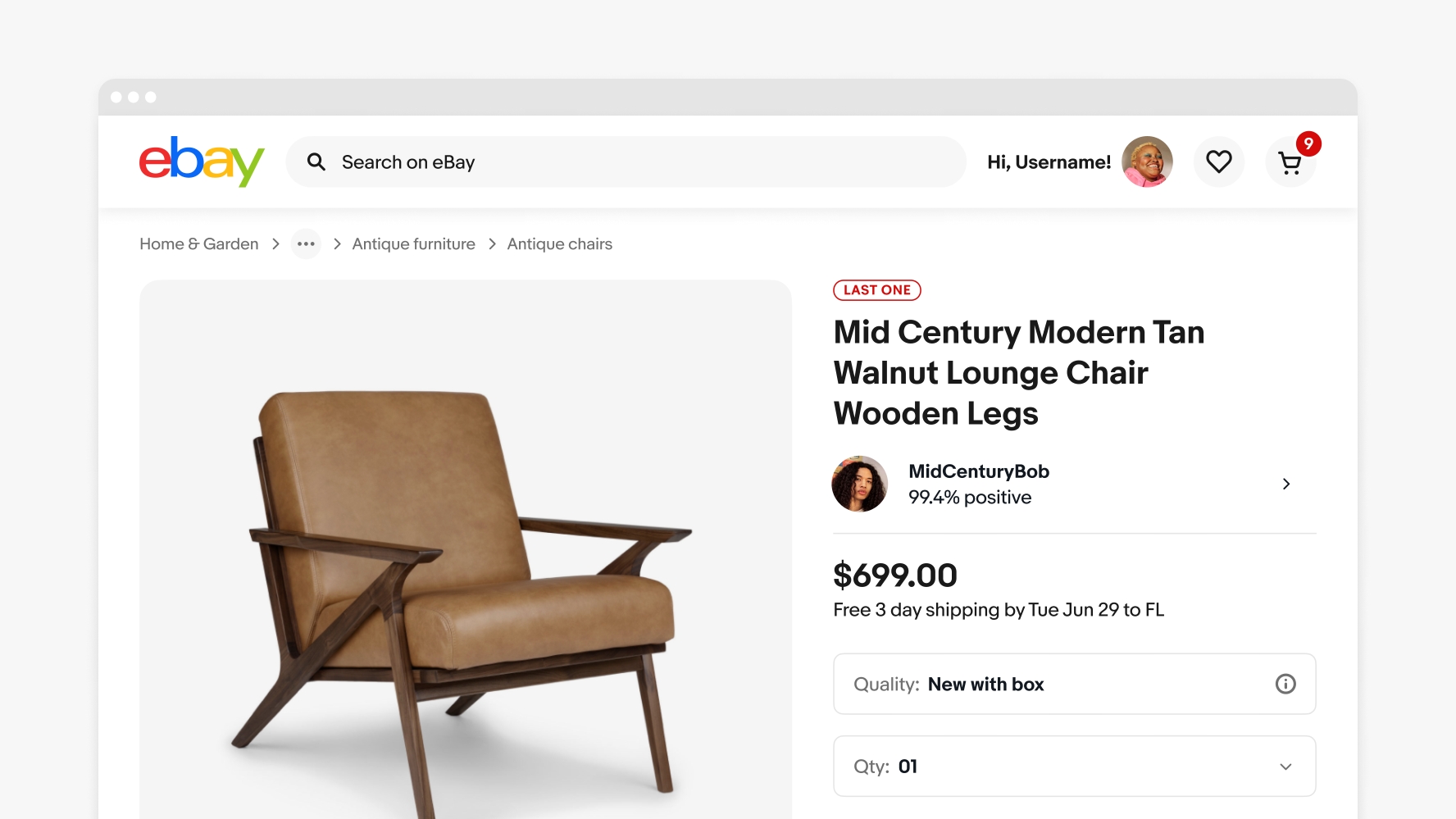
Web collapses all parent pages into an overflow and only surfaces the last item. Native apps do not use breadcrumbs. Instead, use the top navigation bar with a back action.
Native apps do not use breadcrumbs. Instead, use the top navigation bar and a back action, or a navigation rail.
Breadcrumbs on larger screens are located below the global navigation and above the page title or other page content.
Do keep the number of items visible to no more than 4. Collapse pages into an overflow if there are more.
Don’t have more than 4 labels visible. This can get overwhelming and is unnecessary to convey the general context.
Do collapse all labels except for the first and last items if there are multiple long labels.
Do not show more than 24 characters or let labels wrap to a new line.
Do use breadcrumbs in addition to navigation.
Do not use breadcrumbs as primary wayfinding.