Pagination

v2.1.0

Pagination breaks large data sets into multiple pages for easier consumption. Controls are included to navigate between pages and manage how much content is shown at once. This is primarily an HTML pattern.

  • Skin
  • CoreUI
  • React

Considerations

Consumable

Pagination breaks up large, overwhelming amounts of data into consumable chunks.

Simple

Interactions are quick and easy within a tap or two.

Distinct

Pagination provides a clear distinction of the current page within a data set.

Anatomy

1. Back Navigation: "Arrow pointing left, indicating the option to go to the previous page in the pagination sequence."
2. Page number: "Unselected page numbers showing the sequence of pages available for navigation."
3. Overflow menu: "Three vertical dots representing an overflow menu with additional pagination options."
4. Active page indicator: "Circle highlighting the current page number, page 44, in the pagination sequence."
5. Forward Navigation: "Arrow pointing right, indicating the option to go to the next page in the pagination sequence."
  1. Back Navigation
  2. Page number
  3. Overflow menu
  4. Active page indicator
  5. Forward Navigation

Properties

Visible slots

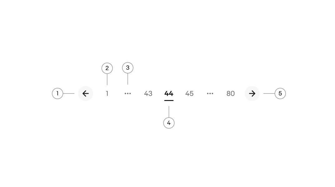
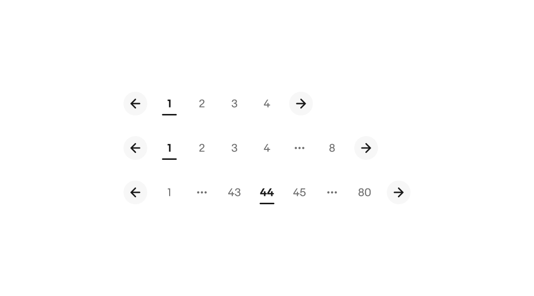
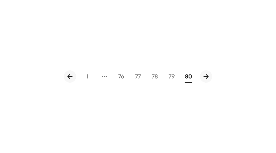
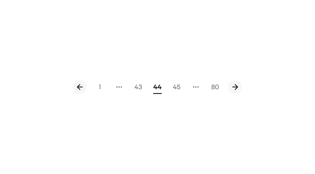
There is an absolute maximum of 7 visible slots available, including the overflow element if pages are truncated. On smaller screens, more pages will be truncated as the screen width decreases. When pages are truncated, the minimum is 5 slots visible. Avoid showing pagination if only 1 page exists.

A user interface for pagination with three examples showing numbered page buttons and navigation arrows. Top: pages 1 to 4 visible. Middle: pages 1 to 3, overflow icon, and page 8 visible. Bottom: page 1, overflow icon, pages 43 to 45, overflow icon, and page 80 visible.

Leading overflow

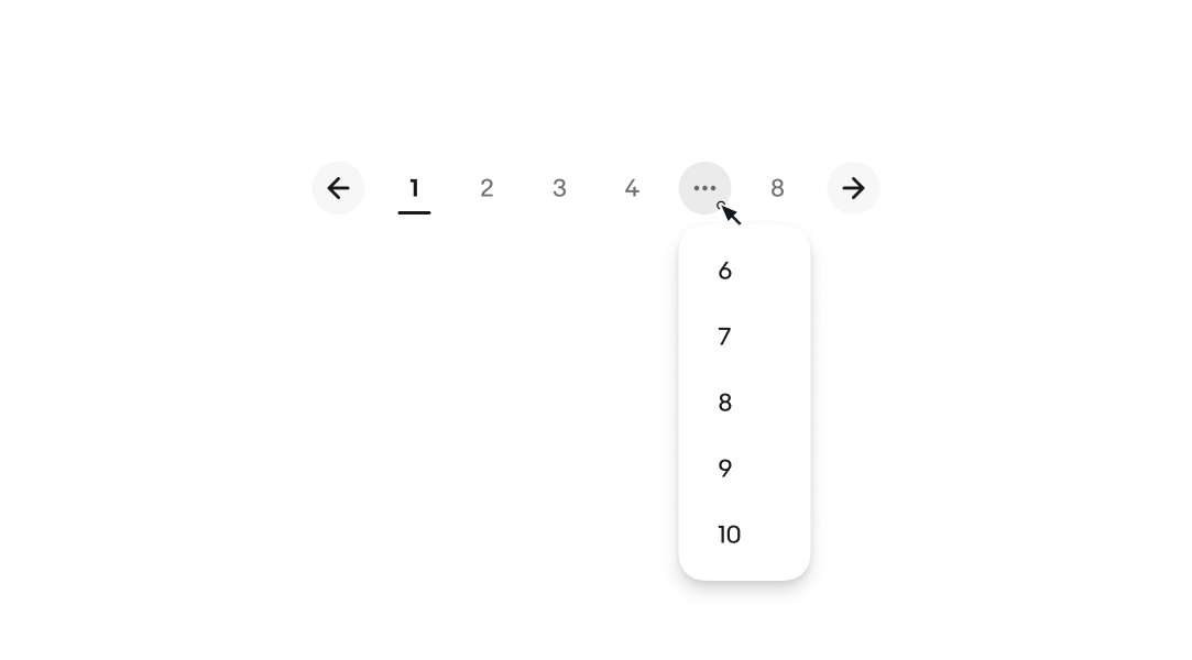
The leading overflow appears when there are at least 2 pages between the last page and the page before the overflow.

A pagination interface with page numbers 1 through 4 and 8 visible, with overflow icon indicating skipped pages, and navigation arrows on both sides.

Trailing overflow

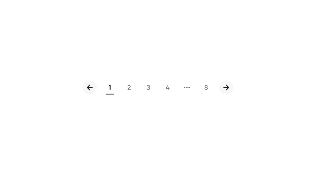
The trailing overflow appears when navigating within the last 4 pages and will contain a minimum of 2 pages.

Pagination interface showing page numbers 76 to 80 with the current page 80 highlighted, and arrows for navigating to previous or next pages.

Leading and trailing overflow

Both the leading and trailing overflow appear when there are at least 3 pages ahead and behind the active page, excluding the first and last page.

Pagination interface with back and forward navigation arrows, page numbers 1, 43, 44 (highlighted as active), 45, and 80, and overflow icon indicating additional pages not shown.

Inline select menu

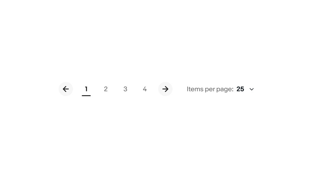
If space permits, it is recommended to pair pagination with a dropdown controlling the results per page.

Wireframe of a pagination component with back and forward navigation arrows, page numbers 1 through 4, an active page indicator on page 1, and a dropdown menu for selecting items per page.

Behavior

Overflow interaction

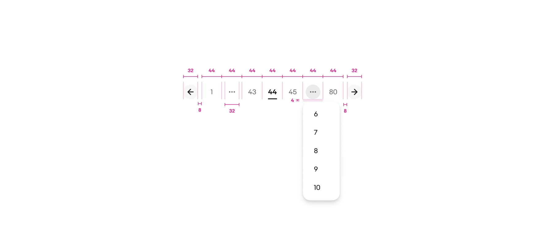
Interacting with the overflow element reveals a popover menu.

Pagination interface with page numbers 1 through 4 and 8, back and forward navigation arrows, and an overflow menu popover revealing additional page numbers 6 through 10.

Platforms

Native

We recommend avoiding pagination on small screens and native applications. Use an infinite scroll pattern instead to allow users to load content on demand.

A small screen design of item tiles stacked in a grid. No pagination is used since this is a native screen.

Web

Use pagination where infinite scroll or load more patterns aren’t appropriate.

A large html page design with 4 item tiles and a pagination control centered beneath them. The pagination includes pages 1-5, overflow icon, and page 8. Arrows are on each side and the left arrow is disabled because page 1 is currently active.

Best practices

Single page

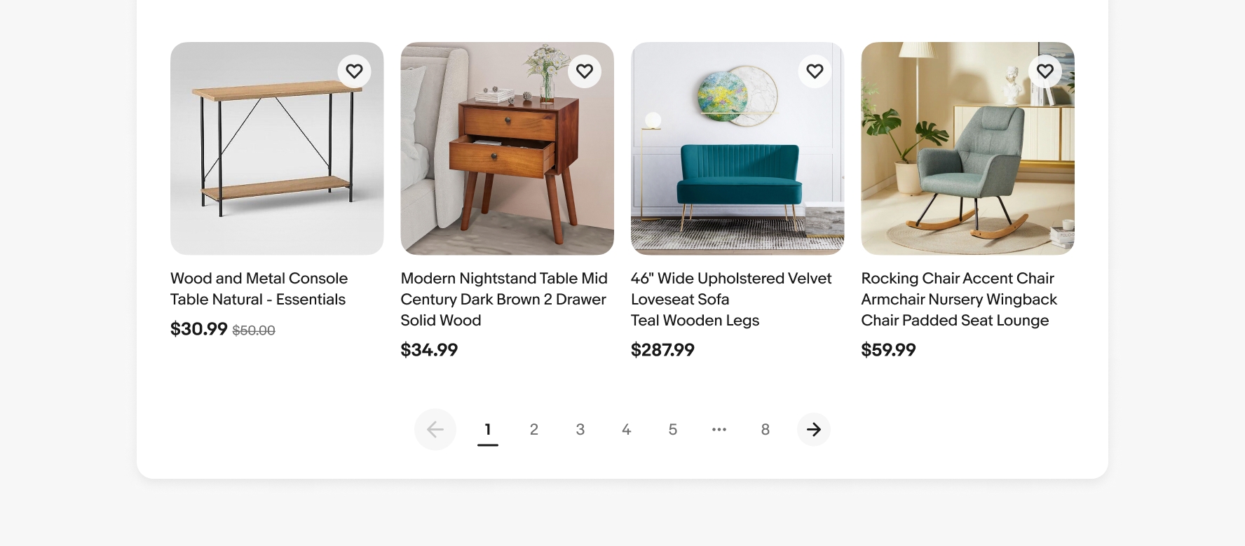
Do use pagination when there are more than 20 items.

Pagination interface showing pages 1 to 4 with previous and next navigation arrows.

Don’t show pagination if all items are visible on one page.

Don't showing a pagination interface with a left arrow, the number '1', and a right arrow, indicating not to use pagination when all content is viewable on a single page.

Specs

A detailed spec of the pagination controls. From left to right reads left arrow button with a width of 32px, 8px of space, page 1 with a width of 44px, 32px overflow button centered in a width of 44px, page 43 with a width of 44px, selected page 44 with a width of 44px, page 45 with a width of 44px, active 32px overflow button with a popover containing the numbers 6–10 with 4px between the overflow and button, page 80 with a width of 44px, 8px of space, and right arrow button with a width of 32px.

Change log

VersionDateNotes
2.1.0
Jun, 2024
  • Updated to eBay Evo
2.1.0
Jan, 2023
  • Simplified parts by linking to updated icon buttons
  • Added keyboard navigation guidance
2.0.0
Apr, 2022
  • Updated left-right arrows to use icon button container
  • Updated button states to use state-layers
  • Updated styles of page states to use opacity
  • Updated component to use appropriate color style tokens