Text field
Text fields let users enter and submit text.
- Skin
- CoreUI
- React

Performant
Forms allow users to complete fields effortlessly.
Accessible
Anyone, no matter their abilities, can complete forms.
Dynamic
Forms provide dynamic feedback so users can correct errors quickly and confidently.
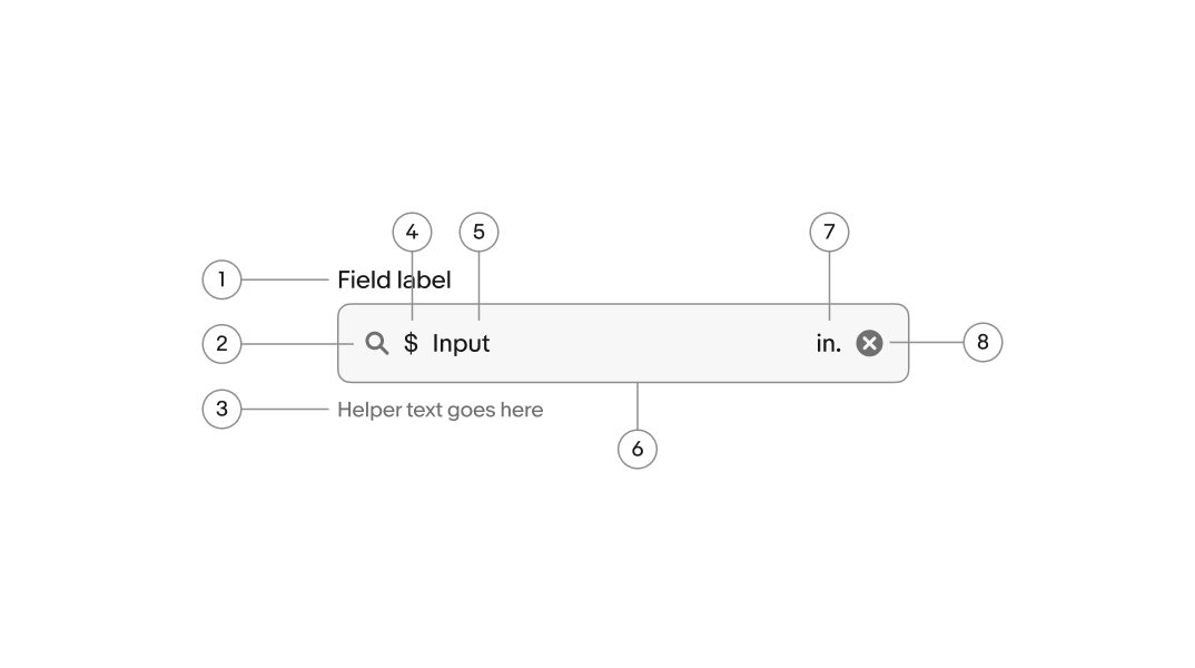
- Label
- Lead icon
- Helper text
- Prefix
- Value
- Container
- Suffix
- Trailing icon
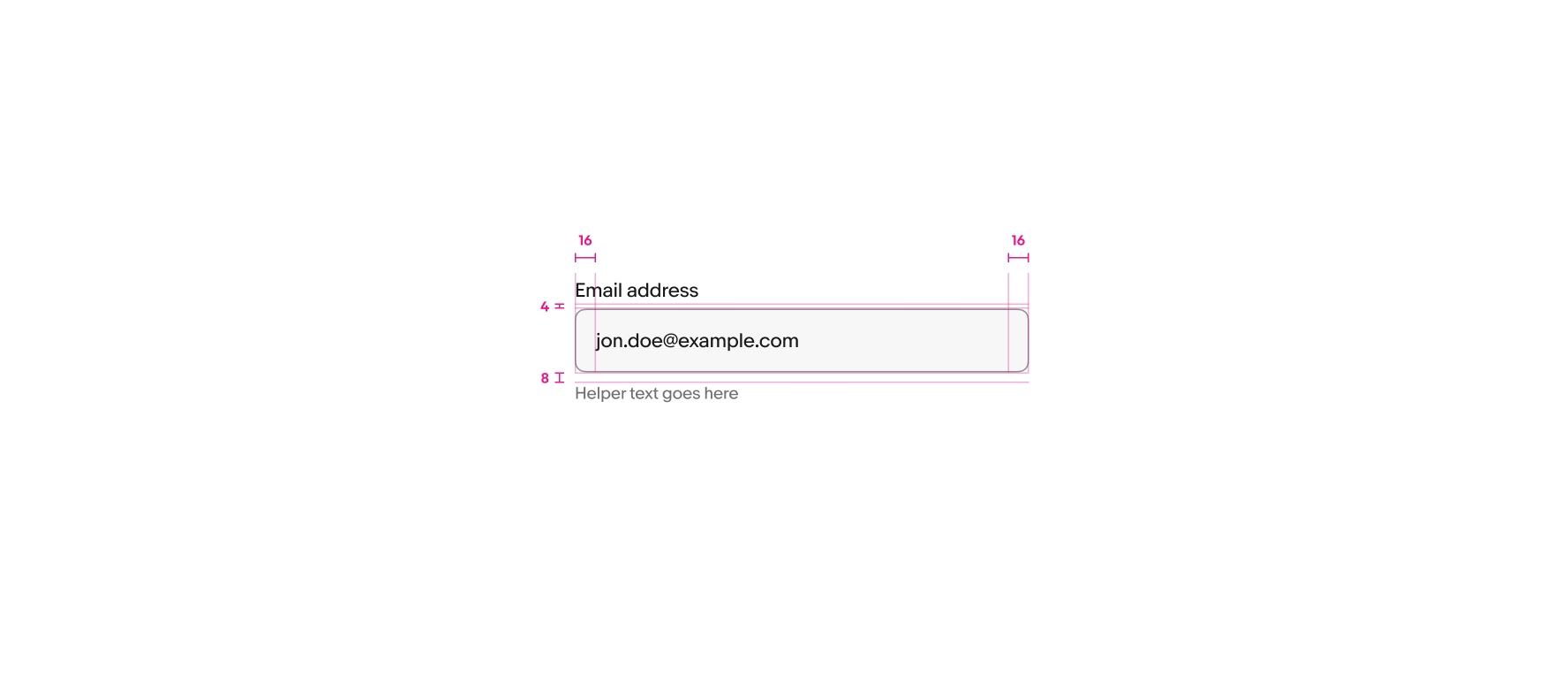
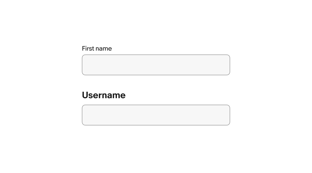
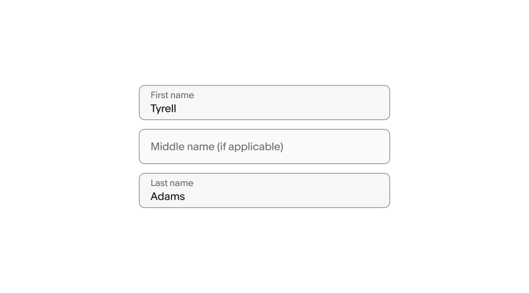
Label
A label is required for text fields and succinctly describes the field’s purpose. A label is included for all fields by default. If another text element is acting as the label, like a section title, then the label can be visually hidden.
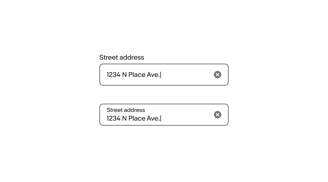
Layout
There are two layouts available for texty fields, stacked and floating. Stacked labels are above the field and floating labels are inside the field. A floating label animates upward on focus to make room for the value.
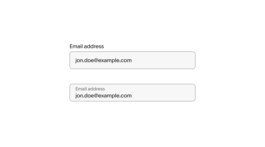
Placeholder content
Placeholder text is optional and remains visible until one or more characters are entered.
Because the placeholder text disappears, putting instructions or requirements as placeholder text is not accessible. Helper text is the preferred method to convey this information.
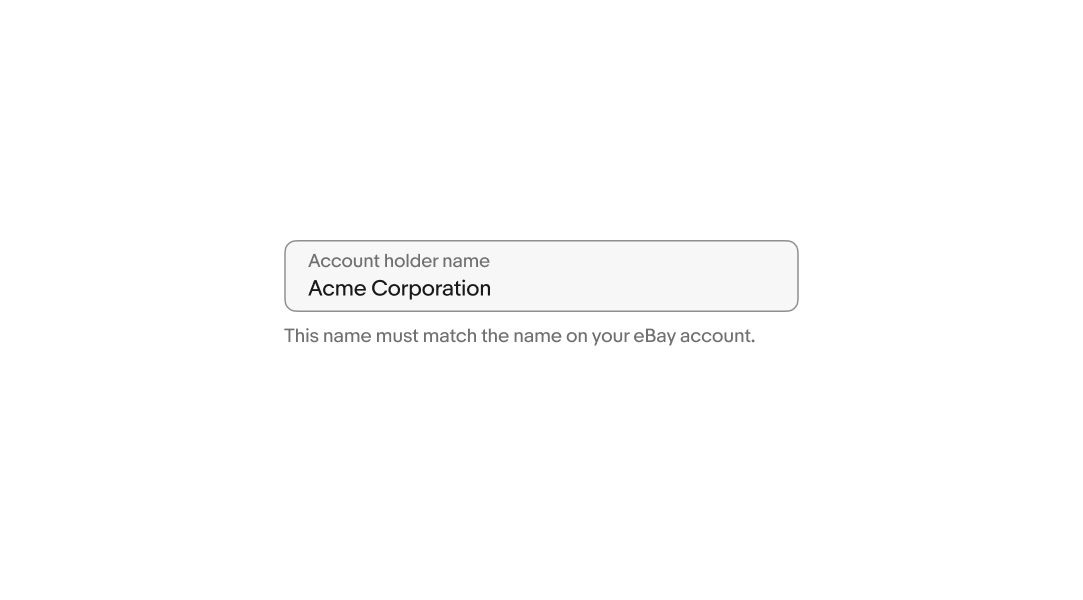
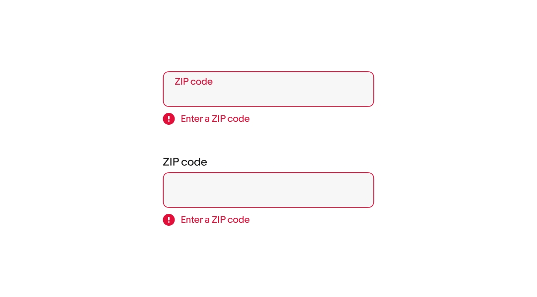
Helper text
Helper text is placed below the field and informs the user of any requirements or disclaimers. Helper text can be shown persistently or on focus.
Helper text will be replaced with an error message if an error occurs.
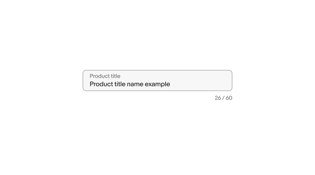
Character count
A character counter will appear when there is a limit on the number of characters. The counter updates in real-time as the characters are added or removed.
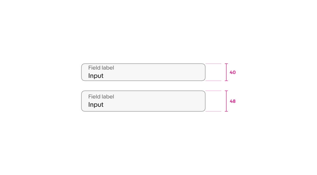
Size
There is a small and large size available for text fields. The default is large and is recommended for smaller screens. Avoid mixing different sizes in a form.
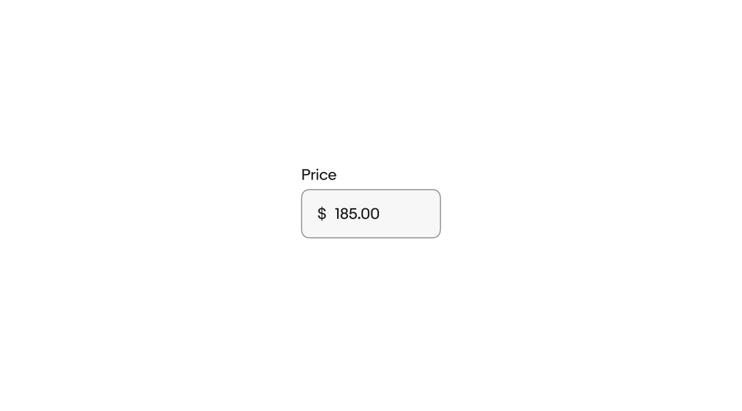
Prefix
Static text or symbols can be prepended to the input. The prefix clarifies the expected input and removes the need for users to manually enter them. These are useful for values like currency.
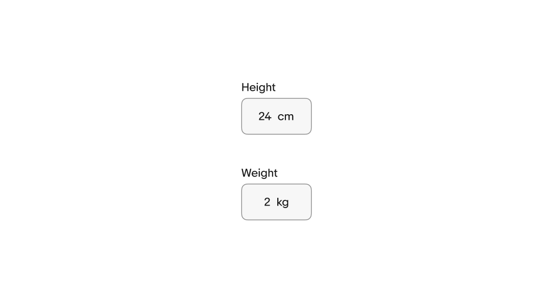
Suffix
Static text or symbols can be appended to the input. The suffix, or postfix, clarifies the expected input and removes the need for users to manually enter them. These are useful for entering values like dimensions and weight or currencies that use trailing symbols.
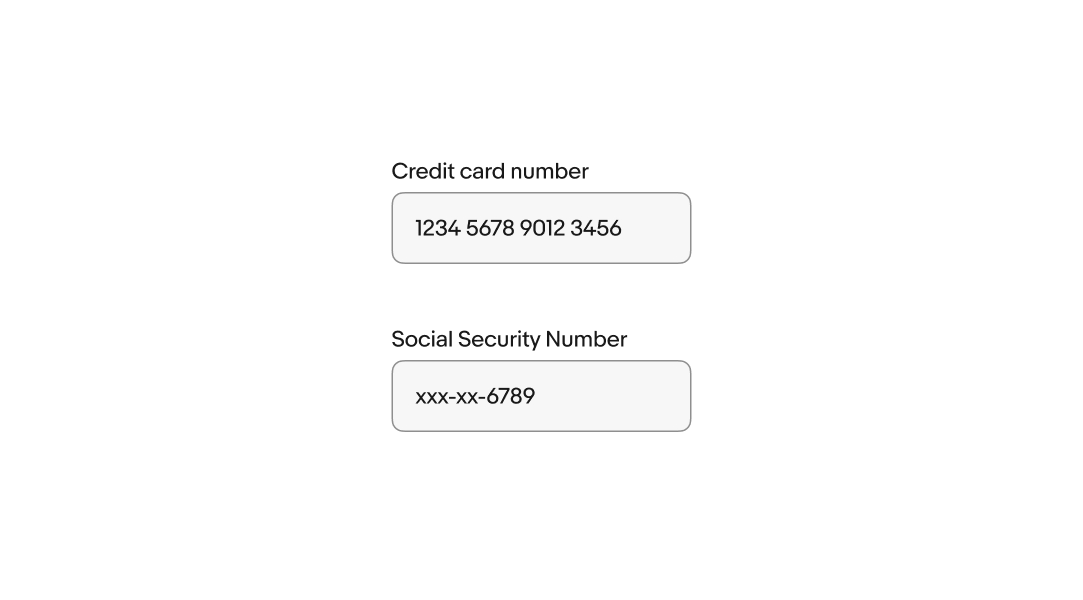
Input formatting
Input formatting clarifies expectations and formats the input to be easier to read. Slashes, dashes, and spaces are automatically added to the input as the user enters characters.
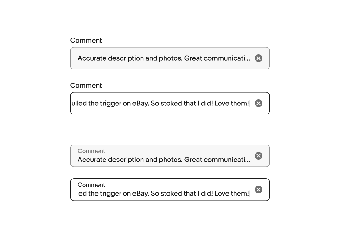
Overflow
Text field values overflow left and right. While focused, the content will shift to keep the cursor in view as the user enters characters. When the field loses focus, the content will scroll to the beginning. Focusing on the field again returns the user to the end of the content.
Generally, text fields should avoid overflow. Use a Text area field if the value of a field is expected to be longer than a short sentence.
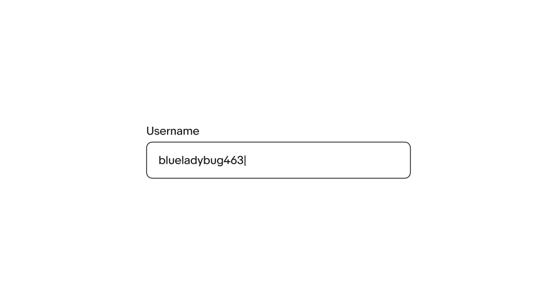
Active
The active state is triggered whenever the user interacts with the field. While active, the background color is removed and the border becomes strong.
Error messages
When a field fails validation, the helper text produces an error message to help the user successfully fulfill the input requirements. Error messages are concise and direct, and replace any previously visible helper text. An error icon is prepended to the helper text to enhance discoverability.
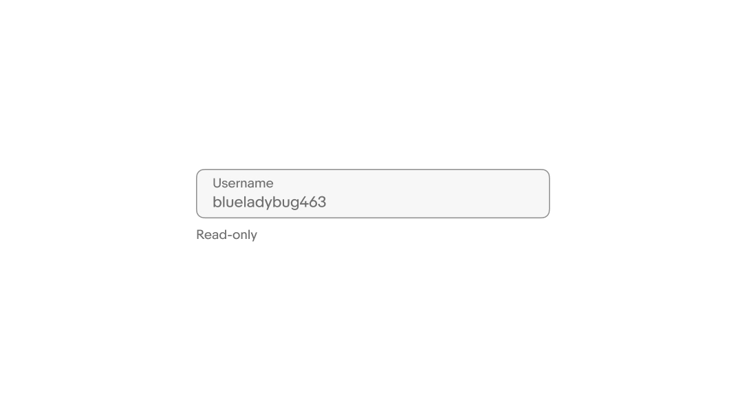
Read-only
Users cannot focus on or change read-only fields. Their input is derived from other parts of the UI and is intended to be viewable for reference. The input is submitted with the form.
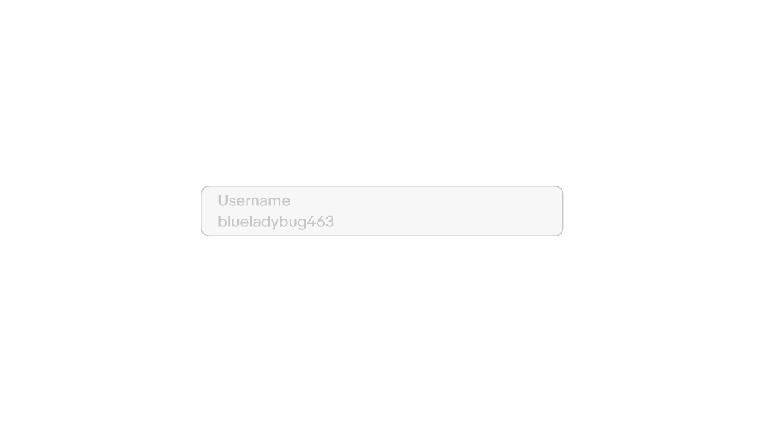
Disabled
Users cannot focus on or change disabled fields. Their availability depends on certain requirements. No value will be submitted from disabled fields.
Clearing input
The clear button appears by default as a trailing icon while the field is focused and has one or more characters entered.
Small
Text fields span the full width of the screen on compact screens.

Medium and large
Text fields are aligned to the grid up to their max width on larger screens. Avoid allowing text fields to span the entire width of the page on large screens.