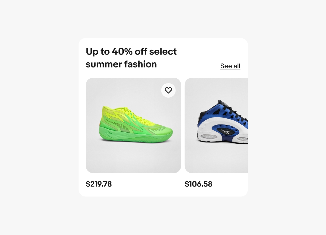
Do include a title on each carousel.
Carousels group similar items into a horizontally scrollable container extending beyond the visible space of the screen.
Carousels allow for a list of multiple complex items to be presented in a more consumable format.
Carousels condense a large list of items into a scrollable container with a smaller vertical footprint.
Carousels react consistently and expectedly across all platforms.
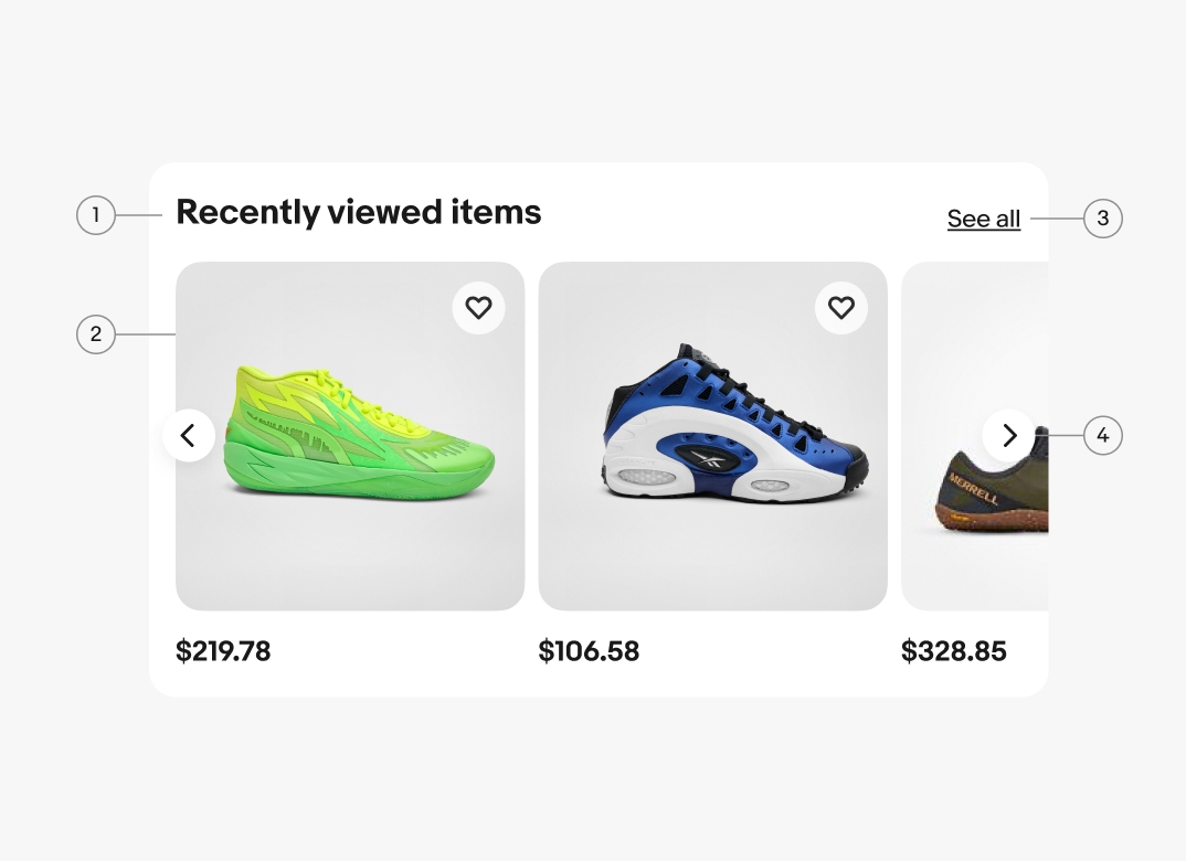
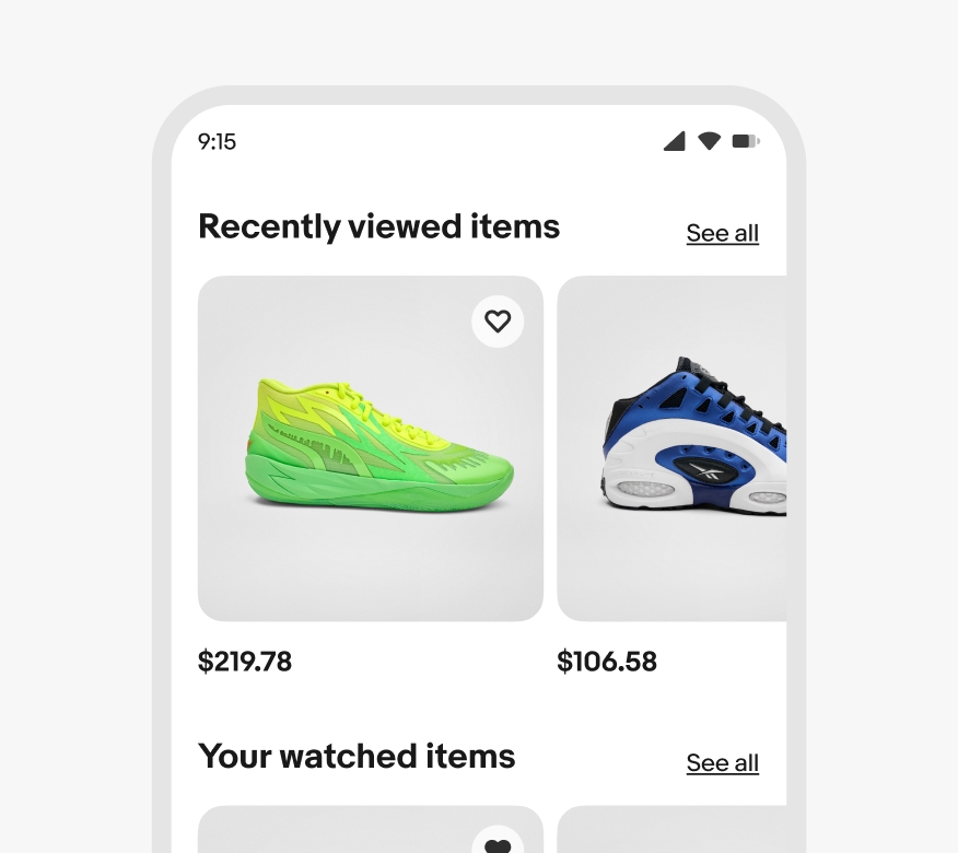
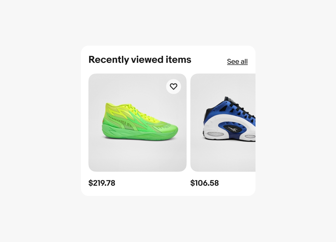
Carousels are paired with a section title. The title should be short and summarize the content within the carousel. A “See all” link is appended by default to the title. The link should lead to a page with more related content.
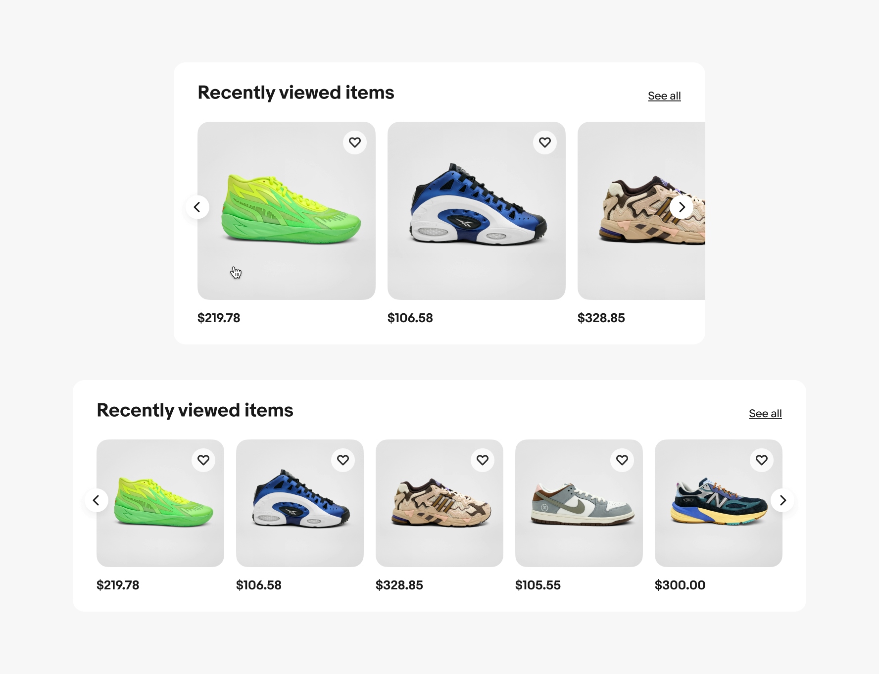
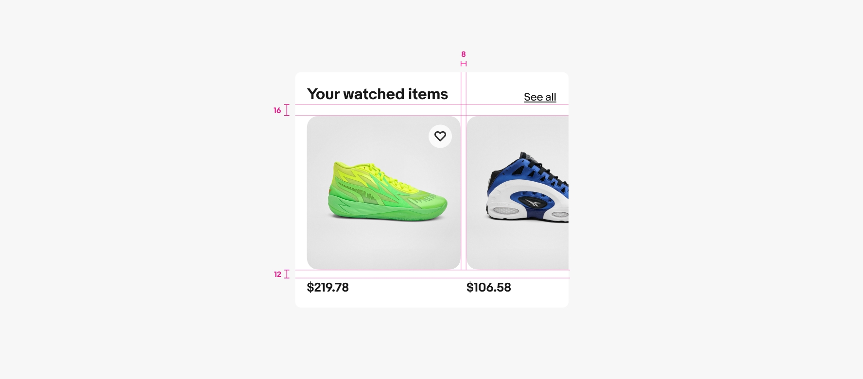
Pagination controls are always visible on x-large screens. Smaller screens reveal the pagination controls on hover and focus.
Carousels use section titles and should summarize the contents in a few words. Titles will wrap to another line if they extend beyond the container width. The “See all” link is anchored to the baseline of the title.
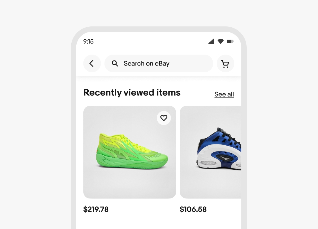
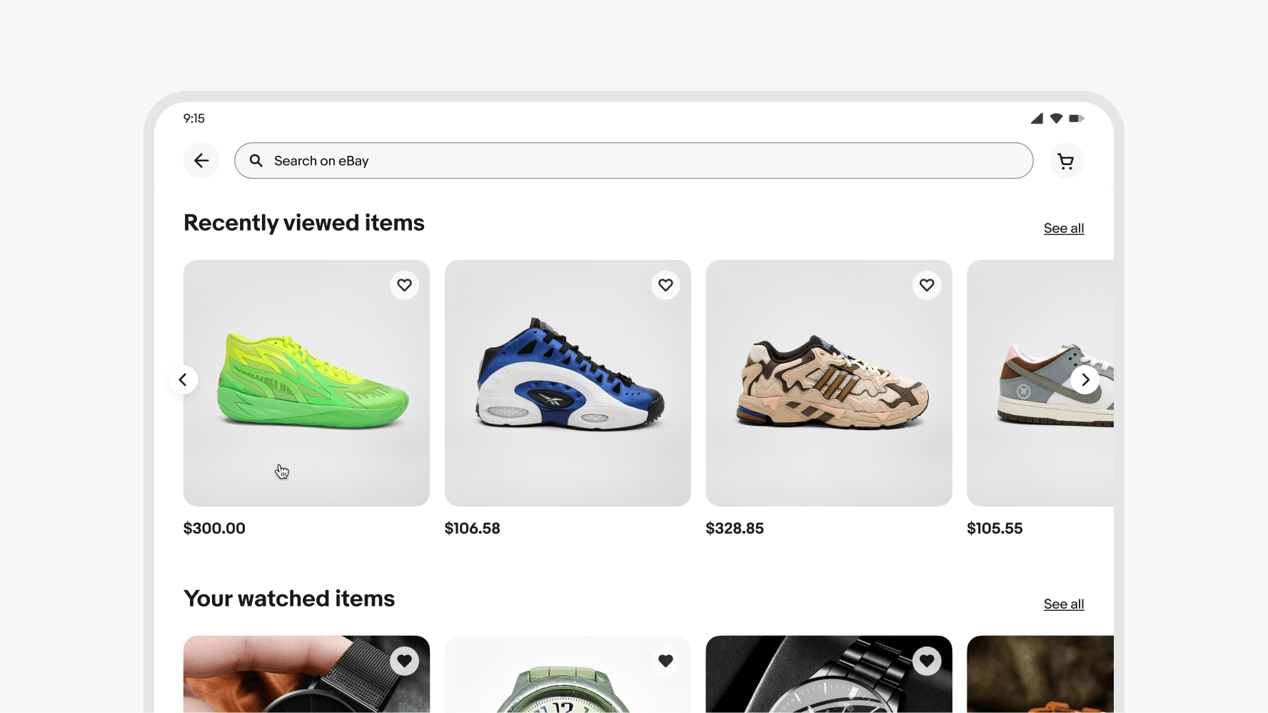
Carousels on small screens don’t have visible controls. Users navigate carousels by using a leftward or rightward swiping gesture. Keyboard and voiceover users tab through the carousel content.
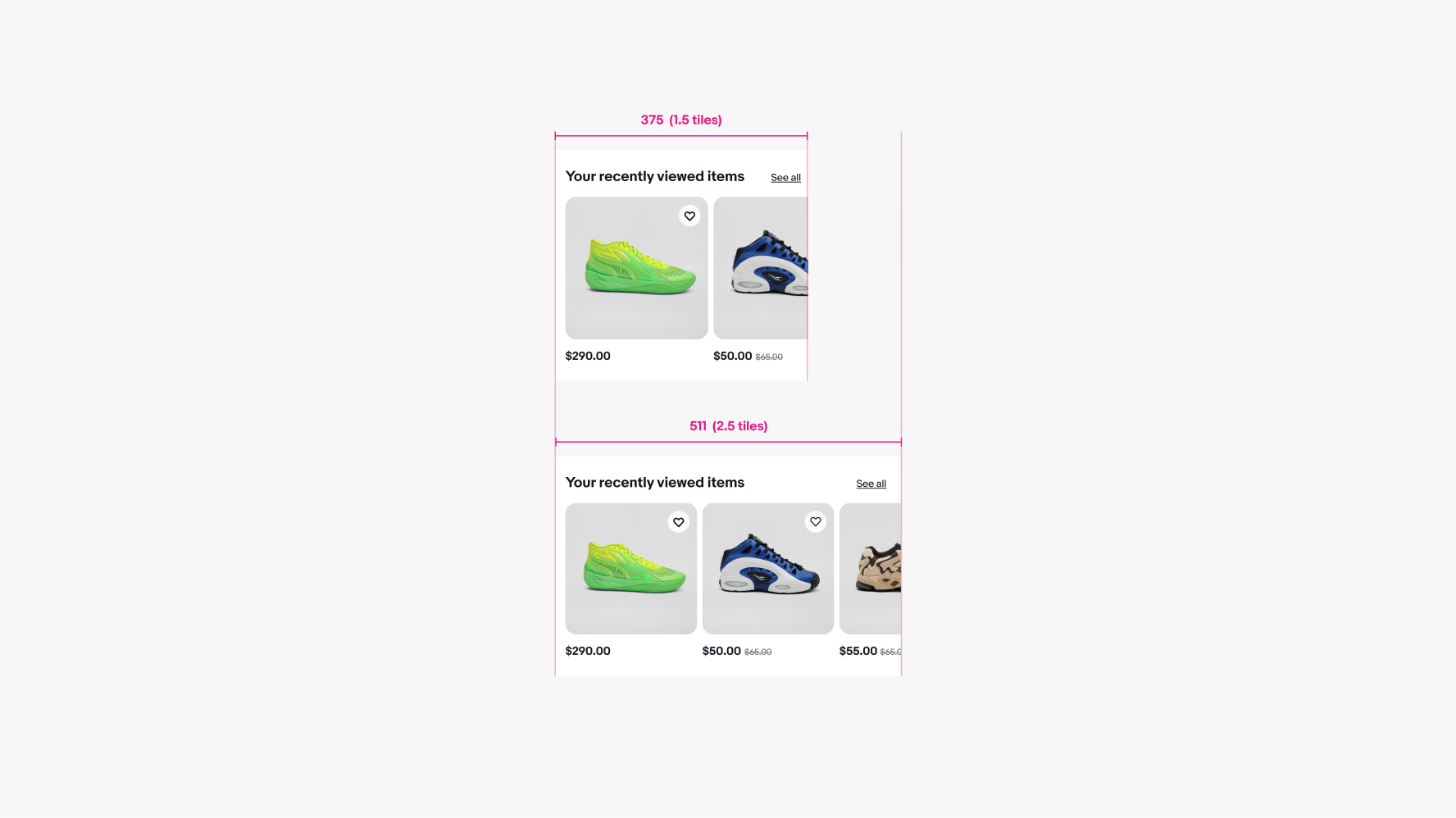
Small screens have 1.5–2.5 tiles from 375px to 511px.
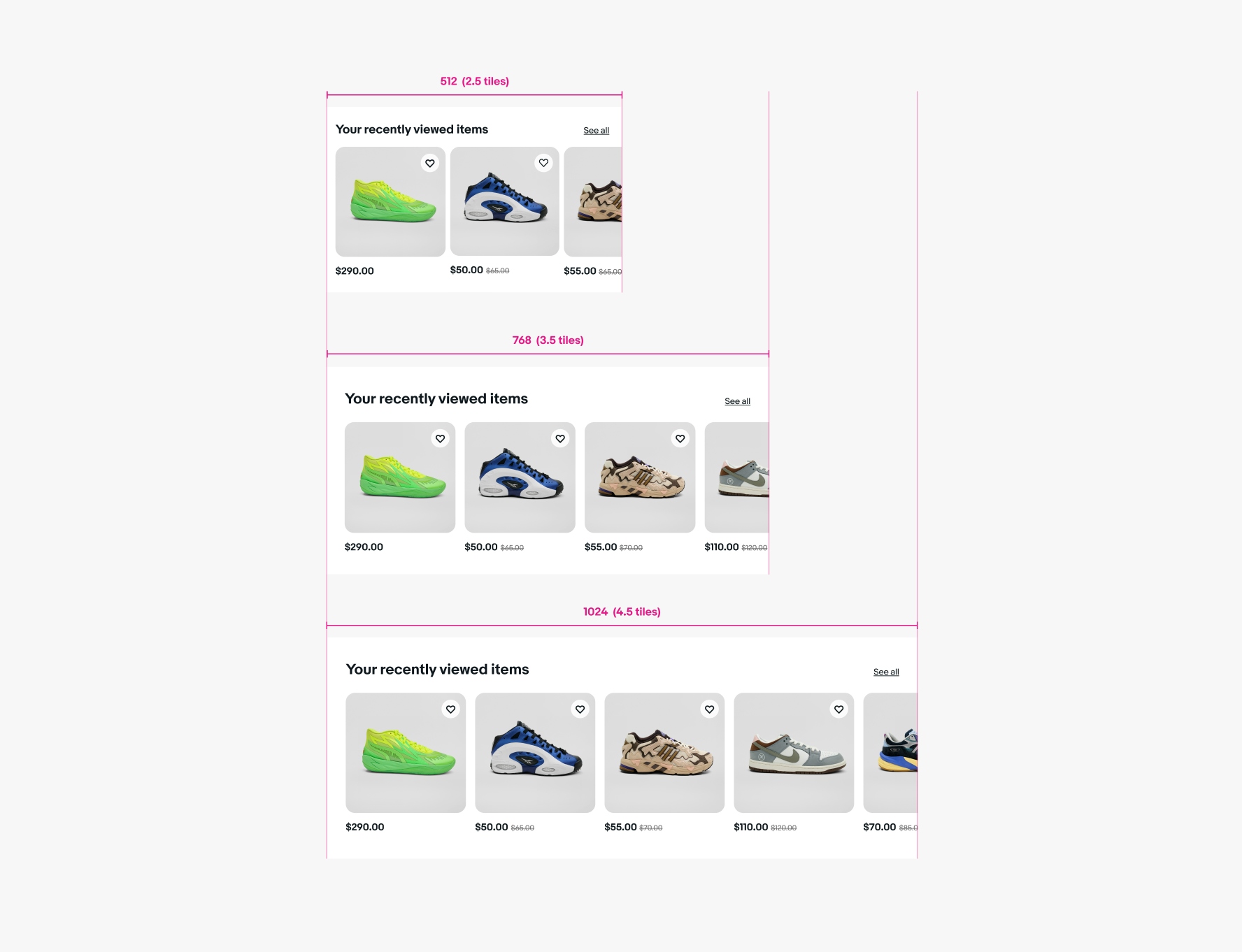
Carousels on medium screens reveal controls when hovering over the bounds of the carousel.
Medium screens have 2.5 tiles at 512px, 3.5 tiles at 768px, and 4.5 tiles at 1024px.
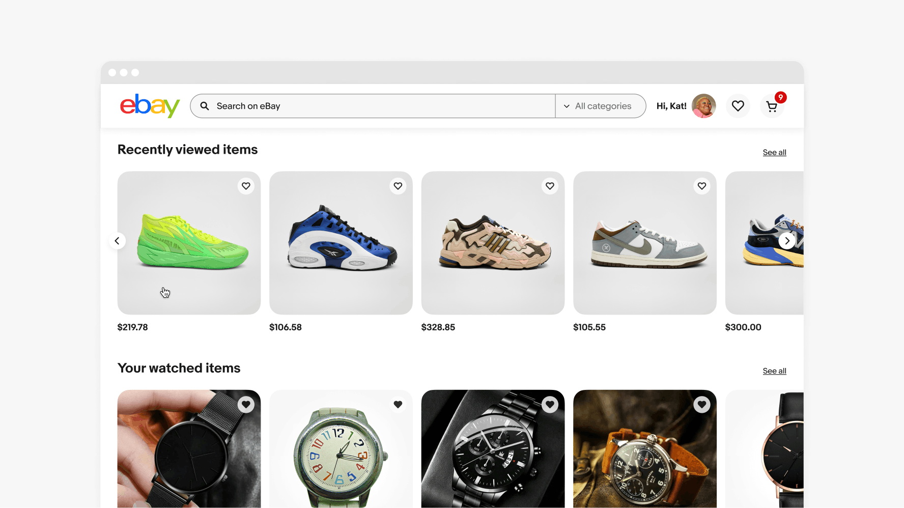
Carousels on large screens will have controls visible on hover. The content can be moved via the controls or by scrolling over the content. Touch-enabled devices can also use swipe gestures.
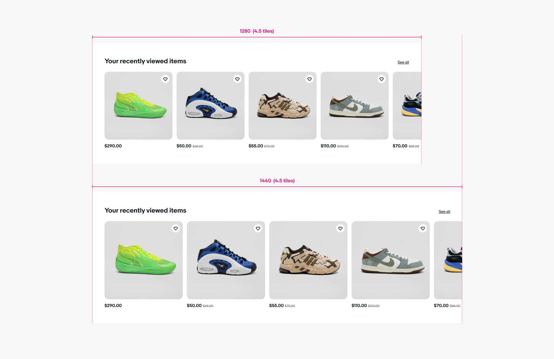
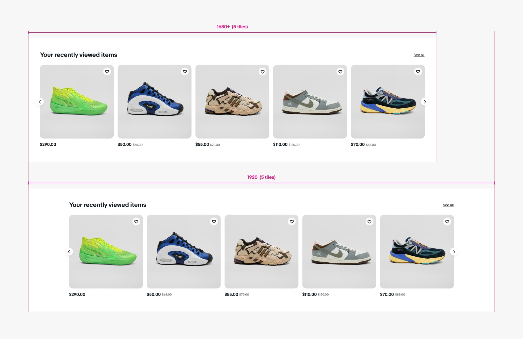
Large screens have 4.5 tiles at 1280px and 4.5 tiles at 1440px.
Carousels on x-large screens will have the controls visible at all times. The content can be moved via the controls or by scrolling over the content. Touch-enabled devices can also use swipe gestures.
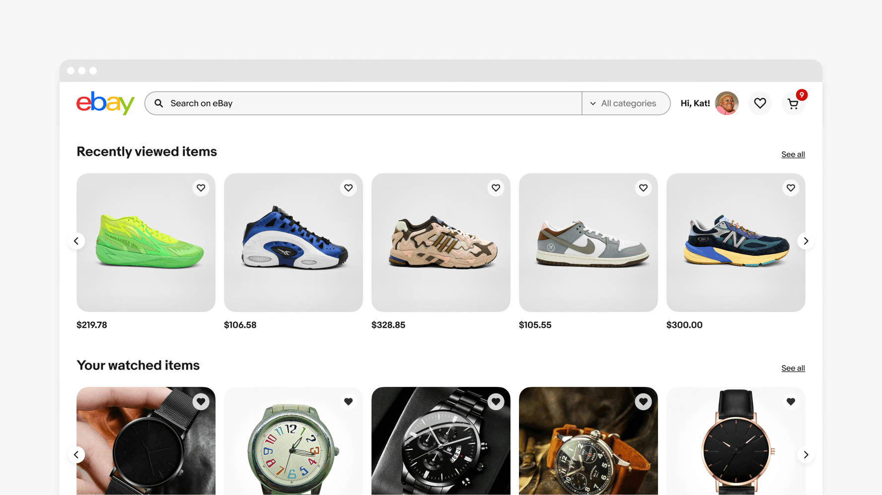
X-large screens have 5 tiles at 1680px and above and have no visual cut on the right side.
Do include a title on each carousel.
Don’t stack carousels under a single title.
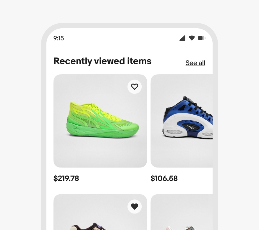
Small screen
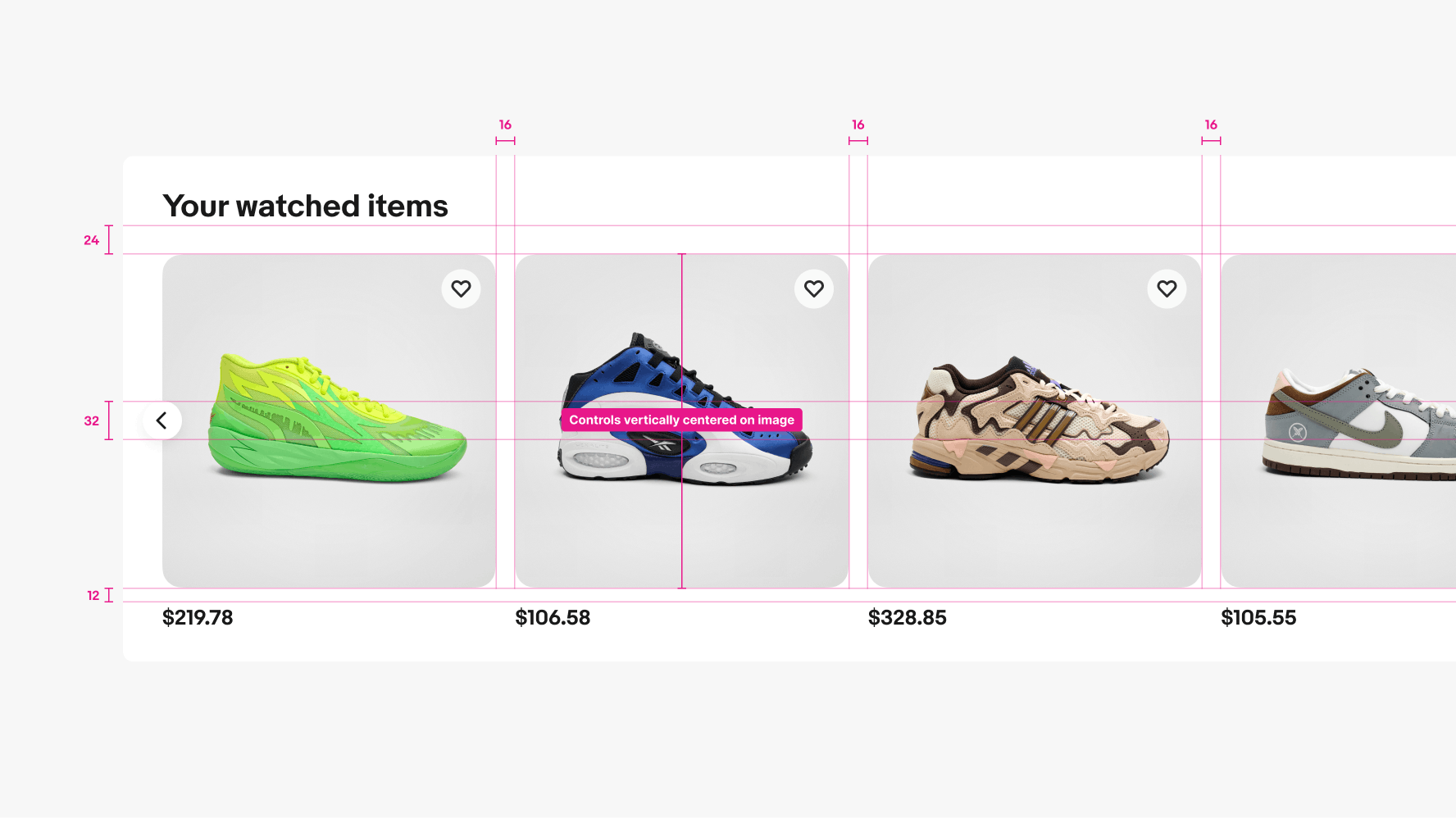
Medium, large, and x-large screen. Controls are vertically centered on the image only.