Combobox
The combobox combines a text field with a popover menu, allowing users to filter and choose an option from a list or enter their own value.

Speed
Comboboxes provide the benefits of a menu with the speed of a text field.
Convenience
Comboboxes improve decision-making and entry speed by allowing for quick typing and matching.
Freedom
Comboboxes empower users by allowing them to type or select an item, and enter a value of their own if one doesn’t exist.
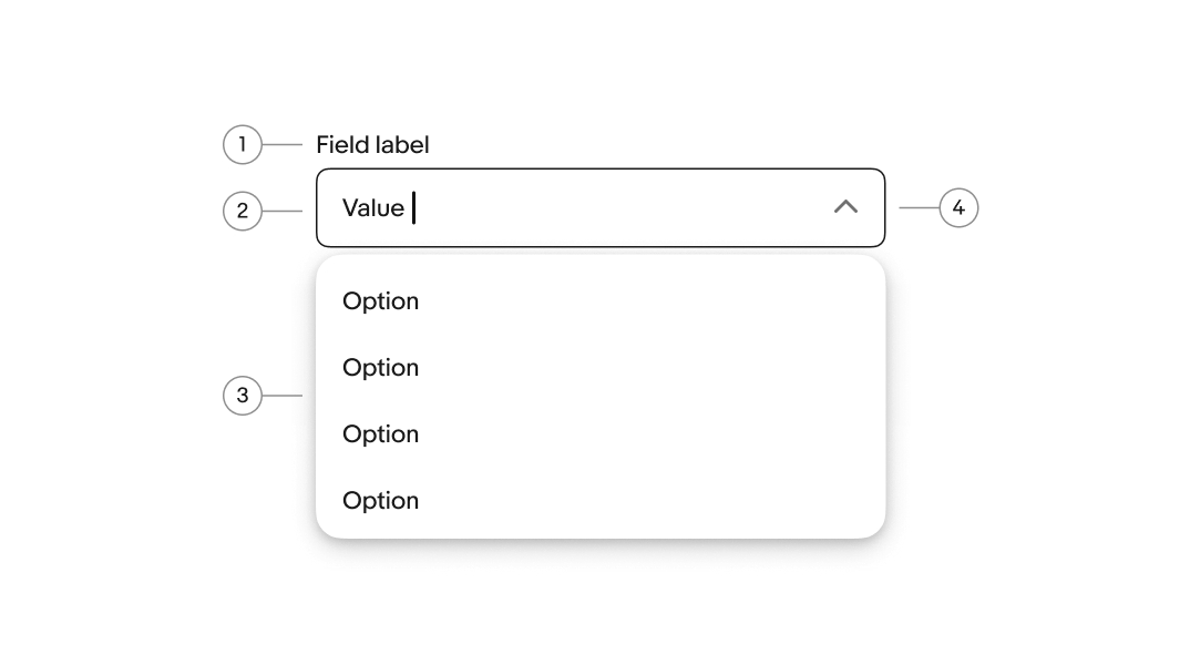
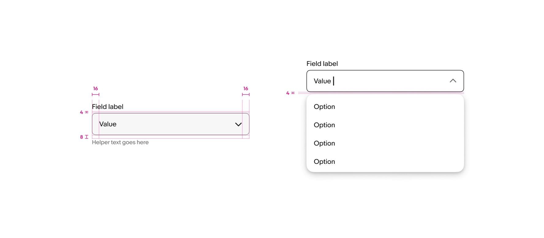
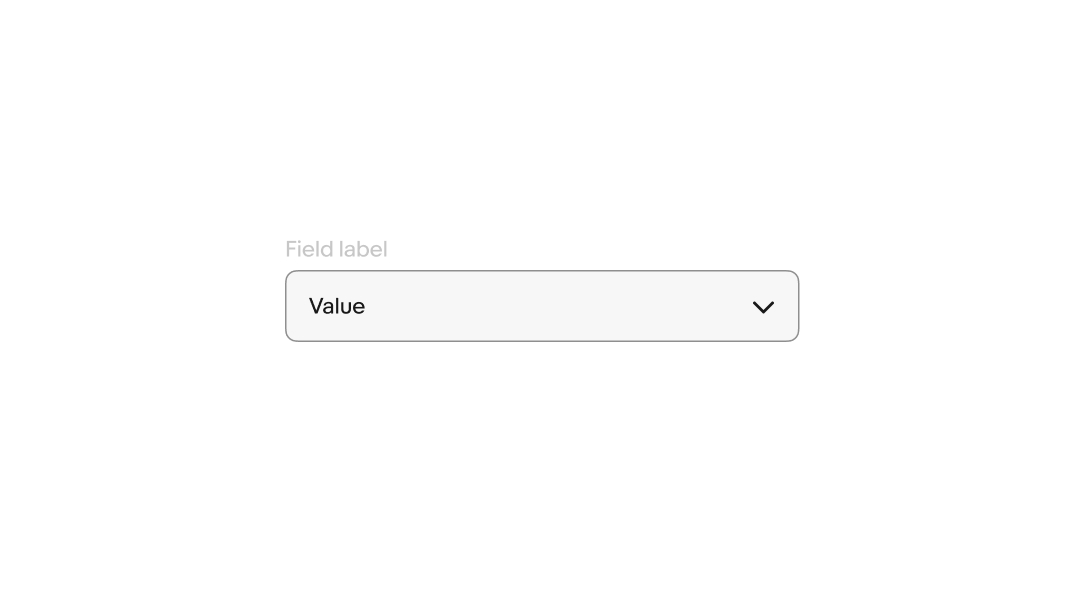
- Label
- Value
- Menu
- Field container
Label
Labels are required for all comboboxes. The label should succinctly describe the purpose of the field.
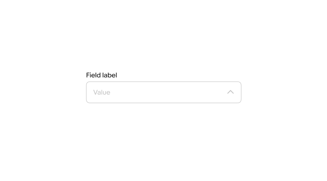
Value
A value can be optional or required depending on the context. A default value can be automatically populated, or the field can remain empty until a character is entered.
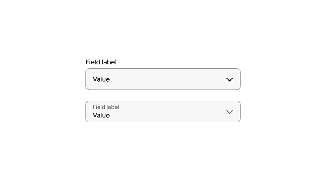
Layout
The field label can be stacked above the field or float within the field. Whichever is chosen, a single style should be used within a single form.
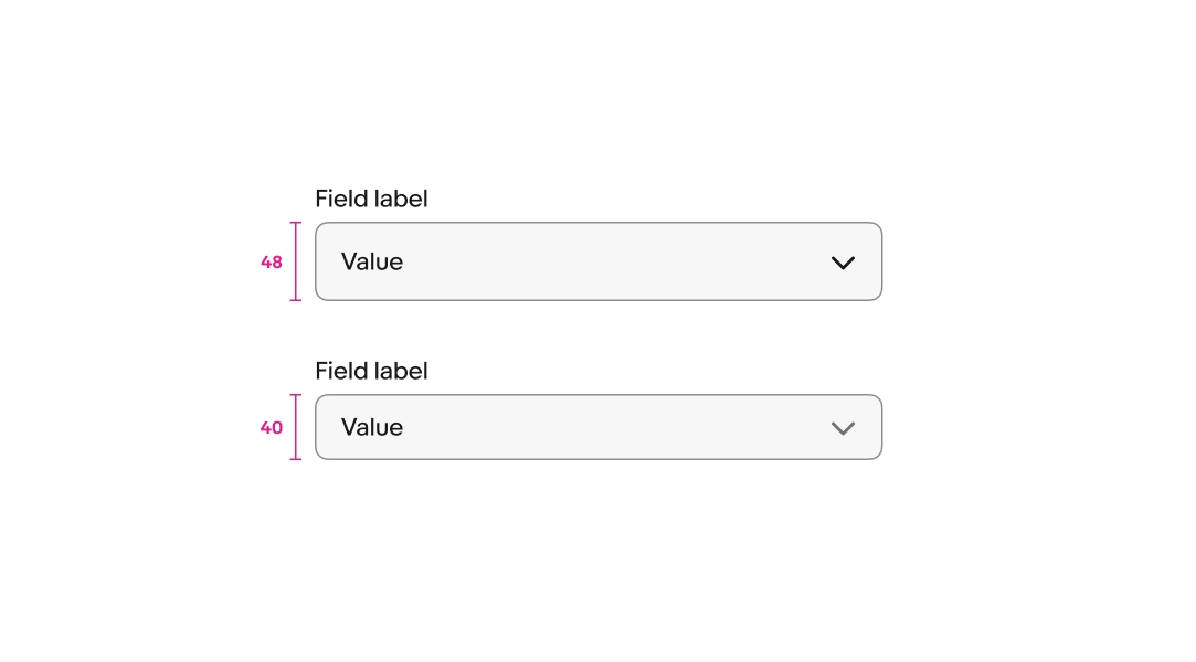
Size
Comboboxes are available in a small and large size. Large is the default and preferred size on compact screens.
Menu trigger
The menu popover progressively displays available values. The popover can be triggered on focus or as the user enters characters. Consider triggering the menu on focus if the content is more complex. When the content is familiar to the user, the menu can trigger as they enter characters instead.
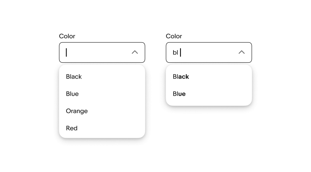
Autocomplete
Autocomplete can be enabled to fill in a value without needing to type out all of the characters. The autocomplete value is selected when navigating away from the field.
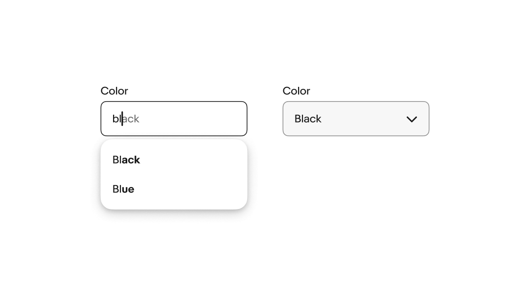
Single-select
Comboboxes that take a single value collapse the menu, set the value, and show the value as a single text element.
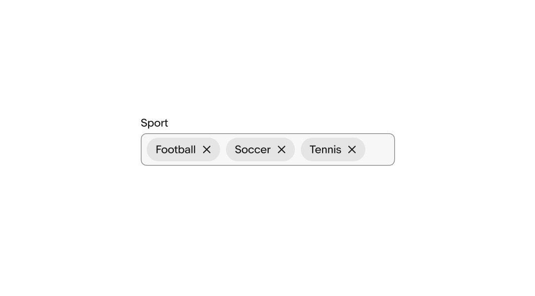
Multi-select
Comboboxes can accept multiple values in a single field. Each value converts to an input chip when selected from the menu list.
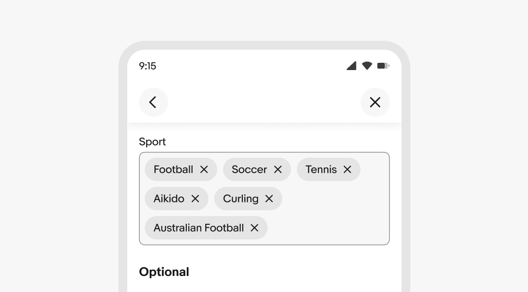
Flex height
When using input chips, the height of the combobox can flex to allow chips to wrap to a new line. Use flex height when it’s important to keep all values visible.
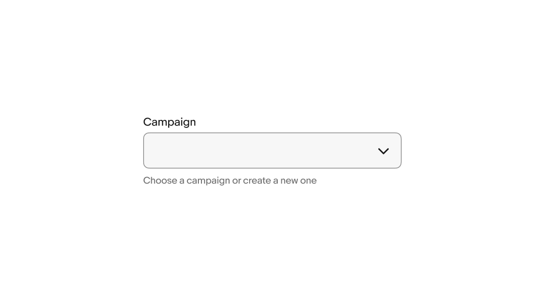
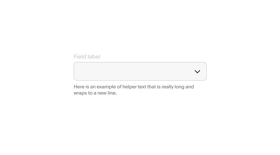
Helper text
Helper text is placed below the field. It guides the user on accurate input or how the input is used. Helper text can be shown persistently or on focus.
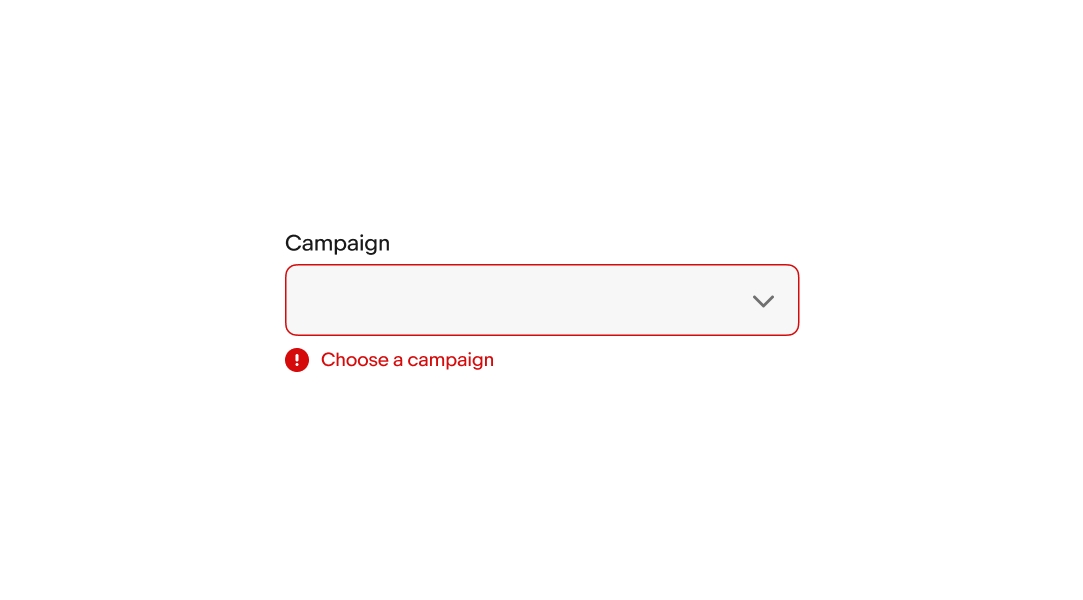
Error messages
When a field fails validation, an error message appears to help the user successfully fulfill the input requirements. The error message is concise and direct.
If the field has helper text, it is replaced with the error message. The error icon appears next to the error message and remains visible while the field is in an invalid state.
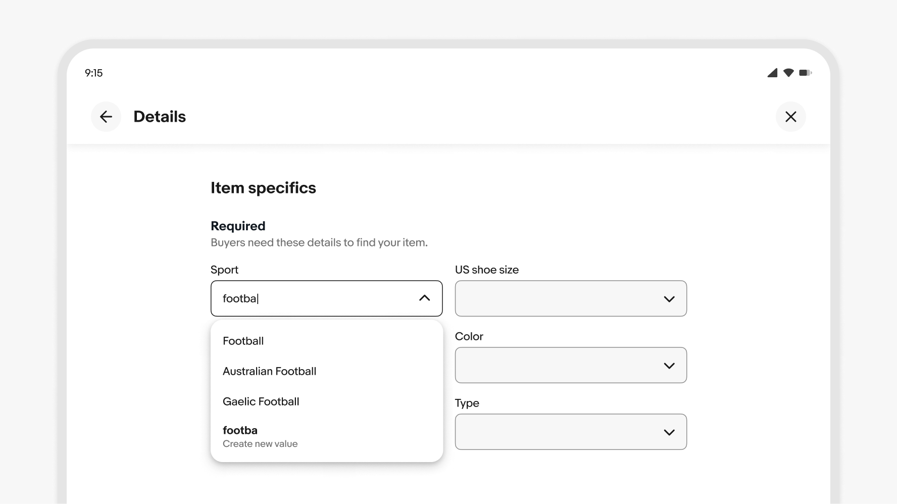
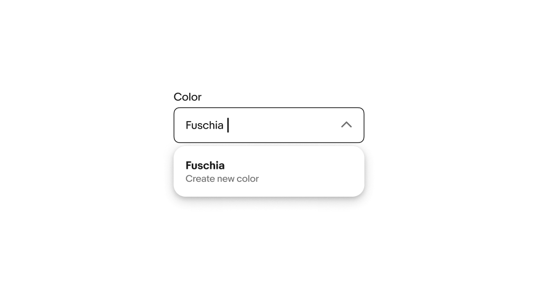
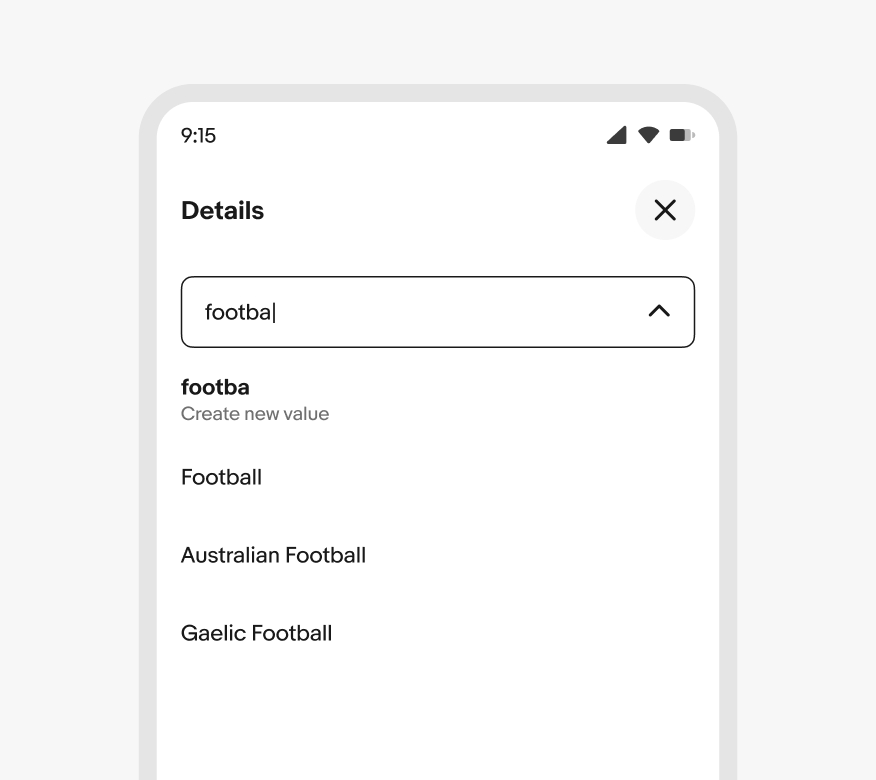
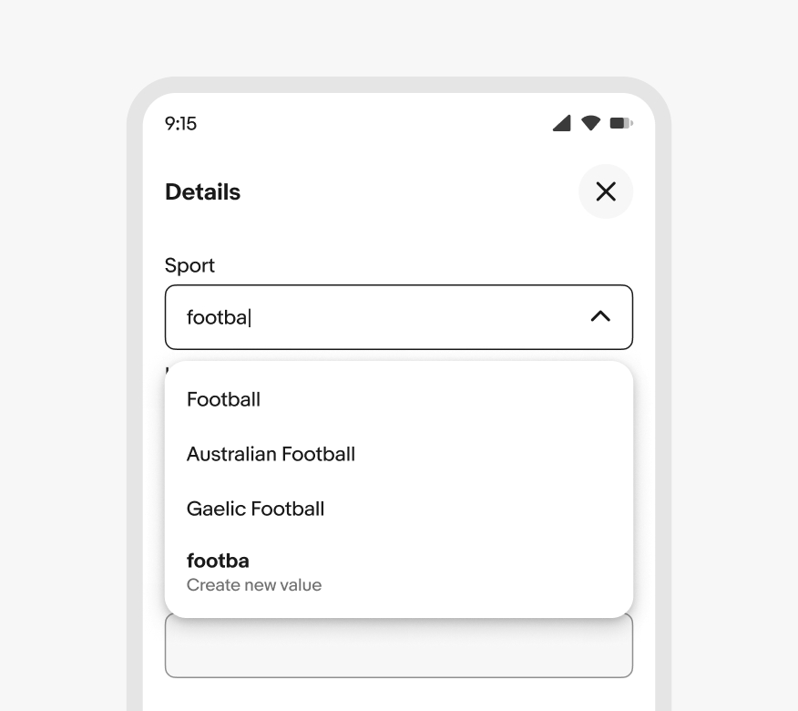
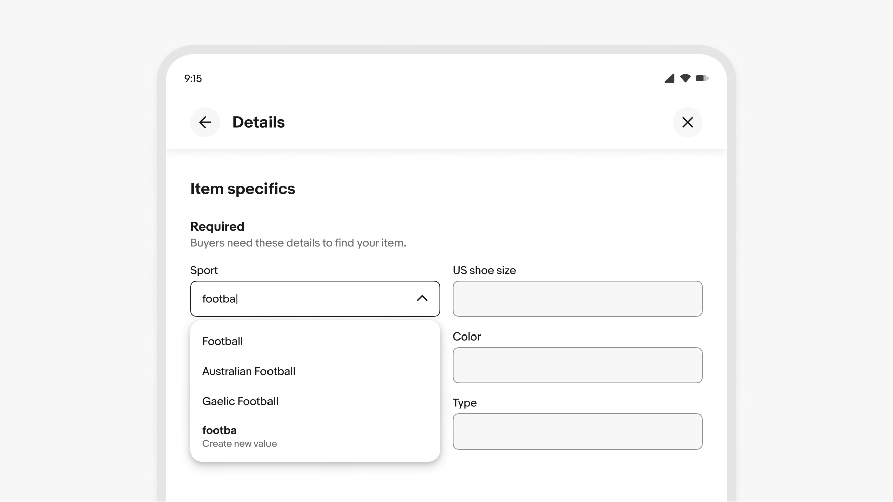
Creating values
Comboboxes allow users to create new values. A “create new” option appears in the menu if there are 3 or fewer options matching an entry. The new value is added to the list when submitted.
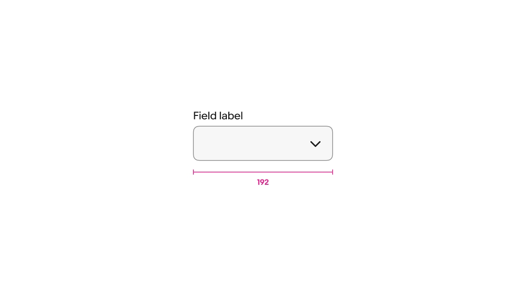
Min width
Comboboxes have a minimum width of 192px.
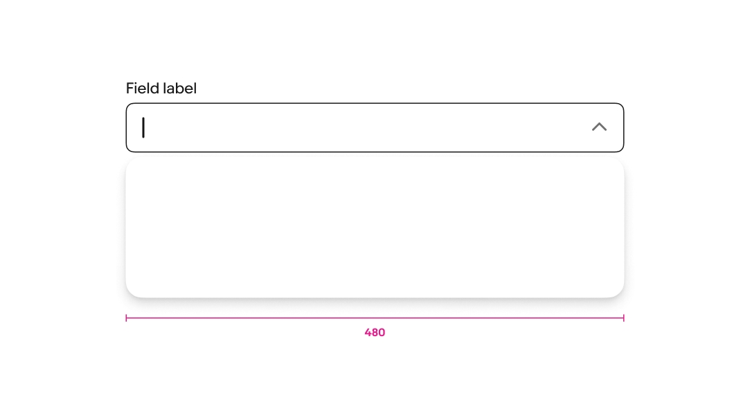
Max width
Comboboxes have a max width of 480px.
Max height
Comboboxes set to flex height have a max height of 3 lines.

Horizontal overflow
For fields that don’t grow and wrap their content, the content overflows to keep the cursor visible as characters are entered. The field returns to the start of the input value when the field loses focus. Focusing on the field again returns to the end of the entry.

Helper text overflow
Helper text spans the width of the field and wraps to a new line when extending beyond the field’s width.
Small
Comboboxes present differently according to platform on small screens.
Native
Comboboxes on small screen native apps disclose values in a fullscreen modal when the field is active.
Web
Small screens on web disclose values in a popover menu when the field is active.
Medium
Comboboxes use a popover menu on medium screens.
Large
Comboboxes use a popover menu on large screens.