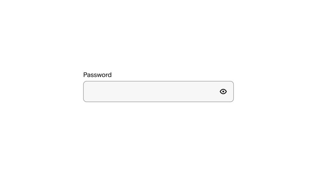
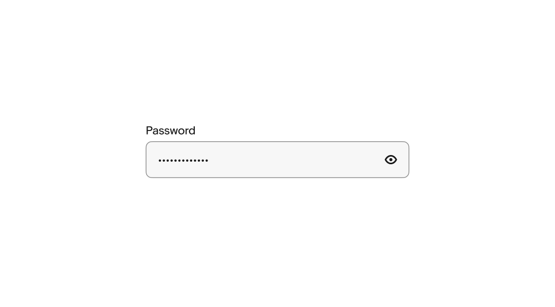
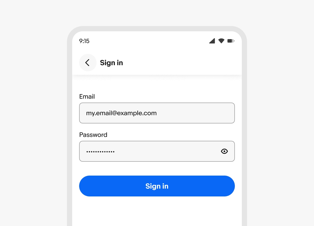
Password
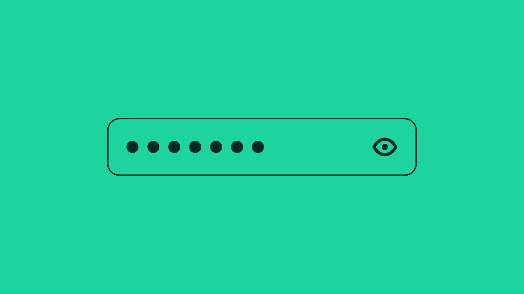
The password field automatically hides its input. It includes a trailing icon that toggles the entry masking.
Performant
Forms allow users to complete fields effortlessly.
Accessible
Anyone, no matter their abilities, can complete forms.
Dynamic
Forms provide dynamic feedback so users can correct errors quickly and confidently.
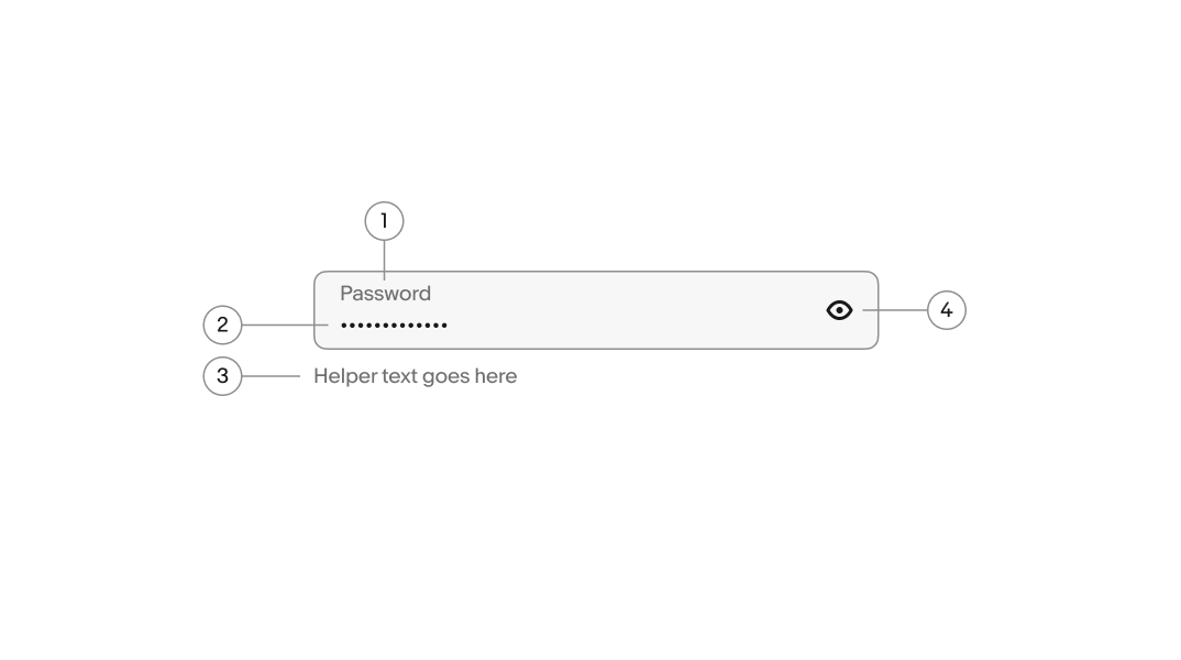
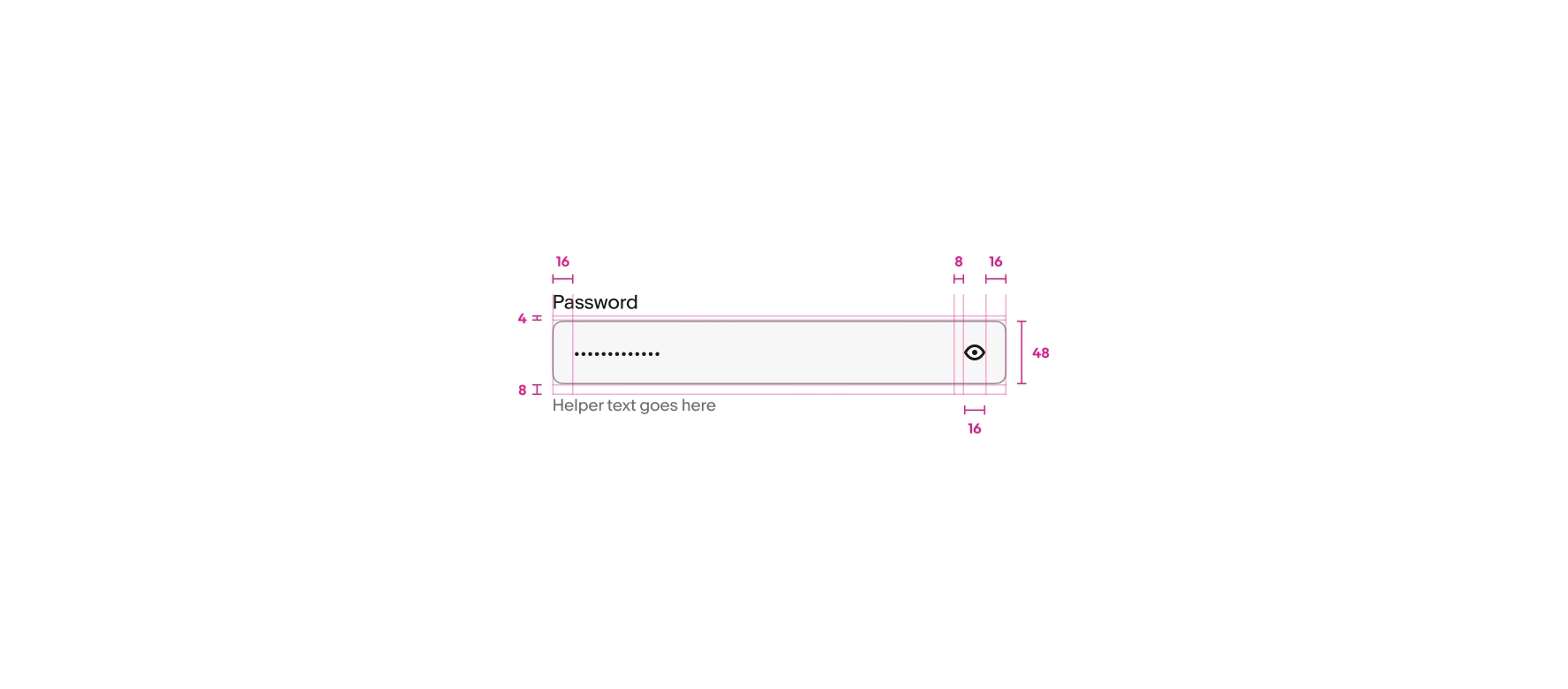
- Label
- Value
- Helper text
- Visibility toggle
Label
A label is required for password fields and defaults to “Password”. The included label can be hidden if there is another adjacent text element acting as the label.
Value
The password value is submitted with the form. It is obfuscated with dots by default.
Layout
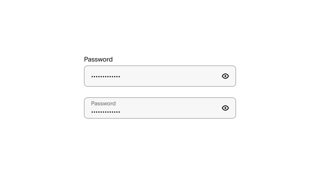
There are two layouts available for password fields, stacked and floating. Stacked labels are above the field and floating labels are inside the field. A floating label animates upward on focus to make room for the value.
Helper text
Helper text is placed below the field and informs the user of any requirements or disclaimers. Helper text can be shown persistently or on focus.
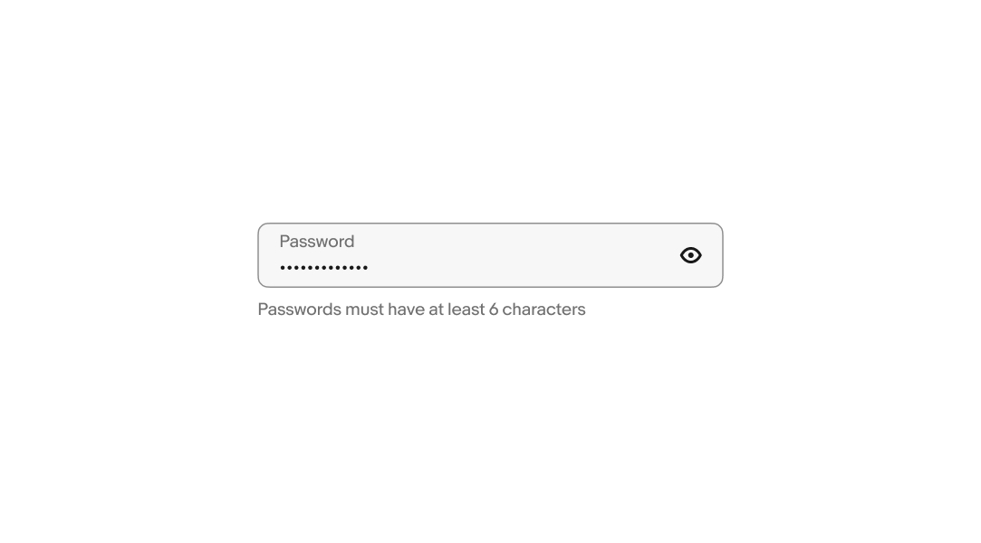
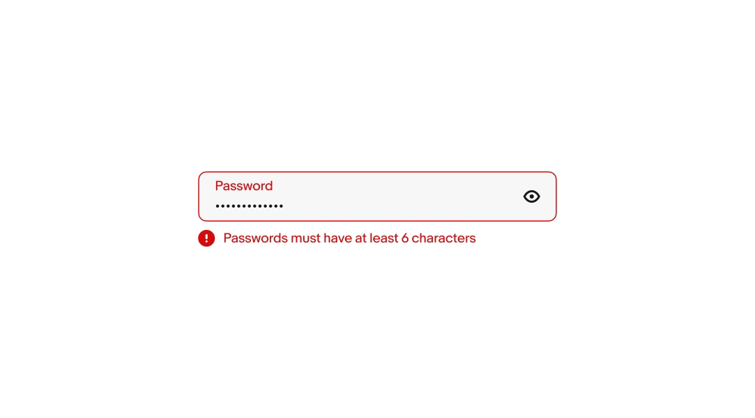
Error messages
When a field fails validation, the helper text produces an error message to help users successfully fulfill the password requirements. Error messages are concise and direct, and replace any previously visible helper text. An error icon is prepended to the helper text to improve discoverability.
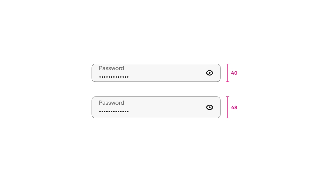
Size
There are two sizes available: 48px and 40px. These sizes match available button sizes in case they’re inline together. Avoid mixing different sizes in a single form.
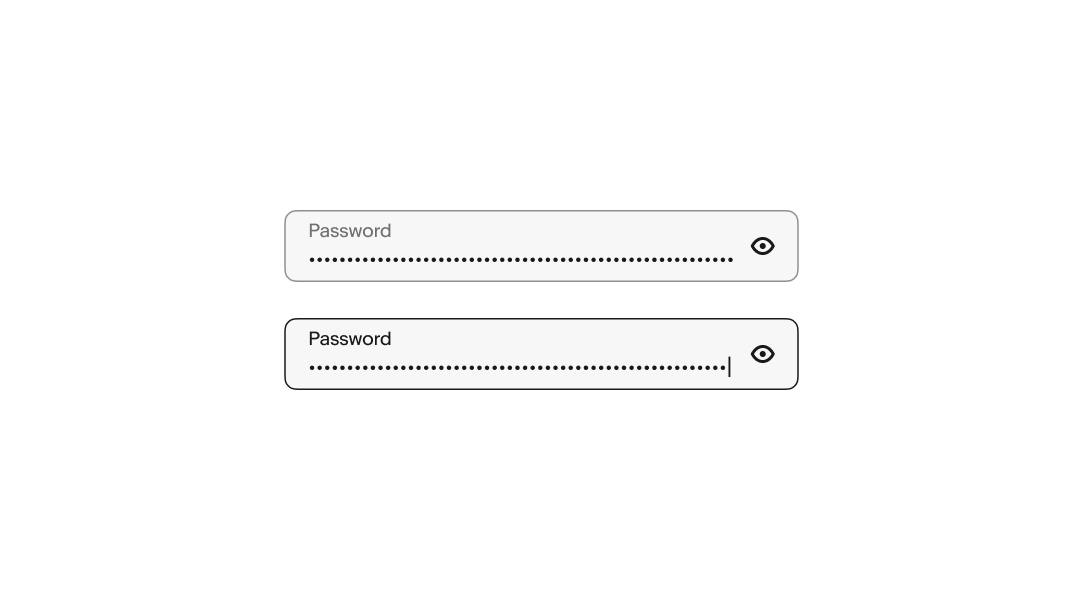
Overflow
Longer passwords flow beyond the visible container. While focused, the value overflows to the left to keep the cursor in view as characters are entered. When the field loses focus, the value shifts to the beginning and overflows to the right. Focusing on the field again returns to the end of the value.
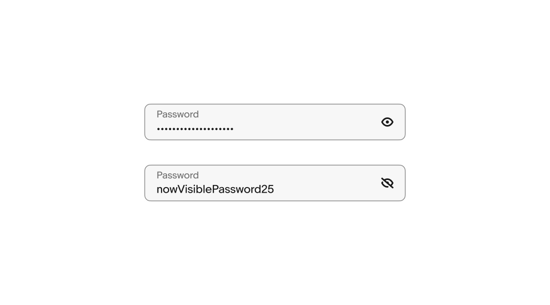
Privacy toggle
The privacy icon toggles between showing and hiding the characters entered to aid in situations where the password needs to be reviewed.
The icon conveys what will happen when interacted with, not the current state, so a concealed value has the show icon and a revealed value has the hide icon.
Small
Password fields span the full width of the screen on smaller screens.
Medium and large
Password fields are aligned to the grid on larger screens up to the max width. Avoid allowing password fields to span the full screen width.