Tokens overview
Tokens are representations of design decisions. They abstract raw values into scalable, meaningful, and readable labels spanning across teams and platforms.
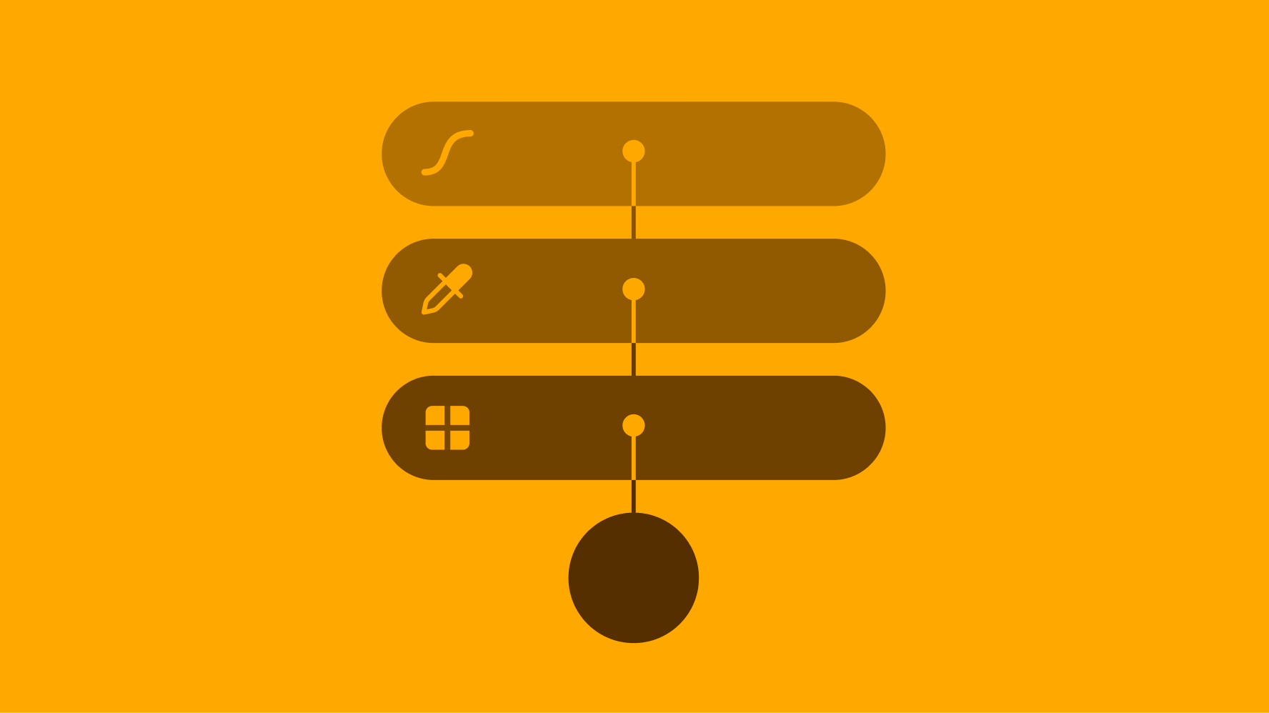
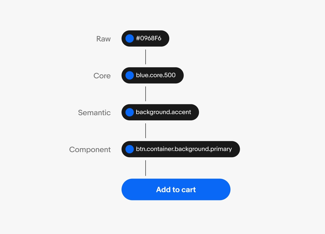
Tokens progress in specificity from raw values to core tokens, semantic tokens, and component tokens.
Tokens apply to a variety of value types, including:
- Color
- Typography
- Spacing
- Sizing
- Radius
- Opacity
- Stroke width
- Effects
| Object | |
|---|---|
| Component | Element |
|
|
| Base | ||
|---|---|---|
| Category | Behavior | Property |
|
|
|
| Modifier | |||
|---|---|---|---|
| Variant | State | Scale | Context |
|
|
|
|
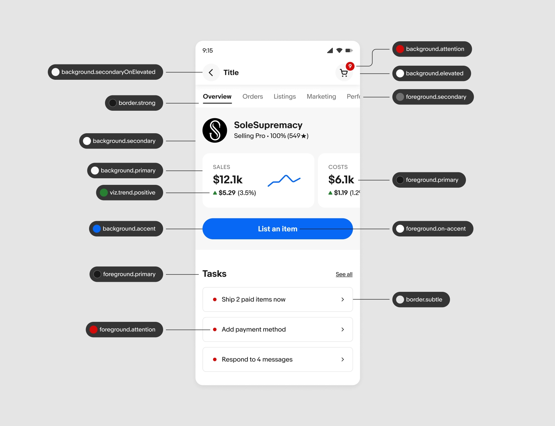
Backgrounds and foregrounds
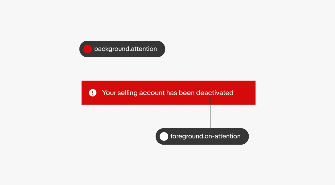
The majority of tokens used are semantic tokens for background and foreground elements. Semantic colors like attention and success have corresponding foreground tokens like on-attention and on-success. This ensures color combinations are used appropriately and remain accessible.
Examples of backgrounds:
- Page background
- Button container
- Banner container
Examples of foregrounds:
- Icons
- Text
Platform agnostic
Tokens are platform agnostic. The names remain similar despite slight alterations to the naming structure. The design library uses dots as separators with all letters lowercase, but can be converted to a preferred platform convention like dashes or camelCase.
Tokens simplify documentation of design decisions and make sharing across teams easier. They establish a common language for styles and intention across all users of the system.

Theming
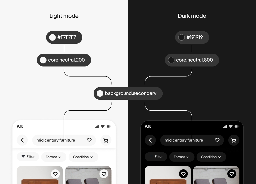
A single token can point to different values depending on the context. The context can be a change in device theme, form factor, or accessibility settings.
When a context changes, the reference values are updated automatically and the changes cascade throughout the system.
Page composition
Here’s an example of how tokens are used throughout a page. Background elements like containers and frames can stack on top of each other. Foreground elements, like text and icons, sit on top of backgrounds. Lastly, border elements include container strokes and dividers.
| Date | Notes |
|---|---|
| Jun, 2024 |
|