Do show one popover at a time. Always close an open popover before opening a new one.

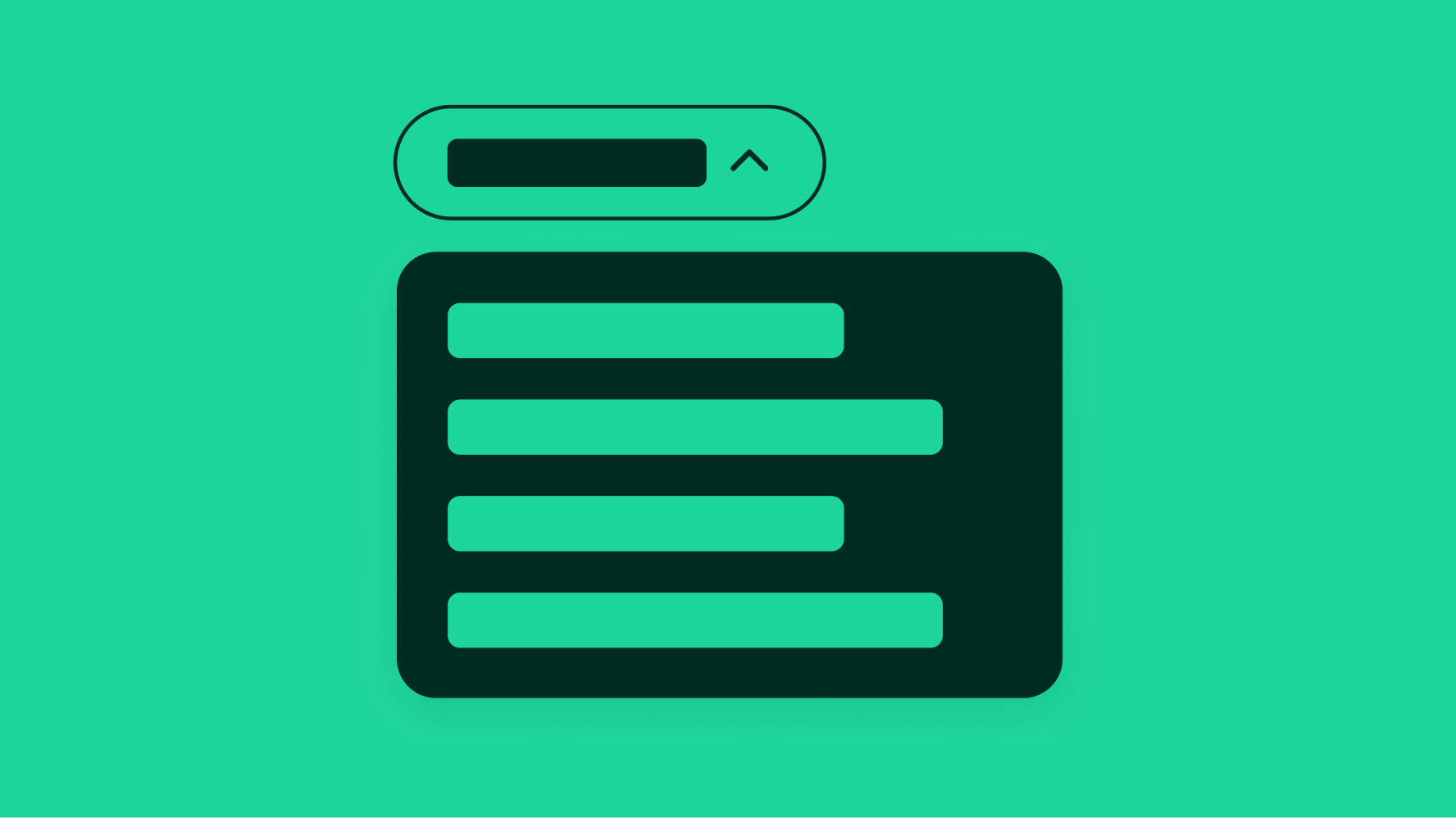
Popovers are non-modal transient containers that appear above other content. They disclose lists of choices or supplemental information.
Expanded component guidance coming soon.
This page will be updated soon with expanded guidance and clarity from Design, Platform, and Accessibility teams.
Directly relates to its trigger element, which is usually a button.
Progressively discloses additional choices or information.
The popover can contain a variety of content of varying complexity.

The header is optional for popovers without navigation. The header appears by default in child views and contains a title and back button. The title maintains the context of the previous view.

A search box is optional. Search boxes allow users to filter large lists quickly. A typeahead pattern can be used to show the match between the user’s query and the values in the list.

The footer is optional and contains up to two actions. Use the footer when there are multiple decisions within the popover that need to be explicitly submitted.
The primary button submits content and closes the popover. The secondary button cancels the decision and closes the popover.

A tip is available to create a stronger relationship between the trigger element and the popover. A tip is recommended when the trigger element may be ambiguous or unclear due to surrounding content.

Popovers appear after interacting with another UI element, typically a button.

Popovers can be dismissed multiple ways:

Scrolling is enabled whenever content extends beyond the popover container.

Popovers use push navigation when navigating to a child view. The new content will replace the primary view and a title with a back action will appear at the top of the popover. List items in a child view will indent further to align with the title.

A popover is launched when focusing on and selecting the trigger element using the ENTER or SPACE key. The ESCAPE key can be pressed at any time within the popover to collapse it and return focus to the trigger element.

Popover menus transition to bottom sheets on compact screens. However, iOS can use the native context menu for short action lists where appropriate.


Larger screens use popovers for menus, filters, tips, and other views.


