Badge

v1.5.0

A badge is a visual indicator that notifies users of numeric values.

  • Skin
  • CoreUI
  • React

Considerations

Noticeable

Badges stand out from the surrounding UI to highlight important information.

Minimal

Badges are just loud enough—easily noticed but not distracting.

Global

A badge tracks notifications globally across the experience.

Anatomy

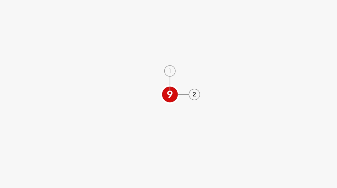
Number 1 points to the text label which in this case has a placeholder of “9”. Number 2 points to the container which is a red circle with a white outline.
  1. Label
  2. Container

Properties

Labels

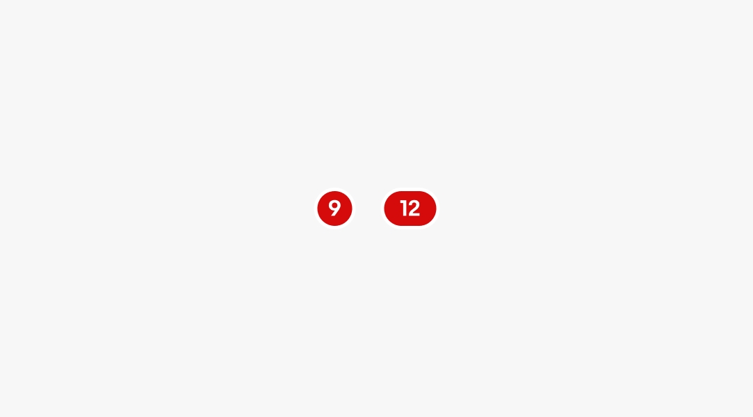
Labels are required to indicate the number of notifications available.

A red circular container with a label of “9” next to a container with a label of “12”. The “12” version resembles a pill shape.

Size

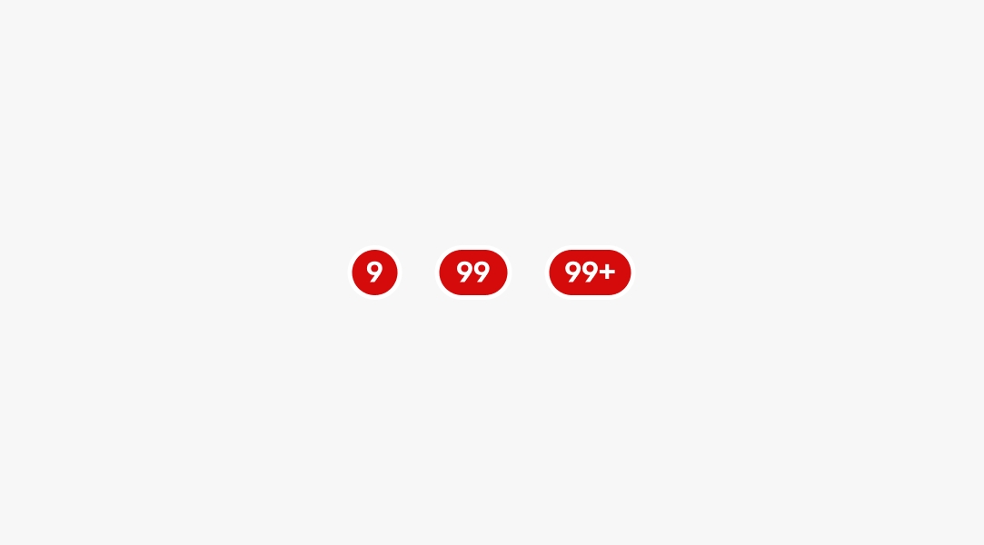
There are 3 sizes available to fit values in the ones, tens, and hundreds values.

Red circular containers with the labels “9”, “99”, and “99+”.

Behavior

Badges can appear in the top-right of icon buttons or inline next to text.

Icon buttons

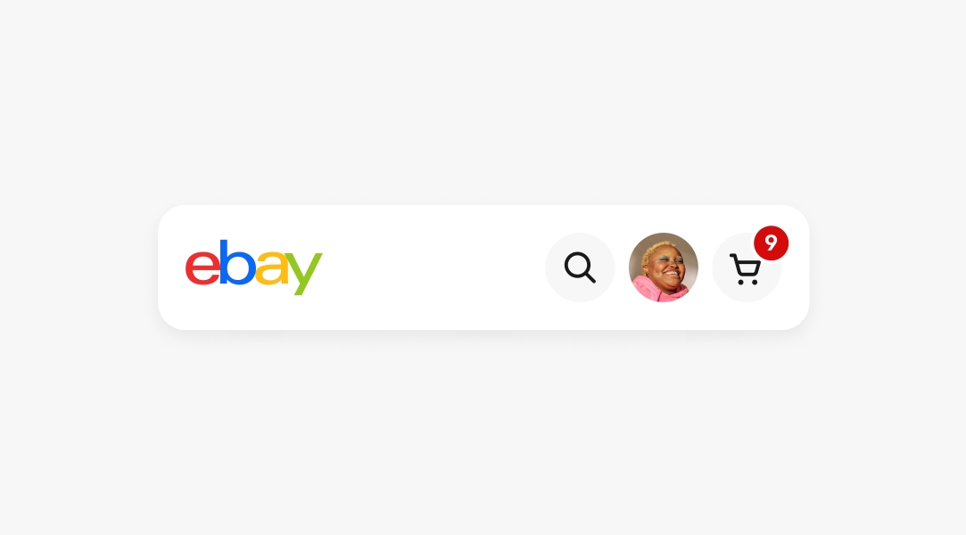
Badges are placed in the top-right quadrant of an icon button to avoid obscuring the icon within the button.

A navigation bar with a cart icon button containing a badge.

Inline

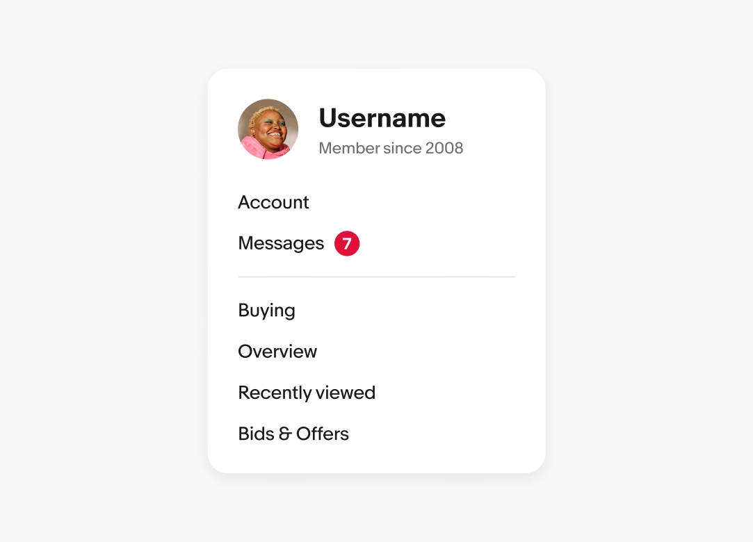
When used with text labels, badges are placed to the right and vertically aligned to the text cap height.

A popover menu with a navigation item and an inline badge next to it containing the label “7”.

Maximum

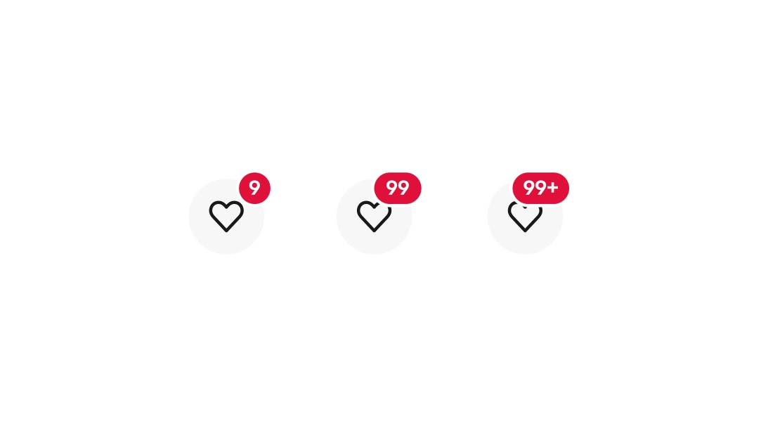
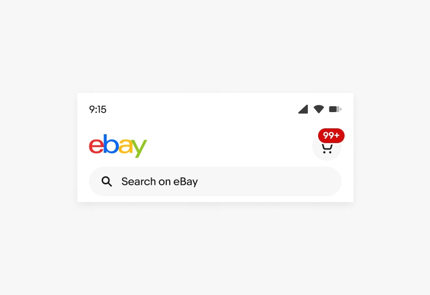
The maximum number shown is 99. When there are more than 99 notifications, a “+” will be appended to the label.

Three icon buttons with badges. From left to right the labels read “9”, “99”, and “99+”.

Screen sizes

Badges remain the same size and layout across platforms and screen sizes.

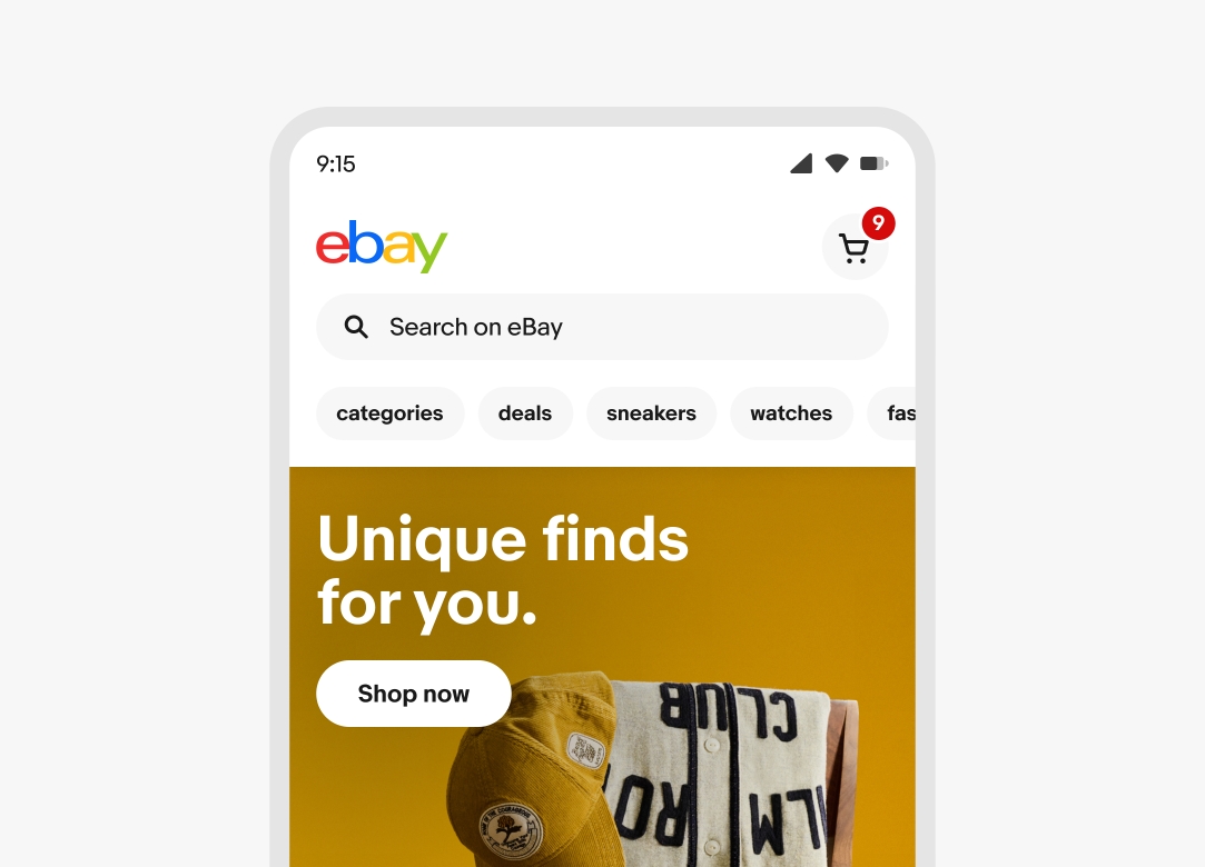
Small

A mobile layout with an icon button and badge in the top navigation.

Large

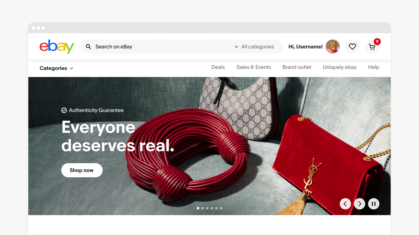
A large desktop layout with an icon button and badge in the top navigation.

Best practices

Placement

Do place badges in the top-right of icon buttons or inline to the right of a text label.
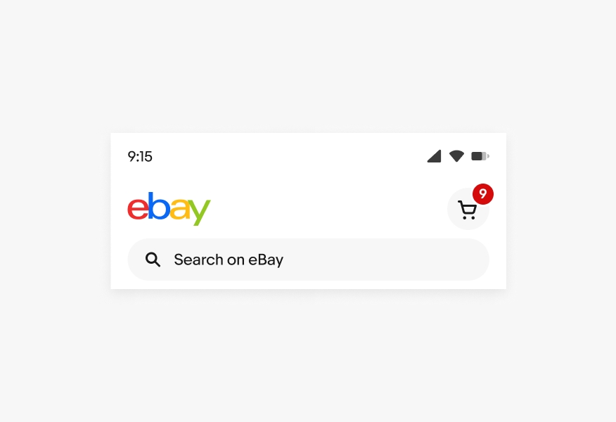
A mobile navigation with an icon button in the top right with a badge.

Don’t customize the placement of badges.
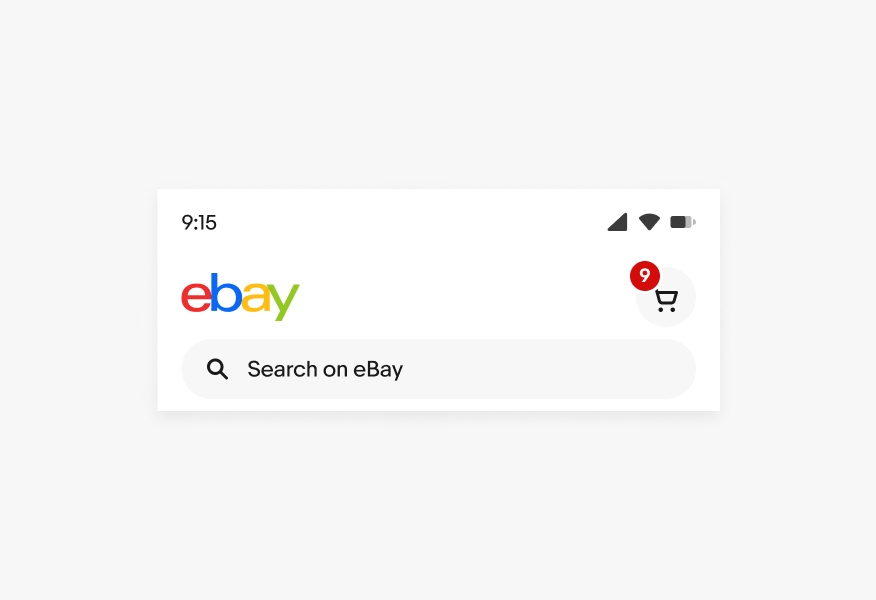
A mobile navigation with an icon button in the top right with a badge. The badge is in the left corner of the icon button.

Maximum

Do adhere to our maximum values.

A mobile navigation with an icon button in the top right with a badge. The label value is “99+” which is the max label size.

Don’t customize the badge to allow for numbers larger than 99.
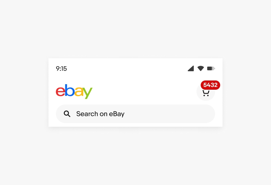
A mobile navigation with an icon button in the top right with a badge. The label value is “5432” which exceeds the max label size.

Specs

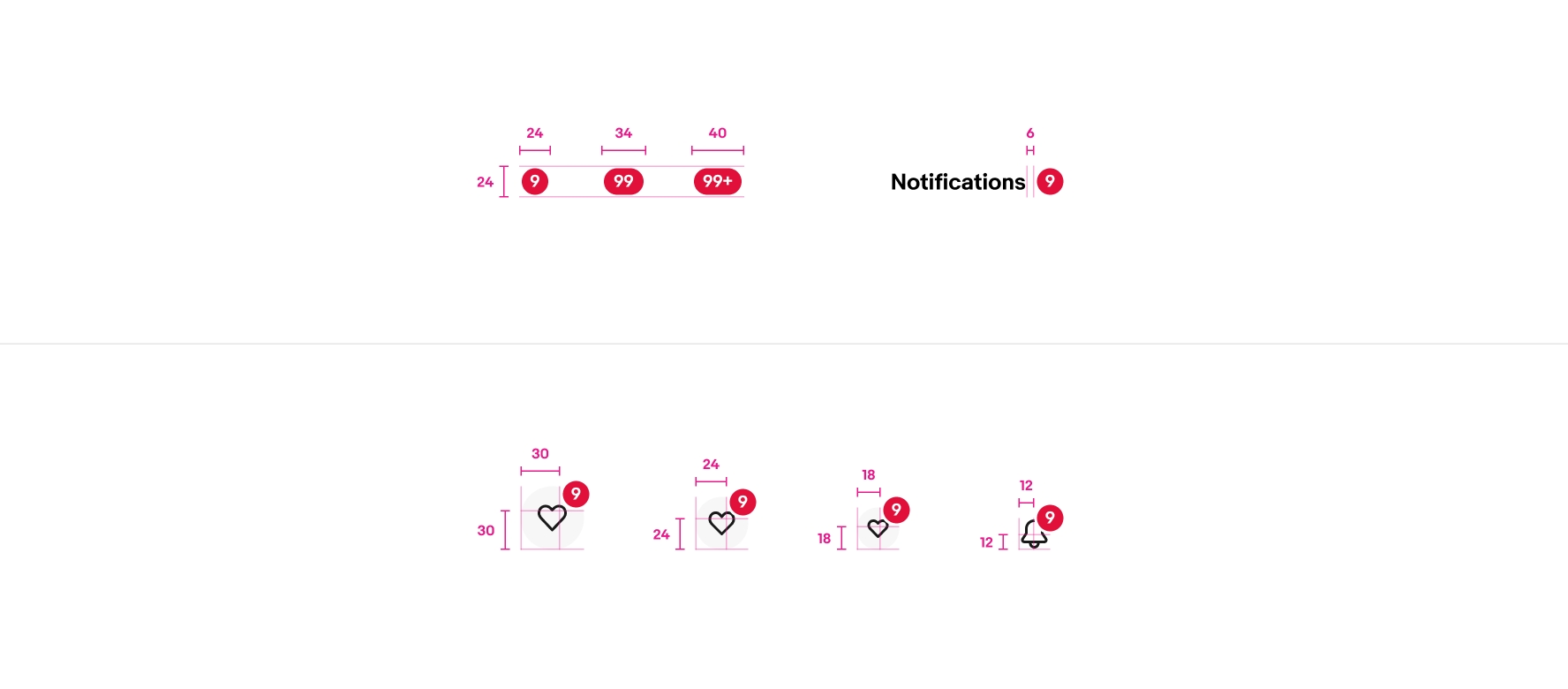
Specs for badge sizes and spacing. The top left contains a group of 3 badges that are all 24px tall. The first badge is a single-digit label of “9” and is 24px wide. The second badge is a double-digit label of “99” and is 24px wide. The third badge is a triple digit max label of “99+” and is 40px wide. The top right example contains the text “notifications” with 6px of space followed by a single-digit badge with the label of “9”. The bottom example contains 3 icon buttons with badges and 1 standalone icon with a badge. The first icon button is 48px and the badge is positioned 30px from the left and 30px from the bottom. The second icon button is 40px and the badge is positioned 24px from the left and 24px from the bottom. The third icon button is 32px and the badge is positioned 18px from the left and 18px from the bottom. The standalone icon is 24px and the badge  is positioned 12px from the left and 12px from the bottom.

Change log

VersionDateNotes
1.5.0
Jun, 2024
  • Updated to eBay Evo
1.5.0
Oct, 2022
  • Added a size property for one value, two values, or maximum
  • Updated outline to align “inside” and included outline in overall dimensions
  • Updated text box to dictate badge size
1.4.0
Sep, 2022
  • Added positioning guidance for buttons
1.3.0
Jun, 2022
  • Added dark mode version
  • Updated to use appropriate color style tokens