Do always center-align alert and confirm dialogs.
Dialogs appear in front of other content to ask for a decision or inform users of important information.

Dialogs focus the user on a single task or piece of critical information.
Dialogs are initiated by the user either explicitly or implicitly. They are not system-generated.
Dialog content is necessary and helpful for the user to complete a larger goal.
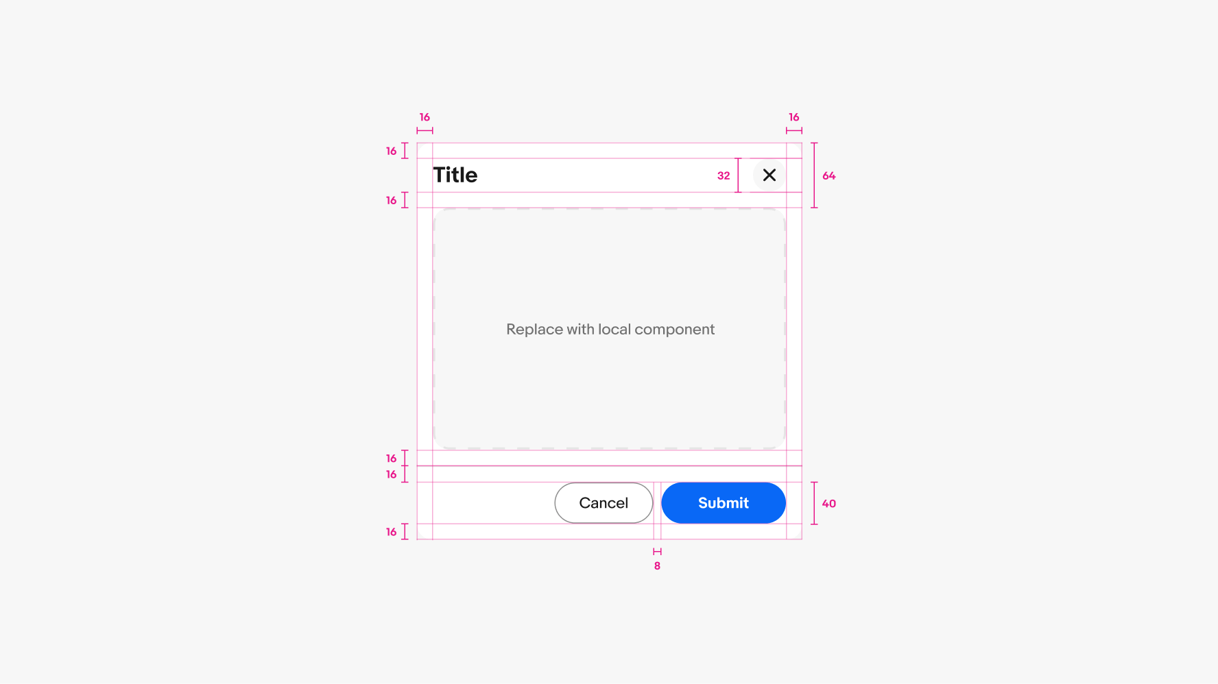
Dialog containers are designed to be flexible to account for a wide variety of content types. The container adjusts to fit its content up to its maximum height.
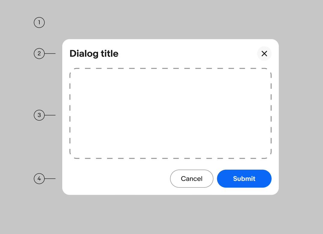
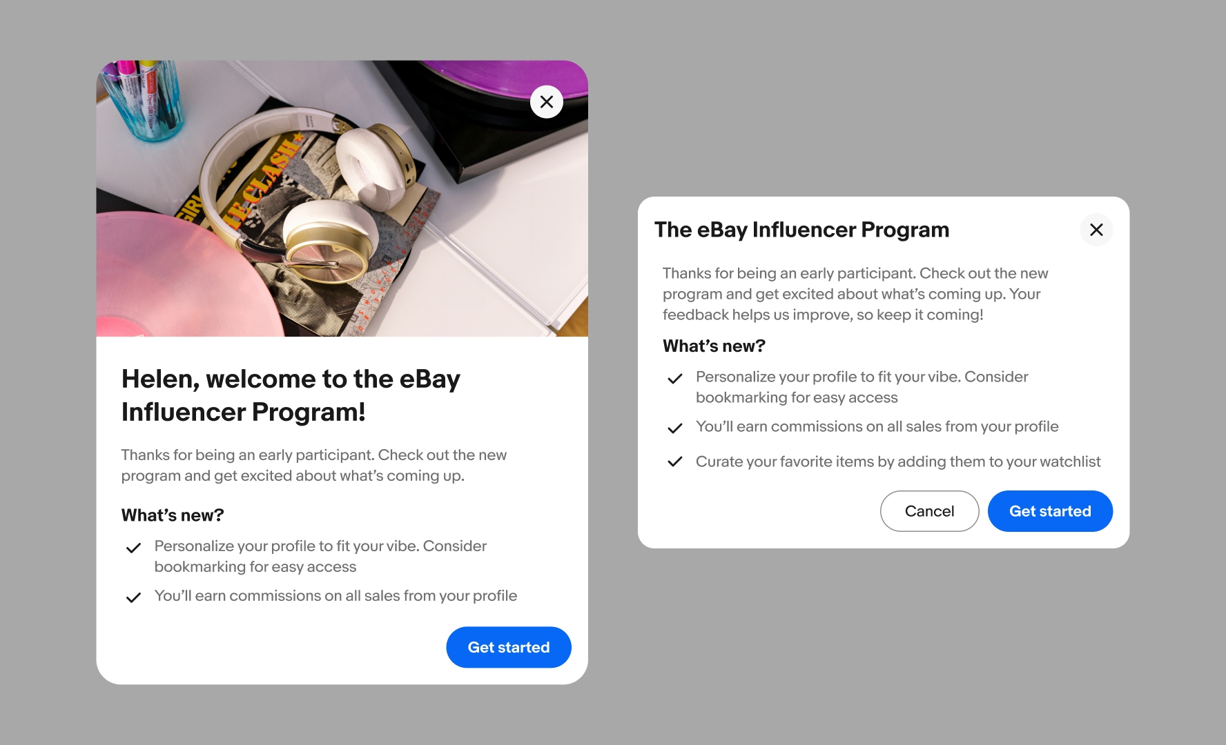
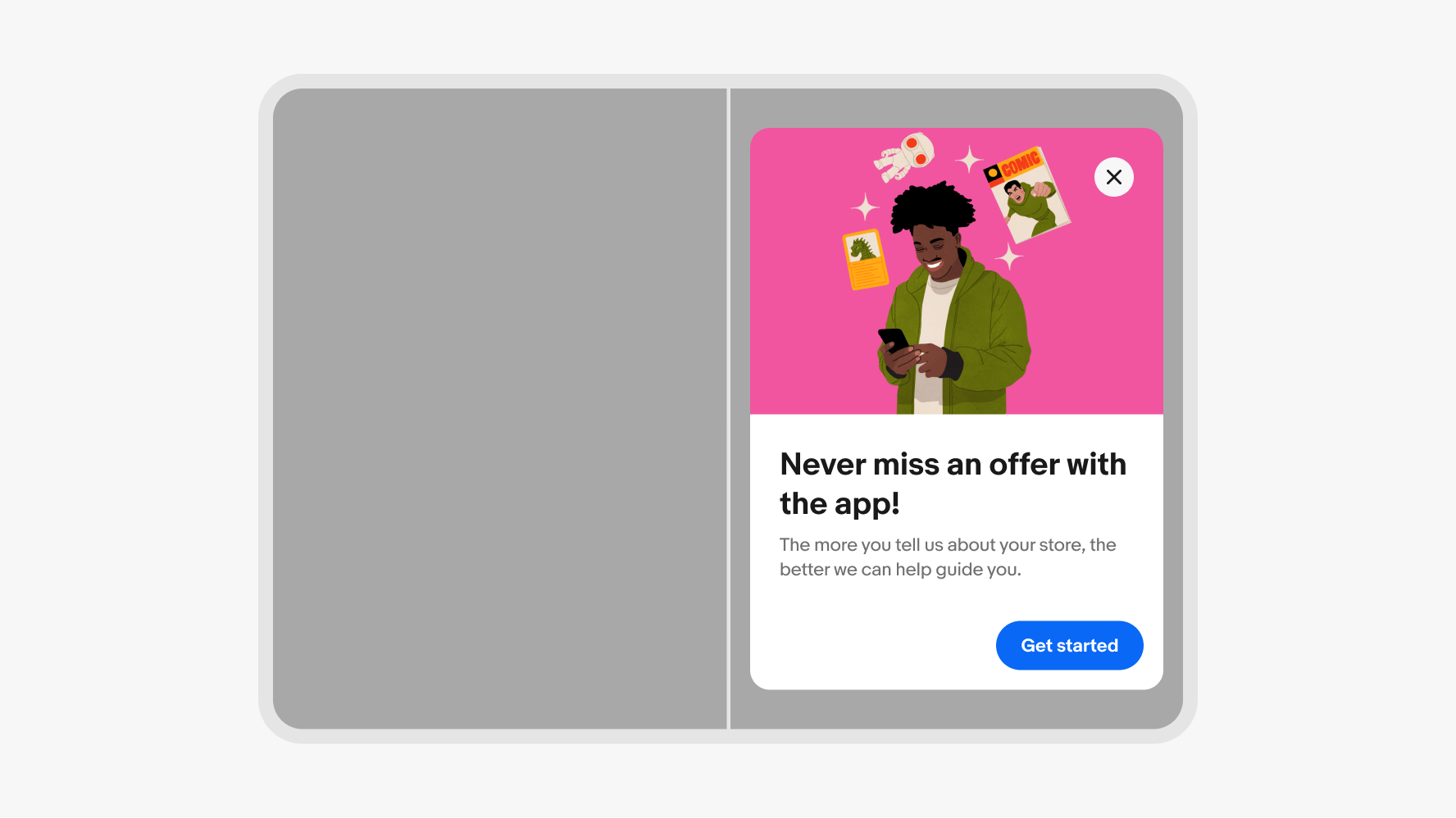
A header is required and provides two layout options: standard and image. The image variant moves the title downwards and increases the overall padding of the dialog. Use the image header for expressive messaging.
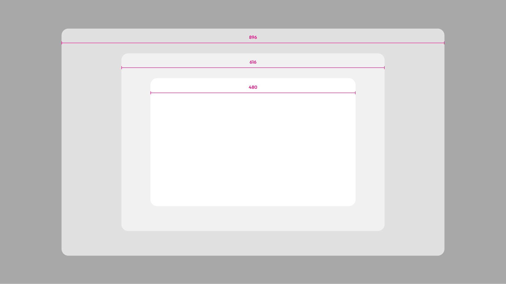
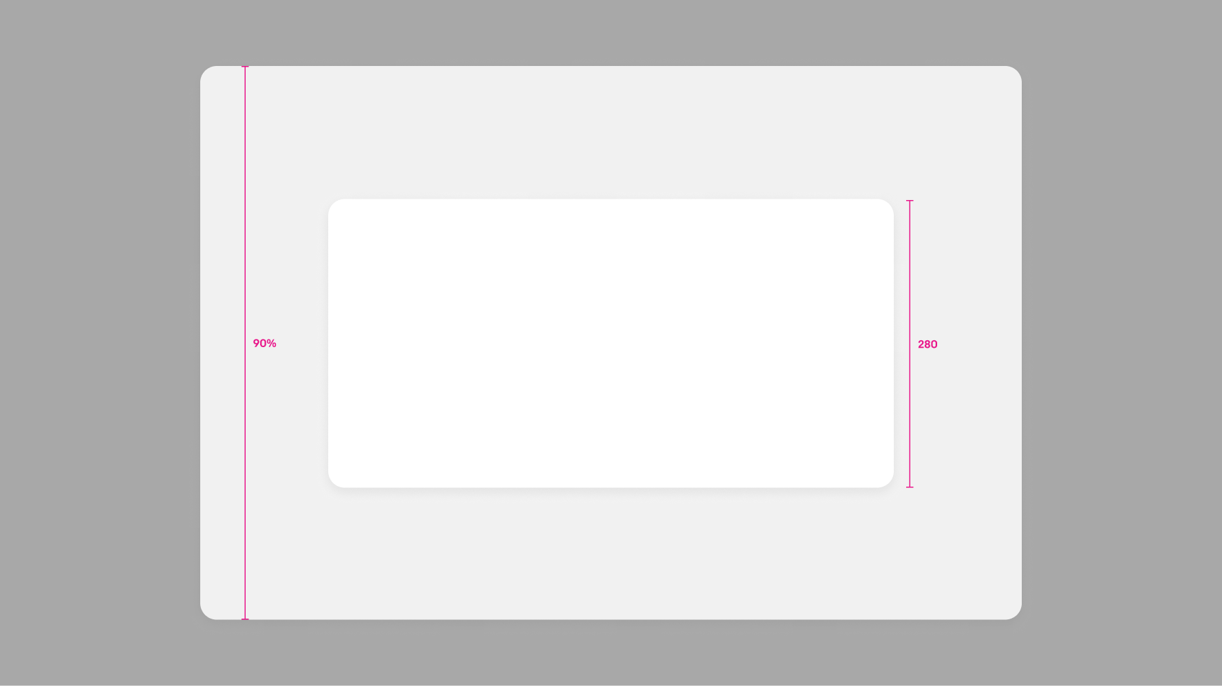
There are 3 sizes available for dialogs: narrow (480px), regular (616px), and wide (896px). The maximum width of dialogs is 100% of the grid width.
There are three types of dialogs available depending on the type of decision and number of actions present.
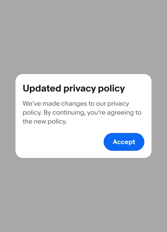
Alert dialogs require the user’s attention. They are usually presented by the system, not an explicit user action, so they are highly disruptive. Alerts have a single action and can only be dismissed through the action.
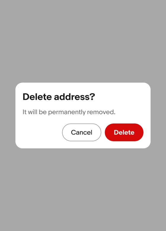
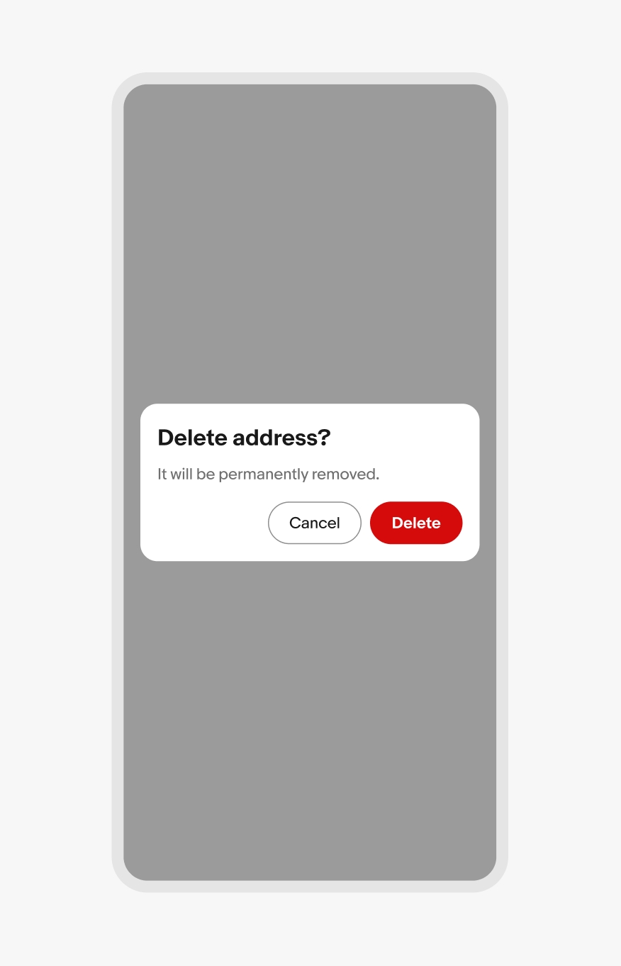
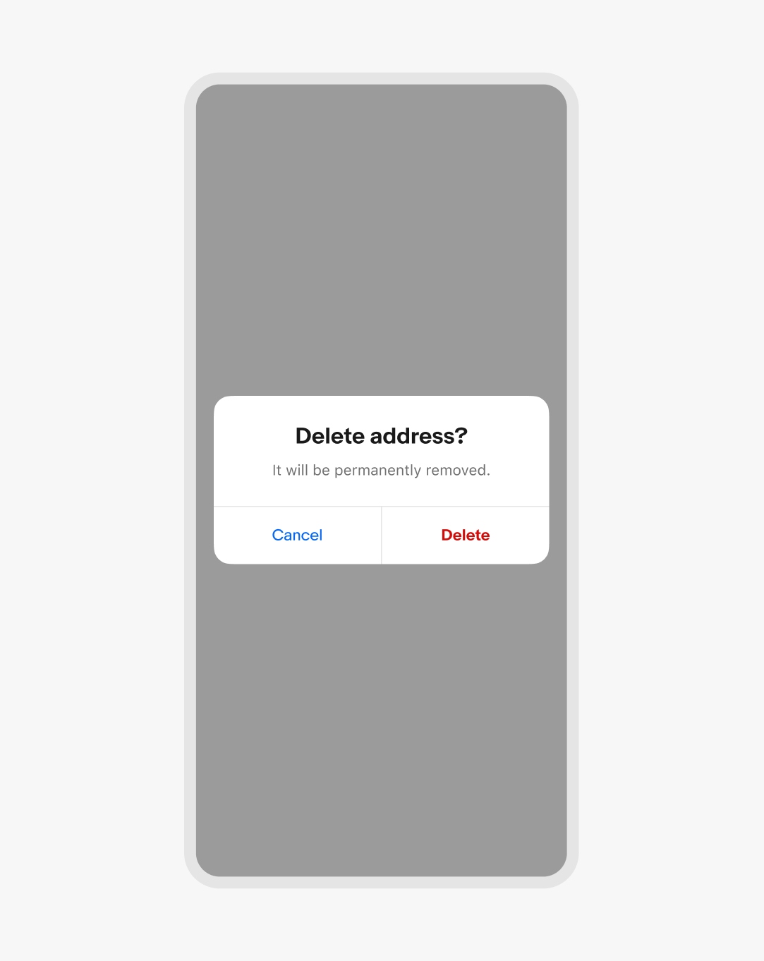
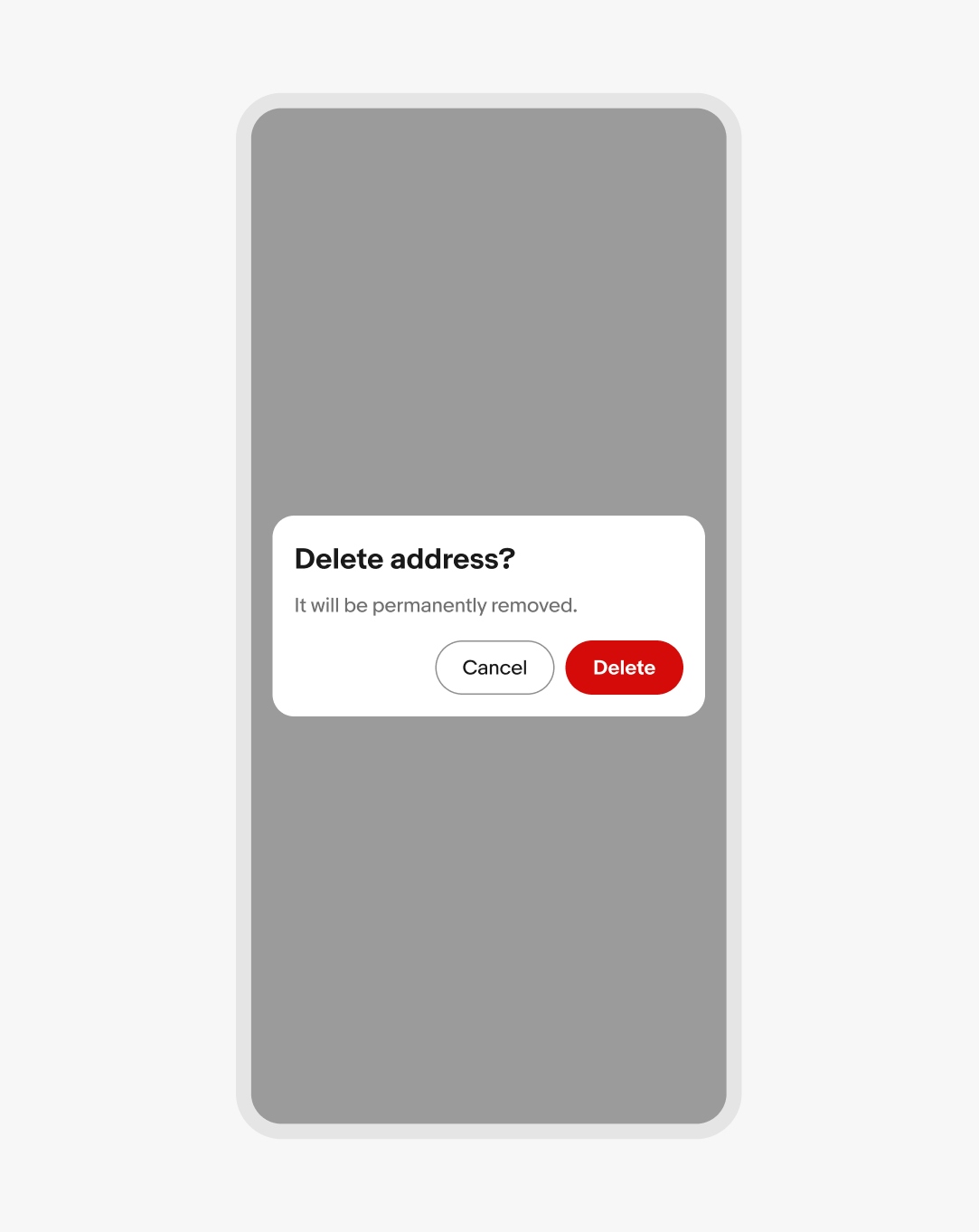
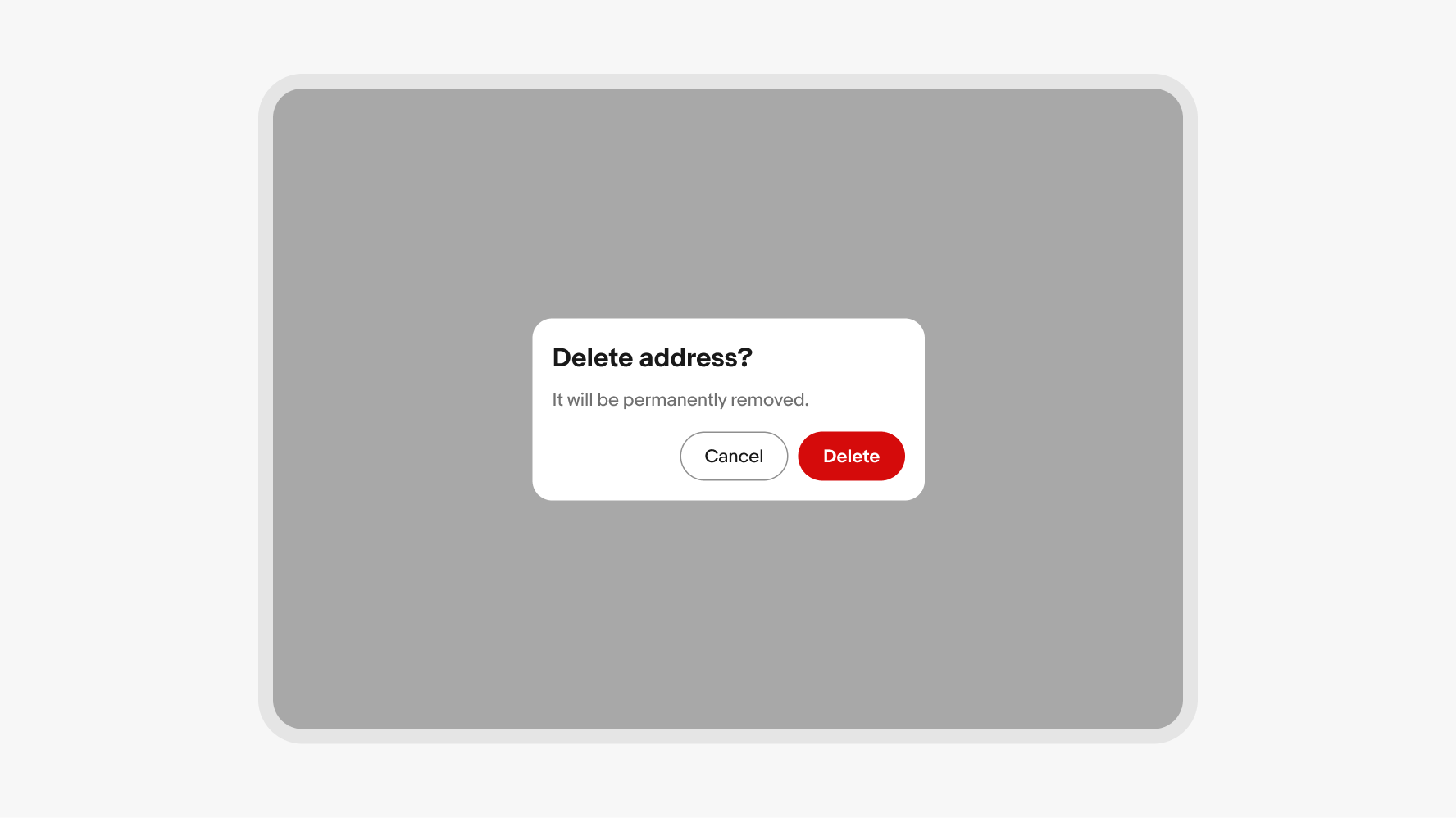
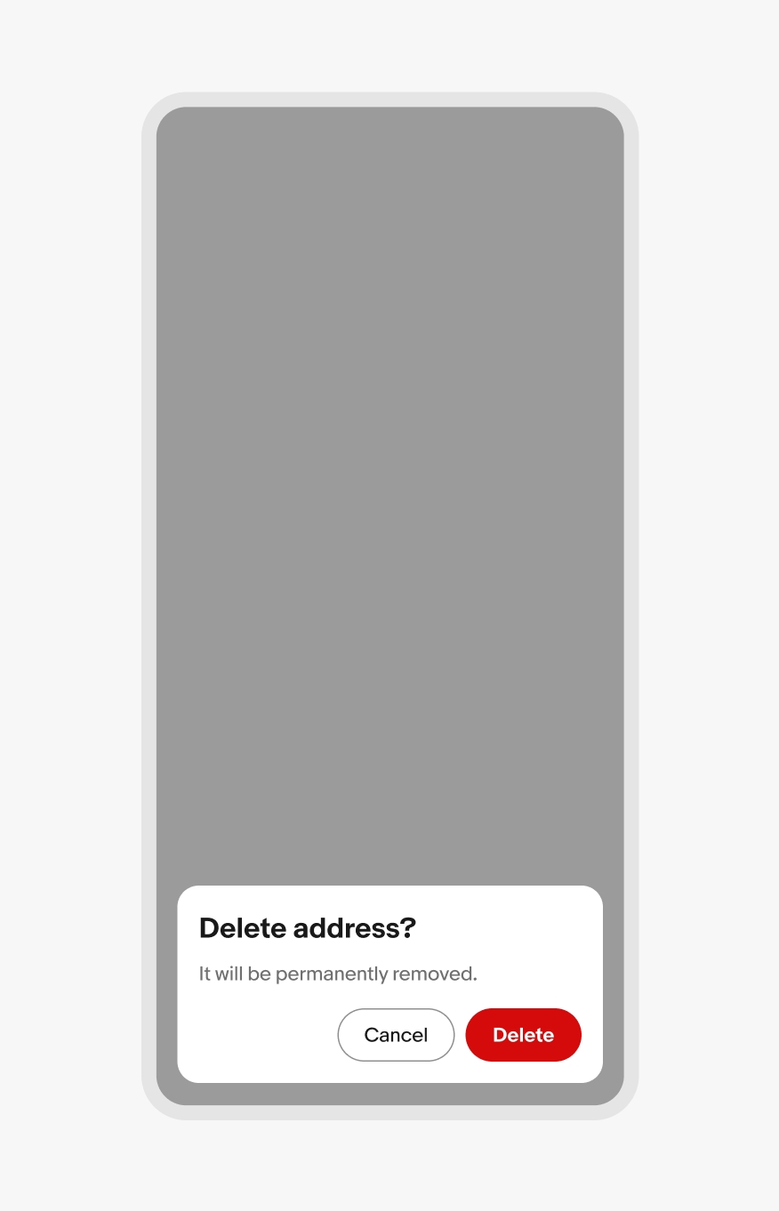
Confirm dialogs inform users of a decision’s impact. These dialogs present two actions and are dismissed by interacting with one of them.
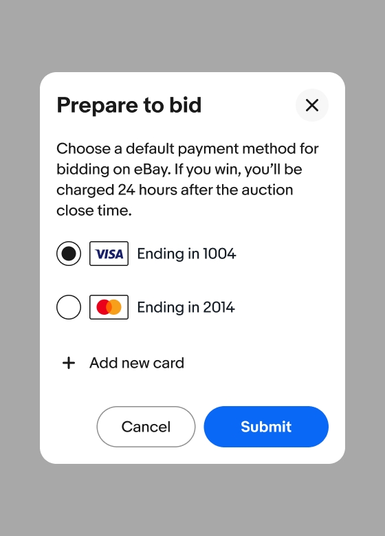
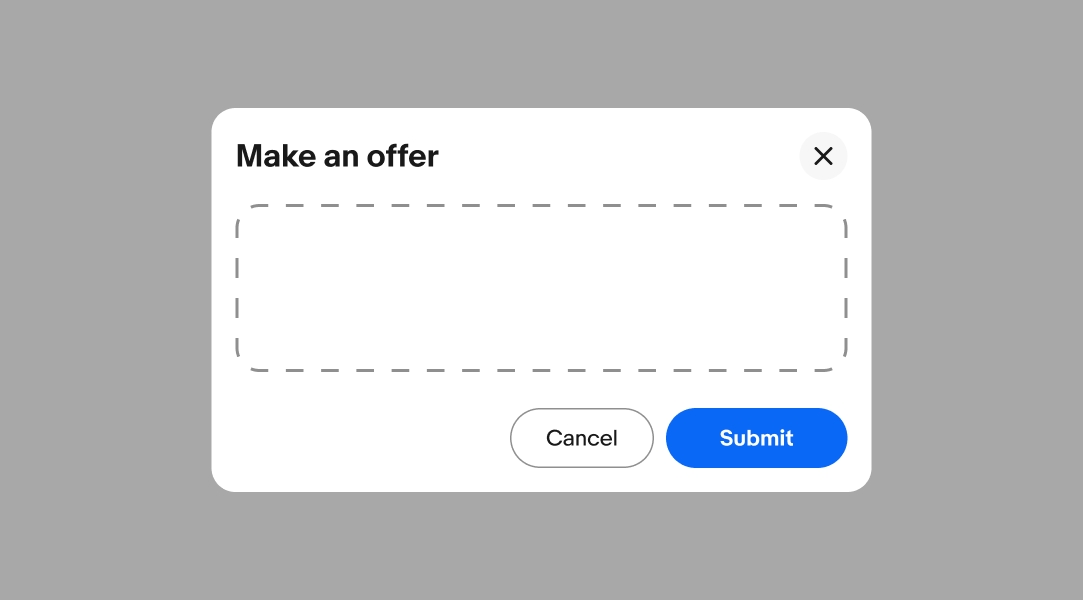
Task dialogs request users to complete a focused task or provide more information related to an element on the main page. The content can vary depending on use case, like form fields to update an item in a table or additional information about a program. Task dialogs have a close button in the header to allow users to dismiss the dialog at any time without a decision.
A dialog’s height defaults to fit its content. The maximum height of a dialog is 90% of the screen height and the minimum height is 280px.
The scrim blocks interactions with the main page to focus the user on the task or message within the dialog. All dialogs are modal, so the scrim is automatically applied. Learn more about scrim tokens.
Use a popover for situations that don’t require modality.

High-priority alert and confirm dialogs requiring an action are centered on native screens.
All other dialogs are full screen overlays or form sheets.

iOS form sheet

Android full screen overlay
High-priority alert and confirm dialogs requiring an action are centered on small web screens.
Dialogs are full screen or bottom inset sheets, depending on the amount of content within the dialog.

Web bottom inset sheet

Web full screen overlay
Dialogs default to centered on larger screens. The dialog can be offset to the left or right on large-format foldable devices.
Centered alert dialog

Centered sheet dialog
Offset sheet dialog on foldable device
Do always center-align alert and confirm dialogs.
Don’t bottom-align alert and confirm dialogs.
Focus the content on a single subtask with simple interactions and decisions.
Avoid overloading modals with complex interactions and decisions. This can overwhelm and confuse users. Use a new page if the content cannot be simplified.
Dialogs lie above all main page content.

Dialogs should not trigger other dialogs. This quickly becomes inaccessible and confusing. Links within modals should open in a new tab or dismiss the modal before navigating.

Do keep dialog content focused and short and avoid scrolling behavior when possible.

Consider using a page if the content extends far beyond the dialog container and includes complex interactions.

Content should only scroll vertically if it extends beyond the dialog window.

Avoid content that scrolls horizontally within a dialog.

Task dialog
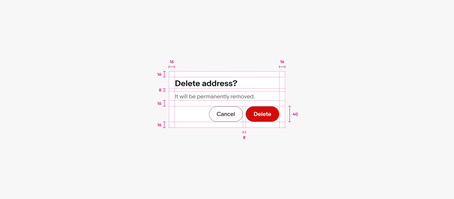
Confirm dialog