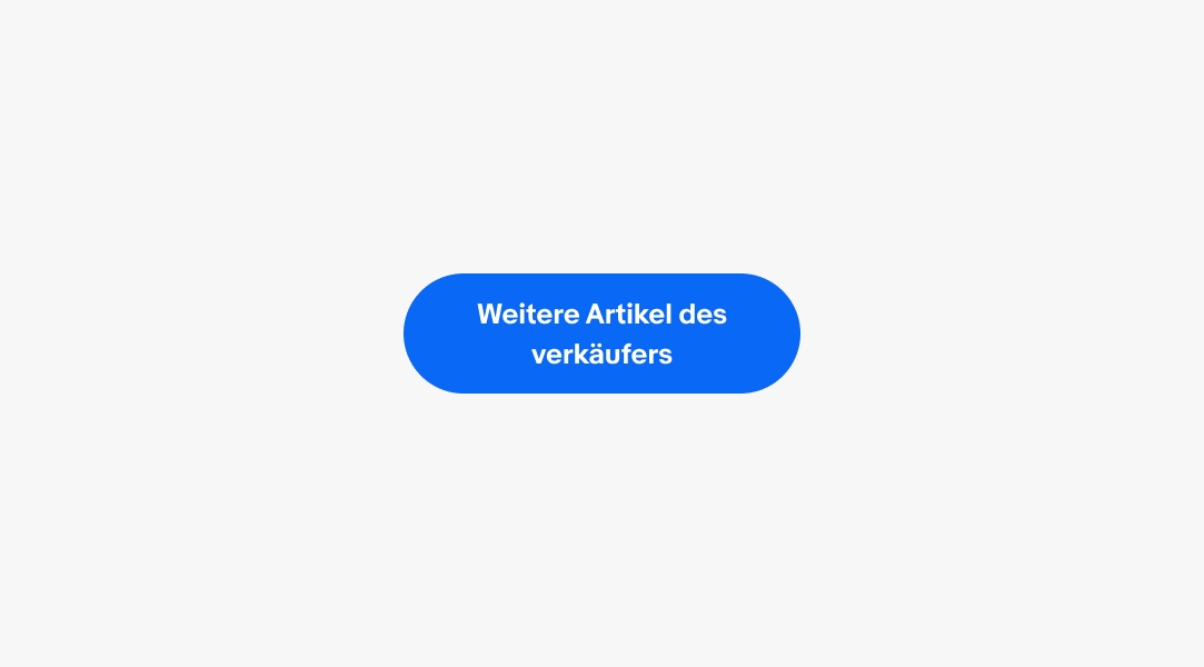
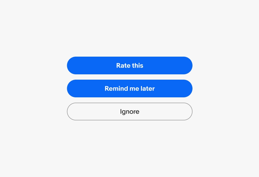
Only use 1 primary button per screen. Use secondary, tertiary, or text buttons for other actions.

CTA buttons present the primary actions within a flow to help guide users through experiences.
Buttons communicate the importance of the actions on a screen.
Buttons appear in consistent places throughout the experience.
Labels are short and express the action that will occur when pressed.
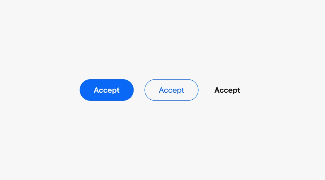
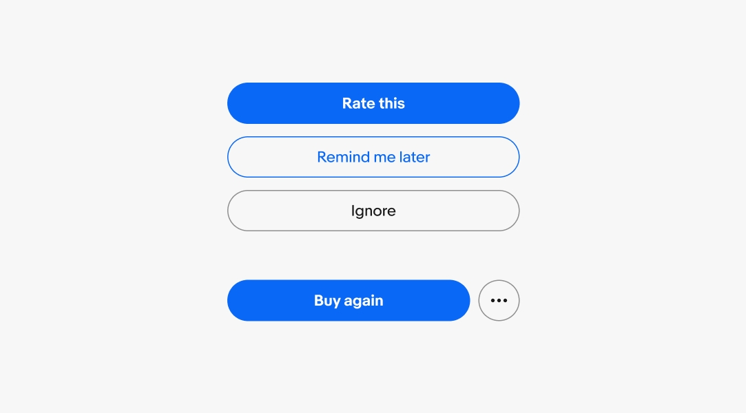
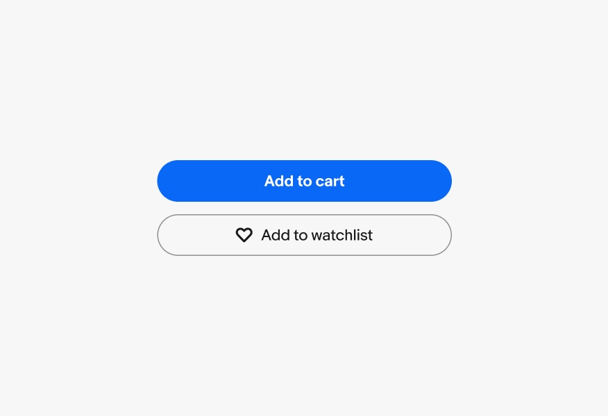
Primary buttons represent the most important action on a page. They guide users to the next step in completing a task. There should only be a single primary action per screen.
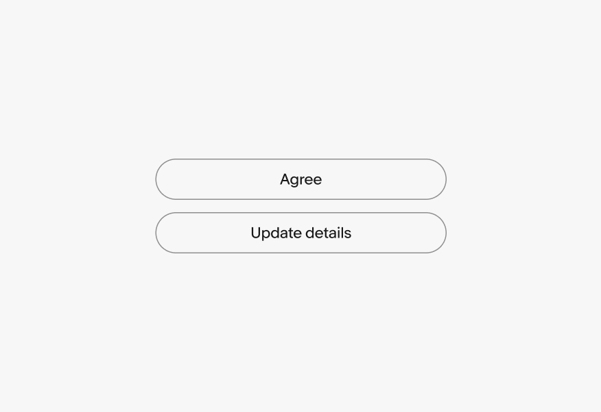
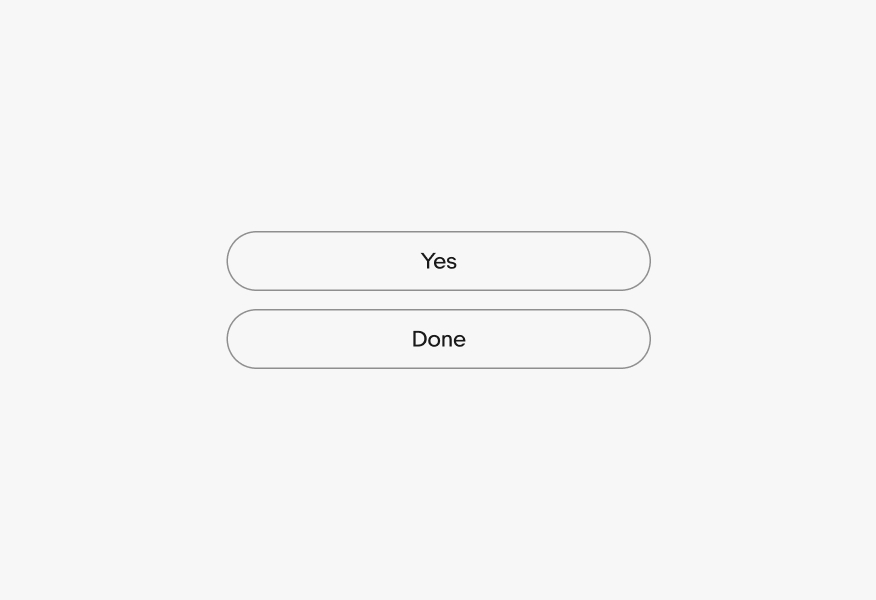
Secondary buttons have less visual weight and are used for non-primary actions. Avoid using them in isolation or as primary positive actions that progress an experience.
Tertiary buttons are for low-priority actions. They can be used in isolation or paired with a primary button for increased contrast. These actions usually supplement a primary task.
Borderless buttons represent lower-priority actions. They are used within other components as optional actions or within button groups.
Use default buttons for routine, safe actions. They are used for tasks like "Accept," "Save," "Next," or "Cancel." These buttons are suitable for non-critical operations that do not lead to significant changes or data loss, ensuring a smooth user experience for regular interactions.
Use destructive buttons when an action will remove user data. Higher-impact decisions should use the bolder primary style while less-impactful decisions can use the secondary or tertiary styles.

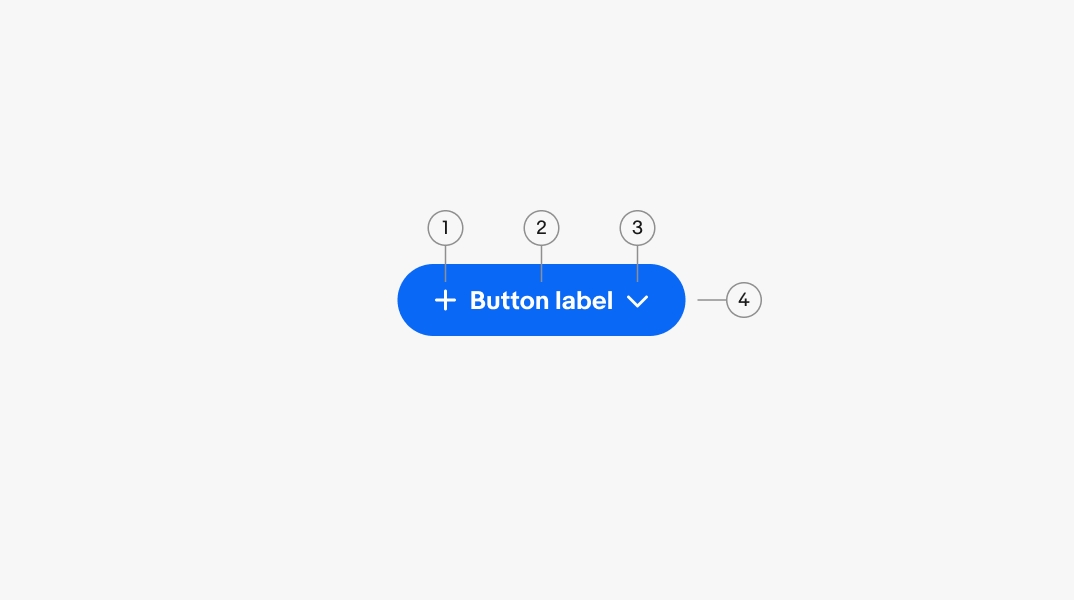
Titles use a verb + noun structure to describe what the button will do when pressed.
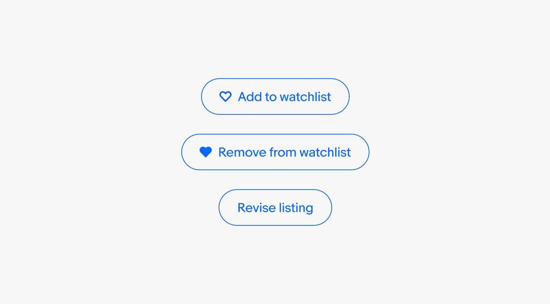
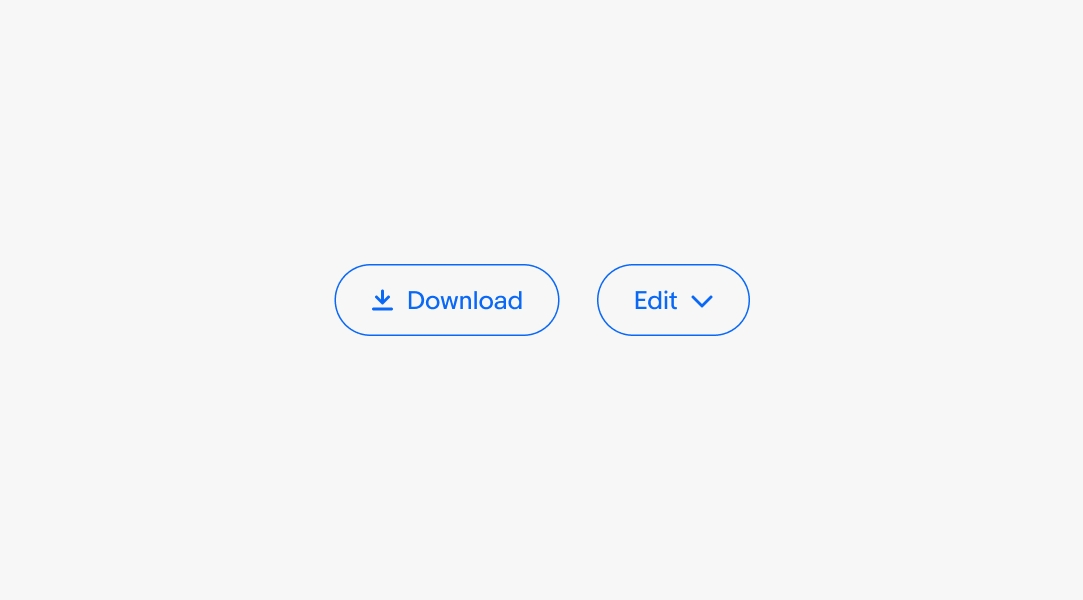
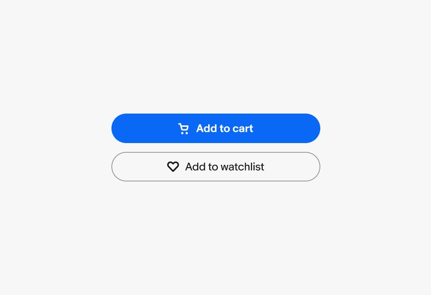
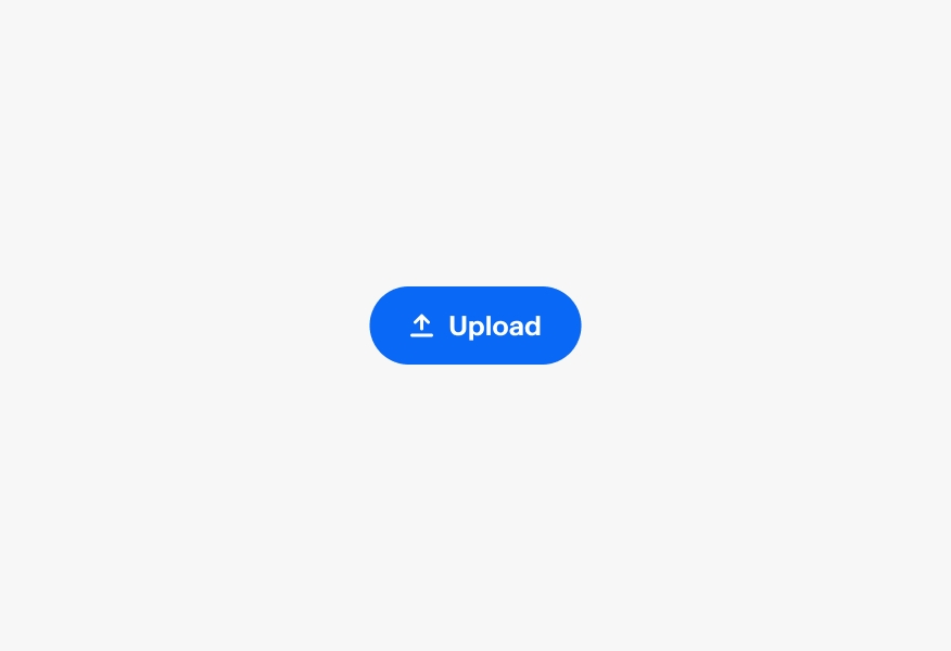
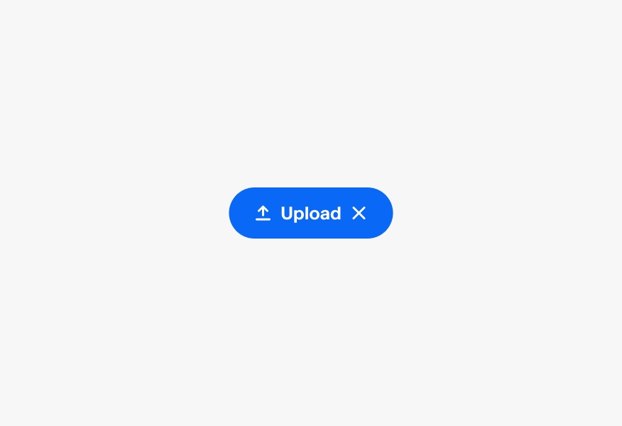
There are two icon slots available, a leading and a trailing icon. Use lead icons alongside titles to visually reinforce their meaning and draw attention.
Use trailing icons for disclosure of additional behavior, like a chevron indicating a popover menu will appear when the button is pressed.
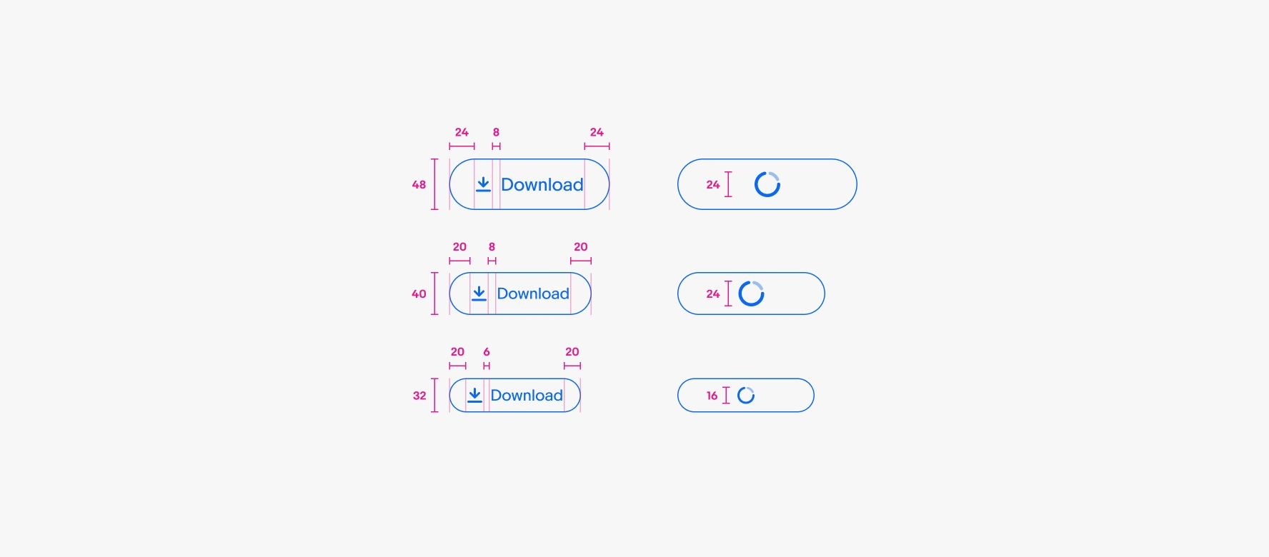
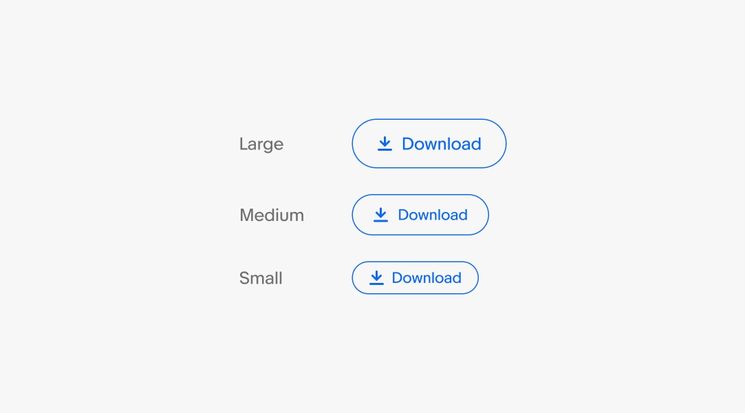
Buttons are available in small, medium, and large sizes. Large is the default size and is preferred on smaller screens.
The small size is primarily used in popover elements to provide visual balance and conserve space. However, the small size still aims for a 48x48px tap target.
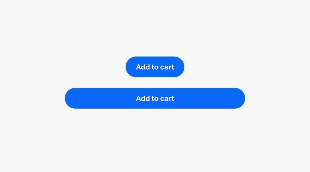
Buttons can span the width of their container or fit to their contents. For either option, buttons adhere to their minimum and maximum widths.
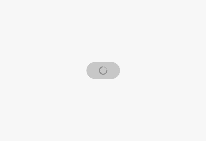
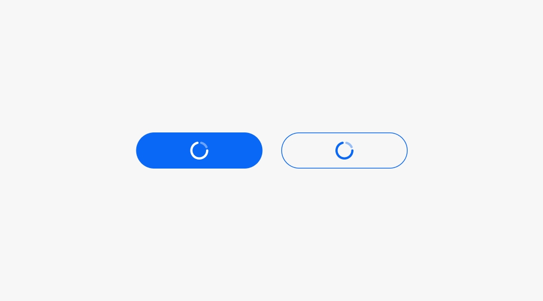
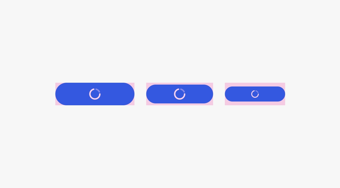
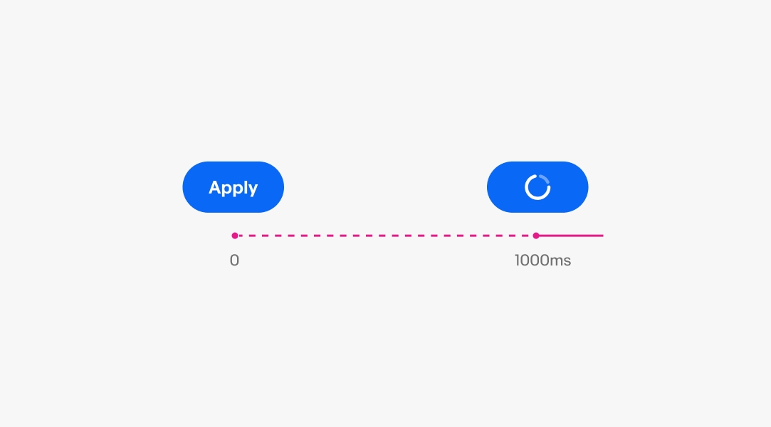
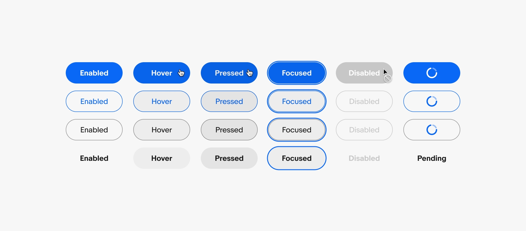
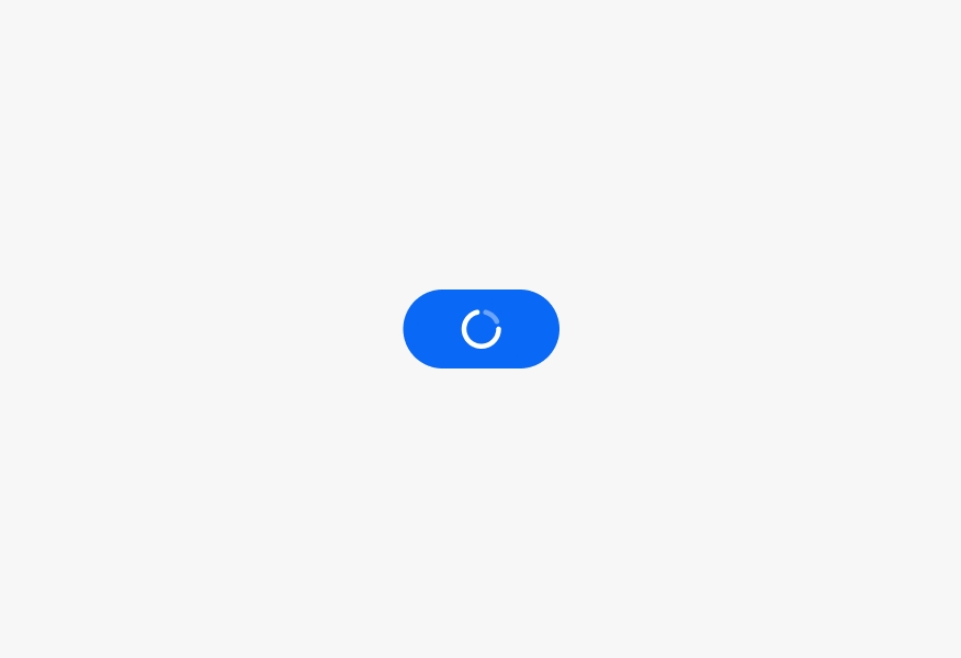
Buttons can show a pending state for actions that take longer to respond. The loading spinner replaces all content within the button and disables further interaction of the button until loading is complete. The button does not transition to a disabled (gray) state during this time.
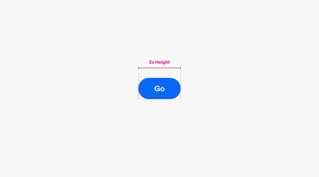
The minimum width for basic and destructive buttons is 2x the height of the button.
Split buttons have a minimum width of 4x the height of the button.
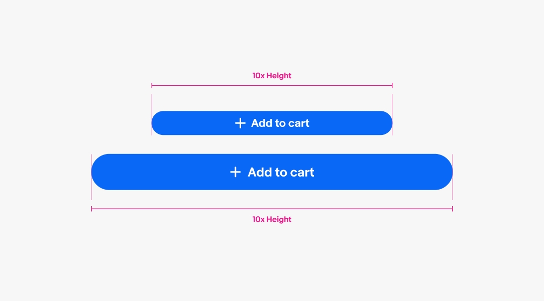
The maximum width for buttons is 10x the height of the button.
The recommended minimum tap target for buttons is 48x48.
Titles that extend beyond the width of the button container will wrap to a new line to ensure the title remains visible for all languages.
A button group contains multiple buttons of related actions. A group can contain a single button type or a mix of CTA, destructive, link, and icon buttons.
Use a button group when nesting additional actions in an overflow icon button.
The pending state has a delay of 1000ms before the spinner appears to avoid unnecessary flickering of the spinner during quick responses.
Buttons use state layers for interaction states. The available states are enabled, hover, pressed, focused, disabled, and pending. Learn more about the state layer color values in Color tokens.
Only use 1 primary button per screen. Use secondary, tertiary, or text buttons for other actions.
Avoid more than one primary button on the screen as it reduces the clarity of what should be done next.
Labels should use verbs and indicate what will happen when the button is pressed.
Don’t use adjectives, nouns, or past tense in labels.
Use icons when it helps clarify an action.
Avoid overusing icons in buttons for decorative purposes. This adds unnecessary noise to the UI.
Do use a single icon in the leading or trailing position.
Don’t use both leading and trailing icons in the same button.
The pending state only replaces the content within the button.
Don’t override the button color when pending. This is unnecessary and renders the content visually inaccessible.