When placing icon buttons over a Secondary background, be sure to use the color.background.onSecondary color token.
Icon buttons help direct and capture user action and intent. They are compact with no visible label.
Icons used within icon buttons should be easily recognizable. Avoid ambiguous icons that could mean different things in the same context.
Each icon button on a page should be distinct. Avoid using duplicate icon buttons for the same function on a single page, except for common actions like save or overflow.
Icon buttons are helpful in dense layouts like tables and dashboards. Their smaller footprint allows for more visible actions before collapsing into overflow buttons.
Icons buttons are used to quickly identify available actions.
Common actions, like save or search, can omit titles and use the icon alone. View available icons in the Icon library.
Avoid using an icon alone when the meaning is ambiguous, unclear, or unfamiliar.
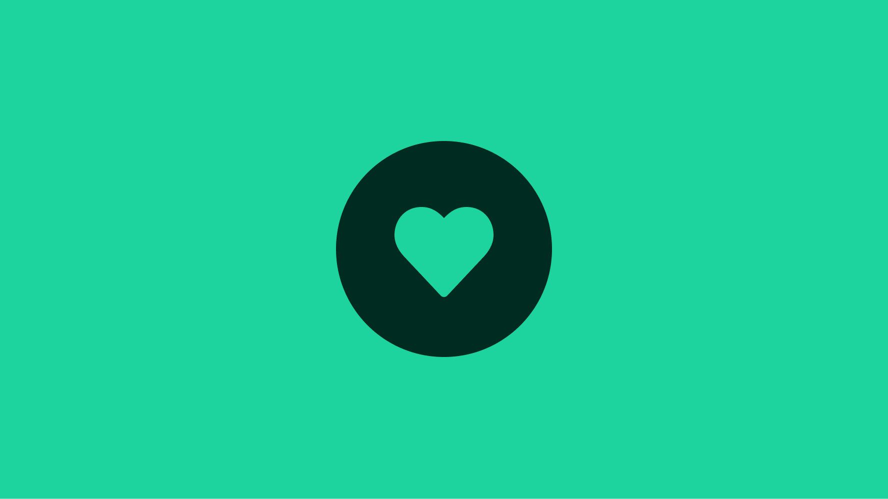
Icon buttons need to remain visible against their background. There are onSecondary and onElevated fill variants that help maintain that subtle contrast against the background. Learn more about background colors on the Color tokens page.
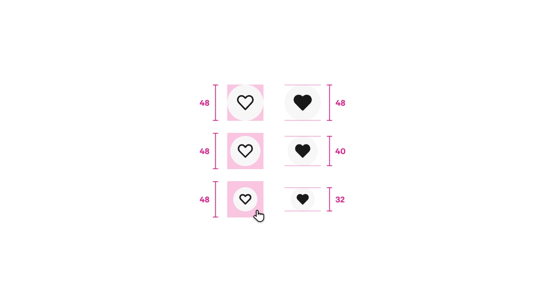
Buttons are available in small, medium, and large sizes. Small and medium sizes are used the most across smaller screens.
The small size is primarily used in popover elements and placed over images on item tiles to provide visual balance and conserve space. However, the small size still aims for a 48x48px tap target.
Buttons can swap icons based on data states. There are several icons within our library that have a “Filled” counterpart to indicate whether a state is toggled on. The “Outlined” version indicates it is toggled off.
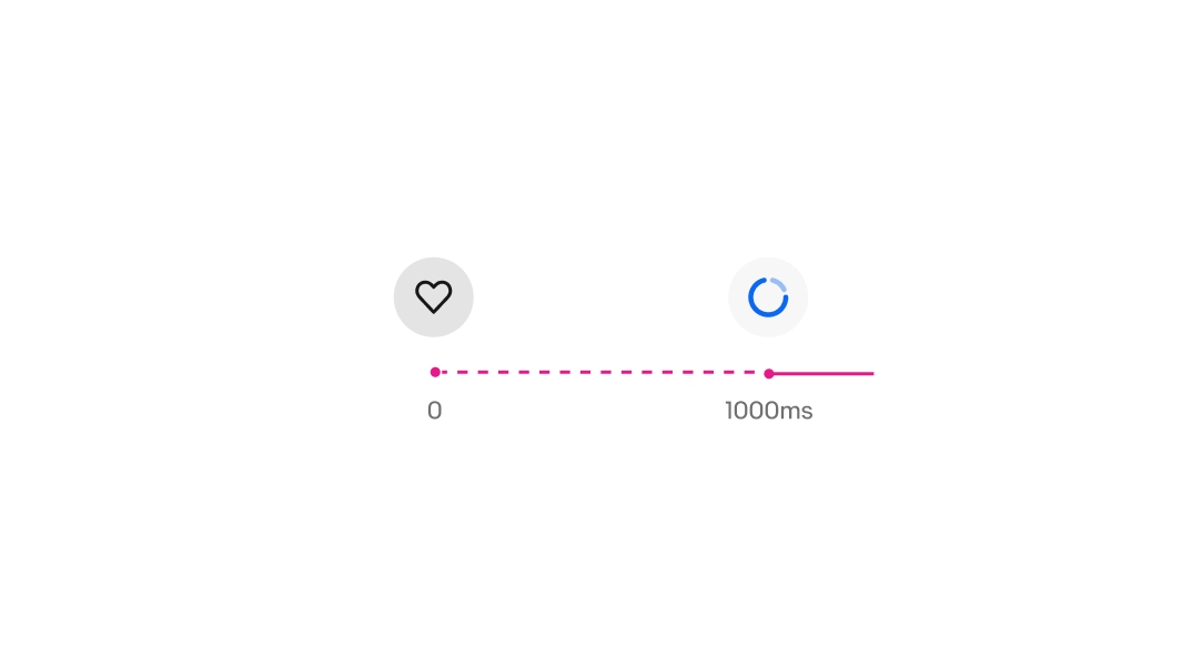
Buttons can show a pending state for actions that take longer to respond. The loading spinner replaces all content within the button and disables further interaction of the button until loading is complete. The button does not transition to a disabled (grey) state during this time.
This can significantly impact the user experience and expected timeframe of your interaction. Work with your development team to reduce lag time between states to avoid these pending states.
The recommended minimum accessibility tap target for buttons is 48x48.
Icon buttons reveal the label in a tooltip on hover or long-press.
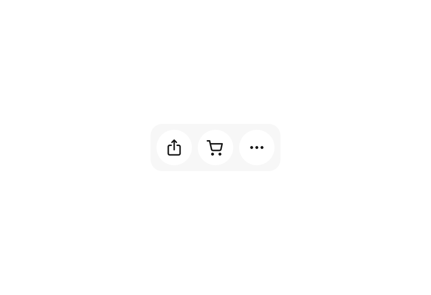
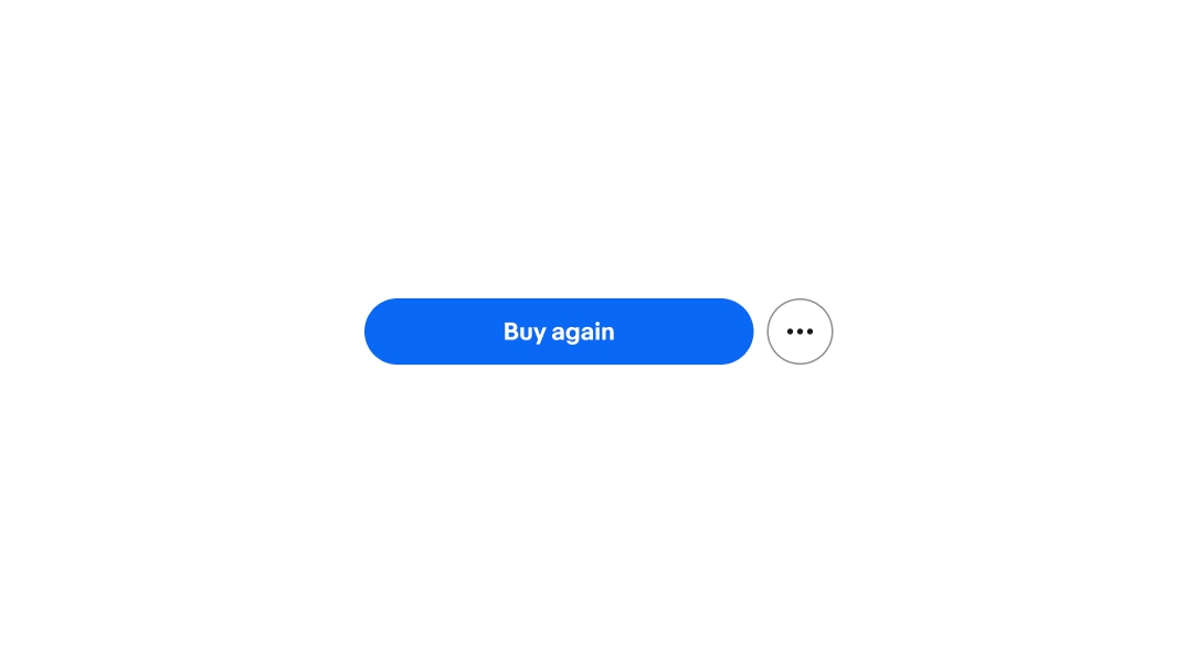
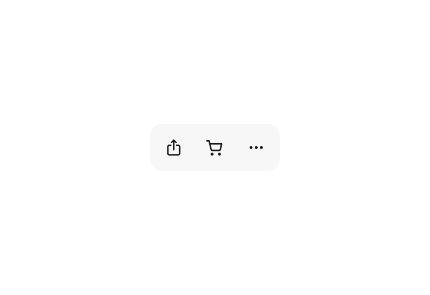
A button group contains multiple buttons of related actions. A group can contain a single button type or a mix of CTA, destructive, link, and/or icon buttons.
Additional actions can be nested under an icon button at the end of a button group.
The pending state has a delay of 1000ms before the spinner appears to avoid unnecessary flickering of the spinner during quick responses.
While pending states are currently supported for icon buttons, we want to have as little latency for quick actions as possible. An end user should almost never see this state if the experience is properly optimizing for user interaction.
Buttons use interactive state layers for states. The available states are enabled, hover, pressed, focused, disabled, and pending. Learn more about the state layer color values in Color tokens.
When placing icon buttons over a Secondary background, be sure to use the color.background.onSecondary color token.
Don’t place an icon button on a Secondary background without using the color.background.onSecondary color token. If the background isn’t changed, the circle will disappear.