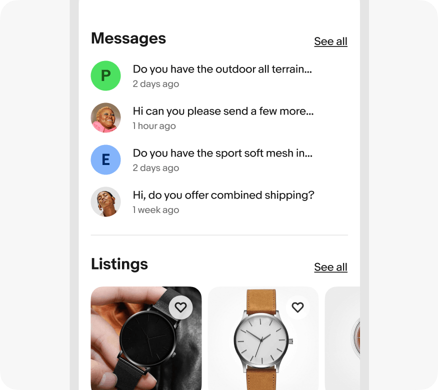
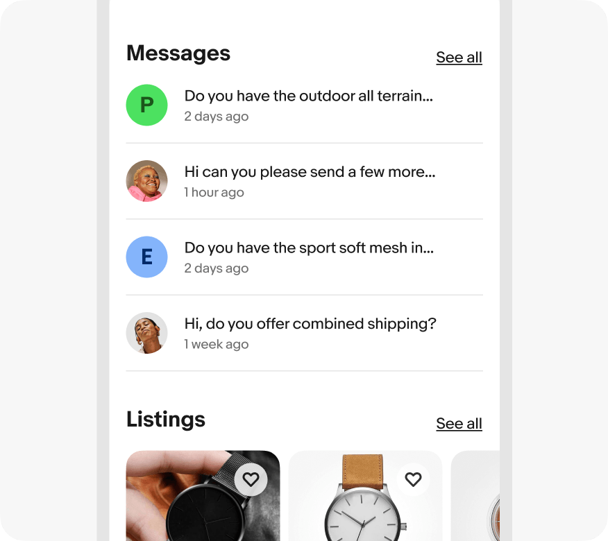
Do use dividers to separate groups of similar content.
Dividers break up and group content on the page.

Dividers separate groups of content when white space isn’t clear enough.
Dividers are just noticeable enough to be effective and not interruptive.
Dividers are used sparingly to group content, not separate multiple list items.
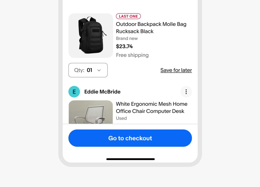
Inset dividers divide groups of related content. They can also be used to provide structure to tappable cells. They should match the inset level of content.

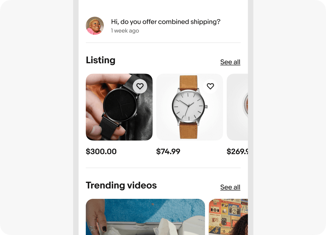
Use full-width dividers to separate distinct sections of content. They can also be used instead of drop shadows to imply elevation for fixed elements.
Dividers are used to separate list groups and not individual list items. This is especially helpful when content in adjacent lists are similar.
Elements that overlay on top of other content, like fixed navigation or fixed actions, use a full-width divider to provide a stronger sense of separation.

Do use dividers to separate groups of similar content.
Don’t use dividers to separate individual items within a list.
Do use full-width dividers for elevated UI elements.
Don’t use inset dividers for content that overlaps other content.

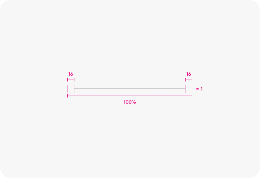
Inset divider
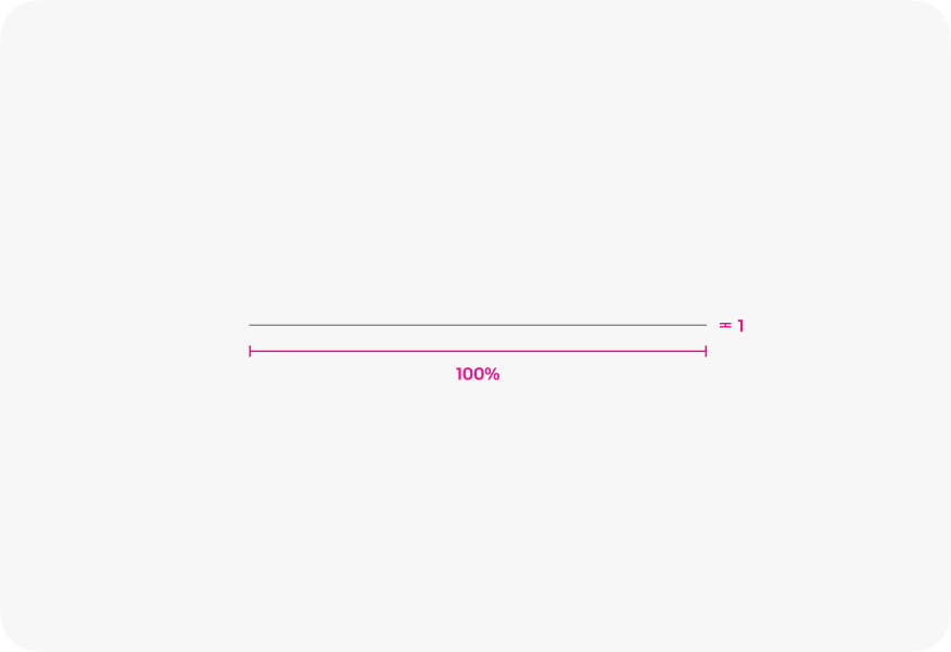
Full-width divider