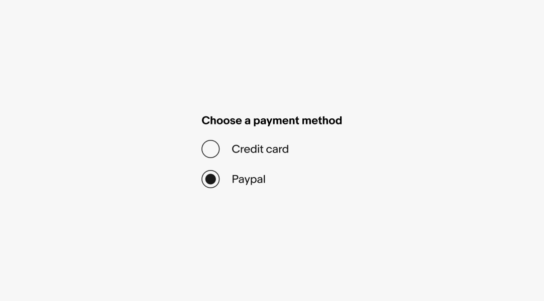
Radio buttons should only be used when a single element can be selected.
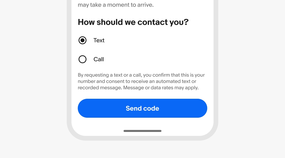
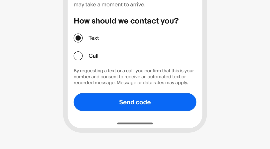
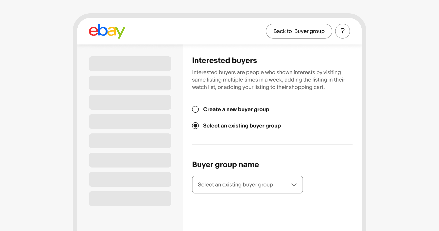
Radio buttons allow the user to select one option from a set. Only one can be selected at a time.

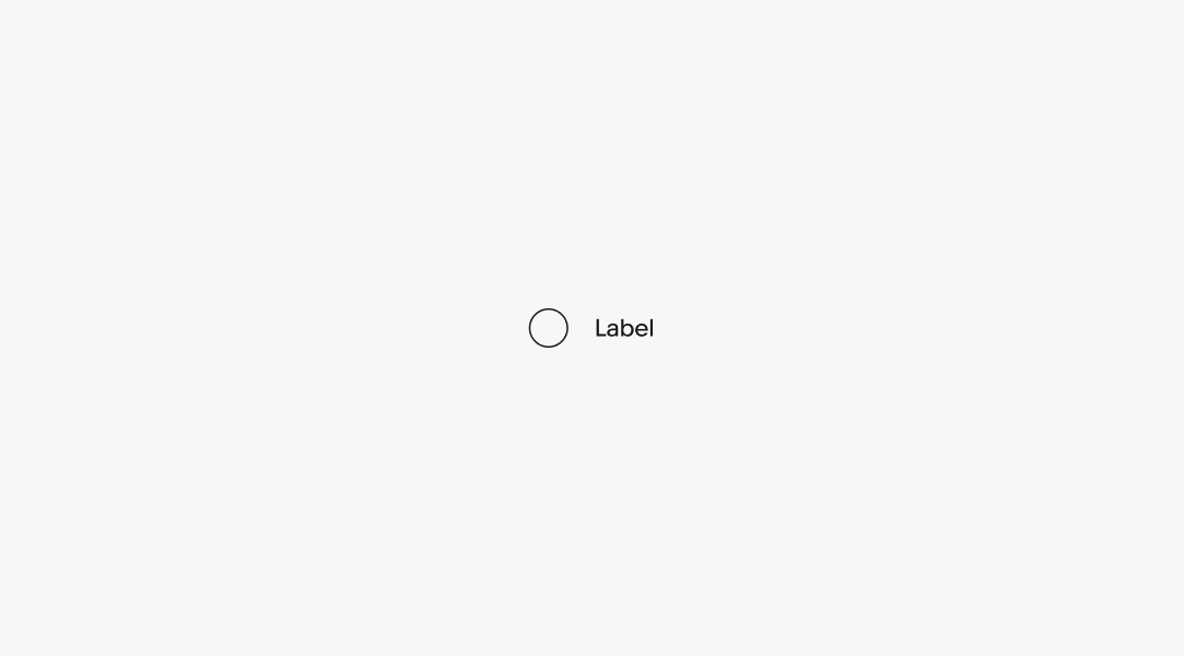
A label is required for all radio buttons. They should be as short as possible.
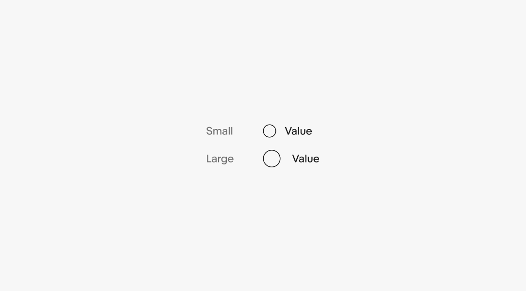
There are two sizes available. Large is the default and is preferred on smaller screens. The smaller radio button can be used for dense layouts, but are less tap-friendly.
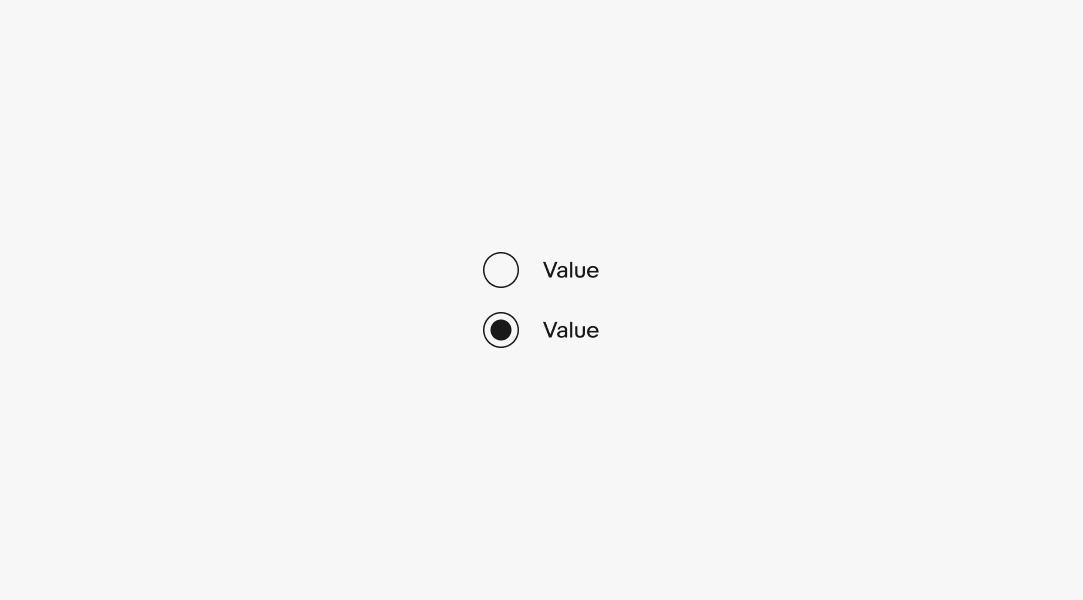
A radio button can be either selected or unselected. There are no indeterminate states for radio buttons.
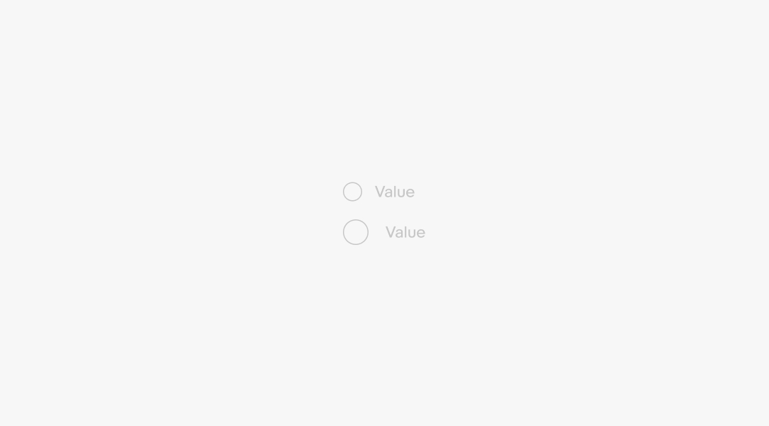
A radio button can be disabled if there is a prerequisite to activate.
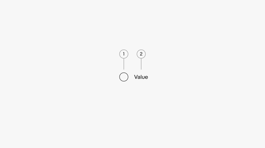
Labels will wrap if they are wider than the parent container. The radio button remains aligned to the top of the text box.
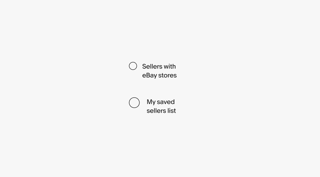
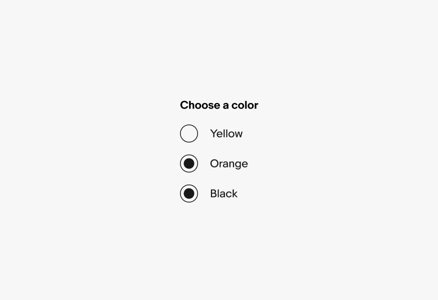
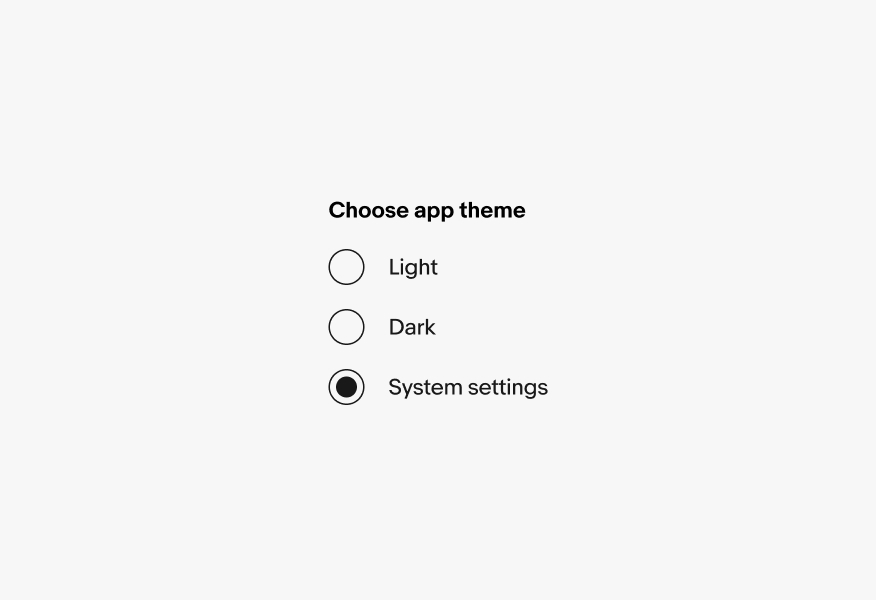
Radio buttons cannot be standalone. They should always be contained within a set of at least two items. The group title is required to clarify how the options are related and what decision is being made.
Android uses the native Material radio buttons for improved support and accessibility.
iOS devices use the large Evo radio button.
Web uses the large and small Evo radio buttons depending on screen size and content density.
Radio buttons should only be used when a single element can be selected.
Don’t use radio buttons when multiple options can be applied simultaneously.