Segmented button

v1.0.0

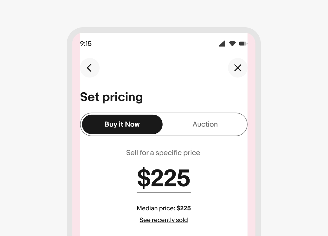
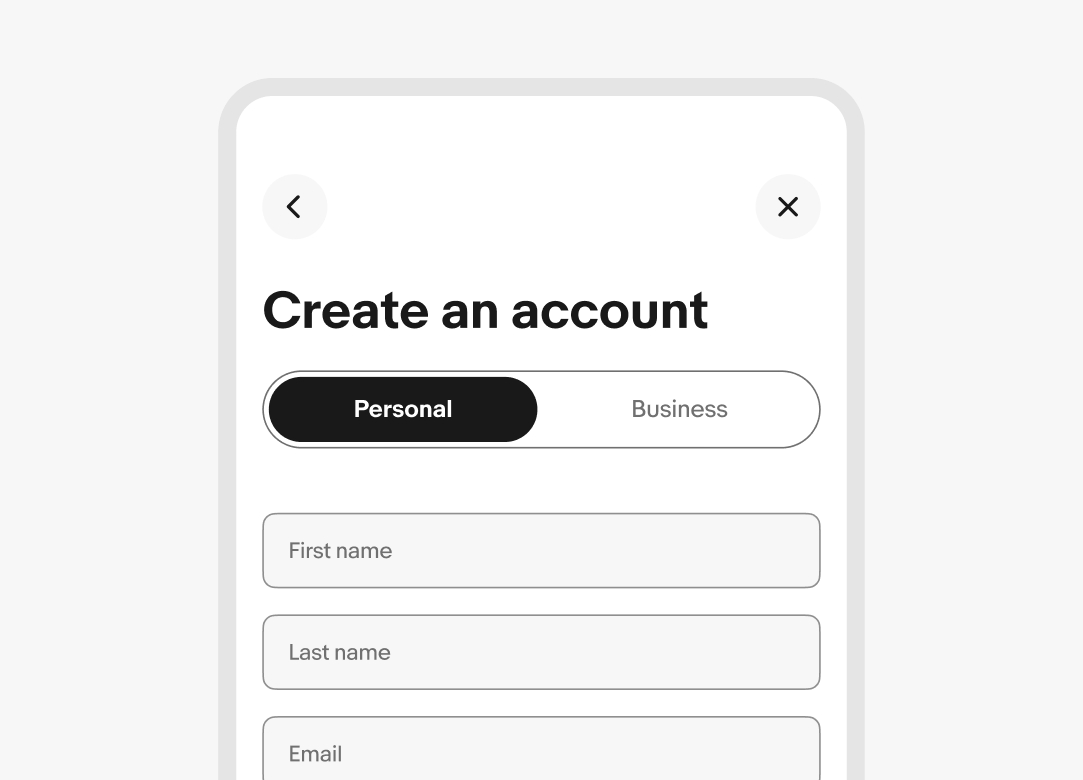
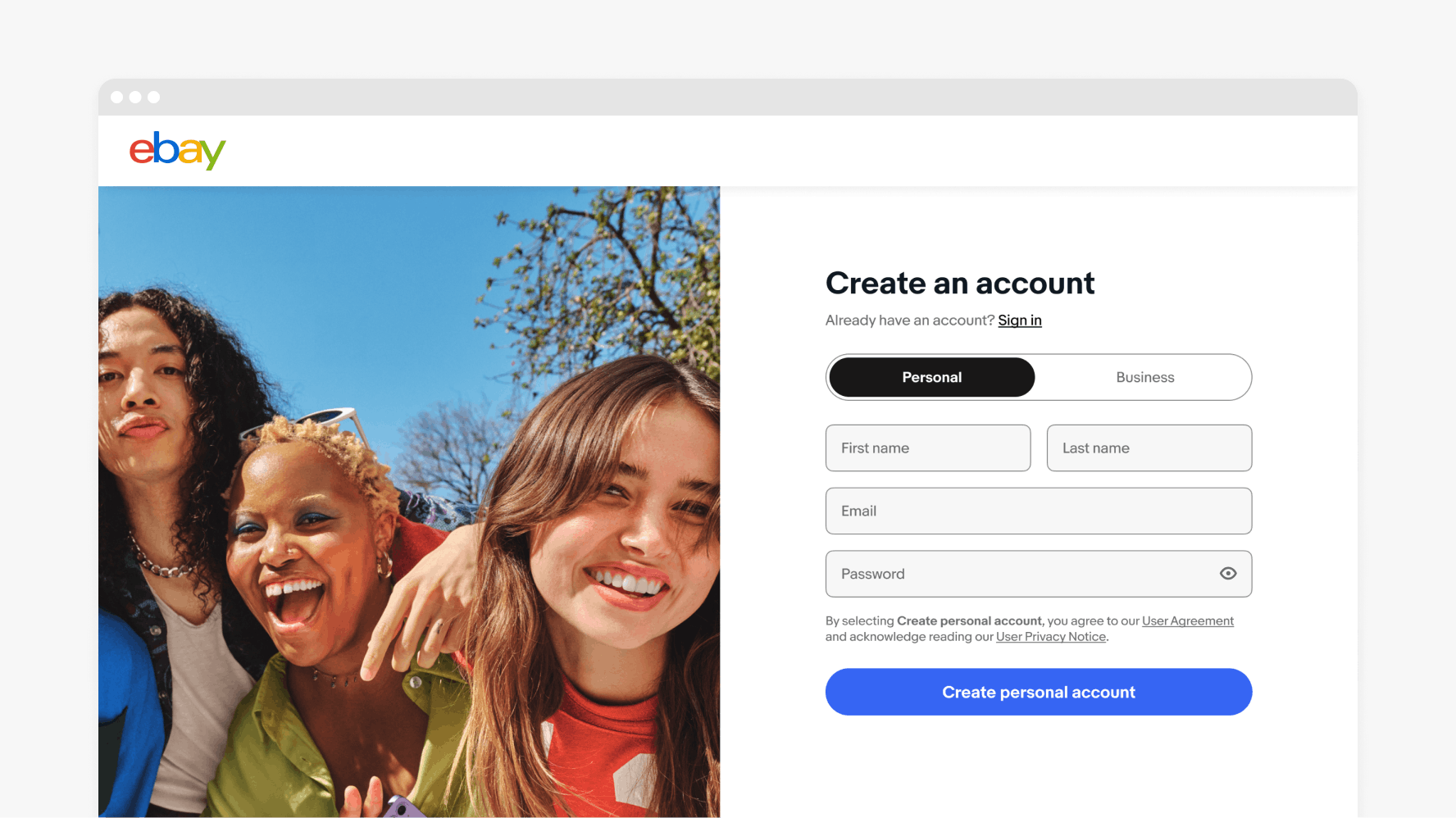
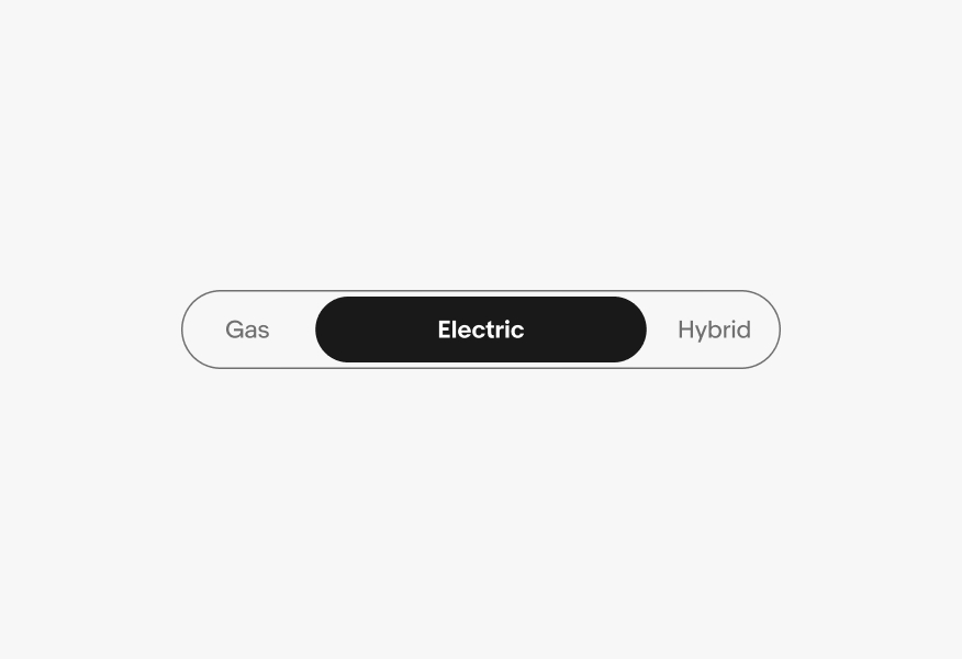
Segmented buttons provide closely related choices that affect an object, state, or view.

Stylized artwork of a segmented button.

Considerations

Concise

Segmented buttons help reduce cognitive load and keep things simple.

Control

Segmented buttons give quick control to swap choices, states, or views.

Focus

Segmented buttons give more affordance to available controls and actions.

Anatomy

A segmented button diagram with 4 elements numbered: 1. Segment, 2. Container, 3. Icon (optional), 4. Label text.
  1. Segment
  2. Icon (optional)
  3. Container
  4. Label text

When to use

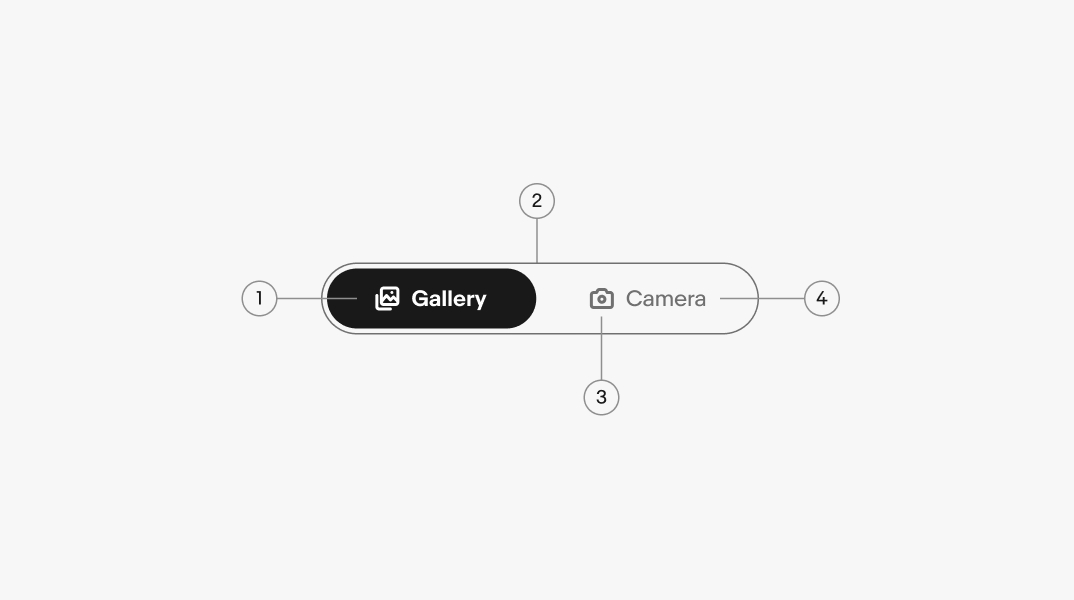
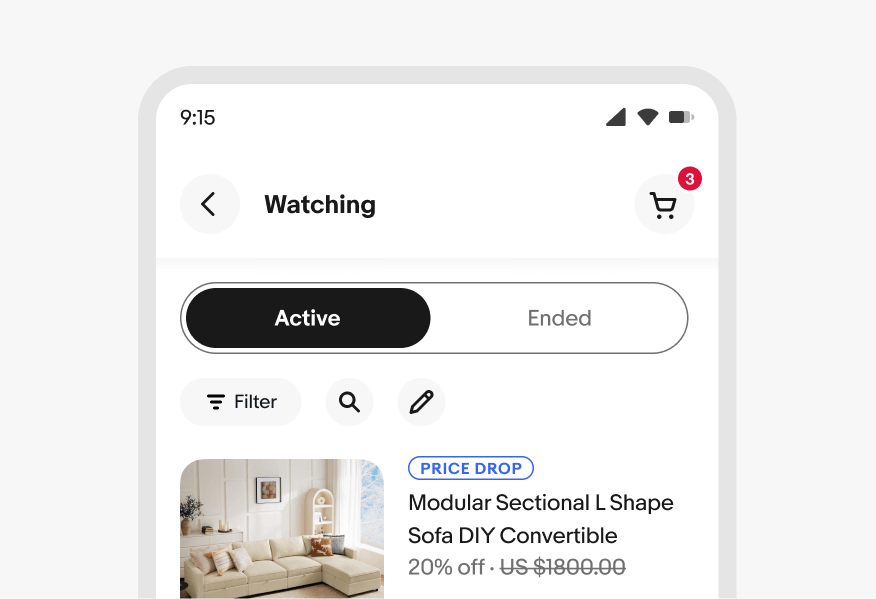
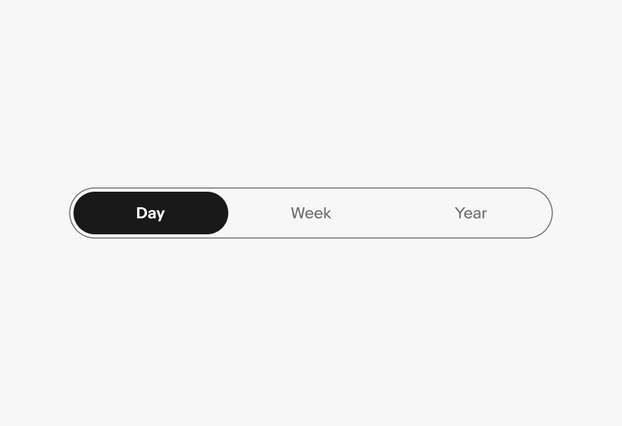
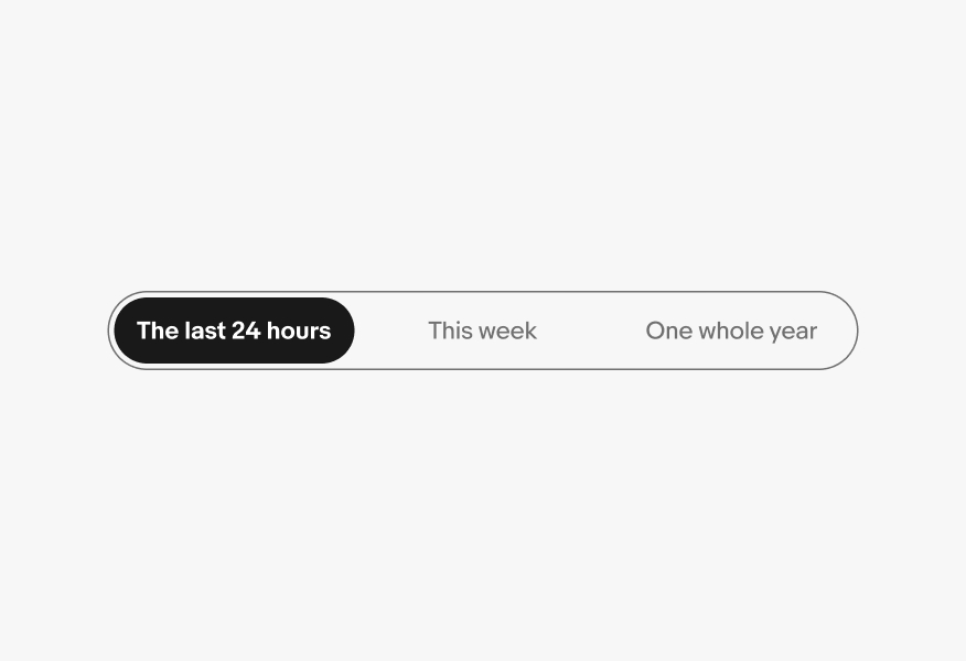
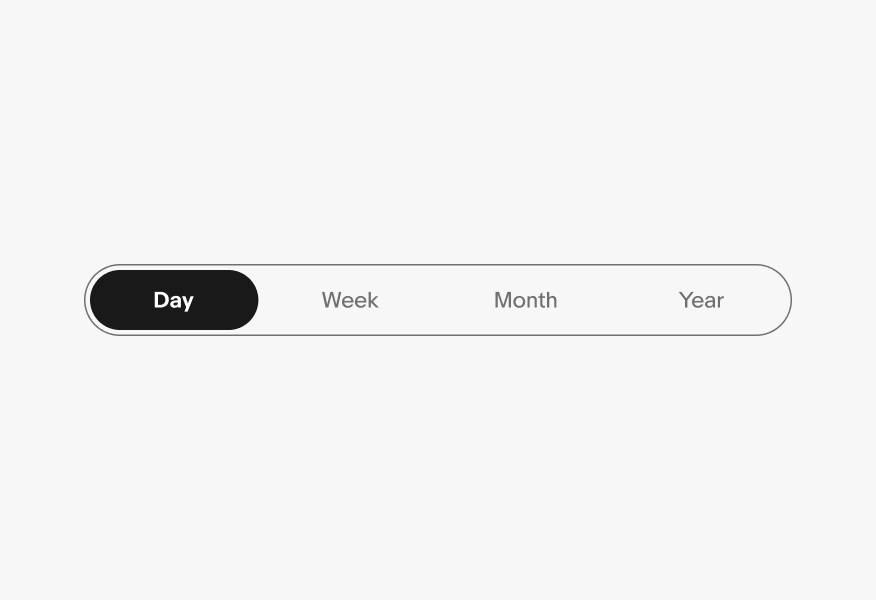
Segmented buttons provide a compact way to display multiple mutually exclusive options. They can also be used to switch or sort views such as switching between a list view and a grid view.

Segmented buttons affect section-level views and should not be considered a replacement for navigational tabs.

A flowchart determining when to use segmented buttons.

The chart starts with ‘Can you select more than one option?’, with ‘Yes’ and a ‘No’ options. The ‘Yes’ path takes you to another question: ‘Are the options short & concise?’, with a ‘Yes’ and a ‘No’ option. If you choose ‘Yes’, the final answer is ‘Use checkbox / selection cell’, and if you choose ‘No’ the final answer is ‘Use quick filters’.

If you choose ‘No’ for the first question presented (‘Can you select more than one option?), you are taken to another question: ‘Does the selection change content panels?’. This question has ‘No’ and ‘Yes’  options. Selecting ‘Yes’ will present you with a final option: ‘Use tabs’. Selecting ‘No’ will then take you to another question: ‘How many options can you select from?’. This question has three options: ‘1’, ‘2 to 4’, and 4+’. 

Selecting ‘1’ will take you to another question: ‘Do you need to confirm selection?’. This question has ‘No’ and ‘Yes’  options. Selecting ‘No’ will present you with a final option: ‘Use toggle’, and selecting ‘Yes’ will present you with a final option: ‘Use checkbox’. 

Selecting ‘4+’ will present you with a final option: ‘Use dropdown / radio / selection cell’.

Selecting ‘2 to 4’ will take you to another question: ‘Are the options short and concise?’. This question has ‘No’ and ‘Yes’ options. selecting ‘No’ will present you with a final option: ‘Use radio button’. Selecting ‘Yes’ will present you with a final option: ‘Use segmented buttons’.

The path from the first question to the final answer of ‘Use segmented buttons’ is highlighted in blue and emphasized as the best use case of using segmented buttons.

Properties

Segmented buttons can have two to four segments and may contain a text label, an icon, or both and come in two visual styles.

Size

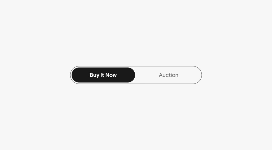
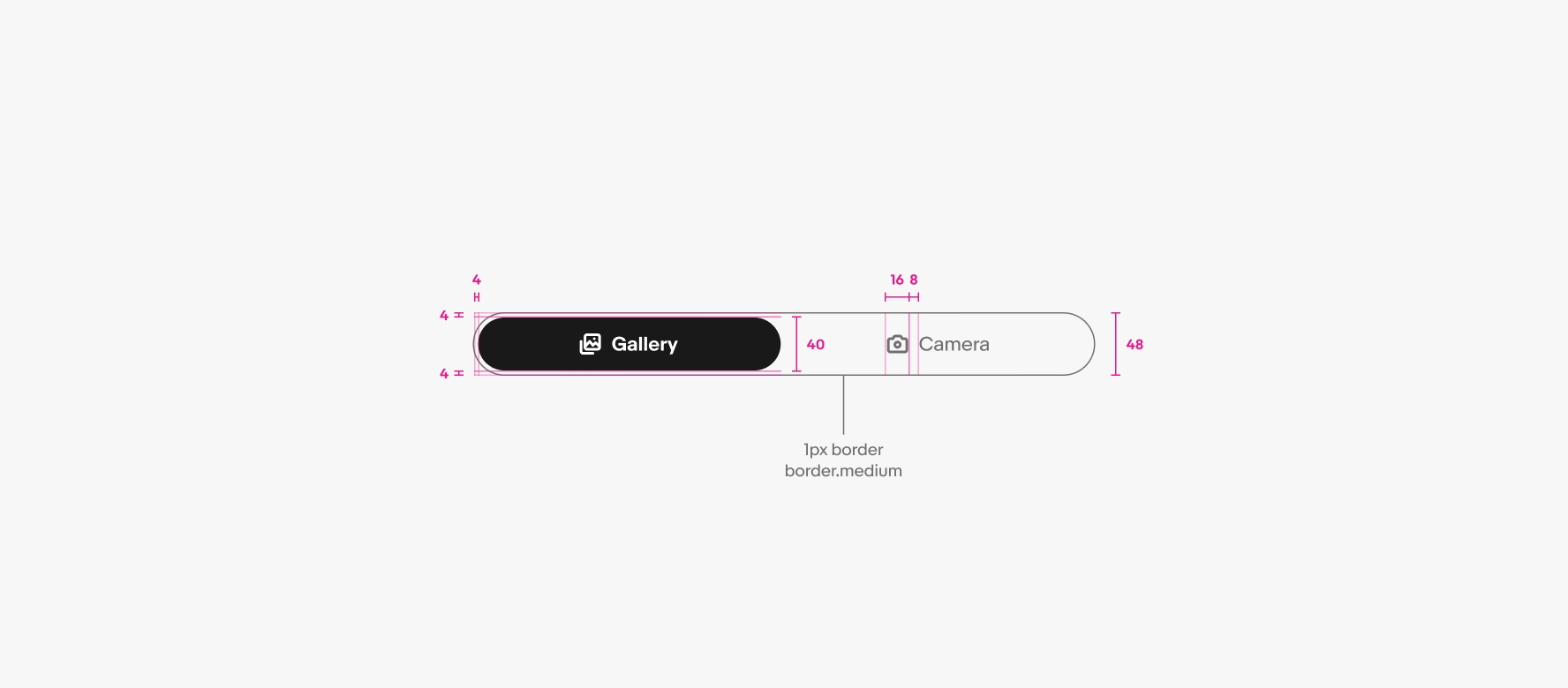
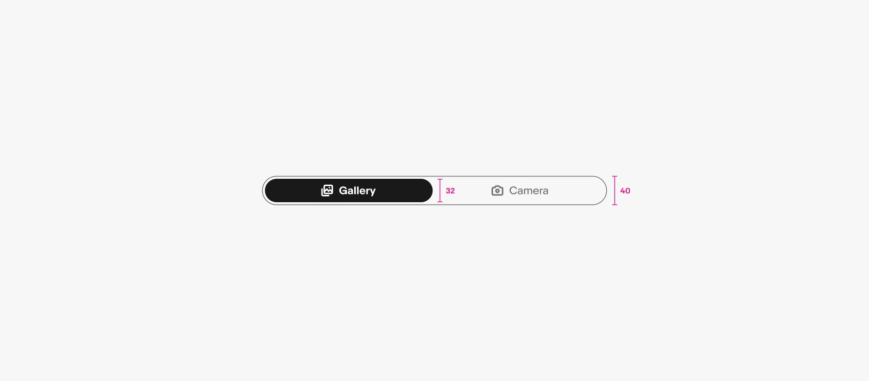
There are 2 size options for segmented buttons: Small and Large. It’s generally recommended to choose the larger option, but the smaller alternative is available if needed.

A regular size segmented button is above a large segmented button.

Label

Labels should be short and succinct. If a label is too long to fit within its segment, consider using another component, such as a Dropdown or Quick filter.

A ‘Buy it now’ label sits on an active segmented button, and an ‘Auction’ button sits the other segmented button.

Icon

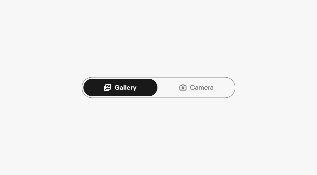
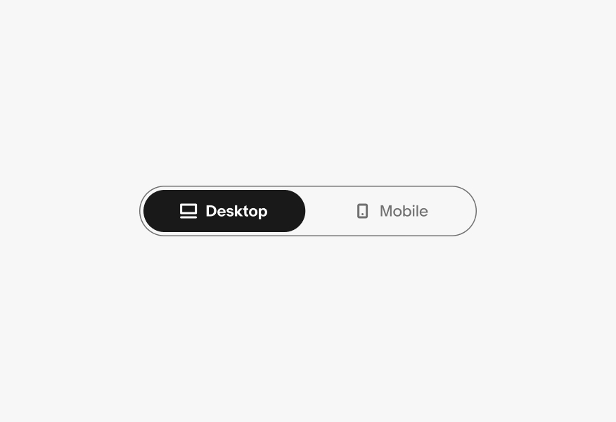
Icons may be used alongside a label. The icon should always be obvious and clearly communicate the option it represents.

A ‘Gallery’ icon sits to the left of a ‘Gallery’ label on an active segmented button, and a ‘Camera’ icon sits to the left of a ‘Camera’ label the other segmented button.

Number of controls

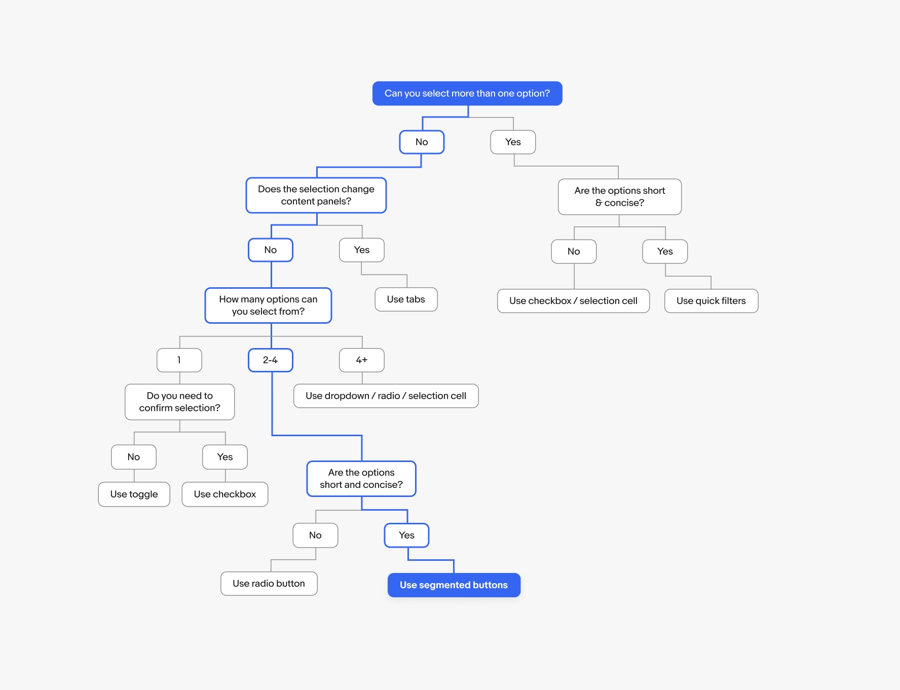
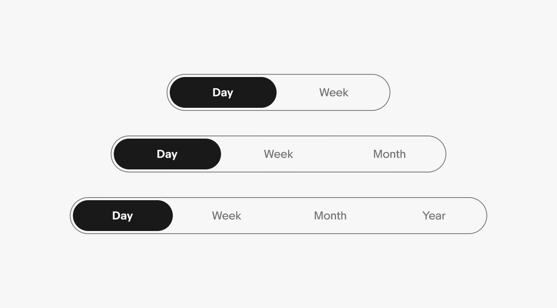
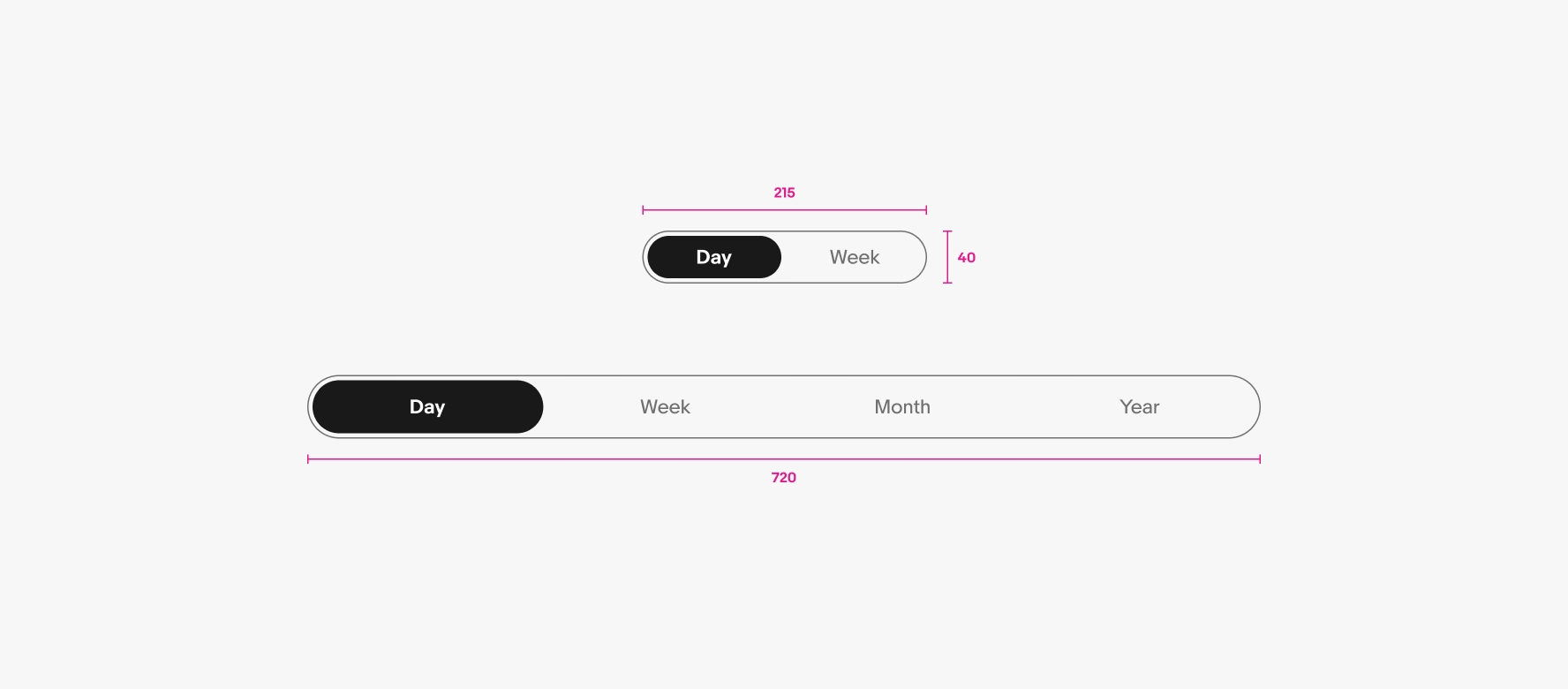
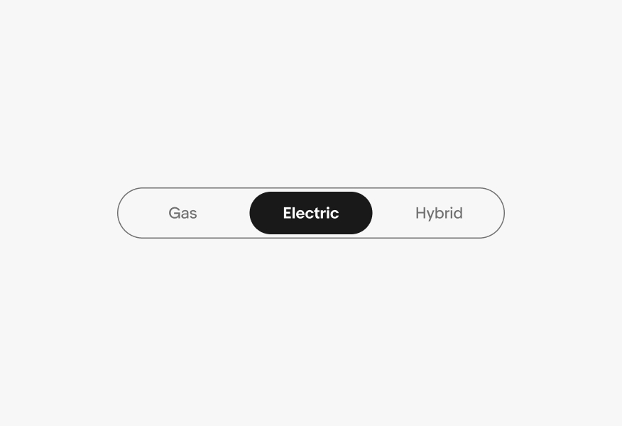
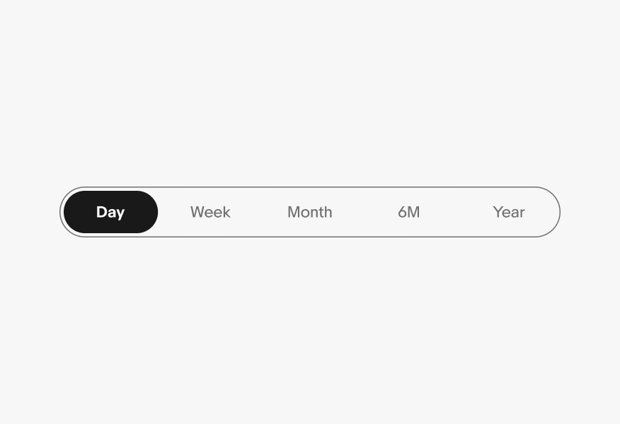
Segmented buttons can have two to four segments. If more options are needed consider using another component, such as Dropdown, Radio button, or Quick filter.

Three segmented buttons: A segmented button with two segments, a segmented button with three segments, and a segmented button with four segments.

Behavior

Hover

For elements with a container, a state-layer is added above the content. Each state increases the opacity by 4%. Dark mode uses white for the interaction layer instead of black.
See Color tokens for more details.

A segmented button is shown with two segments. There is a cursor over the button that is not active, with a hover state applied.

Filtering

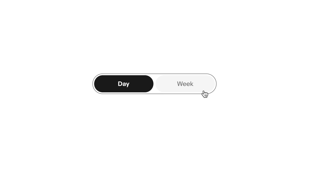
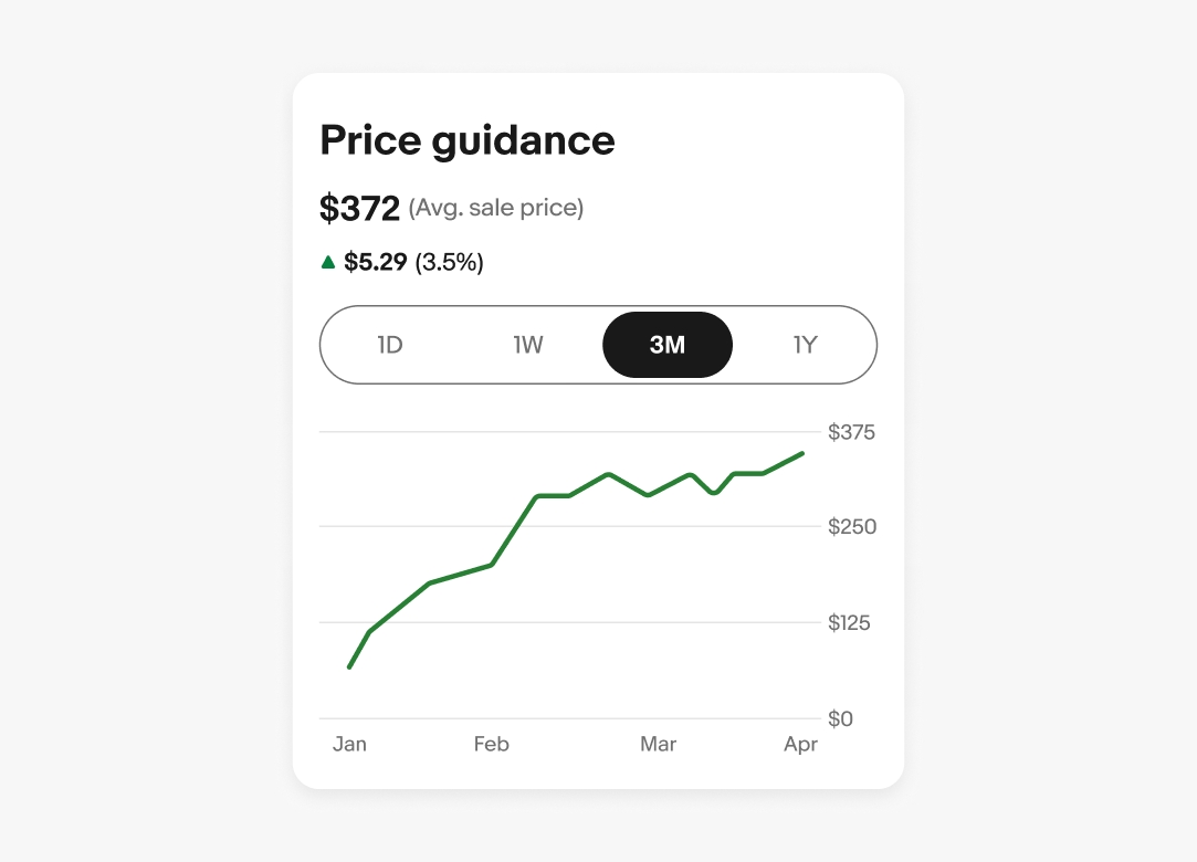
Segmented buttons can be used as section-level filters, such as changing the view from grid to list or a data set from day to week.

A ‘Price guidance’ chart is shown. A segmented button is used here with four segments: 1D, 1W, 3M, and 1Y. 3M is the active button.

Behavior

Clear space

Segmented buttons should have adequate margins from the edge of the viewport or frame. Adjust the inset as needed within the context of the page design.

Pink bars are placed to the left and right of a mobile screen to indicate the clear space needed.

Size

The minimum width for the segmented button is 215px and the maximum size is 720px. When possible, use the grid to help guide and find the right segmented button size for your design.

Two segmented buttons. A segmented button with a width of 215px and a height of 40px sits above a segmented button with a width of 720px and a height of 48px.

Screen sizes

Small

Segmented buttons should have adequate margins from the edge of the viewport or frame. They span full width on small screens up to the page margins.

A segmented button on a ‘Create an account’ page on mobile.

Medium and large

Best practices

Navigation

Do use tabs for navigation, they can be used as secondary or tertiary navigation.

The ‘Watching’ page on the eBay app with ‘Active’ and ‘Ended’ tab navigations.

Don’t use segmented buttons for secondary or tertiary navigation.

The ‘Watching’ page on the eBay app with ‘Active’ and ‘Ended’ segmented buttons.

Short and simple

Do keep labels short and concise. If a label is too long to fit within its segment, consider using another component, such as drop downs or quick filters.

A segmented button with three segments: ‘Day’, ‘Week’, and ‘Year’.

Don’t use long, multi-word labels.

A segmented button with three segments: ‘The last 24 hours’, ‘This week’, and ‘One whole year’.

Active state

Do keep icons consistent and unchanged when active and inactive.

A ‘Desktop’ icon sits to the left of a ‘Desktop label on an active segmented button, and a ‘Mobile’ icon sits to the left of a ‘Mobile’ label the other segmented button.

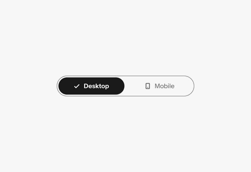
Don’t replace icons with checkmarks when selected.

A ‘Checkmark’ icon sits to the left of a ‘Desktop label on an active segmented button, and a ‘Mobile’ icon sits to the left of a ‘Mobile’ label the other segmented button.

Consistent size

Do keep button widths consistent across all segments.

A segmented button with three segments, all have the same button width.

Don’t alter the width of individual buttons.

A segmented button with three segments. The middle button is active and noticeably wider than the buttons on the left and right.

No more than four

Segmented buttons are best used for selecting between 2 to 4 choices.

A segmented button with four segments.

Don’t use more than 4 segments in a single segmented button. If you have more than 4 choices, consider using another component, such as tabs or quick filters.

A segmented button with five segments.

Specs

A large segmented button is shown with specs highlighted. The segmented button border is 1px, and the color is border.medium. The height of the button is 48px. The padding around the active button fill is 4px. The padding inside of the active button fill is 12px, and the height is 40px. The padding between the icon and label text is 8px.

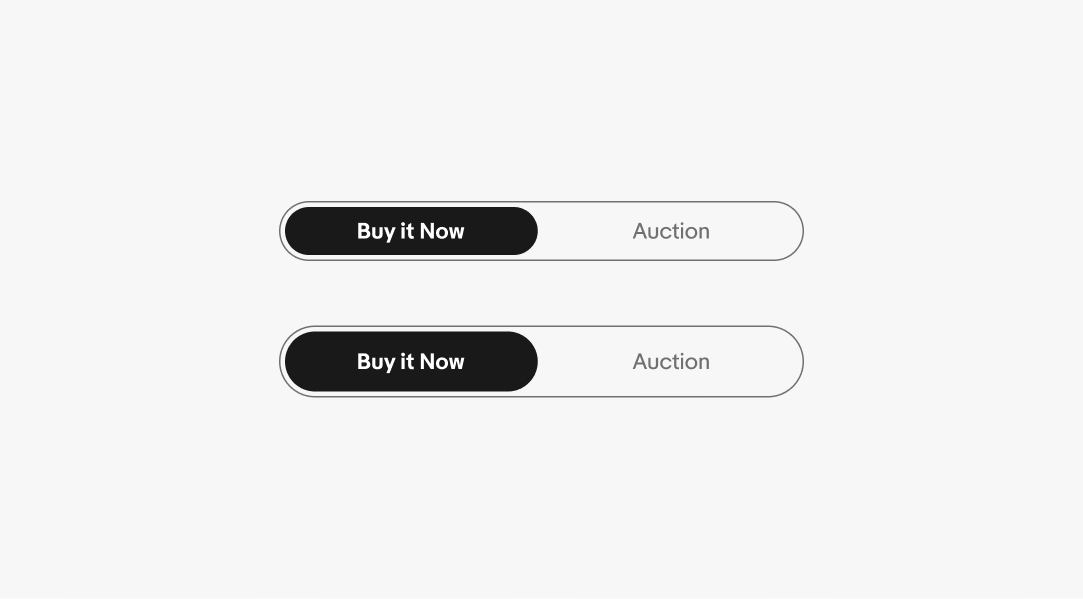
Large segmented button

A small segmented button is shown with specs highlighted. The segmented button border is 1px, and the color is border.medium. The height of the button is 40px. The padding around the active button fill is 4px. The padding inside of the active button fill is 8px, and the height is 32px. The padding between the icon and label text is 8px.

Small segmented button

Change log

VersionDateNotes
1.0.0
Oct, 2024
  • Updated to eBay Evo
1.0.0
May, 2023
  • Added size options
  • Updated guidance for icon option usage
1.0.0
Jan, 2023
  • Added documentation and guidance for when and how to use segmented buttons