Use a minimum of 3 steps and keep each step concise.
Progress steppers are visual indicators of progression through a process or experience.

Progress steppers are immediately understandable at a glance.
Progress steppers use minimal visual UI to allow for quick identification.
Progress steppers focus on key milestones.
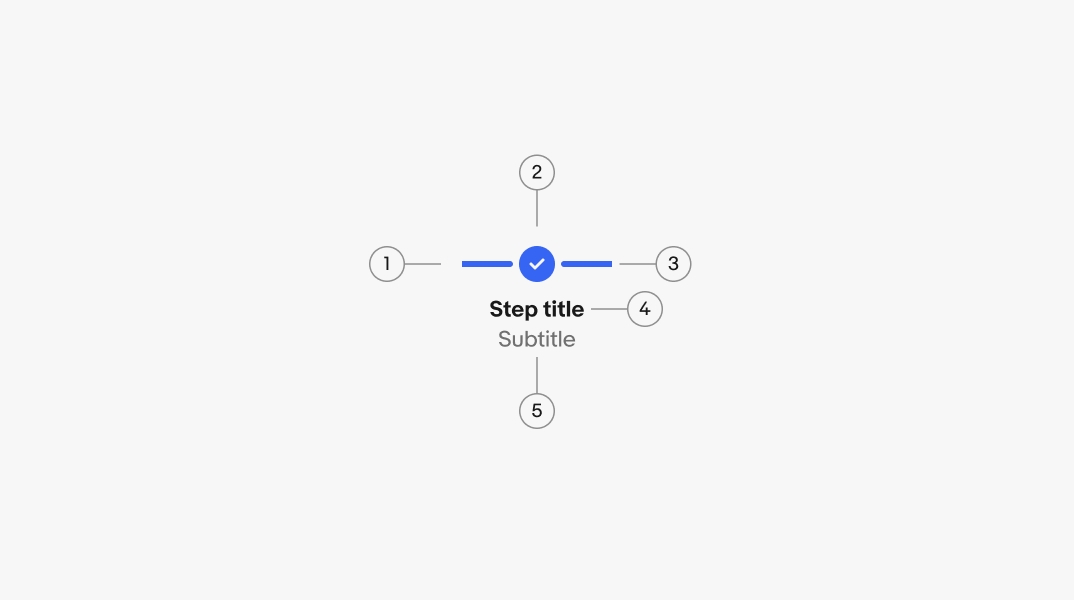
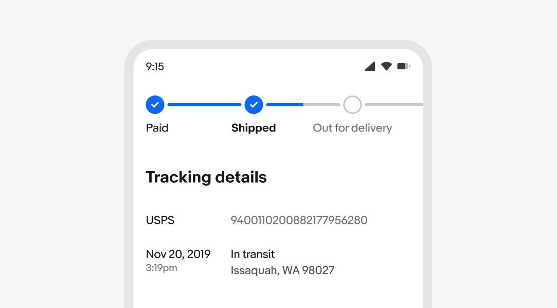
All steps require a primary label. The label describes an important milestone within a process.
An optional secondary label is available for additional information, like the date a step was completed.
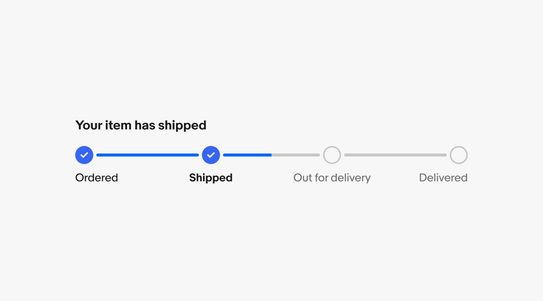
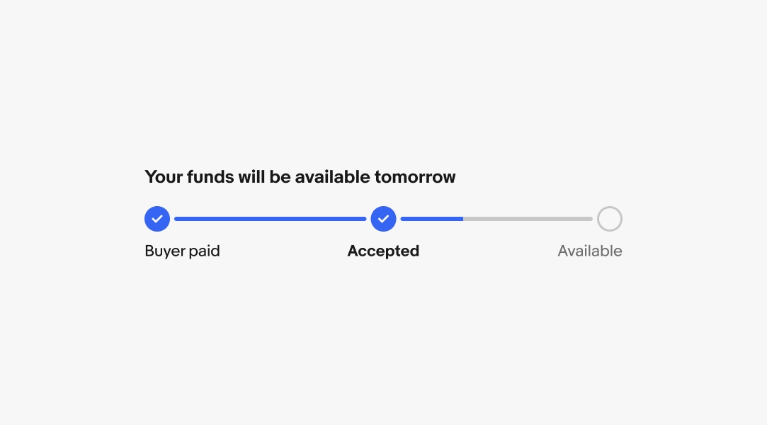
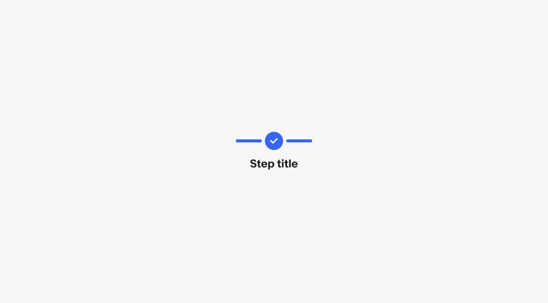
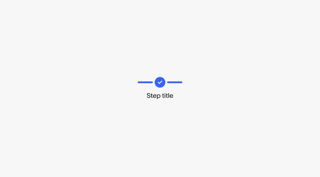
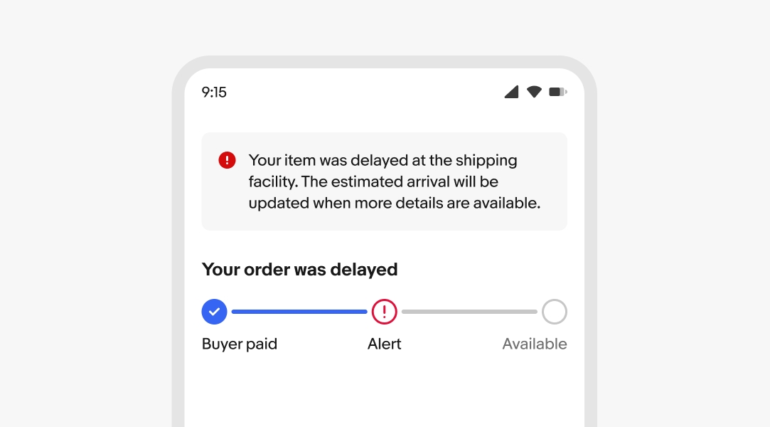
The title sits above the progress stepper and summarizes the latest update in a conversational tone.
Use horizontal steppers when saving vertical space is important. They allow for scrolling if the content extends off screen, but we recommend avoiding this behavior where possible.
The vertical orientation is available when vertical space isn’t an issue. This is the preferred orientation on smaller screens with more steps.
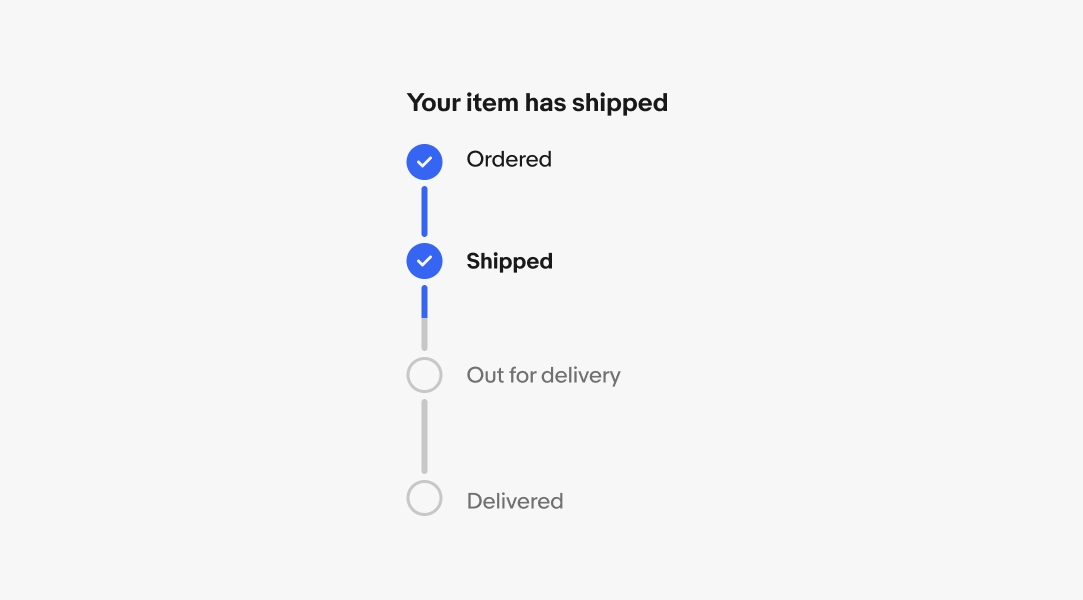
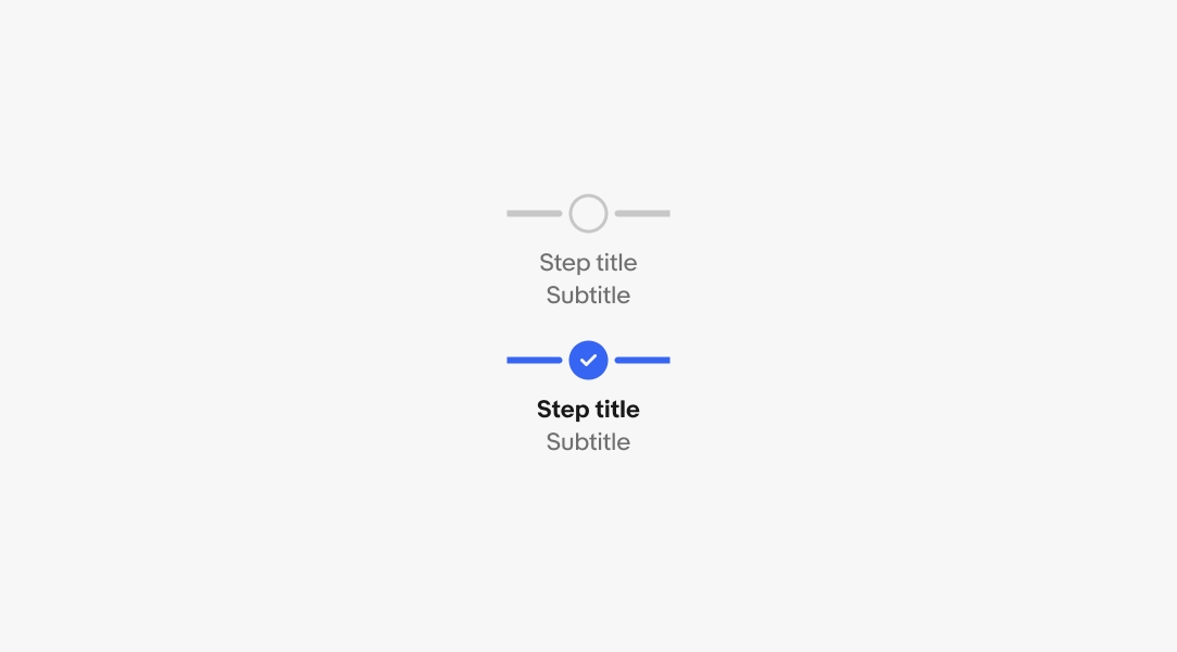
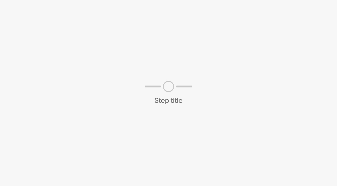
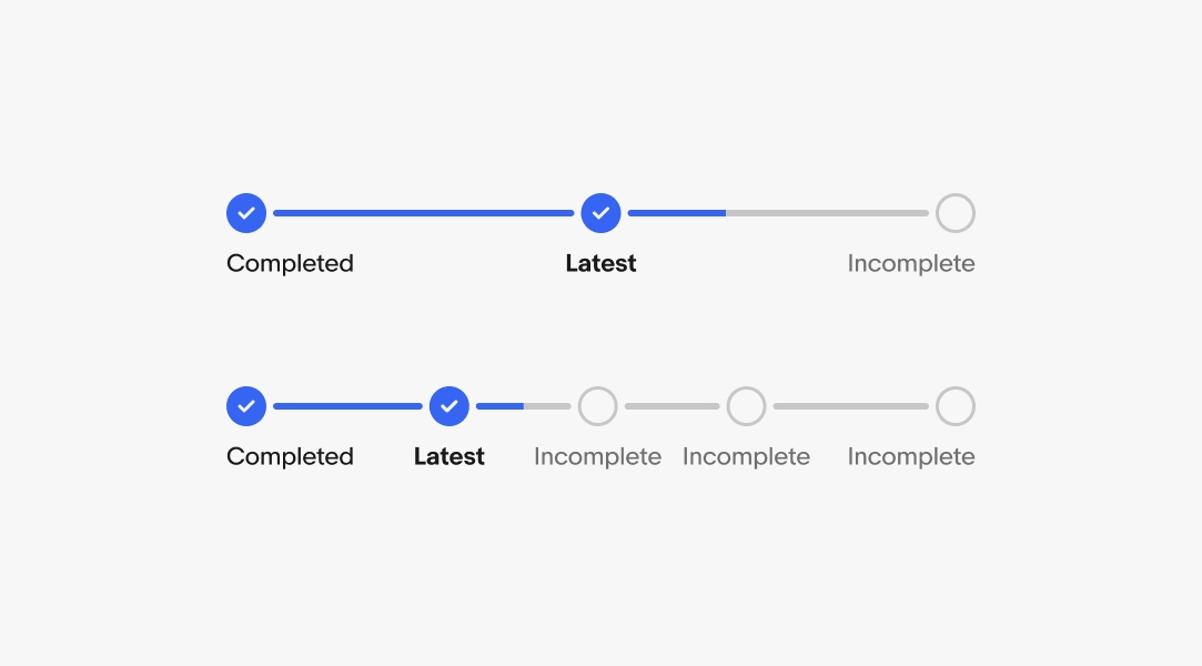
Steps that have not been completed use the incomplete state. Incomplete steps indicate what is expected to occur, and only changes state when completed or when an issue occurs.
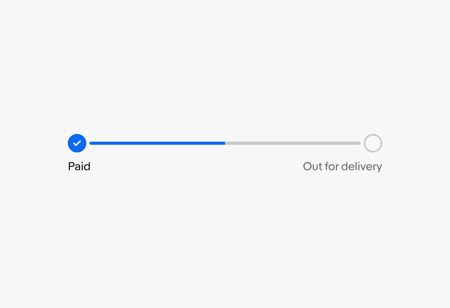
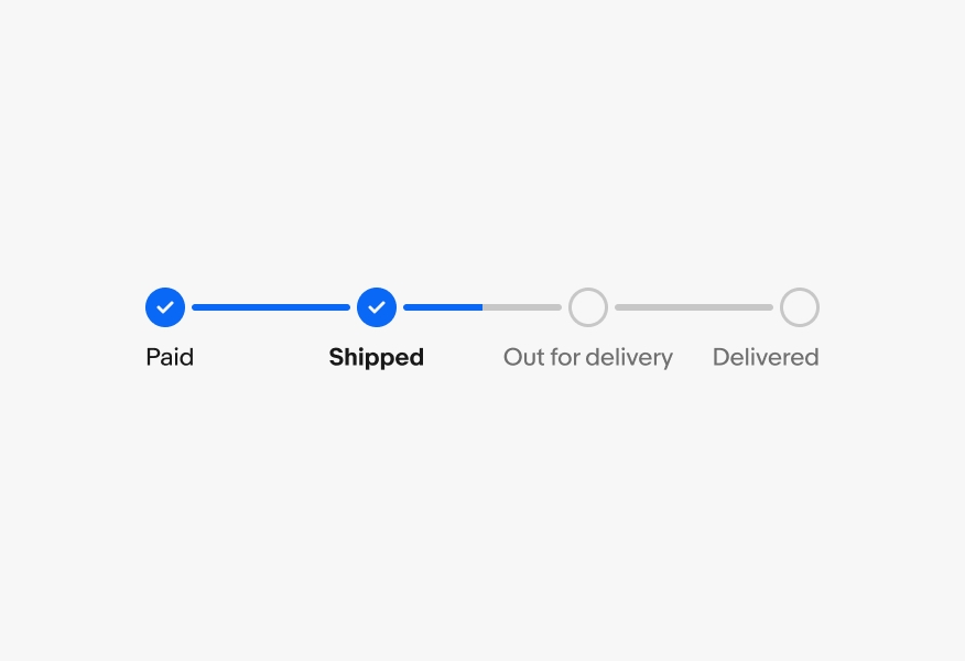
A checkmark and bold title means this was the latest step completed and the next step is in process.
A checkmark and non-bold label means this step is complete and the process has moved on.
The outlined error icon indicates that a blocking issue has occurred and requires user attention before the process can continue. Errors should be paired with an alert banner or notice providing more information about what happened and how to resolve the issue, if possible.

When an error occurs, a section notice or alert banner should appear providing more information and context to the occurrence.
If the issue can be resolved by the user, provide an action within the notice. If the issue is something out of the user’s control, provide as much detail as possible.
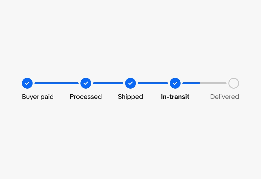
Steppers have a minimum of 3 steps. There are no maximums, but aim for as few as possible to avoid overwhelming the user. Focus on the key milestones within a process.
For vertical steppers, the first and last steps have a minimum height of 36px and middle steps have a minimum height of 48px.

For vertical steppers, the first and last steps have a maximum height of 52px and middle steps have a maximum height of 80px.

For horizontal steps, first and last steps have a minimum width of 76px and middle steps have a minimum width of 128px.

Middle steps have a maximum width of 256px. First and last steps have a maximum width of 140px.

If there are enough steps, steppers will stretch to fill their parent container up to a total width of 960px. However, steps will adhere to their individual maximum widths, so fewer steps will lead to a smaller total stepper width.

The stepper component behaves similar to a carousel when the content extends beyond the screen. The width of each element is adjusted to ensure a peek to the right.
Longer labels wrap when wider than the step width.
Use a minimum of 3 steps and keep each step concise.
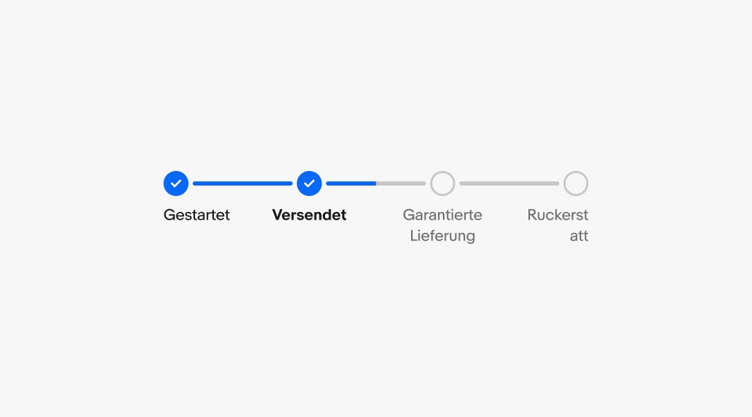
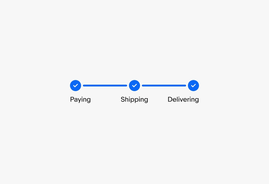
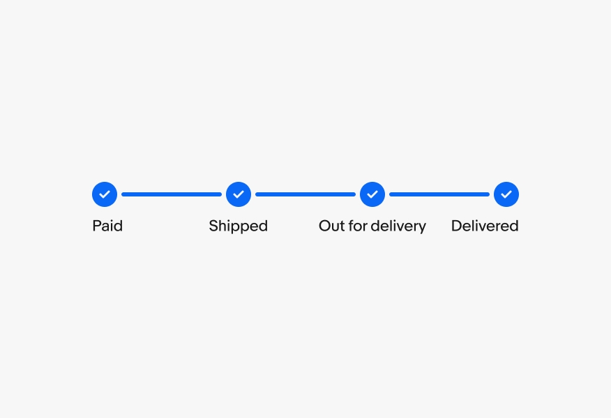
Don’t use redundant steps like “in-transit,” “processing,” or “completed”. The lines and checkmarks imply those states.
Keep all steps past tense.
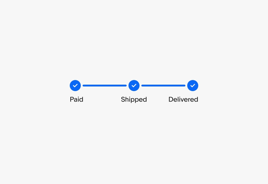
Don’t use present tense for a step that has been or has yet to be completed.
Progress steppers should have a minimum of 3 steps.
Don’t use progress steppers if there are only 1 or 2 steps. Explore using titles and body content or another pattern altogether.