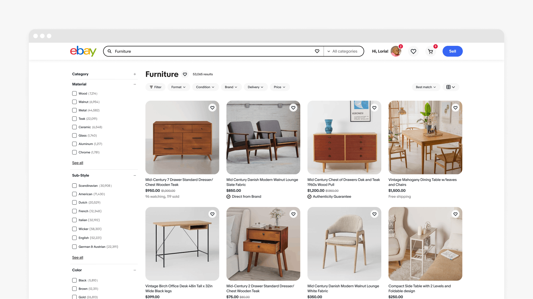
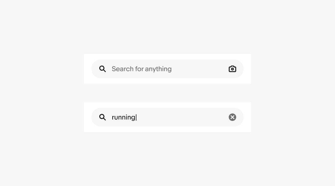
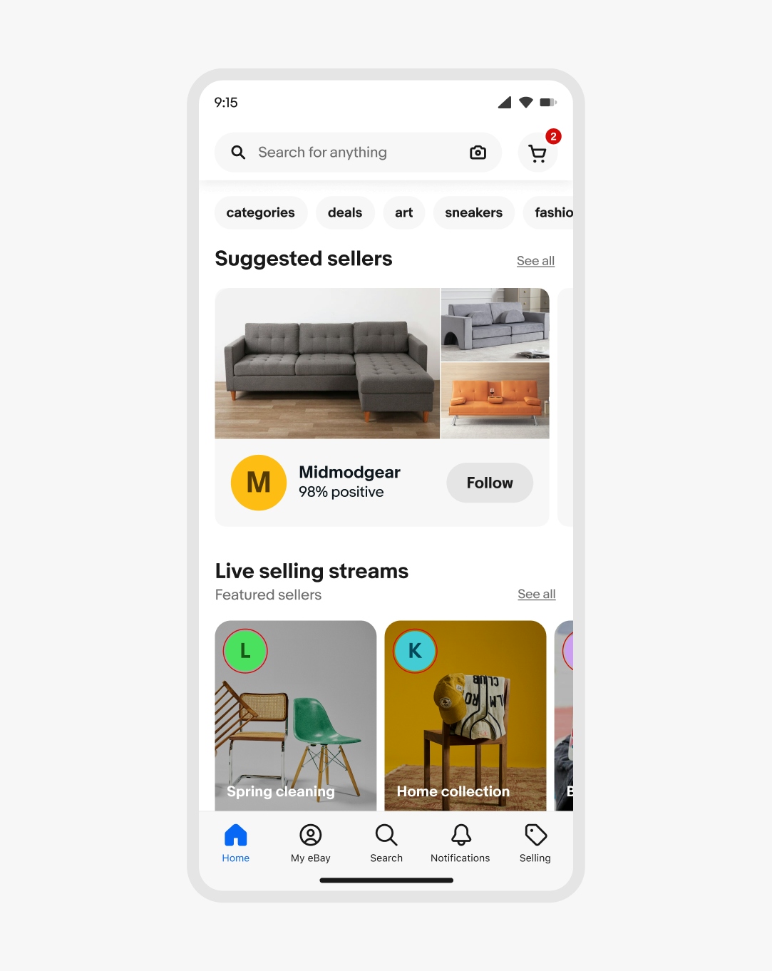
Search bar

v2.1.0

The search bar allows users to search using text or imagery.

  • Skin
  • CoreUI
  • React

Considerations

Identifiable

The search is quickly and easily identifiable throughout the UI.

Helpful

The search field allows users to search in various ways to ensure the result is as close to their needs as possible.

Quick

The search bar enables users to enter and find what they want as quickly as possible.
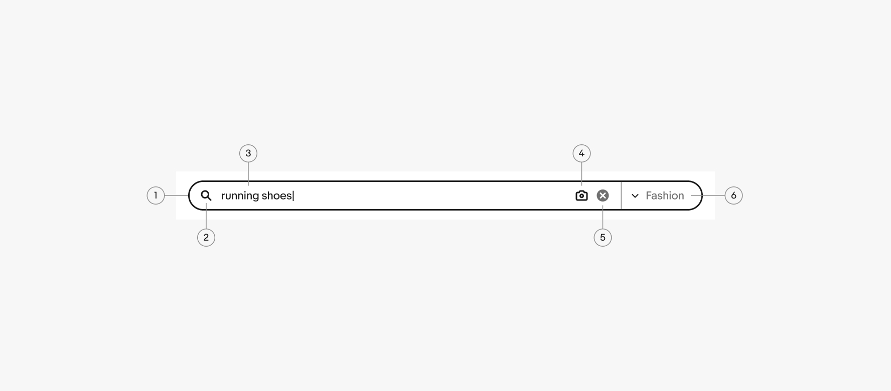
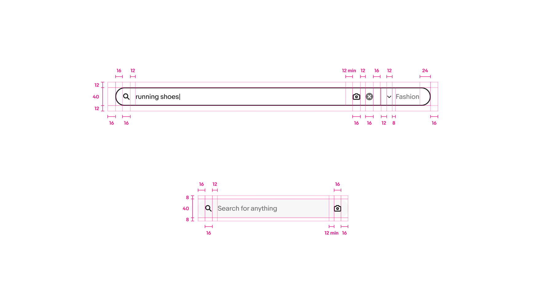
Anatomy

Anatomy of a search bar. Number 1 points the container. Number 2 points to the leading icon. Number 3 points to the query. Number 4 points to the image search. Number 5 points to the clear entry. Number 6 points to the category dropdown.
  1. Container
  2. Leading icon
  3. Query
  4. Image search
  5. Clear entry
  6. Category dropdown

Properties

Image search

The optional image search icon allows users to upload an image as a search query. The icon launches the native file upload window and initiates a search when the upload completes.
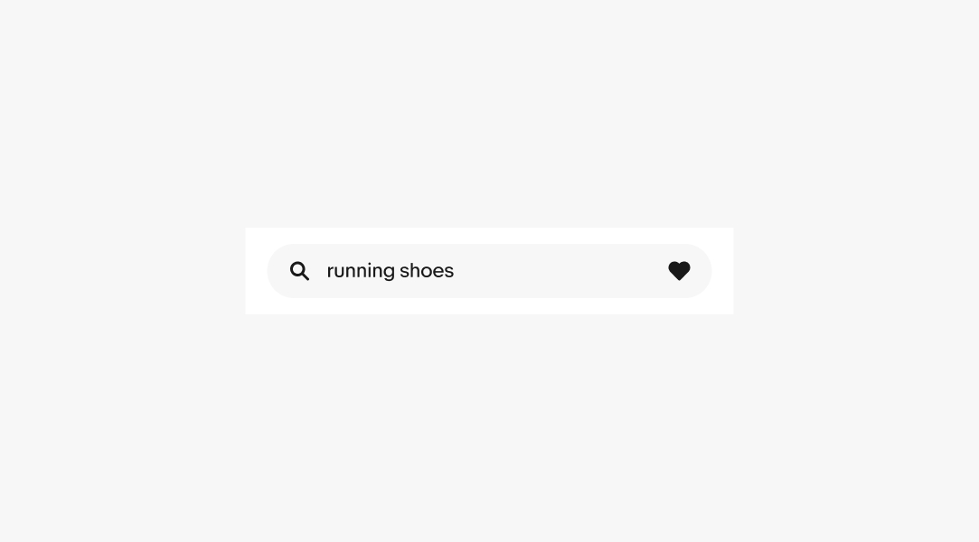
A small search bar with an image search icon on the right side.

Trailing icon

A trailing icon can be added to a field that perform custom actions. The default icon is a heart to save a search query and associated filters.
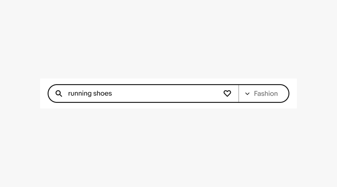
A small search bar with a heart trailing icon that is filled.

Category dropdown

A category dropdown can appear on large screens to filter the query as a search is submitted. The dropdown uses the popover component to present a list of available categories.
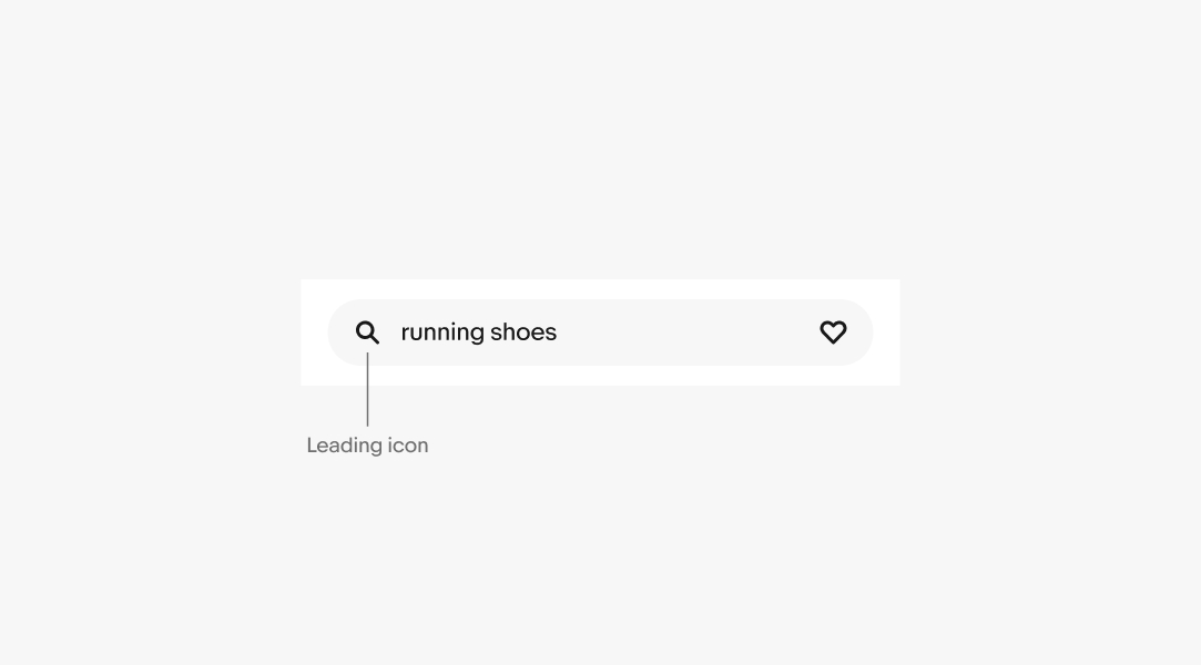
A large search bar with a category dropdown on the right side. The current selection is Fashion and the query is running shoes.

Behavior

Leading icon

The leading icon is a static search icon. This helps identify the field and its intended behavior. The leading icon is always visible.
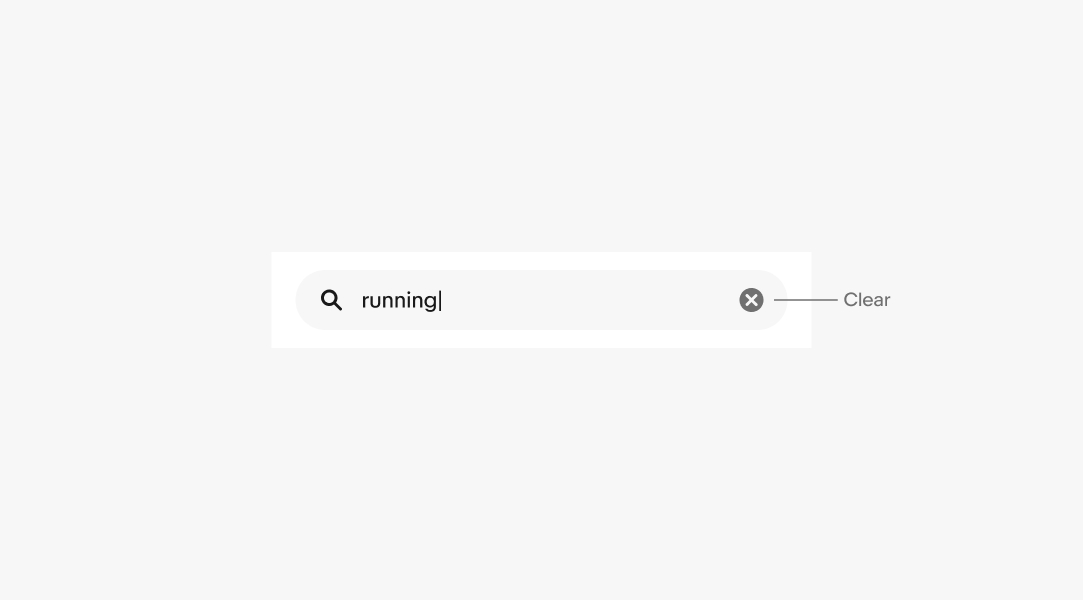
A small search bar with the mandatory leading search icon.

Clear

A clear icon automatically appears on the right when there are 1 or more characters entered. It clears all characters within the field and hides until more characters are entered.
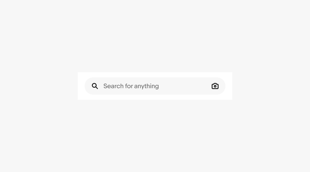
A small search bar with a query being typed out. The clear icon appears on the right.

Placeholder text

The search field has placeholder text when empty and unfocused. The placeholder text disappears as the user begins typing into the field. The leading search icon remains as a visual label in place of the placeholder text.

A small search bar with the placeholder text “Search for anything” with a camera icon on the right side. Another small search bar a query typing out. A clear icon appears on the right side.

Platforms

Native

Native screens use the small version of the search bar. The category dropdown and border are removed.

A native home screen with the small search bar used at the top.

Web

Web screens use the large version of the search bar. This version has the category dropdown and surrounding border.

A search results page using the large search bar at the top of the page.

Specs

Specs for large and small search bars. The large bar is 40px tall with 16px on the left and 24px on the right. The leading icon is 16px with 12px between it and the query. There is a minimum of 12px between the query text and camera icon. The camera icon is 16px with 12px after it, followed by a 16px clear icon. 16px follows the clear icon with 12px between the divider line and a 12px chevron down icon. 8px is between the chevron and the category text. There is typically 16px on the left and right of the full search bar and 12px on the top and bottom. The small search bar matches the same specs but does not have the category and only has 16px on the right.

Change log

VersionDateNotes
2.1.0
Sep, 2024
  • Added platforms section
  • Updated to eBay Evo
2.1.0
Jan, 2023
  • Simplified state management by adding state layer component
  • Added size property
  • Fixed dimensions and flexing of enabled search entry field
  • Cleaned up layer names
2.0.0
May, 2022
  • Updated to 2.0 to begin change tracking
  • Updated behavior of leading search icon to remain visible at all times
  • Updated spacing between element in the search entry field