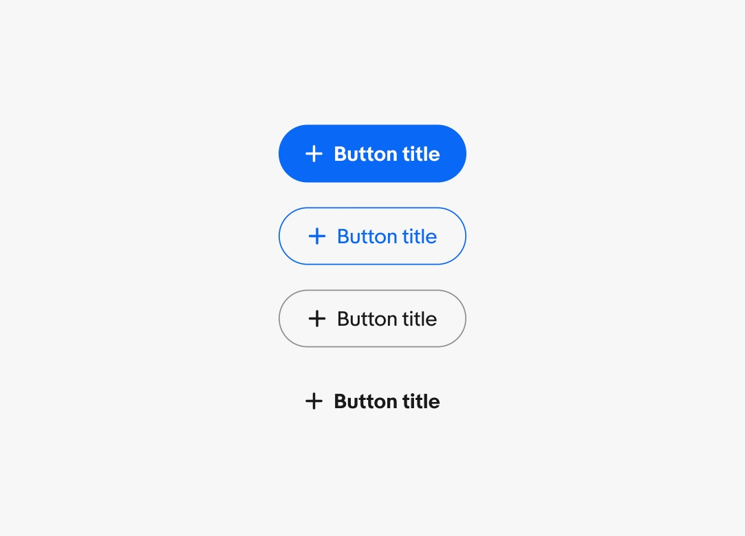
Button
Buttons help direct and capture user action and intent.
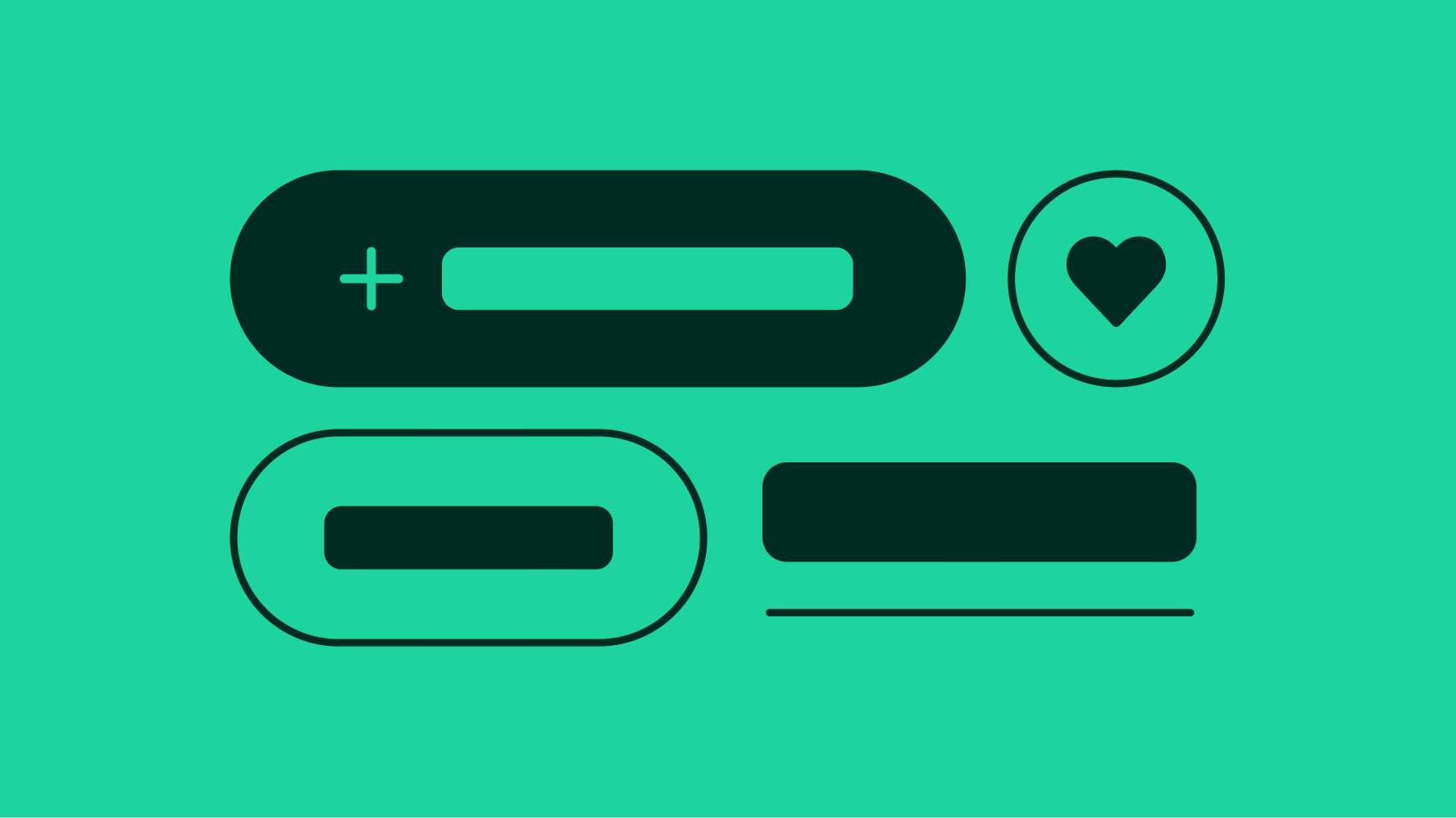
- CTA Button
- Branded button
- Icon button
- Link button
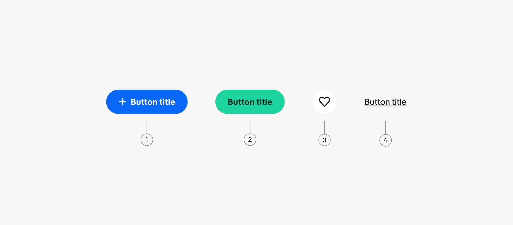
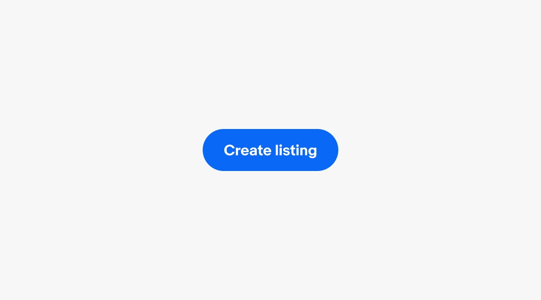
CTA
A button designed to grab the user's attention and prompt an immediate response. Learn more about using CTA buttons.
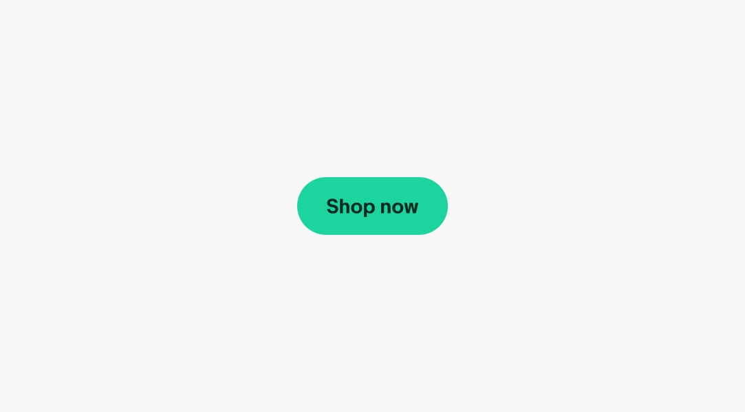
Branded
An expressive button used in branded marketing placements to call attention using a broader color range. Learn more about using Branded buttons.
Icon
A button that uses an icon instead of text to convey its action, often used for common tasks like search, settings, or creating a new item. Learn more about using Icon buttons.
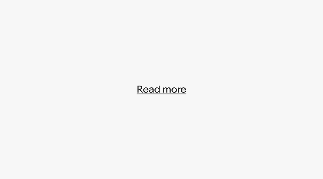
Link
A button styled to look like a hyperlink, used when the action involves navigation to another page. Learn more about using Link buttons.
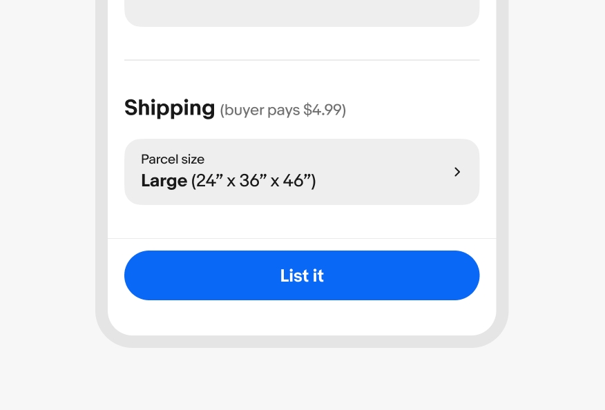
Single primary
Use a single primary button for the most important action on the page.
Vertical stack
Use a vertical button stack when the space is narrow and the buttons have titles.
Overflow
An overflow icon button can be placed inline next to a CTA button when there are two or more related, but low-priority actions.
Horizontal stack
Use a horizontal stack when there is enough room. This is common in dialogs and cards. The highest emphasis button is aligned to the trailing edge of the container in a horizontal stack.