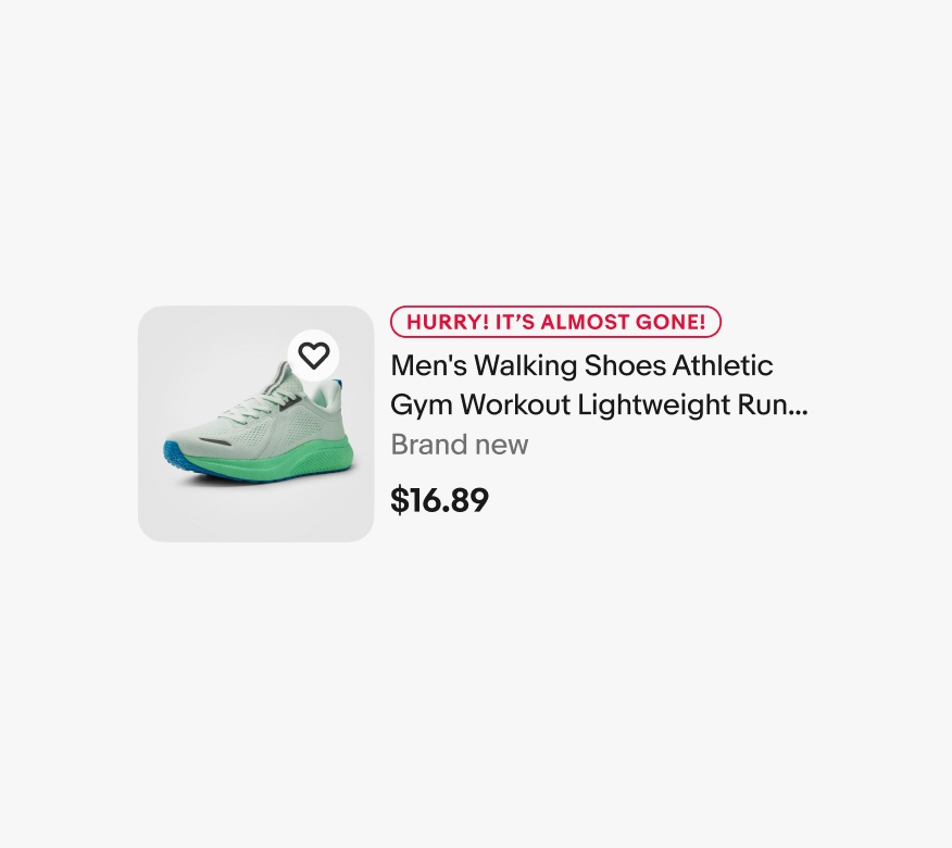
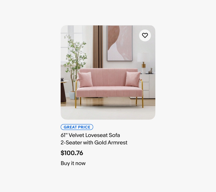
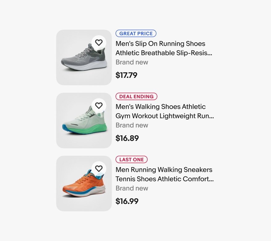
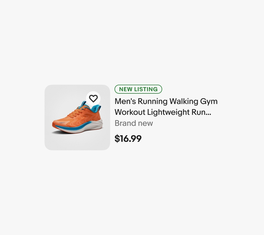
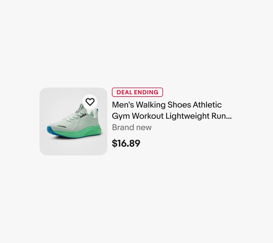
Do keep the signal in a consistent location above the item’s title.
Signals are programmatic recommendations to help customers make more informed decisions.

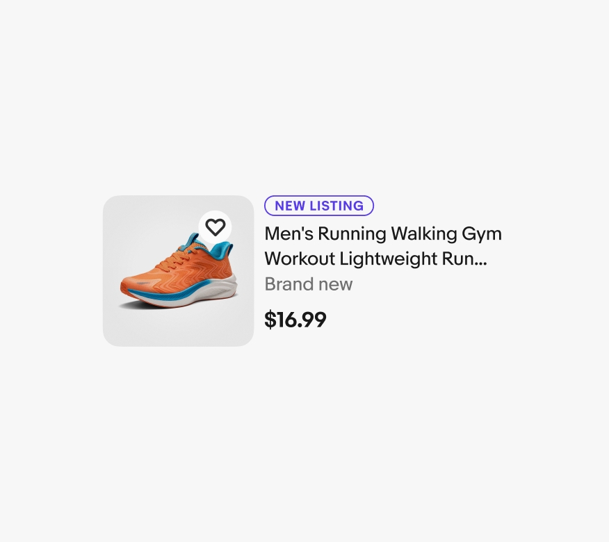
Signals use one or two words to clearly convey their meaning.
Signals appear in familiar places throughout the experience.
Clear, consistent, and infrequent use of signals helps build trust in their message.
A title is required and should summarize the signal in one or two words. Only a select few terms are included in the default signal options.
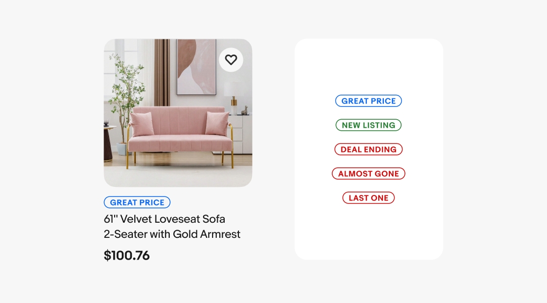
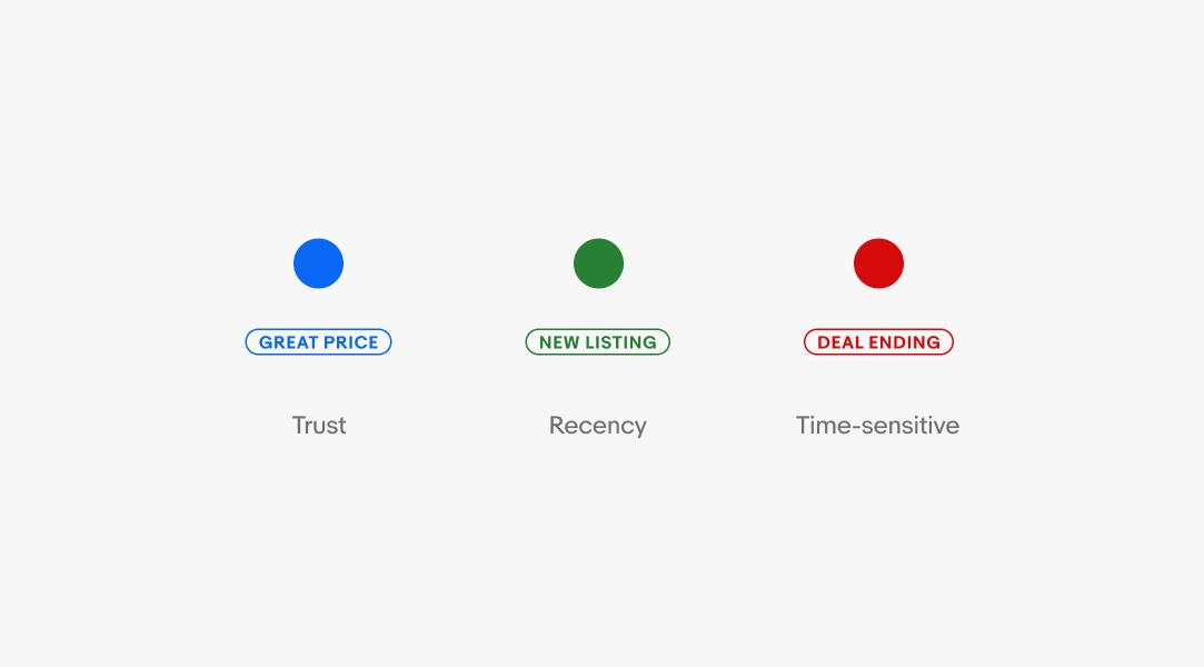
Signals use color in combination with titles to convey added meaning. Blue indicates trust, green signifies recency, and red represents time-sensitive or urgent information.
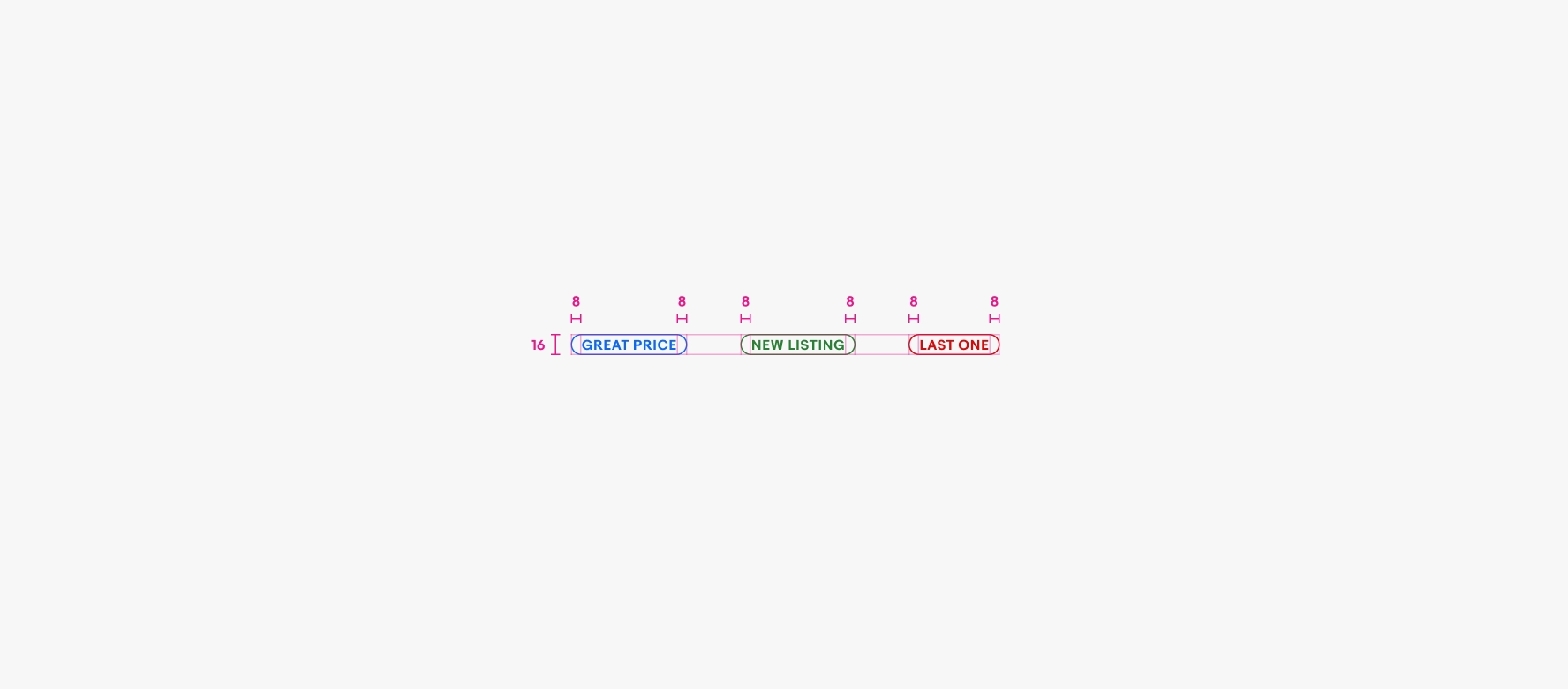
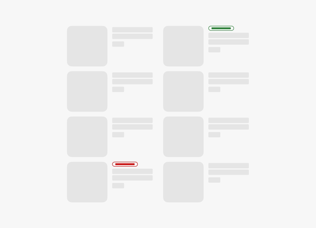
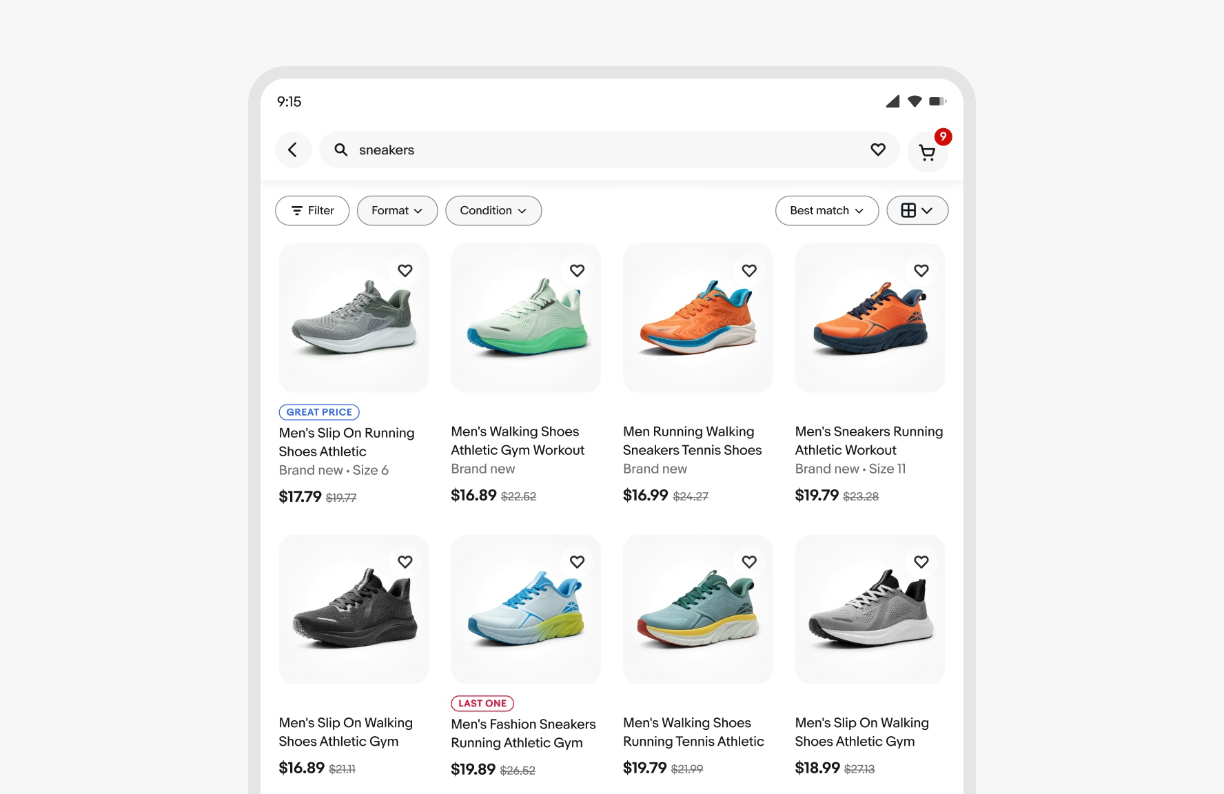
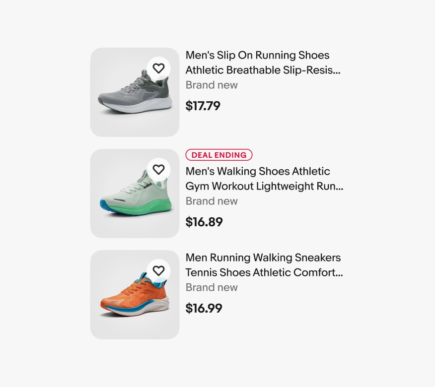
Signals should highlight items to assist customers in making quick, informed decisions. Remember that the system automatically places items and badges. While we can't always predict how many signals will appear on a page or in close proximity, it's ideal to aim for a ratio of 1:5—one signal per five items when possible.
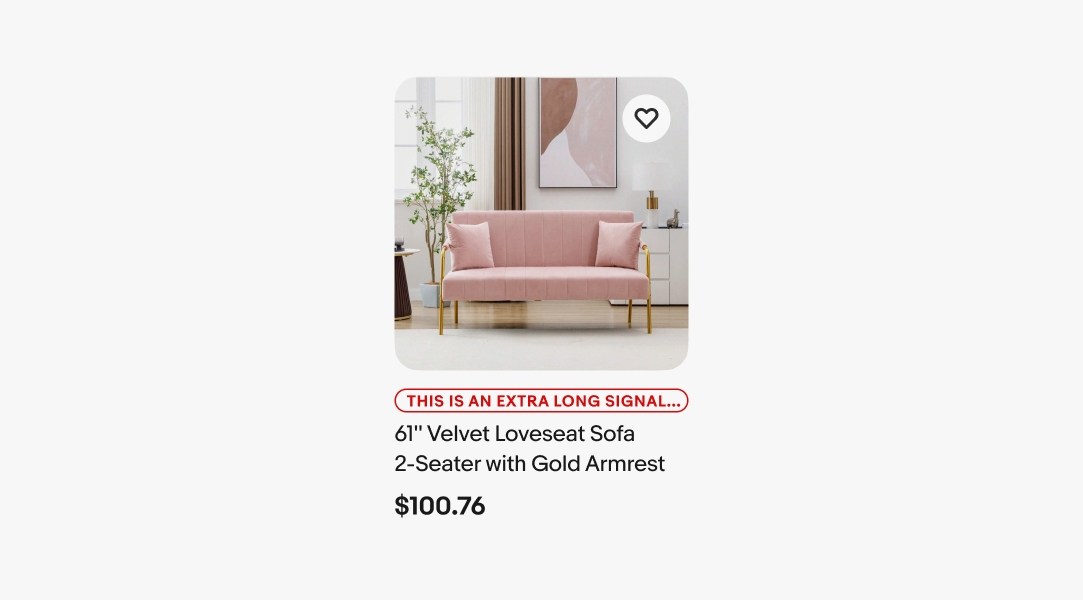
To enforce brevity, titles truncate if they extend beyond the width of the item tile container.
The signal ratio can be adjusted according to the content density in view. Aim for one or two signals in view when possible.
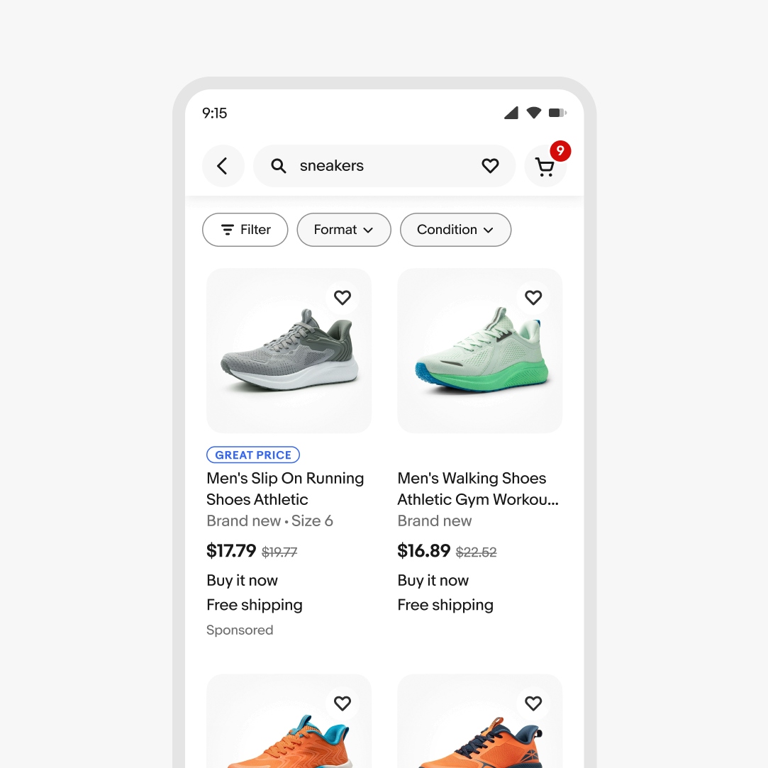
Aim for the 1:5 ratio—one signal per five items on medium and large screens when possible.
Do keep the signal in a consistent location above the item’s title.
Don’t relocate the signal, such as placing it under the price. This interferes with the hierarchy of the content.
Do use signals sparingly to highlight certain products and help the user make a decision.
Don’t overload results with signals. This could nullify their message and cause customers to ignore them.
Use signals as straightforward visual elements designed to assist in decision-making.

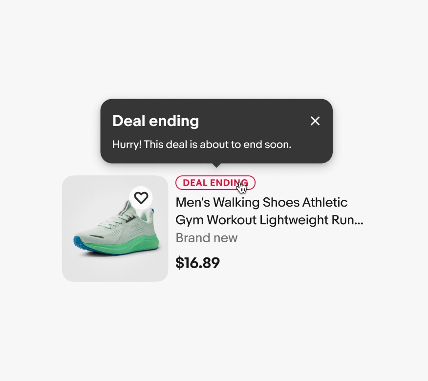
Don’t use a tip on a signal, as there’s no indication that an element of this type is intended for interaction.
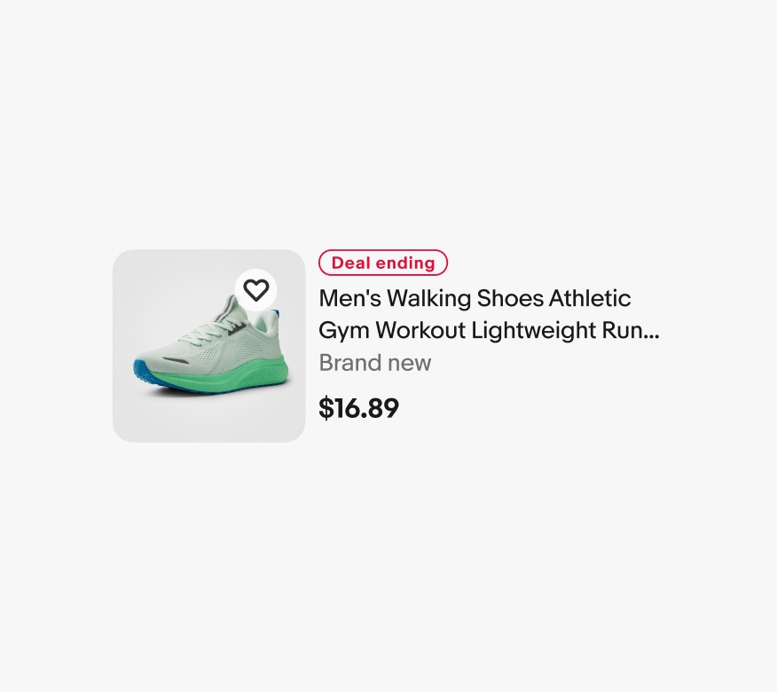
Do use uppercase type for signal titles.

Don’t alter the type casing of signal titles.
Do follow the semantic color strategy for signals.

Don’t update signals to new, unapproved colors.
Do use the outlined signal design.
Don’t fill signals or add effects.
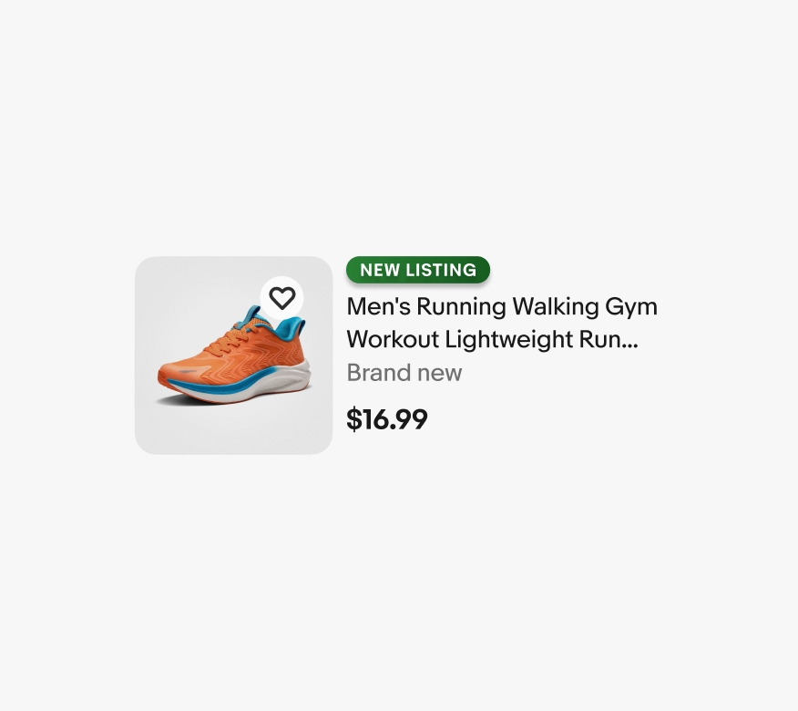
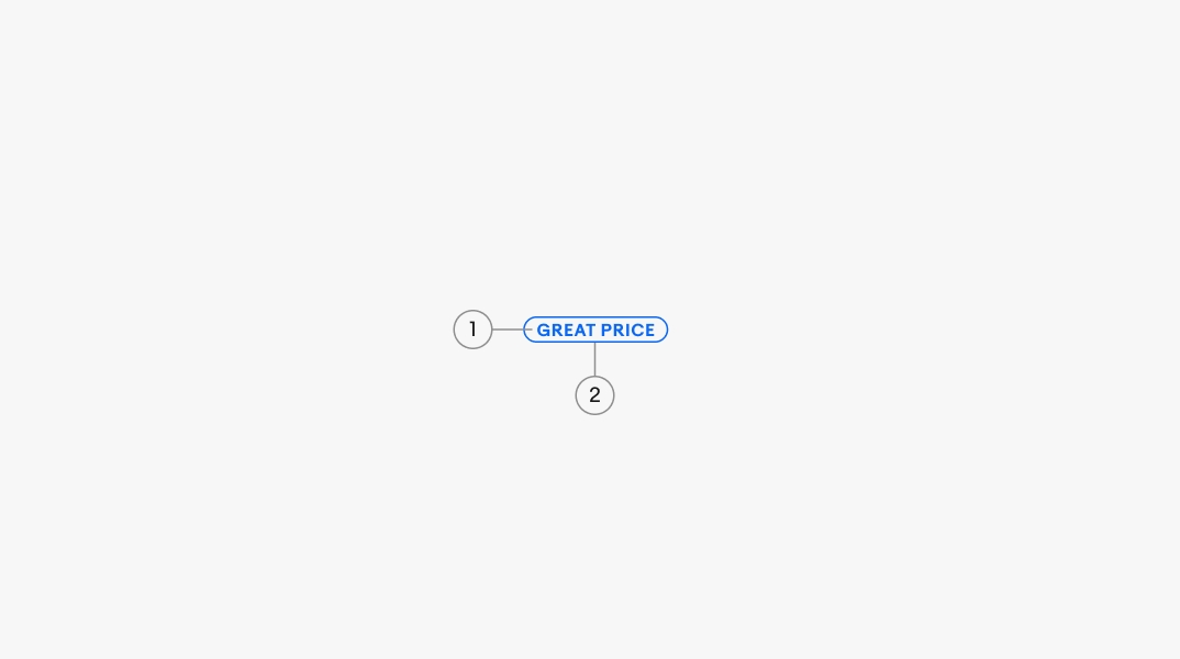
Do use a 100% corner radius on the container.

Don’t alter the shape of the container.
Do use the standard text strings that are readily available for signals.

Don’t create your own text strings. If a new string is needed, please sign up for OneExperience office hours to share your use case.