Link button

v3.1.0

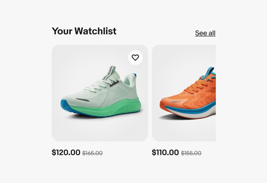
Link buttons behave similar to text links. They are primarily used for navigation and triggers, using an underline as affordance.

  • Skin
  • CoreUI
  • React

Considerations

Clear

The text makes it clear where this action will take the user.

Identifiable

Links are familiar and easily identifiable amongst other content.

Concise

Link text should be short. It’s best to aim for fewer than 5 words.

Usage guidelines

When to use

  • Navigating between pages or editing states
  • Actions that follow a short description of contents

When not to use

  • Actions that manipulate data or how its displayed
  • Actions that change state

Anatomy

A link button’s anatomy. Number 1 is pointing to the title. Number 2 is pointing to the underline.
  1. Title
  2. Underline

Properties

Strong

Strong buttons are primary actions to take in an application. This can sit inline with content or standalone.

Large, medium, and small link buttons in the foreground primary color (black).

Subtle

Subtle links are still a primary action, it’s recommended to use this to align with the foreground color of secondary text.

Large, medium, and small link buttons in the foreground secondary color (gray).

White

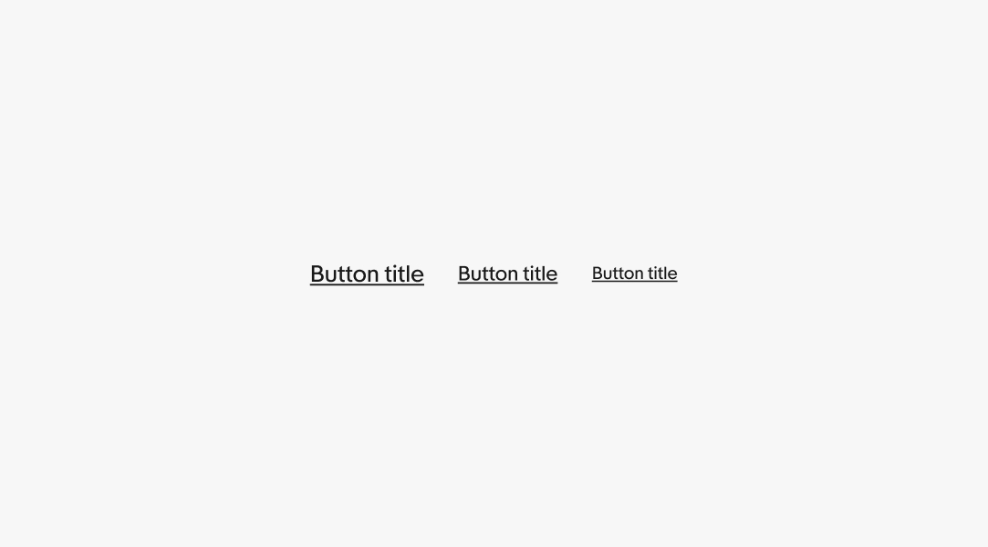
White is used within components that utilize a colored background like alert notices. This particular example uses the foreground onSuccess color token. Learn more about these token values in Color tokens.

A green success alert notice with white text.

Branded

Branded link buttons use the same foreground color as text within banners and other branded experiences.

A marketing banner with a text link under the call to action. The text link matches the blue color theme.

Size

There are three sizes for links according to the size of the content around it. This is generally Subtitle 2 (16/24), Body (14/20), and Caption (12/16). Standalone links can use whichever size is most appropriate for their context. Learn more about type sizes in Typography tokens.

Large, medium, and small link buttons with pink specs calling out there size as 24, 20, and 16px respectively.

Behavior

Underline

Standalone link buttons are placed on their own line close to the relevant content and contain an underline by default.

A carousel with a “See all” link button in the upper right. It has an underline.

No underline

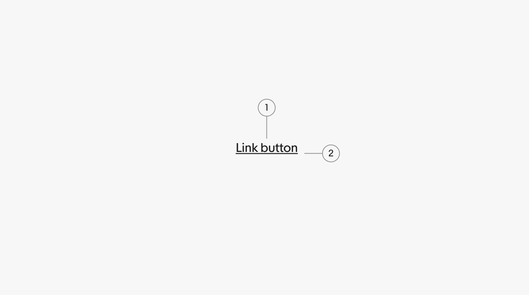
The underline can be omitted if the context is clear, such as in navigational lists.

Non-underlined links are less accessible so avoid using them for critical or important links. When in doubt, use an underline.

A series of link buttons stacked in a footer. They don’t have underlines.

States

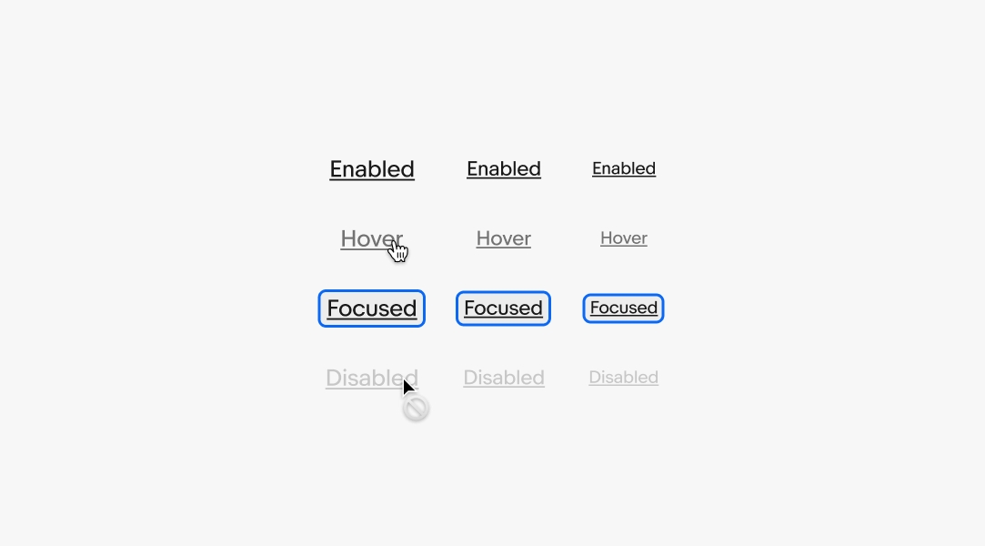
States are used to indicate levels of interaction when hovering a link button. The available states are enabled, hover, focused, and disabled. They follow the same patterns as Text Links. Learn more about the state layer color values in Color tokens.

Large, medium, and small link buttons all in the enabled, hover, focused, and disabled states.

Best practices

Content

Do use words that describe where the link leads and what content is expected.

A carousel with a concise “See all” link button in the upper right corner.

Don’t use lengthy words that create longer strings. They add unnecessary detail.

A carousel with a wordy “See all watchlist items” link button in the upper right corner.

Underline

Do always use an underline with standalone link buttons.

A carousel with a “See all” link that is underlined.

Don’t remove the underline for links near other content. This can easily get lost and are inaccessible to low-sight users.

A carousel with a “See all” link that is not underlined.

Do consider removing the underline in a large list of link buttons, such as in footer and other navigational lists.

A group of link buttons in a footer navigation. The underline has been removed.

Don’t add the underline on large lists of link buttons. This adds visual complexity when the context is already clear.

A group of link buttons in a footer navigation. The underline has been removed.

Titles

Do use links in body copy or footnotes.

A group of text containing a title and body copy. A link button sits at the ery bottom.

Don’t use links for titles or headlines.

A group of text containing a title and body copy. The title incorrectly has a link button.

Specs

A large link button with specs detailing the type is 16px and the line-height is 24px.

Large

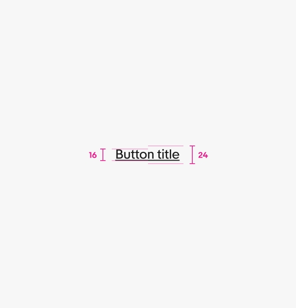
Large standalone links are Subtitle 2 (16/24) type size in regular weight.

A medium link button with specs detailing the type is 14px and the line-height is 20px.

Medium

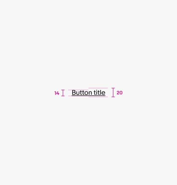
Medium standalone links are Body (14/20) type size in regular weight.

A small link button with specs detailing the type is 12px and the line-height is 16px.

Small

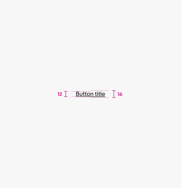
Small standalone links are Caption (12/16) type size in regular weight.

Change log

VersionDateNotes
3.1.0
Aug, 2024
  • Added “underline” behavior and updated best practice examples
3.1.0
Jul, 2024
  • Updated to eBay Evo
3.1.0
Mar, 2023
  • Updated “borderless” value to “text”
  • Converted Standalone Link component into Link button
  • Renamed “role” property into “type”
3.0.0
Dec, 2022
  • Added state-layer component to handle state logic
  • Removed hover and pressed state from button component after adding state-layer
  • Added borderless button variant
  • Staged update for split button (currently testing)
  • Cleaned up component property and value labels
  • Renamed “label” layer to “title”
  • Renamed “icon” layer to “leading-icon”
2.0.0
Jun, 2022
  • Updated to use new component properties feature
  • Updated tertiary button style to improve contrast and accessibility
  • Added 32px size for use in components
  • Updated 40px size label to md
  • Added 48px size icon button to match other buttons
  • Combined destructive and default buttons together as a “role” property
  • Updated interactive states to use new state-layer logic
1.6.0
Aug, 2021
  • Added B5 for hover states
  • Added R5 and R6 for destructive button hover and active states
  • Updated button component architecture to use variants
  • Added tertiary button option
  • Added icon button
  • Added destructive button with all hierarchy levels