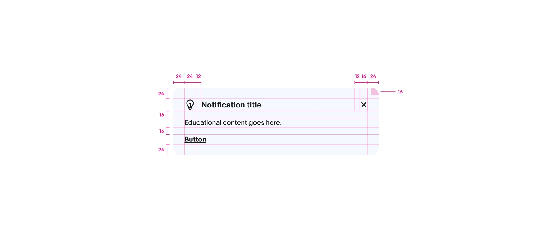
Do keep titles in bold and body copy in regular weight to maintain visual separation from the action.
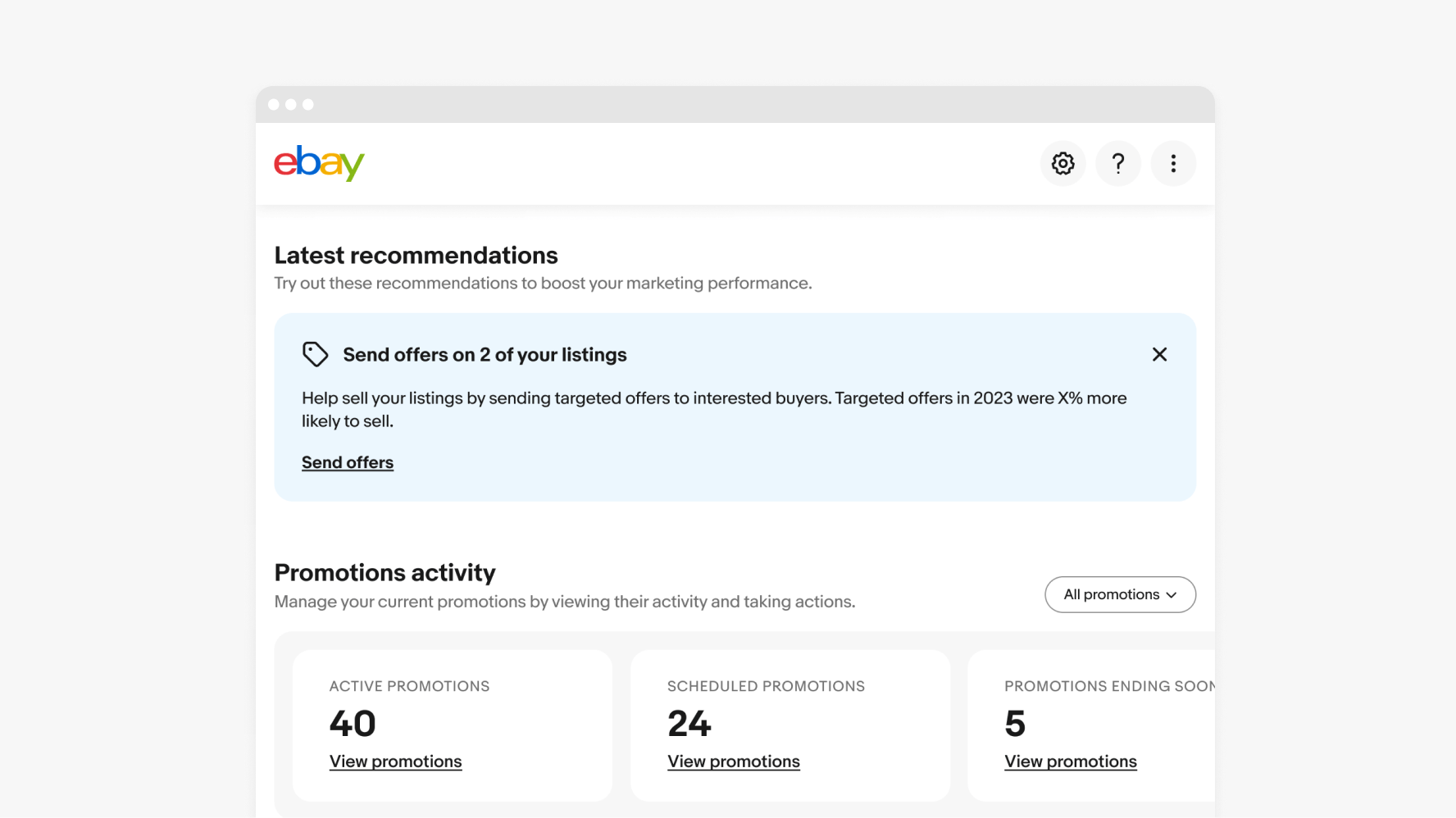
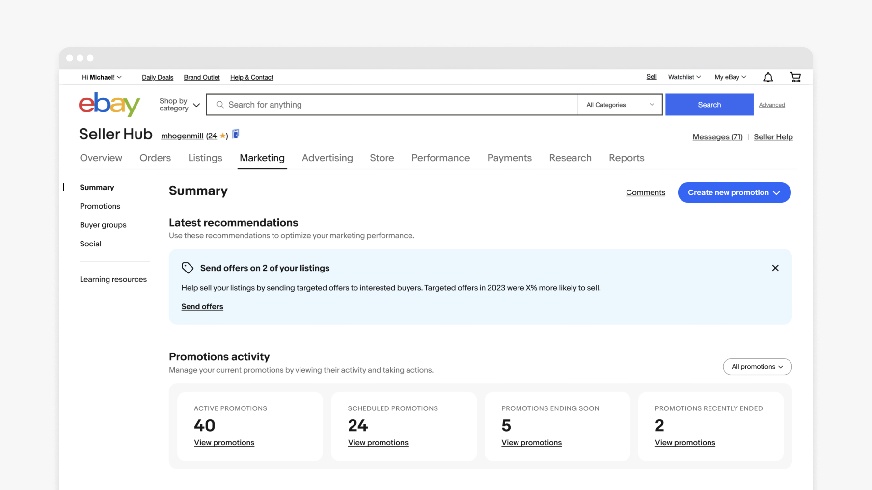
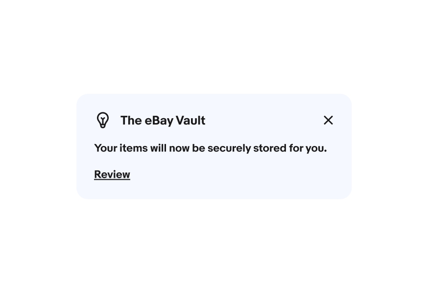
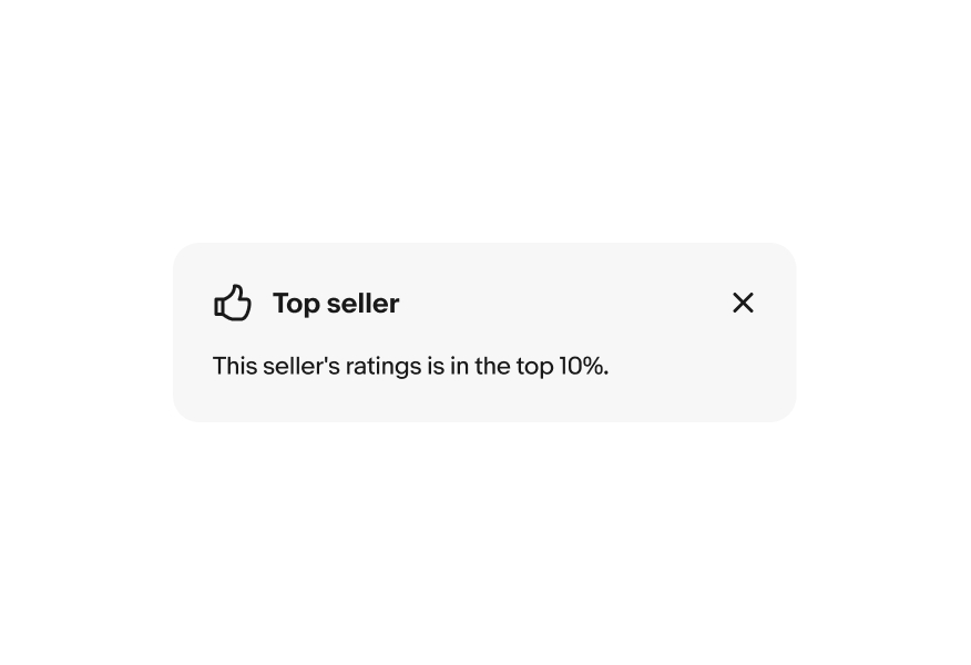
Education notices are supplemental, contextual messages that educate users about programs, features and opportunities.

Education modules help users immediately access additional information.
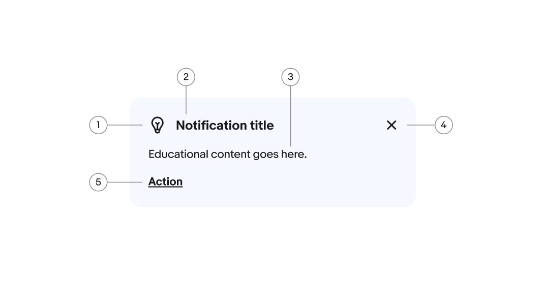
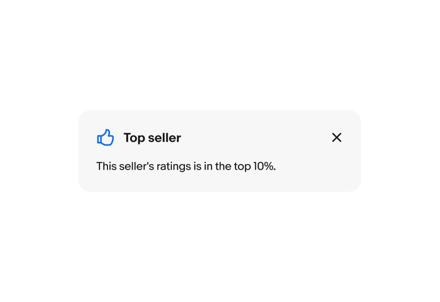
Education modules use icons to help support the message, explain a concept, or create a visual connection to the value prop.
Education modules can be actionable and/or dismissable and have 2 levels of visual prominence to scale to all use cases.
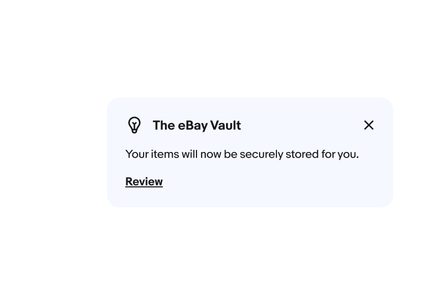
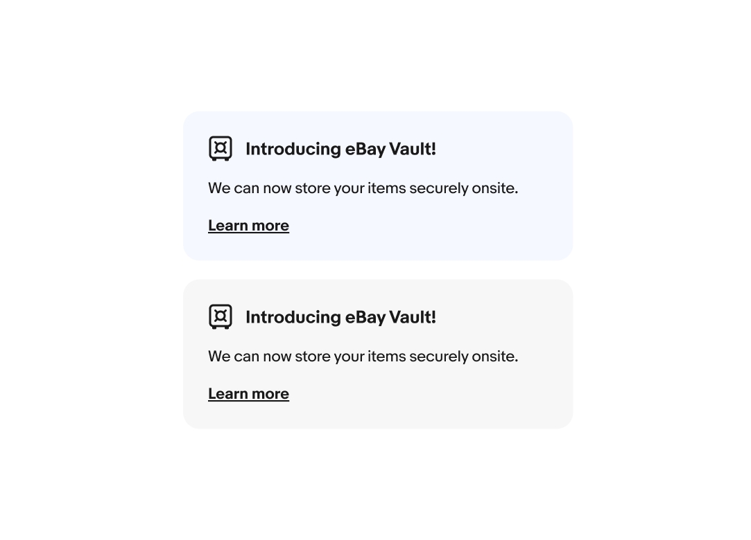
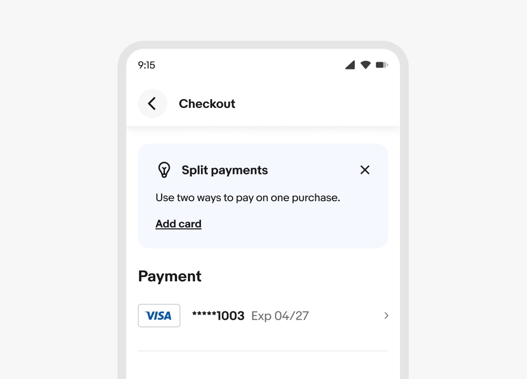
Education notices can have blue or gray backgrounds. Choose a background color based on the message's prominence and the page's hierarchy. Blue education notices are more noticeable, but can be overwhelming when there’s a lot of adjacent colors. Gray education notices are less prominent, but better suited for pages with a lot of color.
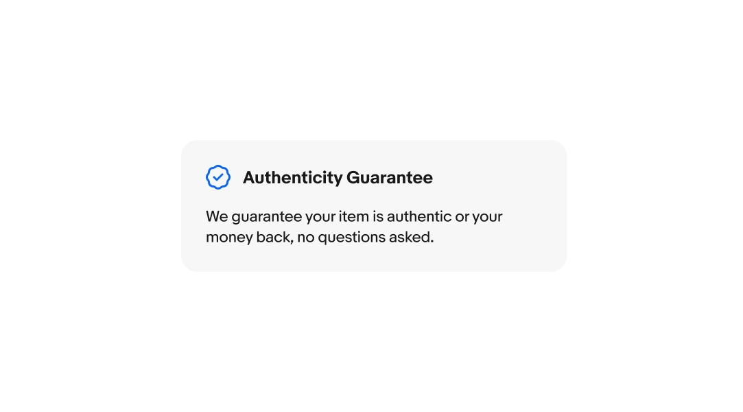
The leading icon can be black or blue. They are black by default, but approved program badges can use blue. If the blue is too prominent or noisy, program badges can use black as well. For more information, please refer to Program Badges.
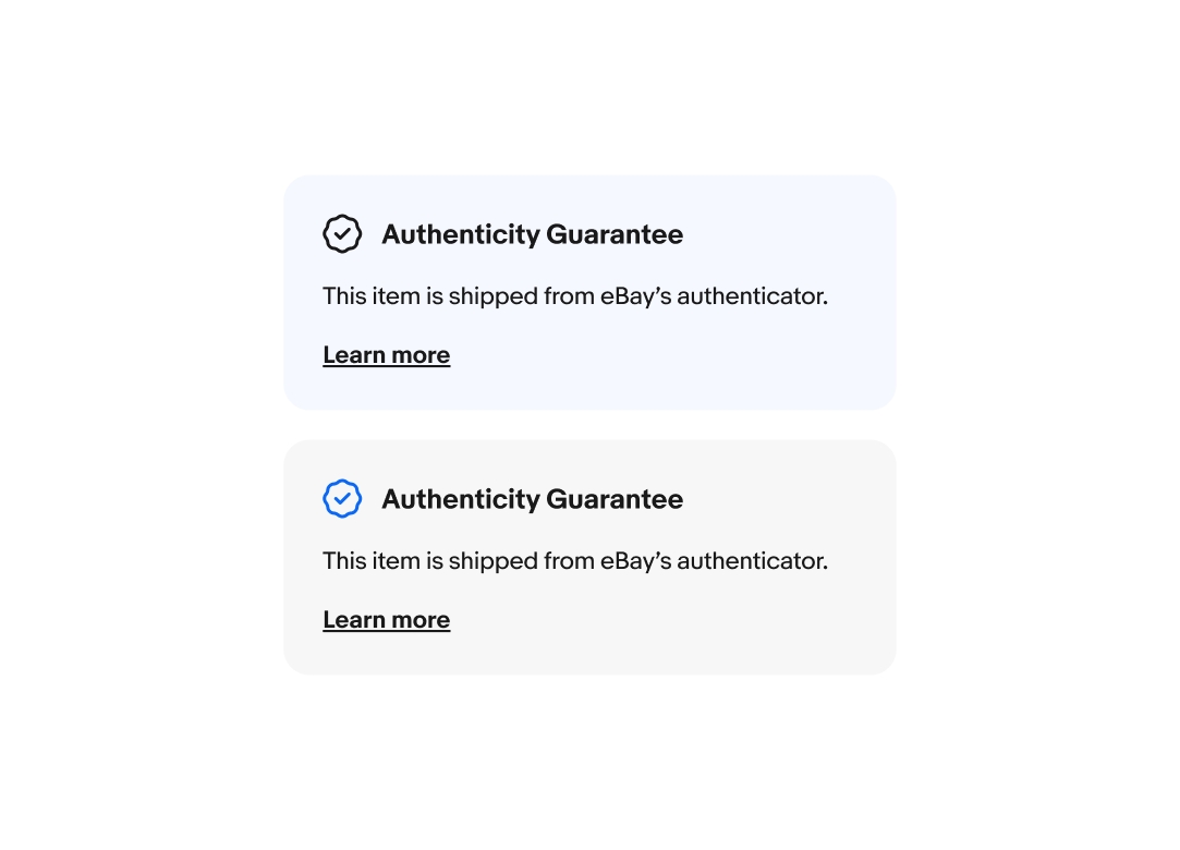
A bolded title is required. The title quickly summarizes the purpose of the notice. Titles have a maximum character count of 55 characters.
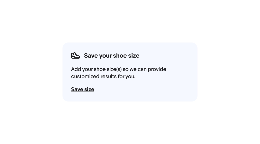
The body text is required. The text should be succinct and avoid repeating elements of the title. The body copy has a maximum character count of 120 characters.
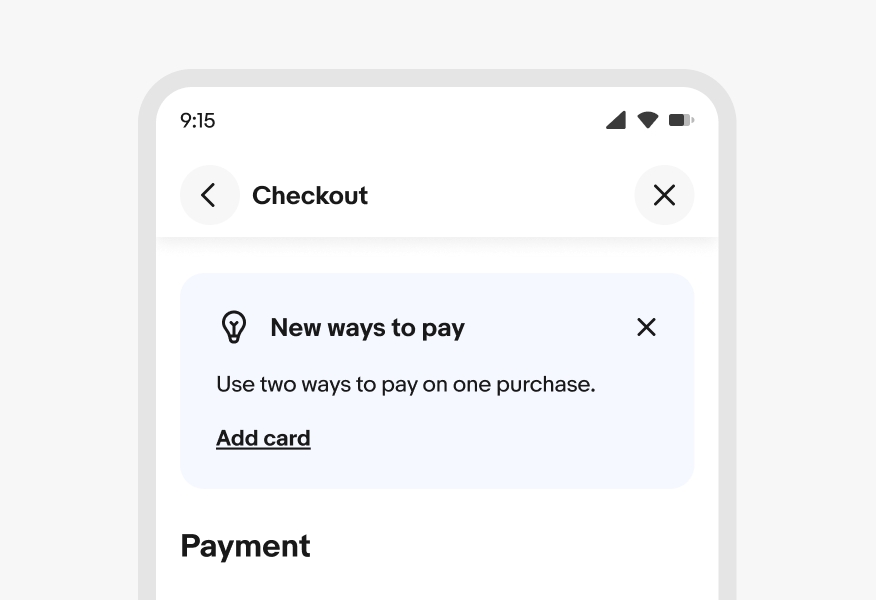
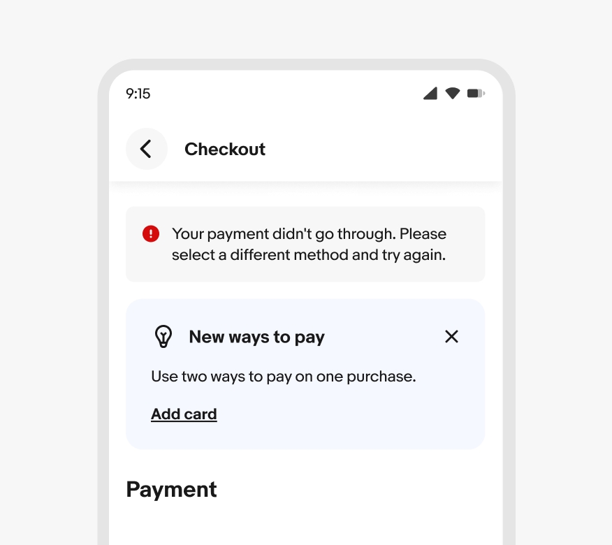
A leading icon is available to increase visibility and drive recognition of a feature or program. The icon relates directly to the messaging. If the message is about a program, use the respective program badge.
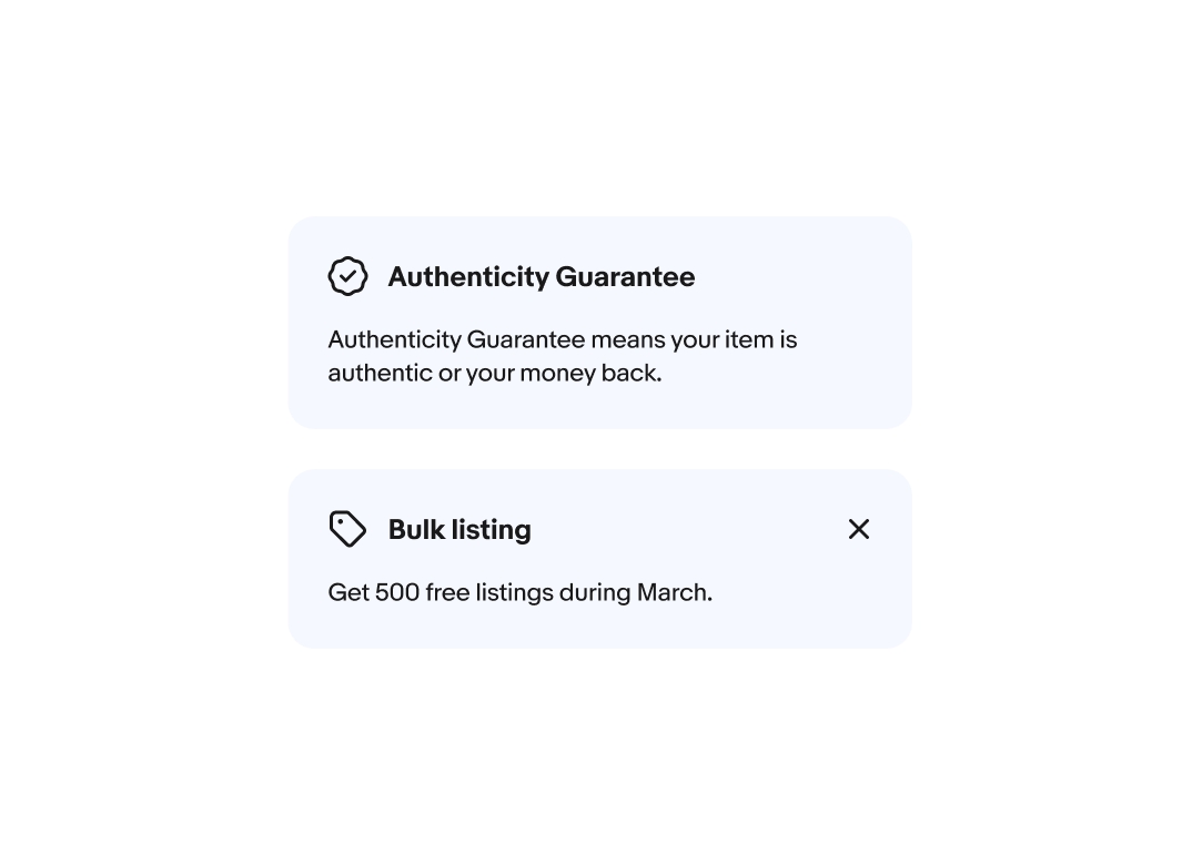
Education notices can include a dismiss button that removes the alert from the page. This is useful for general or supplemental information that users may only need once.

Education notices can include a link button informing users of additional information or a supporting action.
On small screens, the action is stacked below the content, while on large screens, the action is inline to the right.

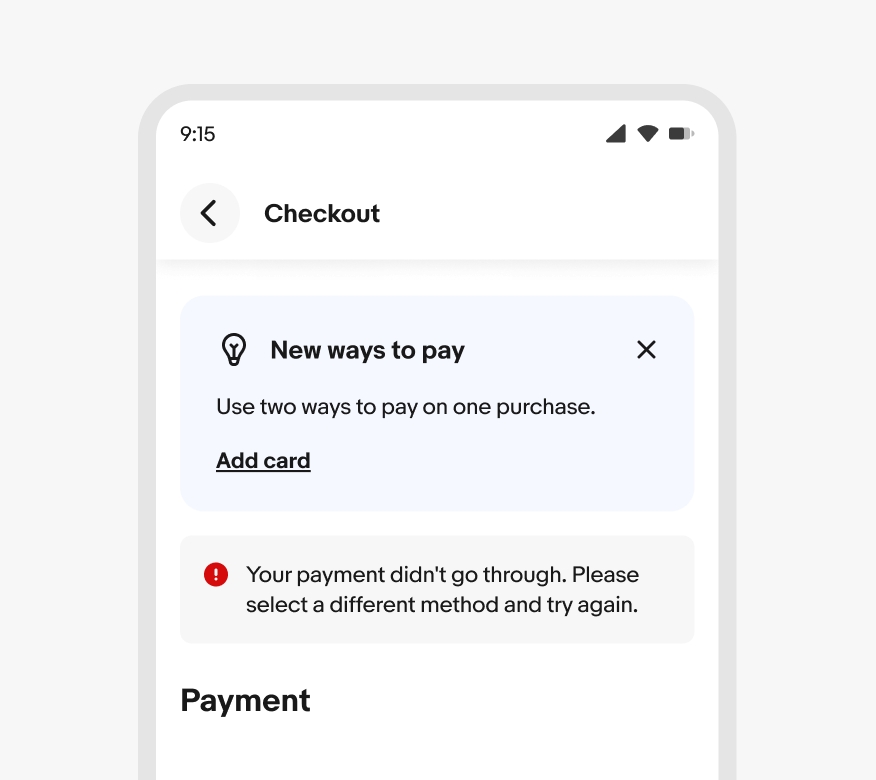
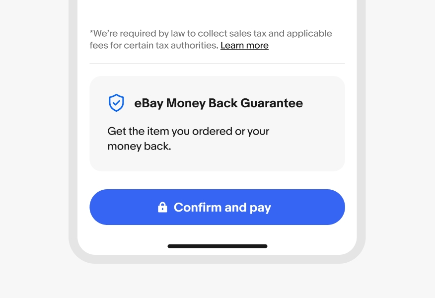
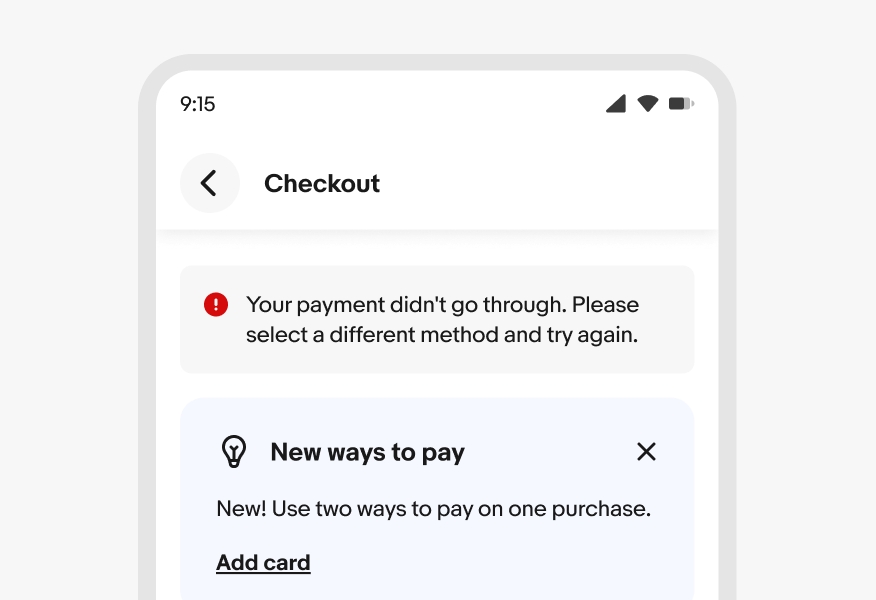
Education notices are contextual; they should be placed close to a relevant page section. For example, a payment message appears above a payment section. Similarly, a Guarantee Trust message is located further down the checkout page, just before the purchase button.
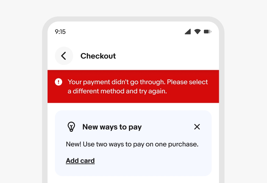
Page level alerts are displayed above any education notices.
Section level notices are also displayed above any education notices if they’re referring to the same section.
The minimum width for education notices is 288px.
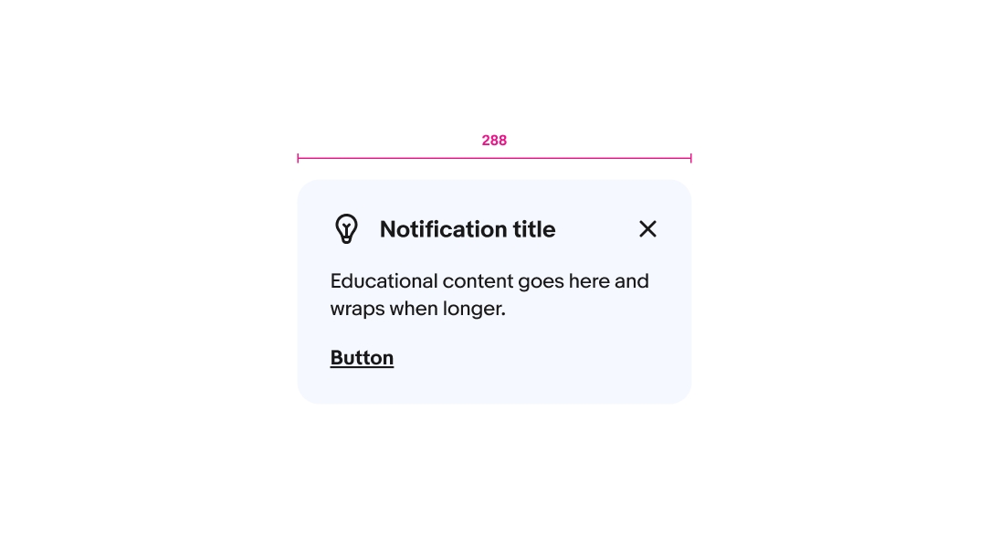
Title and body copy will wrap if wider than the container. Action labels should avoid wrapping.

Education notices can appear in a carousel when there are multiple related notices. If a notice is dismissible, the content shifts to fill the open spot after a notice is removed. The width doesn’t change to fill available space.
On small screens, education notices always extend to fill all columns and have rounded corners. Dismiss is always right top-aligned and the action is left-aligned below the body content.
On medium screens, education notices also extend to fill all columns and have rounded corners. Dismiss is always right top-aligned and the action is left-aligned below the body content.
On large screens, education notices extend to their maximum width.
Do keep titles in bold and body copy in regular weight to maintain visual separation from the action.
Don’t use bold weight for the body copy. The action becomes more difficult to discern from the main content.
Do use black for all icons that are not an approved program badge.
Don’t make generic icons that aren’t approved badges blue.
Do ensure alert notices appear above education notices when they occupy the same space.
Don’t place education notices above alert notices when occupying the same space.