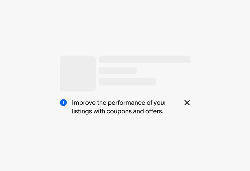
Do keep inline notices close to and focused on their target element.
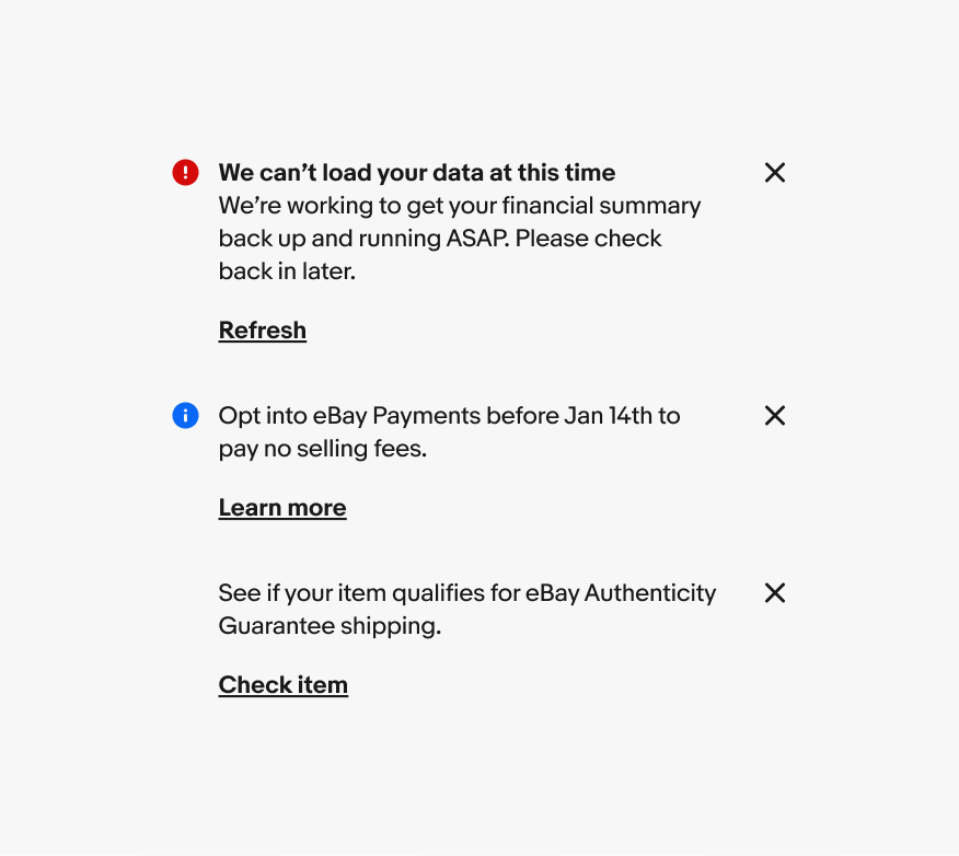
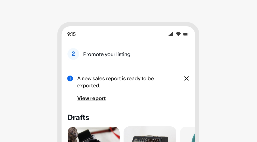
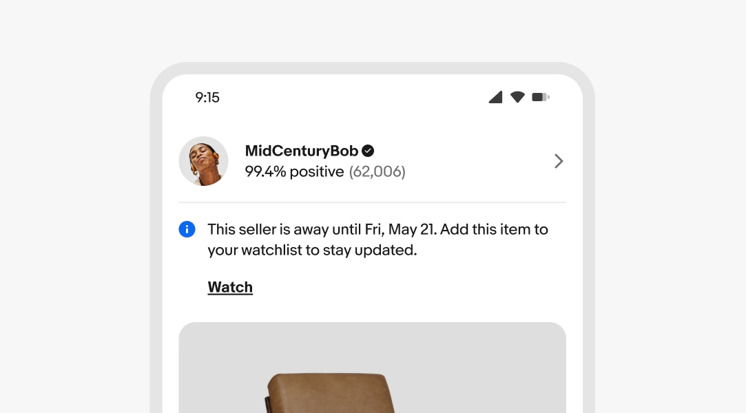
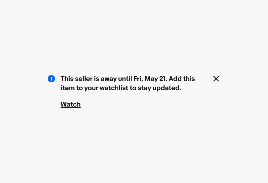
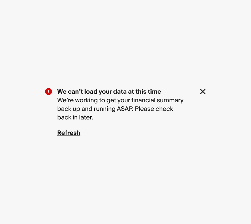
Inline notices are low-priority messages about a single element, like a tile or row item.

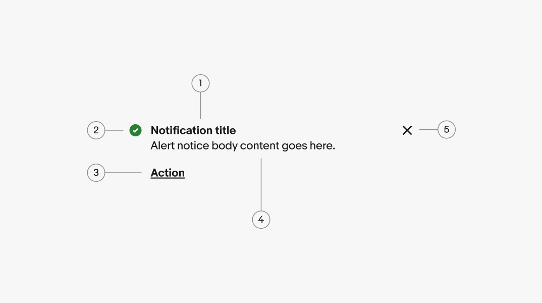
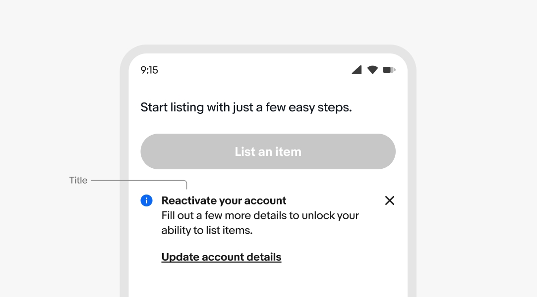
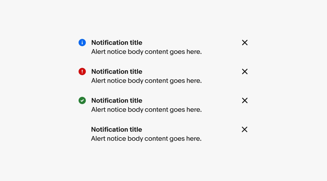
A bolded title is optional. Use a title to quickly summarize the purpose of the notice. Keep titles short, no more than 60 characters, and avoid repeating the body text.
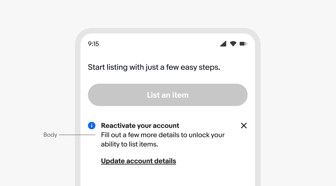
The body text is required for all notices. Aim for 1-2 lines. If the body content exceeds 3 lines, consider whether a different design treatment might be better suited to accommodate the length of the message. For actionable notices, the text should inform the user of a next step.
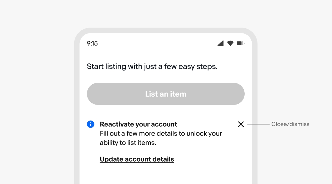
Alert notices can include a dismiss button that removes the notice from the page layout. This is helpful for general or supplemental information provided by the notice.
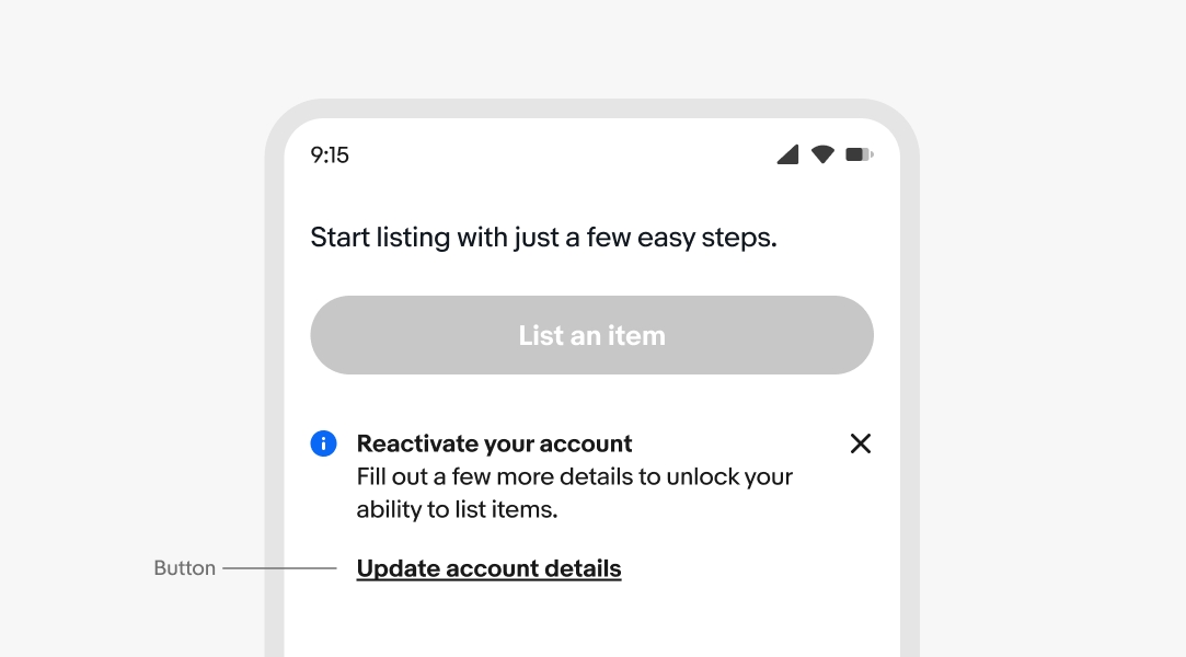
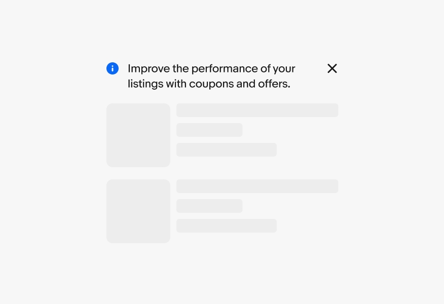
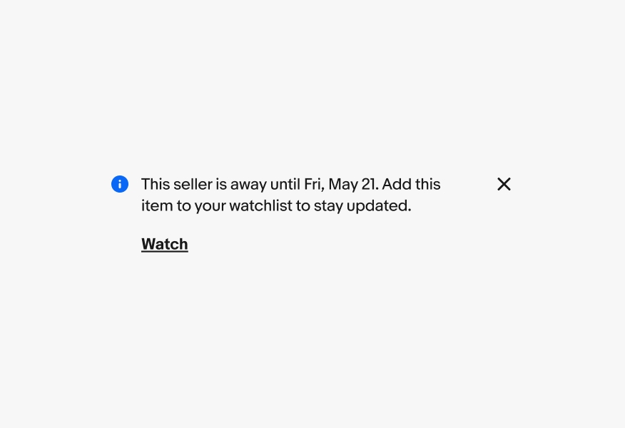
Actionable notices include a link button below the body text. It is recommended that notices include an action that helps resolve them.
All alert notices are semantic. The available options are information, attention, confirmation, and general. Choose the semantic type depending on the type of message. The icons cannot be customized, and only three options are available: information, attention, and confirmation.
Inline notices appear on load as part of the page layout and are inset. Content shifts to fill the space when an inline notice is dismissed. Inline notices should always be dismissible or resolvable, not a permanent part of a design.
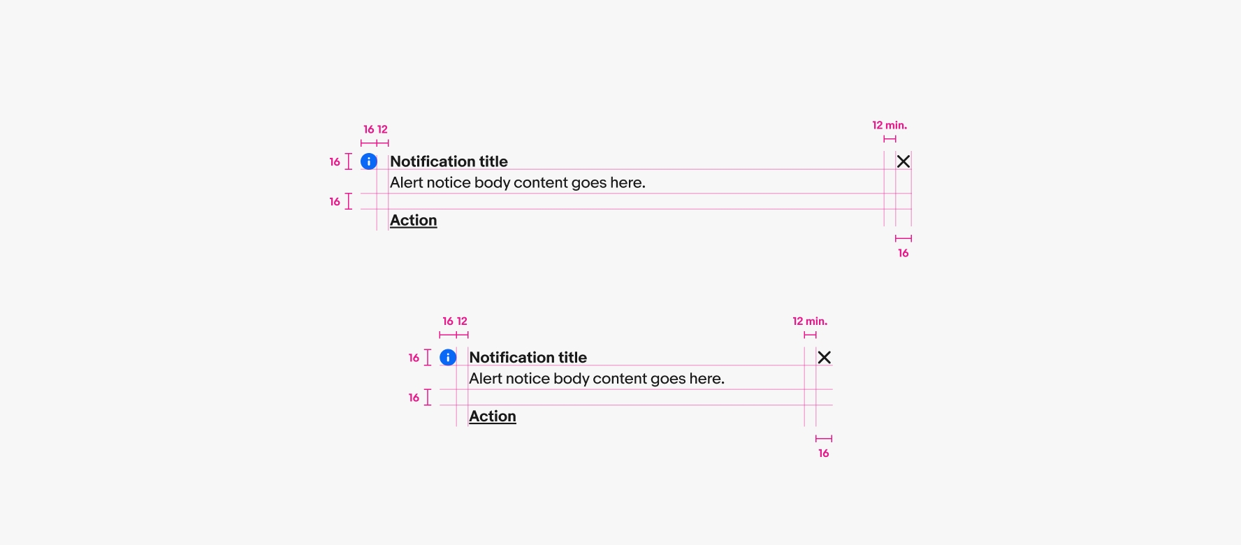
All text content will wrap if wider than the container. Avoid wrapping for titles and button titles where possible.
The button is always stacked below the content for inline notices. This applies to both small and large screens.
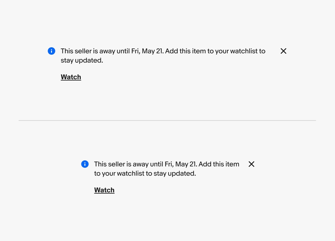
On small screens, inline notices are positioned next to the related elements, with the button placed below the main content.
On large screens, inline notices are positioned beside their related elements. If a button is included, it is placed below the main content. Unlike page and section notices, which can include a right-aligned button, inline notices do not have this option.
Do keep inline notices close to and focused on their target element.
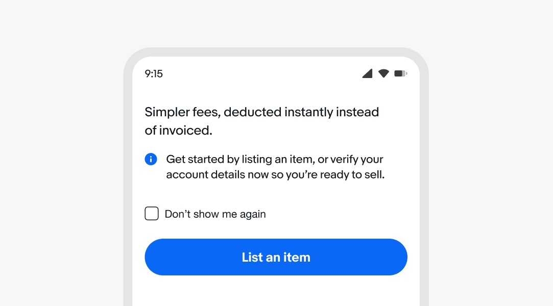
Don’t use inline notices for sections, page-level content, or attention account information. Use a section or page notice notice instead.
Do keep body copy in regular weight to maintain enough visual separation from the action.
Don’t use bold weight for the body copy. The button becomes more difficult to discern from the main content.
Do show one inline notice at a time and replace it with the next priority inline notice after the user dismisses or addresses it.
Avoid stacking inline notices. Stacked inline notices can quickly become overwhelming.