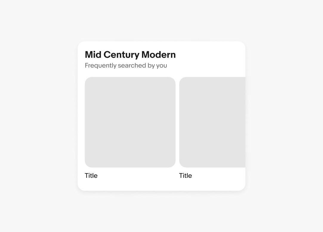
Keep section headers short. Aim for a single line and use subtitles to add more detail.
Section headers separate bodies of content to create hierarchy throughout the experience. They help drive focus and navigation.
Section headers establish hierarchy and delineation between groups of content.
Headers allow users to quickly scan content and identify where they’d like to focus.
Headers are short and summarize the content they group.
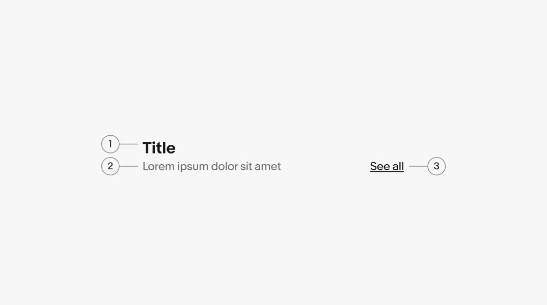
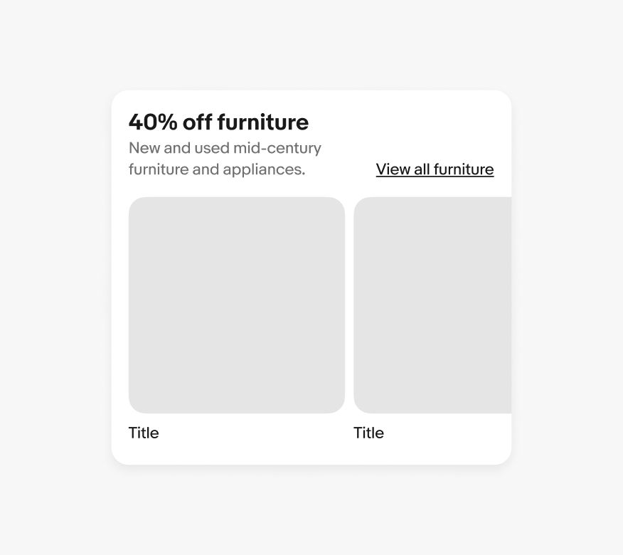
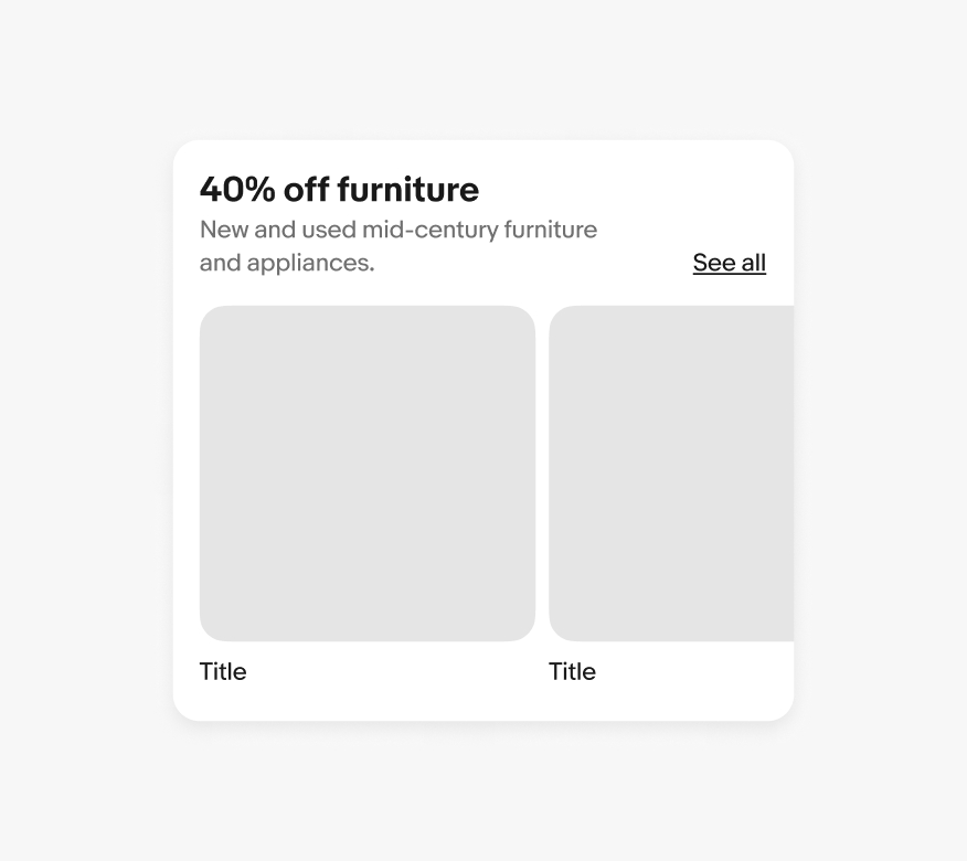
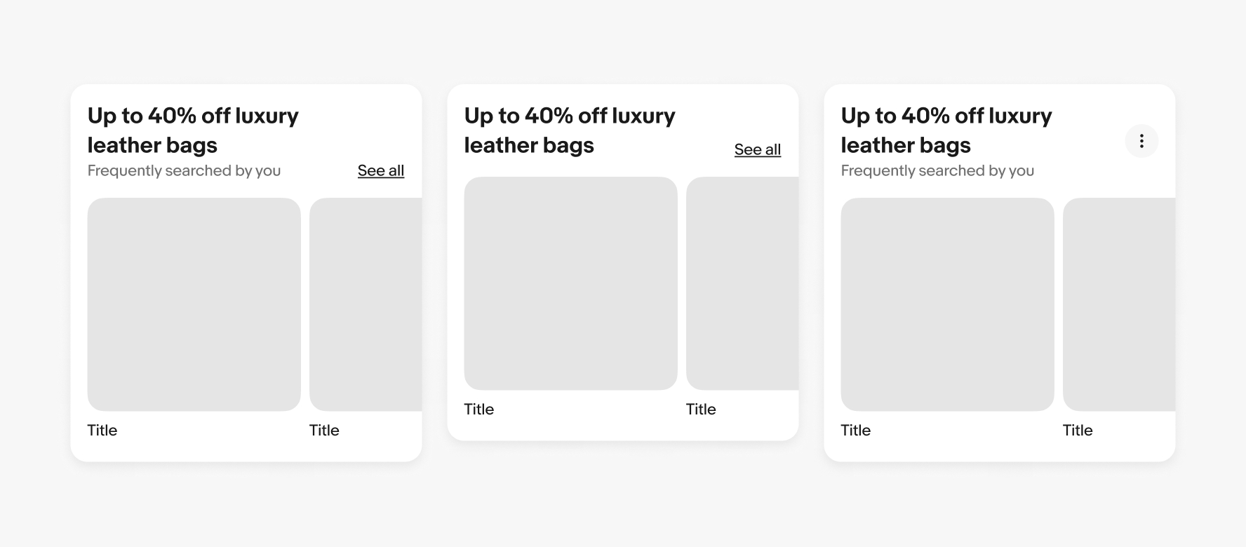
Being a header component, the title element is required. It should succinctly describe the content it is grouping.
A subtitle is optional. Use it to support the title in describing the content and its purpose.
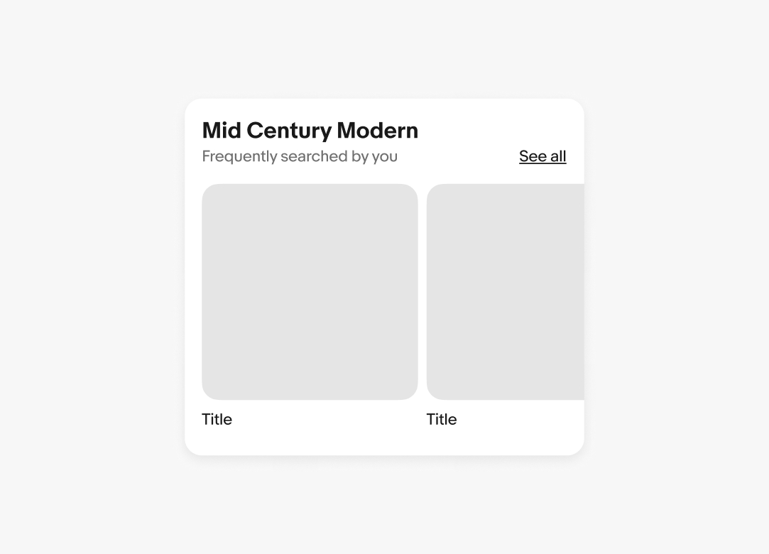
A trailing action is optional. This can be a link to more results or an icon button.
If there is more than one additional action, they will collapse into an overflow icon button.

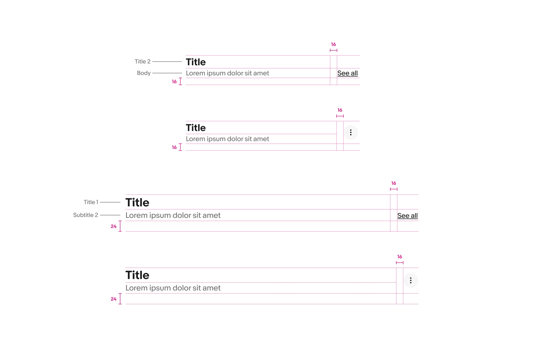
The title and subtitle will wrap to multiple lines when wider than the container. Aim for no more than 2 lines where possible.
The trailing accessory will align differently depending on the type of accessory. Links will align to the baseline of the title or subtitle, and icon buttons will vertically center.
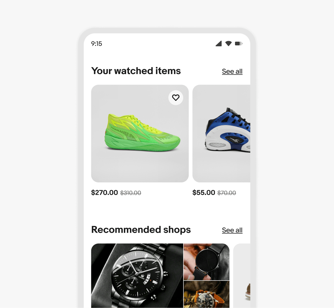
The title and link text are smaller on small screens. The spacing below the title is also smaller.
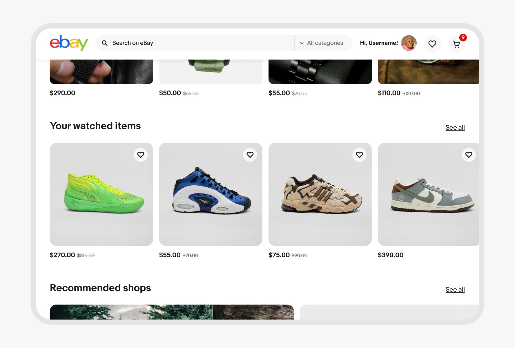
Font sizes and bottom padding increase on larger screens.
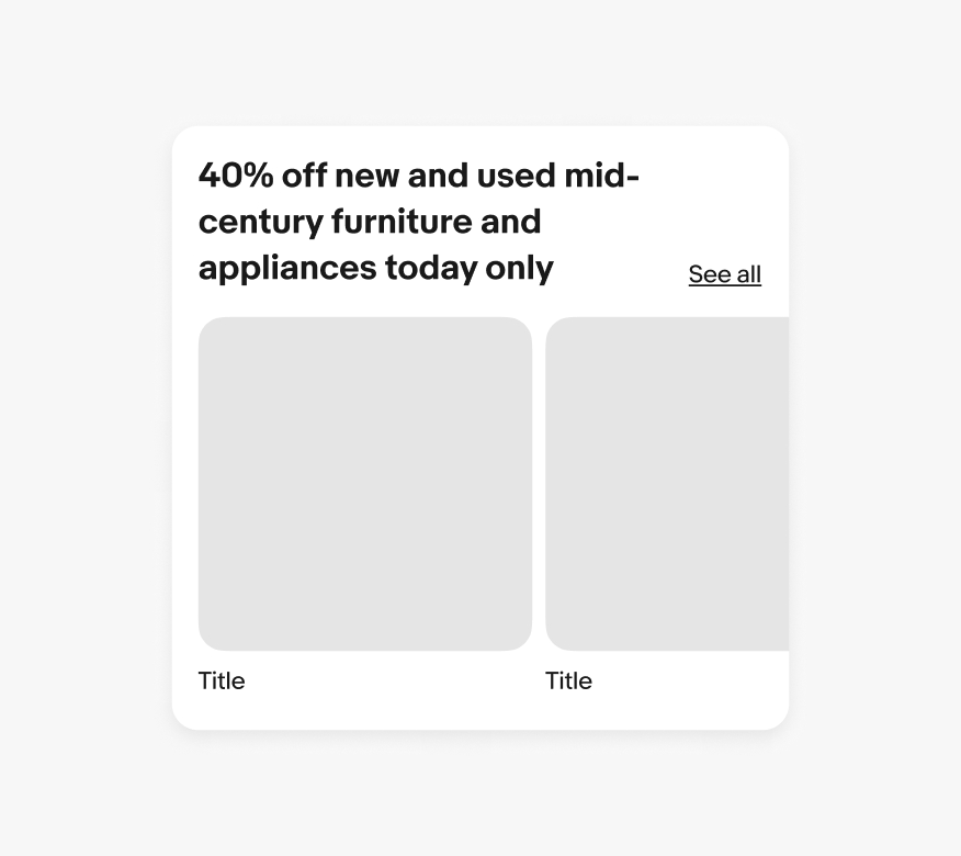
Keep section headers short. Aim for a single line and use subtitles to add more detail.
Don’t let titles get too wordy. Simplify the title as much as possible, and add a 1-2 line subtitle if necessary.
Do use the default text link content.

Don’t change the text link content.