Date picker

v1.2.0

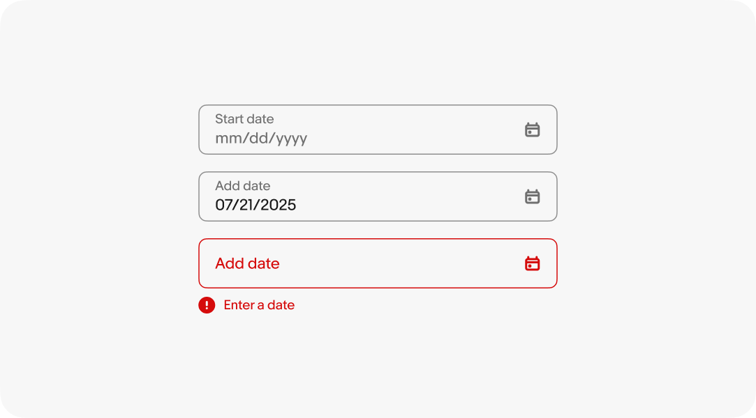
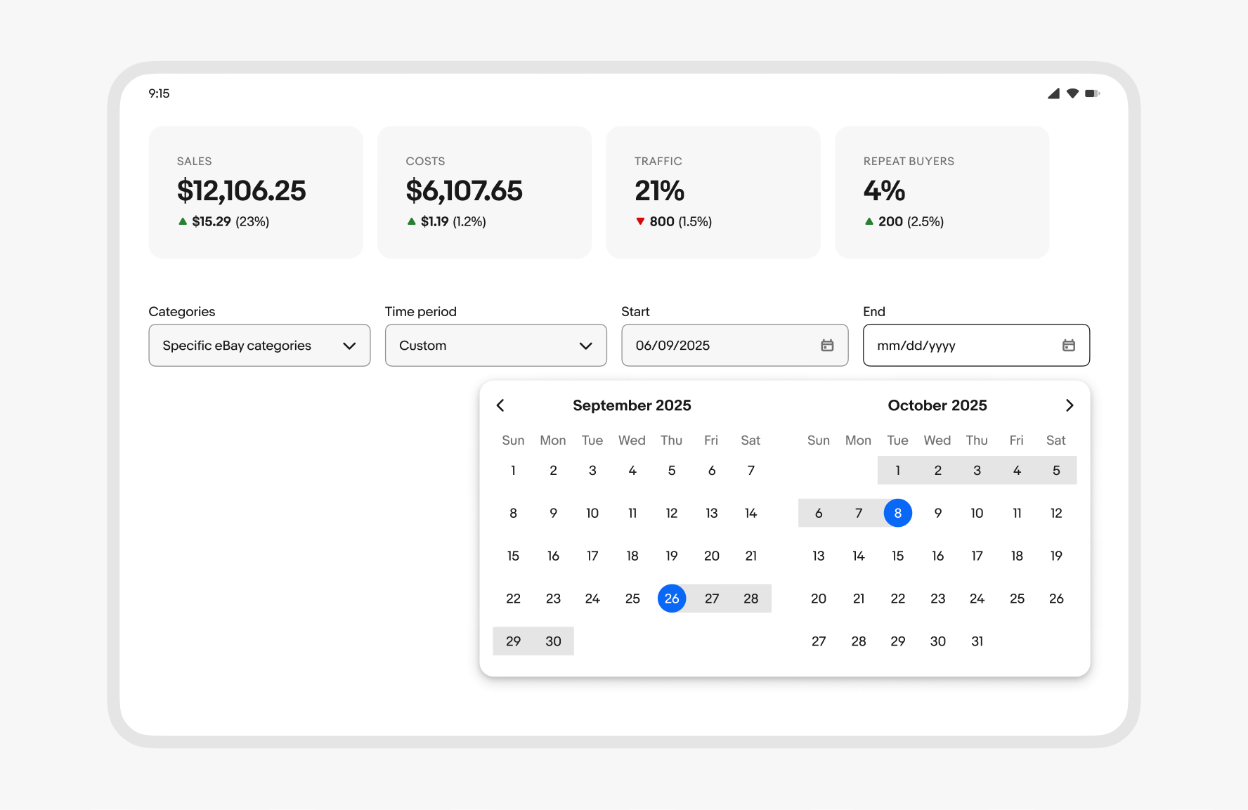
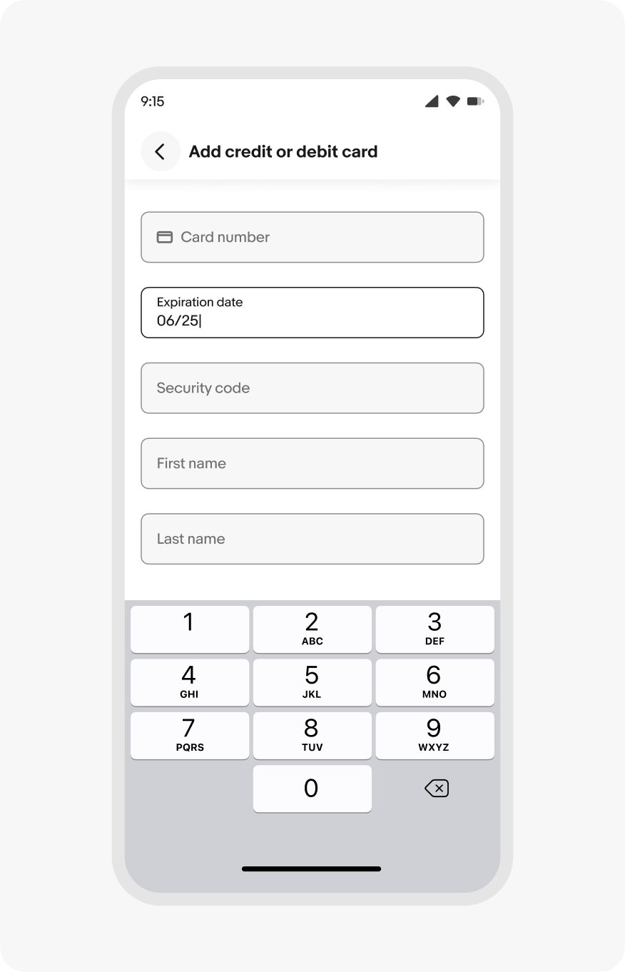
Date pickers allow users to choose a date or a range of dates.

Anatomy

Properties

Behavior

Navigating months

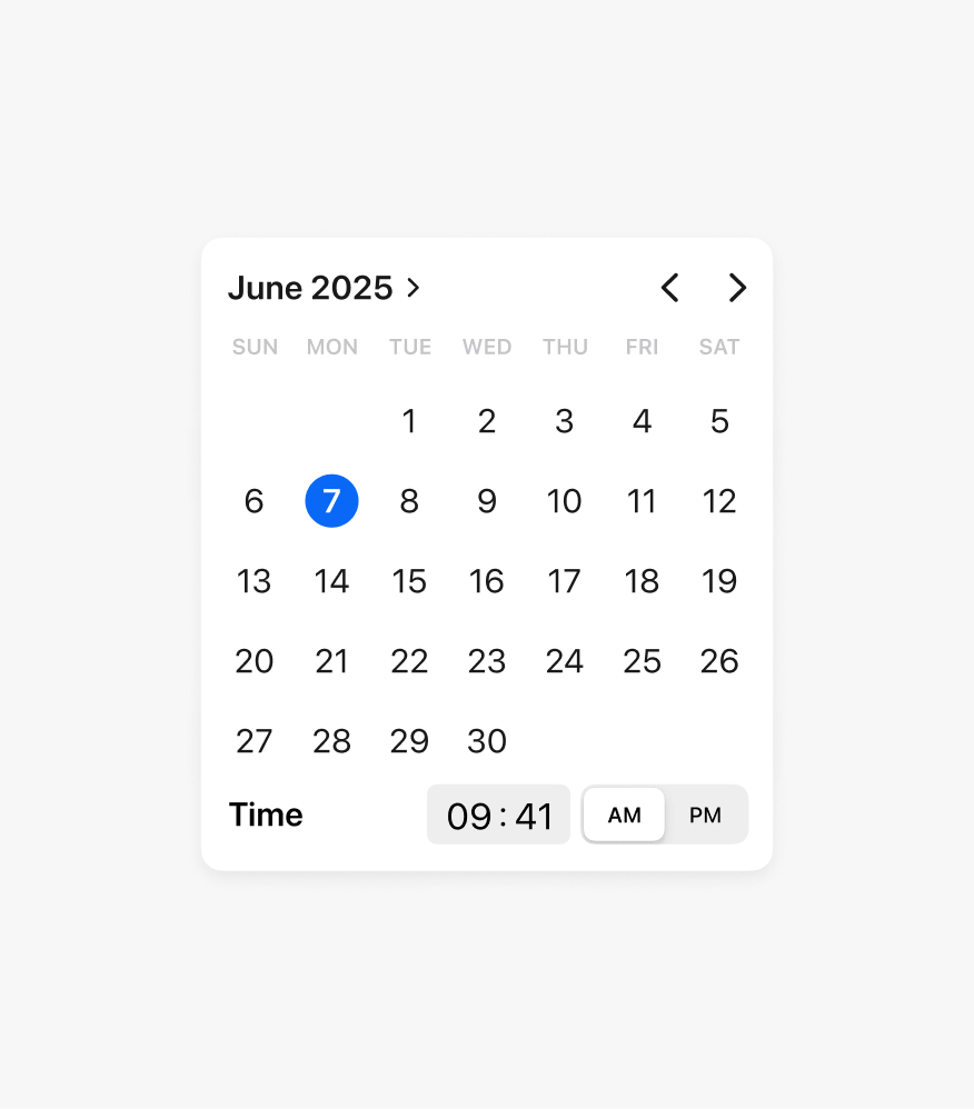
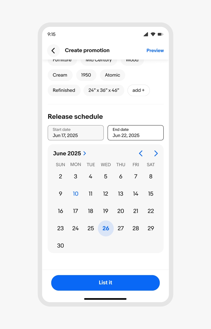
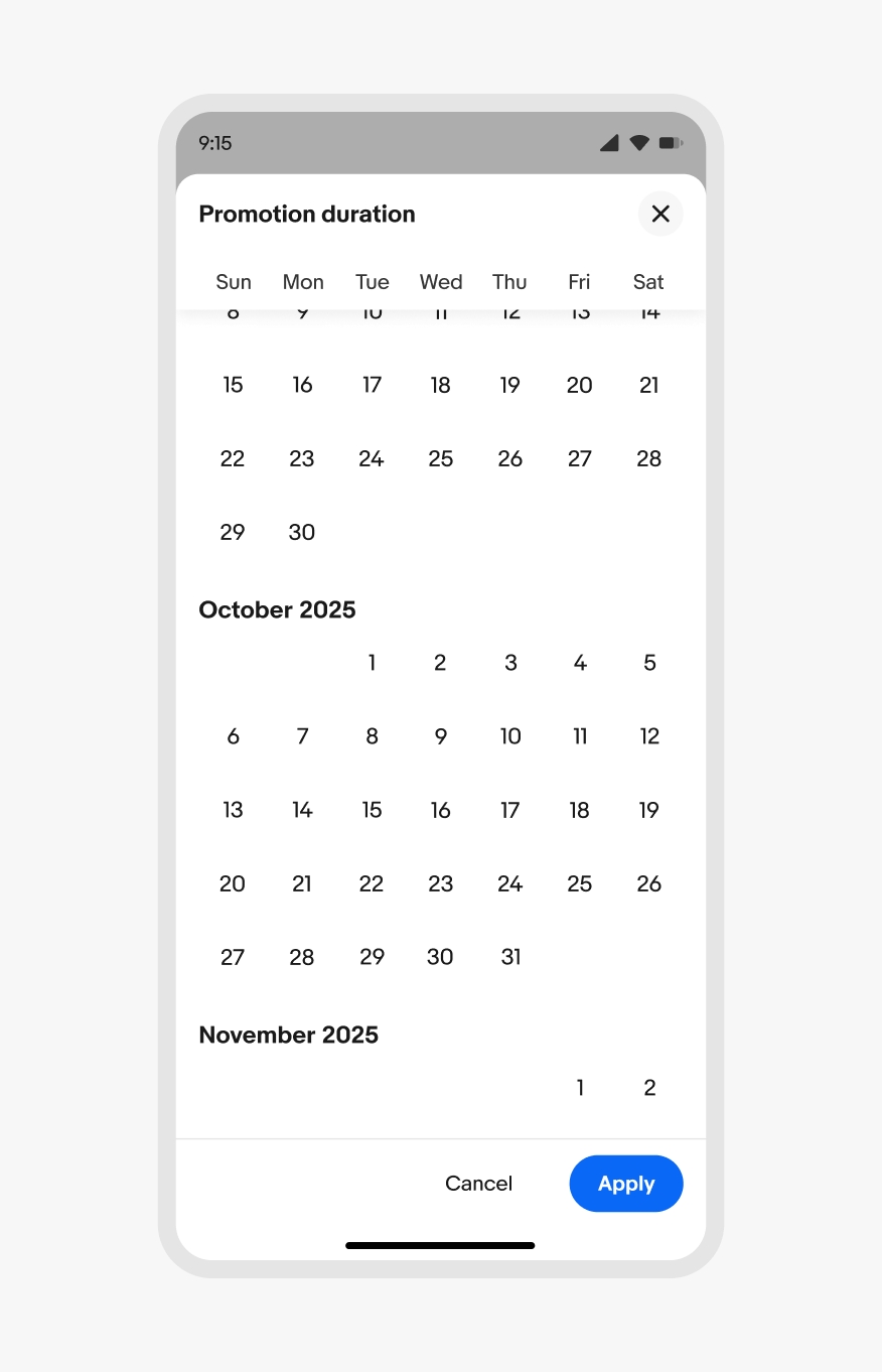
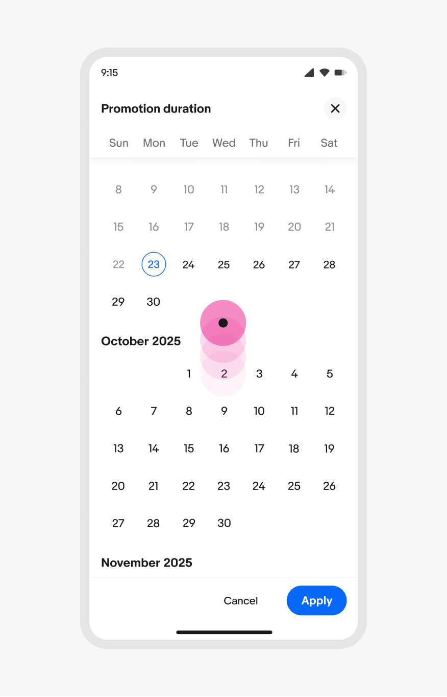
Both single and double pickers navigate horizontally via the top-right controls or by swiping left or right on the dates. Full screen dialog pickers scroll vertically.
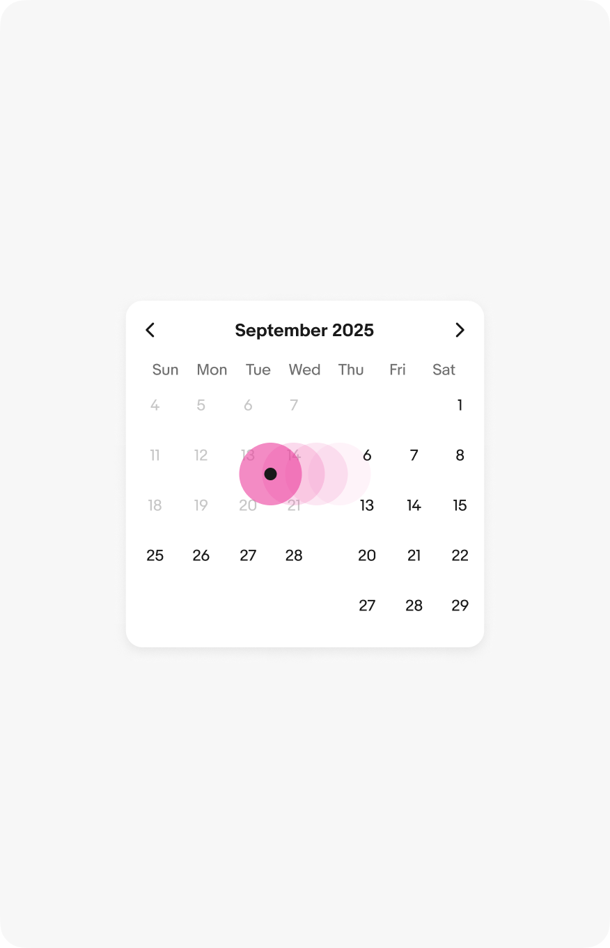
A single default picker with a swiping indicator from right to left.
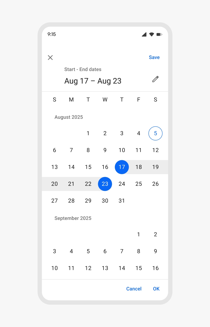
A full screen dialog picker with a swiping indicator from bottom to top.

Platforms

Native pickers

Native Android and iOS devices leverage the OS date pickers.

An Android-styled date picker.

Android date picker

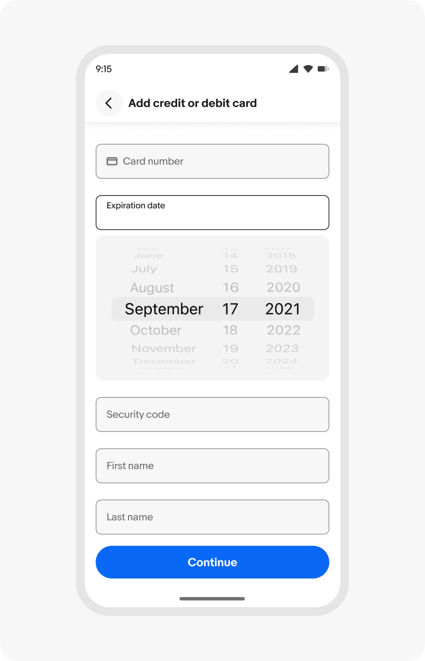
An iOS-styled date picker.

iOS date picker

Android

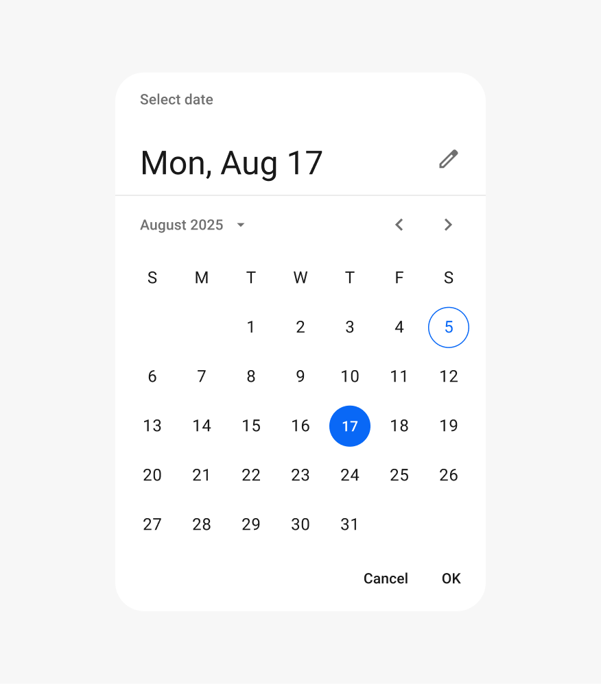
Android devices use the Material date picker component. The Material date picker is available in a docked popover or modal variant.
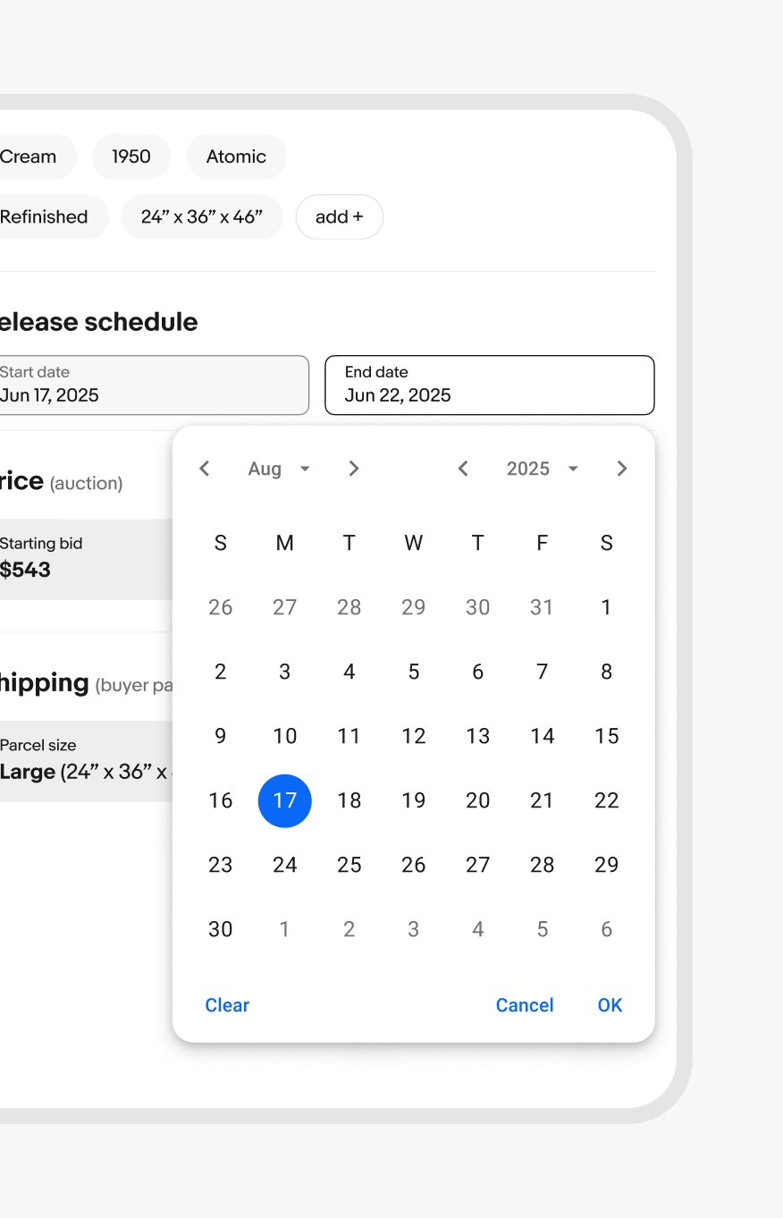
A material design docked date picker popover.
A material design modal date picker on a mobile screen. The months are stacked.

iOS

iOS devices use the native picker components. These are available as popovers or inline pickers.

An iOS popover date picker.
An iOS inline date picker.

Screen sizes

Small

Date pickers in native apps use the OS pickers. HTML uses the popover or fullscreen dialog version.

A native iOS date picker in popover form.

Native date picker

A small screen html date picker as a fullscreen modal.

HTML full screen date picker

Best practices

Specs

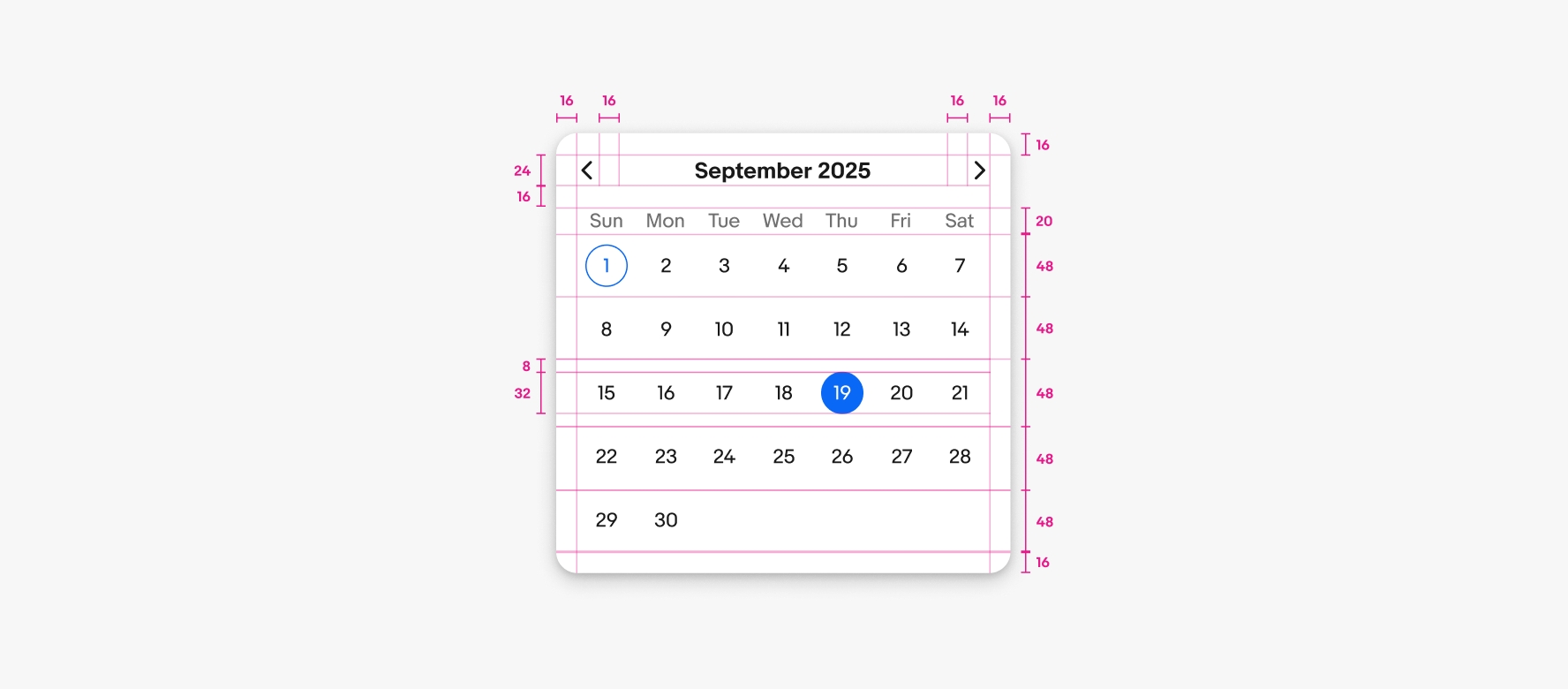
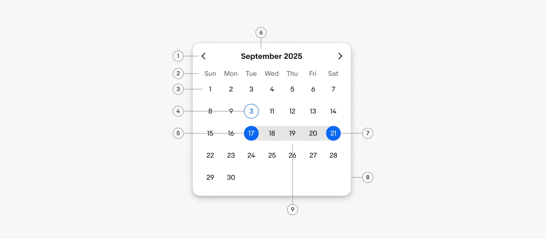
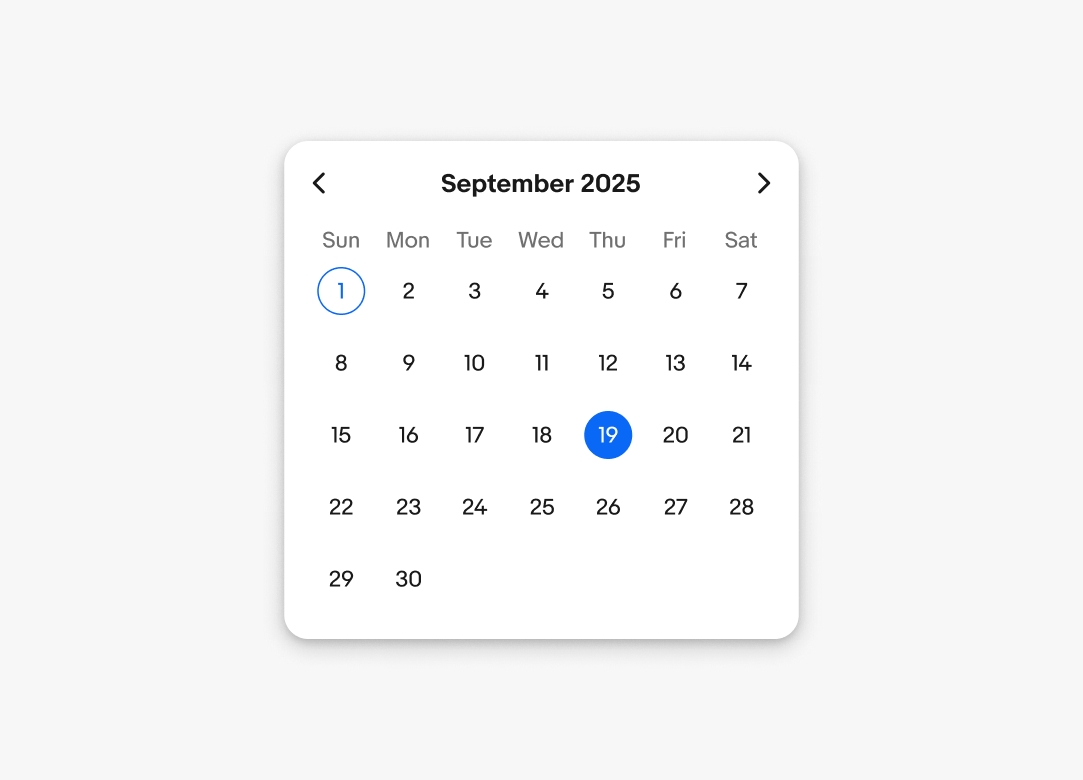
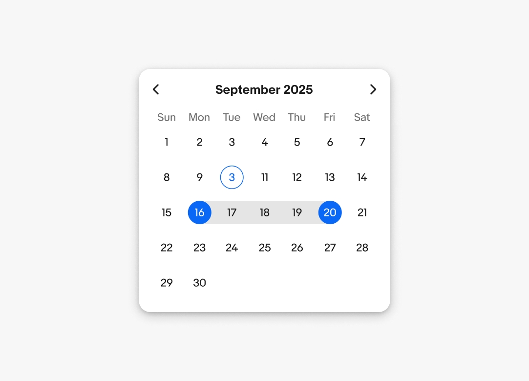
Specs for a default date picker. There is 16px padding around the container. The month and year along with pagination controls are 24px tall. Each pagination control has 16px on the sides. 16px is between the header portion and the day row. The day row is 20px tall. The date selector cells are 48px tall. The selection circles on the dates are 32px tall with 8px above and below equaling the 48px of the cell.

Default picker

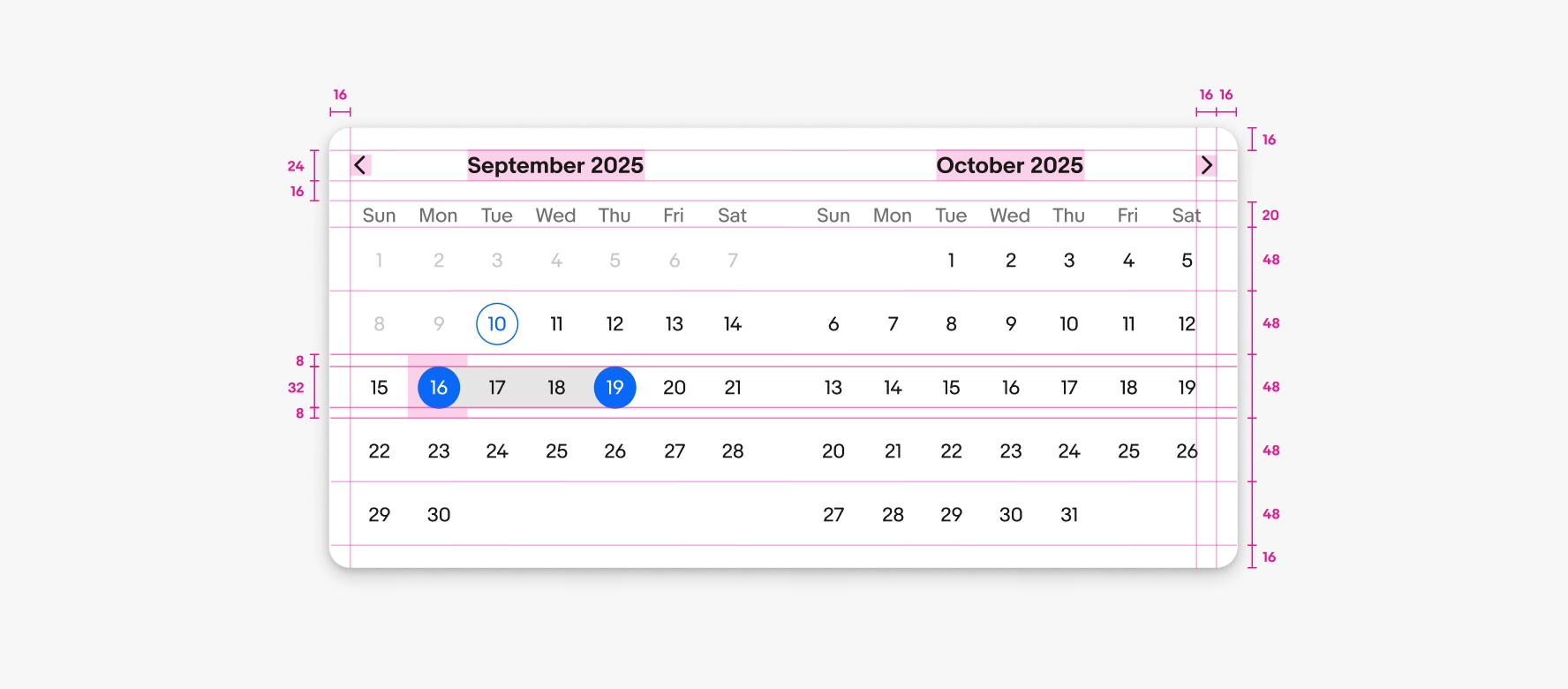
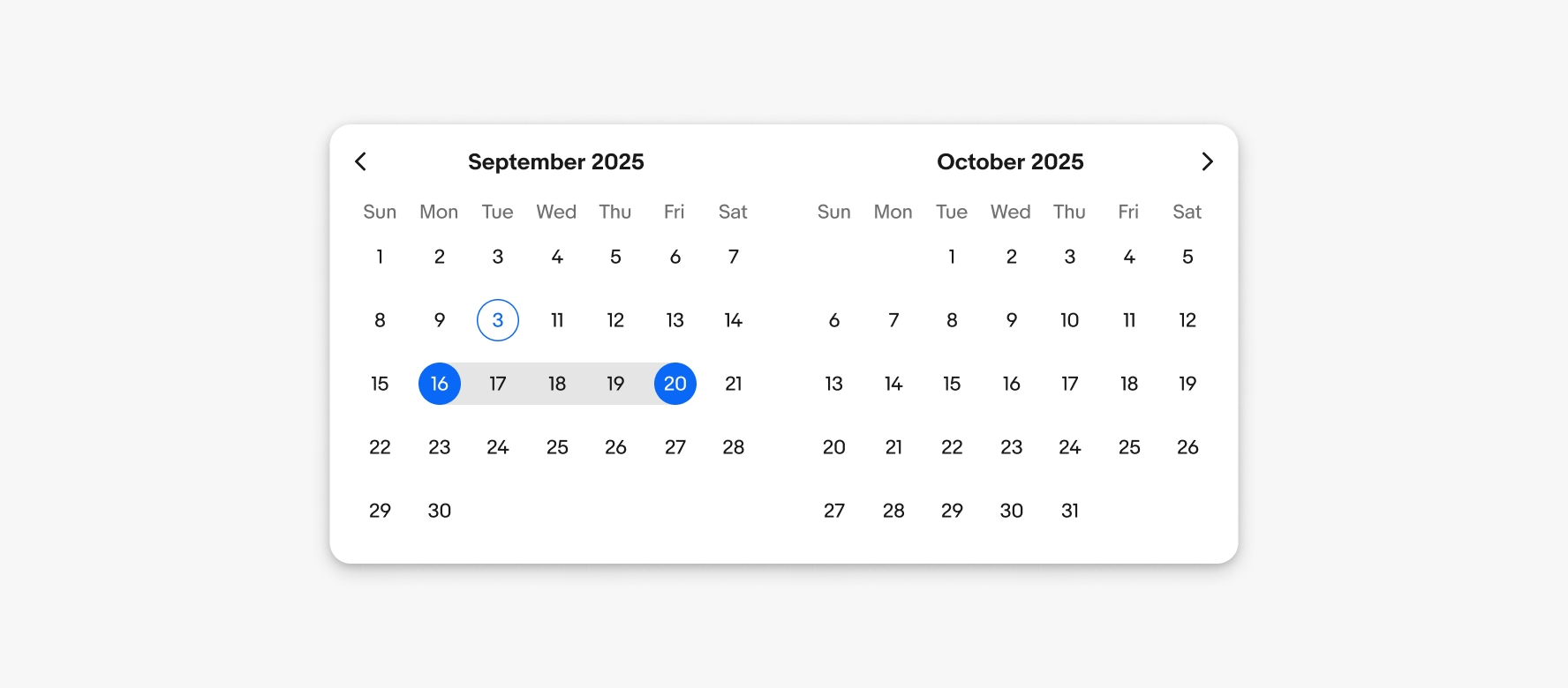
Specs for a double date picker. The specs are the same as the default date picker, but there are two months next to each other.

Double picker

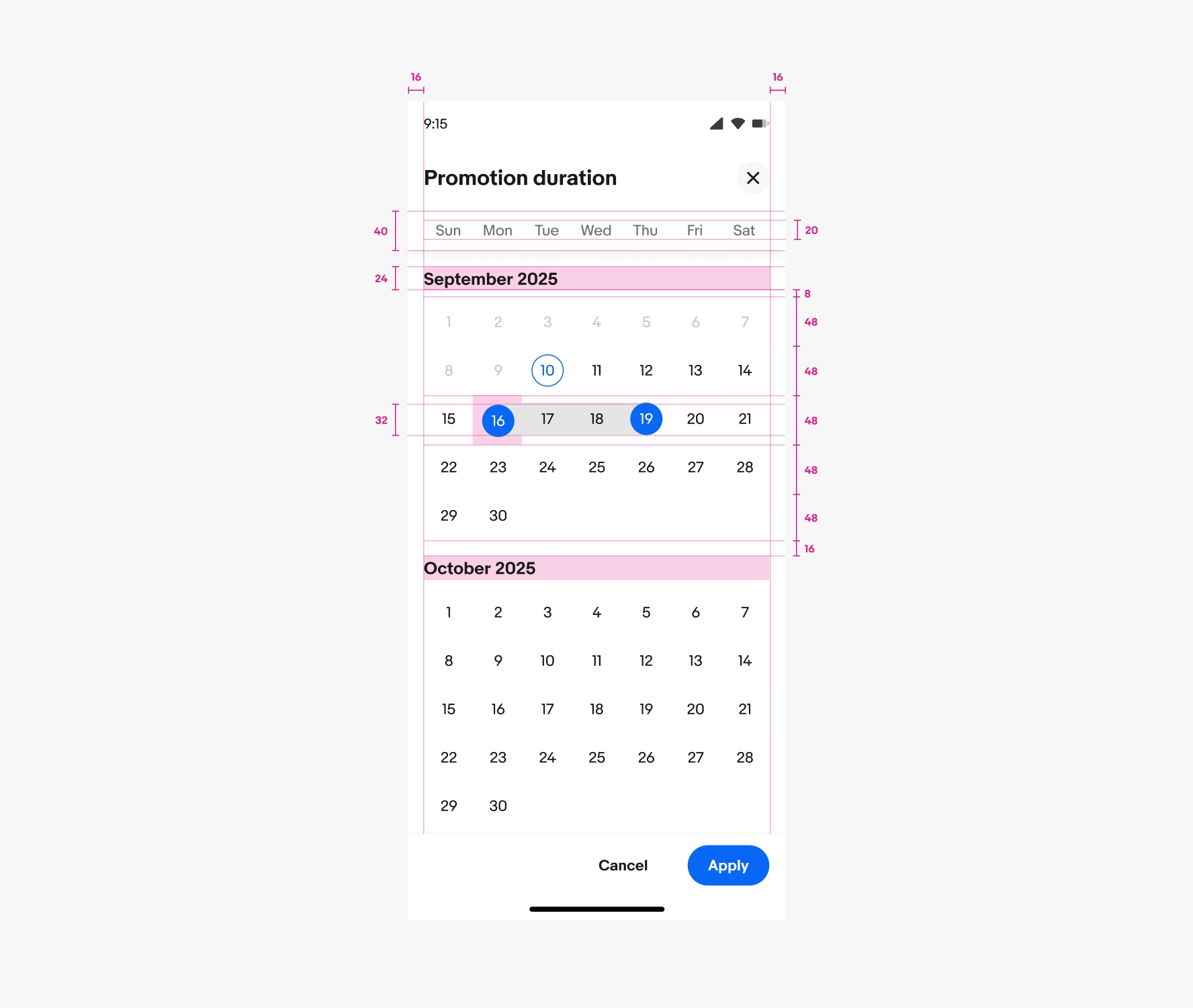
Specs for a double date picker in vertical format. There is 16px on the left and right. The days title container is 40px tall with the dates being 20px tall. The month titles are 24px tall. There is 8px between the month titles on the date cells. The date cells are 48px tall. The circular selections over the numbers are 32px tall with 8px above and below equalling the 48px. There is 16px between months.

Vertical double picker

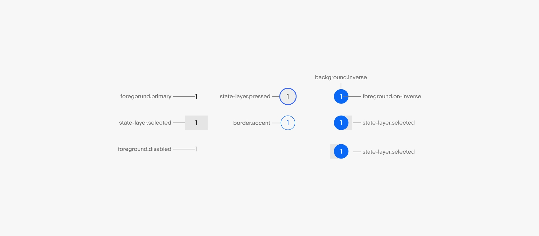
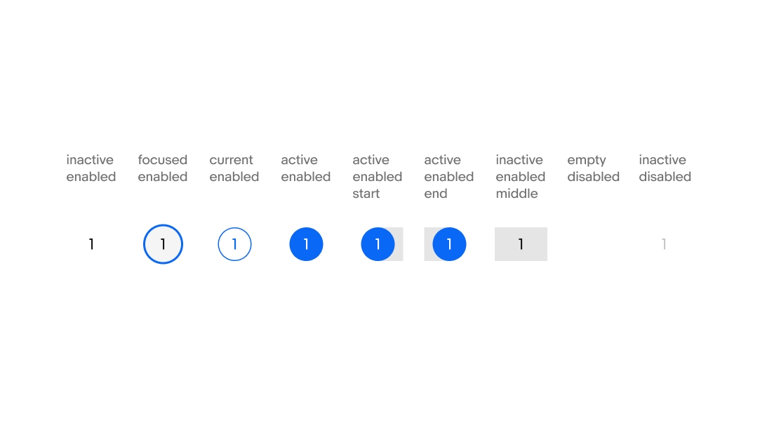
The different colors used for the states. foreground.primary is used for the day selector text. state-layer.selected is used for the range selector background color. foreground.disabled is used for disabled text. state-layer.pressed is used for the pressed state. border-strong is used for the current date. background.inverse is used for the selected date circle. foreground.on-inverse is used for the text inside. state-layer.selected is used for the starting and ending range selector.

Selection states

Change log

VersionDateNotes
1.2.0
Aug, 2024
  • Updated to eBay Evo
1.2.0
Feb, 2023
  • Added keyboard interaction specs
1.1.0
Jan, 2023
  • Added nested instance property for header component to parent date picker component
  • Renamed calendar header layer to “header”
  • Replaced “Calendar” in atomic layer names to “DatePicker”
1.0.0
Jul, 2022
  • Initial release