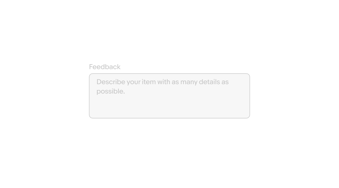
Do use text area fields when longer values and sentences are encouraged.
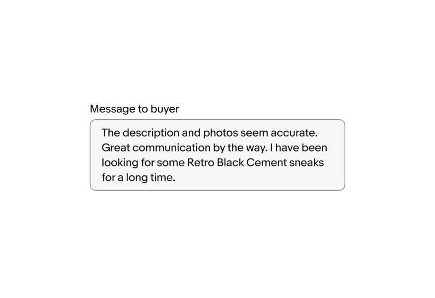
Text areas allow for input that extends across multiple lines.

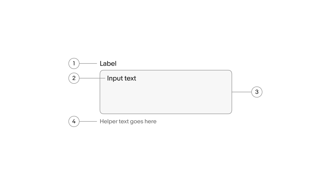
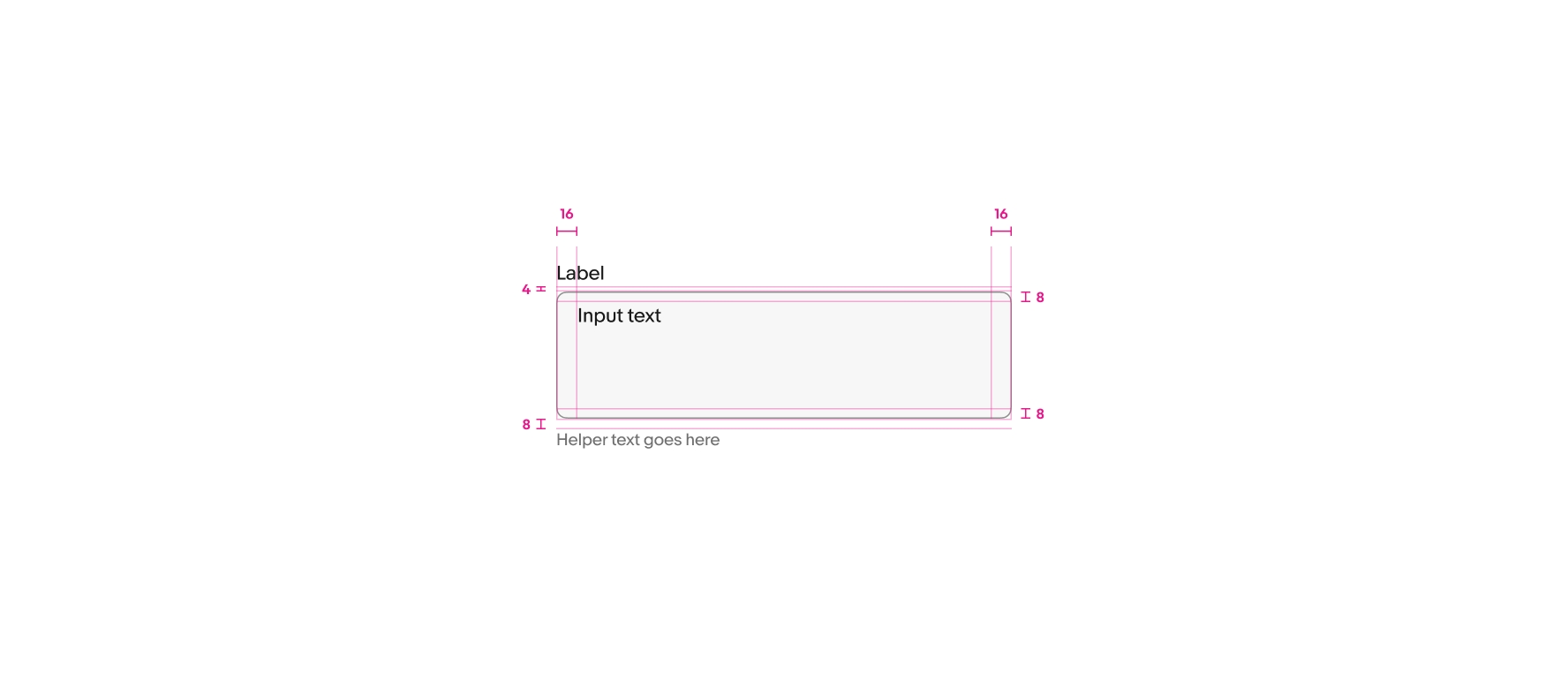
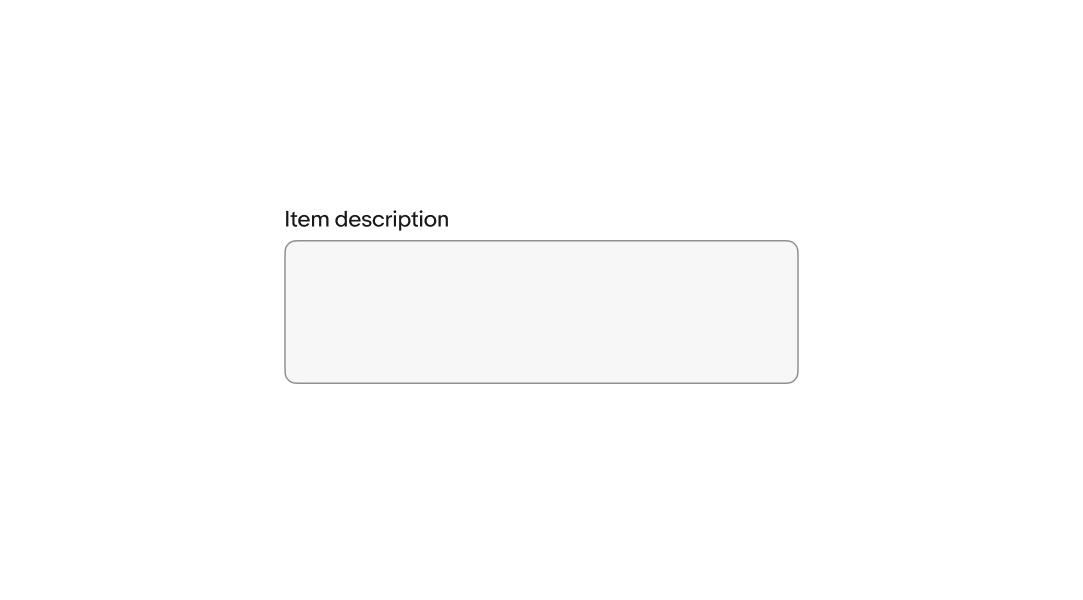
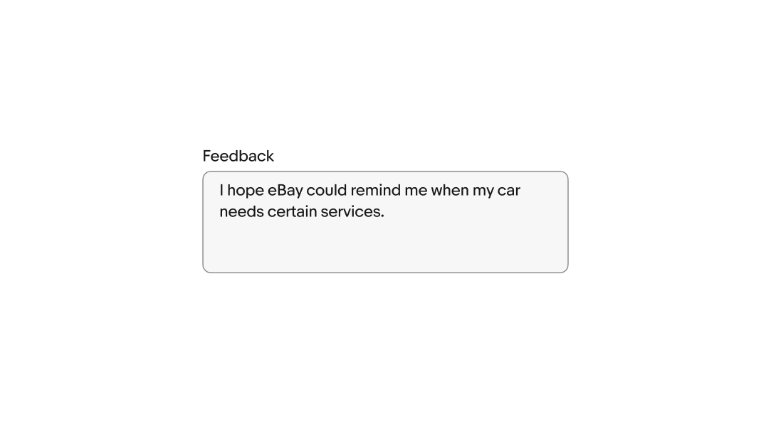
Labels are required for text area fields and quickly describe the field’s purpose.
The value is submitted with the form. The value replaces any placeholder text in the field after the first character is entered.
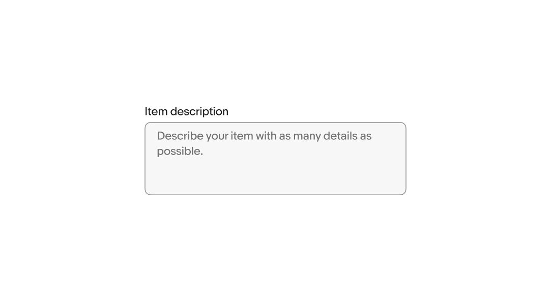
Placeholder text, or “ghost text”, is visible until a character is entered.
Because the placeholder text disappears, putting instructions or requirements as placeholder text is not accessible. Helper text is the preferred method to convey this information.
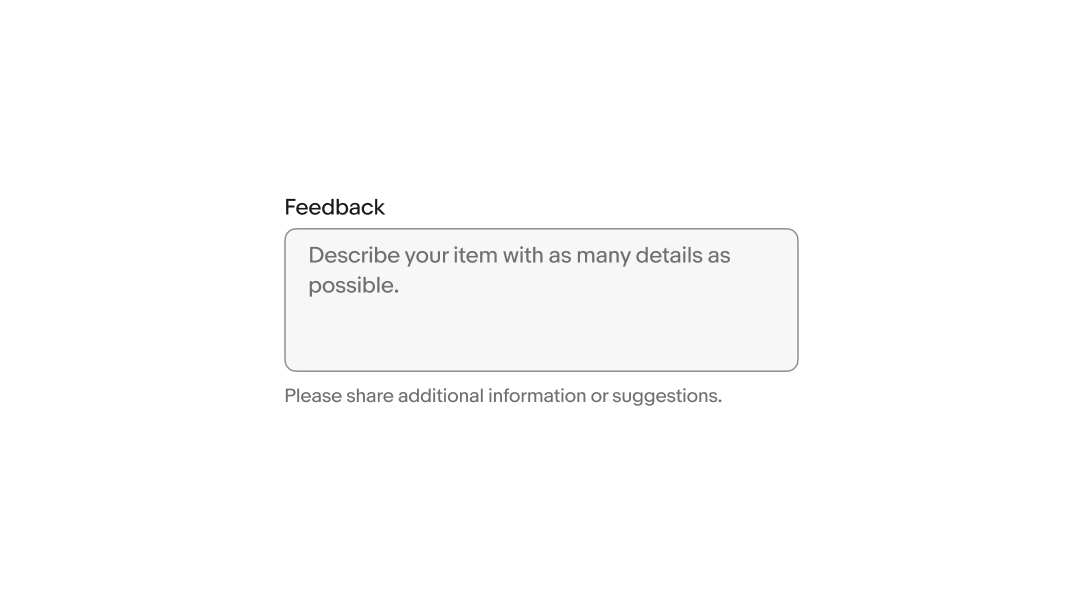
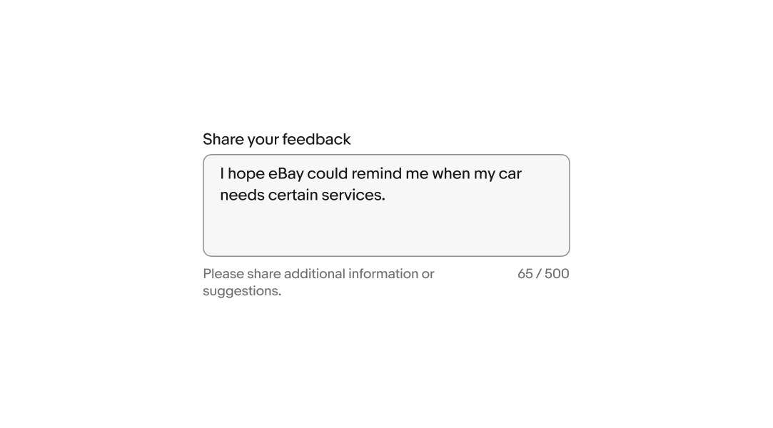
Helper text is placed below the field and informs the user of any requirements, disclaimers, and errors. Helper text can be shown persistently but is replaced by error text when an error occurs.
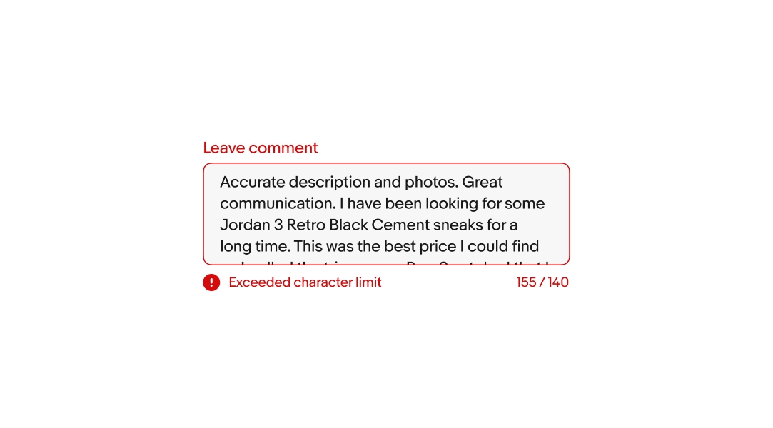
A character counter will appear when there is a limit on the number of characters that can be submitted. The counter updates in real-time as the input is adjusted.
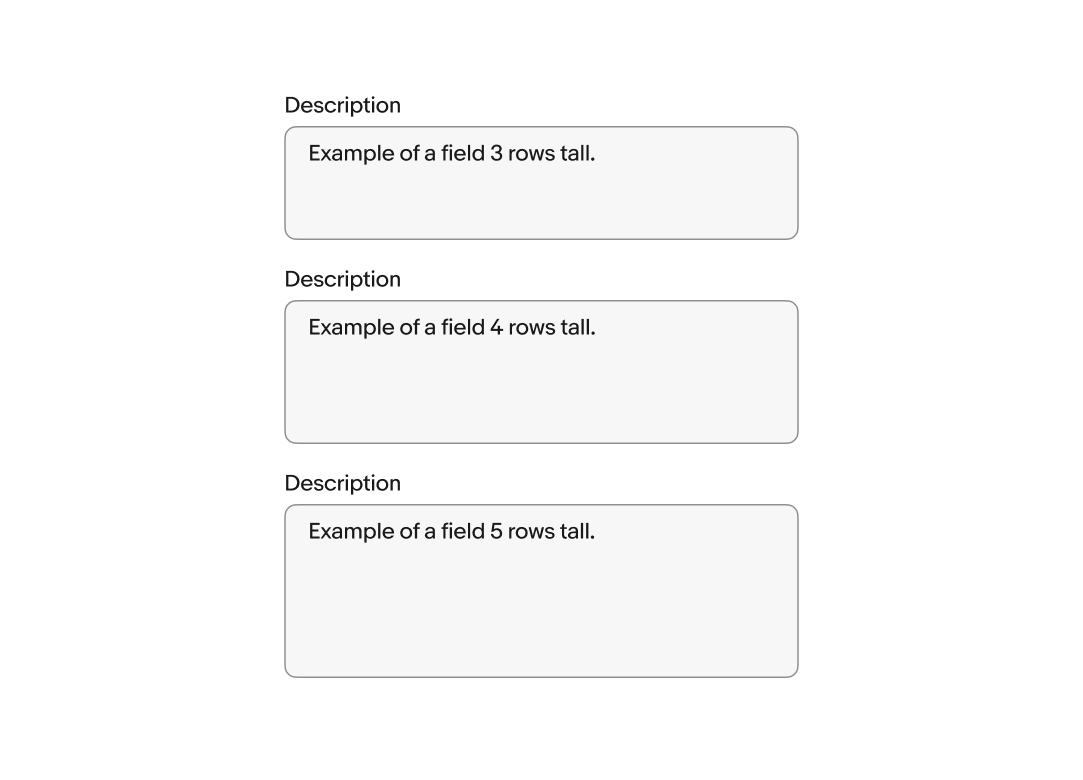
The default number of rows can be customized to increase or decrease the height of the field. The default is 4 rows.
Web browsers add a resize indicator to the bottom right of text area fields by default. Dragging the corner adjusts the field’s width and height. Resizing can be disabled if the behavior isn’t desirable.
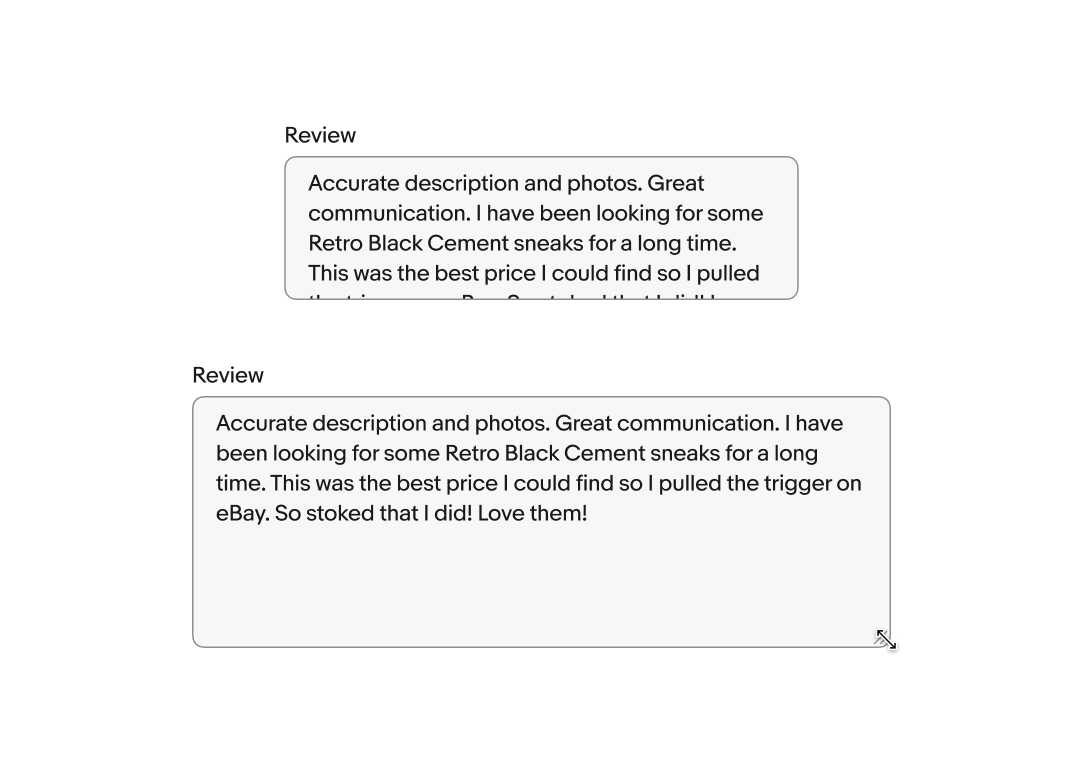
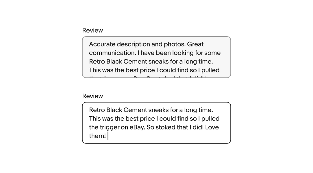
Text area fields overflow top and bottom. While focused, the content will shift to keep the cursor in view as the user enters characters. When the field loses focus, the content will scroll to the beginning. Focusing on the field again returns the user to the end of the content.
An error message appears below the field when a required field is left empty or an invalid value is provided. The error message replaces any existing helper text when present.
Users cannot focus on or change disabled fields. Their availability depends on certain requirements. No value will be submitted from disabled fields.
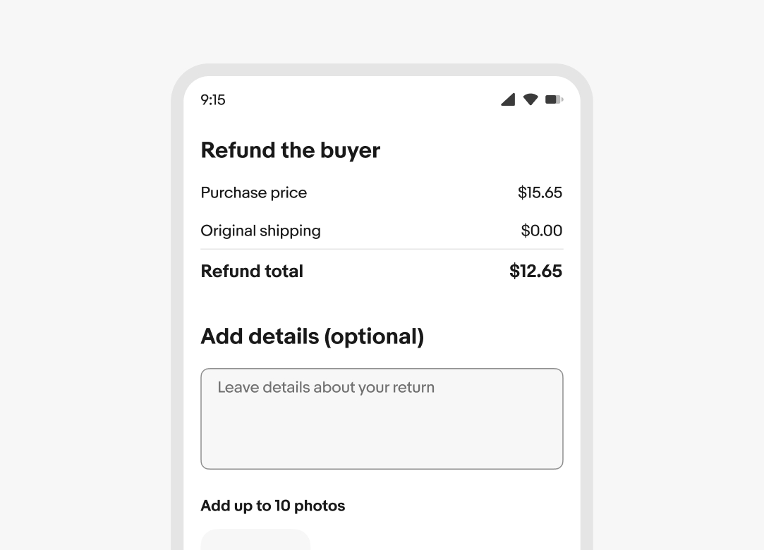
Text area fields expand the full width of the screen up to the page margins on small screens.
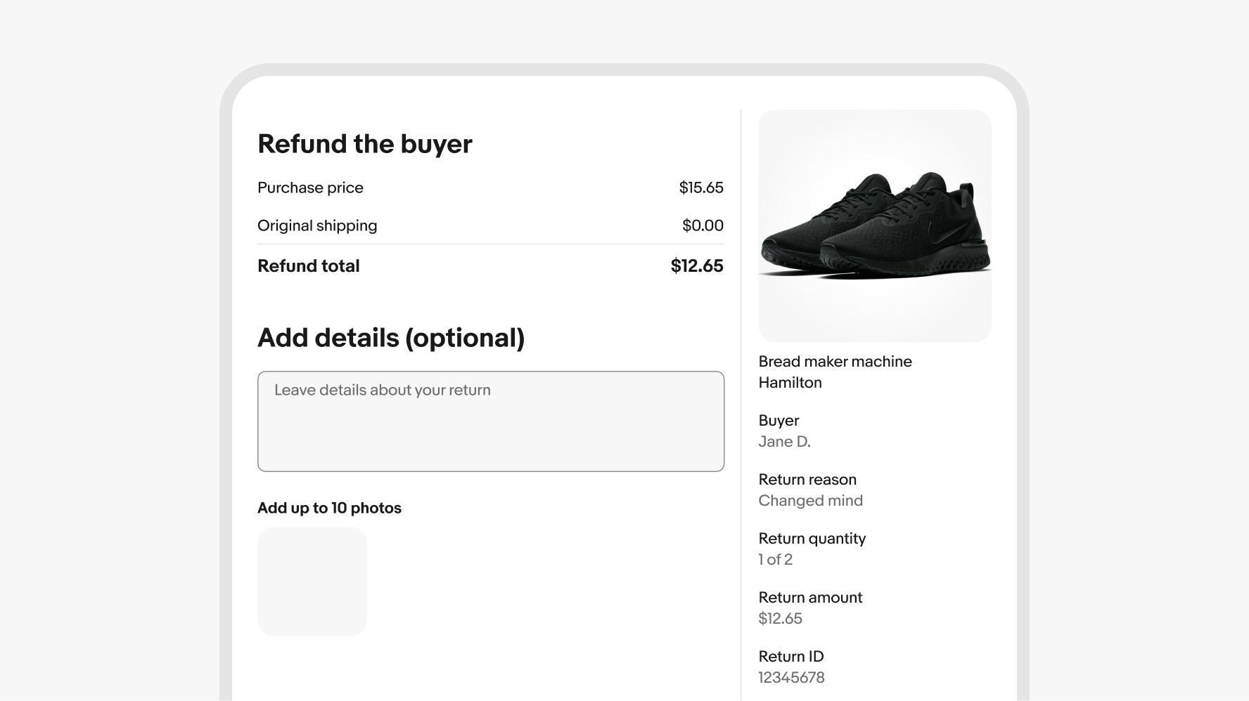
Text area fields expand up to their full width on larger screens. Web devices will have the browser’s native text area resize indicator in the bottom right corner.
Do use text area fields when longer values and sentences are encouraged.
Don’t use text area fields when the expected value is short. Use a simple text field instead.