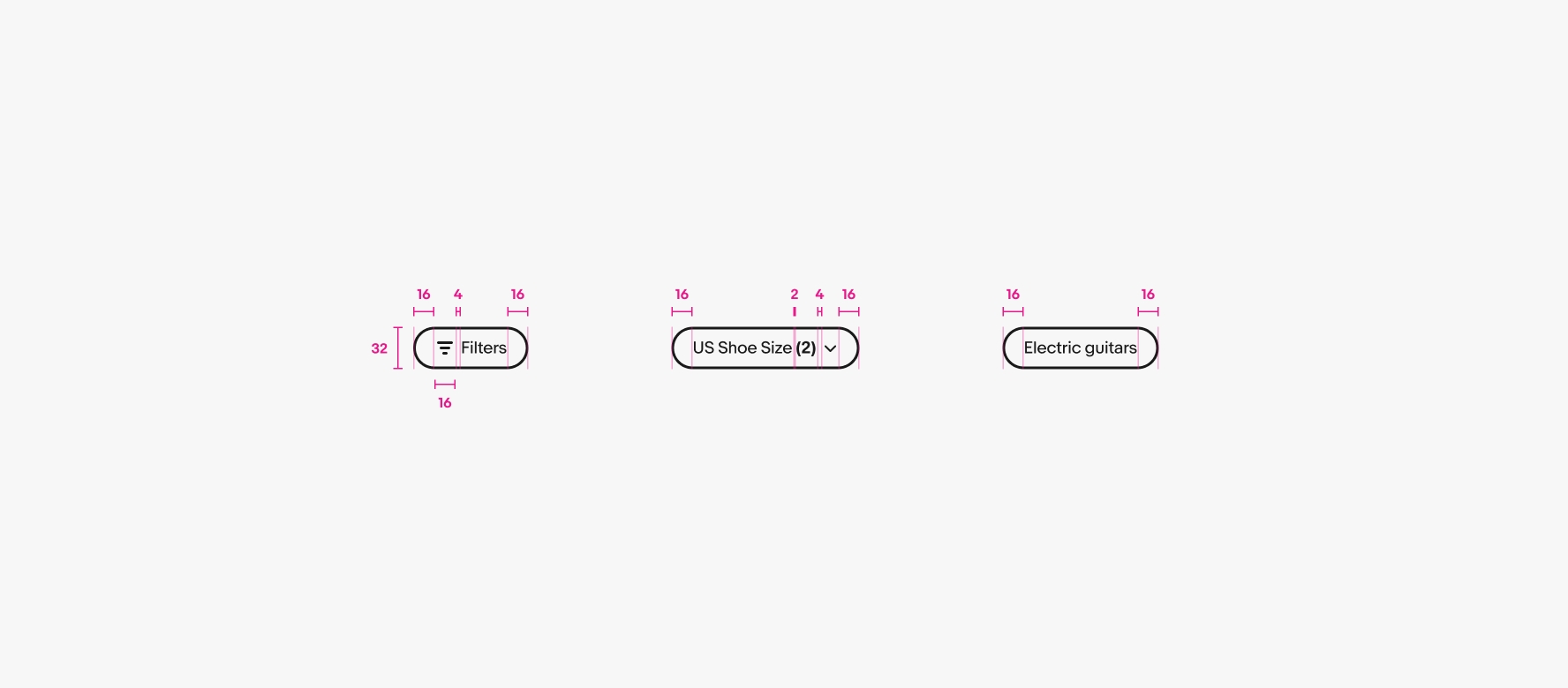
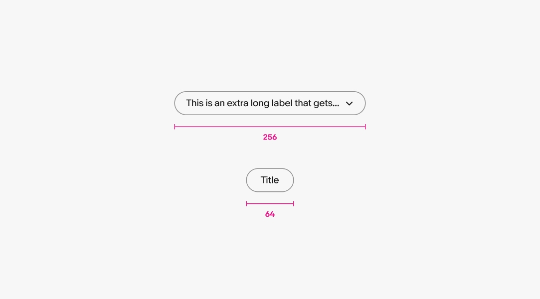
Keep labels short. If the label is too long, see if the filter can be broken into smaller pieces or summarized more succinctly.
Quick filter buttons make filtering or sorting data fast and easy.
The relationship between filter buttons and the content is direct and clear.
Quick filters don’t dominate or interrupt the hierarchy. They represent small bits of data at a time.
Quick filters make things easier to sort or filter content within one or two taps.
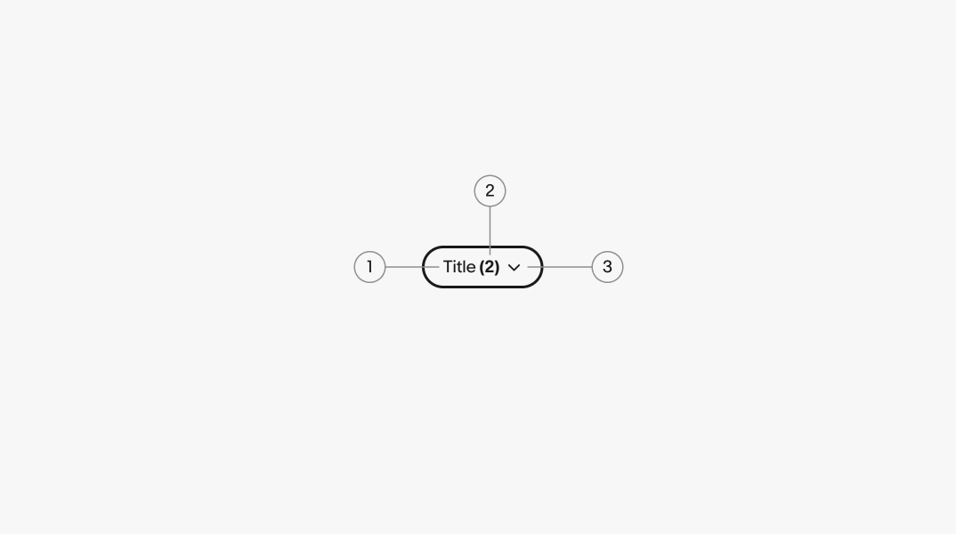
A title is required for all filter buttons. The filter should represent the discrete value applied when selected or succinctly summarize the type of values contained in a dropdown filter.
Quick filters have a maximum width of 256px and a minimum width of 2x its height.
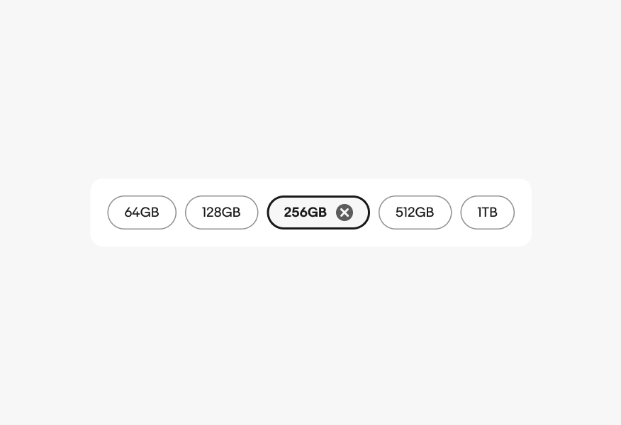
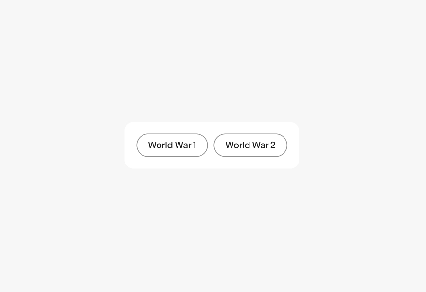
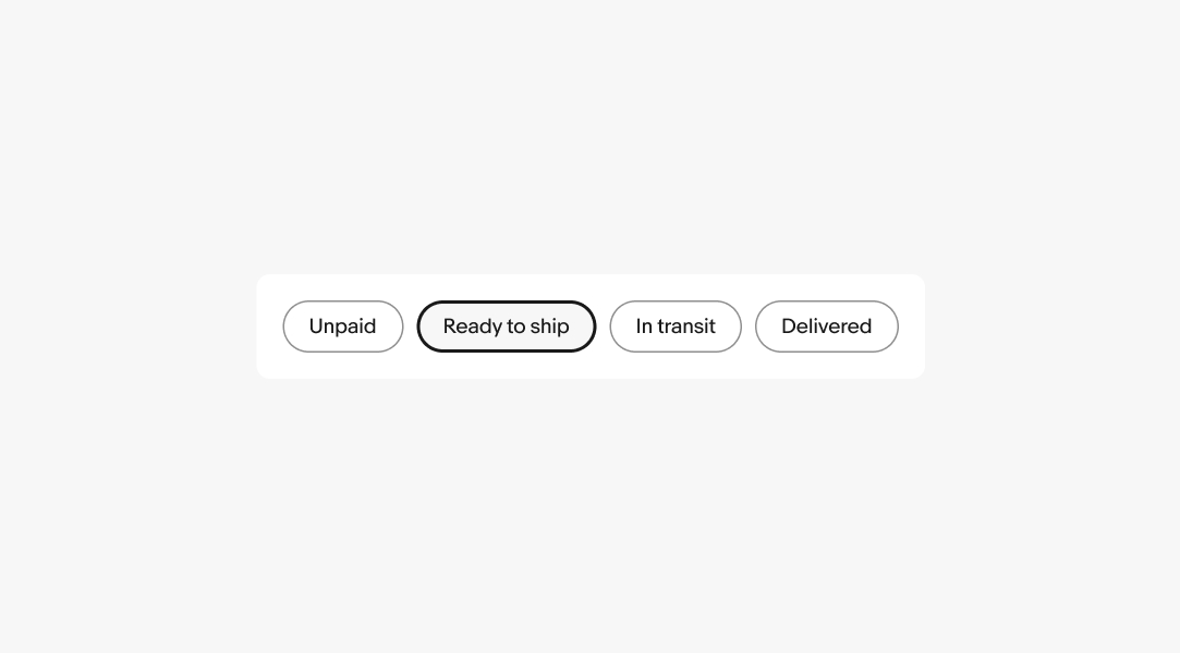
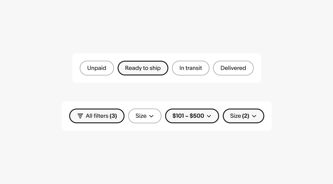
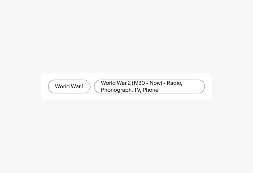
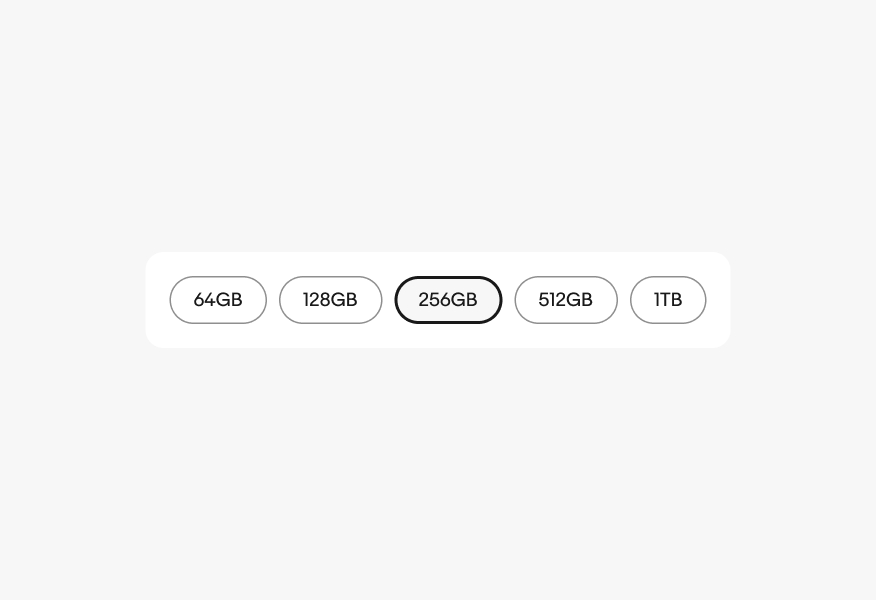
Quick filters that represent a single discrete value will immediately filter the list when selected. They can be unselected by interacting with the filter button again. Discrete filters are the default and preferred version because they only require a single interaction.
Quick filters can use a popover menu or bottom sheet to present a popular group of options. The filter can be multi-select or single-select.

Dropdown filters that represent a radio group apply a value immediately after selecting it in the menu. The label is updated to represent the value selected. The filter can be reset by tapping a clear all action in the filter bar or selecting the default value within the menu.
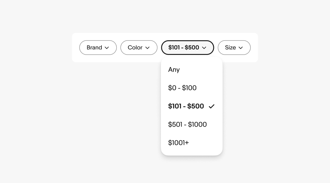
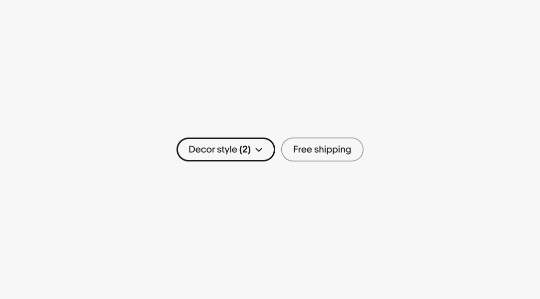
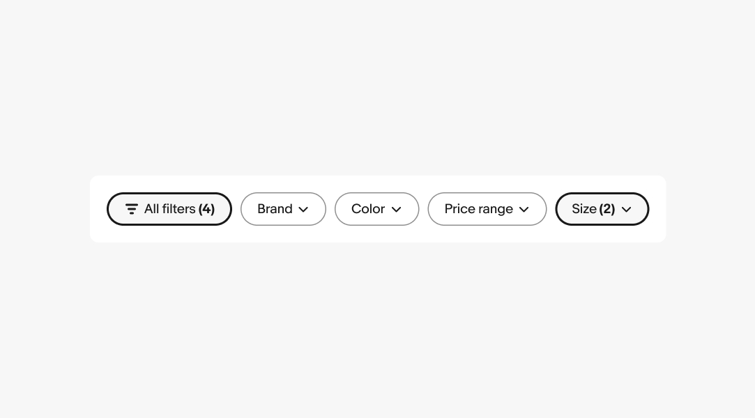
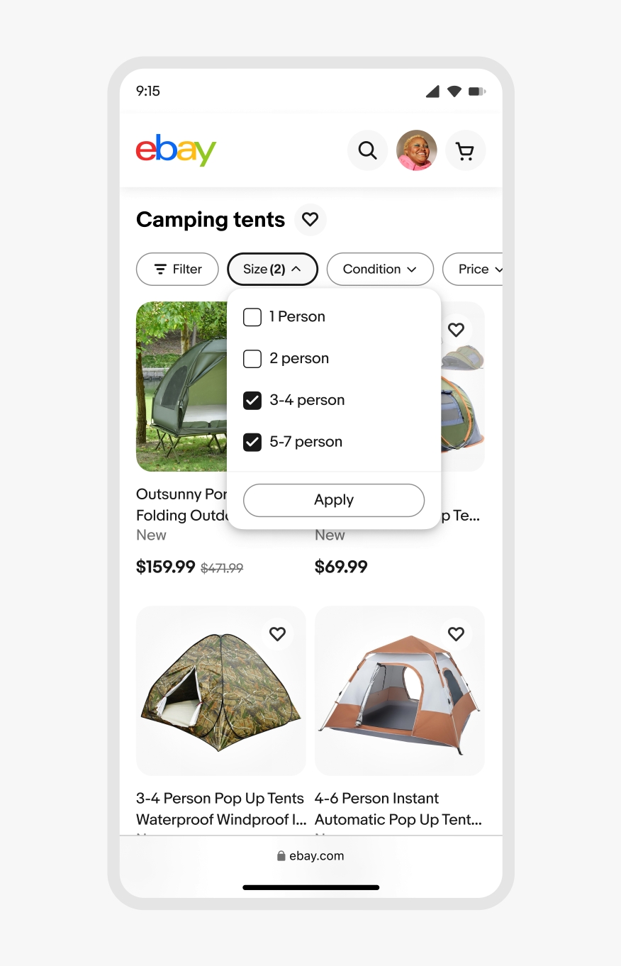
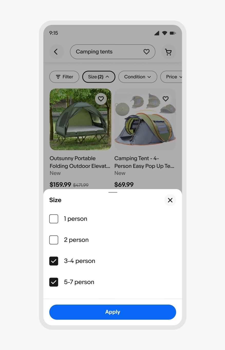
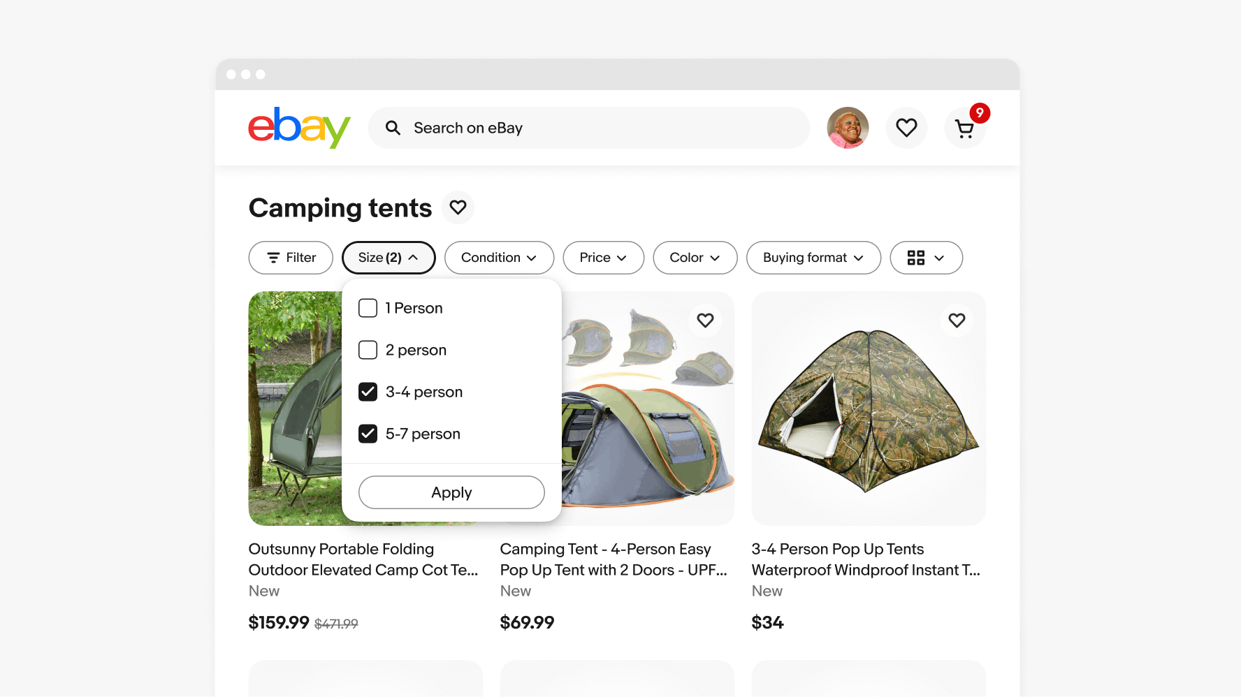
Dropdown filters that represent a checkbox group have checkboxes next to each value label within the menu. Selecting values appends a counter to the label representing how many values are being applied.
The data set should asynchronously update as each value is selected within a menu. If asynchronous updates aren’t possible, an apply button needs to be present to submit the selection.

A counter is appended to the label when multiple values are selected within multi-value dropdown filters.
The selection state toggles on and off for discrete filters. Dropdown filters stay in the selected state as long as at least one value is selected.
Quick filters use the default popover to display menu options on web.
Quick filters use the sheet to display menu options on native.
Keep labels short. If the label is too long, see if the filter can be broken into smaller pieces or summarized more succinctly.
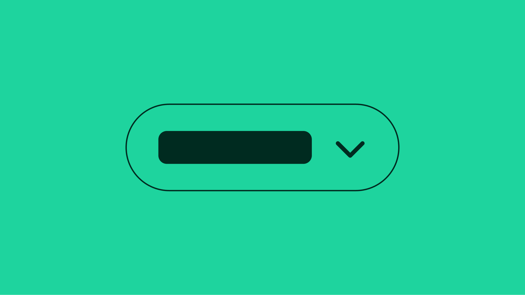
Don’t override the height of quick filter buttons to allow label wrapping. Allow the label to be truncated if it cannot be reduced. The label can be revealed in a tooltip on hover or focus.
The discrete filter selected state toggles on and off.
Don’t override the component to add additional icons.