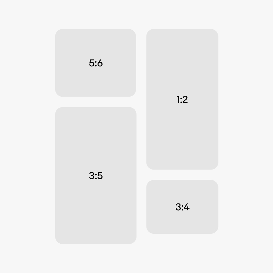
Do use one of the 4 ratios available.
The media container displays a variety of visual content.

Media content will draw more attention than other elements within the UI.
The container is familiar no matter the context or size.
The image container is a simple container for rich visual content. The container itself doesn’t distract from the content.
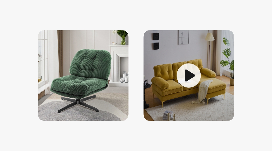
The media container supports both still and animated graphics, including images, videos, GIFs, 3D assets, and Rive animations.
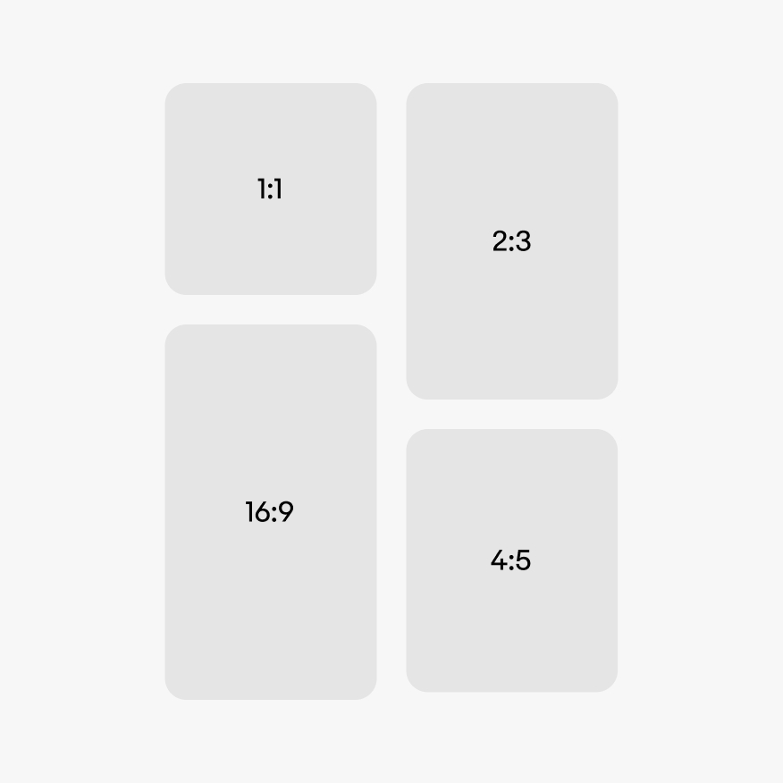
There are 4 container ratios available, a 1:1, 2:3, 4:5, and 16:9. Certain contexts may force one ratio. Other contexts, like a masonry grid, can use the best ratio available for the content.
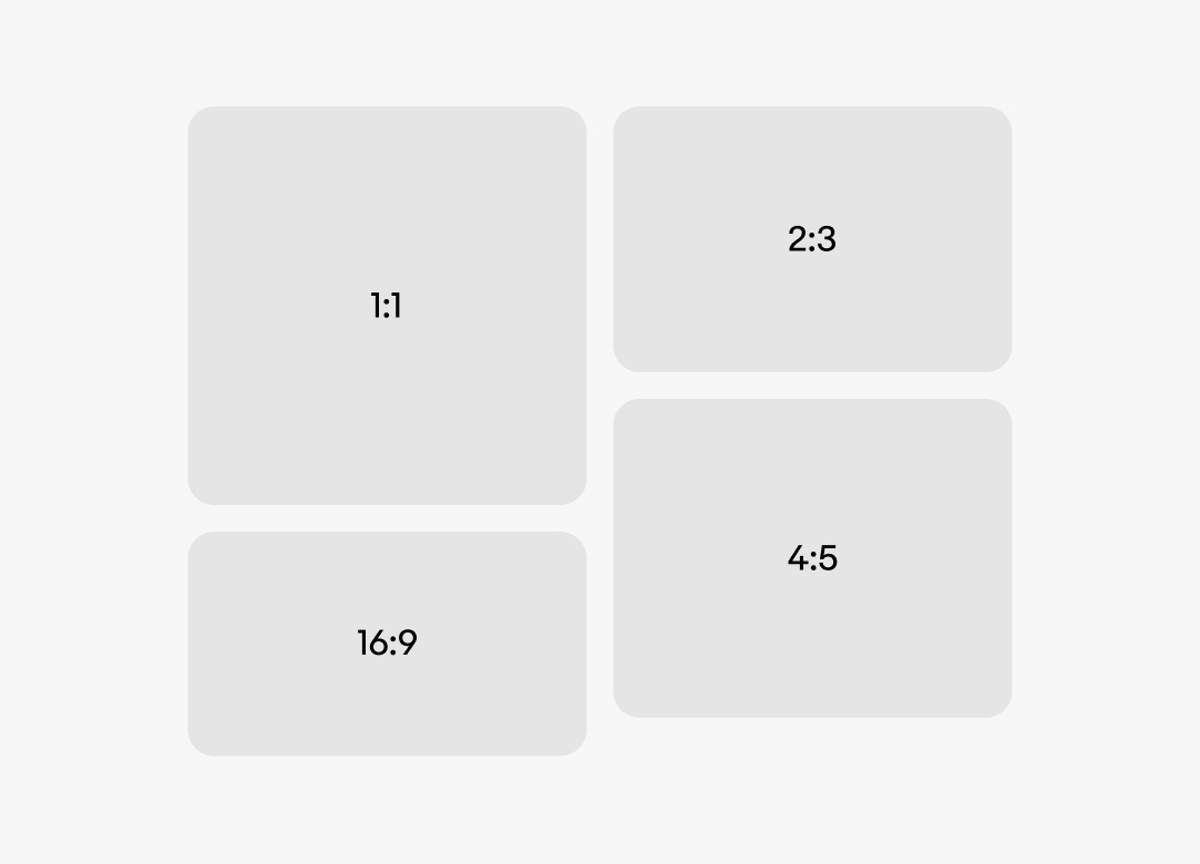
The container can be in a portrait or landscape orientation. The orientation depends on the content and its context. Some contexts may force a ratio and orientation. Others, like a masonry grid, may allow for the best orientation for the content.
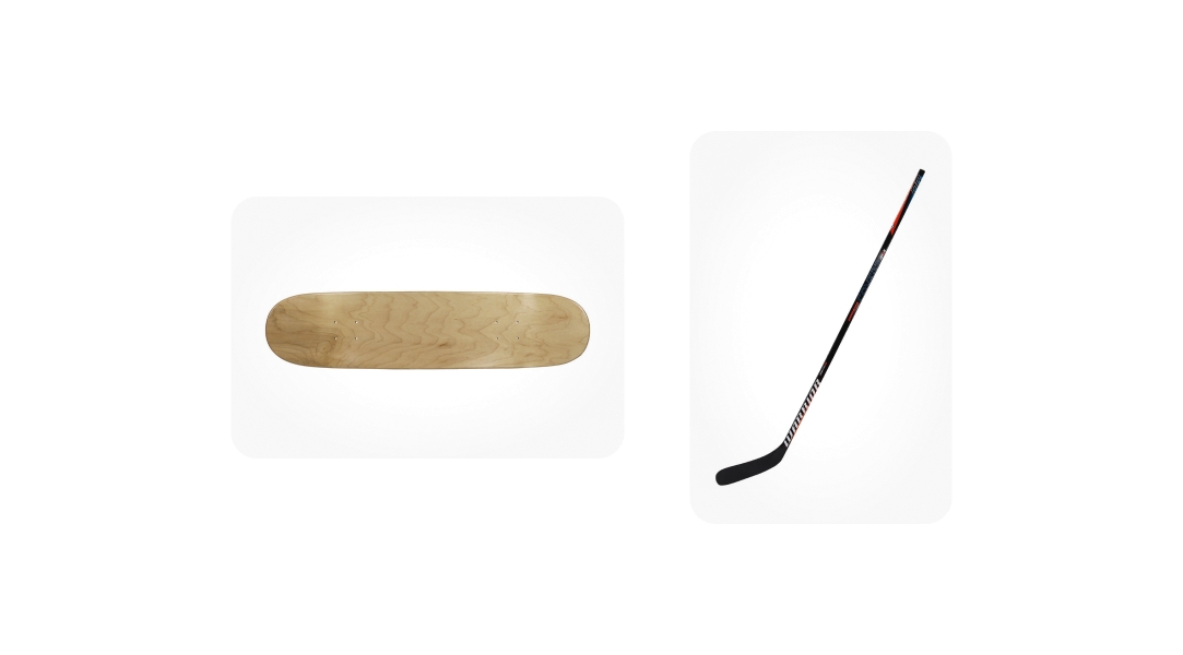
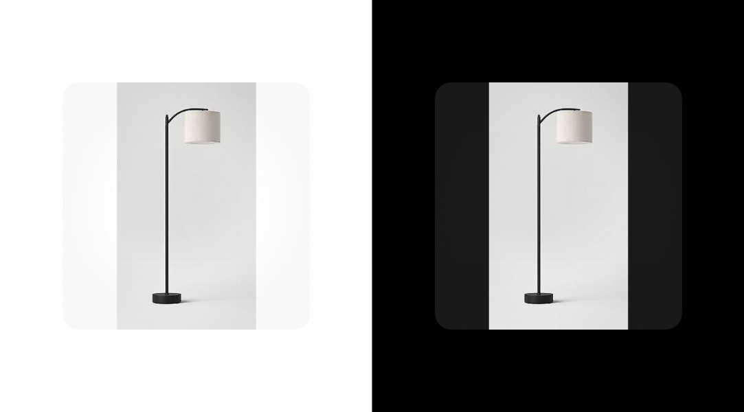
The container can either fill or fit its content. Fill is the default.
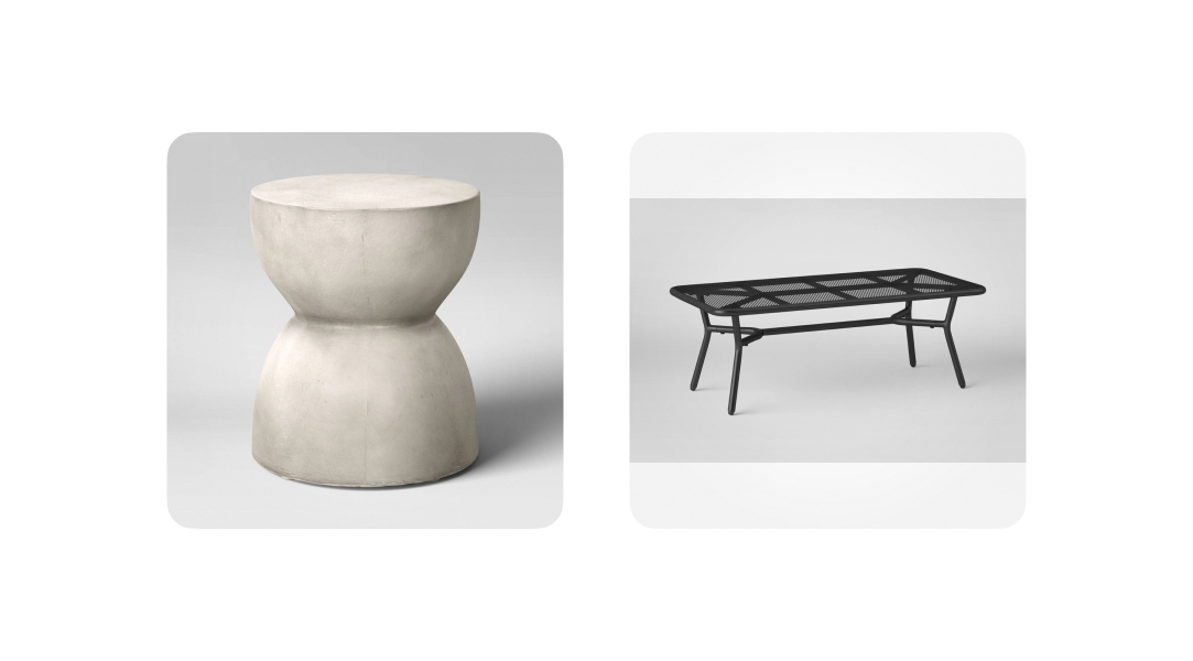
The media content can be set to automatically fill the container if the source media has a ratio close to the container’s. The default tolerance is 75% of the container.
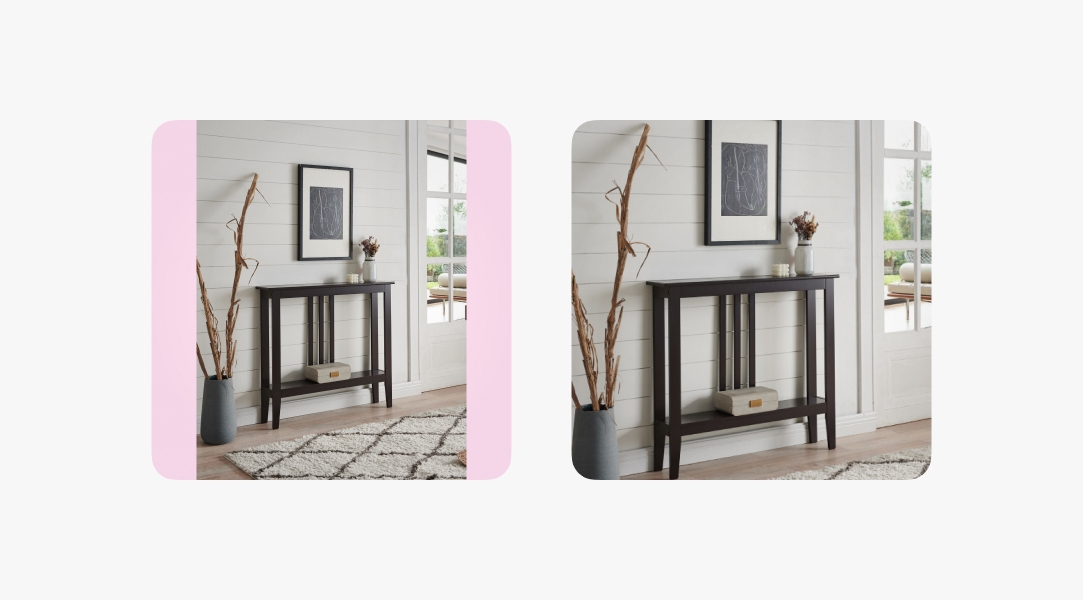
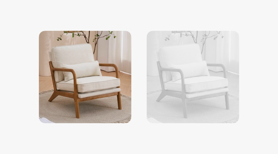
Images used in interactive contexts can be disabled until prerequisites are met. Disabled images are desaturated and the opacity is lowered to reduce its contrast against enabled content.
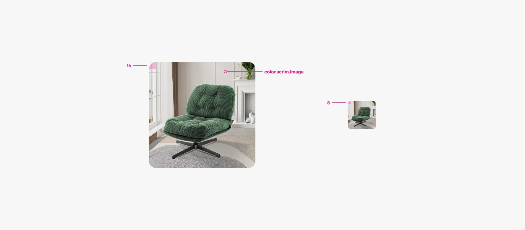
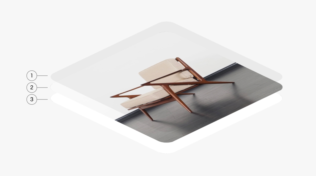
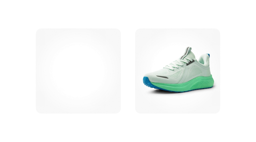
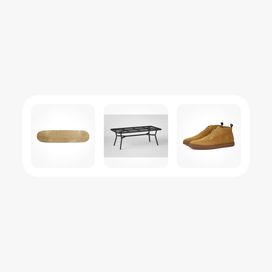
A light radial scrim is applied over images by default to define a consistent shape. The radial gradient leaves a percentage of the center clear to avoid altering key details of the image. The scrim can be toggled off and is generally not used for assets other than photography and video.
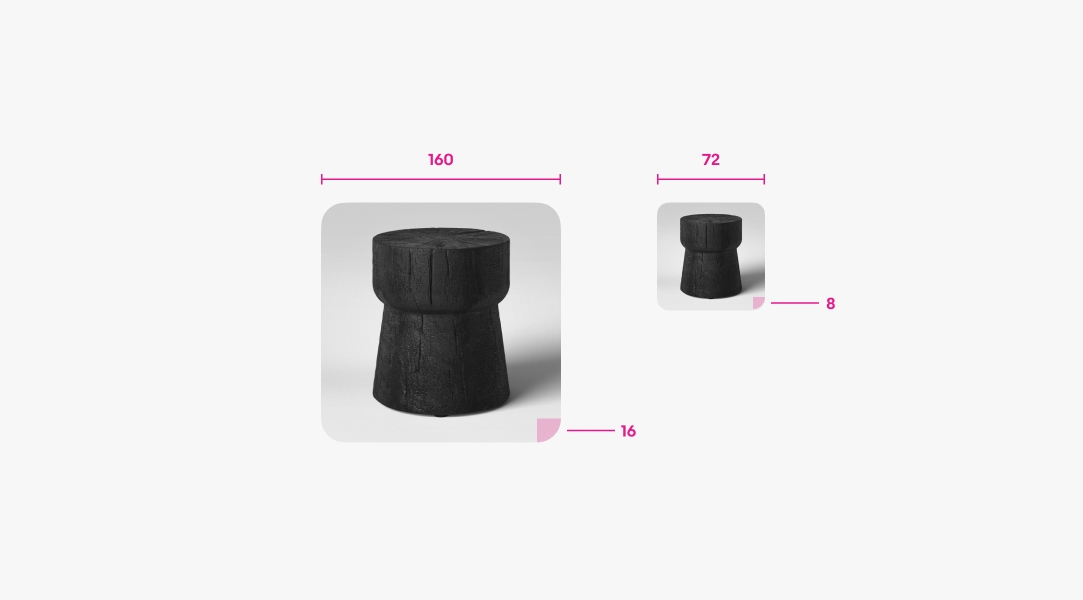
The border radius adjusts according to the size of the container. The radius is 16px for images 80x80 and larger. Containers smaller than 80x80 use 8px.
The image scrim remains the same across light and dark mode. However, the matte behind the image adjusts between modes to maintain the container shape when images are set to fit.
Do use one of the 4 ratios available.

Don’t use arbitrary ratios. This will introduce inconsistency and result in visually distracting layouts.
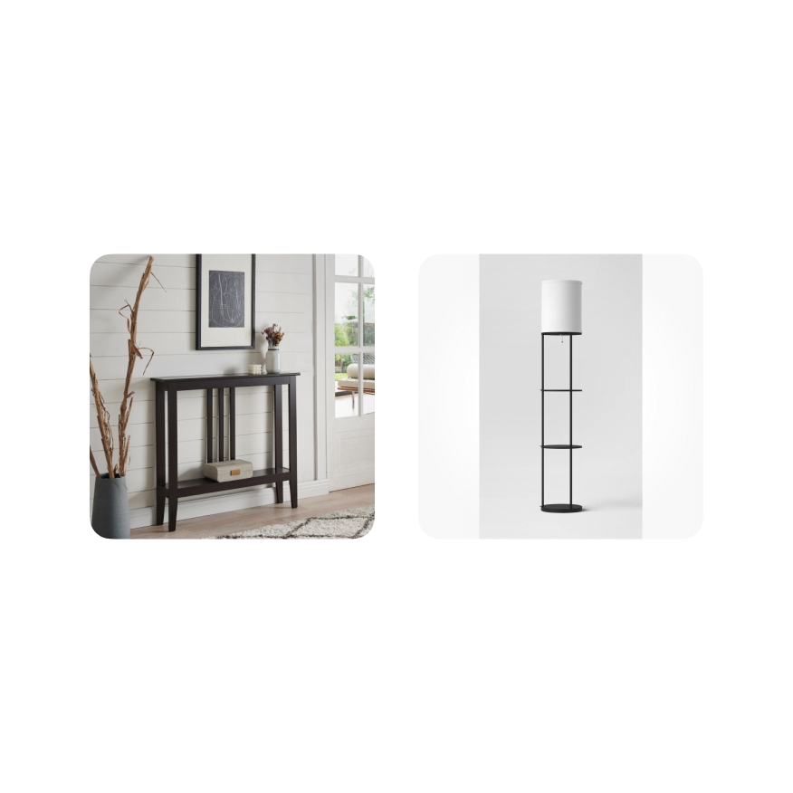
Do choose to fill the content whenever possible. Only fit content with extreme or unusual dimensions.
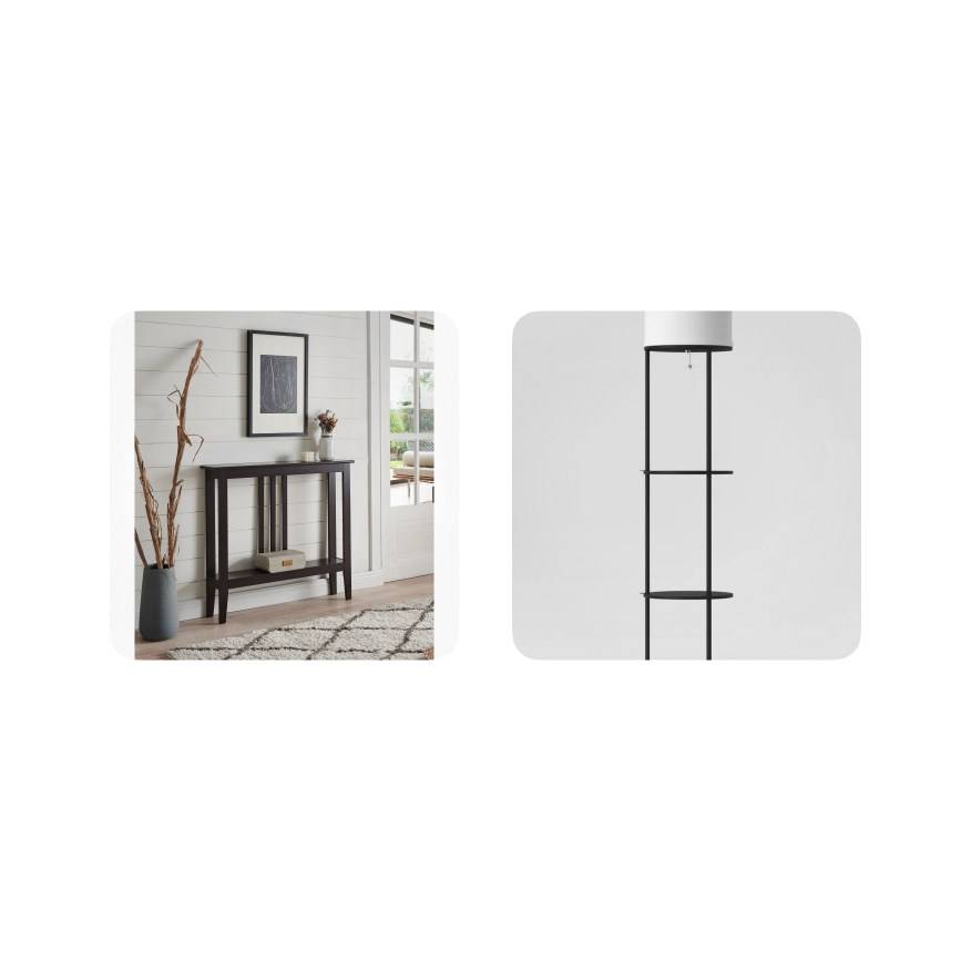
Don’t fit the content if it can fill without losing detail. Don’t fill the content if it has an unusual ratio as this will crop important details.
Do keep the scrim to maintain a consistent shape across item tiles in a collection.
Don’t override the scrim to adjust its opacity, as this will create visual inconsistency between media.

