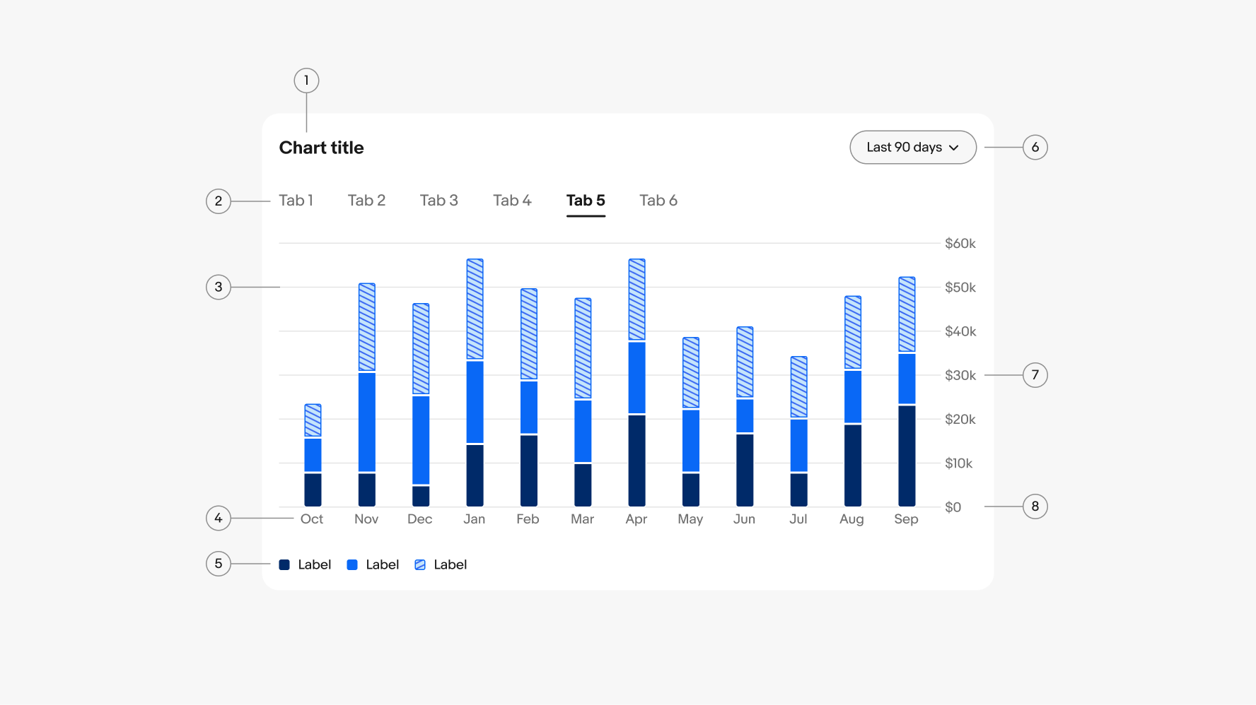
Do separate axis labels with at least 16px of padding.
Our graphs provide beautiful, simple, and accessible ways to understand sets of data.
Progressive disclosure is key—ensure you are using data visualization as a tool to aid in understanding, not to overwhelm users with too much information all at once.
Focus on what you want to communicate and who you’re communicating to. Understanding data is much easier when there is a human narrative. Think about how you would tell the story in a sentence.
Our charts scale seamlessly for all screen sizes and users. Use designated colors, interactive states, and scaling behaviors to ensure they are simple and accessible in all contexts.
Used to compare multiple part-to-whole relationships or ranking a single data set.
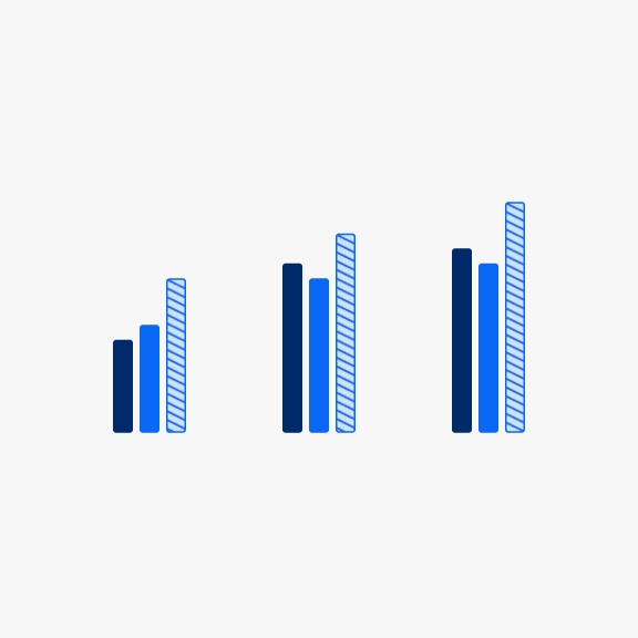
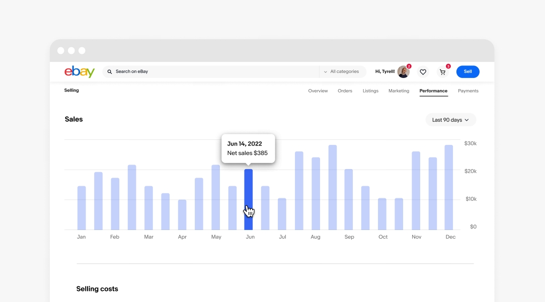
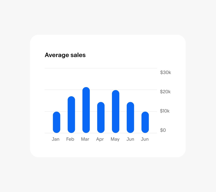
Used to compare data across categories or two or more criteria.
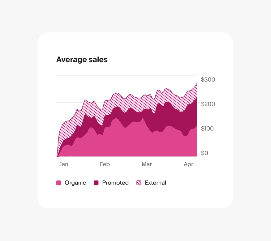
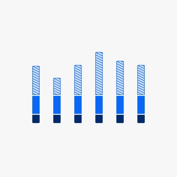
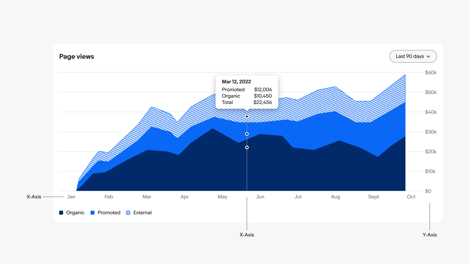
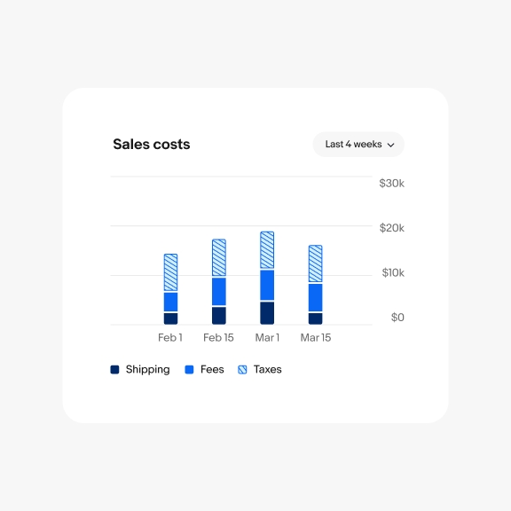
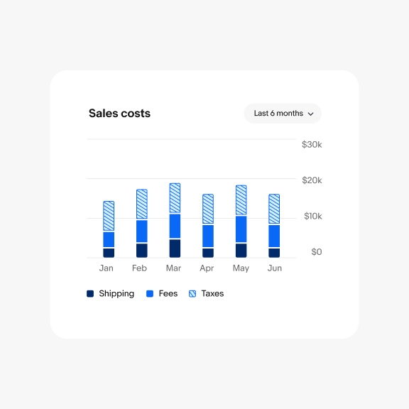
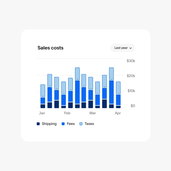
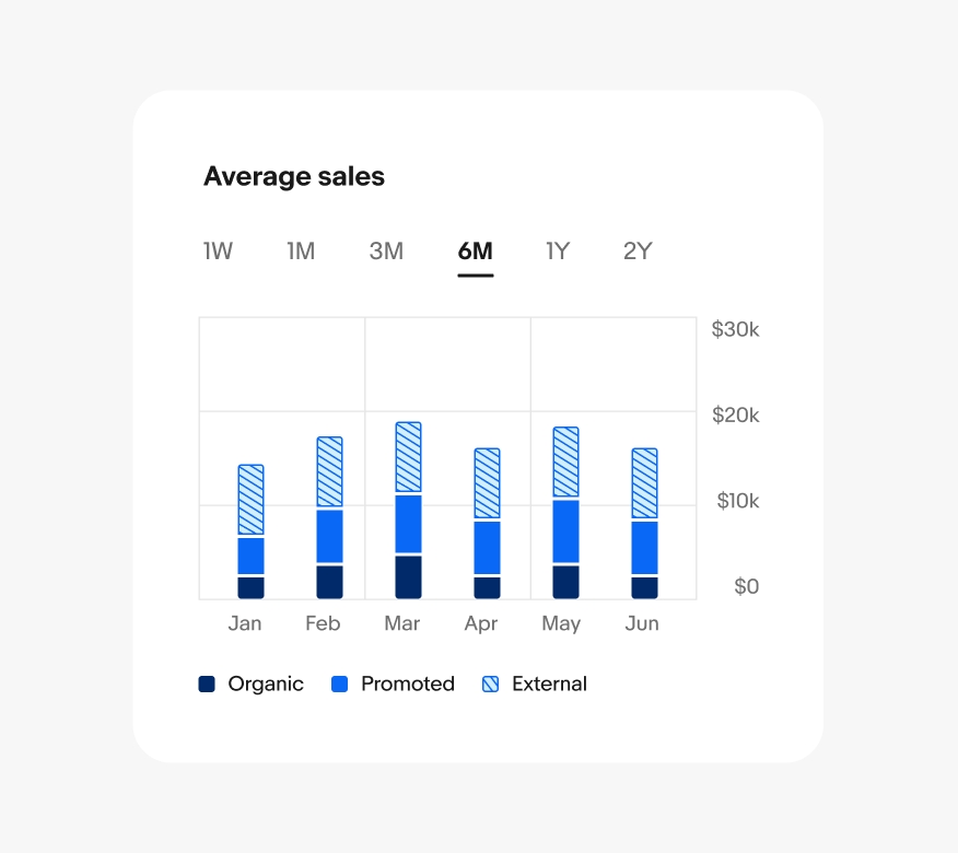
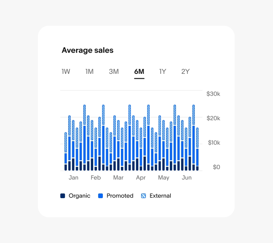
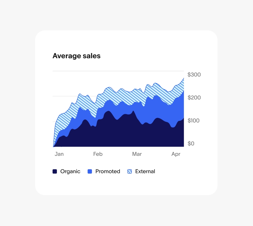
Used to visualize a total over time and how each category contributes to the whole.
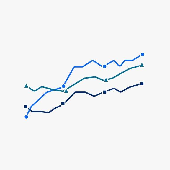
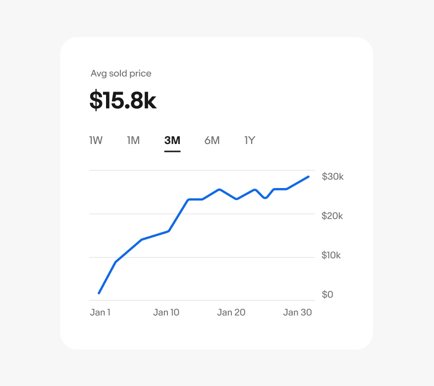
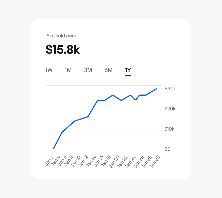
Used to track changes over time for single or multiple data sets. Line graphs are better at showing smaller changes and/or longer time periods than bar charts.
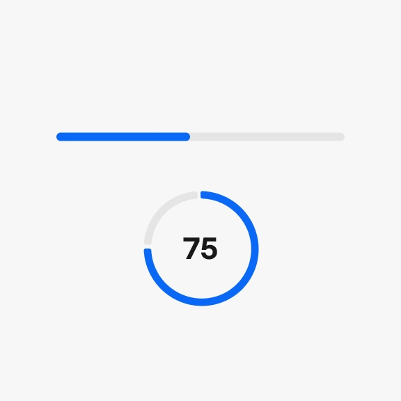
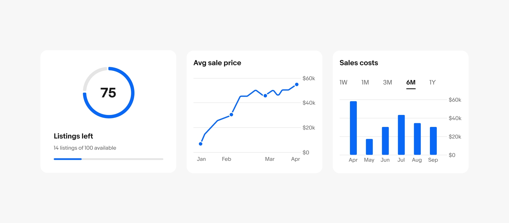
Used to show progress toward a single goal or total. Can be either linear or circular.
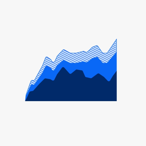
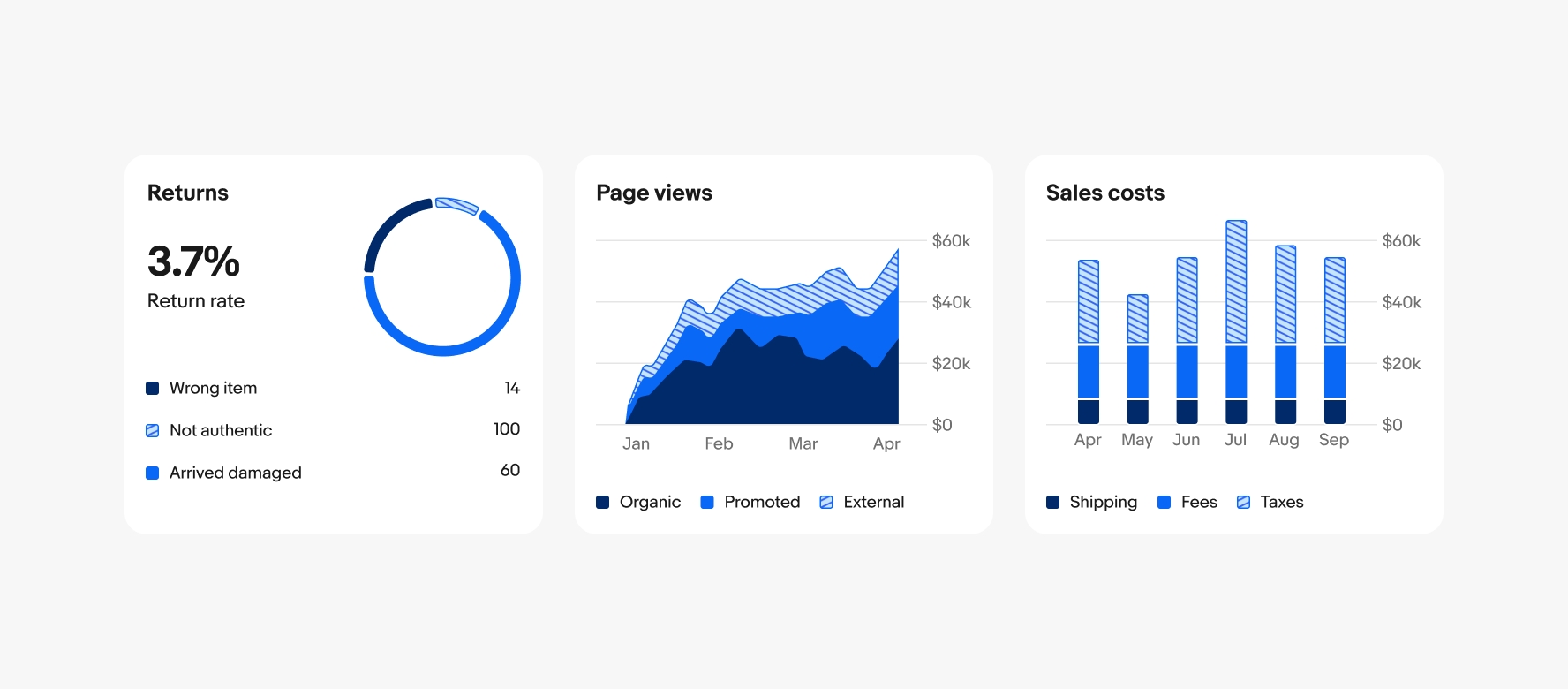
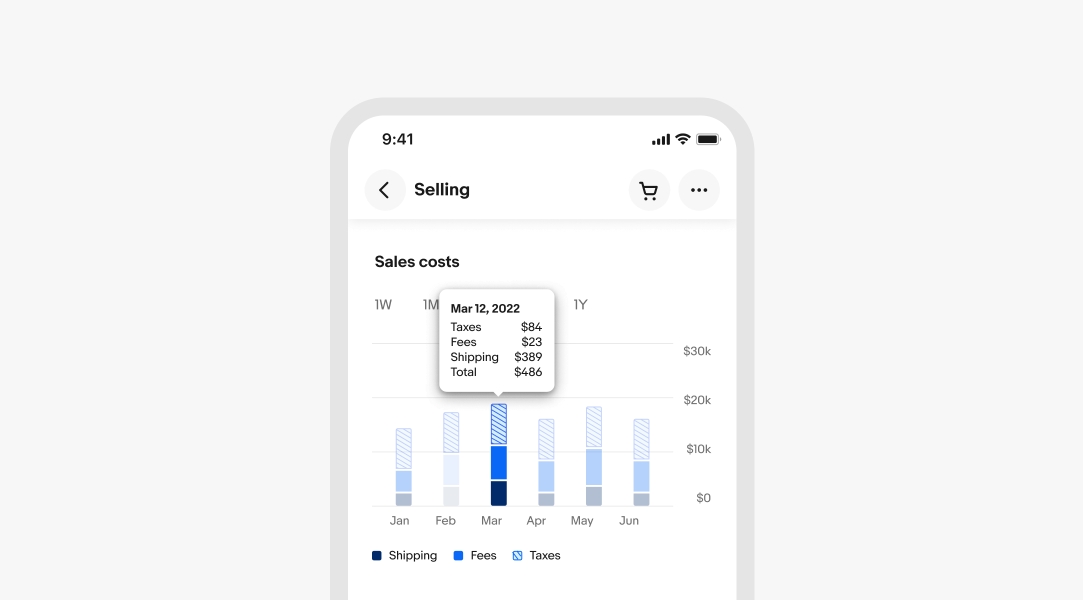
Used to show the breakdown of a single part-to-whole relationship within a total.
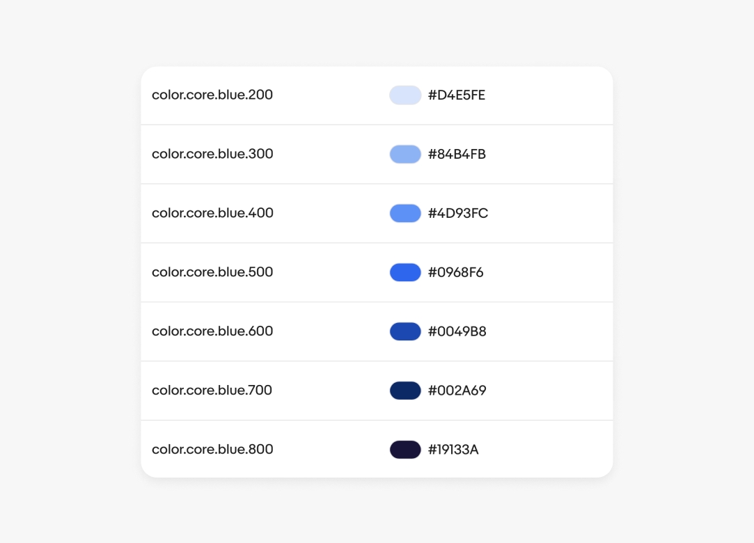
We use our primary blue when visualizing a single value, such as progress bars, or a single data set, like line graphs, bar charts, or area charts.
We use shades of blue, and teal when needed, to represent part-to-whole relationships. This approach keeps the focus on a single, neutral color family, avoiding the use of hues like green and red that may carry specific meanings in other contexts.
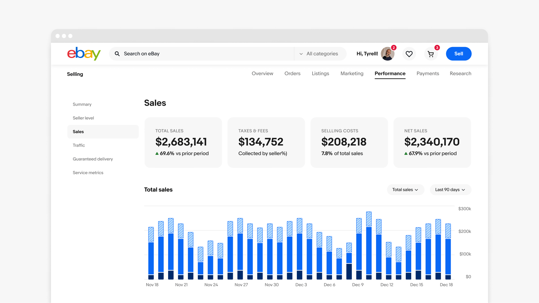
Titles are critical for describing the graph and telling its story. They can summarize the type of data and its time period in a sentence, state the category in a few words and let controls dictate the time period, or highlight the takeaway as a total. You can also utilize subtitles to describe the graph title or tell the story in human language.
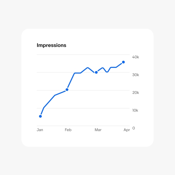
Title only
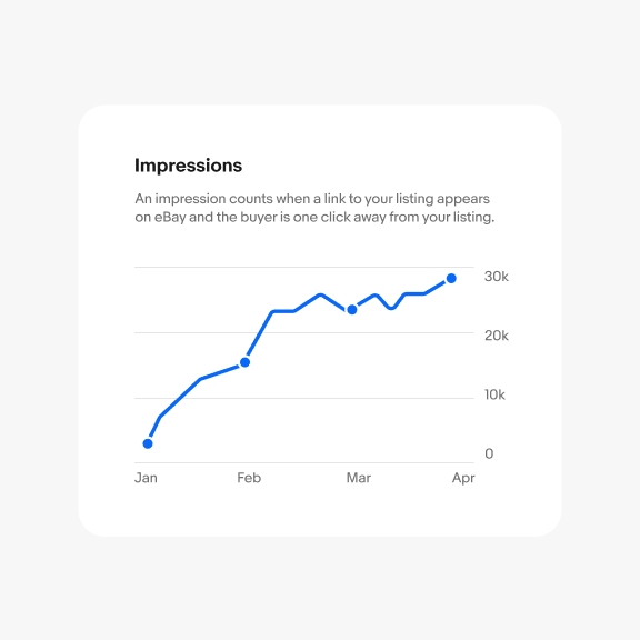
Title and subtitle
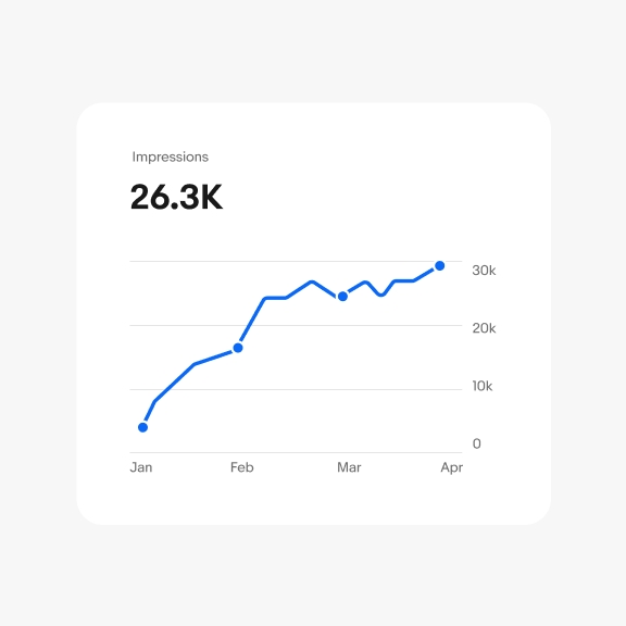
Primary metric
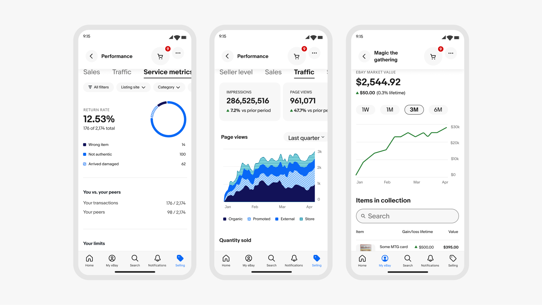
Controls can change time period, type of data, or amount of data shown on the graph. They can be tabs, quick filters or dropdowns that are either left aligned or right aligned depending on your layout and use case.

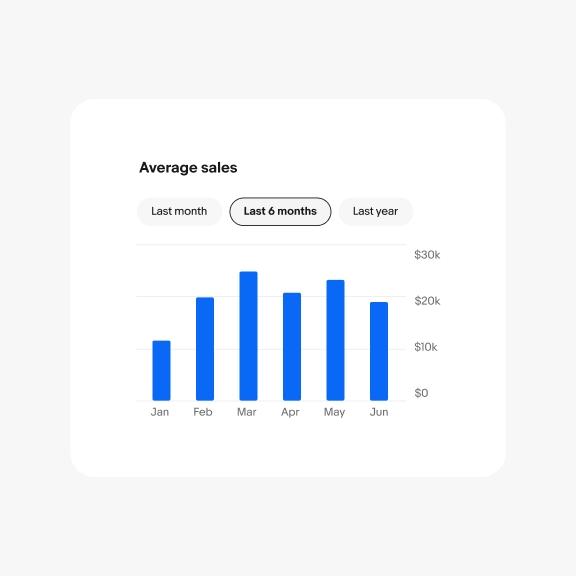
Tabs
Quick filters

Dropdown
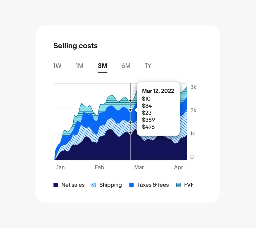
The X and Y axes anchor the user, helping them compare data points consistently across graphs. Use clear, concise intervals that avoid overcrowding. For instance, even if the chart covers a full year with daily data, it’s unnecessary to display all 365 days on the X-axis. Ensure labels have at least 16px of space between them and include key anchor points. For example, start the Y-axis at 0 for accurate proportions and mark significant time points on the X-axis, like financial quarters or days of the week. Users can interact with the graph to view specific data points via tooltips between labels.
Interactivity is crucial in maintaining our principles of simplicity and progressive disclosure. Graphs and charts should be simple enough to be understood at-a-glance. Progressive disclosure allows users to easily find the details they need by interacting with specific parts of the graph.
On web, users can hover or click a specific point in time to see more details. This will open a tooltip above the selected time period and all other shapes on the graph fade to 30% opacity.
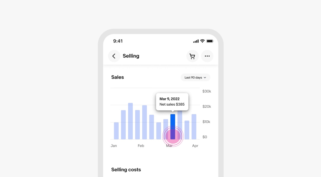
On mobile devices, users can interact with graphs through tap and long press gestures. A tap reveals the tooltip for a specific time period, and a second tap dismisses it. Alternatively, a long press reveals the tooltip, allowing users to scroll left or right while pressing to view each time period consecutively.
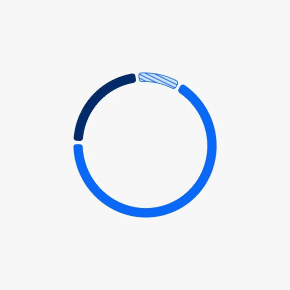
Make sure the ordering of data sets in the tooltip reflects the order of the segments on the graph from top to bottom. For example, the top segment should be the top value in the flyout, the second value should be the second segment down, etc. The key under the graph should be in the opposite order since the key represents building the segments from the bottom up to the top.
The size and number of bars in a bar chart can affect its clarity and meaning when the chart becomes too complex. If bars are narrower than 12px with less than 8px of padding, the chart starts to resemble an area chart, making the bars difficult to read. Aim to keep bars between 12px and 16px wide, with at least 8px of padding between them for optimal readability.
16px bars with 40px padding
16px bars with 32px padding
16px bars with 8px padding
On medium and large screens, the increased real estate allows us to expand the X-axis to display more data in most graphs, often extending the time period and adding more bars in bar charts. However, if consistency in the time period across screen sizes is crucial for the user, you can maintain the same time period and instead adjust the bar width, spacing, and graph inset. On larger screens, bars can widen from 12px to 24px, with at least 8px of padding between them.
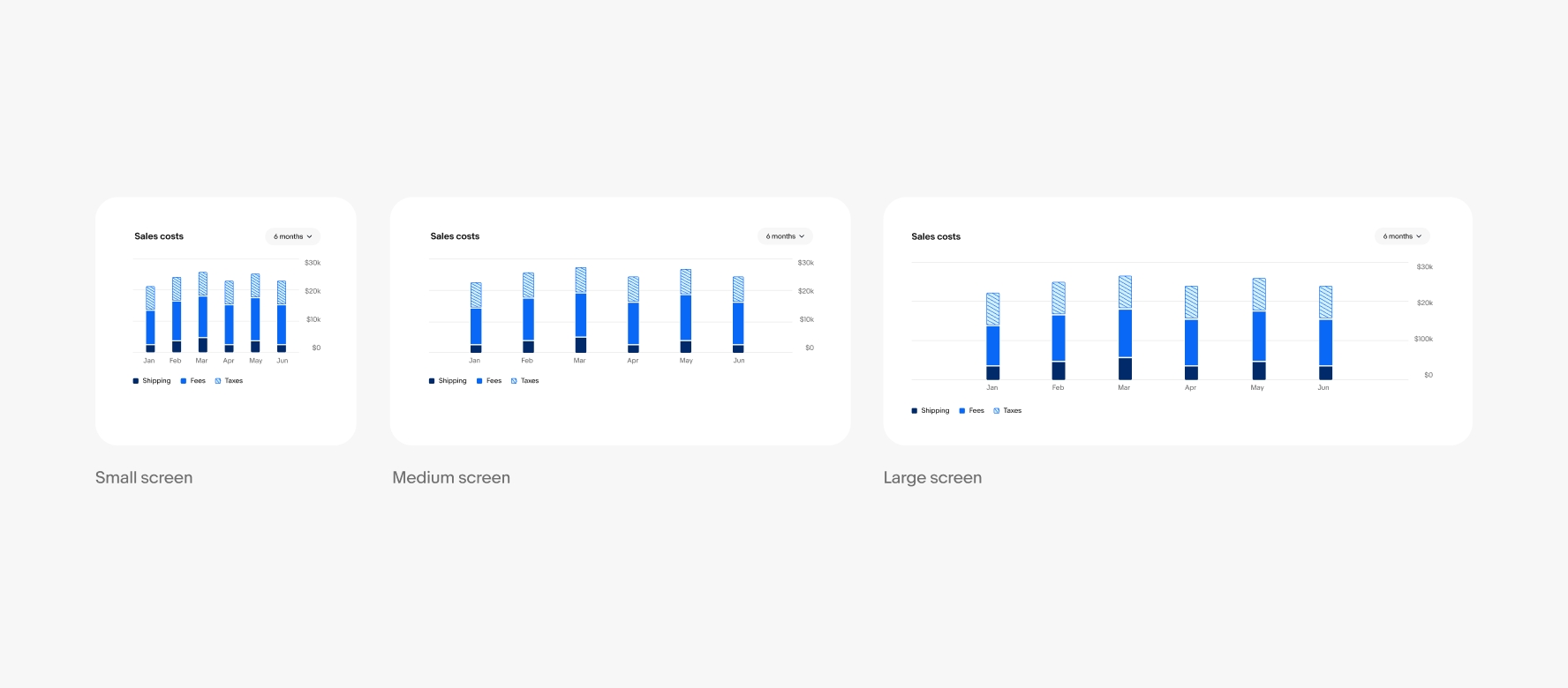
Increase bar width, padding, and inset.
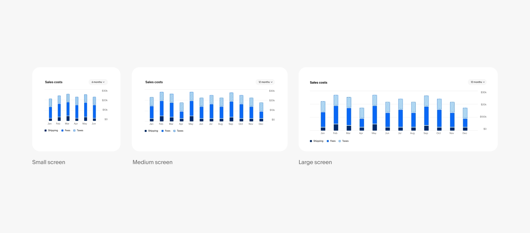
Increase number of bars, width, and padding.
All of the colors we use in our data visualization patterns have been vetted for accessibility and fit into three categories: trends, charts, and line graphs. You can find the colors we use throughout this page in Color Tokens.
Do separate axis labels with at least 16px of padding.
Don’t place axis labels too closely together or angle the text.
Do use 2px corner radii on outside corners of bar chart segments.

Don’t increase corner radii on bar charts. Rounded edges make the values harder to read and the bars harder to compare.
Do maintain between 12px and 24px wide bars with a minimum of 8px padding between them.
Don’t make bars smaller than 12px wide or decrease padding below 8px to show more data. Show less bars or use a different graph to achieve the density of data you are looking for.
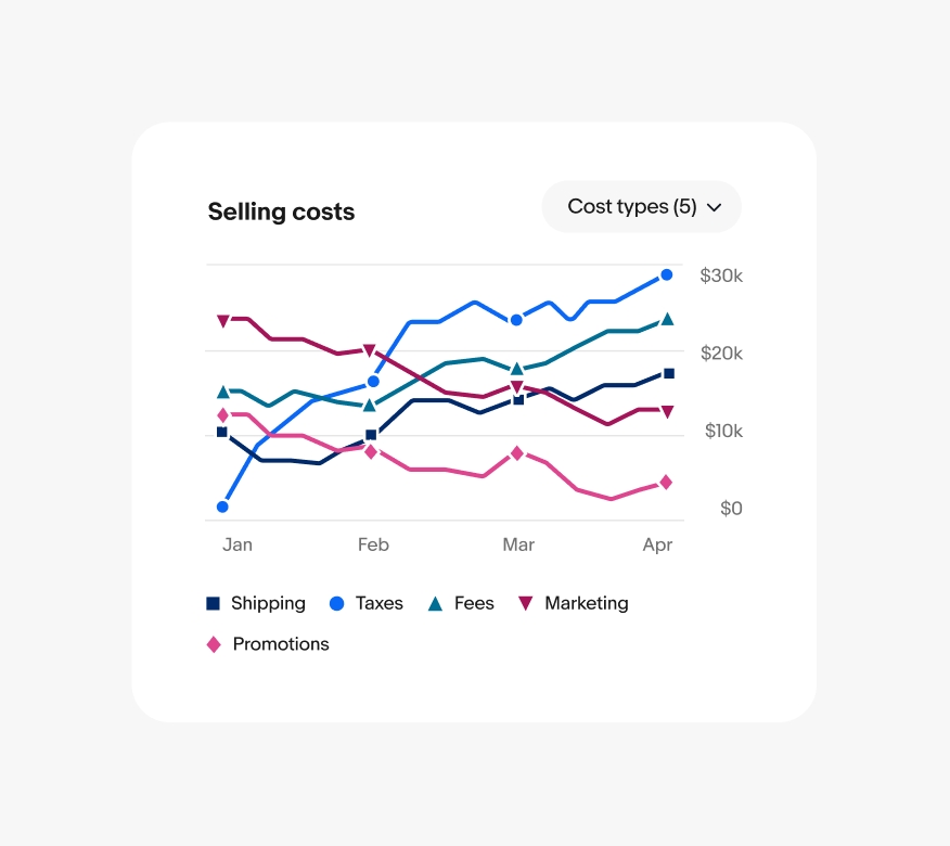
Do show a max of 3 data sets per graph by default.
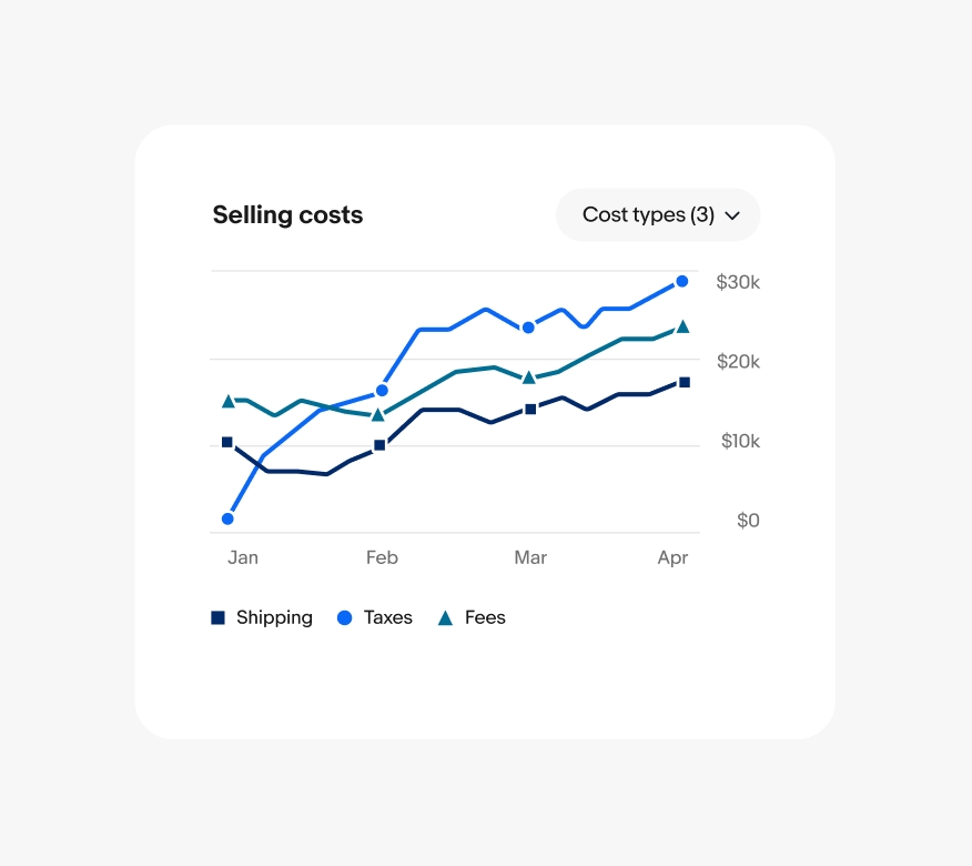
Don’t show more than 3 data sets by default. A max of 5 data sets can be displayed if the user turns on more.
Do ensure interactive tooltips are aligned above all key shapes and data in the graph, even if they overlap the title or controls. Always include the value and label for each data set within the tooltip.
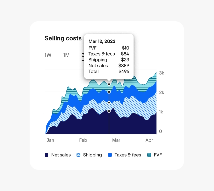
Don’t align interactive tooltips to the left or right where users fingers may cover important data on touch screens. And don’t rely on the order alone to express the meaning of values.
Do use the color themes defined for each graph type and the ordering defined based on number of data sets.
Don’t use colors intended for one chart type in another, such as applying line graph colors in an area chart, and don't create new color themes for graphs that aren’t part of the system.