Include plugin
eBay created the Include—Accessibility Annotations Figma plugin to help designers with accessibility considerations early in their project, and to help with designer-developer collaboration. It is available to the Figma community and free. eBay teams use an internal version.

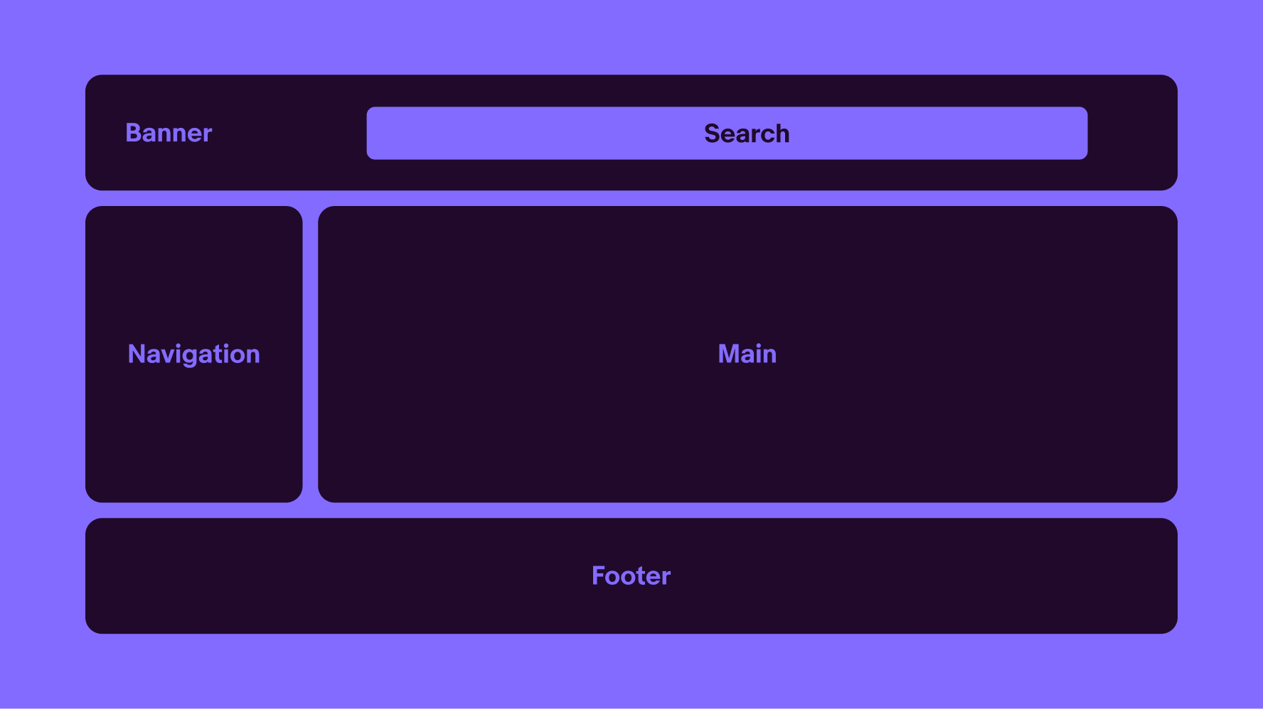
Defining landmarks
- The main landmark identifies the primary content of the page. There can only be one main landmark, and cannot be nested within other landmarks.
- The banner landmark identifies site-oriented content at the beginning of each page within a website, such as the logo at the top of the page, and typically spans full width. There can only be one banner, and it cannot be nested within other landmarks.
- The footer landmark identifies common information at the bottom of each page within a website. There can only be one footer, and it cannot be nested in another landmark.
- The navigation landmarks provide a way to identify groups of links a person can use to navigate a website or page. If there are more than one navigation landmark, it is recommended to give the landmark a name, such as 'Primary' or 'Account.' Assistive technology will announce 'navigation' so do not include that word in the name.
- A search landmark contains a collection of items and objects that combine to create search functionality for content on the website.
Related WCAG Success Criteria
Headings provide a clear hierarchy for the content in a document or on a screen. Think of headings as an outline for the content and sections on a page. Typically, the text we make more prominent and heavier should be headings. Every page must have an H1 and only one H1. Subsequent headings should be nested appropriately and not skip levels. Dialogs and panels appear above the parent page or screen and typically start with an H2 for the dialog title.

Related WCAG Success Criteria
An established reading order improves the clarity of a page’s content. Proper reading order can help people who use assistive technology or have cognitive disabilities. Just like how we decide the visual priority of content, like making more essential things larger and placing them at the top, we must consider how content gets conveyed programmatically. Defining the intended reading order helps our engineers understand how to implement a page’s content.
Considerations
Content relationships
If we have four content modules displayed horizontally on a large screen that are meant to be read in order, keep that order in mind when those four modules are displayed vertically. Do they appear in order on smaller screens?
Consistency
When common elements are used across pages, like a standard header and left navigation, having the same reading order lends to a more predictable and understandable experience.
Visual order
Reading order and tab order often mirrors the visual hierarchy of content and follows a left-to-right, top-to-bottom flow for LTR languages.
Related WCAG Success Criteria
Images that convey meaning are considered informative. Informative images need alternative text that screen readers will announce to communicate the image's purpose, function, or content. Images that do not convey meaning or are non-functional and adjacent to onscreen text that conveys their meaning are considered decorative. Decorative images do not need alternative text; they often use an empty alt attribute.
Related WCAG Success Criteria
To ensure the experience can be used by those with low vision, colorblindness and others, text, interface controls and informative graphic elements must meet contrast minimums.
- Text minimum contrast 4.5:1
- Large text minimum contrast 3:1 The standard defines large text as 24px or greater, or 19px bold or greater. In CSS, bold text typically has font-weight:bold, or font-weight:700 or greater.
- Interface controls and informative graphic elements: 3:1

Exceptions
- Logos and wordmarks
- Disabled controls
- Decorative elements elements providing no information, and having no functionality
- Skeleton loaders covering a large area (e.g. item cards, full screen content)
Related WCAG Success Criteria
Use color as a secondary affordance of information. Differentiating between colors can be very difficult for people with low vision or color blindness. Do not rely on color alone to convey meaning or distinguish visual elements. Review designs in grayscale or monochrome to verify that the hierarchy and purpose are perceivable without color.
Exceptions
- Logos and wordmarks
- Disabled controls
- Decorative elements elements providing no information, and having no functionality
- Skeleton loaders covering a large area (e.g. item cards, full screen content)
Related WCAG Success Criteria
Larger touch areas make it easier for people with limited dexterity or low vision to activate controls, and to avoid inadvertently activating adjacent controls. The target area could be the size of the element itself or an element and its padding.
For web, the minimum is 24px by 24px unless the target is in a sentence or block of text, or a pin on a map, or dots on a chart.
Drawing target areas helps to identify whether these meet the minimum size. Include then checks for any overlapping areas to ensure there is sufficient spacing.
Drawing the target can also help to communicate to engineers design intent on which areas will be actionable. E.g. is the row the target or only the button at the end of the row.
Related WCAG Success Criteria
To meet WCAG SC 1.4.4 Resize text, users must be able to resize text at least 200% without loss of information. Users resize text with browser settings or functionality. When users resize text, it is likely other page elements may need to respond, such as by getting larger or changing position. Note that resizing text to 200% is not the same as zoom to 200%. With zoom, other elements such as images likely get larger.
A common misunderstanding of SC 1.4.4 Resize text, is that it requires support for zoom to 400%, rather than resize text to 200% as required. The reason for the confusion may be that 1.4.10 Reflow mentions an equivalent method of resizing a standard monitor browser width to 320px, is to zoom to 400%. The 2 success criteria are different, and meeting 1.4.10 Reflow does not necessarily guarantee meeting 1.4.4 Resize text. This is why WCAG kept two success criteria and why Include has 2 steps.
Related WCAG Success Criteria
If the user changes device orientation, resizes the browser, or zooms in, the content should reflow without horizontal scrolling or loss of functionality. When the browser is 320px wide, the page must not have horizontal scrolling. Scrolling horizontally for parts of the page may be necessary, such as table headings, carousels, navigation, filter pills etc.
Here are some things to check for after a reflow:
- No overlapping text
- No text extending beyond its bounds, for example, don't create a button label that extends beyond its button container
- No content that is hidden/cropped offscreen as a result of the reflow
- Avoid multi-directional scrolling (except carousels and data tables)
- Avoid loss of user input in forms or editable tables
