Icon library
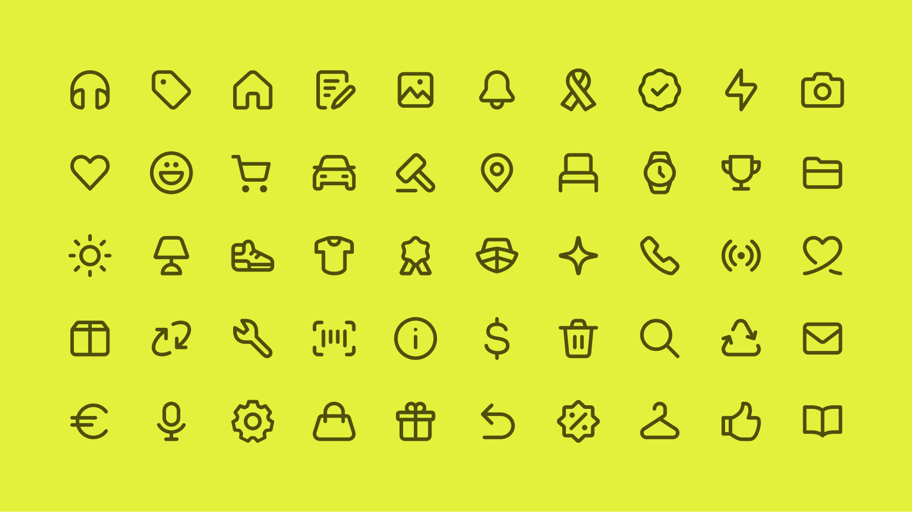
View our suite of available icons.
Our icons are the visual shorthand that make the eBay experience smooth and seamless. They help people find their way, highlight important information, and reinforce our brand’s foundational aspects of being modern, friendly, and universally understood.
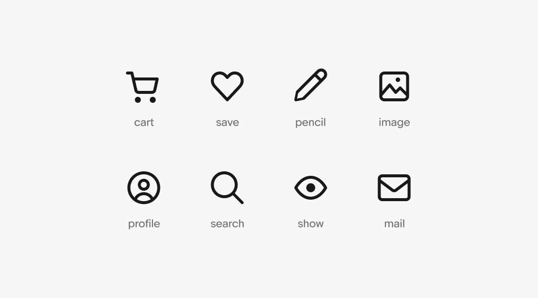
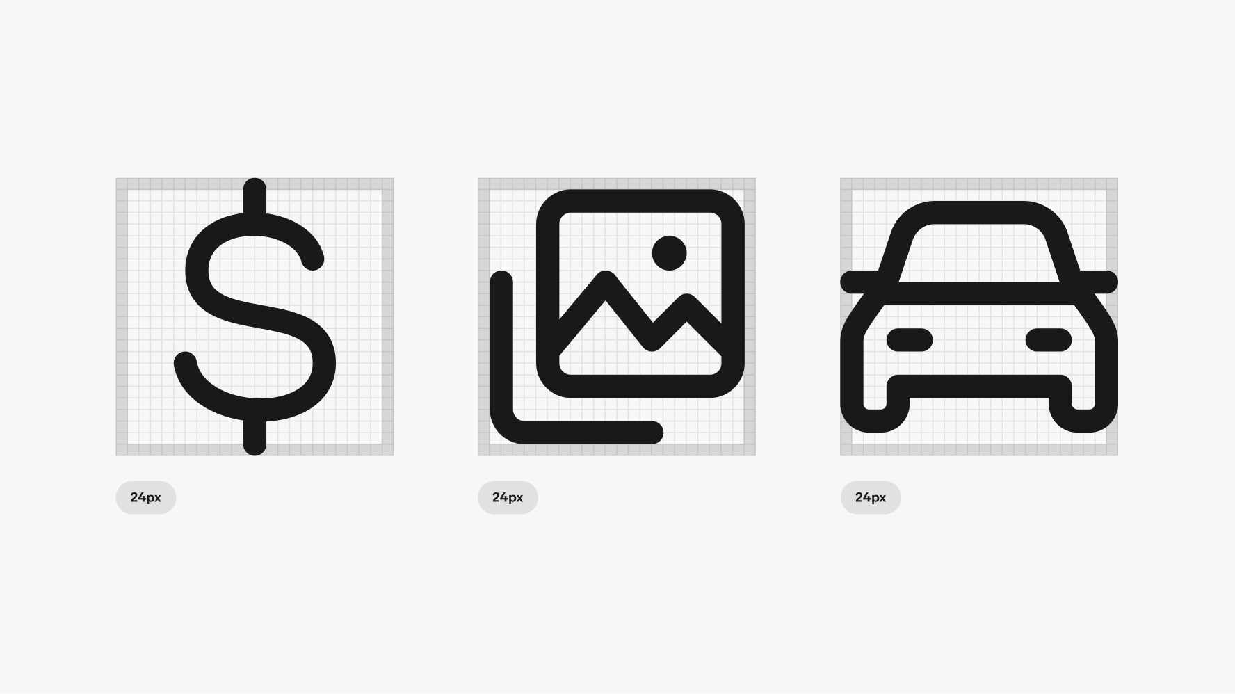
We represent tools and topics as simply as possible throughout our product. To achieve this, we leverage existing metaphors for our icons. Some icons are more abstract by nature, but objects like a cart, heart, pencil, image, and magnifying glass are as universal as they come. Metaphors stay consistent across operating systems and remain clear and additive to the experience.
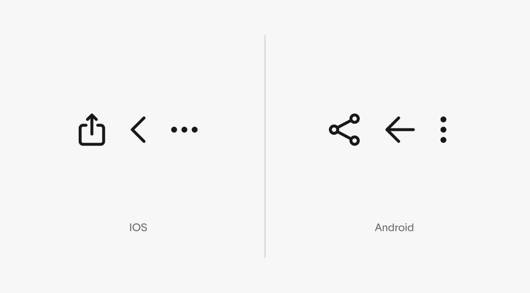
While icons should look and feel consistent across the eBay experience, some icons apply only to certain platforms. In these cases, icons should follow a system’s established patterns. For example, the share, back, and overflow buttons look different between iOS and Android.
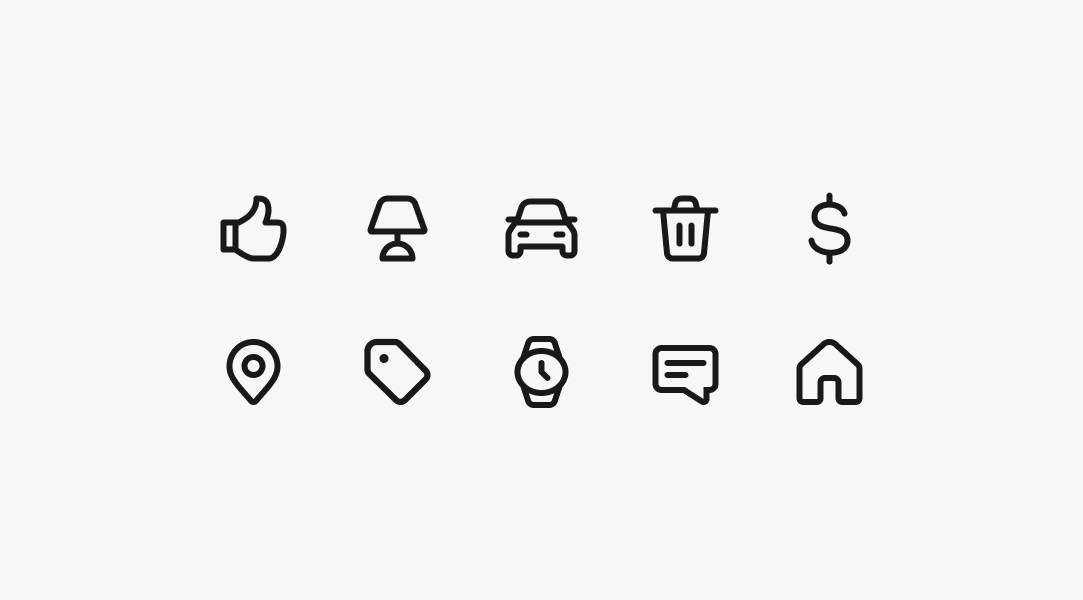
We designed our core library of icons to help quickly direct user attention. Think of the home or settings icons—they’re hyper-functional guideposts for users. We’ve organized these icons into common categories for ease of use. View our suite of available icons on the Icon library page.
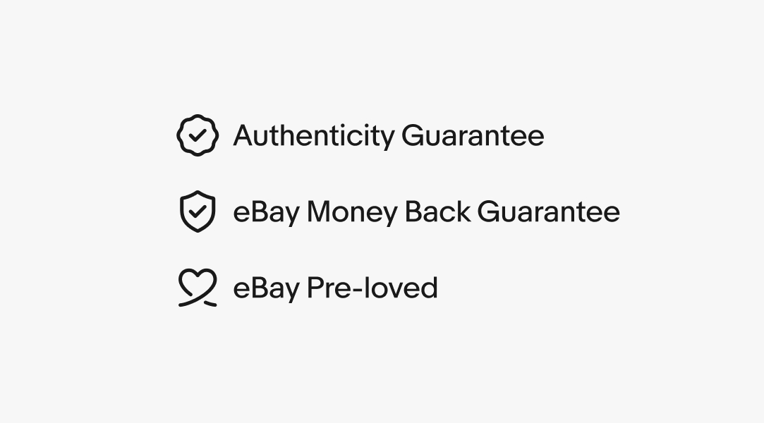
Our program badges express a service offer or guarantee. You can find these in the “Program badges” category of the core library. These icons support programs such as eBay’s Authenticity Guarantee, Money Back Guarantee, PSA Vault, Direct from Brand, eBay Plus, and more. Learn more about using these badges in product and marketing application on the Program badges page.
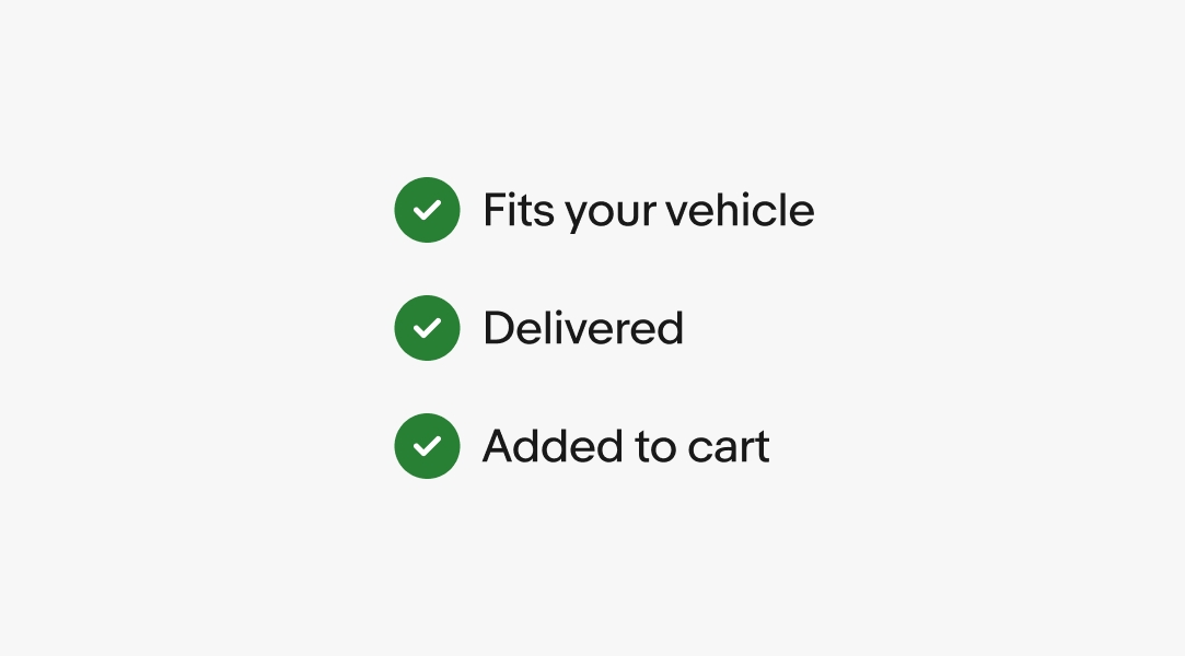
Confirmation indicators express confirmation, verification, and fitment throughout eBay. Learn more about using these indicators on the Confirmation indicators page.
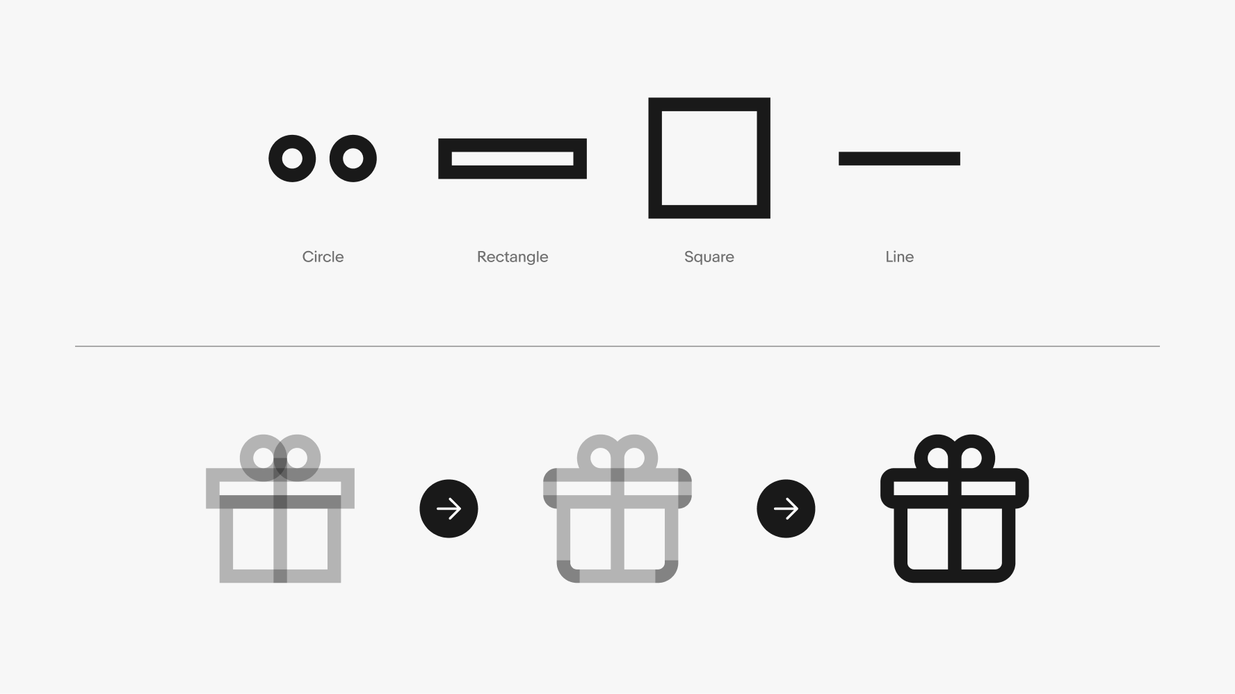
Icons are designed to embody simplicity and clarity, principles that extend to their creation. The process begins with foundational common shapes, which serve as the blueprint. These shapes are then enhanced with rounded corners and refined details, resulting in a polished final asset.
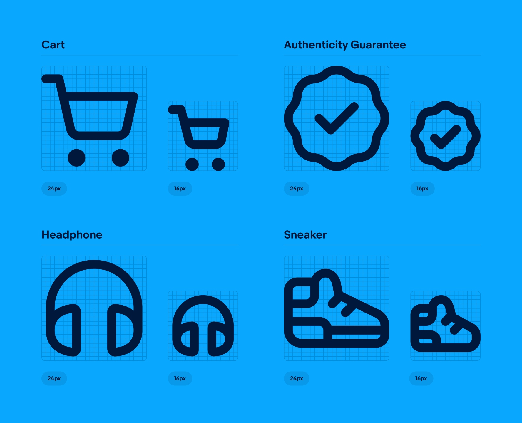
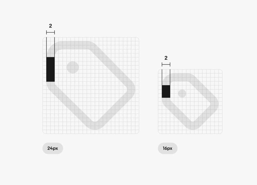
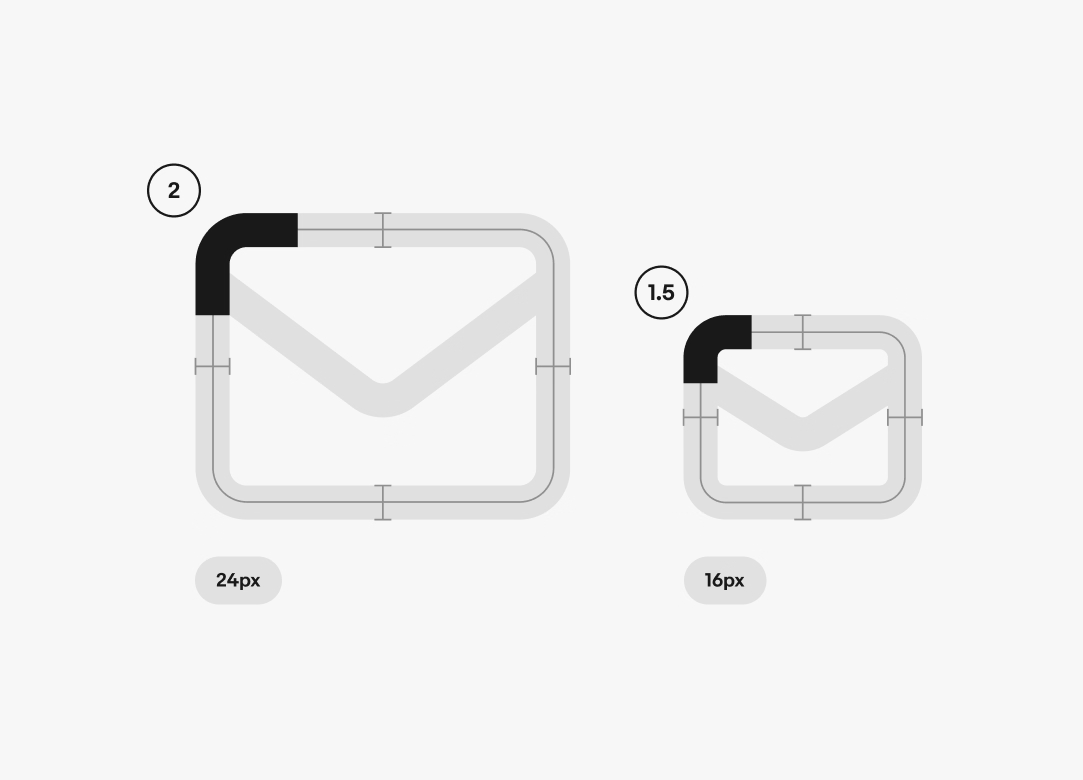
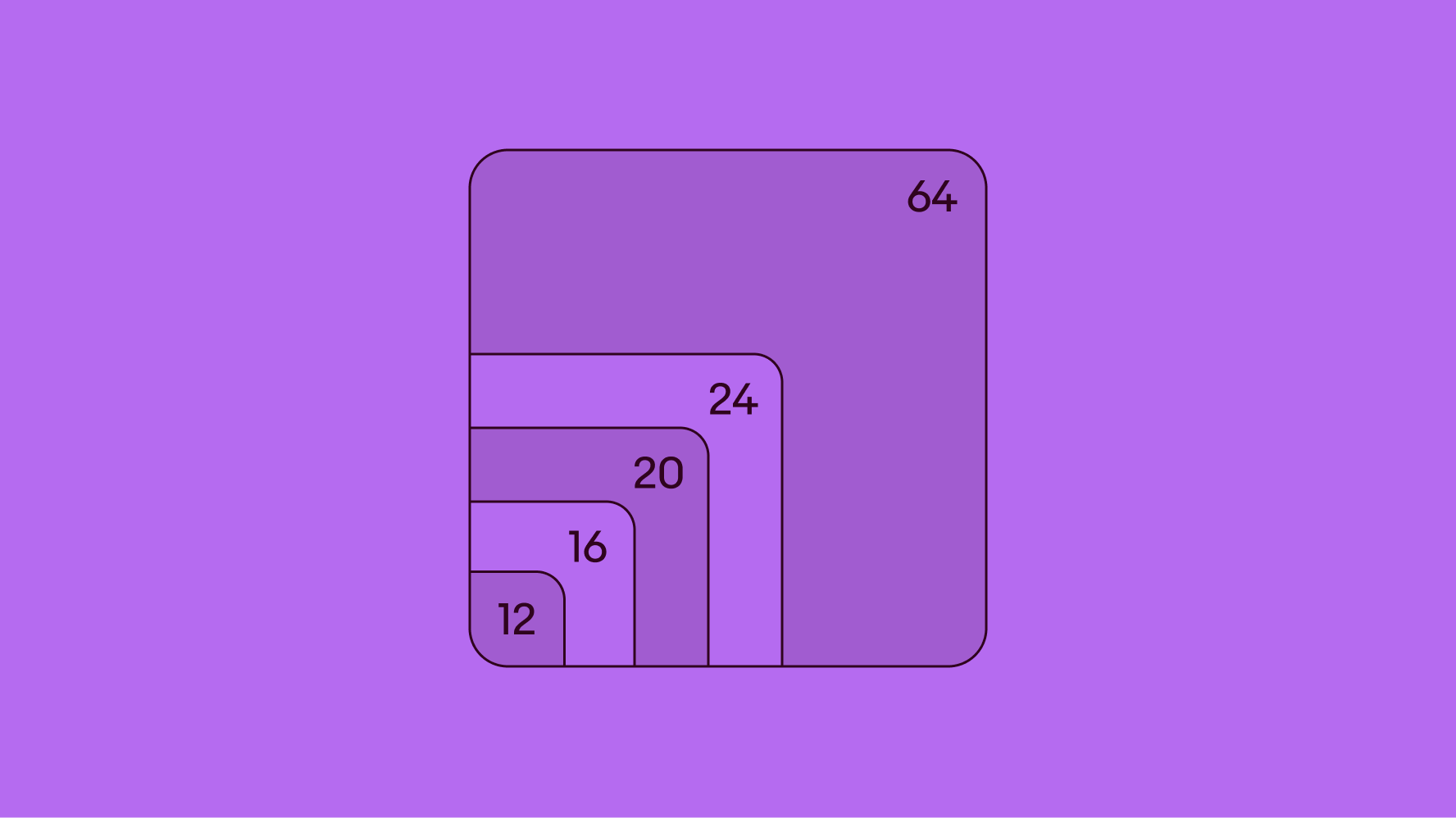
We maintain a consistent stroke weight of 2px for icons sized at 24px, 20px, and 16px, which constitute the bulk of our icon library. Exceptions to this standard are the 12px and 64px icons, which feature stroke weights of 1.25px and 5px, respectively.
The corner radius is determined by icon size and a centered stroke line: 24px and 20px icons feature a 2px radius, while 16px icons have a 1.5px radius. Please note that using an inside- or outside-aligned stroke line will result in an incorrect corner radius. When using these alternative alignments, the corner radius must be adjusted to match the centered stroke specifications.
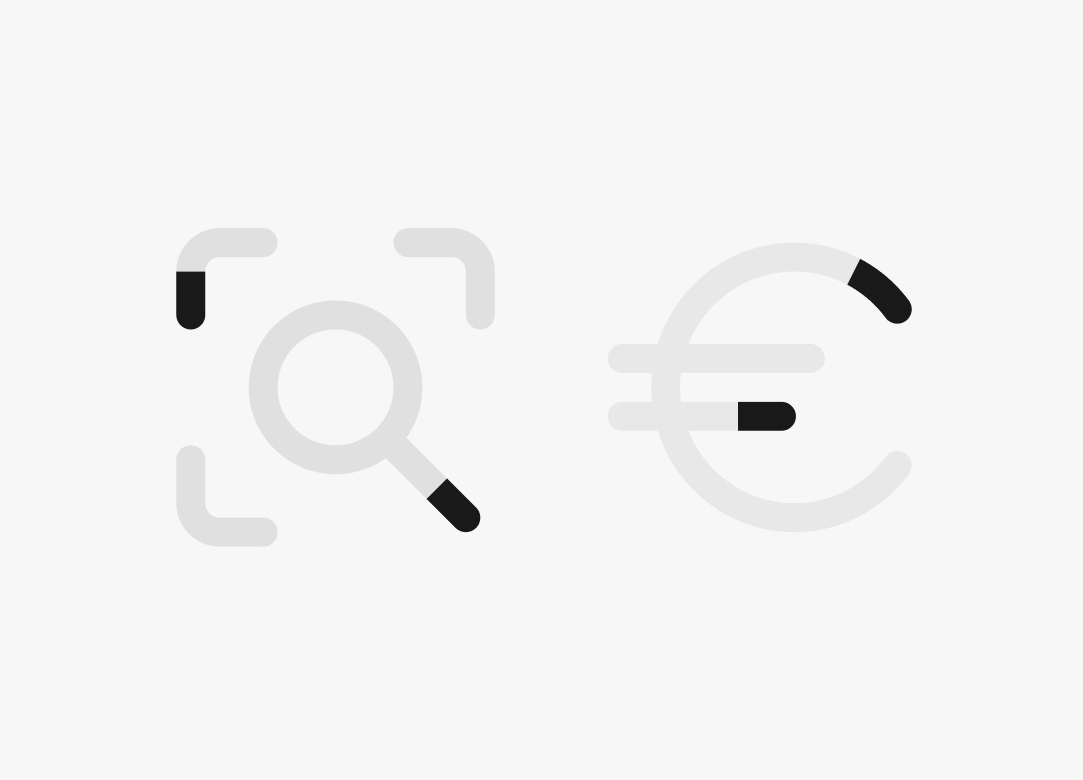
To enhance the playful and welcoming nature of our icon style, we use rounded terminals for all endpoints.
The safe space around our icons is consistently maintained at a minimum of 1px for all sizes. However, circles and various shapes are sometimes allowed to enter this space to aid in optical alignment, particularly for icons with pronounced vertical or horizontal elements.
Our icons exhibit close attention to detail, following strict rules to achieve precise clarity and consistency. You can access these icons in 3 primary sizes for optimal legibility and usability, plus additional extra-small and extra-large sizes to use sparingly. As a general rule, do not alter or edit icons.
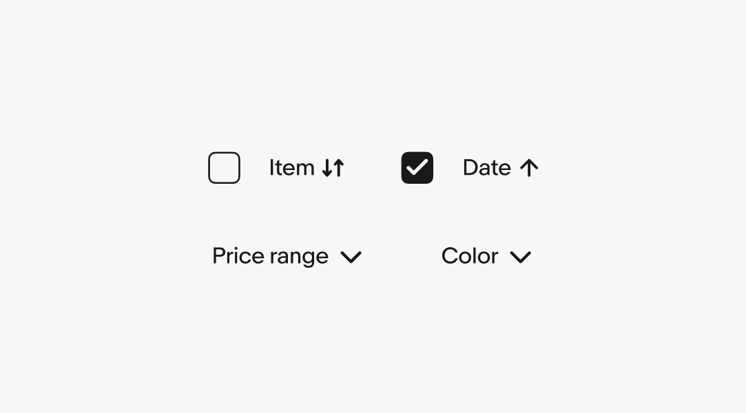
A select few icons have extra-small 12px versions, ideal for table-sorting controls, chevrons, and arrows—situations where the icon must be functional yet secondary to the main content. These icons feature a 1.25px stroke weight and are enclosed within a 12px bounding box.
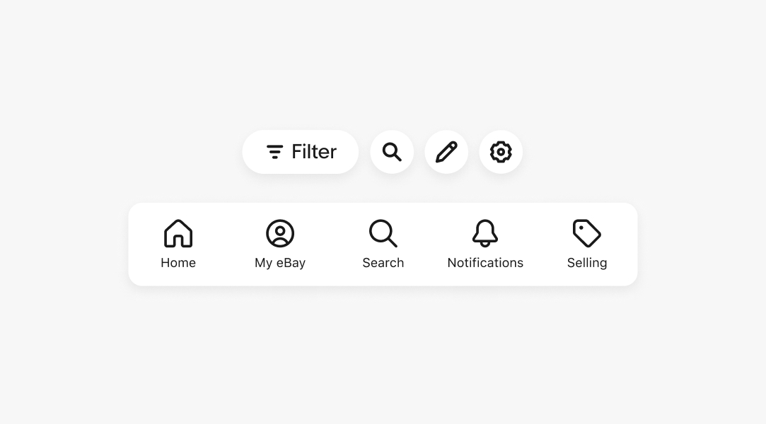
A specialized set of 20px icons is designed to support the top navigation area of the product, ensuring optimal optical balance. These icons feature a 2px stroke weight and are exclusively used within 40px circular buttons.
Throughout the eBay experience, we predominantly utilize two icon sizes: 16px and 24px, both with a 2px stroke weight. These are the sizes you will most frequently use in your designs.
Extra-large icons, contained within a 64px bounding box and featuring a 5px stroke weight, are reserved for empty-state screens. Typically, there is 2px to 3px of safe space around the perimeter of the artwork.
Icons are meticulously crafted at every size. It's crucial to keep in mind that as icons decrease in size, details are often pared down and simplified for optimal clarity. An icon's identity should remain consistent and easily recognizable across all sizes.
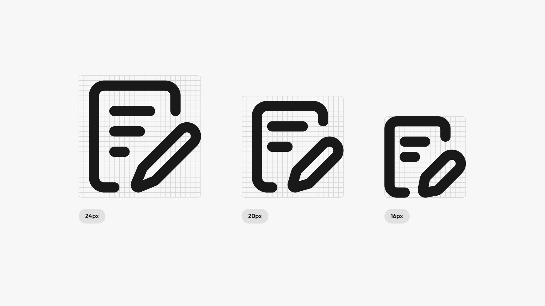
Choose icons that visually align well within buttons. A useful guideline is to select an icon size that is half the size of the button. For instance, opt for a 16px icon when paired with a 32px button.
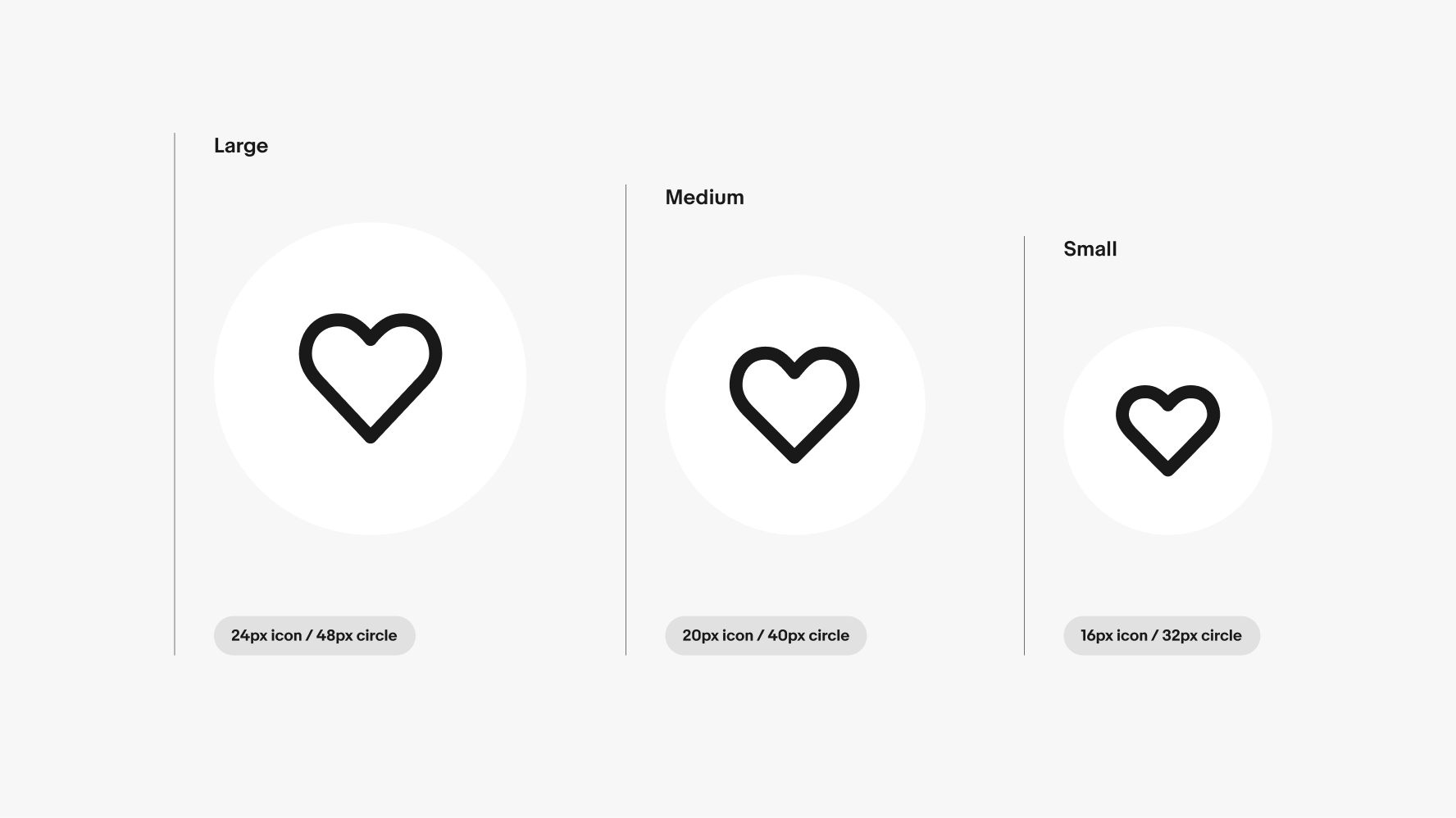
To discuss icon needs, reach out to the OneExperience (OX) team or sign up for office hours.
| Date | Notes |
|---|---|
| Jun, 2024 |
|
| Feb, 2023 |
|
| Oct, 2022 |
|