Do use our pre-defined color pairings found in the Color pairing tool.
What—and what not—to do when using typography.
Do use our pre-defined color pairings found in the Color pairing tool.
Don’t use colors or color pairings that are not explicitly shown in the Color pairing tool.
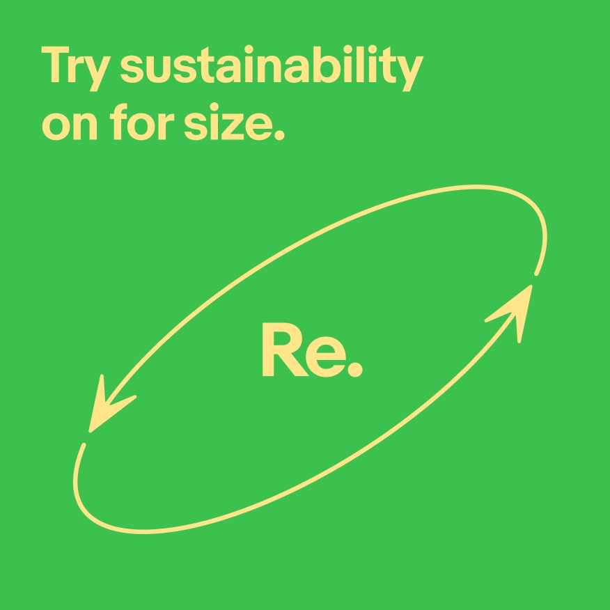
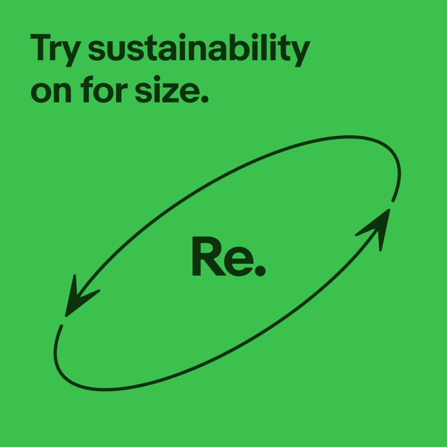
Do use solid colors for type.

Don’t use gradients for type.

Do use the letter spacing defined for each type style in the type ramp.
Don’t increase letter spacing beyond what’s in the type ramp.

Do create emphasis through shifts in type weight, size, placement, and spacing.
Don’t create visual hierarchy by incorporating fonts other than Market Sans.

Do create emphasis through shifts in type weight, size, placement, and spacing.

Don’t create visual hierarchy with type styles that are too similar.
Do create emphasis through shifts in type weight, size, placement, and spacing.
Don’t mix too many type styles (such as font, weight, and size) to create emphasis.
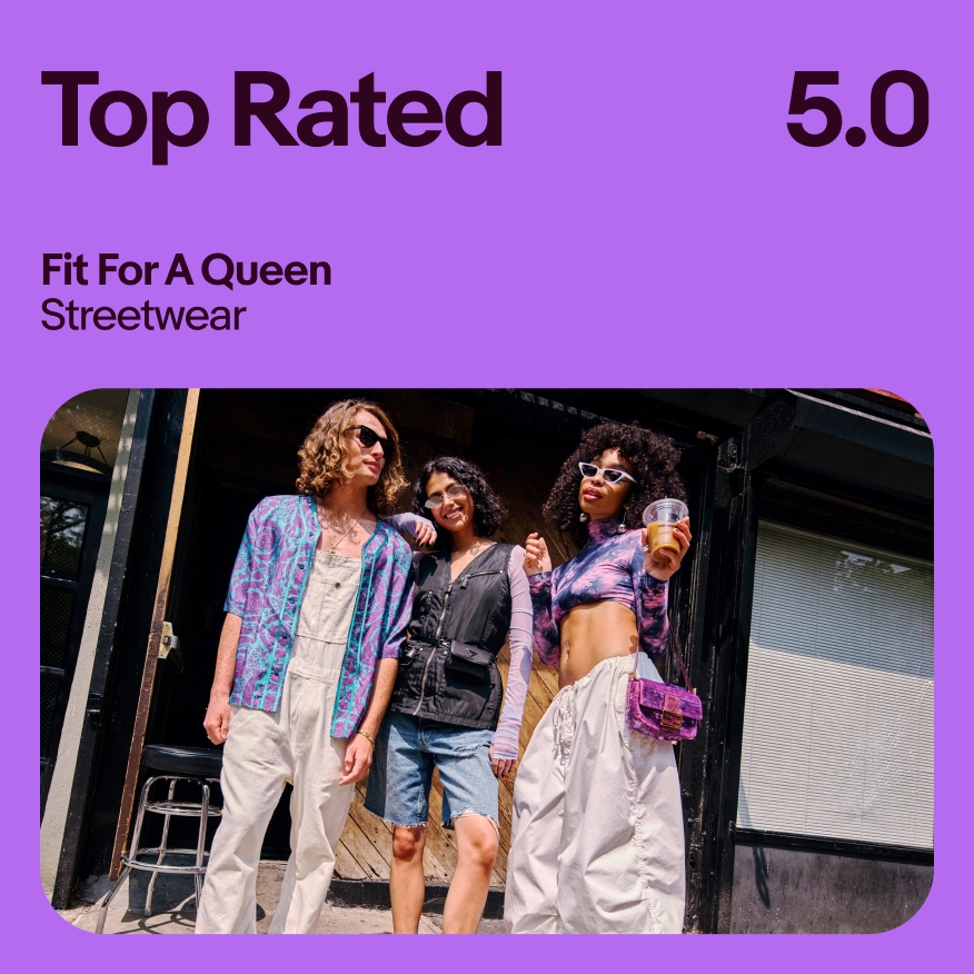
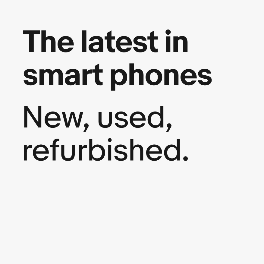
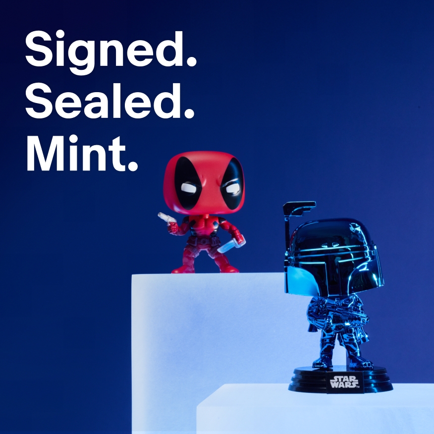
Do use solid white type placed over areas of photography that are not too visually busy.

Don't place type over busy photographic backgrounds.

Do use a drop shadow and linear gradient behind type to ensure contrast ratios are met for legibility.
Don't use drop shadows alone to create separation between type and backgrounds.
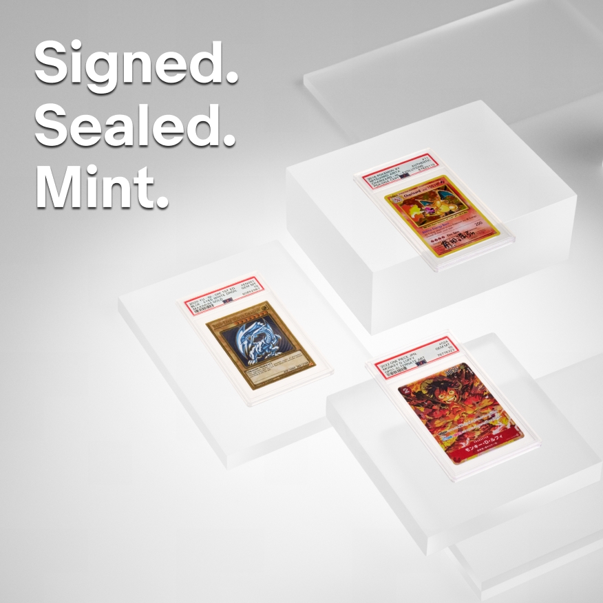
Do only use white type over photography.

Don’t use colored type over photography.

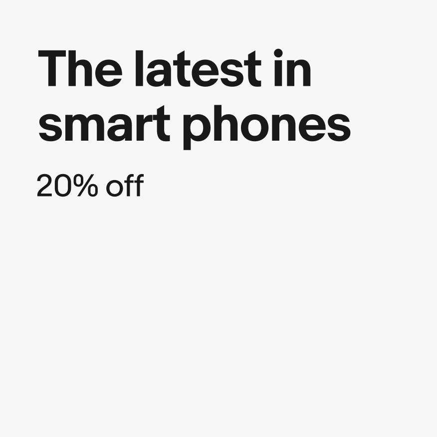
Do use text in its natural, default width and height.

Don’t manually stretch or alter the width or height of text.

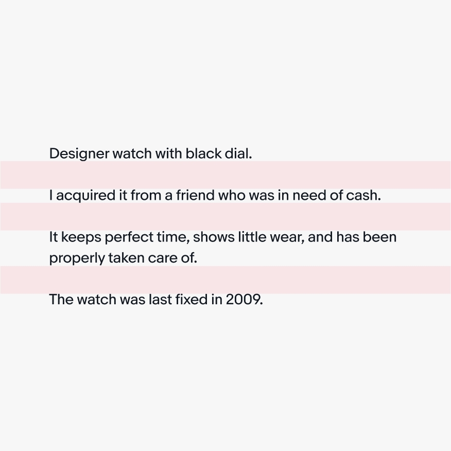
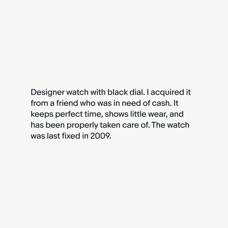
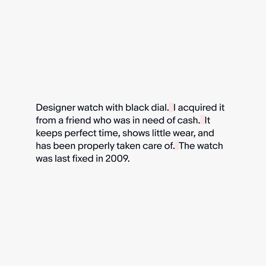
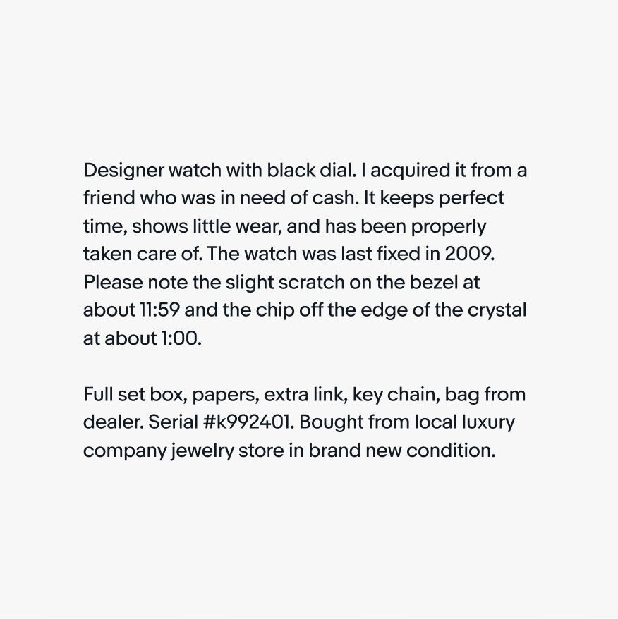
Do chunk relevant information together.
Don’t hard return after each sentence to create emphasis.
Do single space after sentences.
Don’t double space after sentences.
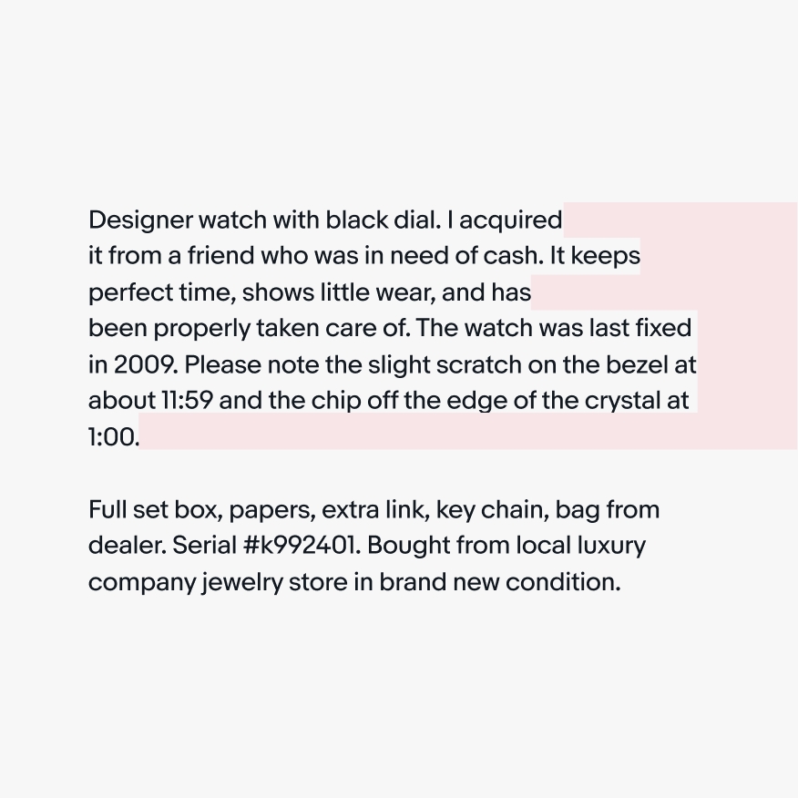
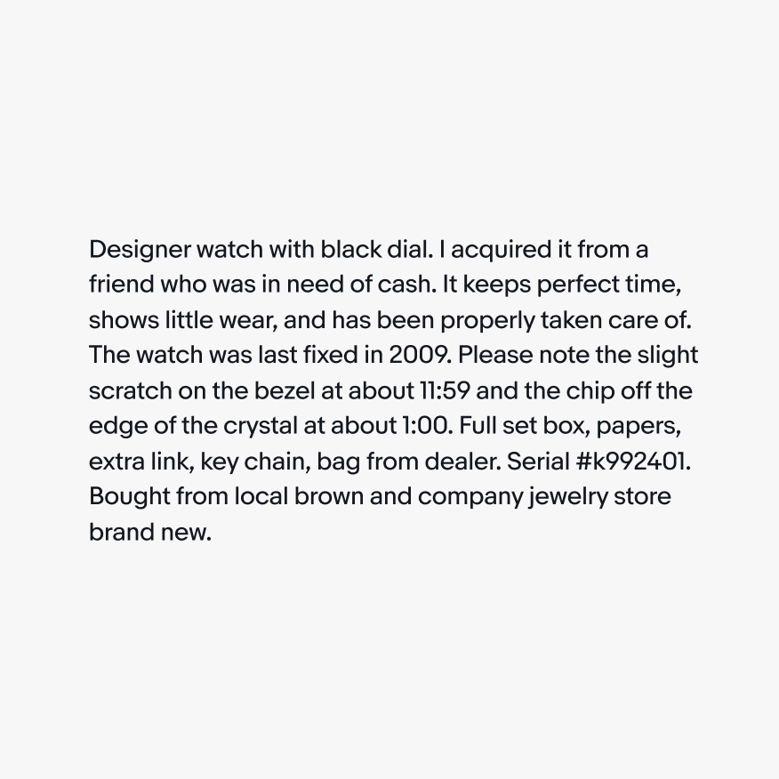
Do format text so the right side of the text block looks fairly smooth.
Don’t create jagged right rags or orphans by leaving a single word on the last line at the end of a paragraph.
Do left align all text to optimize legibility.
Don’t justify text to fill margins.
Do use sentence case for titles.

Don’t use title case for titles.

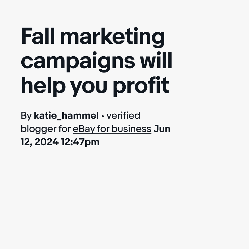
Do use eBay programs as they would appear in UI elements.
Don’t use eBay program names as titles.
Do keep the official spelling and casing for campaign names.
Don’t change the official casing of campaign names or add any punctuation.
| Date | Notes |
|---|---|
| Jun, 2024 |
|