Tokens overview
Tokens abstract raw values into scalable, meaningful, and readable labels spanning across teams and platforms.
Object styles provide structure and communicate shared behavior between elements.
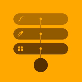
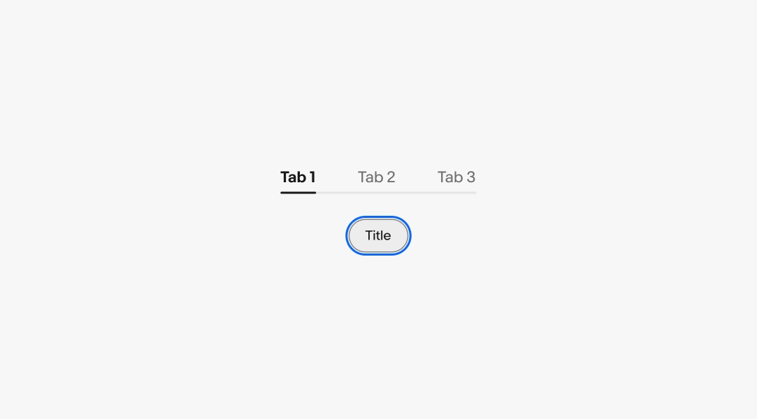
Border width is used to define structure and separation. View all border tokens.
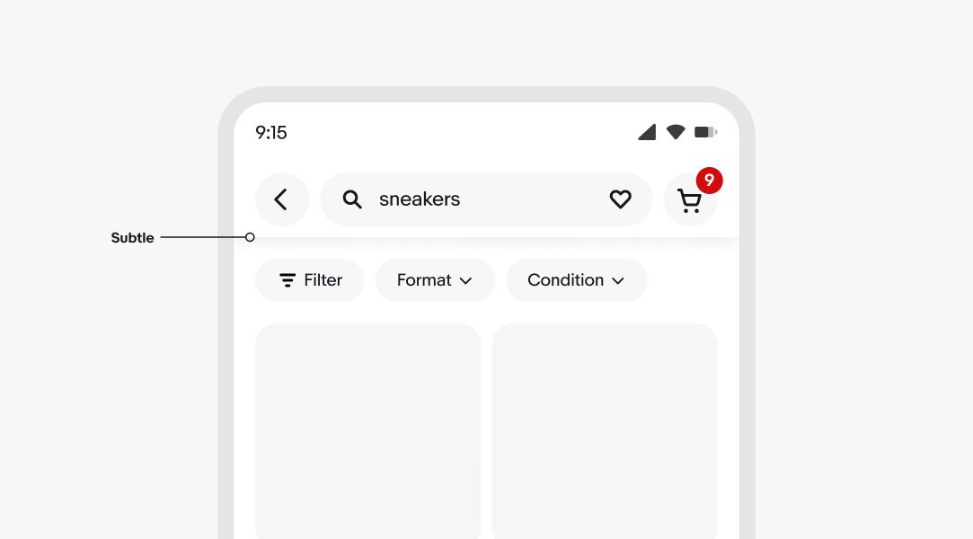
The subtle border width is reserved for navigation elements like the tab menu on compact screens.
The default border width is used to illustrate the boundary of components and divide content.
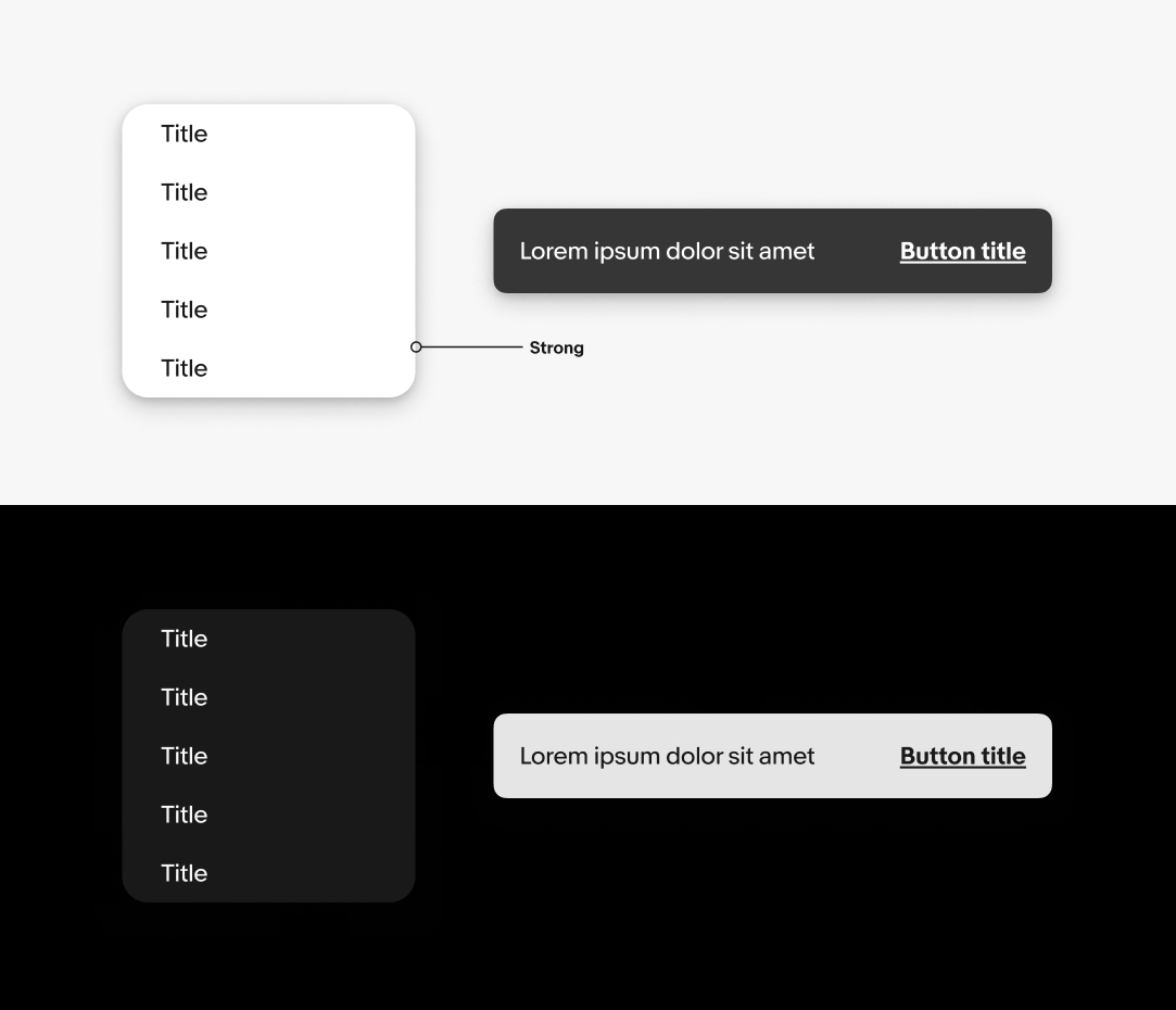
Strong borders are used to emphasize elements that primarily use borders for their structure, like tabs. Focus outlines also use the strong border width.
Radius is used widely throughout our system. Each radius size is intentionally applied to select elements. View all radius tokens.
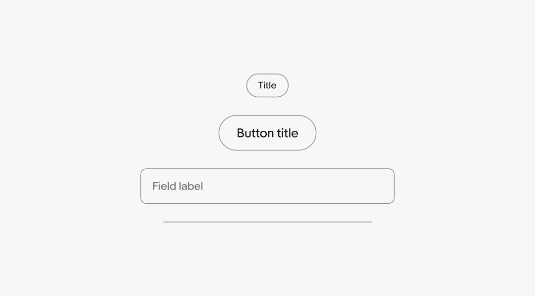
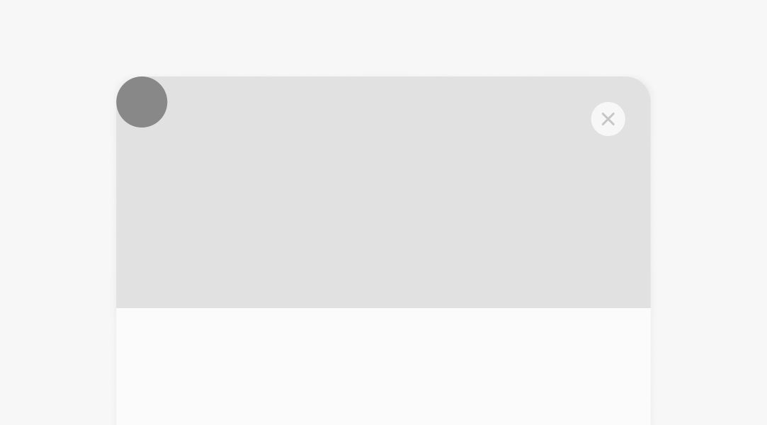
The default radius is the most common radius size. It’s applied to input fields and most component containers. It’s also applied to images with short edges smaller than 80px.
The large radius applies to popovers, modal containers, and images with short edges 80px and larger.
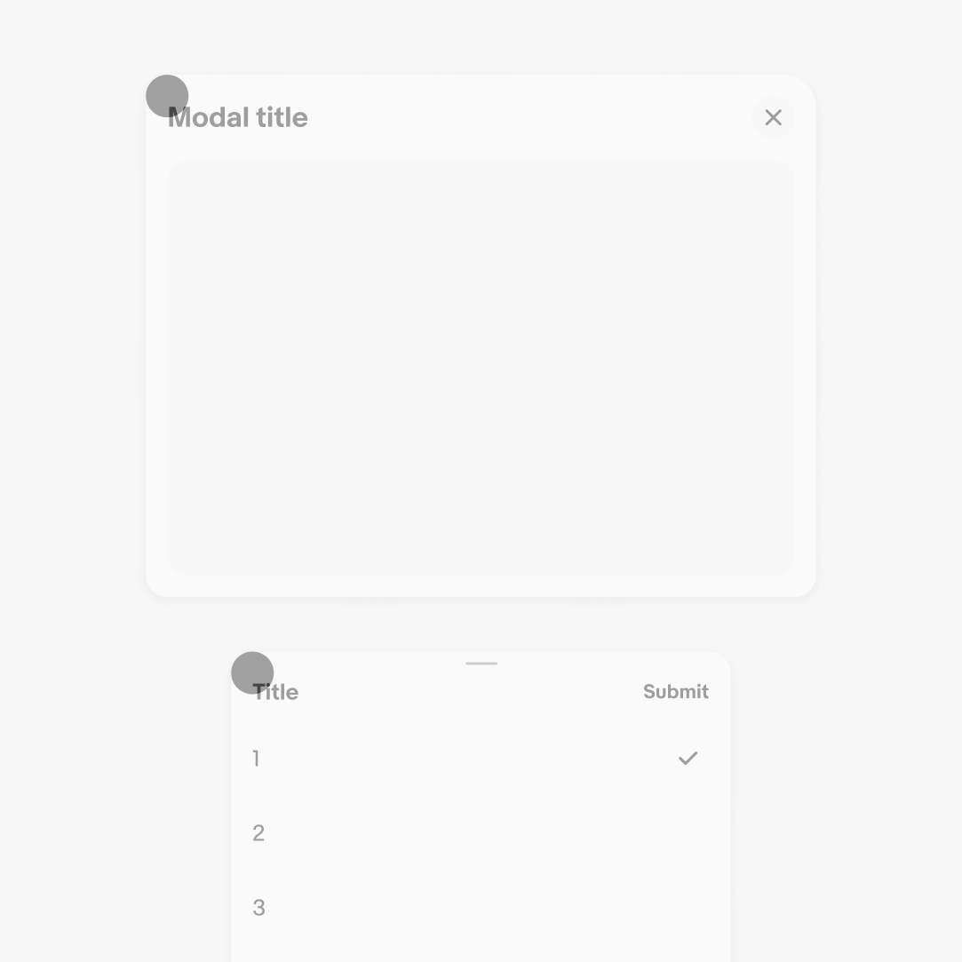
The extra large radius applies to more expressive components like banner dialogs.
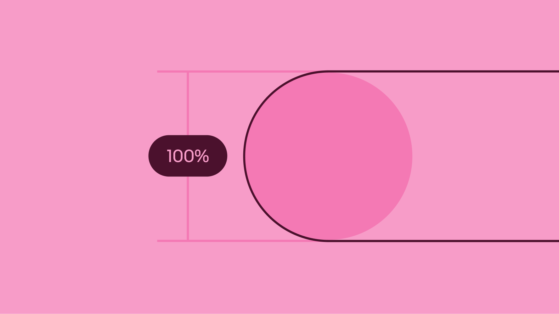
Full rounding is reserved for buttons, notification badges, and priority signals. This shape is meant to draw attention.
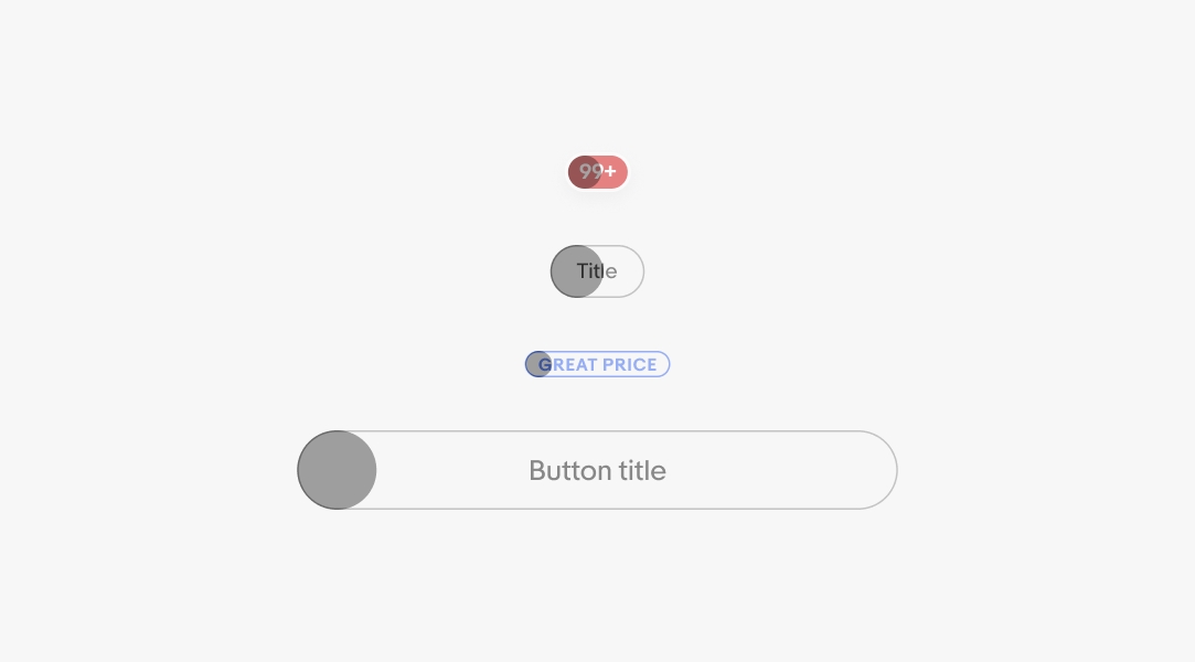
Circles are reserved for avatars and icon buttons.
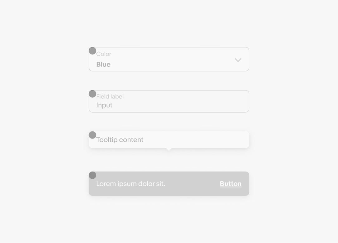
Drop shadow is used for transient and fixed elements. View all shadow tokens.
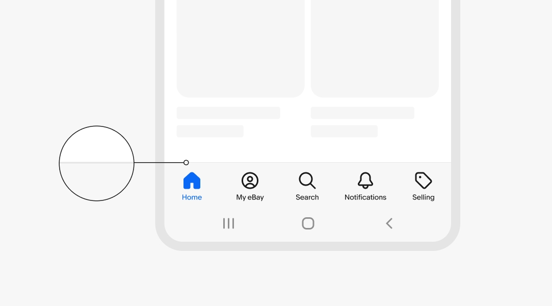
The subtle shadow is only used in persistent navigation elements. This provides separation without being distracting.
The strong shadow is reserved for transient elements, like popovers, snackbars, and tooltips. It remains the same for all components and screen sizes.
| Date | Notes |
|---|---|
| Jun, 2024 |
|
| Jul, 2023 |
|
| Mar, 2023 |
|
| Apr, 2022 |
|