Do use icons that are either universally understood across countries, or are specific to a country’s currency or culture.
Consistently using iconography and pairing with our other foundations like typography can greatly improve usability, recognition, and perception. These guidelines outline how we craft, interact with, and use iconography.
Icons should be utilized to enhance user experience by providing intuitive visual cues, aiding in navigation, and improving usability, especially for commonly understood actions or concepts. They shouldn't be overused or substituted for clear text in scenarios where it might cause ambiguity or confusion. Icons should be avoided when they introduce unnecessary complexity or ambiguity, especially if they don't clearly represent associated actions or concepts, hinder accessibility for text-dependent users, or carry meanings that may vary across different cultural or demographic contexts, potentially leading to misunderstandings or user frustration.
Iconography should be used when it enhances the user experience by providing intuitive visual cues, aiding in navigation, and improving usability, especially for commonly understood actions or concepts. However, it shouldn't be used excessively or in place of clear text when it risks ambiguity or confusion, particularly for complex or less familiar functionalities where text labels may be more informative.
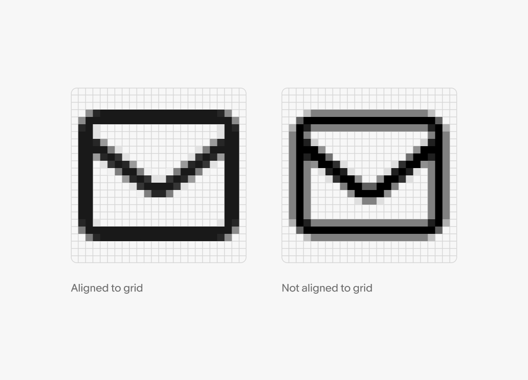
Icons should be aligned to the pixel grid to avoid aliasing and maintain sharpness across screen sizes and densities.
Lines that are not snapped to the pixel grid will be appear gray. A line that slightly enters a pixel will create a “fuzzy” appearance. This is especially noticeable on devices with lower pixel densities.
When creating an icon, always check the grid and conduct a pixel preview to view how it would appear on low-density screens.
Keylines are available as a starting point for designers contributing icons to the system. These keylines guide the placement of common shapes to maintain consistency between icons.
Start by aligning to the keylines, then go outside of the keylines when necessary to make an icon clearer.
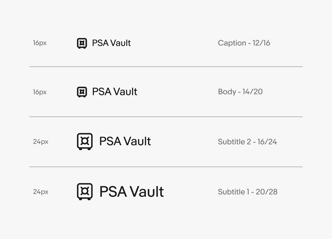
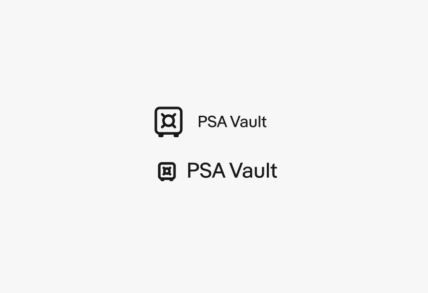
For visual hierarchy, proper icon and text sizes should be maintained when placing these elements together on a single line. In most cases, a single line of text will be placed next to 16px and 24px icons as these icon sizes are most common within our badging system.
Caption and body text may be used next to 16px icons, while subtitle 2 and subtitle 1 text may be used with 24px icons.
Icons and text should be aligned to the vertical centers for this treatment. Use 6px of spacing between 16px icons and text and 8px between 24px icons and text.
Icons are monochromatic by default. The majority will use our primary foreground color token unless in a disabled state within a button.
If an icon is paired with a label or body of text, the icon will match the color of the text.
Icons that convey semantic meaning, like attention, information, or confirmation, can use semantic colors over primary or secondary backgrounds. If the icon is over a background container using a semantic color, the icon will use an inverse color scheme instead.
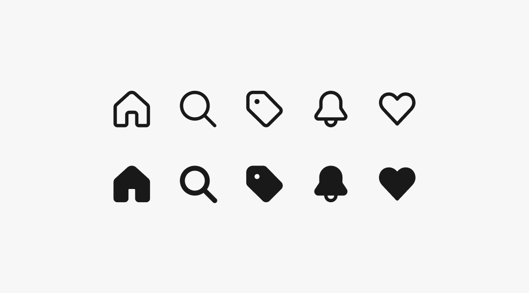
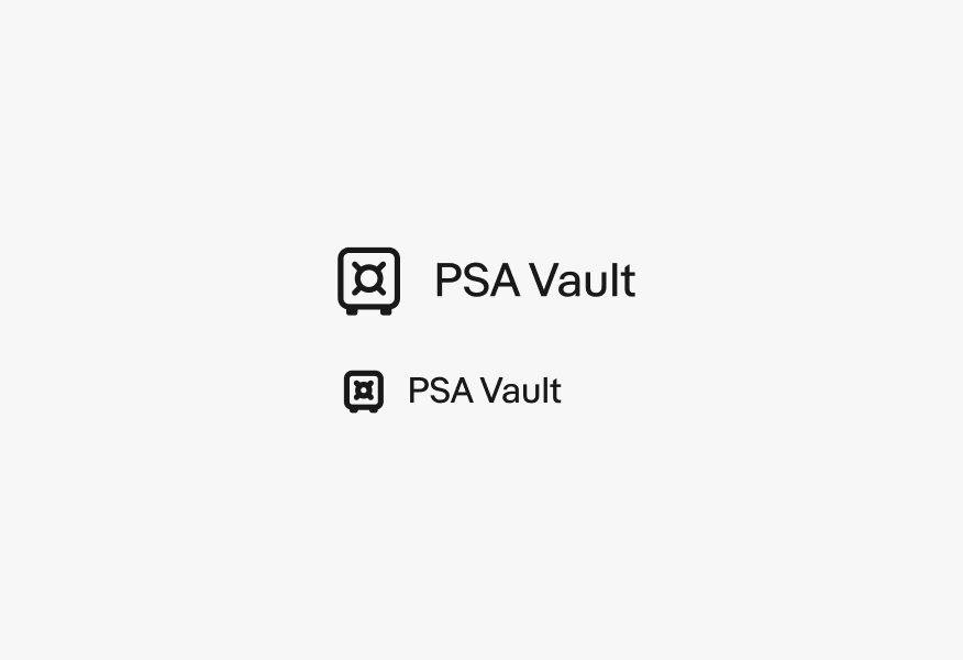
Some icons have an outlined and a filled version. The filled versions are used to indicate a selected state or to increase their prominence within a hierarchy.
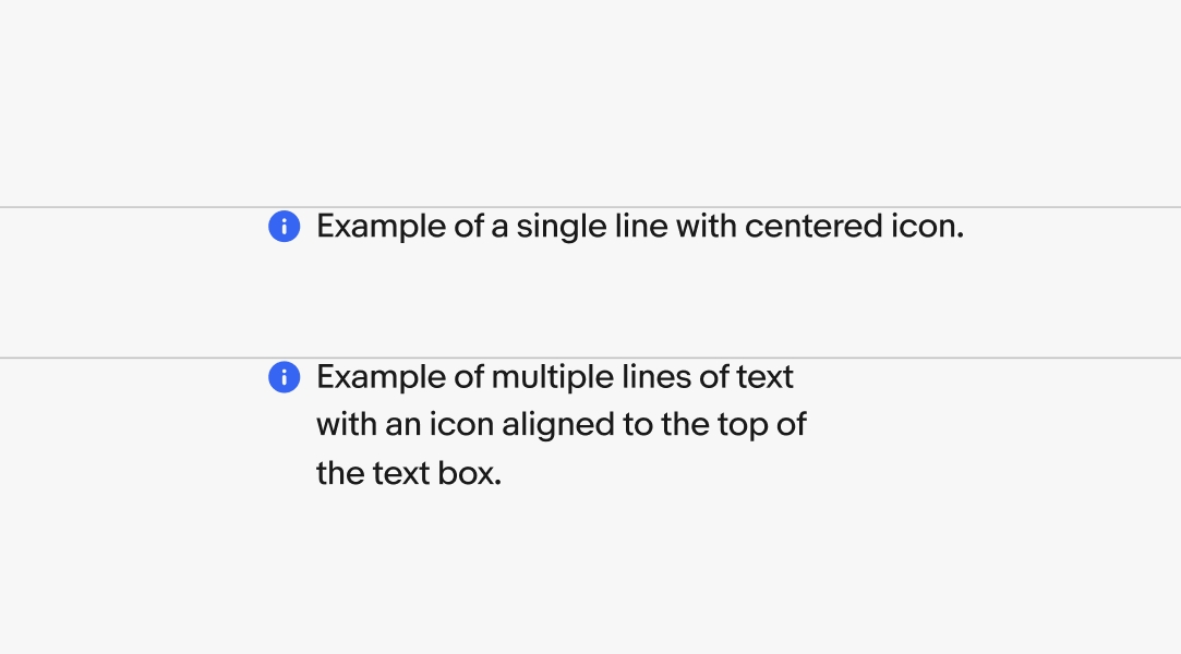
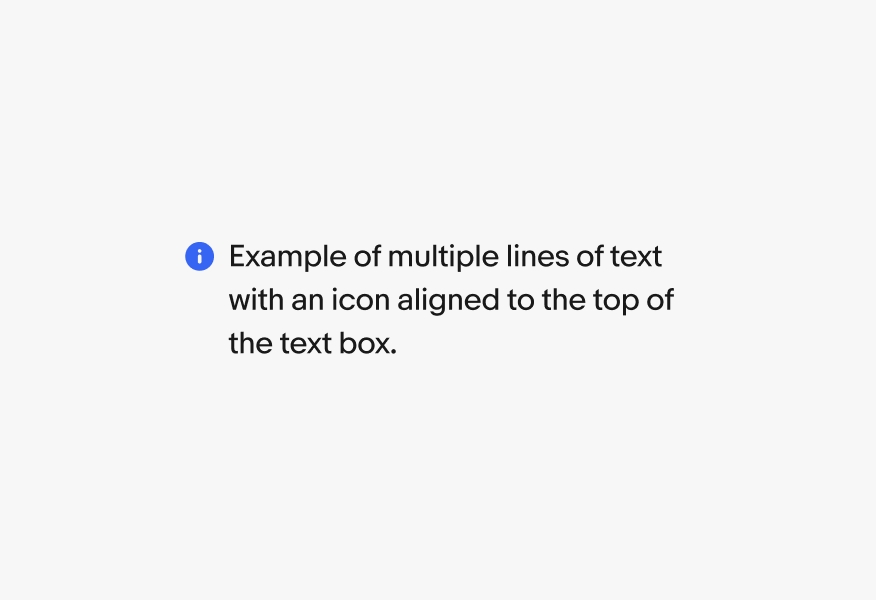
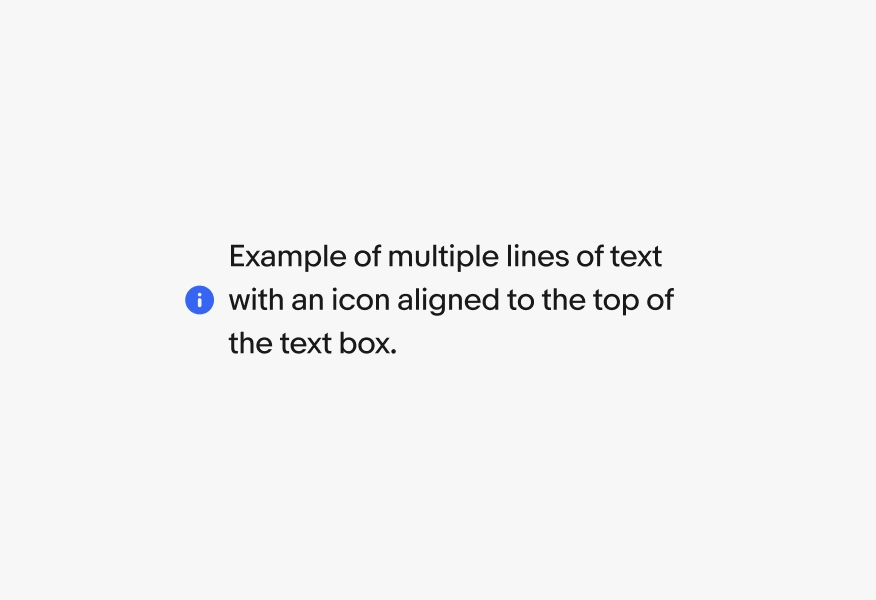
Icons can be aligned center or top with a body of text. The alignment depends on the height and density of the paired content. Icons align center for text that spans 1-2 lines and align top for 3 or more lines.
Do use icons that are either universally understood across countries, or are specific to a country’s currency or culture.
Don’t use icons that fail to align with cultural representation or norms. Be mindful that icons may portray different meanings across cultures.
Do align icons to the pixel grid at their provided size and use them at 100%.
Don’t scale icons to arbitrary sizes. This leads to aliasing and mismatched stroke widths. Contact the design system team if an icon needs a new size.
Adhere to sizing and alignment rules for single-line lockups as used within the badging system.
Don’t use icons that are visually too small or large for available text sizes, and don’t align icons to only the cap height of text.
Do align icons to the top of the text box if paired with 3 or more lines of text.
Don’t center icons when paired with 3 or more lines of text.
To discuss icon needs, reach out to the OneExperience (OX) team or sign up for office hours.
| Date | Notes |
|---|---|
| Jun, 2024 |
|
| Feb, 2023 |
|
| Aug, 2022 |
|