Color tokens
Learn about our color tokens.
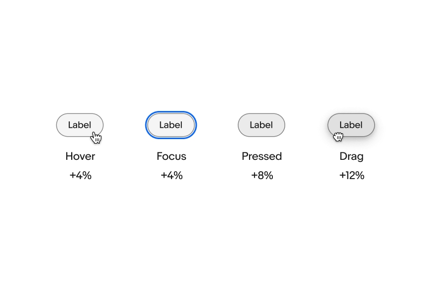
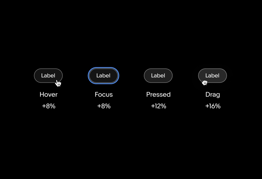
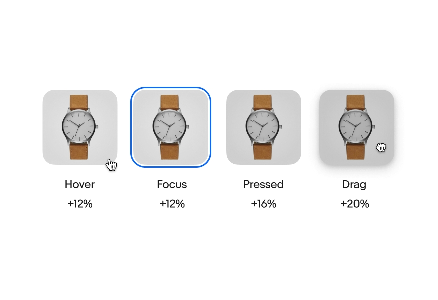
States communicate the status of a component in response to user interaction.
Three tiles with shoes inside are hovered over by a computer cursor. The last shoe tile is selected and an outline appears around it.
State changes are lightweight and distinct.
If multiple states occur simultaneously, like selected and hover, each will be clear and obvious.
State changes are similar across components throughout the system.
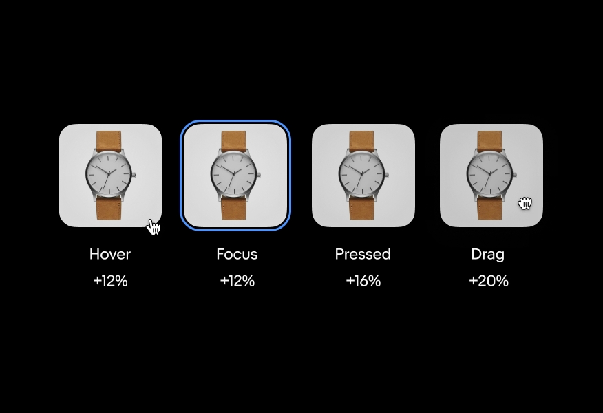
For elements with a container, a state-layer is added above the content. Each state increases the opacity by 4%. Dark mode uses white (#FFF) for the interaction layer instead of black.
Graphic elements use a heavier scrim to account for the variation in contrast and detail. Light and dark mode use black (#000).
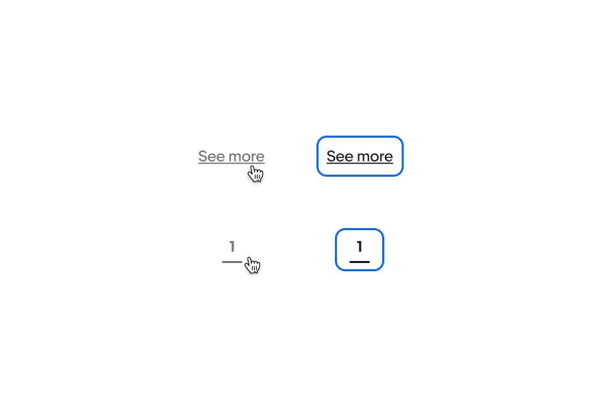
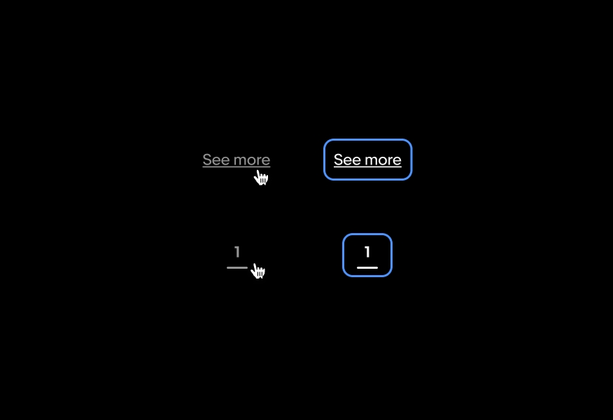
Elements that do not have a container, like links or pagination, use opacity to indicate a change in state. Light and dark mode use 60% opacity for hover states. The focused state does not receive the opacity shift.
| Date | Notes |
|---|---|
| Jun, 2024 |
|
| Feb, 2022 |
|
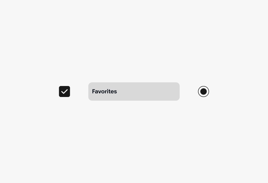
The enabled state indicates an interactive component.
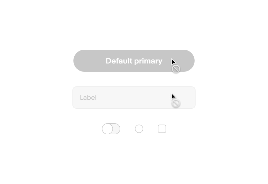
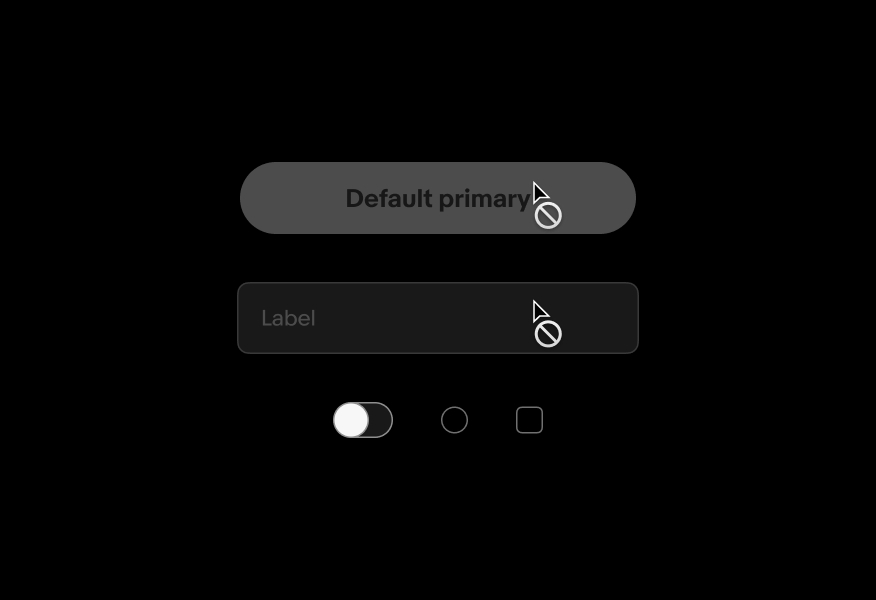
The disabled state indicates a component isn’t interactive. The component may become interactive when prerequisites are met.
The hover state indicates that a cursor is actively hovering over a component. Hover states can be combined with focused, activated, selected, or pressed states.
The focus state indicates that a keyboard has tabbed to a component.
A vertically-stacked segmented button group with a cursor clicking on each item. On each click, the button receives the selected state layer and a stroke around it.
The selected state indicates a static choice.
The press state state indicates a tap or click is occurring.
The drag state occurs if an element is actively being held.
The active state indicates a current destination or selection.
Four image tiles stacked in a grid. A cursor hovers over the bottom left tile, clicks and drags it up to the top left, and releases. The cursor forms a closed hand on drag and the top left item moves to the bottom in a snappy movement.
An anatomy of a state layer in an isometric, exploded view. Number 1 points to a text label on top. Number 2 points to a state layer with an opacity in the middle. Number 3 points to the content layer at the bottom.
A cursor hovers over a blue cta button and presses it. On press, the button subtly scales down with the type to indicate it is being pressed.
A tab icon animates in a tapping motion in the bottom left corner as the focus blue outline state moves between a form field, cta button, and check box in the center.
A cursor hovers over and off a disabled button. The button is gray and an icon appears next to the cursor indicating the button is not able to be interacted with. The icon is a circle with a line diagonally through it.
One primary and 2 secondary cta buttons with a cursor hovering over them. The cursor changes to the pointing hand cursor on hover and the hover state layer appears over the button.