Layout in product

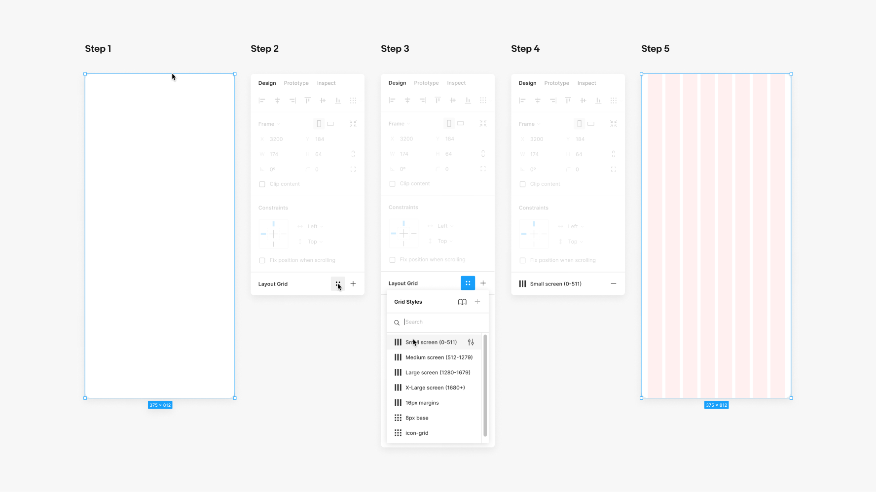
A responsive grid dynamically updates the page layout according to viewport size. The use of a grid allows us to remain consistent throughout our products and platforms.

Grids

We have four main grid presets to consolidate margin and gutter adjustments across breakpoints. Please note that these names are slightly different than the ones found in the breakpoints section below.

Small 8 column (320–511px)

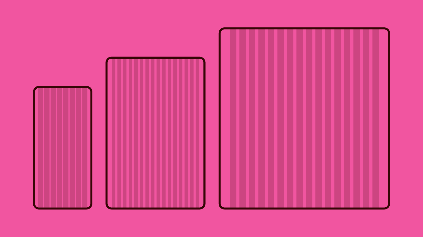
Use for small to medium screens.

Construction

  • 8 columns flexed
  • 8px gutters
  • 16px margins fixed
A mobile search results page with an overlayed pink diagram of 8 columns. Numbers above indicate the left and right margins are 16px, and the gutters between columns are 8px.

Medium 16 column (512–1279px)

Use for medium to large screens.

Construction

  • 16 columns flexed
  • 16px gutters
  • 32px margins fixed
A tablet search results page with an overlayed pink diagram of 16 columns. Numbers above indicate the left and right margins are 32px, and the gutters between columns are 16px.

Large 16 column (1280–1679px)

Use for large to x-large screens.

Construction

  • 16 columns flexed
  • 16px gutters
  • 48px margins fixed
A desktop search results page with an overlayed pink diagram of 16 columns. Numbers above indicate the left and right margins are 48px, and the gutters between columns are 16px.

X-Large 16 column (1680px+)

Use for x-large screens. The columns are fixed-widths with auto margins from 1680px+. Max design area excluding margins is 1584px wide.

Construction

  • 16 columns fixed
  • 16px gutters
  • Margins auto/flexed
An extra large desktop search results page with an overlayed pink diagram of 16 columns. Numbers above indicate the left and right margins are set to auto-width, and the gutters between columns are 16px.

Spacing blocks

Spacing blocks are used to create spacing and dimension throughout the system.

8px Baseline

Evolution uses a proportional layout system anchored around a base value of 8px. For detailed and complex components, factors of 2 may be used sparingly to create additional hierarchy. See spacing tokens for more information.

A detailed spec of two examples fixed to the 8px baseline grid. The top example has two stacked item tiles in list view. The images are 88px and there is 16px between tiles. Text is 16px away from the images and the text blocks have 8px between lines of text and 16px between text and prices. The bottom example is a cta button for “+ Create new listing”. The button is 28px tall, with 24px left and right padding, 8px between icon and text, and centered veritically causing top and bottom padding to be 12px.

Activating grids in Figma

To activate grids in Figma, select a frame, navigate to the "layout grid" section on the right panel, and select the "style" button that appears on hover. Choose the appropriate grid from the menu.

A detailed step-by-step diagram of how to select a grid style in Figma. Step 1 is selecting the frame. Step 2 is selecting the layout grid icon that looks like 4 circles in a grid. Step 3 is selecting a grid preset from the dropdown. In this case it is the “Small screen (0-511) preset. Step 4 shows the grid selected in the UI. Step 5 shows the pink 8-column grid preset on a frame the size of a mobile screen.

Screen sizes

Design should be output to at least three sizes: small 375px, medium 768px, and large 1280px. However, we recommend designing across the screen sizes below to account for design behavior across the range of breakpoints.

A detailed grid of screen size names and widths. There are 4 columns. From left to right reads “Small”, “Medium”, “Large”, and “X-Large”. Small has 320 Min, 360 Android HTML, and 375 IOS. 375 is highlighted in pink. Medium has 512, 768, and 1024. 768 is highlighted in pink. Large has 1280, 1440, and 1679 Max. 1280 is highlighted in pink. X-Large has 1680+.

Breakpoints

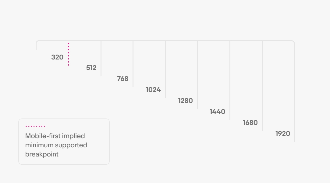
On web, we utilize eight breakpoints for maximum scalability and control over layouts and components. These breakpoints are 320, 512, 768, 1024, 1280, 1440, 1680 and 1920px. Refer to the eBay skin page grid documentation for the latest resources.

Min and max widths

Designs need to flex down to 320px and up to 1680px. Through our mobile-first approach, our official support for the smallest viewport width is 320px. However, technically speaking, there is no “minimum” breakpoint required.

Resources

Change log

DateNotes
Jun, 2024
  • Updated to eBay Evo
  • Added spacing blocks section
Mar, 2023
  • Updated small and medium grid presets
  • Updated min & max width section example and language
  • Added breakpoints section
Oct, 2022
  • Changed the “large” grid preset to “medium”
  • Added a new “large” grid preset that accounts for larger screens with new 48px margins
  • Added a new “x-large” grid preset that accounts for x-large screens where design locks at a max width with automatic margins
  • Updated the grid style color from 12% #000000 to 6% #FF0000
  • Added “activating grids” section
  • Updated guidance to included medium, large, x-large grids
  • Updated screen sizes area
  • Updated min and max widths
  • Updated flex rules examples
May, 2022
  • Updated to use documentation kit