Do use a neutral background to ensure contrast with the product.

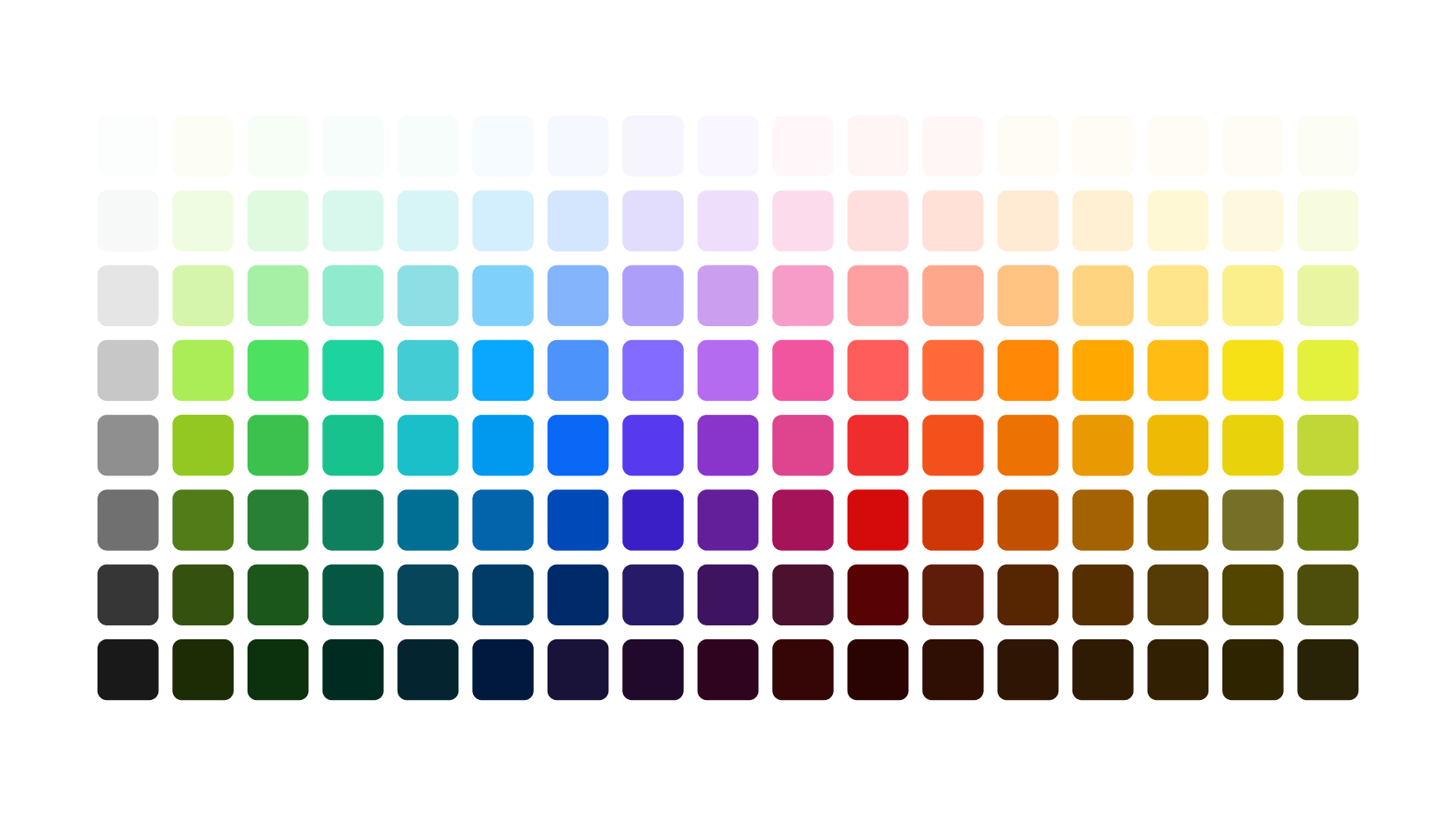
Consistently pairing color with typography, iconography, photography, and illustration can greatly improve brand recognition and perception. These guidelines outline how we use color across all touchpoints.

We use a few subsets of our full color palette depending on the audience and platform. When the audience is off platform or further from the product, we use a more limited palette to establish brand recognition. When customers are on platform or closer to the product, we use an extended palette to express more boldly. For example, we stick closely to our core colors in off-platform ads and use a more extended palette in social and on-platform marketing. Illustrations are the only application that use our full palette. Visit the tabs above to see guidance for each area.
We use color boldly but sparingly by applying our tone-on-tone strategy wherever possible. This means that we derive color backgrounds from the photo(s) being featured, and the foreground color is always a lighter or darker tone of the background color, which are pre-defined in the Color pairing tool in Using color. This focuses each placement on a single color family that harmonizes with the product and everything else layered on top.

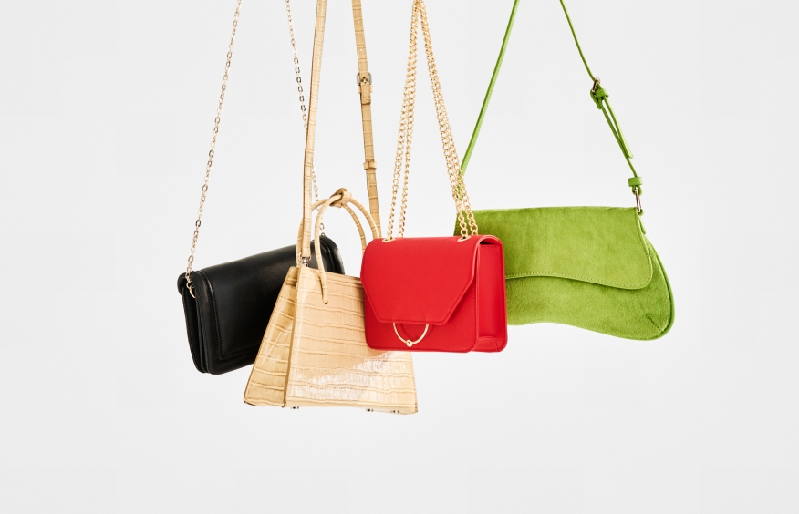
We use color backgrounds with masked images, lifestyle images and studio photography. We always choose colors from our color palette and generally use tone-on-tone pairings. Learn more about using photos in the Photography section.
We use color backgrounds with masked images, lifestyle images, and studio photography. We always choose colors from our color palette and generally apply our tone-on-tone strategy. For more information on using photos, see Photography.


There are moments when our tone-on-tone strategy doesn’t work. When more contrast is needed with a photo or more color variety is needed when featuring a specific brand or highlighting a specific season, you may use colors that are either next to or across from each other on the color wheel as background colors to photography. This does not apply to masked photography laying directly on a background color. Those layouts should use a tone-on-tone color.
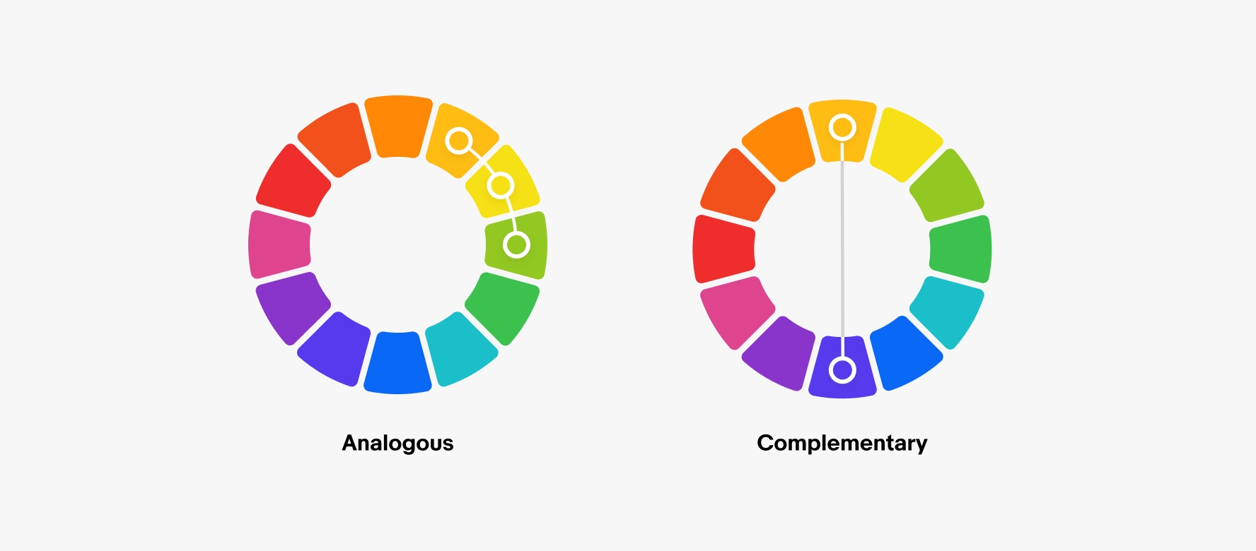
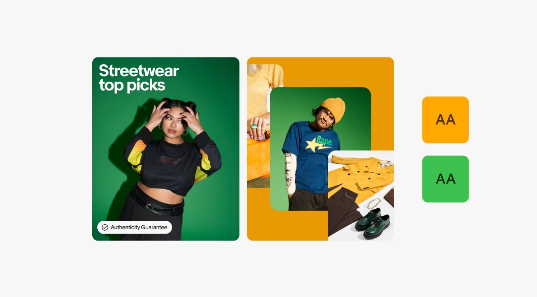
Analogous colors are next to each other on the color wheel, like green and yellow. This social post uses mainly green photography on a yellow background to match the featured photo.
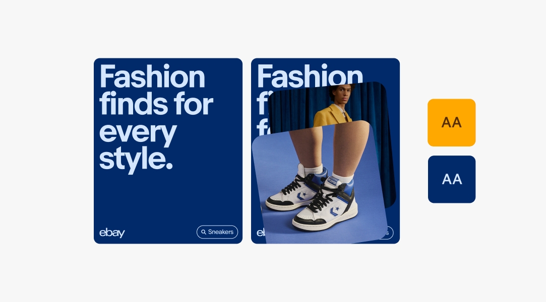
Complementary colors are across from each other on the color wheel, like blue and orange. This social post uses photography that’s primarily orange and is with blue background and typography for added contrast.
Colors used with badges depend on the background the badges are being used on. For more information on using badges, see Program badges.

Badges are always white when used over photography.

When used on color backgrounds, badges should be the tone-on-tone foreground color as predefined in the Color pairing tool.

When used on neutral backgrounds, badges should be their default color.

When used directly over photography, the logo is always white.

When used on color backgrounds, the logo should be the tone-on-tone foreground color as predefined in the Color pairing tool.

Our 4-color logo can be used on white, black, and neutral 200 backgrounds. For more info, see Our logo.
Typography can be used on photography, color, and neutral backgrounds. The color of the type depends on the background it’s being used on. For more information on sizing and formatting guidelines for type, see Using type.

When used directly over photography, typography is always white.

When used on color backgrounds, type should be the tone-on-tone foreground color as predefined in the Color pairing tool.

On neutral backgrounds, typography is also neutral. Find specific color combinations we recommend for neutrals in the Color pairing tool.
Each illustration can be used on white (Neutral 100), light gray (Neutral 200), or any of the other predefined colored backgrounds. To download each illustration with color backgrounds baked in, see the Illustration library. Do not put illustrations on any other background colors that have not been pre-approved.

All illustrations can be used on white backgrounds.

All illustrations can be used on neutral 200 backgrounds.

Illustrations can only use background colors that have been predefined in our Illustration guidelines.
We use white backgrounds in off-platform and out-of-home ads to establish brand recognition with audiences that may not be as familiar with eBay and are not currently in context (like on our Instagram or website). Using white or light gray backgrounds in these applications allows the imagery and the logo to shine. We use Neutral 100 (white) backgrounds for social and out-of-home backgrounds and Neutral 200 (light gray) backgrounds for digital ads because they need to stand out against a white background.


When there's no clear primary color or the primary color isn't an option, we use neutral backgrounds.

We also use neutral backgrounds if the available shades of the product’s primary color do not allow enough contrast for the image to shine.
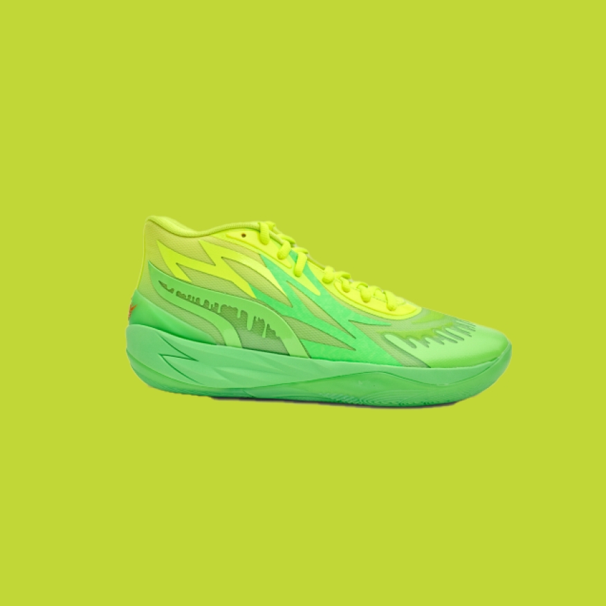
Do use a neutral background to ensure contrast with the product.
Don’t use the product’s primary color as a background if there isn’t enough contrast to ensure the product is legible.
Any time we place text or buttons over color, we must ensure we’re meeting minimum accessibility contrast requirements. By using these predefined color pairs, we can make sure that eBay is accessible and meets brand standards for all. For more info, see Accessibility.


| Date | Notes |
|---|---|
| Jun, 2024 |
|
| Mar, 2024 |
|
| Oct, 2023 |
|
| Aug, 2022 |
|
| Jun, 2022 |
|
| Dec, 2021 |
|

