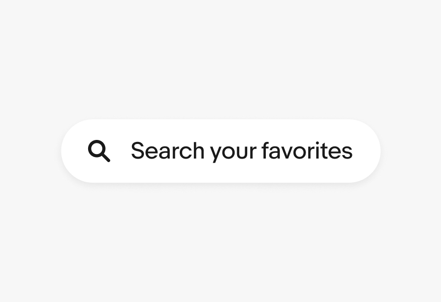
Do use the icon assets in our library.

What—and what not—to do when using iconography.
Do use the icon assets in our library.
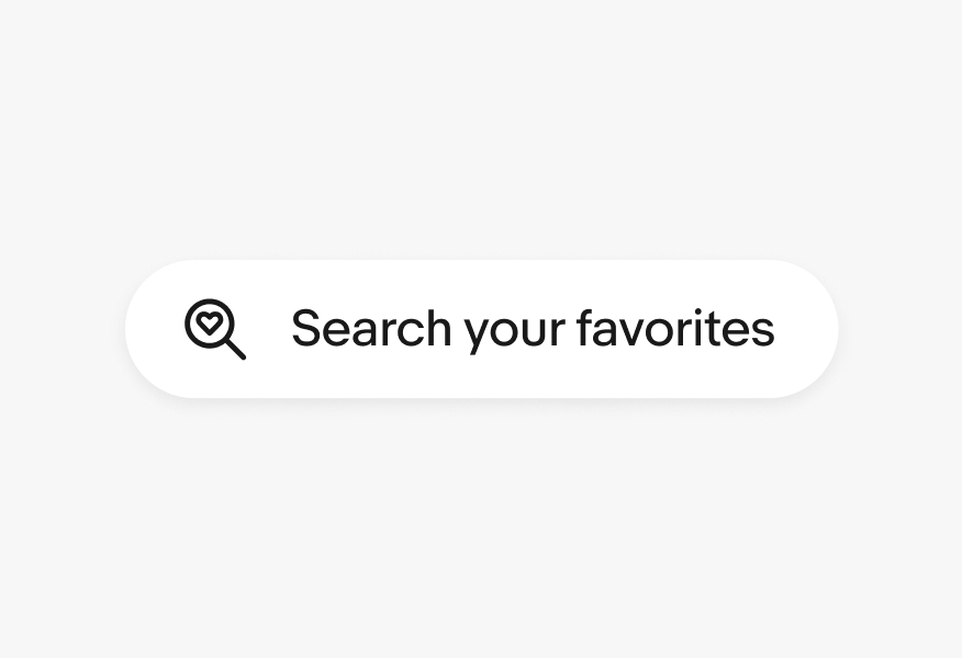
Don’t modify or change icons.

Do partner with the Design System team to create icons that aesthetically adhere to our system.

Don’t create icons that have a visually different style.

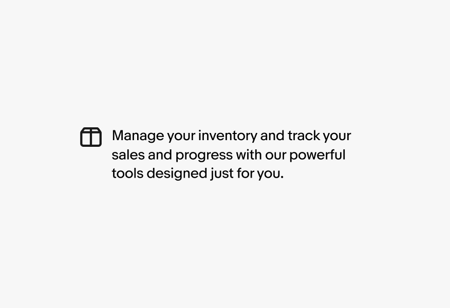
Do use icons for their intended subject matter.
Don’t use multiple icons to create a new icon or larger graphic.
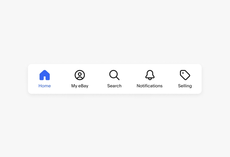
Do use a single color for icons.

Don’t segment an icon into multiple colors.

Do use our existing filled or active versions of icons when applicable.
Don’t create your own filled or active versions of icons.
Don’t rotate, skew, or stretch icons.

Don’t alter the stroke weights of an icon.

Don’t apply gradients or other effects to icons.

Don’t fill icons with patterns or imagery.

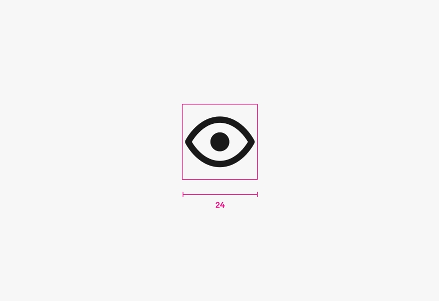
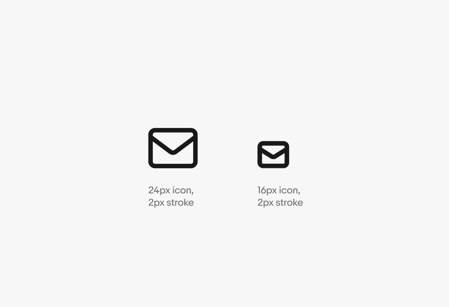
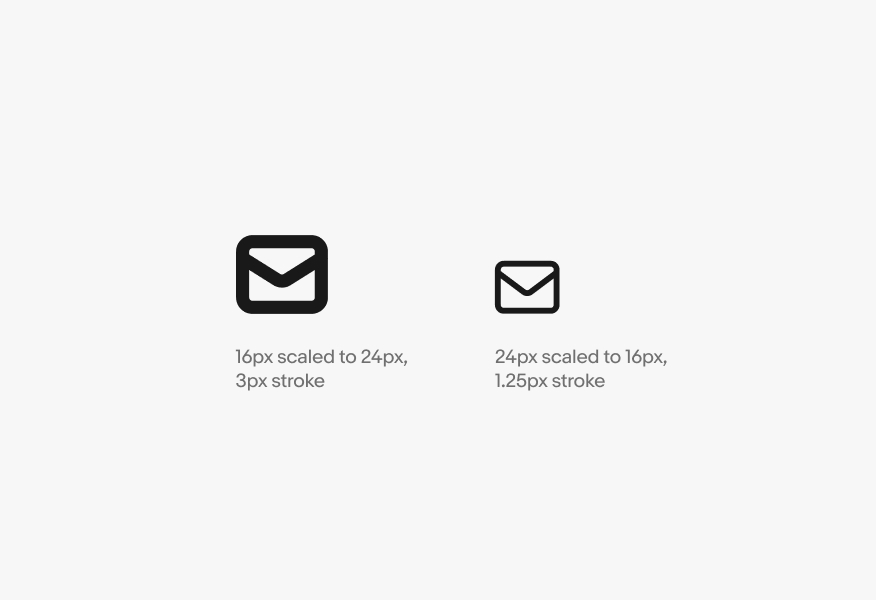
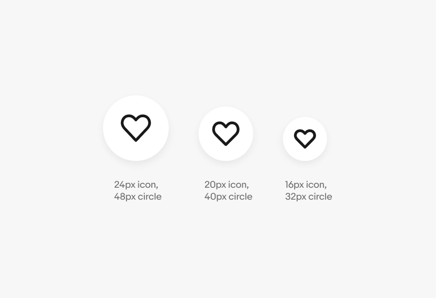
Do create icons at our standard sizes.
Don’t create arbitrarily-sized icons.
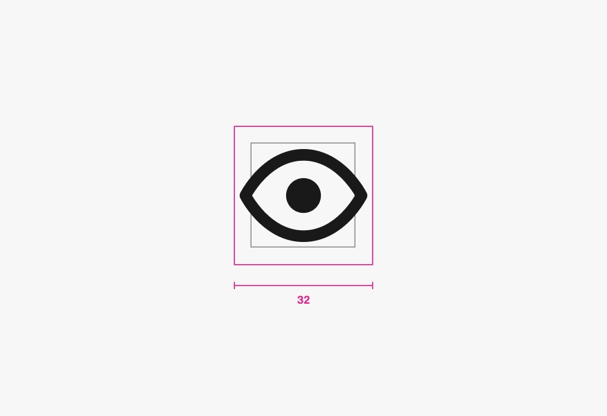
Do use our provided icon sizes. Our icons are drawn at each size to maintain proper stroke weights across the experience.
Don’t scale an icon to different sizes. This creates an imbalance in stroke weight next to our other carefully drawn sizes.
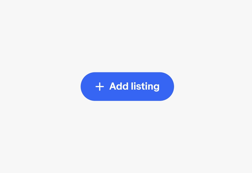
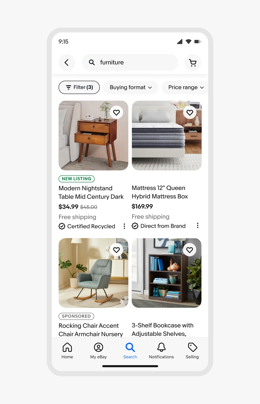
Do use icons that optically fit inside buttons. In general, use an icon that is half the size of a button (for example, place a 16px icon in a 32px button).
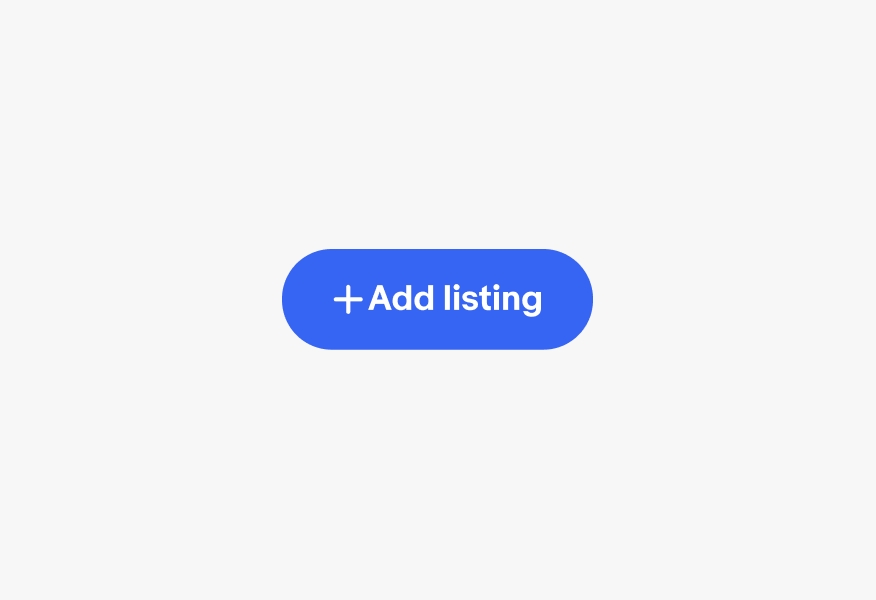
Don’t use icons that appear too small or large for a button size.
Do give enough space between icons and text.
Don’t crowd icons and text too closely together.
Do use the icons to represent correct subject matter.
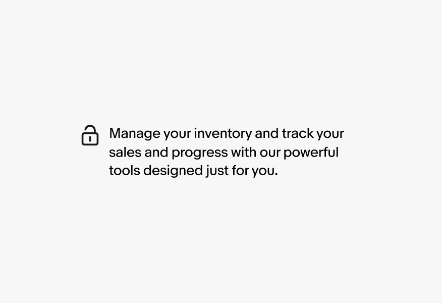
Don’t use an icon for subject matter it doesn’t represent.
Do use icons to guide users with purpose.

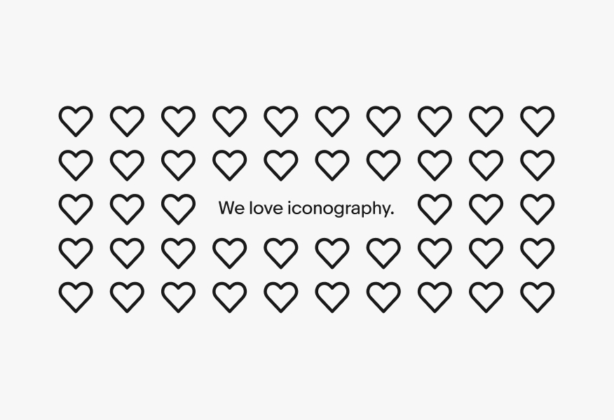
We love iconography.
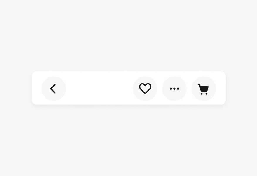
Do try to consolidate icons to ones that are truly necessary for navigation and actions.
Don’t overuse icons that cause the hierarchy of the page or navigation and actions to become difficult to understand. When more than one action is needed, an overflow menu is a good option.
| Date | Notes |
|---|---|
| Jun, 2024 |
|