Illustration components
See each supported background color in our illustration components.
We use illustrations to enhance our storytelling and create a bridge between our product language and lifestyle-focused imagery.

Illustration works well in representing broad categories, abstract ideas, or complex processes that may be challenging to convey through photography or iconography alone. Illustration can also add a touch of whimsy and color to capture attention and evoke emotion. It's most effective when balancing realism and creative expression and most often used for education, celebration, null states, and categories. Use illustrations sparingly in the product experience to avoid dilution and overshadowing of content. All illustrations must undergo mandatory review by the OX team during office hours to ensure optimal use.
Welcome users and introduce them to new features and concepts.
Congratulate users on their wins and evoke positive emotions along their journey.
Indicate empty states and evoke a sense of delight during system errors.
To visually represent areas of our product that can be navigated or selected.
Illustration works well in representing broad categories, abstract ideas, or complex processes that may be challenging to convey through photography or iconography alone. Illustration can also add a touch of whimsy and color to capture attention and evoke emotion. It's most effective when balancing realism and creative expression and most often used for education, celebration, null states, and categories.
Feature introduction cards introduce users to new features or programs, offering a way to learn more or try them out. They always use a neutral background and blue button to make it clear the message is from eBay.

Modals welcome users to a new tool, communicate an important update, or gather info we need to move users through a flow. Our expressive modals accommodate a photo—they can use neutral or colored background illustrations and be a half sheet, full sheet, or full-color sheet.


Multi-step modals are used for education and onboarding that need more than 1 step to explain. This may include explaining specific features or steps in a complex process or gathering multiple types of information from the user. Multi-step modals also accommodate an image and can use neutral or colored backgrounds. To ensure legible text and not-too-jarring transitions between steps, full-color sheets aren't available for multi-step modals.


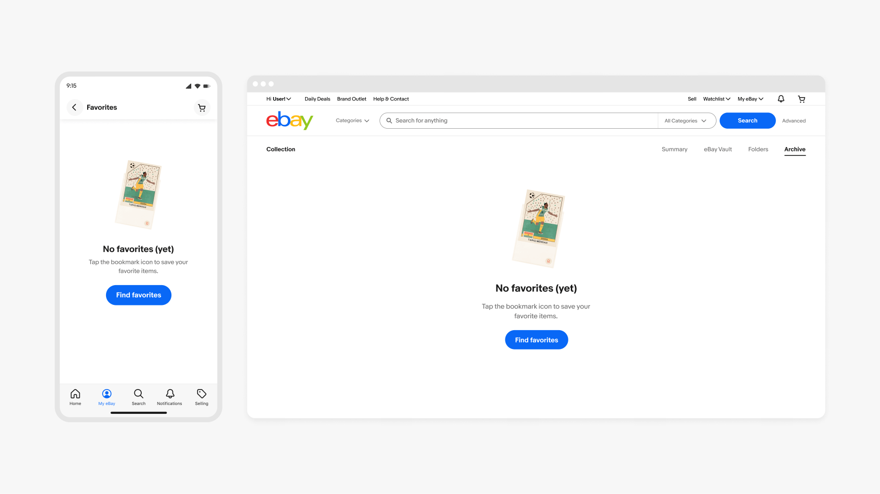
Illustrations can add inspiration to empty product areas or evoke a more positive reaction when something goes wrong. Avoid leaving users with a dead end by including a call-to-action. For example, refreshing the page if there was an error or adding favorites to a collection if they haven't yet.
We use empty states when users encounter product areas that don’t have any data yet. Empty-state illustrations should represent what would be there and encourage users to take relevant action.
System errors can happen unexpectedly and be frustrating. In these situations, using illustrations that add a touch of humor or relatability helps ease the frustration. Ideally, they should have an action that allows the user to try again or refresh the page.

If no illustration fits your null-state needs, you can always use an icon instead. Make sure to use the 64px by 64px icon size—do not enlarge smaller icons in this context.


| Date | Notes |
|---|---|
| Jun, 2024 |
|
| Dec, 2023 |
|