Do always include a section title, preferably with some context as to why the user is seeing the gallery grid in the subtitle line.
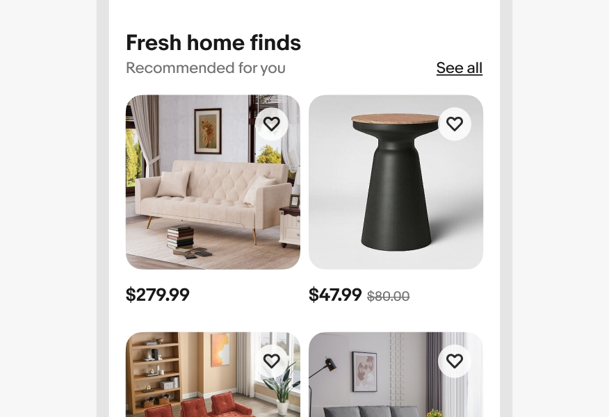
We use gallery grids to showcase a defined number of items for easy comparison.

Whether it's user-curated or activity-based suggestions, items in gallery grids are closely related and generally share the same category.
Gallery grids are organized so that all images are the same size and data like title and price are aligned so they can be compared easily.
Gallery grids are meant to contain a specific, curated set of items and are not meant to be scrolled endlessly.

Section titles are required on gallery grids. They anchor the item tiles on the page and give context as to why the user is seeing them. Subtitles on section titles are optional and only used when additional detail is required.

Titles can be used in gallery grids to give additional information that may be critical for comparing similar items.

The minimum amount of information used in a gallery grid is price only. Strikethrough price will appear on the right when applicable.

You can add a "See more" button below the default number of rows in a gallery grid to load additional items in place. Once tapped, the button loads a specific number of rows below those shown by default, which pushes the content below the gallery grid down.

After the max number of new items have loaded, the button text changes to "See all," which takes users to the primary destination page. This page should be the same page as the "See all" link in the header, if there is one.

If the gallery grid module appears at the bottom of a page, scrolling will load more items, but no button is necessary. Users can scroll continuously and keep loading content until no more items are available.

The number of columns in the grid changes responsively based on the width of the screen and its margins. The item width will grow and shrink to fill the column space. As you scale across breakpoints, be sure to follow the specific column guide for each grid size.

On screens smaller than 540px wide, titles wrap up to 3 lines and then truncate with an ellipses. On screens larger than 540px wide, titles wrap up to 2 lines and then truncate with an ellipses.

Focusing on an item tile outlines the image with a focus indicator. TAB navigates through interactive elements within the tile. ENTER or SPACE activates nested elements or navigates to a detail page when the image is selected.

On small screens, there are only 2 items per row with max 8 items total shown by default.

On medium screens, there are only 4 items per row with max 12 items total shown by default.

On large screens, there are only 5 items per row with max 10 items total shown by default.

Do always include a section title, preferably with some context as to why the user is seeing the gallery grid in the subtitle line.
Don’t leave off the section title. It makes long pages hard to scan and doesn’t give the user enough context.

Do align price to a single baseline even if titles have different lengths.

Don’t stagger prices.

Do always splay items out vertically.

Don’t extend gallery grids out of view or make users scroll horizontally to access more items.

Do use gallery grids for similar items in a specific category.

Don’t use for multiple content types and/or categories.


| Date | Notes |
|---|---|
| Jun, 2024 |
|
| Mar, 2024 |
|
| Mar, 2023 |
|