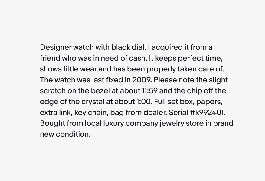
Do format your text so that the right side of the text block looks fairly smooth.
How we size, format, and color our typography can greatly impact how it’s read and perceived. These guidelines outline how we use typography in our brand overall, in digital applications, and in print.
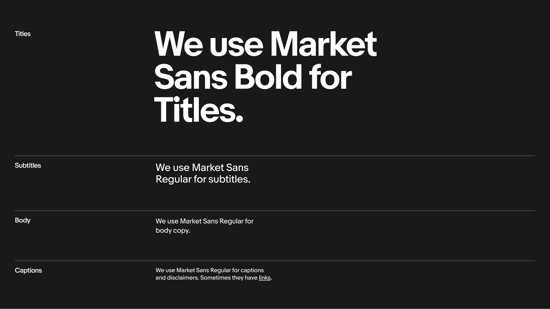
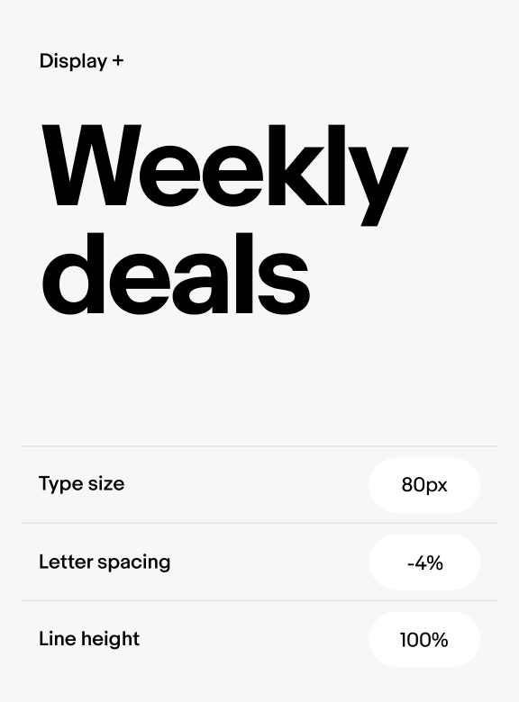
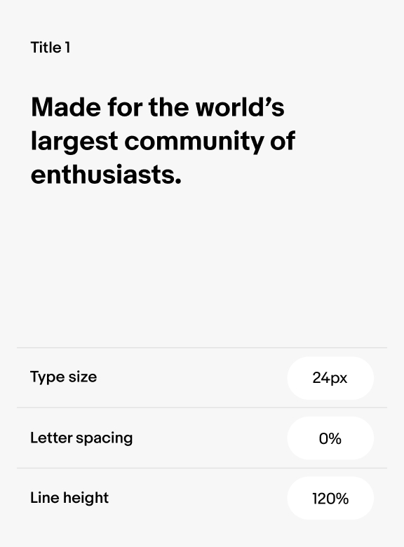
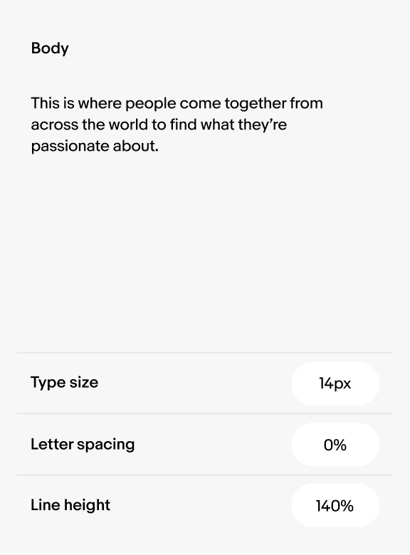
We always use Market Sans bold for Titles and Regular for Subtitles, Body, and Captions. Make sure there is adequate contrast between these four types of content to create clear hierarchy. Refer to Using type in digital for type styles used in product, digital ads, and emails.
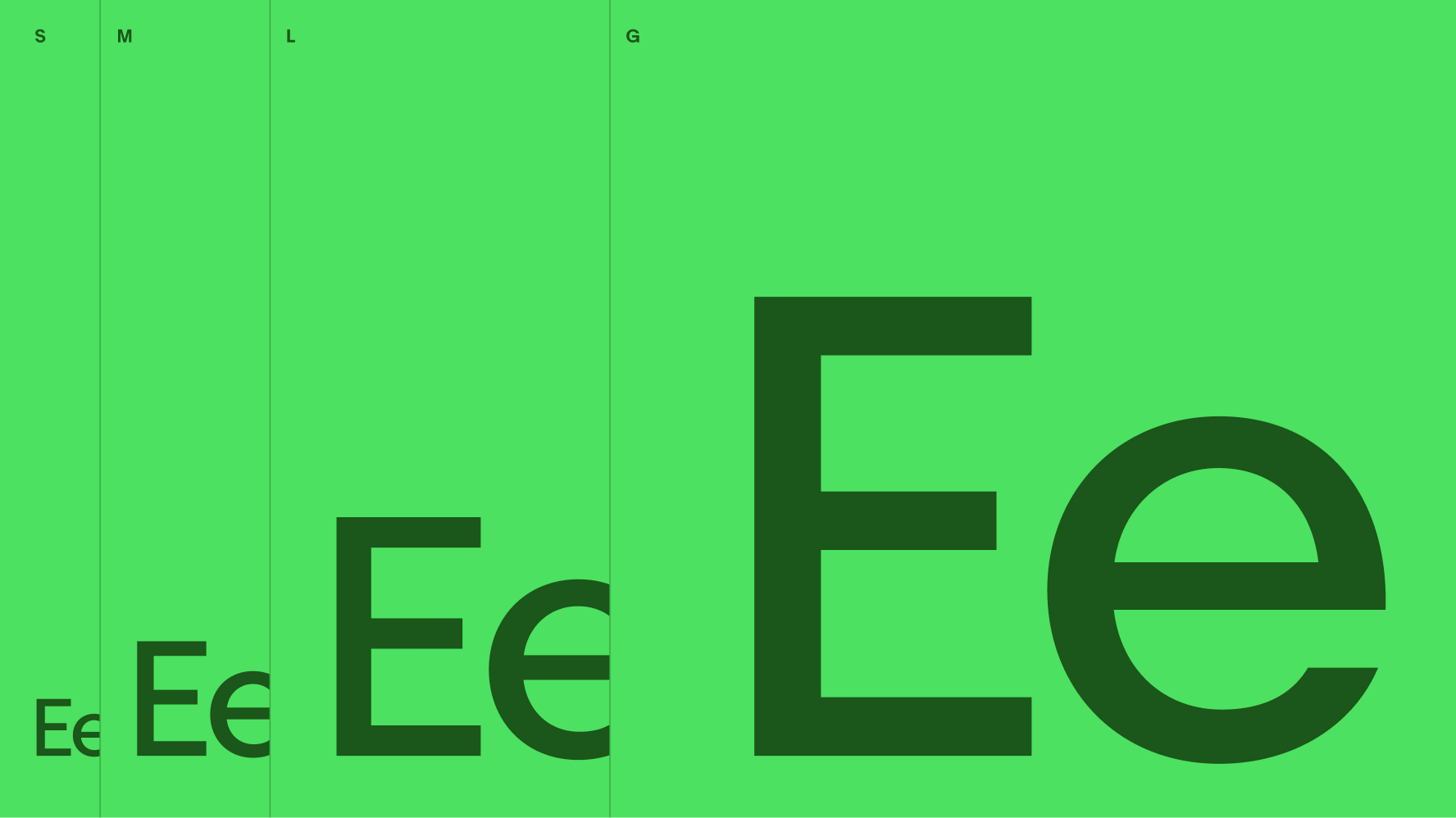
All the type sizes we use in product and digital marketing are pre-defined in our type ramp. To maintain legibility, make sure body copy is no smaller than 6pt in print media and 10px in digital media. Refer to Using type in digital to see our type ramp. Refer to Using type in print for how to calculate type sizes for print material.
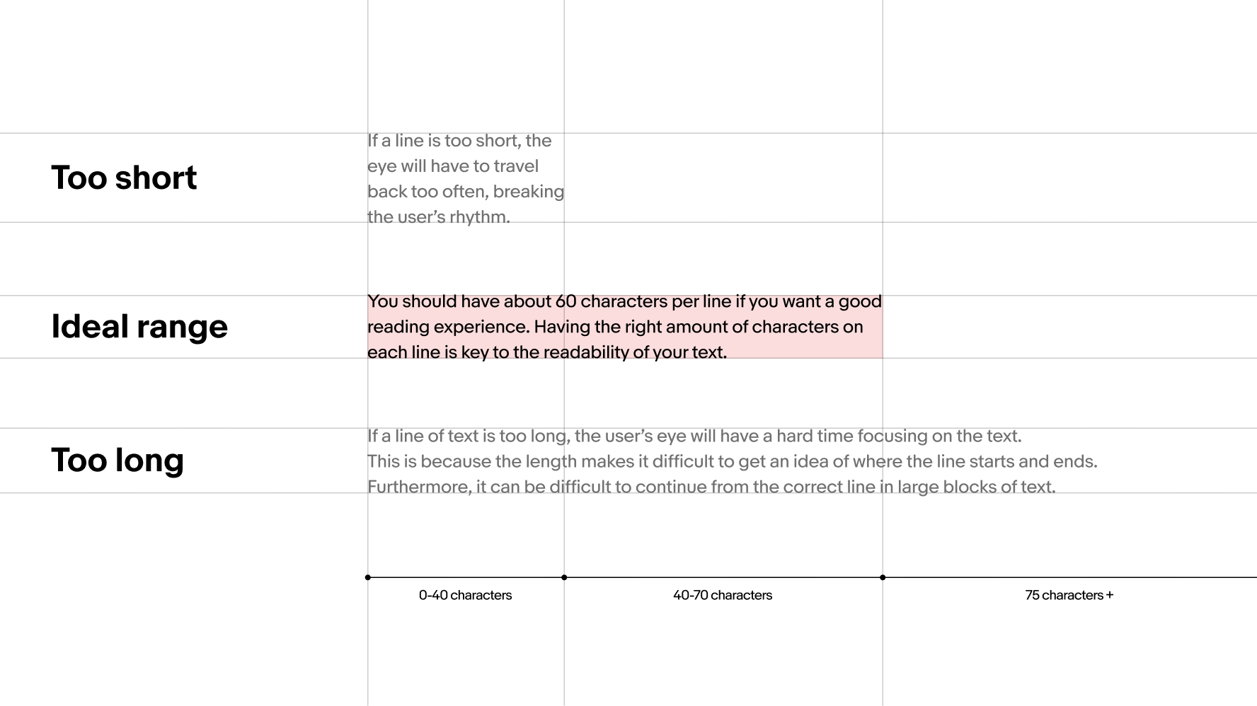
The number of characters on a line of text influences a paragraph’s readability. Keeping your line length between 40–75 characters (counting both letters and spaces) ensures important information isn’t lost and the reader remains engaged (source: Baymard Institute). And always make sure line breaks snap to the grid.
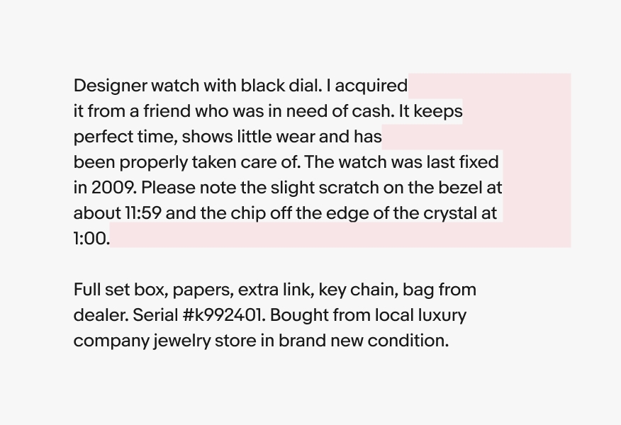
Large indentations in paragraph text and leaving a word or two hanging at the end of a paragraph or page can create distracting white space. Format text to avoid poor rags, widows, and hyphenation.
Do format your text so that the right side of the text block looks fairly smooth.
Don’t create jagged right rags or orphans by leaving a single word on the last line at the end of a paragraph.
Proper text alignment helps create visual balance and connection between related elements. Left alignment offers an invisible edge for readers to easily scan text. Avoid mixing alignment between text blocks to maintain simplicity and clear structure.
Do left align all type in both headlines and body copy to optimize legibility.
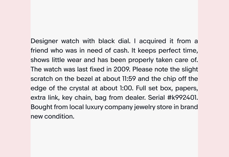
Don’t justify text to fill margins.
When type is placed on top of color backgrounds, it's critical to provide a high level of contrast to ensure legibility. To avoid adding visual clutter and to maintain high contrast, always apply color carefully and choose from our pre-defined color pairings. For guidance on choosing and applying accessible color combinations in our color palette, see Using Color.
Layering text onto a photographic background adds depth and vitality to our messaging. It’s important to create clear contrast, balance, and harmony between foreground and background elements to avoid a poor or confusing reading experience. For more guidance on working with photos, take a look at our Photography section.
In order to ensure legibility of any text that is layered over photography, we always apply our standard black scrim in #000000 at 5% opacity over the entire photo plus an additional radial or linear gradient behind text. This helps text stand out without putting a shape behind it. For more details on how to make typography legible over photos, visit the Photography section.
Do apply a 5% black scrim over the entire image, a radial or linear gradient behind the text, and a drop shadow on the text to ensure it is legible.

Don’t place text over busy or extremely light/dark images without a scrim, gradient, or drop shadow on the text. It must pass contrast ratios of 4.5:1 for text.

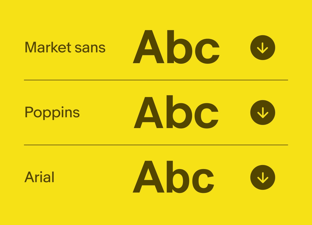
For internal documents, Powerpoint and Google Doc presentation templates, or emails where Market Sans isn’t available, use Poppins. Only use the alternate fallback font, Arial when Poppins is unavailable.
| Date | Notes |
|---|---|
| Jun, 2024 |
|
An animated line height graphic increasing the height between lines of type from 100% to 112%.
An animated letter spacing graphic decreasing the space between characters from 0% to -4%.
A series of two-tone type and colored backgrounds. Green has "Motors". Pink has "Create the future NOW!". Teal has "Since 1995". Red has "2024—(GBP) Global Brand Platform eBay Design Trademark".