Stacks

Discovery is at the heart of the eBay experience and our new approach to expressing our brand brings that notion to the forefront of all our communications. We’ve developed a visual mechanism, the stack, to demonstrate the different experiences customers have when searching for their perfect item.

Image ratio

We employ two image ratios for crafting our stack layouts, depending on their intended usage: 1:1 (square) and 4:3 (portrait and landscape).

A graphic highlighting 1:1 and 4:3 image aspect ratios.

Stack types

Our layout options are flexible and broad enough to cover all use cases—from showing off our cross-category catalog, to honing in on a singular item—our new system tells our brand story in unique and dynamic ways.

Graphic, black rectangular shapes in portrait orientation in a neat grid of 3 columns and 3 rows.

Catalog

Catalog uses a modular grid layout that displays our product variety.

Graphic, black square shapes moving in a diagonal direction from bottom left to top right. The squares grow in size as they move upward.

Discovery

Discovery has a distinct layout that plays with scale and repetition.

Three graphic, black rectangular shapes in portrait orientation overlapping organically in an expressive way.

Browse

Browse is the most expressive stack, adding a sense of playfulness.

Catalog

The catalog layout offers flexibility and can be crafted in various methods.

A large screen banner design on a white background. The left side has a title, subtitle, and cta button. The right side has a neat grid of 4 columns and 3 rows of portrait orientation images containing hand bags.

Density

  1. When using the catalog layout, display a minimum of three cards. Always be aware of image quality and sizing, ensuring that photography is readable.

  2. Corner radii and spacing between cards are determined by using multiples of 8.
Graphic, black shapes stacked in a neat grid of 3 columns and 2 rows.

Curation of imagery

Tell our brand story through photography by selecting images that subtly incorporate eBay's colors into the overall composition without being the main focus or appearing too overt.

A variety of colorful photos in a row that bleed off the left and right edges. The photos consist of shoes on a vibrant green background, a woman wearing a fun jersey with patches on a vibrant blue background, saturated green shoes, and a chair with hat and jersey in front of a rich yellow background.

Discovery

We have two types of discovery stacks including uniform and scaled.

A large banner with a scaled discovery stack layout. The images scale in size from the bottom left to the top right. The eBay logo is in the upper left and “Things.People.Love” is in the lower right.

Uniform

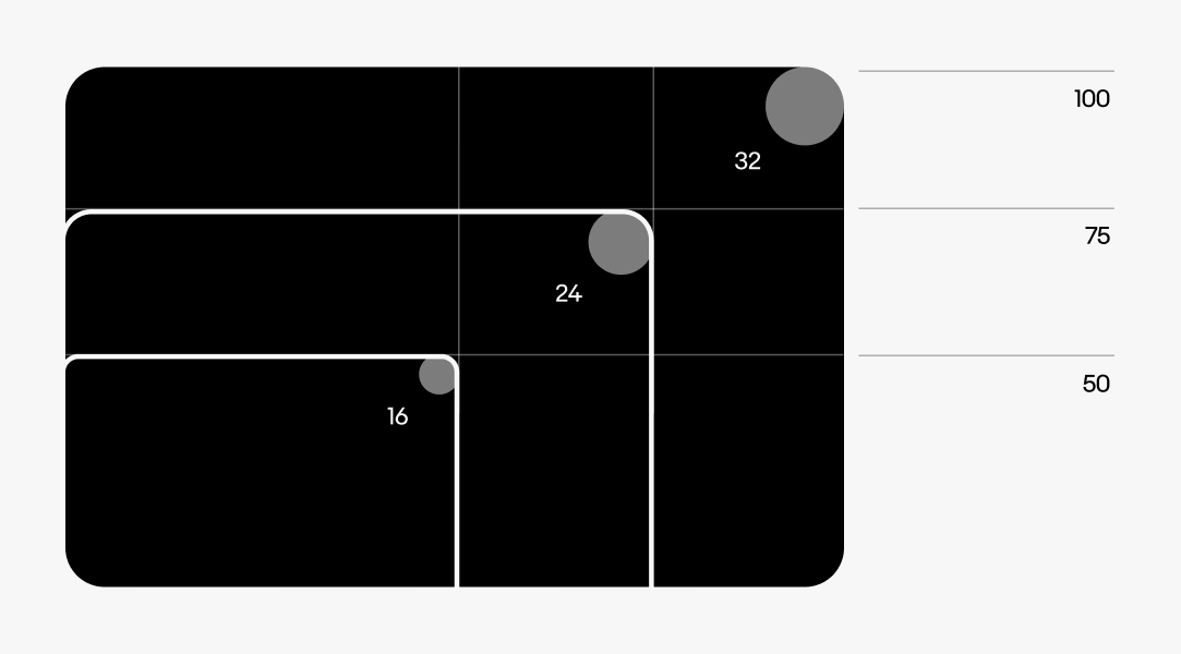
Images within a uniform stack remain the same size and use the same radius.

Graphic, black squares stacked in a uniform manner. They are all the same size have the same corner radius.

Scaled

To create a scaled stack, we start with the largest card and decrease the size of each subsequent card by 25%.

  1. When using the discovery stack, display a minimum of three cards. Always be aware of image quality and sizing, ensuring that photography is readable.

  2. Corner radius and spacing between cards are determined by using multiples of 8. The smallest radius is 8 and scales upward from there.
A detailed graphic detailing 3 stacked images. The bottom image has a radius of 16px. The middle image has a radius of 24px. The top image has a radius of 32px. Each card is 25% smaller than the previous.

Layering

Uniform

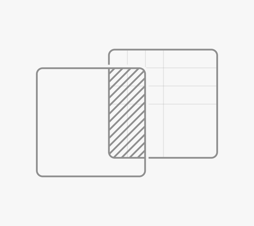
When using the uniform stack, ensure that more than 50% of each card is visible, including the edges of the cards.

Scaled

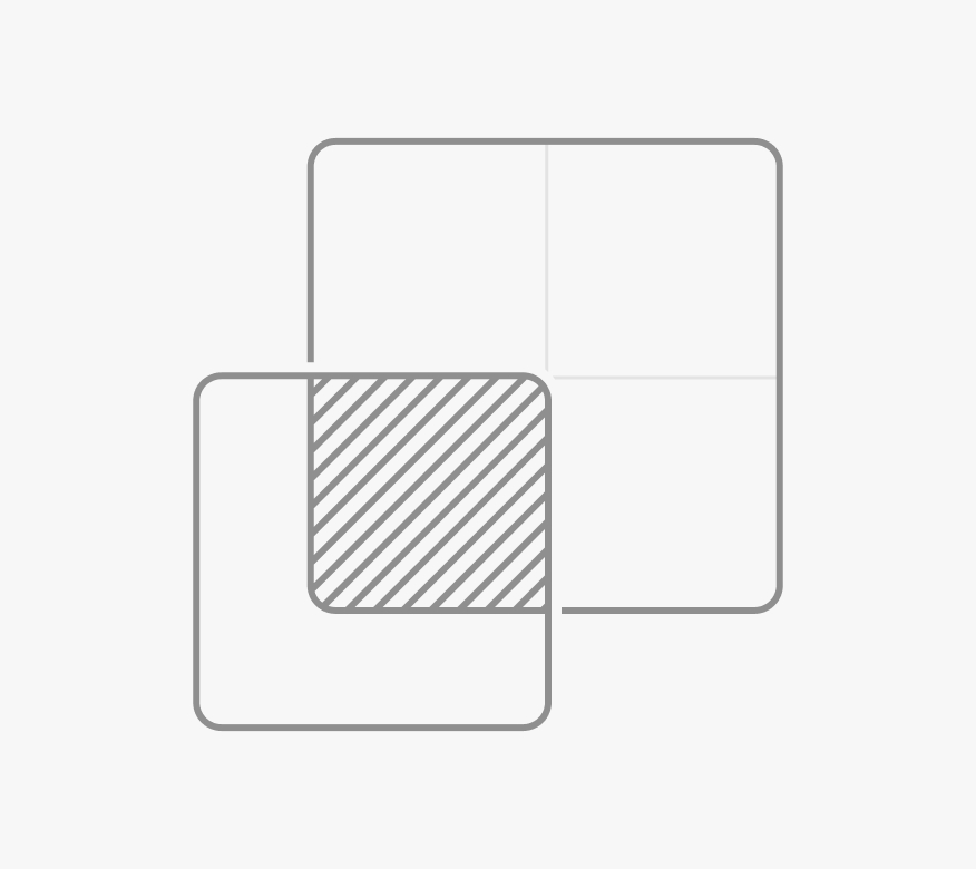
When using the scaled stack, the overlapping card must not exceed 25% of the overlapped card size. Ensure product visibility stays within the approved overlap area.

Adding depth

Adding shadows to our cards increases contrast and adds a sense of depth.

Drop shadow specs

  • x0 y20
  • Blur 64
  • Color #000000
  • Opacity 20%
  • Multiply
Two white cards stacked. The top, smaller card is overlapping the bottom left corner of the larger card. The top card has a shadow applied to show depth.

Browse

The browse stack adds a sense of playfulness to our visual system. This layout is versatile and suitable for social media and motion graphics.

A layout using the browse stack. There are 4 portrait-orientation images that are playfully positioned over each other. The eBay logo is in the upper left and “Things.People.Love.” is in the lower right.

Adding depth

Adding shadows to our cards increases contrast and adds a sense of depth.

Drop shadow specs

  • x0 y20
  • Blur 64
  • Color #000000
  • Opacity 20%
  • Multiply
Three white cards stacked organically. The bottom left and upper right are both overlapping the middle card. They both have shadows applied to show depth.

Best practices

Ensure that more than 50% of each card is visible.

Three stacked cards that are spaced to allow the images to show prominently.

Don’t place cards in a way that obscures the subject matter.

Three stacked cards that are spaced too tightly together, causing images to not be visible.

Resources

Change log

DateNotes
Jun, 2024
  • Created with eBay Evo