
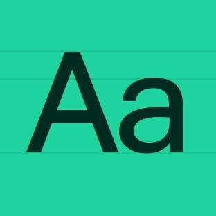
Iconography
Learn how to use our iconography across product and marketing applications.
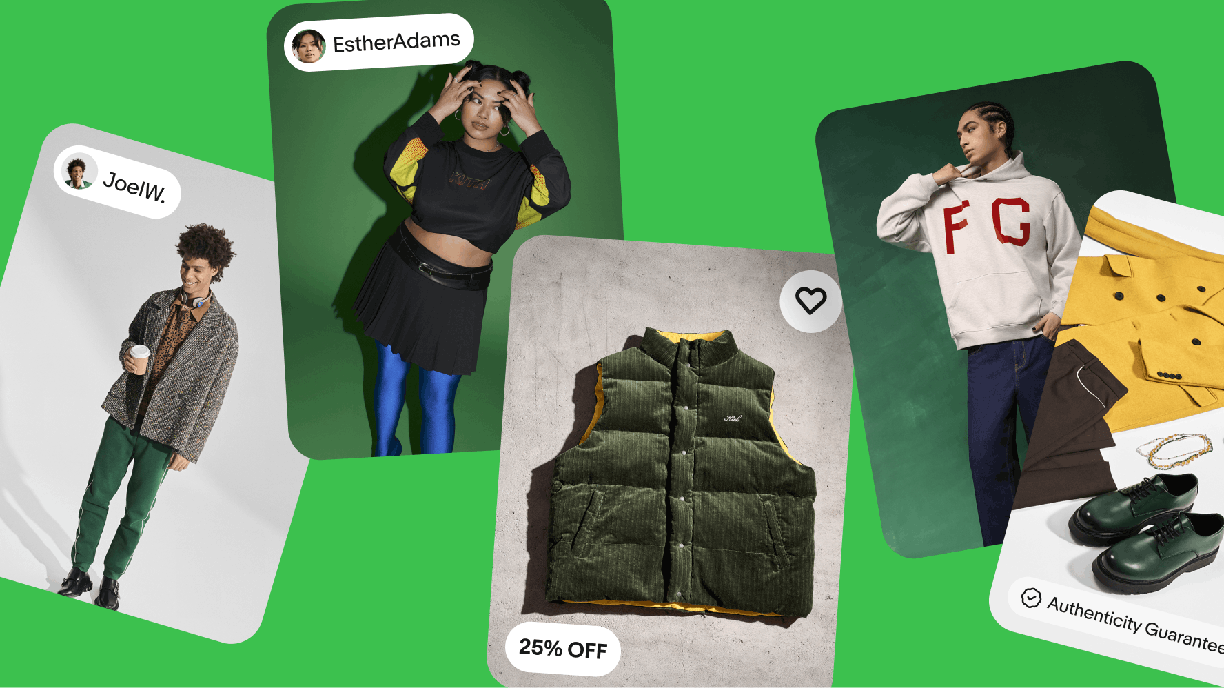
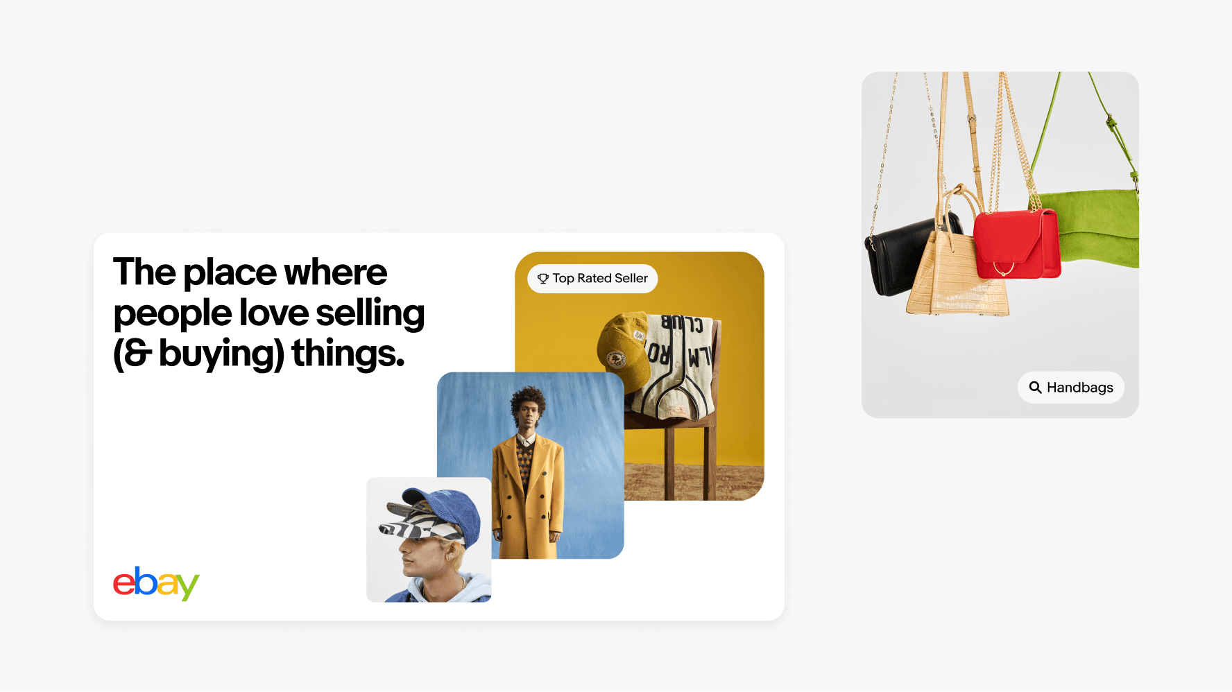
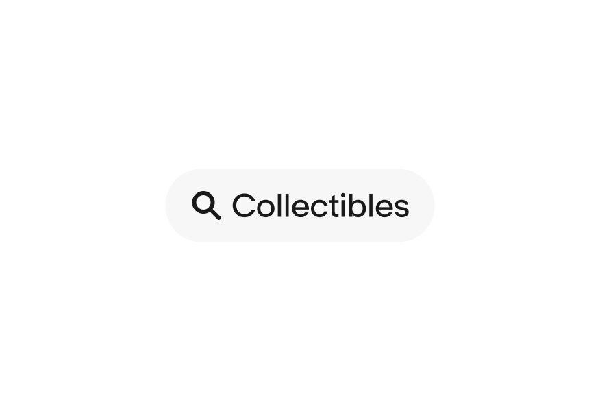
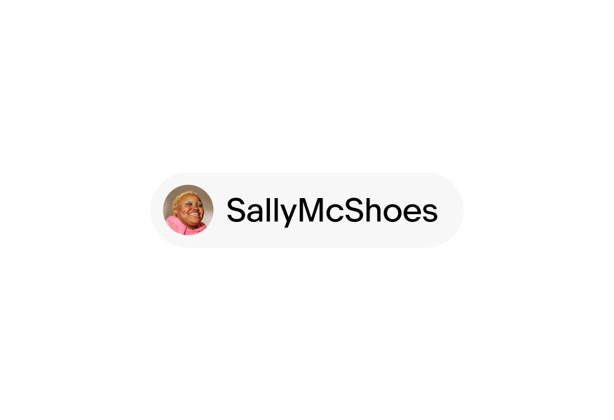
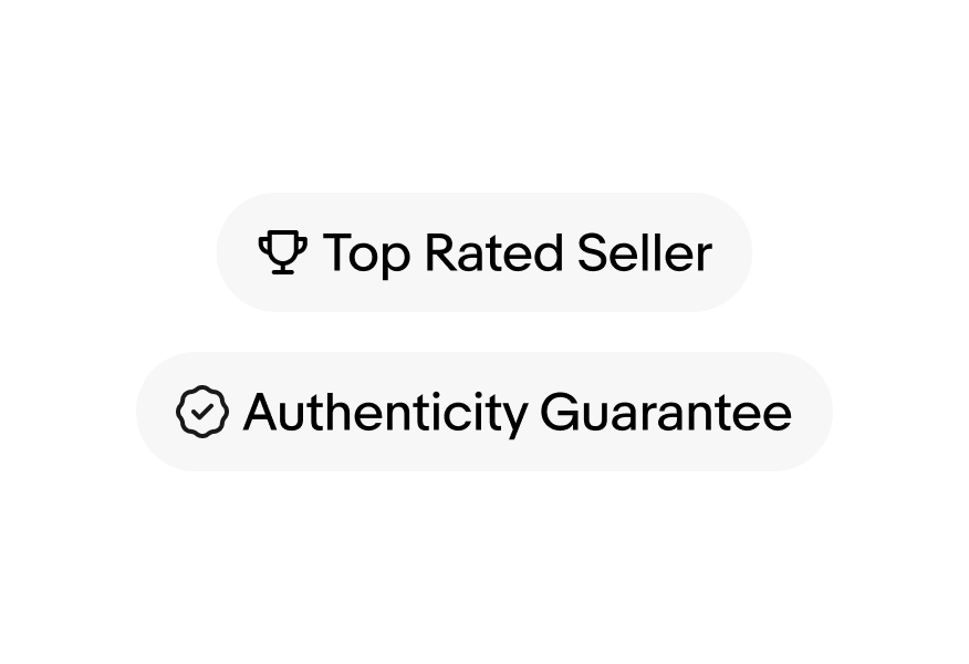
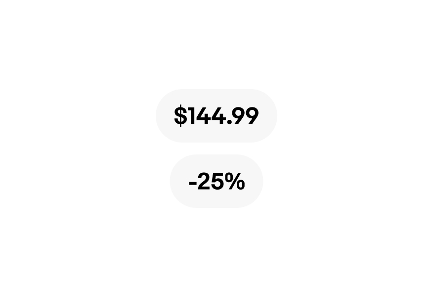
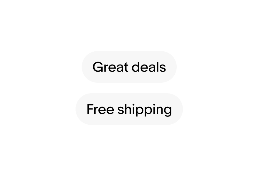
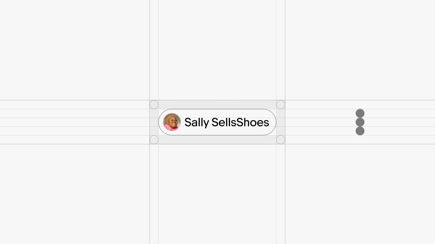
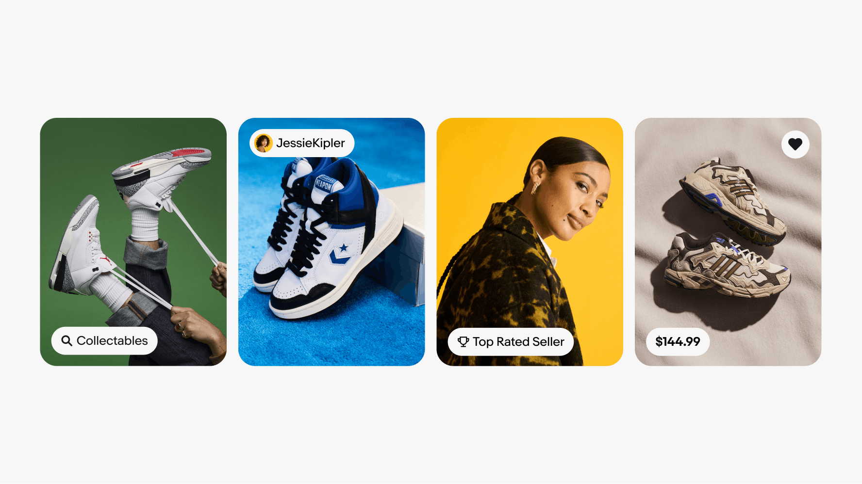
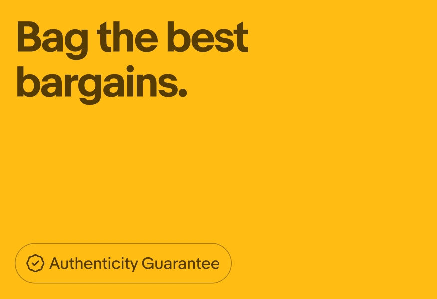
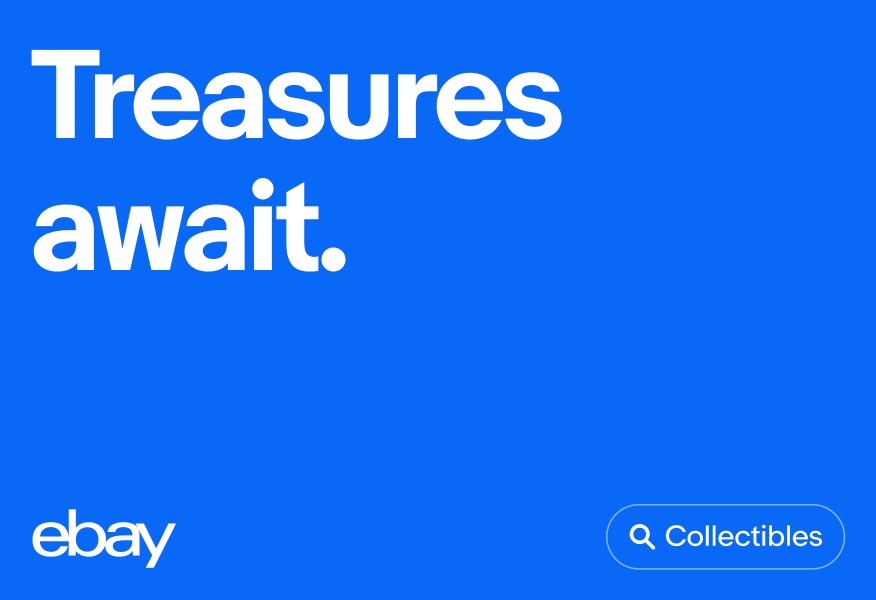
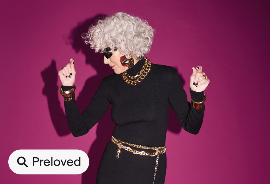
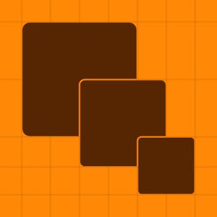
We use UI graphics to connect our marketing and top of funnel campaigns to our product. These graphics also serve as quick references to how we use product features, and allows for more in-depth storytelling.
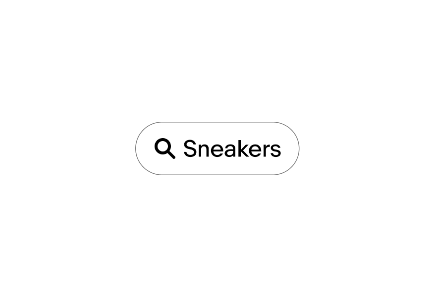
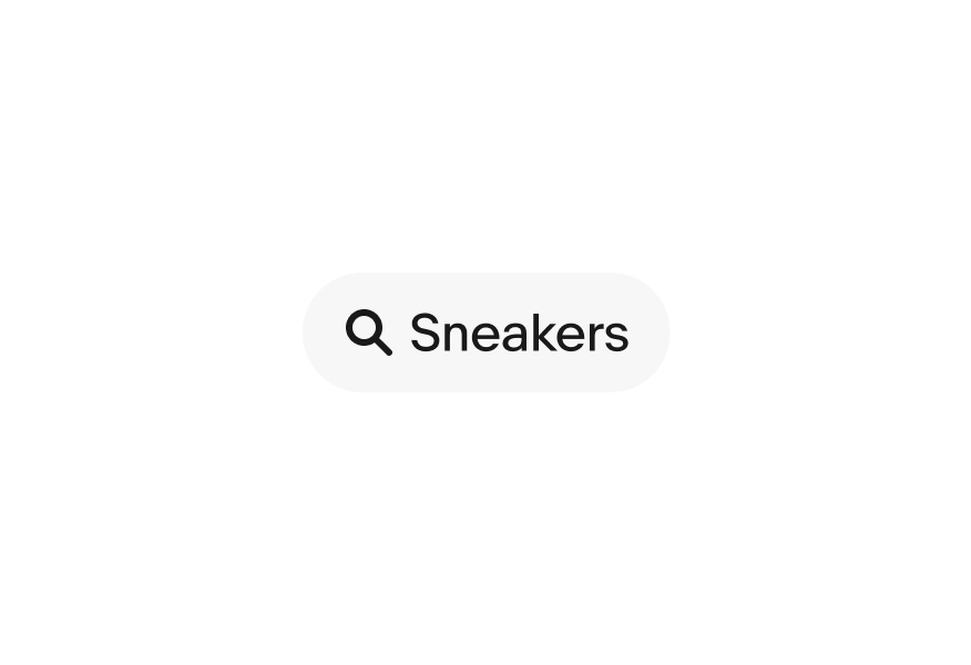
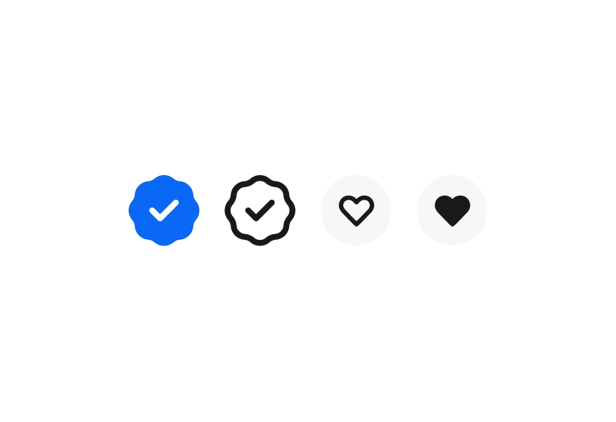
UI graphics have 2 container styles—outlined and filled. When using the outlined options, ensure the stroke color is the same as the text and set to 50% opacity. Outlined options can also follow our tone-on-tone color guidance referenced in the Color pairing tool.
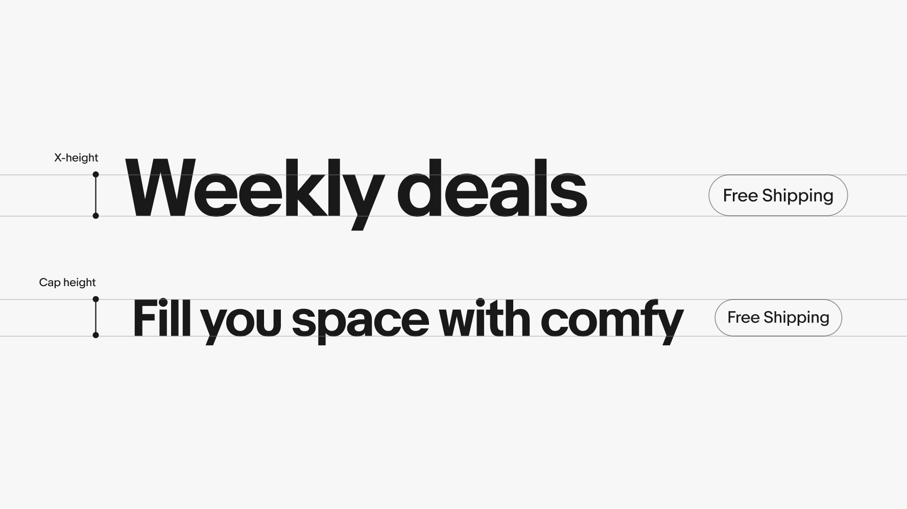
UI graphic heights are determined by the cap height or x-height of the headline.
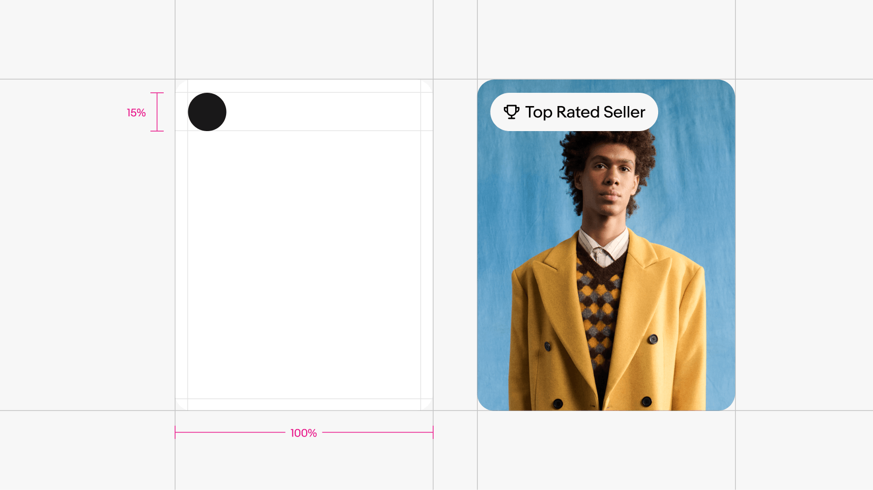
In the absence of a headline, the UI graphic's height should be 15% of the the layouts shortest side.

| Date | Notes |
|---|---|
| Jun, 2024 |
|
Learn how to use our iconography across product and marketing applications.
Learn how to use our color across product and marketing applications.
Learn how to use our typography across product and marketing applications.
Learn how to build layouts across product and marketing applications.
Learn how to use our photography across product and marketing applications.