System definitions
Explore definitions and examples of words and elements mentioned across eBay Evo.

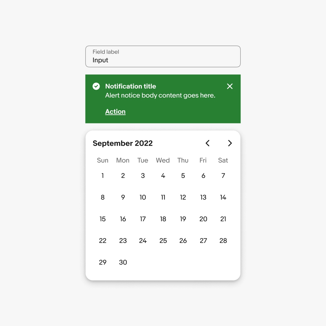
Component
A reusable piece of code that serves as a specific user interface element or function.
Examples
- Button
- Checkbox
- Card
- Section title
- Sheet
- Text field
Expressions
An expression is the application of the system to a particular subject/area.
Examples
- Landing pages
- Campaigns
- Emails
- Program materials
Foundations
Fundamental elements that provide the building blocks for creating consistent and cohesive user experiences.
Examples
- Color
- Spacing
- Typography
- Iconography
Related terms
- Primitives
- Atoms
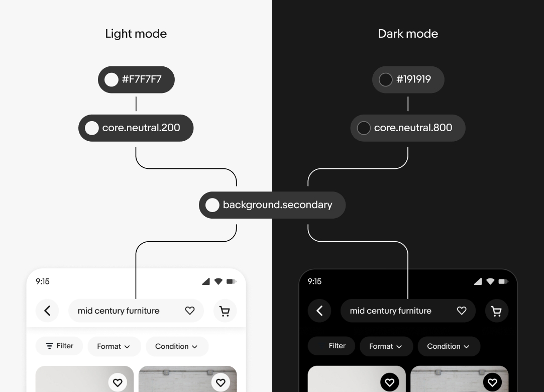
Mode
A list of values for a variable within a specific context.
Examples
- Light
- Dark
- English
- German
- Compact
- Large
Pattern
A reusable solution to a common user problem.
Examples
- Collecting user data
- Building data dashboards
- Progressive disclosure
- Feedback
- Sharing
- Bulk editing
- Uploading files
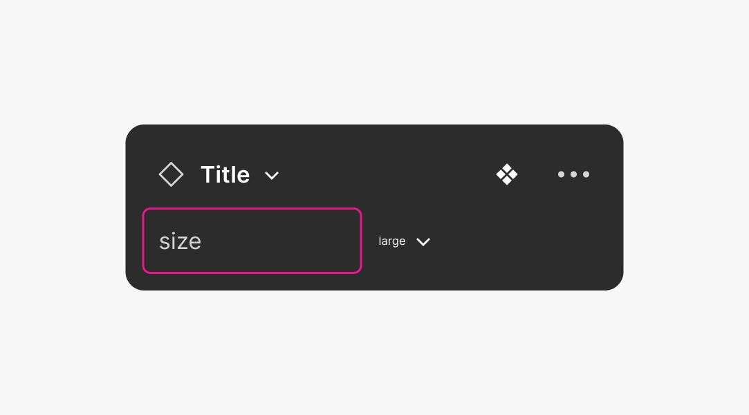
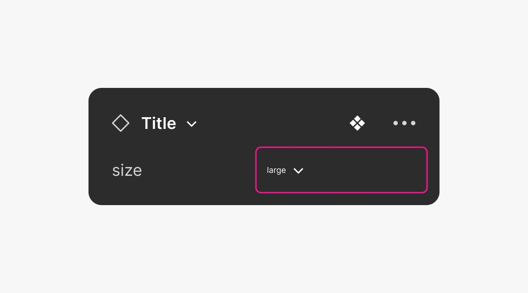
Property
A variable that can be passed to a component and used to customize its behavior or appearance.
Examples
- isVisible?
- Level
- Size
- Orientation
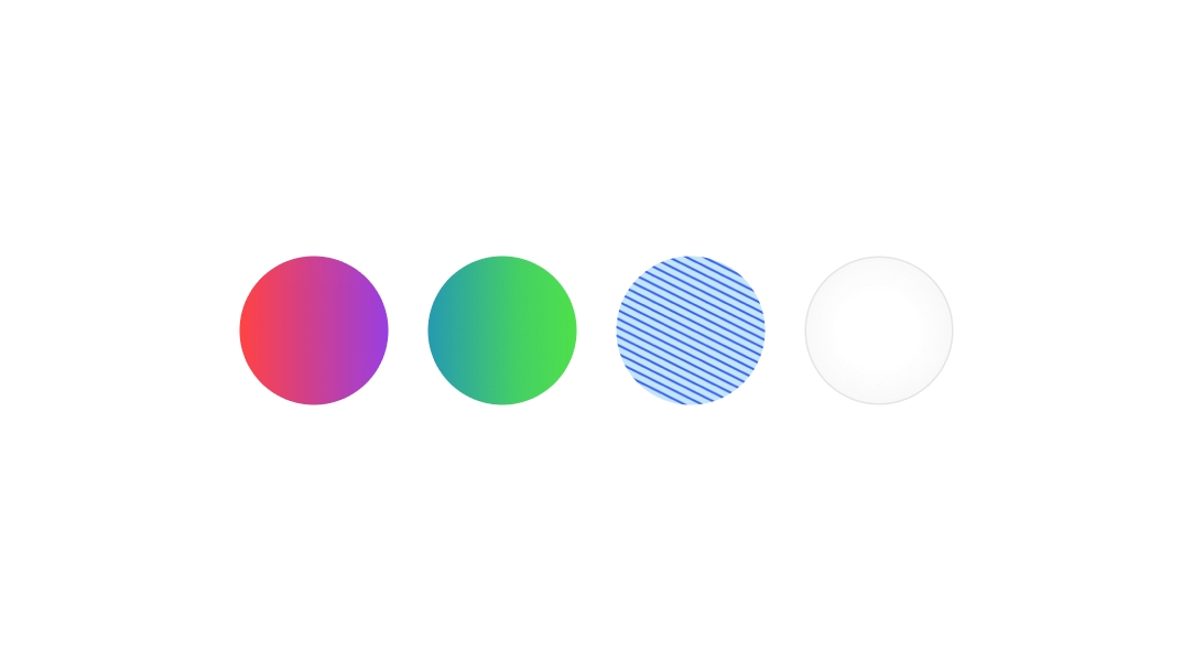
Style
Holds a combination of values that are expressed all at once.
Examples
- scrim/image
- ai/gradient/green/strong
- image/avatar/2
- viz/chart/fill/tertiary
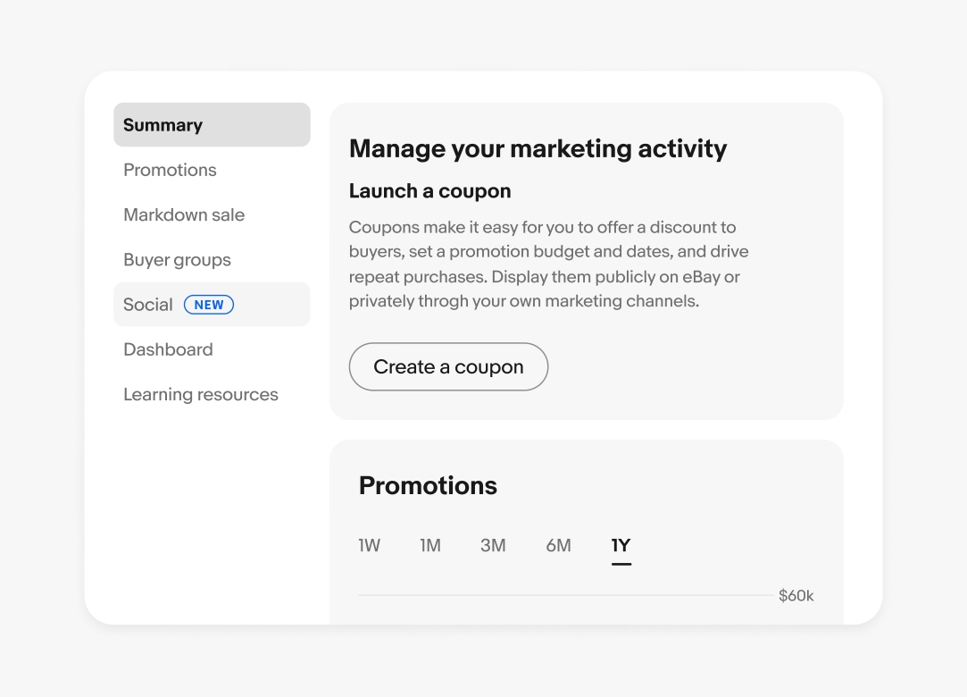
Template
A pre-built layout or design that can be used to create user interfaces. They usually include content areas and surrounding elements like navigations headers, menus, and device-specific UI elements.
Examples
- Dashboard
- Landing page
- Product feed
- List-detail view

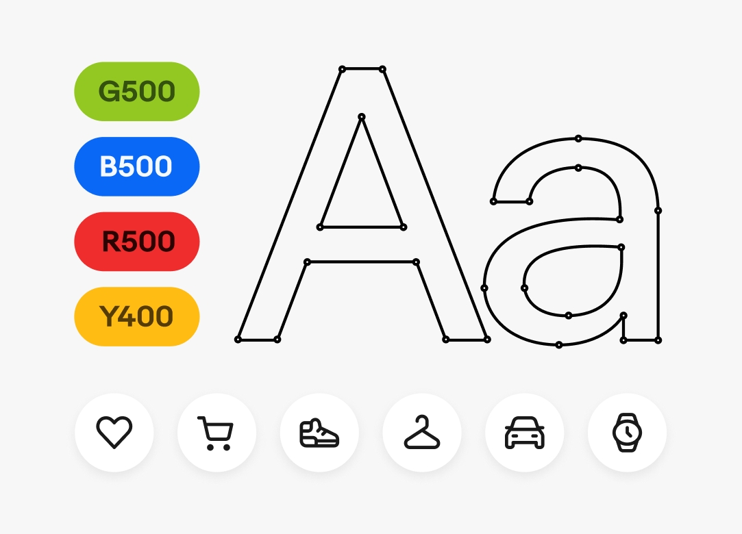
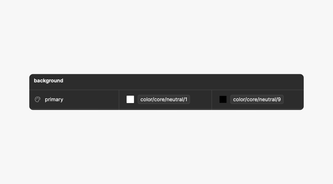
Token
A reusable variable that represents a specific design decision.
Examples
- color.core.blue.4
- color.background.accent
- spacing.page.grid.gutter
- border.radius.small

Value
A value is the data that is assigned to a component property.
Examples
- Small
- False
- Attention
- Stacked
Variable
A specific implementation or representation of a single value.
Examples
- colorCoreBlue4
- --color-background-accent
- spacingTitlePaddingHorizontal
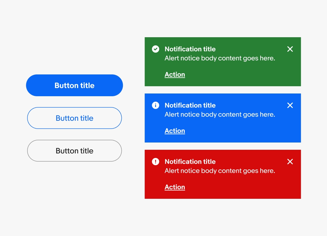
Variant
An alternative presentation of a component with different properties and values.
Examples
- Primary button
- Secondary button
- Small text field
- Confirmation alert notice
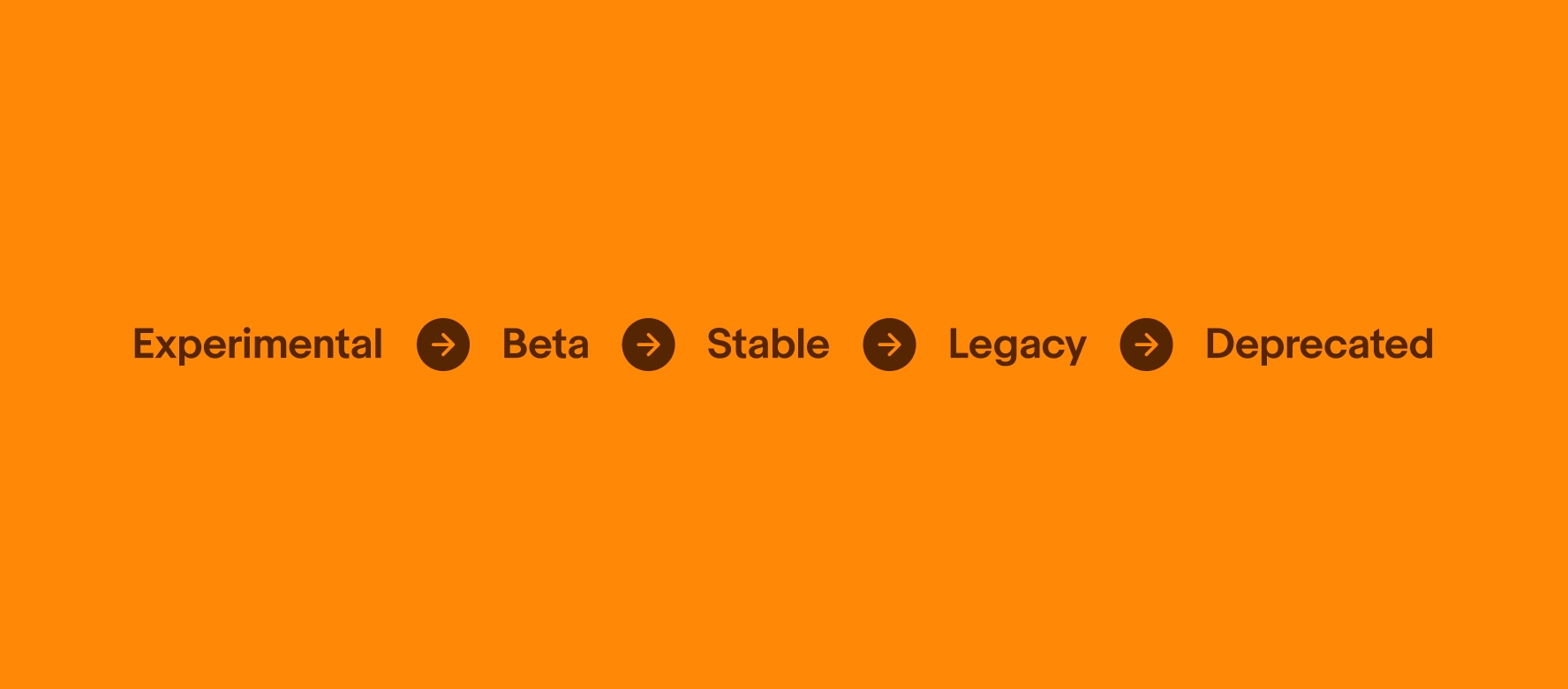
Experimental
Experimental components or features are still in their early stages and are not yet ready for widespread use. Experimental features are released to gather feedback on new ideas or concepts, and they may not be fully functional or stable.
Beta
Components or features in beta are nearing completion and are being released to a limited group of users for testing and feedback. Beta features are released to identify and fix any remaining bugs or usability issues before being officially released to the general public.
Stable
Stable components are fully functional and available for use in most, or all, circumstances.
Legacy
Legacy components are stable but discouraged due to availability of a newer or better alternative.
Deprecated
Deprecated components are marked for removal in next major version and should no longer be used.
| Date | Notes |
|---|---|
| Jun, 2024 |
|